Sony Tablet S Review
It's been some time since Sony had a tablet on the market. Times have changed since the VAIO UX's day, though, and where once tablets were niche devices, now they're making headway into our living rooms. The Sony Tablet S is the first model of the company's new strategy, packing Android Honeycomb into a hardware design that's a little more interesting than many rivals have managed. Late to the game against the iPad, though, has the Tablet S' tardiness undermined its potential? Check out the full SlashGear review after the cut.
Hardware
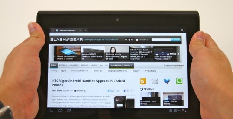
Sony hasn't strayed too far from the Honeycomb herd with the Tablet S' core specifications. Powered by NVIDIA's dual-core Tegra 2 paired with 1GB of RAM, its dimensions are kept compact thanks to a slightly smaller than usual 9.4-inch capacitive touchscreen. This still runs at 1280 x 800, like 10.1-inch Honeycomb slates, so the only real difference is a slightly higher pixel density. The display overall is a success, with wide viewing angles and solid contrast, though as is often the case it's highly reflective and a fingerprint magnet.
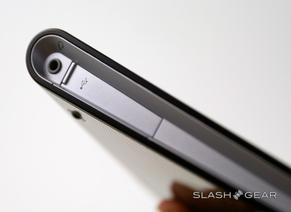
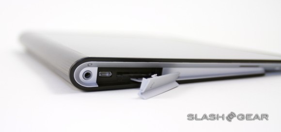
Where Sony first pulls away from the pack is in the physical design; this is no basic slab. Sony calls it "folding design" and says the tapering form-factor is based on a folded-back magazine. The company has even carried that through to the rear panel, emphasizing the asymmetry with a ridgeline where the curve ends, and using contrasting white and black plastic to highlight. Ports – including a full-sized SD card reader, useful for quickly checking shots from your digital camera, and microUSB, though no HDMI – are clustered in the white end-caps, some under flip-out panels.
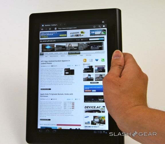
It's a design concept we've seen attempted before – Notion Ink's Adam, for instance, has a swollen battery bulge intended to offer an easier grip – but Sony's downsizing abilities make it more successful. The Tablet S is purposefully made with off-center balance so that, when you're holding it in portrait orientation and gripping the thicker edge, the weight is biased to your hand. That reduces the leverage effect; we found we could hold the slate single-handedly for longer than with regular tablets. The downside to the lightweight is that it feels less "premium" than, say, the aluminum iPad 2, instead being more plasticky like the Galaxy Tab 10.1. Unfortunately it's also – even at its thinnest edge – thicker than the Samsung.
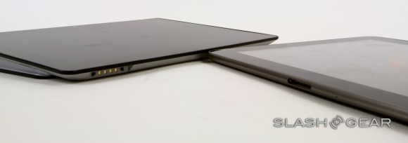
In landscape orientation, meanwhile, the Tablet S' profile angles it on the table, mimicking the slight elevation many cases offer for easier typing. Sony says it helps avoid lighting reflections, too, though we still found ourselves shuffling around the glossy tablet frequently. A matte screen may not lead to the same eye-popping colors as a gloss-finish one, but it's still a sacrifice we'd be happy to make.
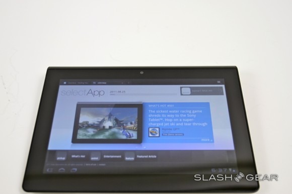
Sony will offer two models, one with 16GB of onboard storage for $499, and another with 32GB for $599. Connectivity on both includes the usual WiFi b/g/n and Bluetooth 2.1+EDR, together with USB and a headphone socket. There's no 3G/4G option at this stage, unlike the AT&T 4G support the Tablet S' clamshell sibling, the Tablet P, will arrive with. Up front is a 0.3-megapixel camera for video calls, while a 5-megapixel camera capable of 720p HD video recording is on the back.
More surprising is the return of the infrared (IR) port, though as with Vizio's tablet it's here for universal remote control duties rather than sluggish file transfers. Sony preloads a Remote Control app, which, happily, works with TVs, cable boxes and other A/V hardware from other brands too. Setup is straightforward, requiring a selection of category (e.g. HDTV) and then manufacturer, and there's a basic button layout for full control along with a swipe-gesture based channel/volume control, which lets you flick through without having to look down at the screen. What you can't do is customize the layout: we'd like to have combined controls for several pieces of A/V kit onto a single panel, rather than have to jump between them via the app home screen, as well as ditch a few of the less frequently used buttons.
Software
Like other tablet manufacturers before them, Sony has been unable to leave Honeycomb alone. The software modifications are less obvious, initially, than say Samsung's TouchWiz UI on the Galaxy Tab 10.1, but there are more preloaded apps for what Sony says is a boosted "out of box experience."
Preloads generally make us wary, but Sony's choice isn't too bad. The Tablet S will get a selection of homegrown and third-party titles, including Evernote, FourSquare and USTREAM though they weren't present on our review unit, plus the Remote Control app mentioned before. There's also Sony's Reader app for ebooks, the Reader Store, a File Transfer app, along with Music Unlimited and Video Unlimited. It's also PlayStation Certified for mobile gaming, so you can load PSOne and PSP titles just as on the Sony Ericsson XPERIA Play.
Crash Bandicoot and Pinball Heroes will come with the slate, and Sony expects to launch a dedicated PlayStation Store for tablet gaming later in 2011. Since there are no hardware controls, the Tablet S uses on-screen buttons: a D-pad is on the left side and the familiar action buttons on the right. The exact positioning of these can be adjusted according to where your fingers most comfortably fall, though we reckon the clamshell Tablet P may be the gamers' choice thanks to its more compact scale. The classic and portable titles should have no problems running on the Tegra 2 chipset, though they won't be available to test until the tablet's launch.
[vms 319973d3173a74a03860]
Other changes are more subtle. Sony has polished the homescreen transitions as part of what it calls "Swift and Smooth"; it did seem like there was a little less jerk or lag in swiping between homescreens, but it's not a groundbreaking difference. Better is Quick View in the browser, baking a proprietary algorithm into the native Honeycomb app that speeds up webpage load times as well as pre-caching offscreen portions of each site. That means less catch-up when you scroll, though it may have an impact on data use if you're relying on a mobile hotspot to get online.
[vms 0f5be4dd354bb3e295d3]
While the homescreen looks like the Android norm, Sony also has its Favorites screen, a Pulse-style shortcut page with nine tiles on the right side and a dynamic preview window on the left. Apps and content can be pinned to each tile, either a single program or recently played content, your bookmarks, browser history or recently added music. There's plenty of nice pivoting animation as you flick between each one, though we wish there was a way to set Favorites as the default desktop.
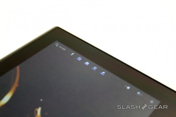
Just as the universal remote app tries to join the dots between the Tablet S and the rest of your A/V kit, there's DLNA support on the tablet to handle media streaming. The audio and video apps have "Throw" buttons, which automatically scan for DLNA-compliant hardware – such as speakers or your network-connected HDTV – and then allow you to drag & drop the currently playing content to those outputs. It works just as you'd expect, and we were able to quickly get video recorded using the tablet streaming to our smart TV. For all Sony's branding this is regular DLNA at its core, which means that other brands of TV and speaker system are supported (they'll need to support MPEG4 rendering for video use, however).
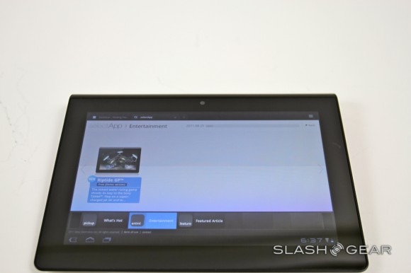
Honeycomb still lags behind iOS for tablet-specific apps, and the Android Market doesn't exactly help what with its filtering shortcomings. Sony has begun a new site, called Select App, to guide new users toward key software, split across various categories like home, lifestyle and entertainment. It's sparse on information – just a short blurb about each app – and there's no way for Tablet S owners to leave their own reviews or suggestions, but it's better than nothing. What will make the difference is how often it's updated, something Sony isn't yet pinning down.
Battery
Sony claims iPad 2 equaling battery life from the 5,000 mAh battery in the Tablet S, and our experience suggests that's a reasonably fair estimate. With mixed use but a solid amount of browsing and gaming, together with multimedia playback, we saw approximately ten hours of runtime. Less ambitious use, like ereading, and more casual browsing should see that extend even further.
Accessories
Sony has two key Tablet S accessories initially, a Bluetooth Keyboard ($79.99) and a Desk Cradle ($39.99). The former – which in fact works with any Bluetooth tablet – is a low-profile 'board with a similar layout to the keys on Sony's VAIO laptop range. It has a line of dedicated keys for Android tablets, such as Home, Search, the contextual menu, etc., which work with models from other companies.
The Desk Cradle, meanwhile, is a little less useful. It only charges the Tablet S, and has no ports or other connectivity. While it can be adjusted for angle, it only has two positions rather than free movement. Drop the slate in, and a menu offers a choice of displaying the gallery, a desk clock or the preloaded chumby app with its various widgets. With no HDMI output on either tablet or dock, there's currently no way to hook the Tablet S up to a big-screen TV, Sony instead relying on the DLNA support.
Wrap-Up
Sony's UX series VAIO UMPCs were, with their tiny slide-out keyboards and futuristic design, innovative enough to still show up in motion pictures as space-age props long after their actual hardware was outdated. The company has attempted some of that creativity with the Sony Tablet S, too, though it's far more in line with what other Android device manufacturers are pushing out. We'll have to wait for the dual-display Tablet P, with its pair of 5.5-inch touchscreens, for the truly eye-catching hardware.
Starting at $499 when the Tablet S goes on sale in mid-September, Sony matches the iPad 2 and Galaxy Tab 10.1 pricing. That's perhaps a brave strategy given the Apple slate's current dominance, though viewed against the Samsung each has its strengths and weaknesses. Sony has packed the Tablet S with a higher resolution rear camera than that in the Galaxy Tab 10.1, and the custom apps are arguably more useful than Samsung's TouchWiz interface, especially the universal remote; on the flip-side, it's a chunkier tablet than the Samsung and the asymmetrical design forces compromises in terms of bulk that have to be balanced against the increased ease of holding it in portrait orientation. Performance and app selection are in the same ballpark, for the most part.
[vms 616d874afad0f44ba338]
