Sony Tablet P Review
In a tablet market that's flooded with similar offerings comes Sony and their Tablet P. With a unique clamshell design they can call their own that we've never seen from an Android this is truly a one-of-a-kind tablet. Is it worth the money or just an interesting wannabe Nintendo DS? We first heard about it back last year but now that it's available from AT&T lets dive into the full SlashGear review and see what we think.
To jump right in I'll start by saying the Sony Tablet P is available today, right now from AT&T for $399 and a 2-year contract, or for $549 contract free. With dual screens, cores, and cameras it makes for one interesting device to say the least. Is the Tablet P practical though? That is the question. Check out our hands-on first, then enjoy the rest of the review.
Hardware
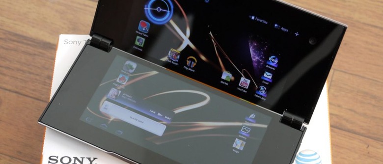
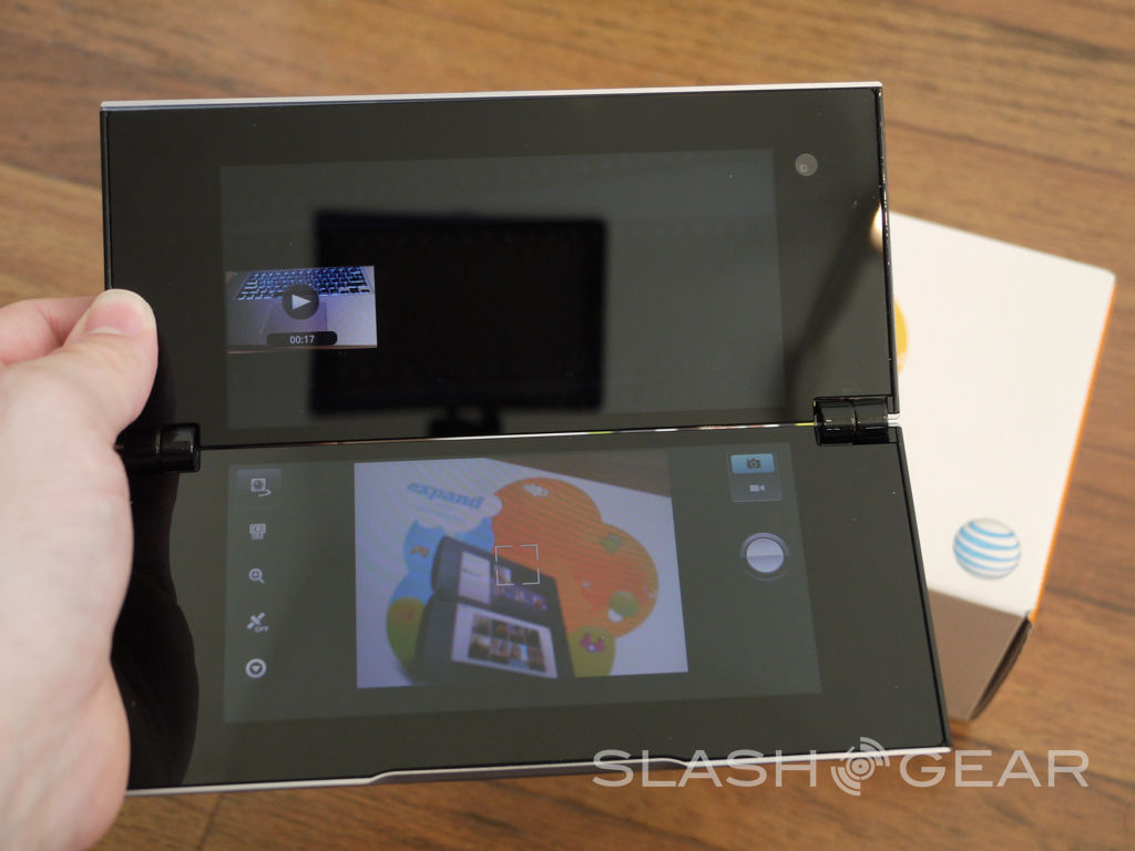
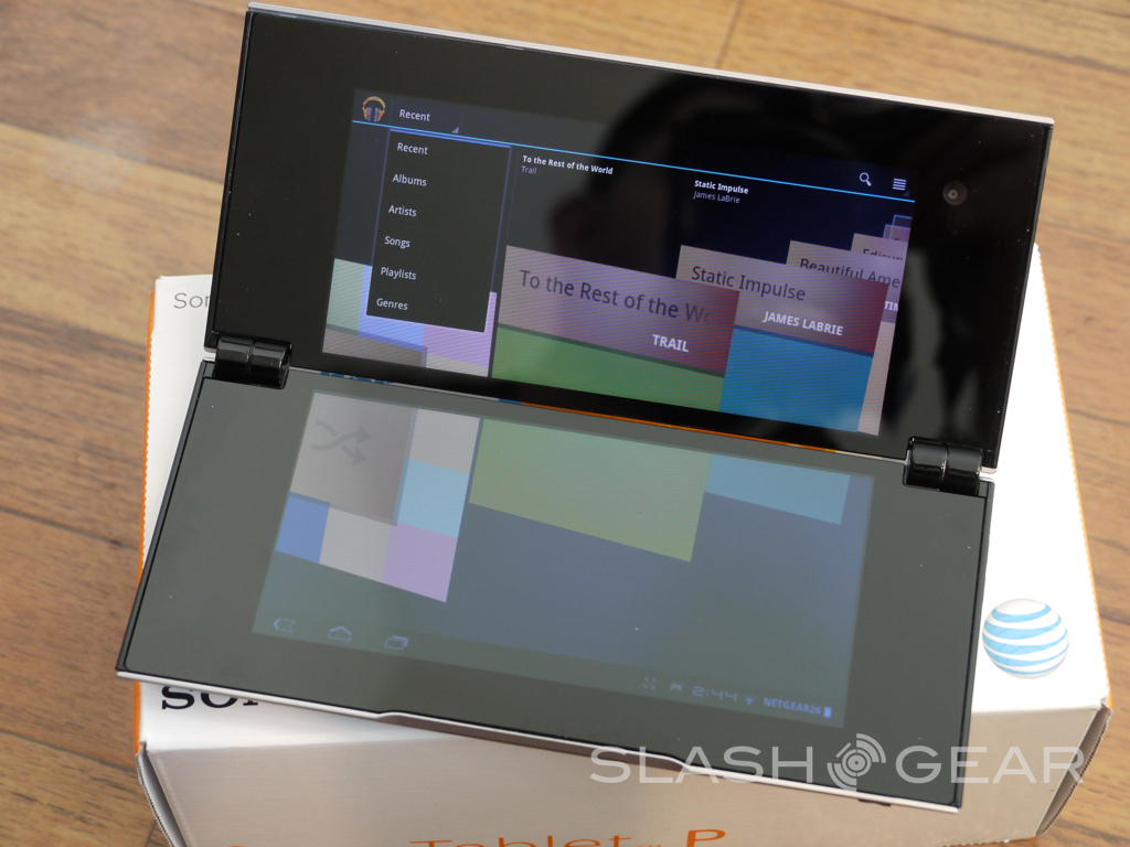
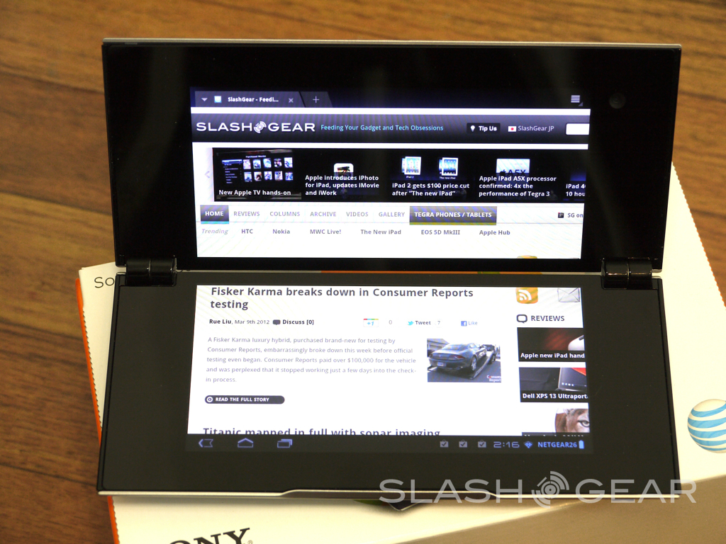
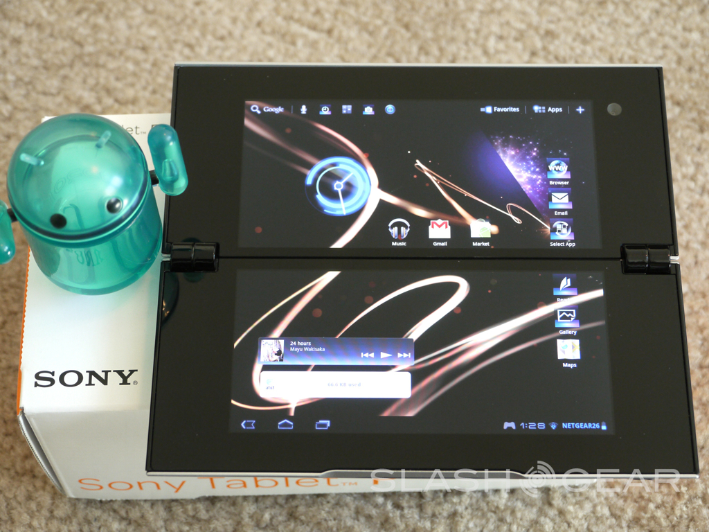
The hardware is extremely unique to say the least. With two 5.5" 1024 x 480 screens, the NVIDIA Tegra 2 dual-core processor at 1 GHz, 1GB of RAM, 2GB of storage (SD card) and dual cameras it has some specs that most tablets can't even compare to. We also get dual cameras with a 5 megapixel rear and VGA front for video chat. Has Sony reinvented the wheel here, or will this be soon forgotten?

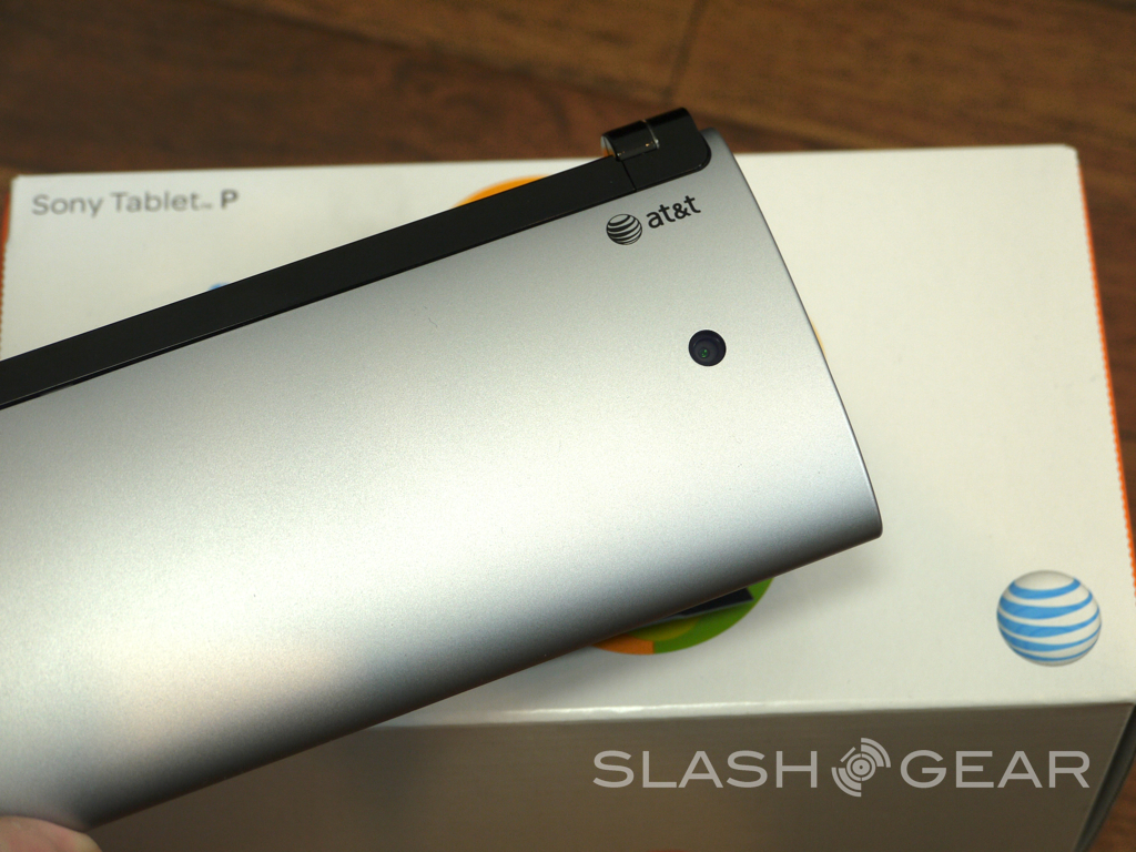
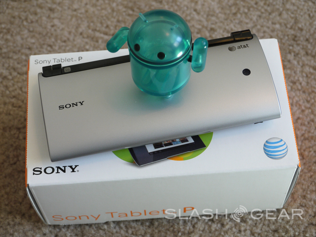
This is an 11" tablet with the footprint slightly larger than a smartphone. Out of the box it's slightly fatter than most phones but around the same width being 3.1" wide and a little over 7.1" tall. Easily pocket-able makes this one of the most portable tablets we've used to date. The design looks and feels nice but in reality is just cheap plastic. I couldn't help but wish they used a better material for construction as the entire device just seems a little cheaply built if you ask me — almost like a toy. Then again this is a crossbreed between a tablet an a gaming device.
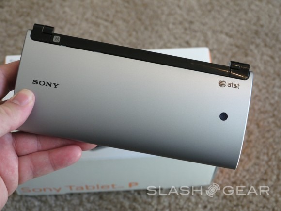
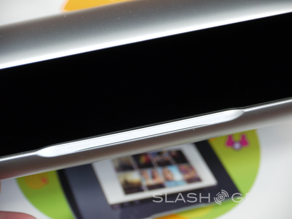
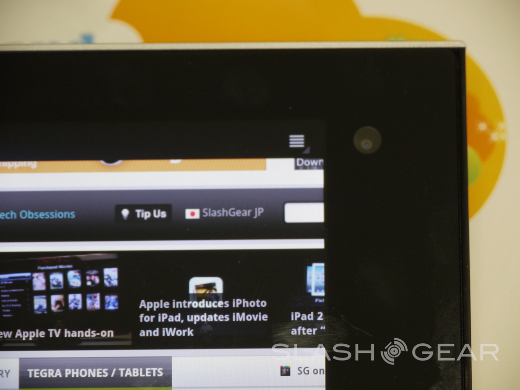
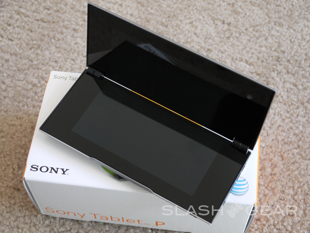
The matching 5.5-inch screens are nice and pretty but the large, almost 1-inch wide bezel around the entire thing could have been cut down and made smaller. The front has a nice cut out to help open the clamshell design and a slit is also included with a green LED for notifications.

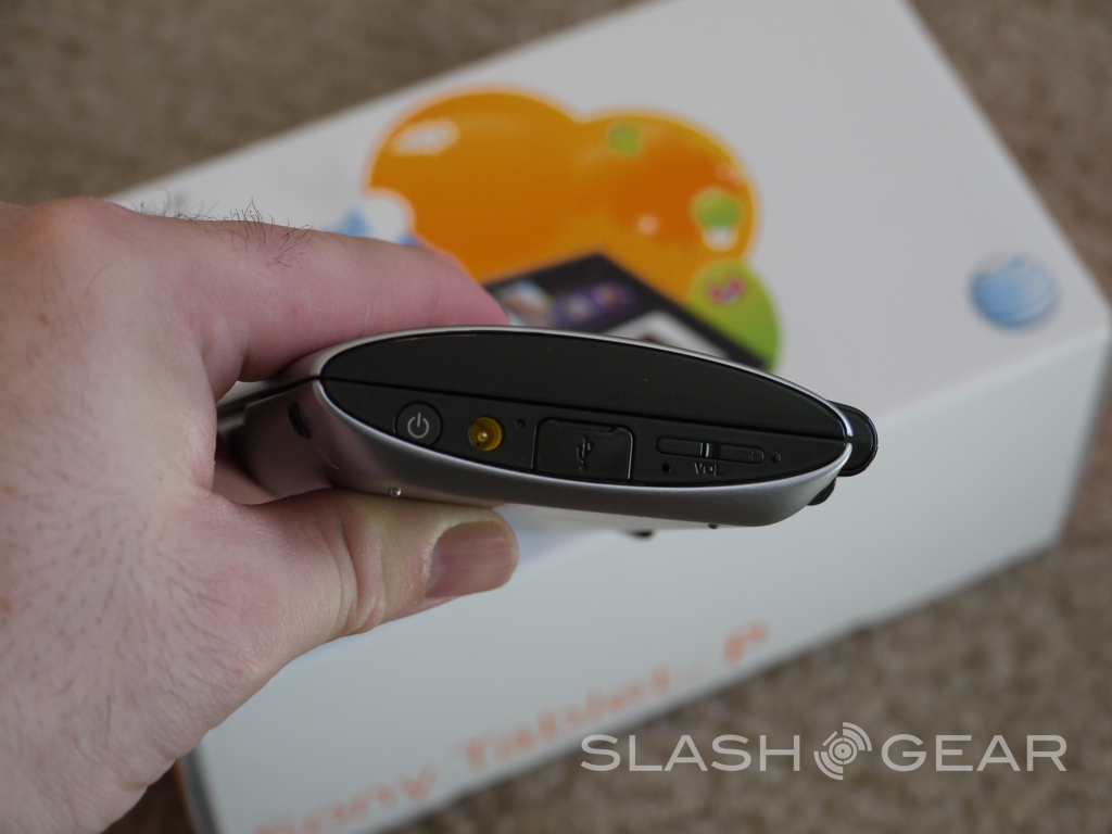
As far as buttons and ports they are all on the side, bottom portion of the device. We have the volume rocker, micro-USB for sync (not charging) the proprietary charging port, and the power button with a red/green LED for charging. On bottom are some small feet to sit it on a table and the 3.5mm headphone jack. Then on the left is a lone grill for the speaker and that is all. The design is actually nice, elegant, and simple but the cheap feeling just leaves me wanting more.
The dual-screens are 5.5" and use Sony's Bravia engine and Tru-Black technology and look great — so long as you look straight on. At much of an angle colors go bad and whites turn yellow. For a dual screen device that you won't always be looking at straight on this was a major bummer.
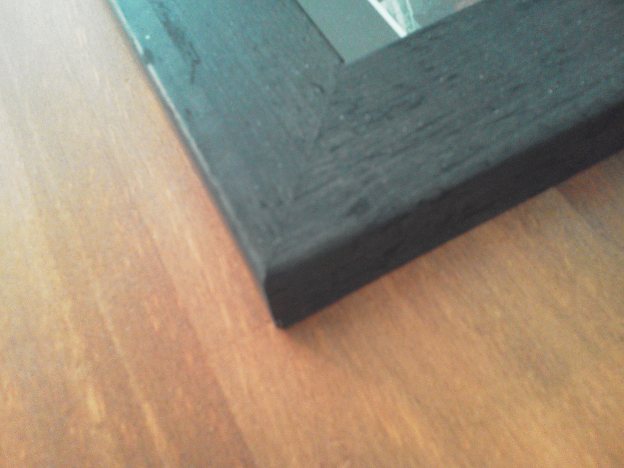
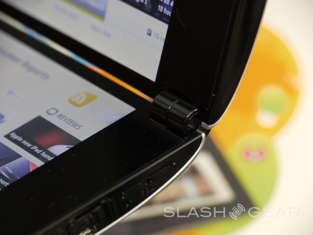
One of the best parts of the design, and the durability is the extremely strong hinge. You can lay it on any surface and open the top screen to any angle you'd like and the strong hinge will hold it in place, and the tablet wont fall over backwards. Watching the video below you'll get another great example of the hardware and my last complaint is the sharp corners on the inside. The outer shell is nice, smooth and round. The inside isn't so lucky and the sharp corners cause extreme discomfort after about 5-10 minutes of use.
Software
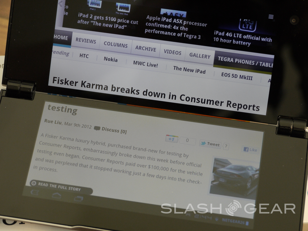
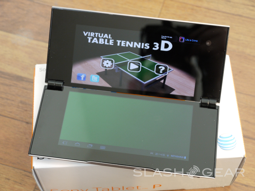
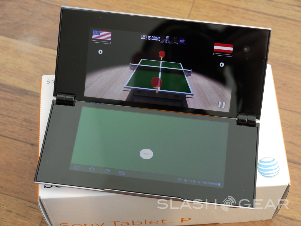
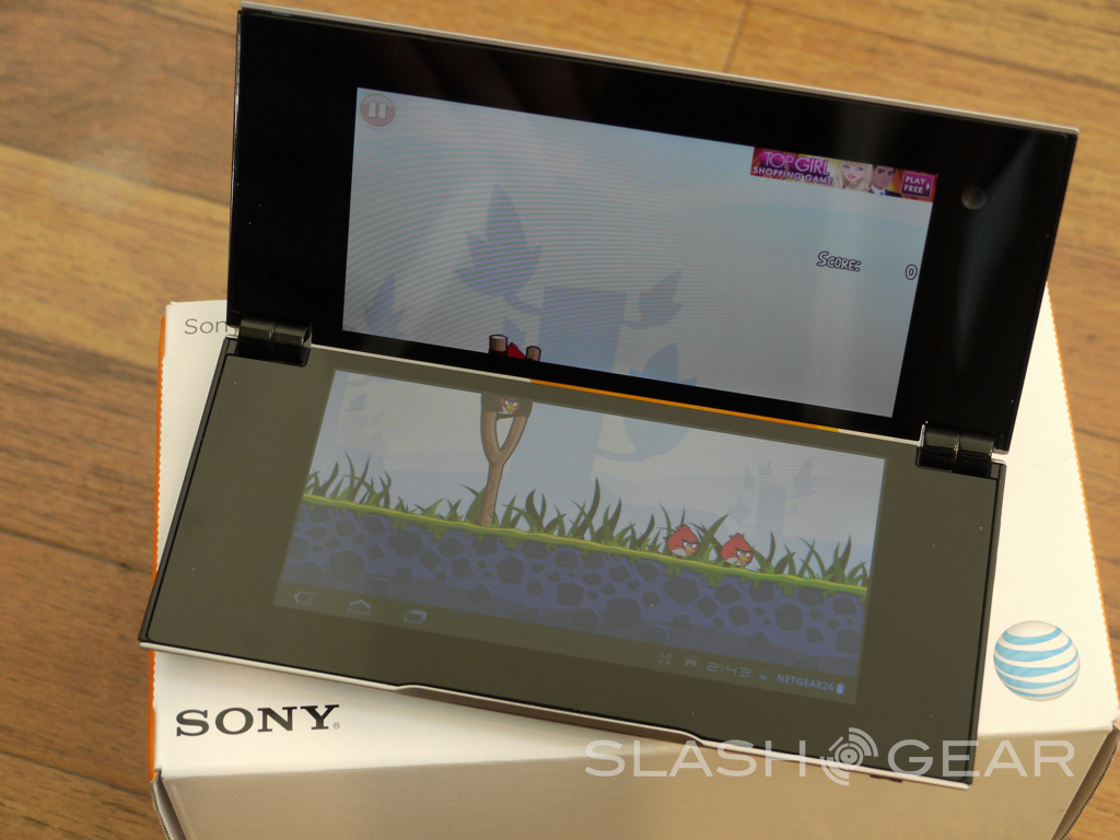
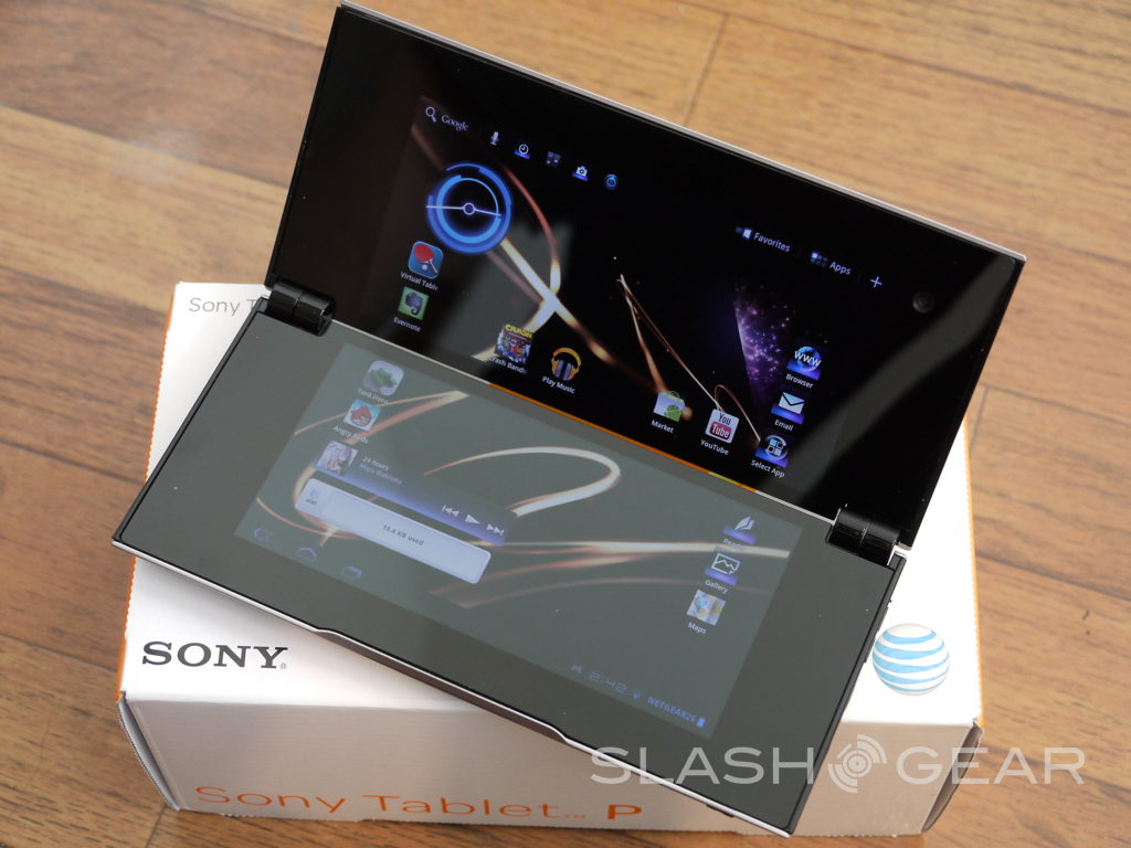
The software is Android 3.2 Honeycomb and while it works well, could be better. Android 4.0 ICS should bring along plenty of improvements to this device and is said to be coming soon, but for now we get Honeycomb. Obviously with two screens the operating system will need to be thrown together, and that is how it seems. Some aspects work great while others are terrible. Some games are enjoyable on both screens and take full advantage of the real estate while others don't. Even the pro-loaded Crash Bandicoot doesn't work that great although we do have complete PS2 controls.
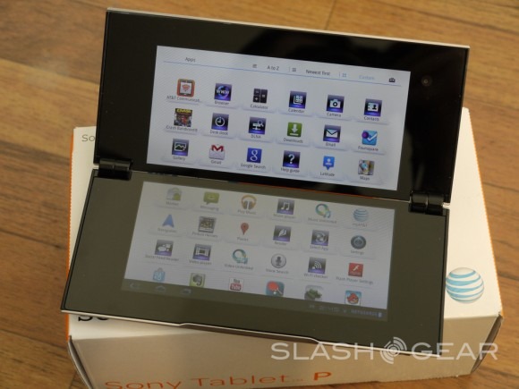
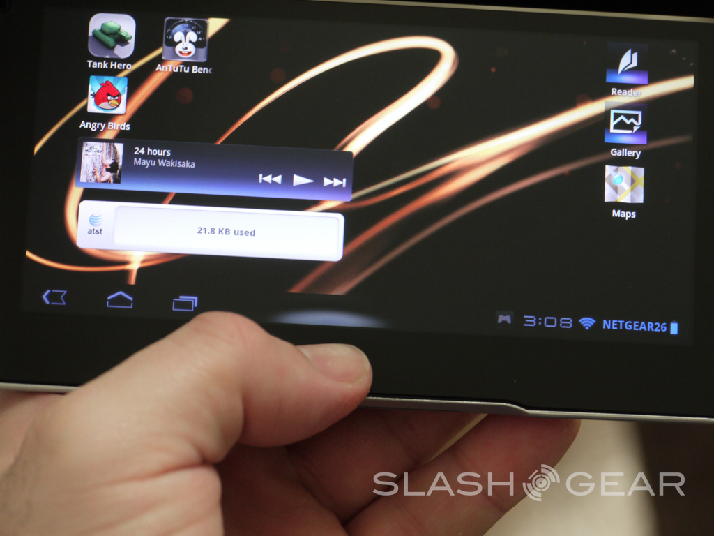
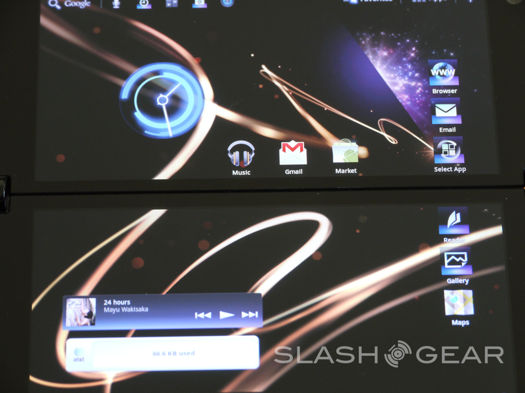
As you see above many of the icons have been replaced with generic blue ones from Sony. Things like the camera, browser, calender and other stock apps. Why these aren't the same as Honeycomb icons beats me. The software is basically untouched in regards to Android 3.2 Honeycomb and is everything we know and expect with the Android OS. but does have moments of lag from sliding icons and such onto a different screen.
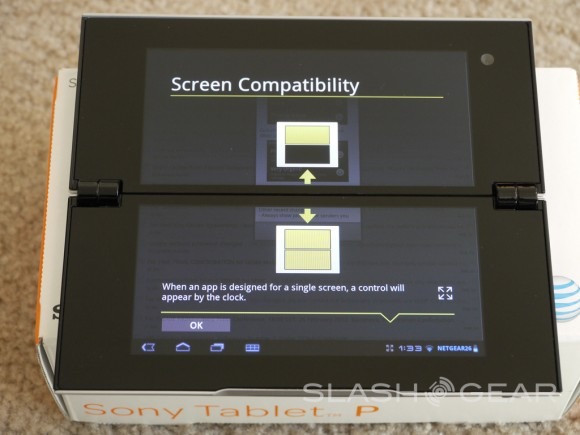
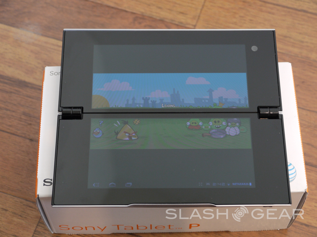
The bezel is something that for now we can't get away from, and it kills the experience. You don't actually miss content but it does ruin the experience and makes things harder to read and do. Now most apps don't work with both screens although Sony has worked with developers and we have around 40 available in the market that take full advantage. Not a lot but it's a start. Most apps will use the bottom, or the top and occasionally we can use the "fit to screen" option in Honeycomb and that sometimes works, and often causes problems. YouTube fails to work completely and in fact was not pre-installed. So that could be a huge con for many.
I wont talk too much about the dual-screen experience because my extended hands-on video below will show you the performance, and usage situations with both screens. Not to mention a few games, apps, and the fact that YouTube is missing in action.
[vms c380218a8cc9a43d438f]
Benchmarks
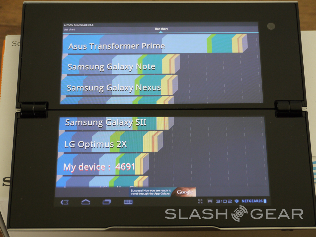
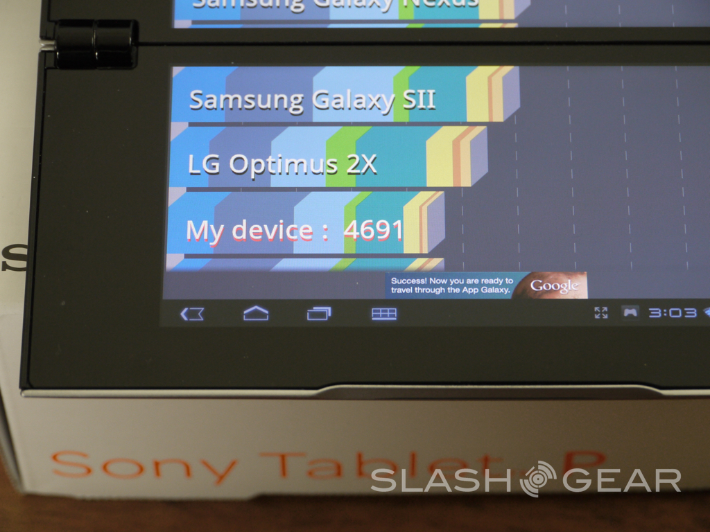
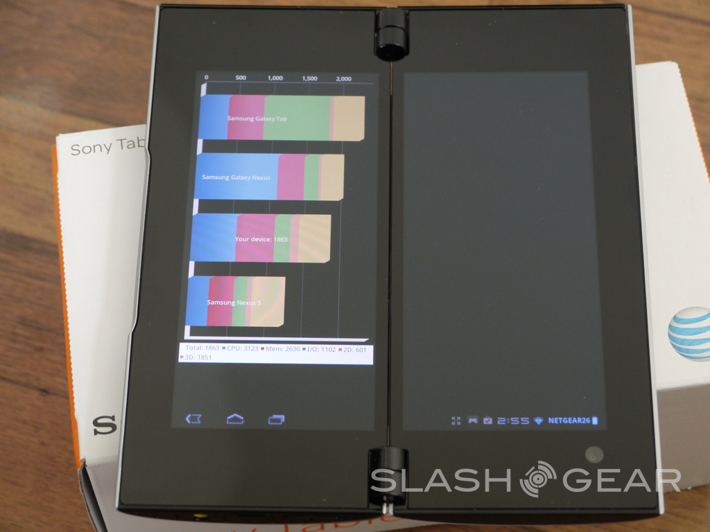
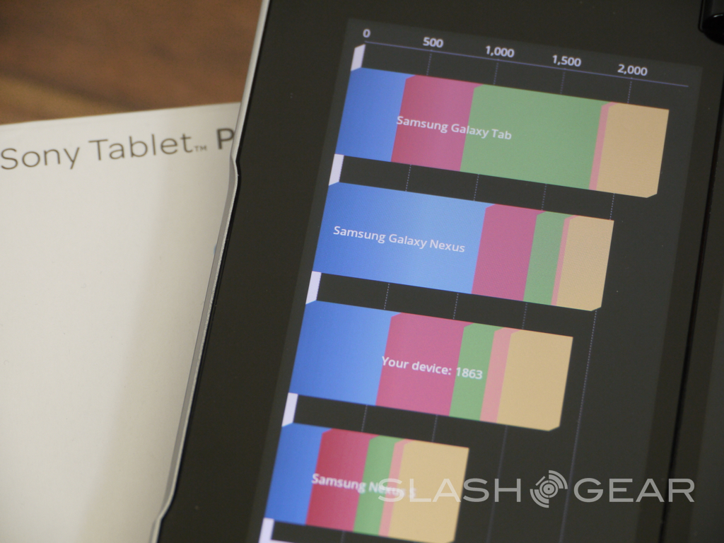
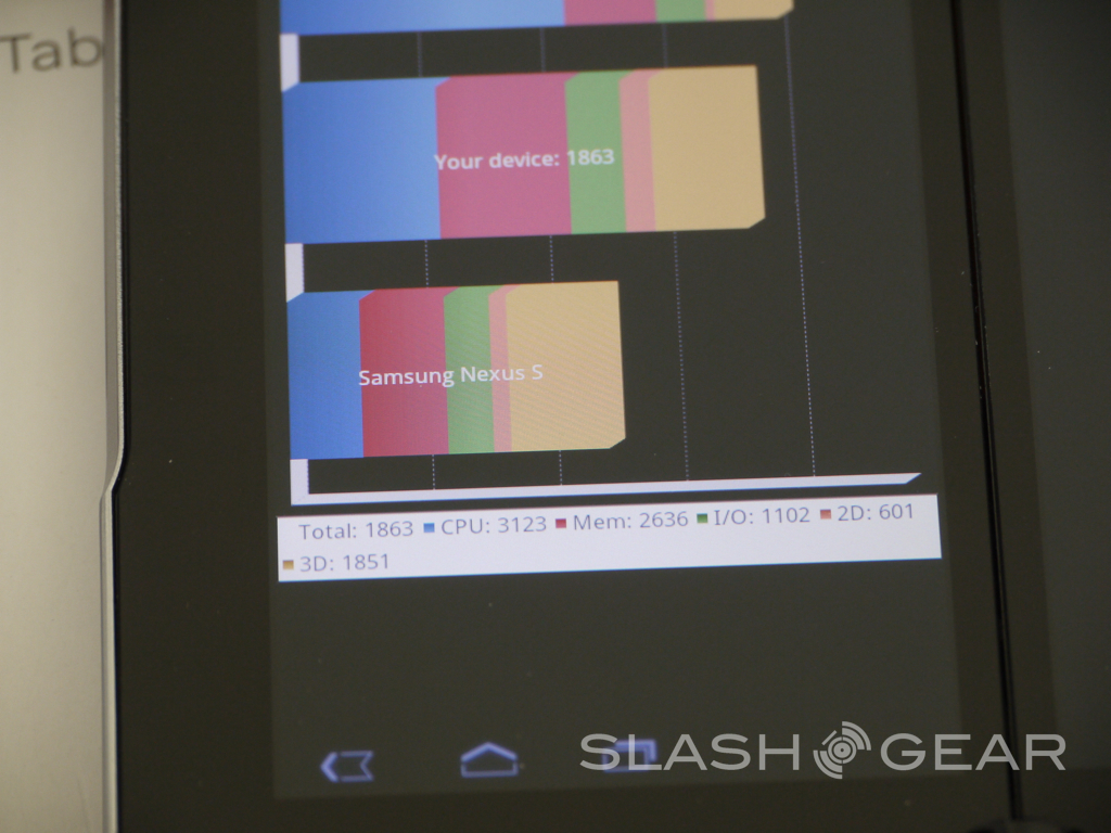
As usual we've ran a few benchmarks and things are not looking good for Sony. Obviously we have two screens and far more pixels than most phones and tablets so the results will be lower, but they seem extra low. This isn't too big of a concern as gaming was fluid and I didn't experience any issues from the multiple games I've tried.
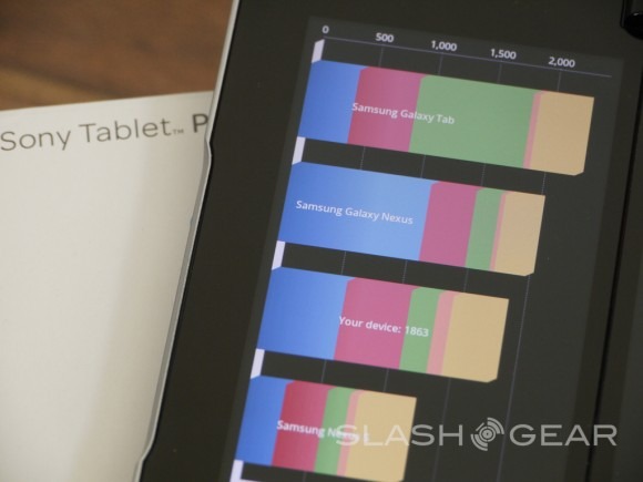
Quadrant was lower than expected for a dual-core NVIDIA Tegra 2 but at the same time we are pushing nearly 1/3 more pixels of even 1280x800 tablets with two 1024 x 480 screens. AnTuTu however was very very low and the Sony Tablet P barely outscored single core phones from early last year.
Gaming
While this is still a full tablet experience with a browser, Android Market (Google Play Store) and many other things gaming is where this will shine. Well that and portability. Sadly the gaming aspects didn't have me sold. It was fun to use, and playing split view with Battleship and Lazer Wars from the market was fun, it isn't something I'd do often. The Sony Plastation certification and Sony apps are where it shines.
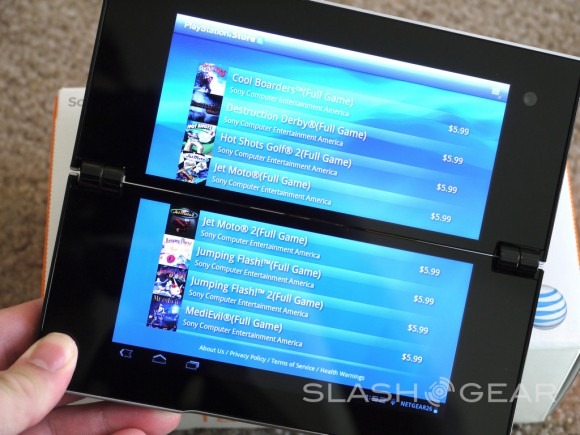
With Music and Video Unlimited, not to mention the Sony store with tons of optimized games that is mostly what this should and would be used for. At the same time many will just opt for the Sony PS Vita. The games you see in the screenshot below will become your best friend with this tablet, and many of them still don't use both screens well but we do enjoy Playstation-like controls.
Camera
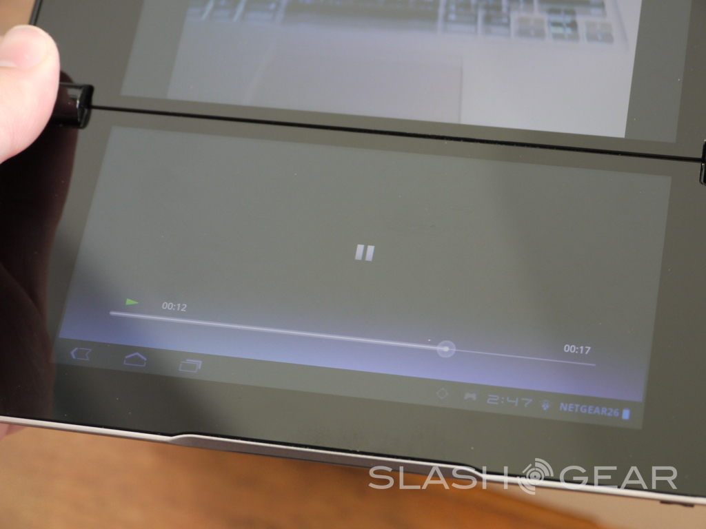
Sony has released some pretty impressive cameras in the past. With the new Xperia line having 8 megapixel cameras that work great we were surprised to see how terrible they were with the Tablet P. The 5 megapixel camera on the back takes decent photos as long as you have enough light. The shutter speed was extremely slow and required more attempts than we'd like. Video is capable of 720p but it wasn't anything special. Playing video only used part of the top screen and the entire bottom had a terrible and over-sized UI to forward, pause, and play the video. Video playback is a key area this should excel — even with the bezel in the middle — but sadly it does not. Either way here is a sample from the mediocre camera with more in the gallery below.

Battery Life
The Tablet P comes with a 3,080 mAh battery under the hood. While that would be great for a smartphone, a tablet with two screens totaling 11" I feel we need more. Many tablets like the recently reviewed Samsung Galaxy Tab 7.7 has a 5,100 mAh battery and lasts far longer than the Tablet P. We do have enough juice for about a single day of usage on 3G/4G from AT&T or on WiFi. Gaming takes the battery down faster but in general it lasted through a days use.
Wrap-Up
Sony has redesigned most of the core apps to work with the dual-screens. They have a few that launched in the market with full dual-screen support and work great too, but in general the experience is sub-par at best. They did a good job with what they could — like the browser but many apps just wont work right and give you a poorly put together and rough experience. Honeycomb needs to be tossed out and upgraded to Android 4.0 Ice Cream Sandwich as soon as possible, and Sony needs more developers on board to not only support both screens, but at least one's odd 1024 x 480 5.5-inch size.
I really wanted to love the Tablet P and I've enjoyed using it day to day and can really see it having potential for those needing portability. Sadly it has a little bit of a personality disorder and doesn't know if it wants to be a 5.5" phone, a tablet, or a gaming console and doesn't do any of them well. The design is simple until you open it and start using it day to day, and the corners are sharp and hurt your hand after a mere matter of minutes.
If Sony could do this again with more developer support, the latest and greatest specs and OS, and cut down on the bezel this could be a real winner. For now it seems tossed together and a halfway finished experience. If you want an excellent and portable tablet with data access get the Samsung Galaxy Tab 7.7, for gaming get the PS Vita, and for a true tablet experience try the Transformer Prime or the iPad.
