Sony Ericsson XPERIA X10 Mini & Mini Pro Hands-On
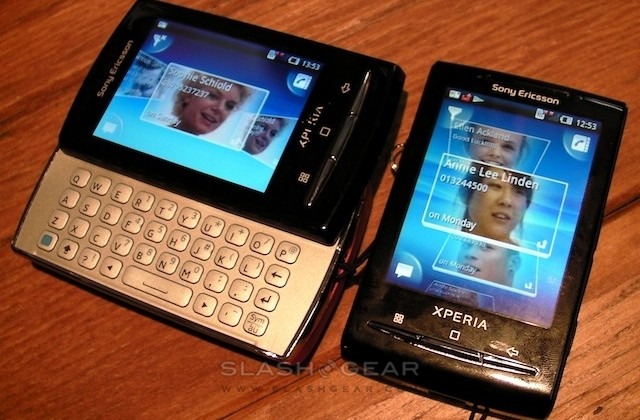
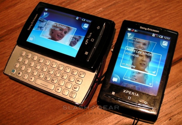
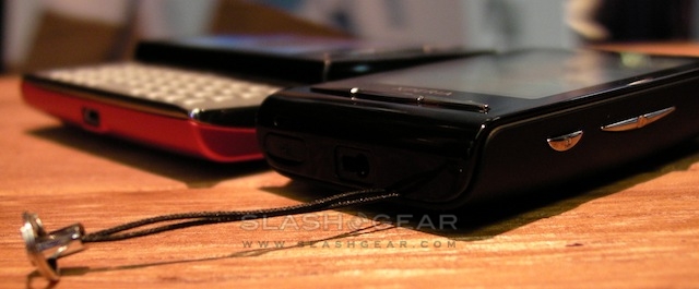
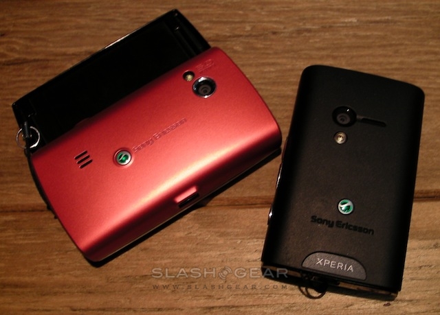
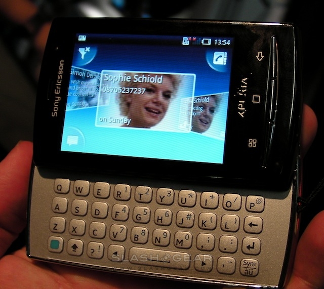
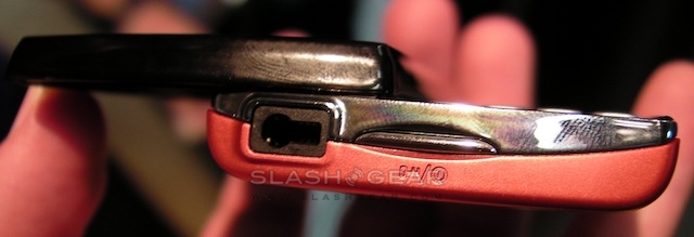
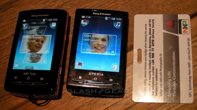
Biggest surprise about the Sony Ericsson XPERIA X10 mini and X10 mini pro? Just how small the new Android smartphones are in the plastic. We grabbed some hands-on time with both earlier today, and while they don't have the original X10's eye-catching 4-inch display they go some way to making up for it with extreme pocket-friendliness. Check out the live photos and video demos after the cut.
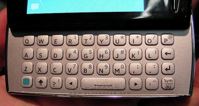
Sony Ericsson's Timescape and Mediascape apps lose some of their impressiveness on the 2.55-inch touchscreen, but the displays are capacitive and key controls – like the Infinity button which pulls up full contact records in Timescape or track/artist information in Mediascape – seem to have been enlarged slightly to make them easier to hit. Meanwhile there are four contextual corner buttons rather than soft-keys. The X10 mini pro's keyboard is certainly compact, but Sony Ericsson have sensibly avoided cluttering it up with extraneous button rows and so it's actually pretty reasonable for thumbing out text messages and emails.
Text entry on the keyboardless X10 mini is a little less slick, with Sony Ericsson's concession to display size being a T9-style layout rather than a full on-screen QWERTY. To be honest we'd accept the slight size increase on the X10 mini pro – it's a little bigger in all directions, but only by a matter of millimetres – for the hardware 'board.
Build quality – on what seemed to be pre-production devices – err'd on the plastic side, but we're expecting budget price-tags too. Both handsets will arrive in Q2 2010.
