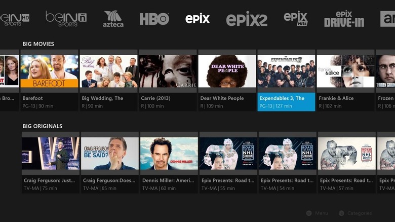
Sling TV Updates User Interface On Xbox One
Dish Network's Sling TV has a bunch of visual changes up its sleeve, and those changes are arriving first for those on Xbox One. The service announced the new changes today; included among them is a new channel guide and more details than before. Says Sling TV, subscriber feedback directly influenced this newest improvement. As such, the company is wanting more feedback — if you have a Sling TV subscription, you can tweet your feedback at Sling and make your voice known.
The new Sling TV for Xbox One, first and foremost, brings better streaming and stability and fixes a bunch of bugs. Beyond that comes an improved user interface — one that includes a refreshed guide that is better able to accommodate the increased number of channels Sling TV offers.
Program details are provided directly below show thumbnails now, and there's more imagery, too, making it easier to visualize what you're offered and what you're looking for. Clicking up on the game controller will move the mini guide to the top of the display, revealing VOD content for a channel. Scrolling left and right, then, will toggle between channels.
The "Y" button is also getting some new functionality; press it and you'll be taken to the Search page to search for content. Typing in some type of search term — fight is the given example — will pull up related content across movies and TV shows. These updates are rolling out this week; when those on other devices will see the new interface isn't stated.
Sling TV, for those unfamiliar, is an Internet TV service that allows subscribers to stream live television over the web. It comes in the form of a $20/month core channel package; additional channel packs, which are aggregated by type (kids programming, sports, etc.) are available for $5 each.
SOURCE: Sling TV
