Sling TV Has A Totally Redesigned UI, But You Need Fire TV To See It
Live television streaming service Sling TV has introduced a new interface that gives users an entirely new, more polished experience. Subscribers are promised an enhanced personalized experience with the new design, as well as an intuitive interface that makes it easy to find the content they're looking for. Unfortunately, some users will need to wait longer for it.
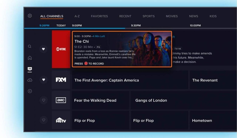
The redesign features tabs along the upper edge of the UI, enabling users to quickly toggle between the channel guide, shows listed alphabetically, as well as things like favorites, recently watched content, sports options, and more. There's also a quick-access menu on the left-hand side of the screen for things like search and returning home.

The channel guide resembles the kind you'd find on a traditional cable or satellite television service, offering things like filtering and sorting options, viewing descriptions of shows, and scheduling content to record. The service retains features like pausing and rewinding content, including a fast-forward feature for the live TV channels.
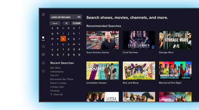
The new search UI, meanwhile, greatly resembles the one you'll find on Netflix's TV apps — the content is listed with thumbnails on the right side of the screen, while the search field and recent searches are listed on the left side of the screen. Similarly, the DVR section has been polished, making it easy to see at a glance how much storage space you've used and the content that has been saved.
Other options include things like a channel view and a series view, offering a look at things like on-demand, live, and upcoming shows, the ability to schedule recordings, and add content to a personalized watchlist. The only downside is that for now, you need a Fire TV device to see the new interface, which won't arrive on other platforms until later this year.
