SlashGear Review: O2's Minimalist Cocoon Cellphone
Cocoon, if you remember, was a film about a bunch of cantankerous elderly people who discovered the alien key to prolonging their life; with that horrible thought in mind, I grudgingly agreed to review O2 UK's Cocoon cellphone, fearing that at any moment a trio of elderly men might leap out and deliver a touching message about not marginalising the old. Thankfully, O2 have been a little more up-to-date with their latest own-brand handset, and while it's nowhere near perfect have still managed to inject it with a bit more life than some rivals.
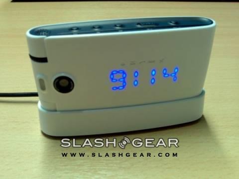
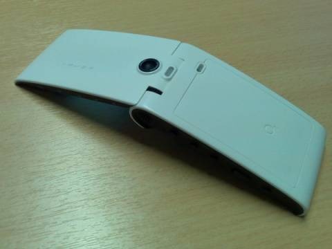
It's not a small phone. The white casing doesn't help, to be frank – any fashionista will tell you that white will make you look wider – but the amply curved profile and sharp edged sides conspire to make the Cocoon feel bulky in the hand. Where some manufacturers would use that as an excuse to squash in screens galore, Pantech (who build the handset) have instead gone for a band of hidden LEDs that spell out incoming numbers, the time, the first part of SMS messages and MP3 track names as a scrolling marquee. Five discretely engraved icons – for alarm, message, missed call, battery and silent mode – are illuminated as appropriate. Clever, yes, but frustrating in equal measure: the at-a-glance purpose of an external display is hijacked in favour of style, and the whole thing, undoubtedly attractive, is simply not as convenient as a normal screen.
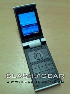
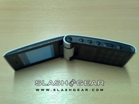
Inside, though, things take a huge leap into practicality. Number keys are almost a centimetre-square and indecently easy to use, while a large, simple platter of end/dial and softkeys surrounds the distinctly thumbable D-pad and centre-select. The whole thing is surmounted by a gorgeous, 2.1-inch QVGA display capable of 262k colours, and a discrete internal VGA-quality camera for video calls. Special mention has to go to the retro-simple volume wheel, embedded into the clamshell's hinge, which also does duty as a zoom control for the 2-megapixel main camera.
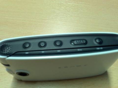
O2 are positioning the Cocoon as a their flagship music handset, and so there are obviously external controls (track skip and play/pause, as well as a hold switch and toggle between FM radio and MP3) and memory expansion above its inbuilt 2GB thanks to a MicroSD slot. More unusual are onboard stereo speakers, which sound full-bodied and are easily capable of annoying fellow travellers on public transport, and – disappointingly – no 3.5mm headphone socket. Instead you have to use either the headphones O2 supply (which are, admittedly, pretty good) or the included double-adaptor. Stereo A2DP Bluetooth is supported, too, if you're allergic to wires.
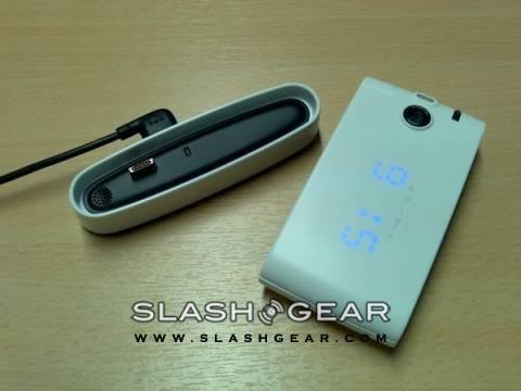
The music software will sync happily with Windows Media Player, and supports MP3, AAC, AAC+, WMA and WAV formats as well as album cover art, while the FM radio comes with RDS for station recognition. O2 quote 15 hours of music playback, which is several hours less than an iPod nano but reasonable for a musicphone. If you're listening at home when you can always drop the Cocoon into the supplied "nest", which is what O2 are camply calling the compact docking station. This is seemingly doubly-designed to sit both on your bedside table – with the Cocoon performing alarm clock duties – and by your computer, for easy USB syncronisation of music. It's handy, but it does mean that while the phone is docked you won't be able to take calls (unless using a Bluetooth headset) since the phone sits horizontally on the charger. Alternatively, you can fly the nest and plug the AC adaptor directly in to the handset.
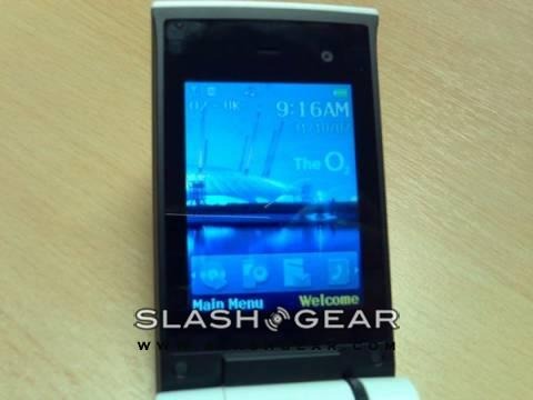
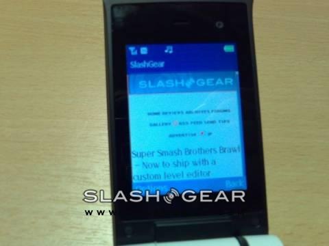
There's no denying that the Cocoon is different; eye-catching, too, with the broad, solid body and monochrome colour scheme. The main camera – complete with autofocus and an LED flash – takes par-for-the-course photos and YouTube-friendly video, while HSDPA cellular broadband and quad-band GSM mean the internet browser (which, as ever, pales a little in comparison to the S60 browser Nokia's handsets are blessed with) does a decent job making the most of that gorgeous internal screen. The heavily-O2-customised UI is thankfully more classic than garish (helped by the carrier's dark blue colour scheme), and borrows a lot of imagery from the recent sponsorship of the O2 arena in London (formerly the much-maligned Millenium Dome). Indeed, if you step into the arena with your Cocoon, it'll automatically start a venue guide and offer further music information.
Nonetheless, aspects of the Cocoon do seem to be change for the sake of changing. Clamshells first acquired external displays so that users could quickly check Caller ID and the like; the scrolling display, while eye-catching, can be tricky to follow and as such proves less functional than even a one-line black & white LCD. Similarly, the icons for missed calls and new messages are straightforward but maybe too much so: there's no telling whether you've received one SMS or a dozen of them. You may think having a single screen would pay dividends on battery life, but I consistently failed to reach the quoted 5hrs talktime or 350hrs standby. Call quality was decent, though, both in calls made on the Cocoon itself and through a connected Bluetooth headset.
Consider, then, the O2 Cocoon as a fashion-phone, with the usual compromises that title predicts. It looks good and performs reasonably as a phone, and there are flashes of brilliance such as the ample onboard memory and straightforward music and volume controls. However battery life and a sense of style over function prevent me from recommending it wholeheartedly. If the external display tickles you, then you'll be far more likely to appreciate the handset as a whole so, just like most fashion, it's a particularly subjective thing.
The Cocoon is available now from O2 UK, priced from free with a new contract.
