SlashGear 101: This Week's Facebook News Feed Redesign
The changes that are coming to your Facebook News Feed are numerous – but they're not going to interrupt the way you do business on a daily basis. Instead you're going to find the features added this week by the Facebook crew to be just that – Features: helpful and (hopefully) rather intuitive to use. For those of you working with the mobile app version of Facebook on either iOS or Android, this change-over will be extra simple: it is, at its core, a bridge between the mobile and desktop experience.
Facebook speaks up on the changes
What you'll want to see first is Facebook's designers speaking up about the changes they've made themselves. They're always good at making the case for a positive forward movement, and today's video is no exception. They'll speak up here about each of the three main points this change is pushing before we go through them one by one.
Rich Stories
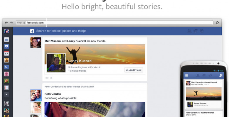
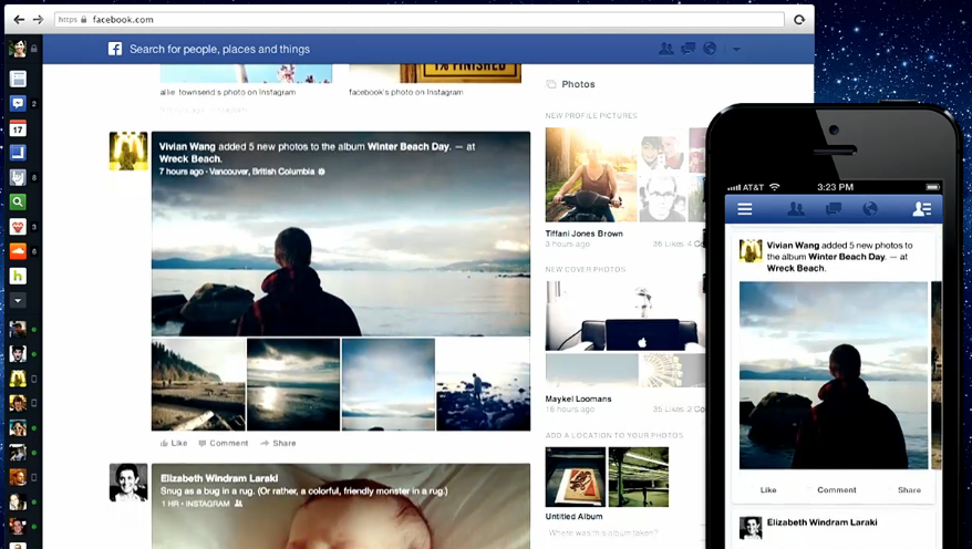
Design choices throughout this new iteration of the News Feed on Facebook show the company to be coming to terms with the idea that images are king. If you post a photo, you'll find that you've got the largest preview showing in your News Feed that Facebook has ever shown before – along with Like, Comment, and Share buttons right below in newly smoothed-out sections. If two people become friends, you'll see one of them in a tiny icon and the other represented by not just their icon, but their header image as well.
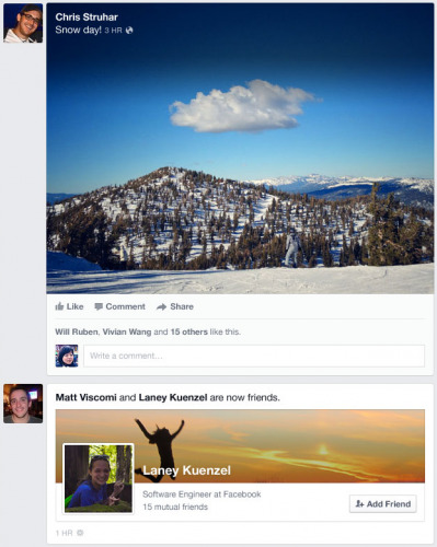
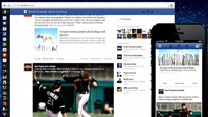
When you see a link being shared, you'll also see a short list of icons associated with the people who have shared it on Facebook as well. Hovering over one of these icons expands the rest – this element is in place to have people finding new friends with similar interest, of course. Along those same lines you'll find Upcoming Events appearing next to single dates – Fridays, for example, will be of particular interest.
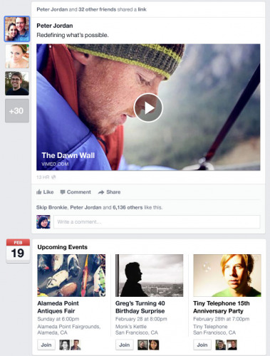
Finally you'll see newly revamped posts from pages – this will be great for pages such as SlashGear (http://www.facebook.com/SlashGear) for appearing in your News Feed in a newly sleek setup. As with the rest of the feature updates, this redesign is much more simplistic than it's been in the past.

Choice of Feeds
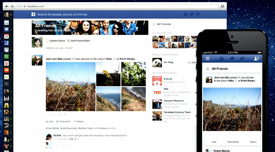
With a new pull-down menu that reads "News Feed" until you switch it, you'll be able to select from any of the following to syphon your feed down to just the items you want: Most Recent, All Friends, Photos, Music, Following, Games, or Groups. This filter will be working in both the desktop (web browser) and mobile user interfaces soon – simple and smooth.
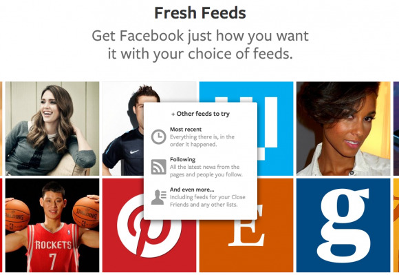
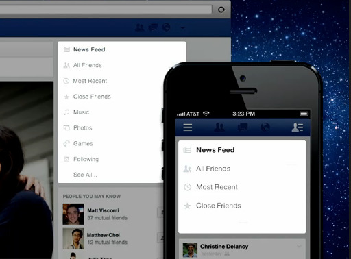
This filter will not be the first time you'll be seeing a page that only shows photos and videos, but it is the first time we're seeing Facebook push the "Following" aspect in a completely separate way. You can follow people on Facebook without friending them – this is good for "famous" users and the like – with this filter you'll be able to see things that they share with the public and nothing else. This is much closer to what we see on Twitter on the daily – not so much the personal friendliness of Facebook.
Mobile Consistency
Both the desktop and the mobile editions of this change-over are going to be pushed almost at the same time. The desktop version will be coming first – with a limited roll-out starting today, the day of the update's announcement. The mobile version – for iOS and Android at once, mind you – will be out in coming weeks.
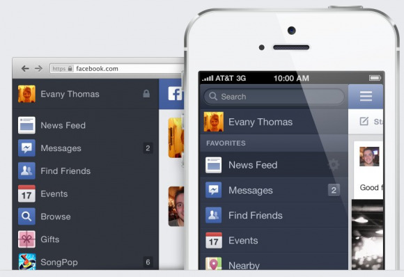
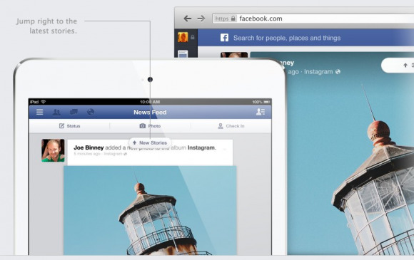
The "Mobile Consistency" title refers also to the idea that the design for both user interfaces are now much more close to one another than they've ever been before. The biggest addition to the desktop end of things is the left-hand sidebar – get anywhere you need to from any Facebook nook or cranny, no more need to go all the way back to the News Feed every time!

