Slack Is Rolling Out A Simpler Redesigned UI With New Features
Slack has unveiled a major redesign that simplifies the entire system while keeping users organized and helping them get their daily work done. The company is rolling out the new design over the next several weeks, according to Slack, which boasts that its paid users spend an average of more than nine hours on the platform every business day.
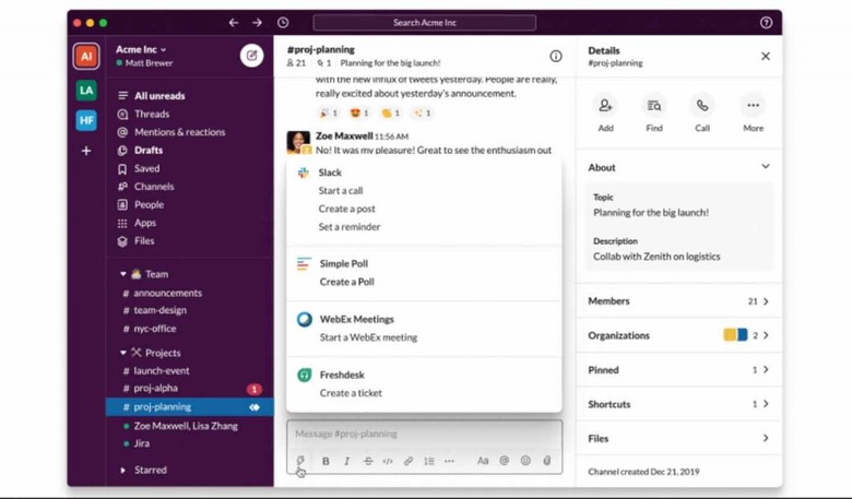
The simplified interface makes things easier for new users who may not be able to keep up with their poweruser counterparts. The new design includes the ability to start a new message from anywhere in the app using a dedicated 'compose' button, as well as better options for organizing channels and shortcuts for various actions.

The top of the sidebar has become a destination for the files, apps, 'key conversations,' and similar things that regular users require. As well, the new UI brings a navigation bar at the top of the app that rapidly provides access to search and channels.
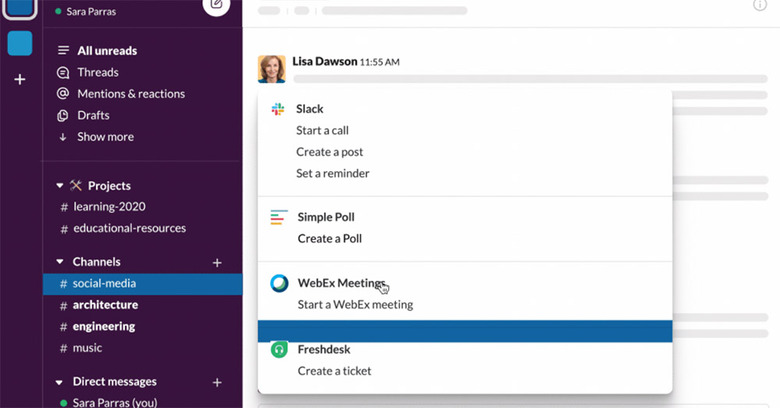
As far as organization goes, users will also be able to easily create and name sections, then drag and drop channels and conversations into them. Slack says that renaming even supports emojis. The new design also adds a lightning bolt icon that, when clicked, opens a convenient menu with the various tools you're likely to use most, including polls, reminders, posting, and more.
Slack says that over 'coming weeks,' the new shortcuts menu will also feature Slack apps like Cisco WebEx Meetings, Freshdeck, and Simple Poll in addition to the built-in tools. These features will start arriving for users soon and will roll out over the next handful of weeks.
