Skype's Next Big Redesign Will Be 'Super Modern' And Very Smooth
Microsoft has revealed what it has planned for the future of Skype, taking the wraps off the updated user interface and some of the features in the pipeline. Among other things, the company says the next big Skype redesign will bring a 'super modern' look alongside 'buttery smooth' performance.
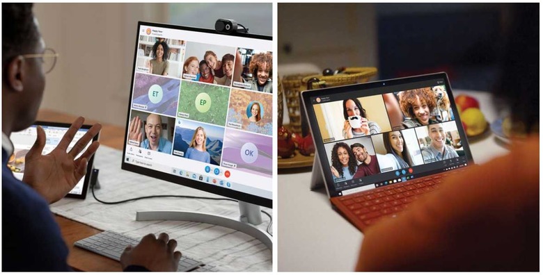
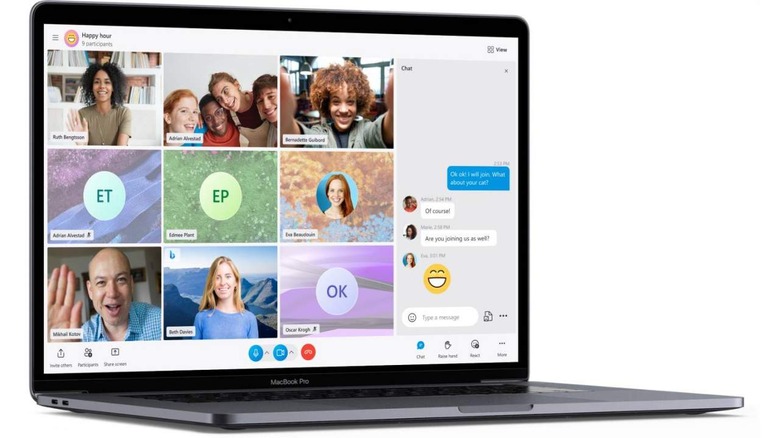
Microsoft unveiled the future Skype changes in a post on Monday, explaining that it will update the software's call stage so that it is more modern, offers new layouts, the ability to apply themes, and other changes the company hasn't detailed yet. The update also addresses the generally slow and clunky reputation Skype has.

According to Microsoft, the updated Skype product offers more than a 2,000-percent performance improvement on Android and a 30-percent increase on desktop. The text-based messaging aspect of the software has also been improved, including a sleeker left-side panel, a new group avatar, and even the addition of gradients to the buttons.
Circling back around to themes, Microsoft presented several theme options that it will offer with the updated Skype; they primarily change the color scheme so that messages and highlighted chats show up in your favorite bright or pastel shades. As far as design goes, Microsoft says it is also redesigning the 'Meet Now' lobby to improve it visually and make it easier to use.
Join links will show previews, and Skype will support all browsers going forward, including Safari and Opera. Mobile users, meanwhile, will get access to Office Lens and a new feature called TwinCam. With that latter feature, users can add a second camera via their mobile device to a call. This could be used to, for example, show off a piece of art or demonstrate a project while remaining on your desktop's webcam.
While some of these changes can be observed now in Skype, others will be rolled out with future updates.
