See A Few More Android L Features Google Didn't Mention
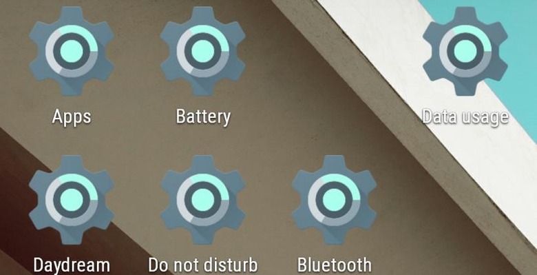
A few days ago we released our first "Android L features Google didn't mention" based on our Android L Developer Preview hands-on. Today we're having another look at a few more features we've discovered that we'd previously missed.NOTE: Above you're just seeing a homescreen filled with Android L's new Settings icon set as a widget over and over again. Each widget is a shortcut to a settings screen.
Battery Saver / Low Power Mode
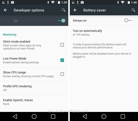
Google made mention of some new battery-friendly elements that'd be coming with Android L, but here we see two separate power-saving modes in separate locations. Battery Saver can be found in your normal Battery settings with a switch, out in the open. Low Power Mode can be found hidden in the Developer Settings under the "Monitoring" section.
Android Color Space
Simulated color spaces have been around in ROMs for some time now, but Google hasn't really touched on the idea for the general public. Two new color-centric abilities are added to Accessibility options for Android L, and one new "Simulate color space" option is added to Developer Settings.
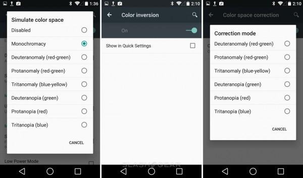
To the left you'll find Simulate Color Space, where a variety of color options are presented. For those of you interested in kicking in every single possible option for pushing battery time to its limit, try out Monochromacy – though we've yet to test it ourselves to see if color really does suck battery life.
On the right you'll find Color Inversion for the extremely rare case in which you'll have a person who sees things flipped. Correction Mode is also in Accessibility settings, allowing a number of options also available in Simulate Color Space, here for the color blind rather than just for developer friendliness.
NOTE: When developer options are switched ON, Color Space Correction includes a note about how Correction Mode is overridden by Color Space Correction choices.
Multitasking Cards
Instead of setting up your Multitasking, task-switching window with flatness, Android L adopts the Material design immediately. This means you've got a stack of cards that you're moving through with extreme smoothness. You'll be able to view this screen in portrait or landscape mode whenever you arrive, regardless of if you're on a smartphone or not.
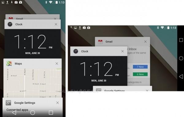
This update also brings on the separation of sharing tasks. Where before L, if you wanted to share a piece of content to a social network, you'd launch that app inside the app you were already in, which could be confusing if you weren't redirected back to your original task immediately. With Android L, you're launching a whole new task with sharing, making certain you're not stuck in Twitter inside of your Photos app, for example.
NFC Tag Wi-Fi Writing
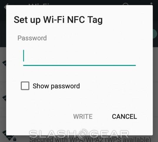
Inside your Wi-Fi settings you'll find a new NFC Tag writing option. To access this feature, you'll need to tap and hold the Wi-Fi network you're connected to. You'll be given the option to edit your settings for that hotspot, disconnect, or create a new NFC Tag. This NFC Tag ability will – hopefully – only show up for those that actually have an NFC chip inside their smartphone.
Pull-down Notifications and Quick Settings
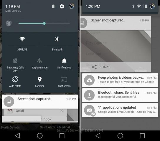
The Material aesthetics of Android L come out clearly in your pull-down Notifications menu, compounded by the second pull or tap which shows Quick Settings. Here you've got transparency, Google Now-like cards, and a Quick Settings setup that also reveals Cast Screen for the first time. If you didn't think Google was pushing Chromecast (and now Android TV)'s ability to "cast" content hard enough before, they certainly must be now.
Android L exploration continues
Please feel free to let us know what else you've found in the Android L Developer Preview, and stick around as we continue to explore. We'll also be having a look at Android Auto and the Android TV developer builds as well!
