Samsung's Software Wake-Up
Samsung's new Galaxy S III isn't short on superlatives – its quadcore chip and HD Super AMOLED display spring to mind – but the biggest upgrade is surprisingly in software, not hardware. There's no denying that the Galaxy S III raises the game from the Galaxy S II, bringing the new flagship up to scratch in competing with HTC's One X and steeling itself for the incoming iPhone 5. Yet, while Samsung excels in hardware, it's software and ecosystem which took the focus of the company's launch.
Samsung is arguably the king of mobile hardware. Not for nothing does arch-rival Apple – despite the ongoing legal spats – rely so heavily on Samsung's components for its own range. That supplier status leaves Samsung's devices on the cutting edge of specifications, as well as other firms, such as HTC, without the same manufacturing heft to play catch-up with whatever components they can source in sufficient quantity.
Most of the Galaxy S III rumors, then – and there were plenty – focused on what new gadgetry Samsung would bring to the table. With HTC and others adopting Tegra 3, a quadcore processor seemed almost inevitable, something Samsung itself confirmed in advance of the new phone's big reveal. Arguments over megapixels followed, Samsung eventually opting for 8-megapixels despite talk of 12-megapixels being more likely. Display size estimates covered the gamut from 4- to 5-inches.

The actual phone improves on all of the areas of the Galaxy S II which were beginning to show their age. The old WVGA display now becomes larger, in keeping with how the Android segment has evolved, and adopts 720p resolution; the CPU is a quadcore paired with boosted graphics. But, as several Samsung spokespeople mentioned to us before and during the event, these are likely to be pretty much baseline specifications for any top-tier phone launched in 2012. The focus, instead, is on the user-experience.
[aquote]Look past the uncomfortable phrasing and there's a significant departure[/aquote]
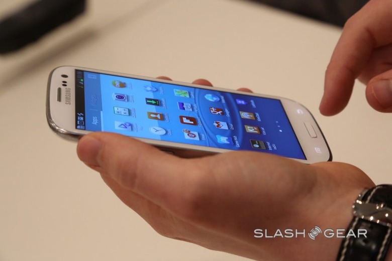
Samsung dressed it up in awkward hyperbole – phrases like "Inspired by nature, designed for humans" and "Cares for all your needs with emotion and wisdom" have no place in a discussion about a smartphone – but look past the uncomfortable phrasing and there's a significant departure. Previous iterations of TouchWiz, Samsung's customized UI, were childish in their design and did little more than visually differentiate the company's devices from those of their rivals; this latest version, though, shows Samsung actually put some thought into how users will live with their phones, not just into making them "different."

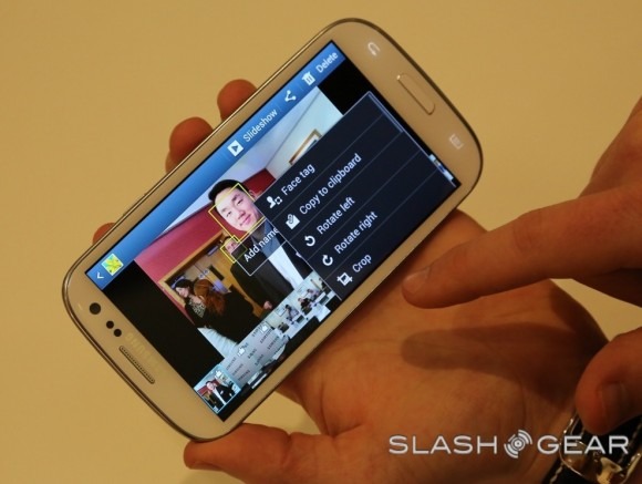
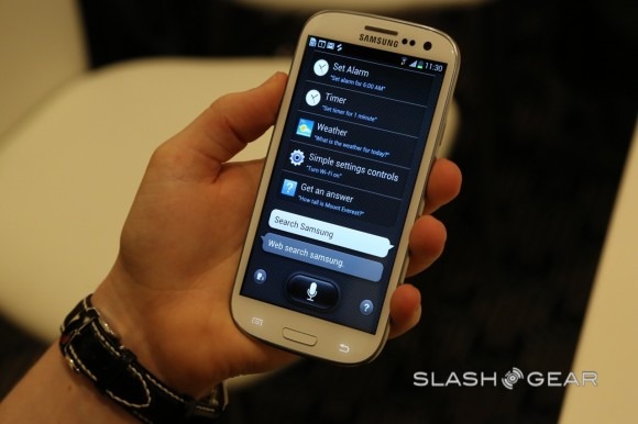
So, we get a display that uses eye-tracking to remain active as long as you're using the phone, even if you're not tapping at the display – though seriously, Samsung, who in your marketing department approved "It waits till your'e asleep" as a tagline for Smart Stay? – and camera features like automatic highlighting of the "best photo" after burst photography, rather than making users sift through a dozen or so almost-identical pictures else clutter up their gallery with them all. Even S Voice, Samsung's Siri rival – which we'll have to try again when in more typical environments than a crowded, noisy briefing room – shows a recognition that users may not want to adopt the typical touchscreen-tapathon to dig through all their phone's abilities.
Samsung Galaxy S III hands-on:
[vms 10d9b7e9abed244dd2f2]
Meanwhile AllShare's various upgrades give functionality that has been there already, like DLNA, a user-friendly redesign. All of the smartphones on the market are incredibly capable devices, so Samsung's thinking goes; what's stopping people from taking advantage of that is core usability. Specifications, after all, mean nothing if the features aren't straightforward to use.
It's not perfect, of course; there are still some glitches in joined-up thinking where, perhaps, Apple might have polished the experience but Samsung missed it this time around. In S Beam, for instance, the tweaked version of Android Beam that adds WiFi Direct to NFC for faster transfers of larger files, if you haven't got WiFi Direct turned on in the settings, S Beam simply fails to swap the files. There's no pop-up suggesting you might want to turn it on, or – even better – an automatic and perhaps temporary toggling of it on, so that it could be used that one time.
Blips aside, it's Samsung's new focus on experience not spec-sheet bingo that's the biggest takeaway from the Galaxy S III launch. That the company devoted so much of its presentation time to discussing not only what the new features were, but how they would improve users' experiences, shows it's finally waking up to something few rivals – yes, Apple among them – do particularly well. As we've said before, context is the mobile industry's biggest challenge, and it's with the Galaxy S III that Samsung has apparently woken up to that.
