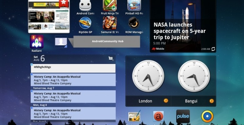
Samsung TouchWiz UX Review With Galaxy Tab 10.1
Welcome to our look at Samsung's newest work with Android, this being made specifically for the Samsung Galaxy Tab 10.1 and called Samsung TouchWiz UX. What TouchWiz amounts to is a custom user interface that sits on top of and beside Android 3.1 Honeycomb, working to improve the way you work with Android and your tablet in general as well as opening your pathway to Samsung's new movie collection interface and ability to work with Mini Apps on top of your everyday full-screen apps and home screens. The big question many users are having at the moment is: "should I update?" and we aim to answer that question here.
Before we go any further, here we have a hands-on look at the majority of the new features you'll find working with Samsung's TouchWiz UX as seen on a Samsung Galaxy Tab 10.1 Wi-Fi edition. This device was upgraded to TouchWiz UX today and all features are part of this first iteration of Samsung's UX. Below this video are each of the main pieces of this new puzzle in a bit more detail.
[vms 21b80f37d9b55f63ed8b]
Live Panels
First up is Samsung's new approach to widgets. What they've done here is spruce up the grid system Google's made with Android Honeycomb with some widgets that fit together like a magazine. You'll have the option to change the size of several of these widgets of course, thanks to Android 3.1, and in at least one case, that being with the Gallery widget, you're able to turn your whole home screen into one gigantic picture flipping pretty panel.
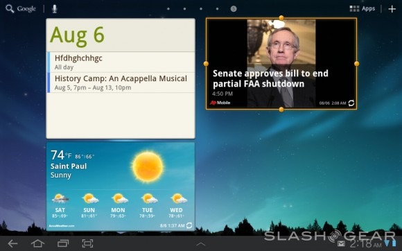
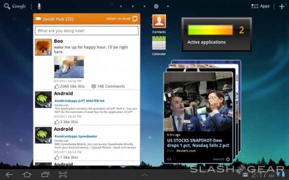
Several widgets have been upgraded to work especially well with this new system, those being the gallery widget I just mentioned, social panels, and weather. To those who have a bad taste in their mouths whenever they think about how "cartoony" they find TouchWiz in its earlier iterations: you're gonna hate em all! To those who love the way great widgets work no matter how they look: you're in luck. The gallery widget being so simple in its nature is clearly the best of these, then there's the calendar widget which works so very well with its Mini App companion (spoken about later in this review.) Again though, you can choose to not use these widgets and your home screens will continue to be essentially the same as they were before the upgrade.
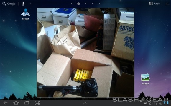
Where while most user interfaces create changes so large that they cannot possibly be avoided, those being huge changes to icon systems, home screen moving, app drawers, and etcetera, TouchWiz UX doesn't change a LOT of the elements in the system, save for a few big items, those being the Mini Apps Tray and Quick Panel, the latter coming up next.
Quick Panel
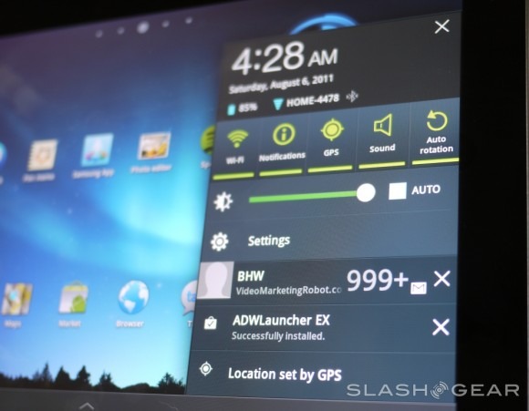
When you tap the lower right-hand corner of your display in Honeycomb, you get a panel that shows you the time, date, battery level, Wi-Fi signal, screen brightness, has a link to settings, and shows your updates. What Samsung has done is to take this already working system and add some well-done functionality to it. You've now got a set of switches that activate or de-activate GPS, Wi-Fi, Notifications, Airplane Mode and more with a simple swipe and a tap or just a tap. This bit of TouchWiz UX is certainly an improvement over the slightly less-accessible panel provided by the stock version of Honeycomb.
Mini Apps Tray
At the center of your menu bar at the bottom of your screen is an up arrow symbol which, when you tap it, turns into what Samsung is calling your Mini Apps Tray. This tray holds a set of 6 icons which shortcut to Mini versions of apps that open as floating panels above whichever app (or home screen, or whatever) you've got open. They even open on top of a full-screen video playing. Each of these apps works pretty wonderfully save for a tiny bit of lag when it comes to moving them around and opening them up in the first place.
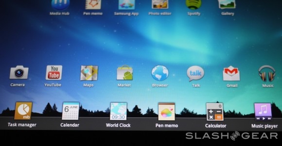
These apps get another separate hands-on view by us because they're basically a whole new level of functionality for Android – windows above apps? Wacky! What is this, a desktop computer? This is crazy talk. That said, we have seen similar windows in Motorola's Webtop on devices such as the Atrix 4G (a device which, incidentally, also has the same NVIDIA Tegra 2 processor as the Samsung Galaxy Tab 10.1 we're using here.) Draggable windows on top of apps! Welcome to the futuristic merging of PC and mobile right here, right now!
[vms 39589fdd2b0f7218d8b0]
Media Hub
In Samsung's Media Hub comes a lovely new store where you can both purchase and rent videos both new and old, plus television shows as well. You'll be sliding back and forth all your favorite new releases front and center, each movie expanding with a brief description with specs and your ability to view a preview for each in full-screen mode. Would I use this interface to purchase or rent videos? Sure I would! I'm not sure that I'd pay $15+ for a movie I could just watch on Netflix inside my much lower months fee, but this looks rather nice I must say.
Pen Memo
This app is what many in the forums are calling a stripped down version of Evernote, this note taking system able to collect your thoughts simply with text and fingers for pen or paint. You'll be able to keep everything in your day straight here in this yellow paper with lines and multi-color paint strips. You'll see this Pen Memo pop up in your Mini Apps Tray as well in a compact version – this is the one you'll end up using most.
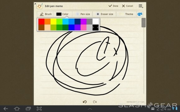
Photo Editor
If Pen Memo is a stripped down version of Evernote, Photo Editor is a stripped down version of Photoshop. You'll be able to do essentially anything in this easy to use photo editor that you'll find allows you to chop, hack, flip, and resize any image you've got sitting on your device. I said it before on Android Community and I'll say it again here: give it a few iterations and it'll be beating Photoshop out for the mobile market – maybe.
Fun fact: the people in the photos above are myself and the guy who installed our cable internet – now we get to see if he reads SlashGear!
Panning and Tilting
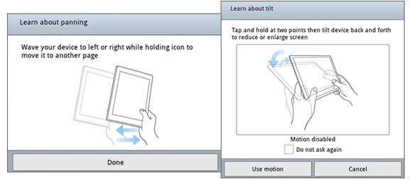
Both of these features are here on TouchWiz UX and have been present on the latest iteration of TouchWiz and we got our first look at them all the way back at CTIA 2011. Both are neat and are sure to impress your family and friends, but you'll more than likely forget you're able to utilize them 10 minutes after you make em work.
Samsung Dive
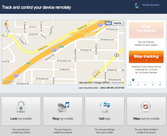
This bit is activated in your Settings under Location and security and called "Remote controls." Flip it ON and you'll have full control over your device (or at least, the important bits) from a web browser. You can track your device when this feature is on if you either lose your device or have it stolen. You could also use this feature if you want to track your children – dastardly! Head over to SamsungDive.com and get to tracking – be it your own lost phone or your digitally-aware kiddies!
Should I Update to TouchWiz UX?
Of course you should update. If you only have a love for Vanilla versions of Android, then skip it, but if you're one who likes to see and use the coolest new versions of user interfaces as made by the manufacturers who've made the devices themselves, then go for it. I updated the moment I was able much in the same way I updated my MacBook Pro the moment LION was available, and I've not been disappointed by either thus far. The ONLY drawback I've seen is the ever so slight lag I've seen when flipping through screens full of gigantic widgets and in using the Mini Apps, but the slowness isn't so big as the average user would notice.
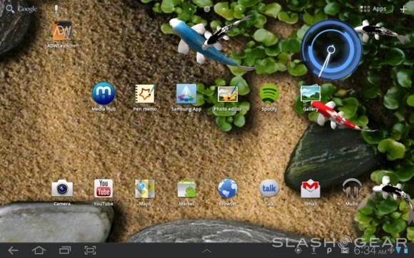
The process which you'll have to go through to get the update is simple but will take you upwards of 30 minutes to accomplish. Make sure your device is plugged in to a power source and do the following: check for an update in Settings under About tablet and Software update. Once you've hit the update button, you'll have to do some waiting. There might be a few extra clicks and presses of the word "OK" here and there, but it's simple and yes, worth it.
Also note: we've got a full review of the Samsung Galaxy Tab 10.1 Limited Edition while Android Community has a full review of the Samsung Galaxy Tab 10.1 Wi-Fi Edition (the same one you see being used in this look at TouchWiz UX.) Check em out!
