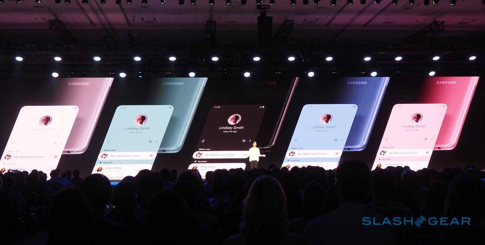
Samsung One UI Previews Galaxy S10 Experience
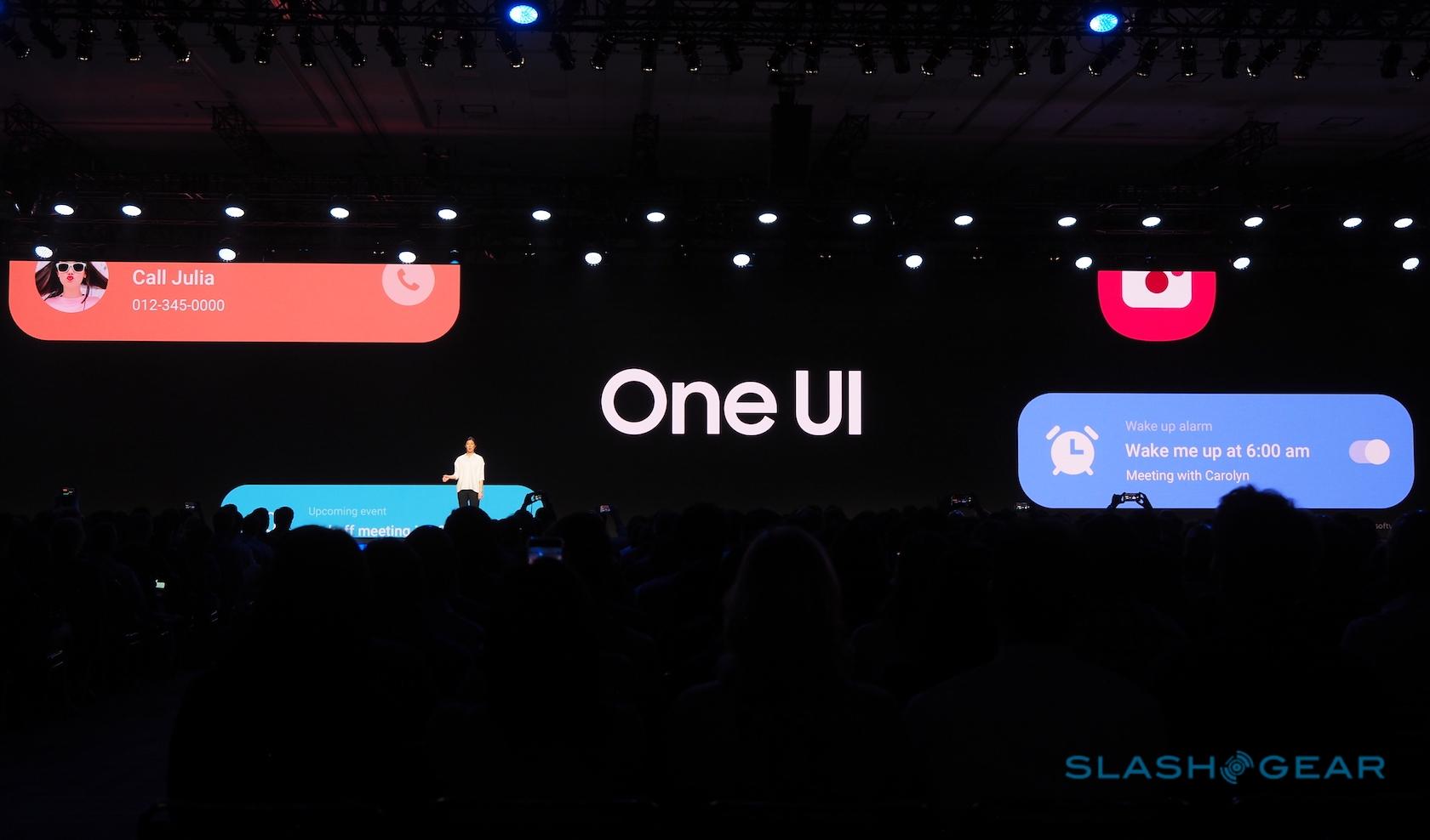
Samsung has revealed its new interface for smartphones, One UI, focusing on making the experience clearer and more intuitive, not to mention easier to navigate with just one hand. Previewed at Samsung's annual developer conference, SDC 2018, in San Francisco, CA today, Samsung One UI takes the familiar aesthetic of the Galaxy S9 and Galaxy Note 9 and revamps it throughout.
"Hardware and software must work together in perfect harmony," Jee Won Lee, Senior Designer of UX Design at Samsung, said of the new interface. That means the rounded corners of the devices being echoed in the iconography and other UI elements, but also a more esoteric interpretation. As phones have got bigger, Lee pointed out, so they've shifted further away from something you can use single-handed.
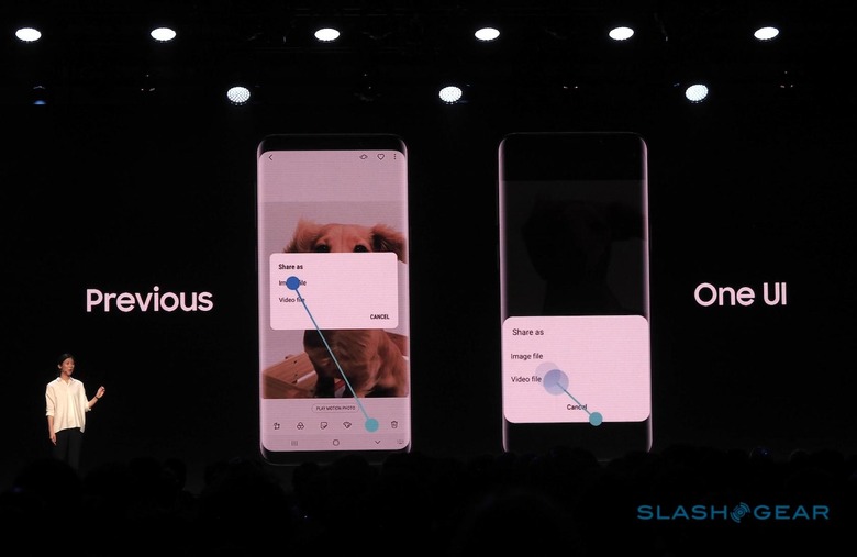
Back in the early days of the touchscreen phone, 3.5- to 4-inch displays were commonplace. That meant pretty much the full expanse of the screen was reachable with the thumb of the hand actually holding the device. With 6+ inch phones commonplace now, however, that's no longer the case.
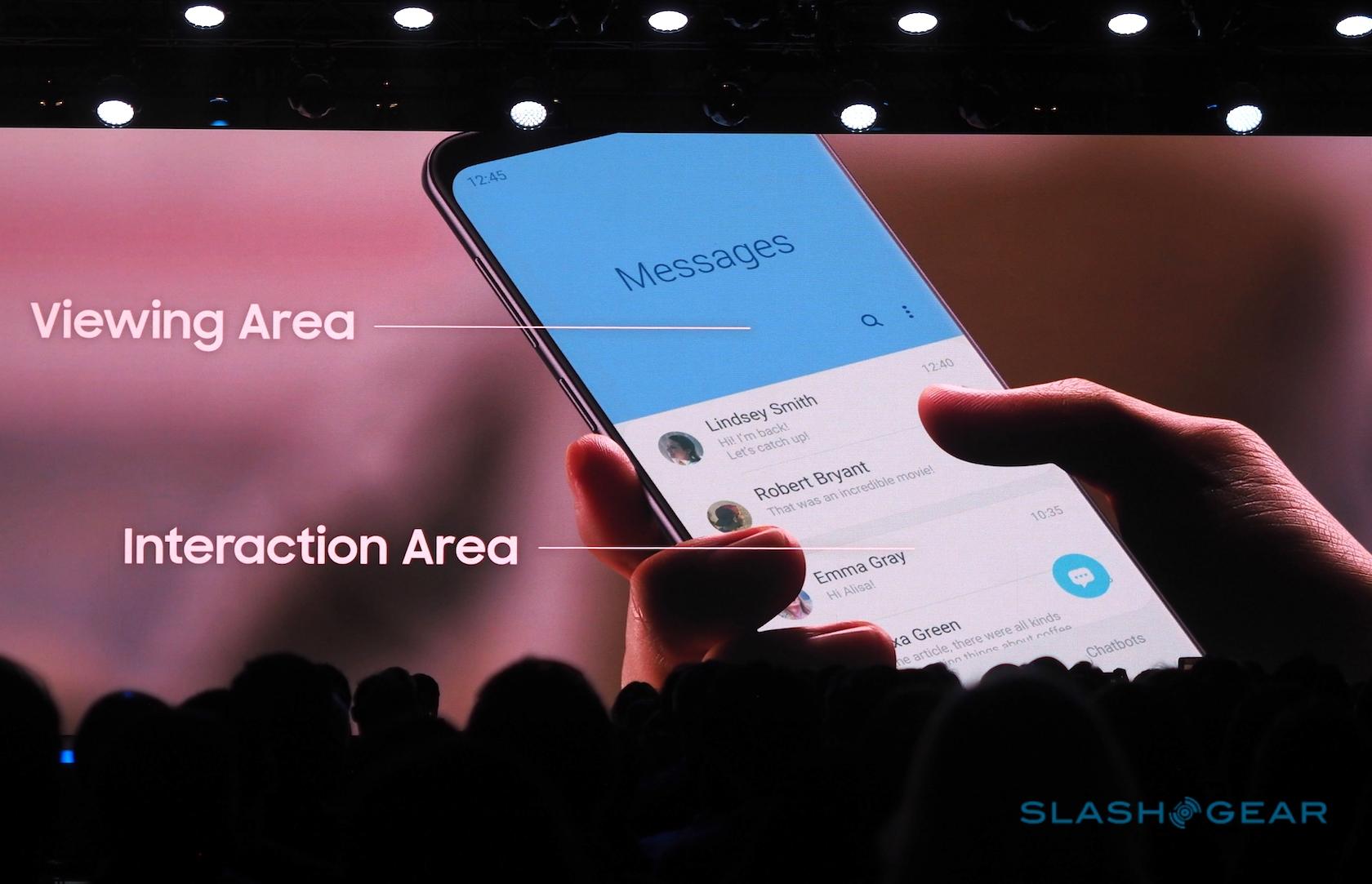
"As phones have gotten bigger," Lee joked, "you're expected to have the dexterity of a classical pianist" in order to reach all the controls. One of the key goals with One UI, therefore, is to separate out the interface into what you need primarily to look at, and what you need to be able to actually touch.
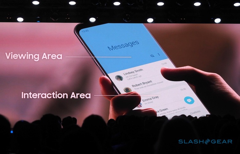
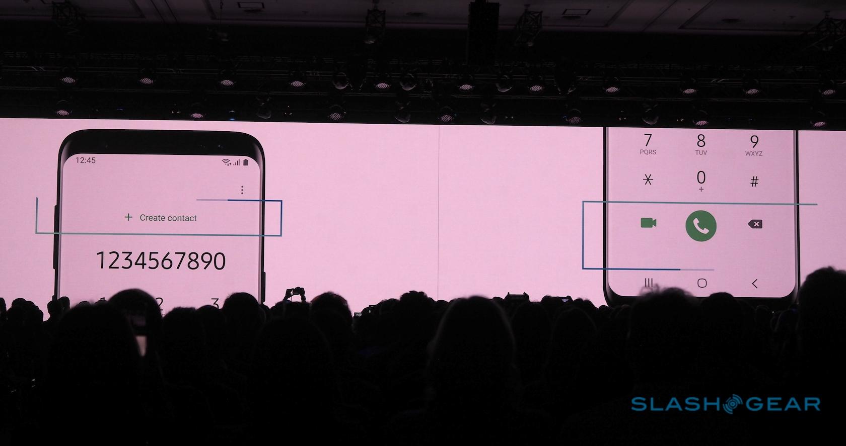
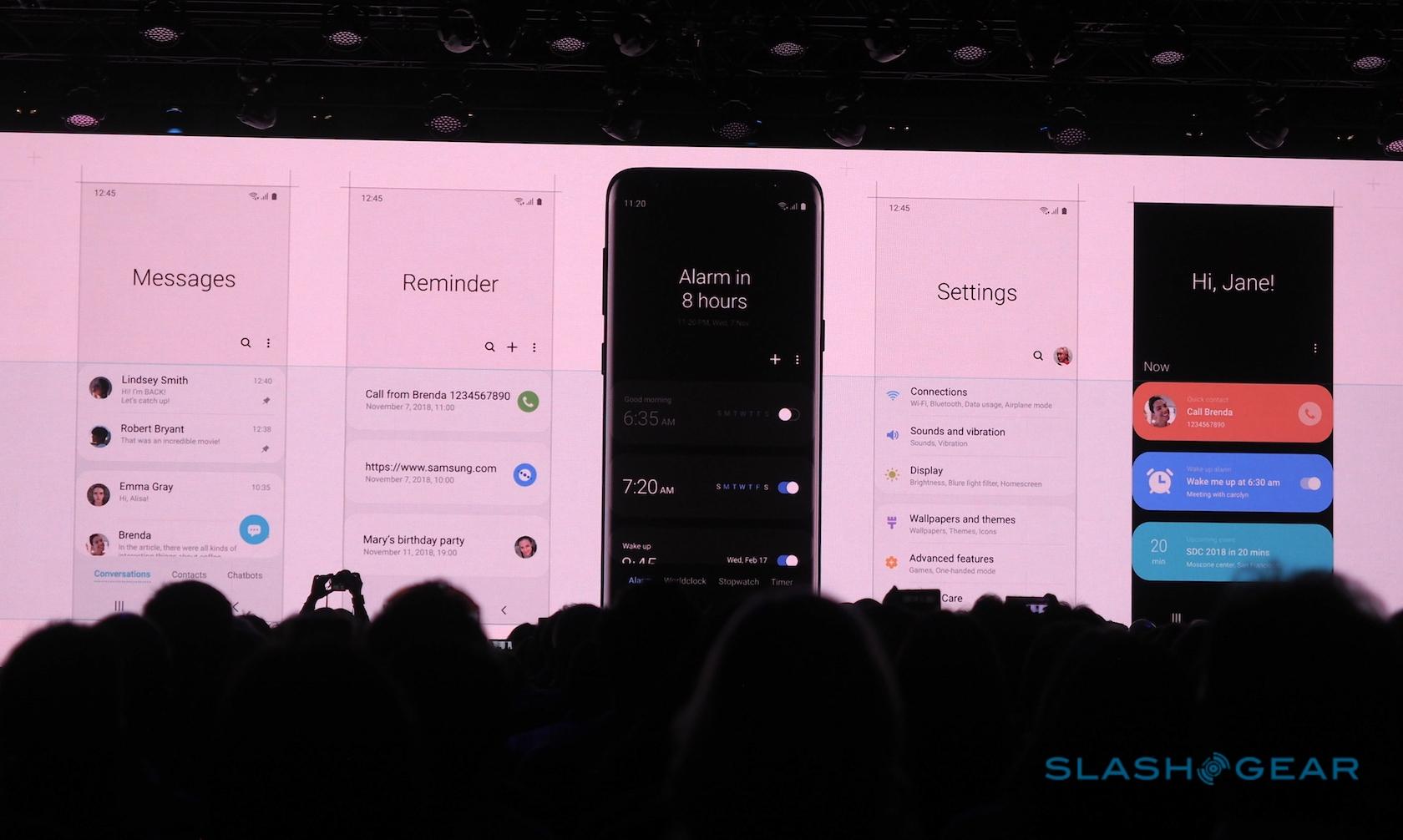
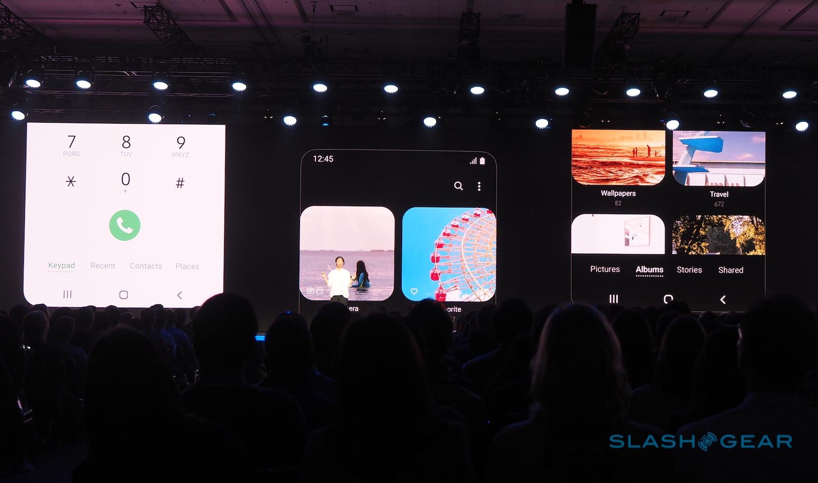
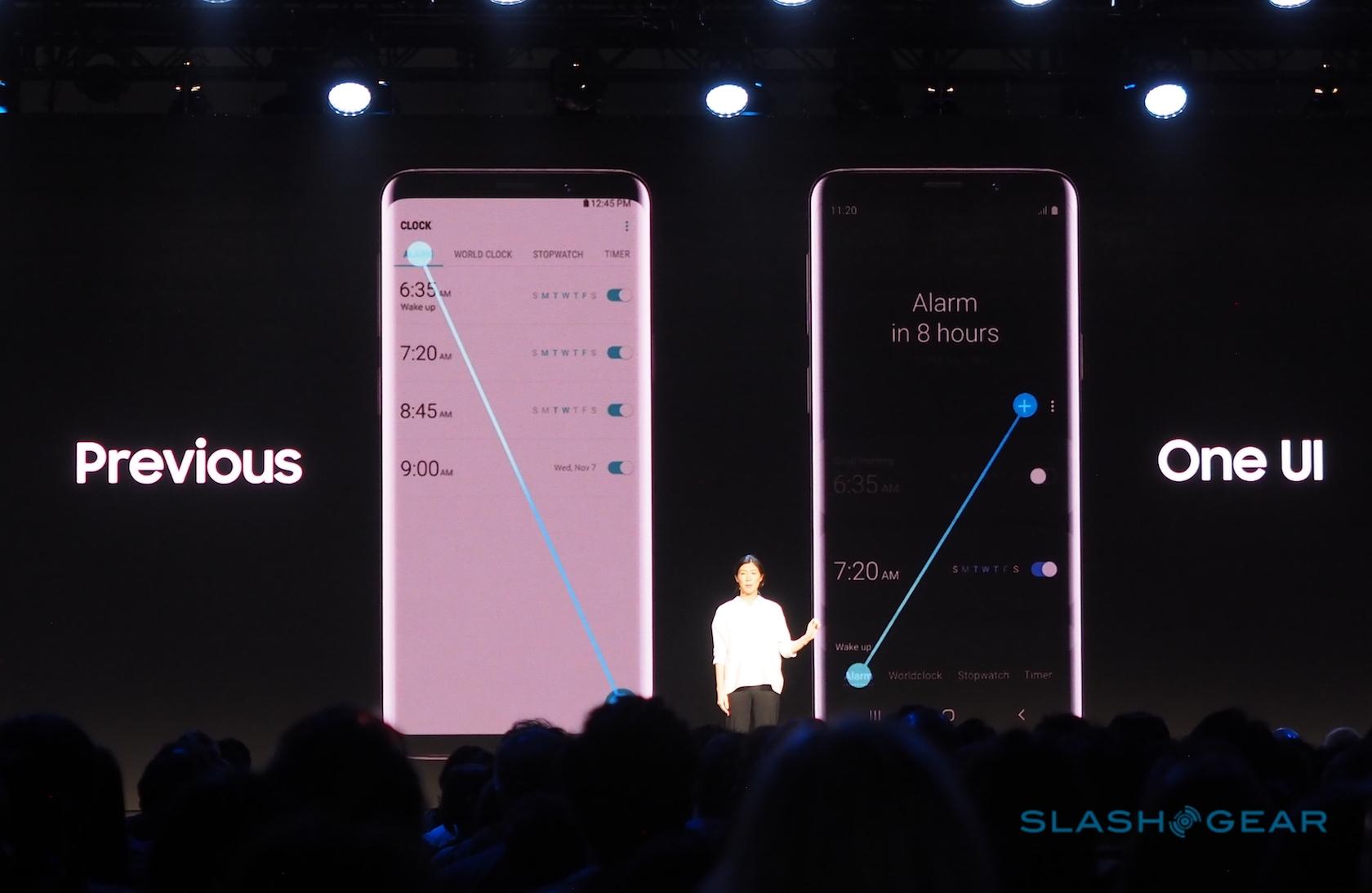
So, the upper part of the screen is for viewing content, while the lower part is for interaction. In the messages app, for example, the list of messages itself now starts in the middle of the display rather than at the very top. That way, you can more readily reach up with a thumb and tap the latest one.
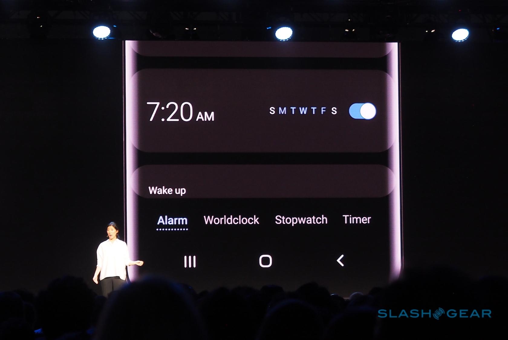
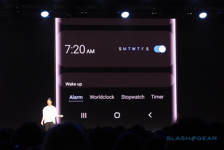
Tabbed apps, where different parts of the UI are split out into separate panes, have also been reworked. Samsung has moved the tabs to the bottom of the screen from the top, so that they're more readily accessed. Dialog pop-ups, too, have been shifted from the middle section of the display, where they currently appear, to lower down it.
It's a small change, but a welcome one. Phones like the Galaxy Note 9 are, with the S Pen, obviously designed to be used with two hands a lot of the time. However, there will always been occasions when you're trying to navigate the UI single-handed – pushing a shopping car, for instance, or trying to juggle a cup of coffee and your phone – and anything which reduces the chance of dropping the device (or having to try to tap out-of-reach icons with your nose) could make a huge difference.

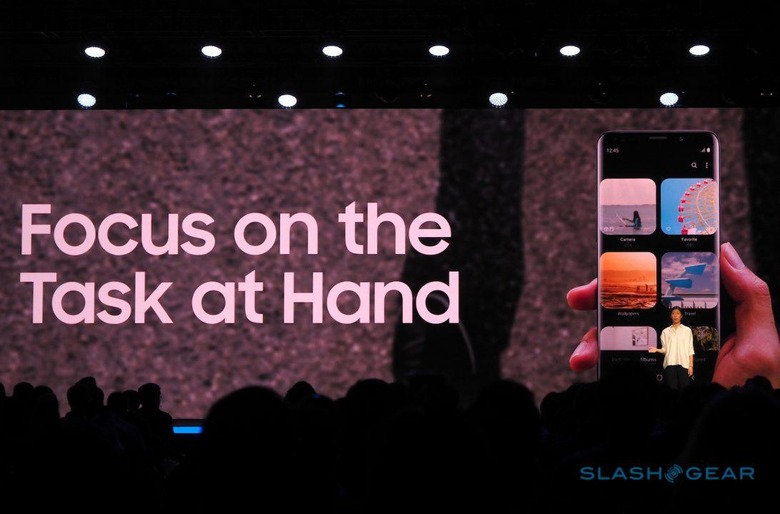
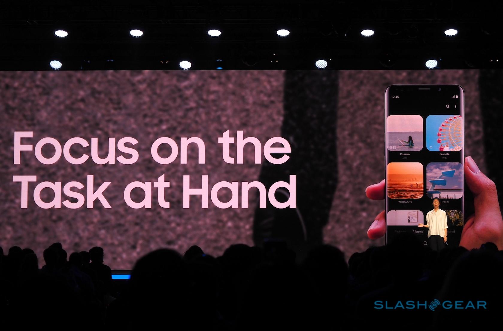
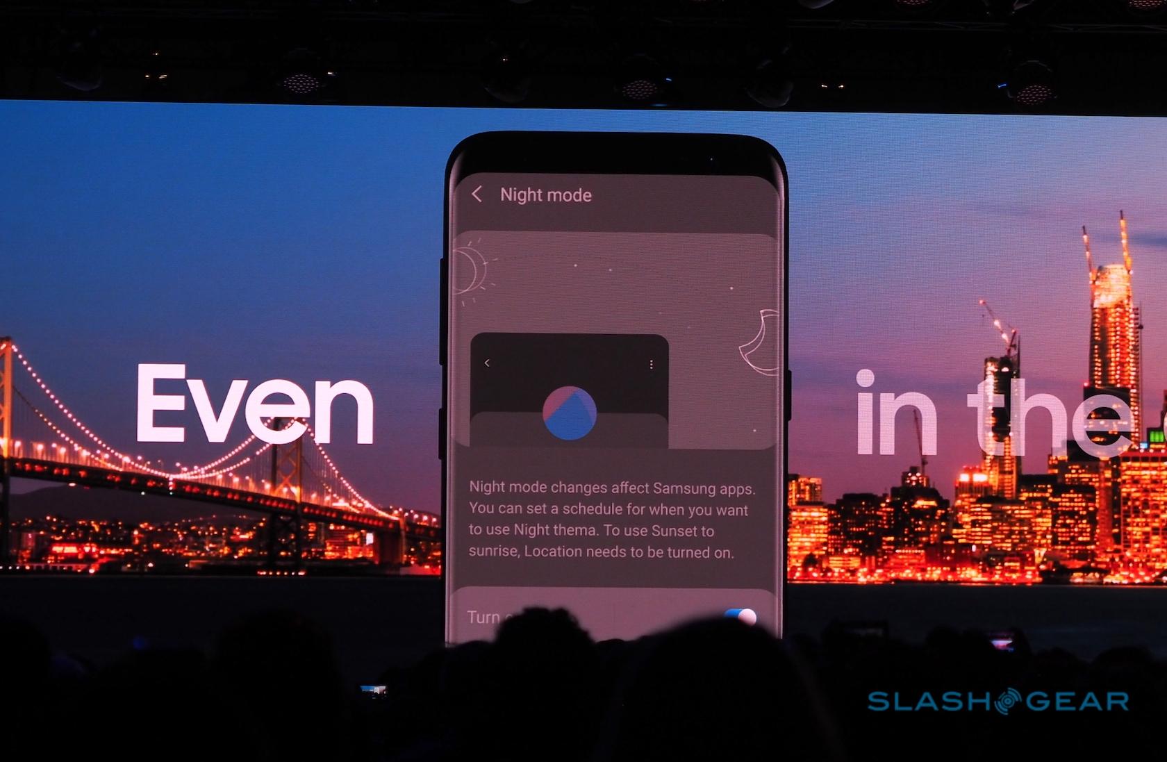
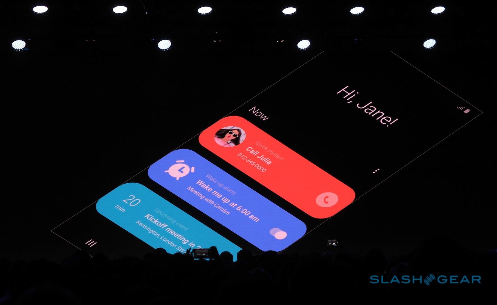
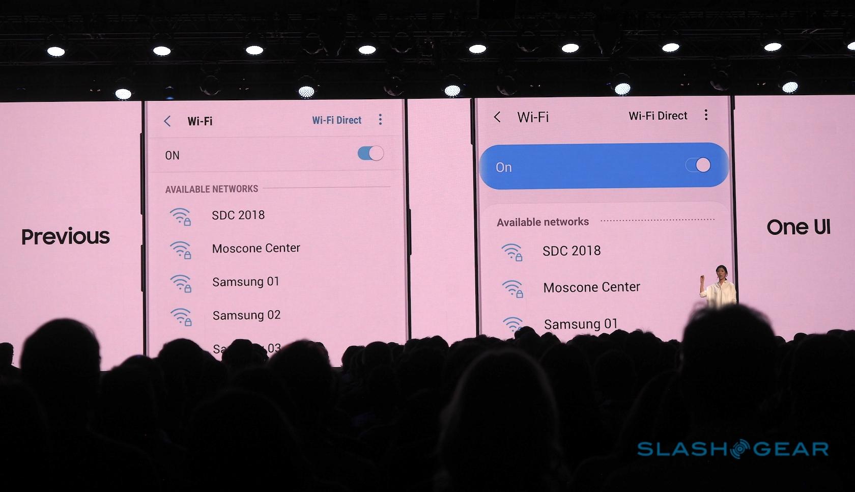
As for the One UI's updated aesthetic, it's cleaner and more focused. Samsung has made greater use of black for the interface, something that looks particularly good on its inky Super AMOLED panels. "Focus Blocks" pull together key features and surround them with negative space.
"By changing the layout and adding more blank space," Lee suggests, "you can interact with your device more naturally."

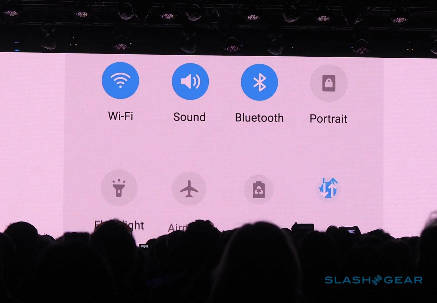
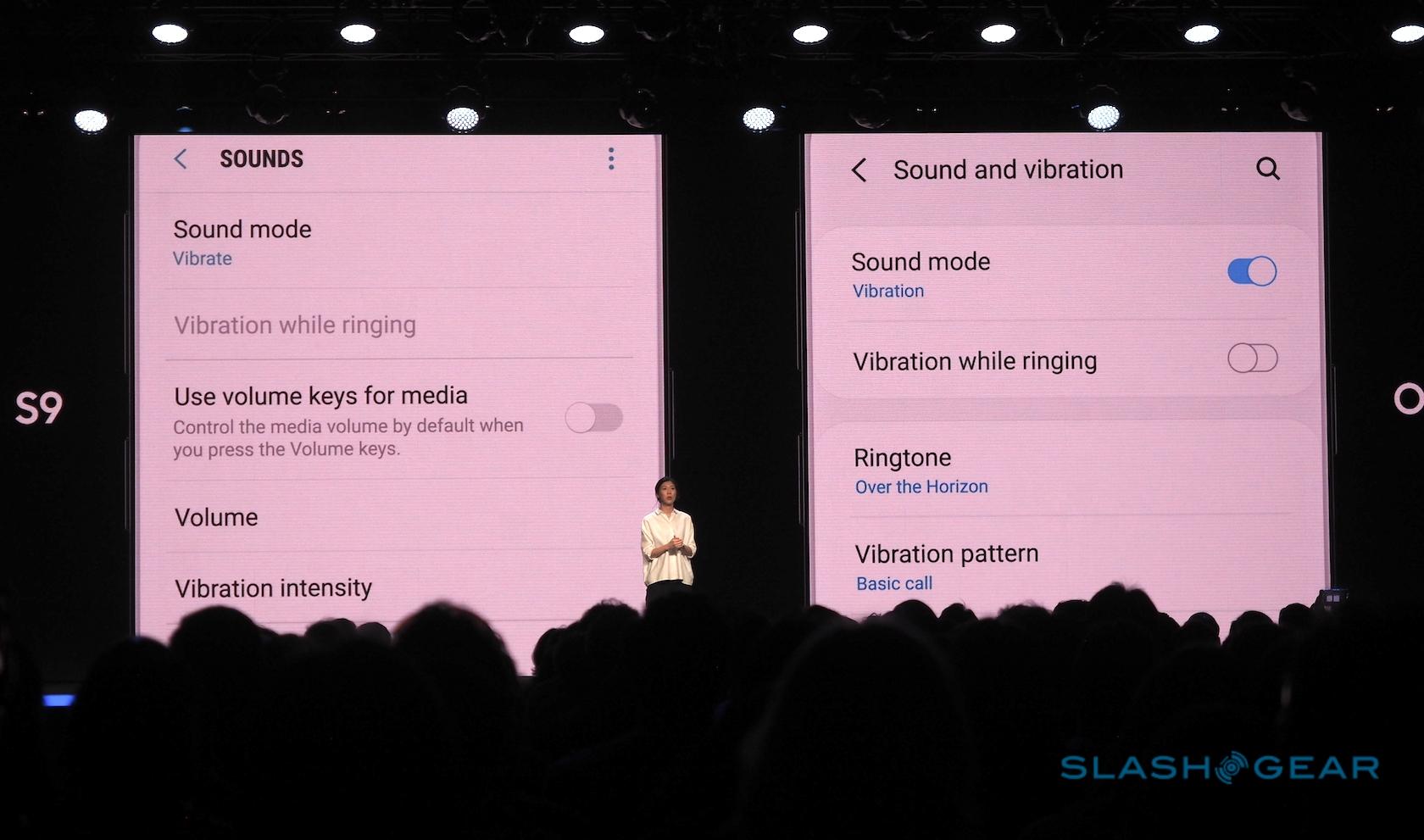
At the same time, however, there's more color – and more clarity of color. Settings and other controls more conspicuously show when they've been selected, and Samsung has grouped more of the linked options together to reduce both the visual clutter and the amount of menus and sub-menus you need to dig through. There'll even be the option to match the UI color scheme to the color of your device.

Samsung plans to roll the One UI out in the new year, starting in January 2019 with the Galaxy S9, Galaxy S9+, and Galaxy Note 9. However there'll also be a One UI beta test program – available for the US, Germany, and Korea – from December, which will allow developers and others to get a taste of the updated interface early. As for the first new smartphone to launch with One UI, that Samsung isn't talking about today, but it's hard not to imagine that it will be the much-anticipated Galaxy S10.
