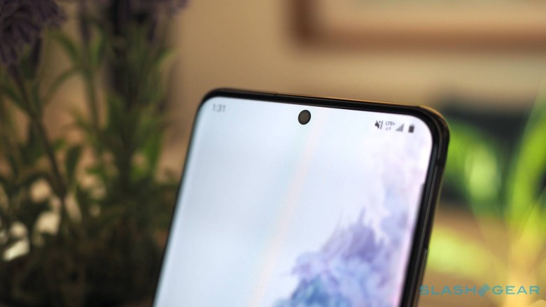
Samsung One UI 3.0 Android 11 Removes Option To Hide The Camera Cutout
Although they were controversial and divisive new designs, notches and camera cutouts have pretty much become standard fare on smartphones these days. Most people have more or less grown accustomed to them or have developed the ability to ignore them completely but some still found them irksome to see. Smartphone makers have given users the option to "hide" these cutouts but it seems that Samsung has decided to remove that feature since those aren't being used that much anyway.
Hiding notches and punch-holes don't come for free, of course. What these options, which are often buried under menus and other options, is to have a black bar flanking the cutouts and pushing the notification panel below it. In effect, this would make it look like the phone has a thick bezel on top, something that Samsung doesn't want consumers to think of its phones, naturally.
Now it seems that Samsung has learned that people don't actually use this feature that much. That may be based on telemetry data it collects from smartphones, user surveys, or what have you. Whatever the reason, the manufacturer has apparently removed that option rather silently.
GalaxyClub reports that the latest iteration of One UI 3.0 based on Android 11 no longer has the option to mask the presence of that punch-hole. Some theorize that this is Samsung's way to prepare for under-screen cameras, though it might be too early to expect that any time soon.
Of course, users can still try to use a wallpaper that either makes the camera cutout less visible or even makes creative use of that shape. Unfortunately, the illusion easily breaks when other content and apps are used and raises the question of whether it was really too much work to keep that option for users who do want it.
