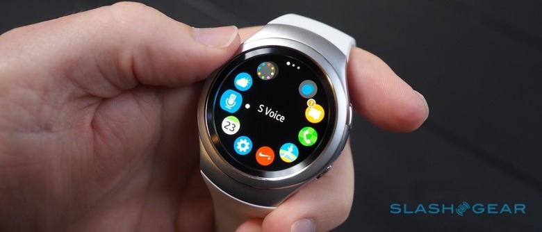
Samsung Gear S2 Review
When you can do so much with your smartphone, it's easy to assume that your smartwatch needs to be equally capable in order to make it worthwhile on your wrist. Problem is, all those talents can turn the wearable experience into a confusing morass of tapping, swiping, scrolling, and swearing. Samsung may just have come up with the answer in the Gear S2, however, and all it took was a big wheel.
Unlike the variously vast, clunky, and – let's just say it – pretty ugly smartwatches Samsung has made in the past, the Gear S2 is actually quite handsome. With its brushed metal casing – that really is 316L grade stainless steel, even if some people I showed it to were convinced it was plastic masquerading as metal – and white elastomer strap it's more of the Swatch, sports-watch breed of wearables, but it's smaller and more discrete than anything Samsung has done before.
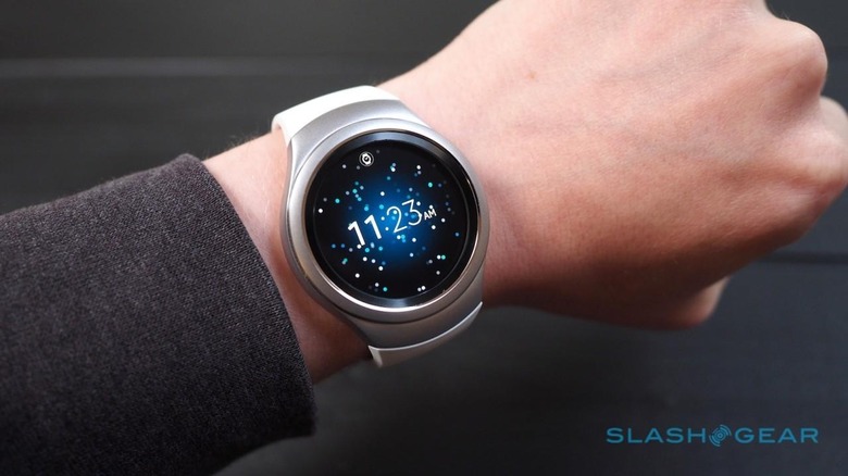
It's fronted with a superb 1.2-inch AMOLED touchscreen, a full circle unlike the flat-tire Motorola manages with the 360, running at a crisp 360 x 360 resolution and with excellent viewing angles, punchy colors, and great brightness even outdoors. I set it to 70-percent – there's no automatic brightness adjustment – and had no issues indoors or out.
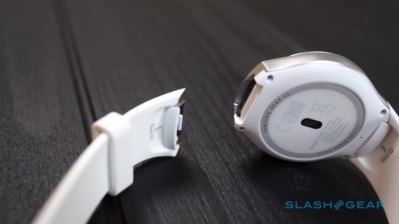
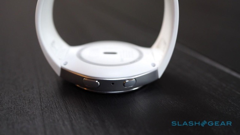
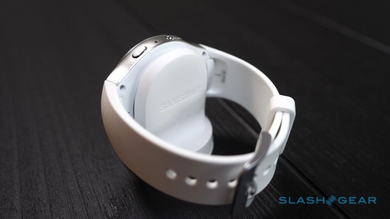
The straps are comfortable, which is a good thing as they're going to be tricky to replace. Not mechanically – slide the latches on the back and they pop out, and Samsung includes a short and a long version in the box – but because of their non-standard connectors. The Gear S2 Classic is $50 more and has a regular 20mm pin instead, used for its standard leather band.
I'm calling it: Samsung has come up with the biggest finger-occupier in wearables so far. Yes, the Apple Watch's Digital Crown can distract your digits in dull meetings, and certainly there's no shortage of fitness trackers that will buzz and flash as you tap and tickle them, but none has the addictive whiz of the Gear S2's rotating bezel.
I knew from my time with the Gear S2 at its launch that the Classic's notched bezel is the most tactile of the two versions, but the regular model isn't far behind. The wheel has just the right balance of resistance and click, which you feel more than hear.
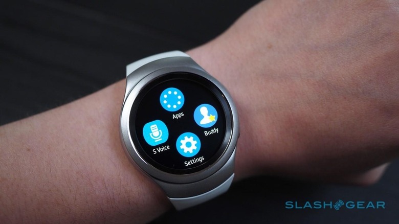
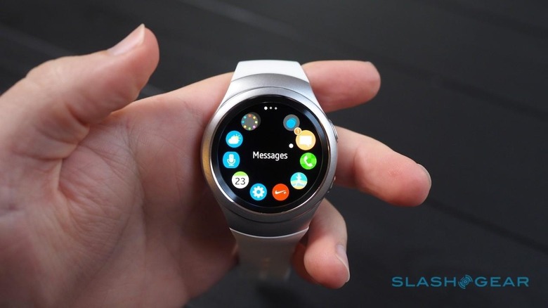
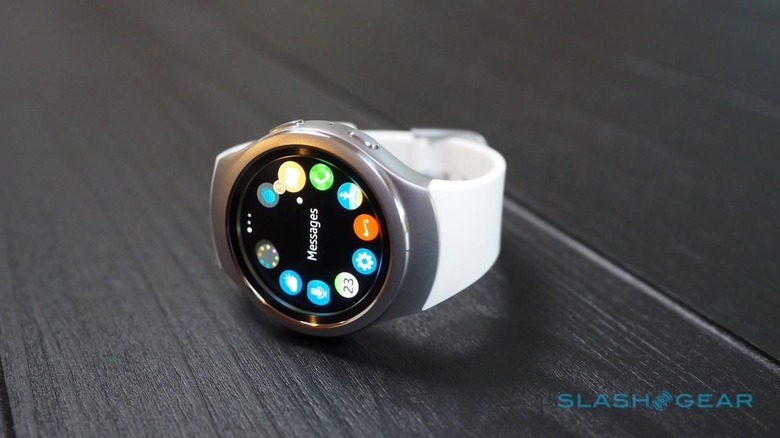
Of course, Samsung's goal wasn't distraction but usability, and the S2's dial satisfies there, too. The new Tizen UI could teach Android Wear a thing or two about how to handle a circular display, and while the iconography has some heavy hints of Apple Watch about it, I'd argue it's easier to navigate the Gear S2's app crescents than it is Apple's bubble-dense launcher.
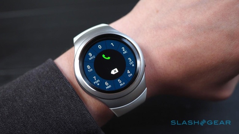
What, exactly, you might be loading is the big issue the Gear S2 faces. Certainly, the essentials are there: you can see incoming caller ID and trigger calls (though, since there's no speaker, you'll still have to use the phone or a Bluetooth headset), send and receive messages, log exercise stats into S Health, and use the HERE Maps app to see where you are and the streets around you.
Importantly, you don't have to be a Galaxy phone user to enjoy all this, either. The Gear S2 is compatible with any Android phone running 4.4 and above and equipped with 1.5GB or more of memory. There's no iPhone support, at least not yet, but given the hamstrung way Android Wear works with iOS devices that's perhaps no great loss unless you were determined to have the arch-rivals on your wrist and in your pocket.
Still, Tizen lacks the third-party support that Apple and Google command and, with the smartwatch segment still in its relative infancy, I'm not sure that's going to change any time soon. Developers – if they even have the time, resources, and inclination to code for wearables – have a surfeit of choices for their "third" OS.
So, do you code for Pebble which is doing its level best to occupy the budget end of the market, or make something more health-focused for one of the various fitness bands out there? Or, frankly, do you sit back and watch to see how the market levels out of its own accord?
In fact, even the third-party apps that Samsung demonstrated at the Gear S2's launch are MIA; you can't summon an Uber from your wrist, for instance. I've no doubt Samsung will do its best to encourage developers, but I'm also not confident that it's a sure-fire success.
That's a shame, since the Gear S2 does a lot right, even if some aspects are a little half-baked still.
Basically, most notifications on Android come through with whatever quick actions you'd get in the notification bar on your phone. Gmail messages, for instance, can be archived from your wrist. You don't need to be using Samsung's version of the dialer and messaging apps, either.
Performance proved swift with the 1.2GHz dualcore processor and 512MB of memory. Connectivity includes Bluetooth and WiFi – the Gear S2 can stay online through the latter even if your phone is out of range, so notifications still come through – and there's NFC which, eventually, will be enabled for Samsung Pay.
4GB of storage is baked in, though only a little over half of that is available for the user to load music and such. I found it was easier to just use the Gear S2 as a remote control for what was streaming from my phone, though if you're a runner the idea of being able to pair headphones directly and leave your handset at home might be appealing.
That does leave you at the mercy of the Gear S2's on-watch input options, mind, which could drive you a little crazy. S Voice, Samsung's speech control system, does dictation but required me to speak as slowly and precisely as an 50's BBC newsreader. It also struggled with basics that Siri on the Apple Watch and Google's Android Wear system had no issues handling; many of my attempts to perform basic web searches fell flat.
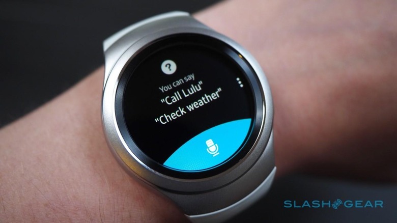
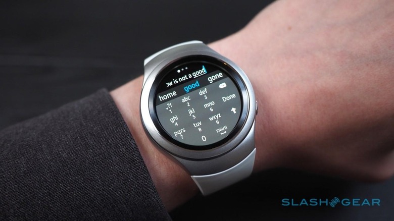
If talking into your wrist makes you feel self-conscious – don't worry, I'm the same – then there's also an on-screen keyboard option should the canned responses for messages not suffice.
It isn't a full QWERTY, thankfully, but instead a traditional phone keypad layout with T9-style predictive word completion. Tapping multiple times to enter words piecemeal isn't really practical for anything other than the briefest of missives, but it works in a pinch.
As for battery life, the 250 mAh inside kept the Gear S2 running for two days wear before I had to drop it onto the wireless charger. That's with always-listening S Voice turned off, and the screen set to only light up when I lifted my wrist.
That's not bad, but it does mean that you're probably going to have to carry the dock with you if you travel, and while the shape is handy for keeping the time visible on a nightstand, it's not as practical to drop into a bag as, say, the circular puck used by the Apple Watch and Huawei Watch.
Wrap-Up
I'm quietly impressed by the Gear S2. Samsung has created something which actually feels like a watch on your wrist, not a clunky smartwatch, and its deep control over Tizen makes many of the regular interactions you have with it a pleasure. That often came down to little things, like the watchface glowing green when I was being active.
On the flip side, there are some big things which are yet to play out. Samsung is making all the right noises about third-party apps, but right now there's a paucity of compelling software and watch faces for Tizen.
What that means is that, while I'd feel pretty confident recommending an Apple Watch or an Android Wear watch with the understanding that more apps are in the pipeline for each platform, I can't say the same for the Gear S2. If you want it, you'd better be content with exactly what it does out of the box; this isn't one of those times where it's safe to buy now on the promise of significant improvements over time.
Happily the Gear S2 does a lot right from the outset. The core functionality is brought neatly and fairly intuitively from your phone to your wrist, and of course there's the brilliant navigation system in the shape of the tactile scroll wheel. If that's sufficient return for your $300 then you're getting Samsung's best smartwatch to-date.
[gallerybanner p="411263"]
