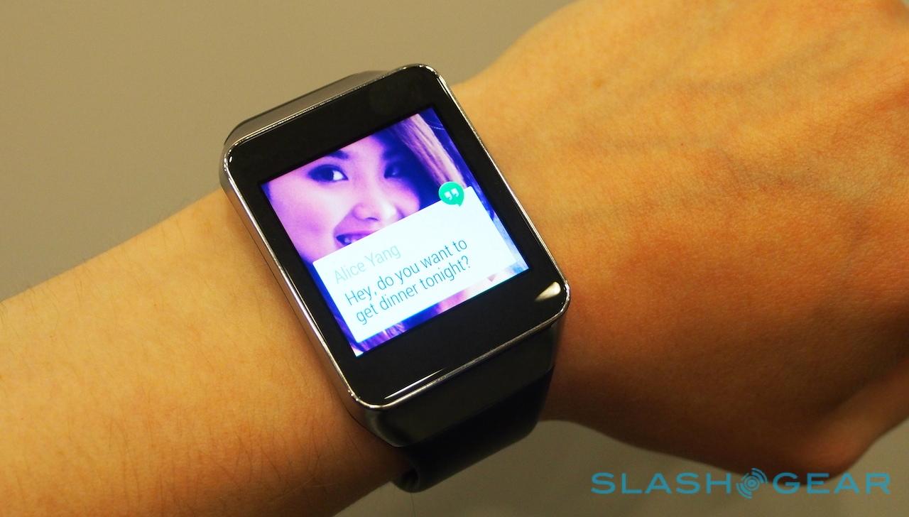
Samsung Gear Live Hands-On
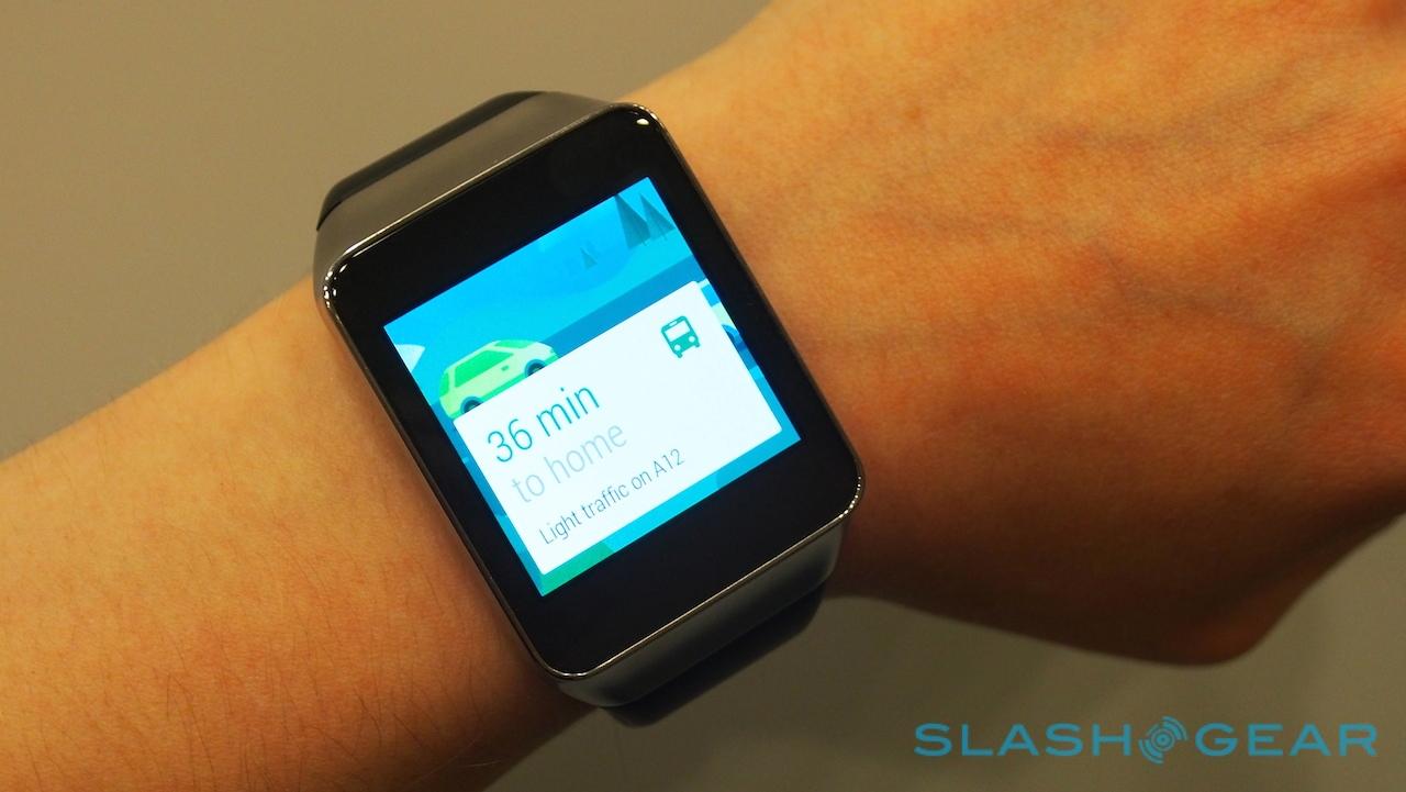
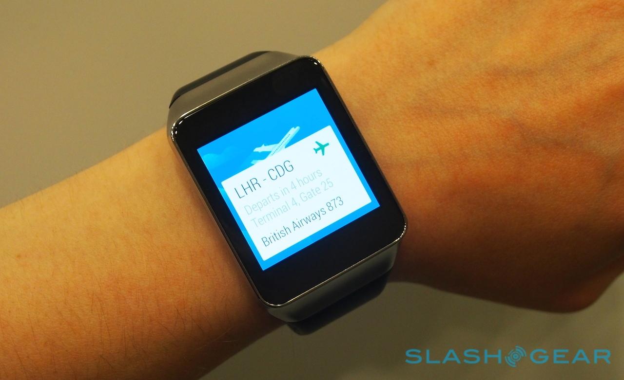
Samsung's Gear Live was a surprise addition to the Android Wear lineup at Google I/O 2014, but with its roots firmly in the Tizen-powered Gear 2 and Neo it's no great stretch for the Korean giant. As with Motorola and LG's watches, Google and its partners are playing things close to its chest when it comes to actually playing with the new smartwatch platform, but that doesn't mean I couldn't draw some early conclusions from my hands-on time.
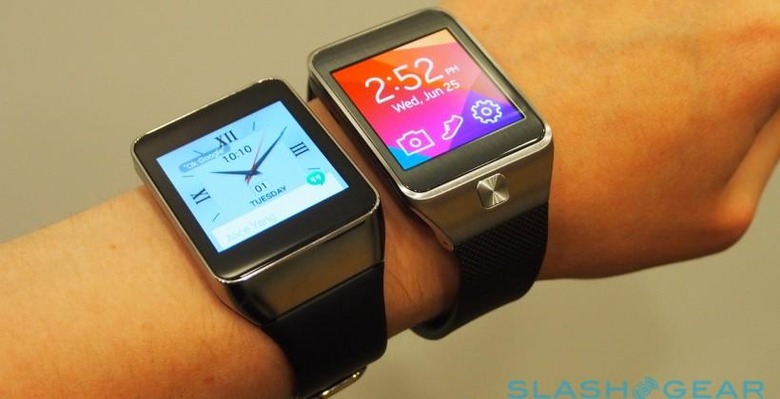
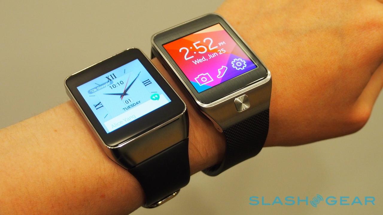
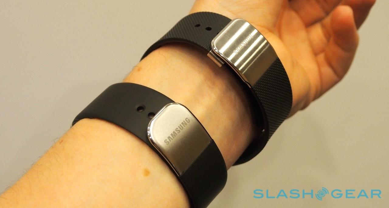
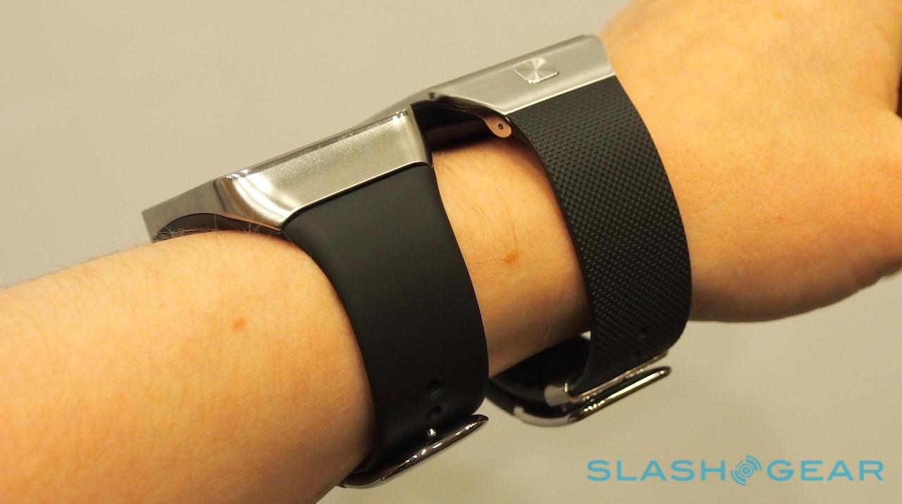
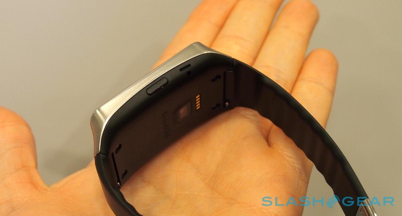
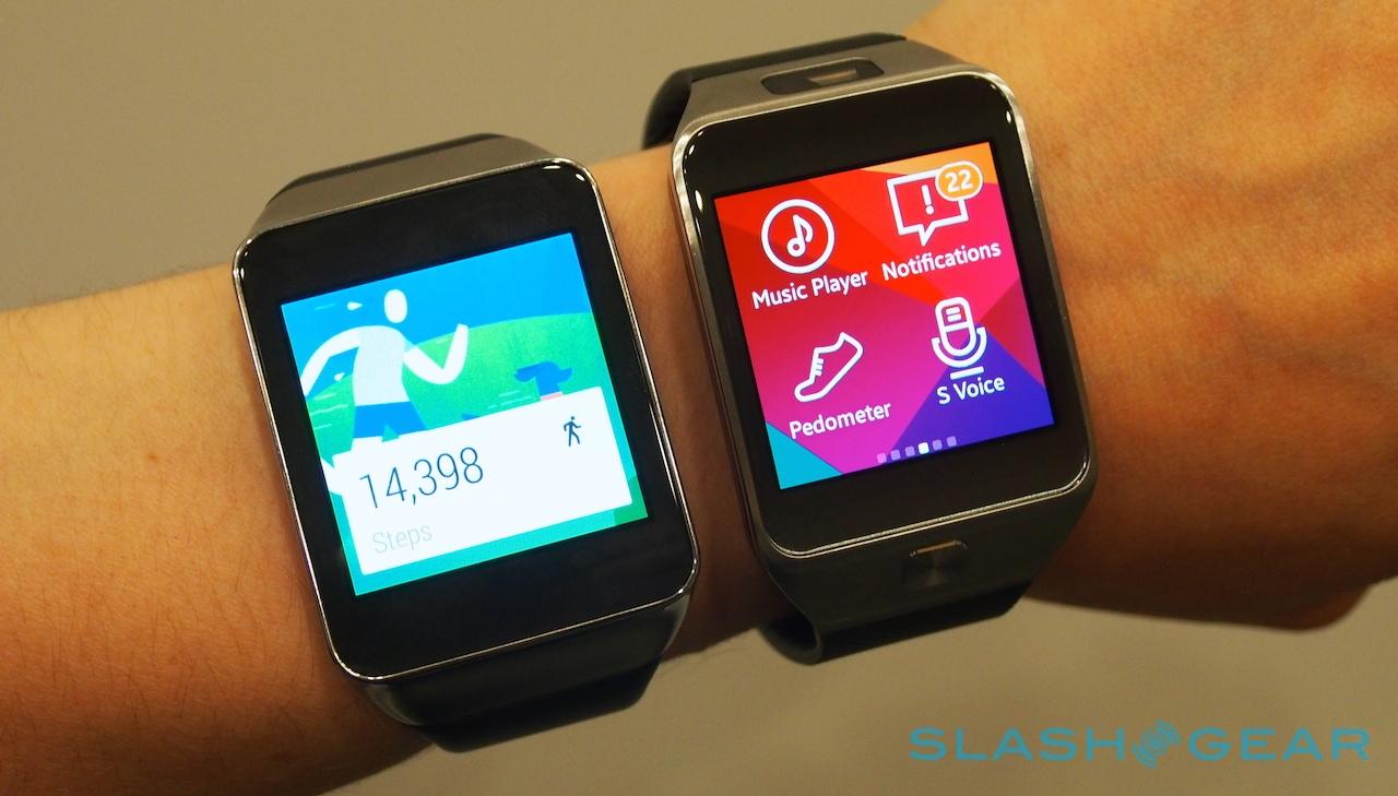
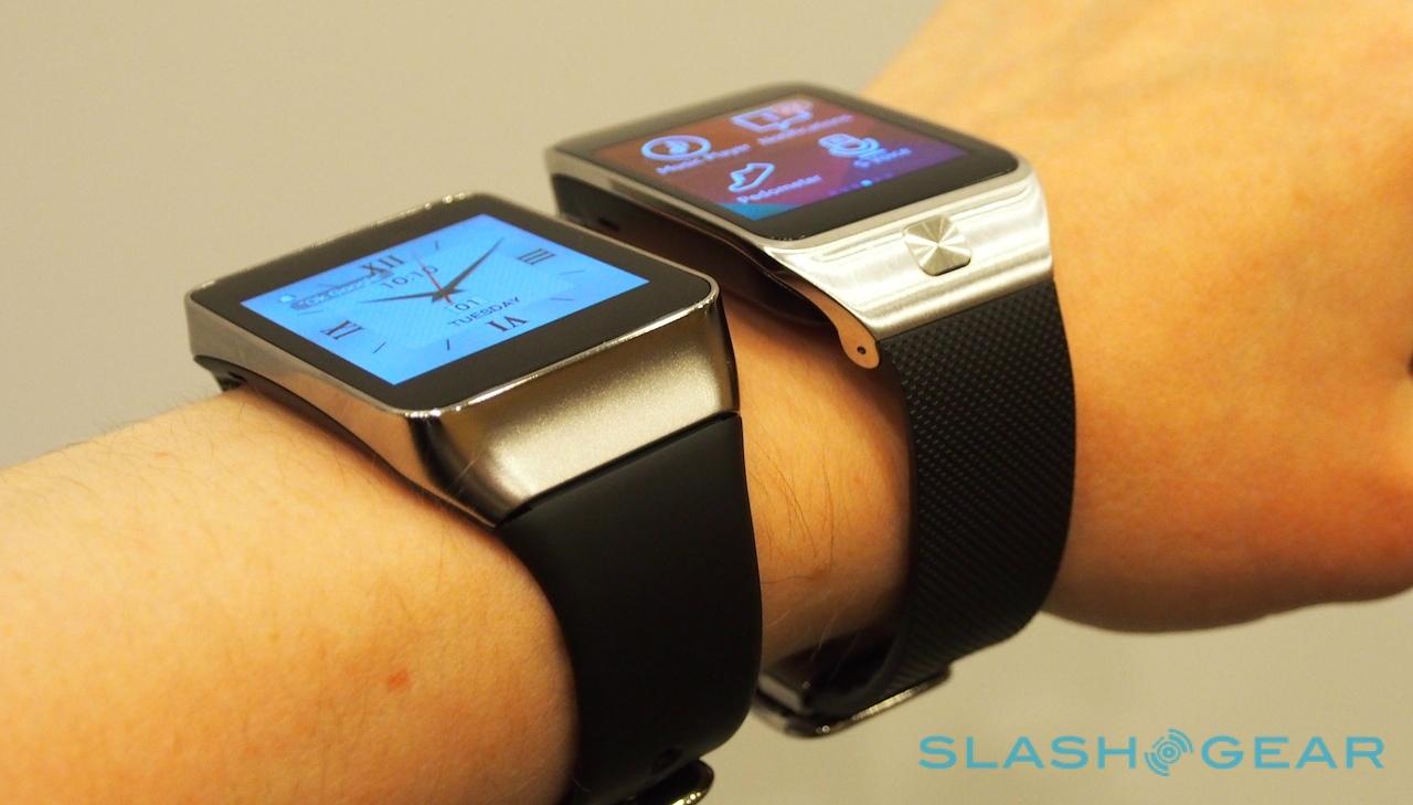
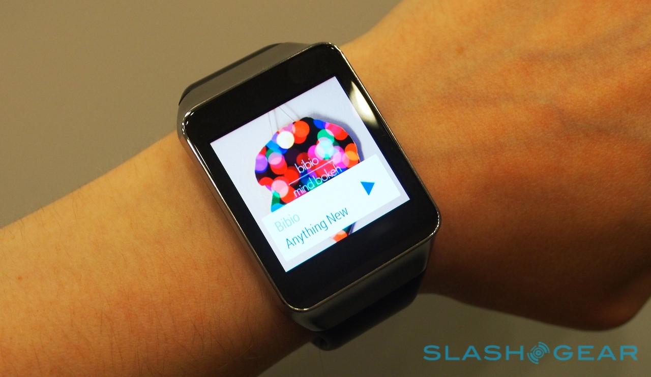
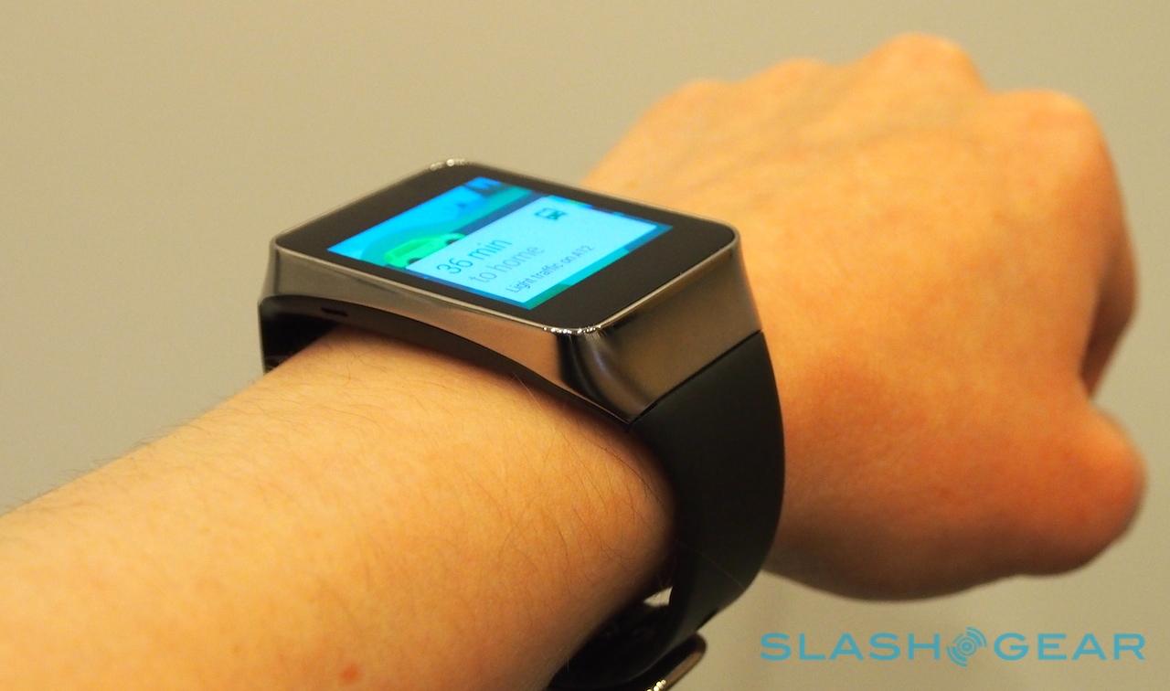
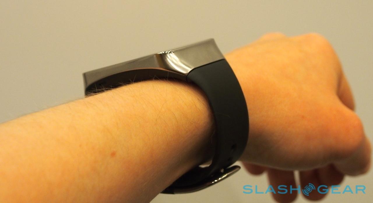
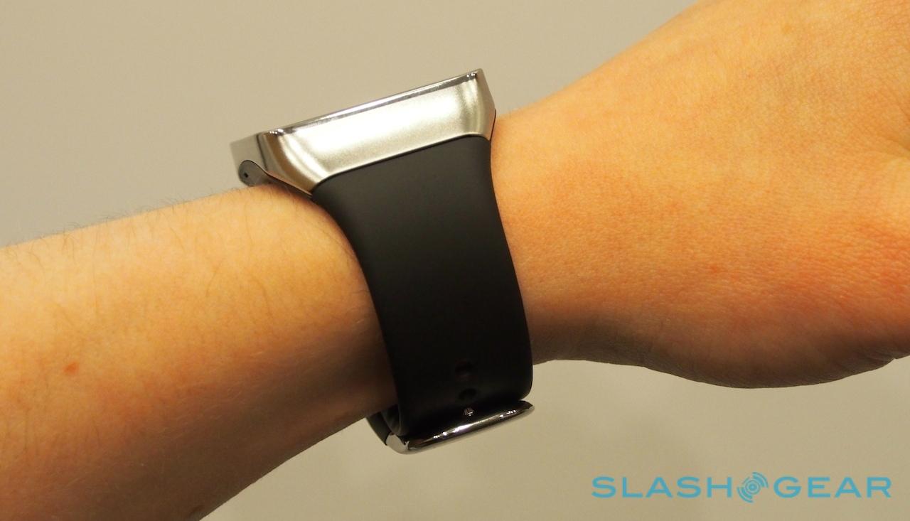
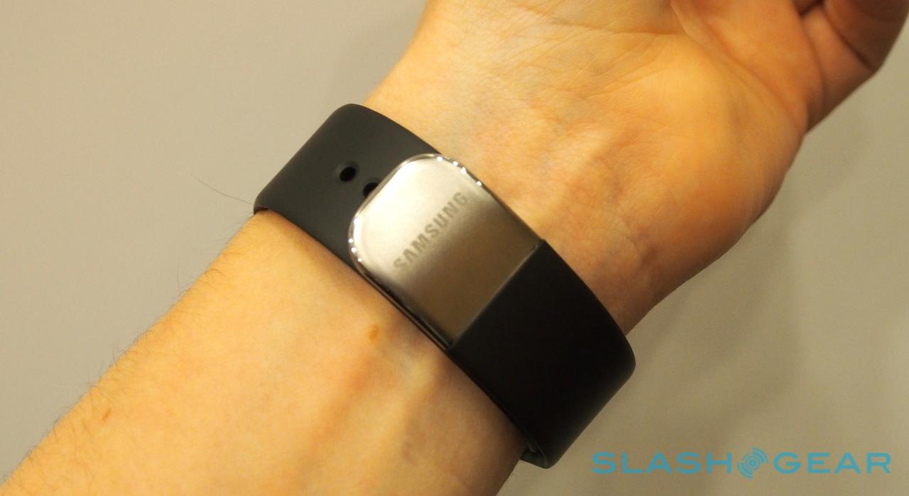
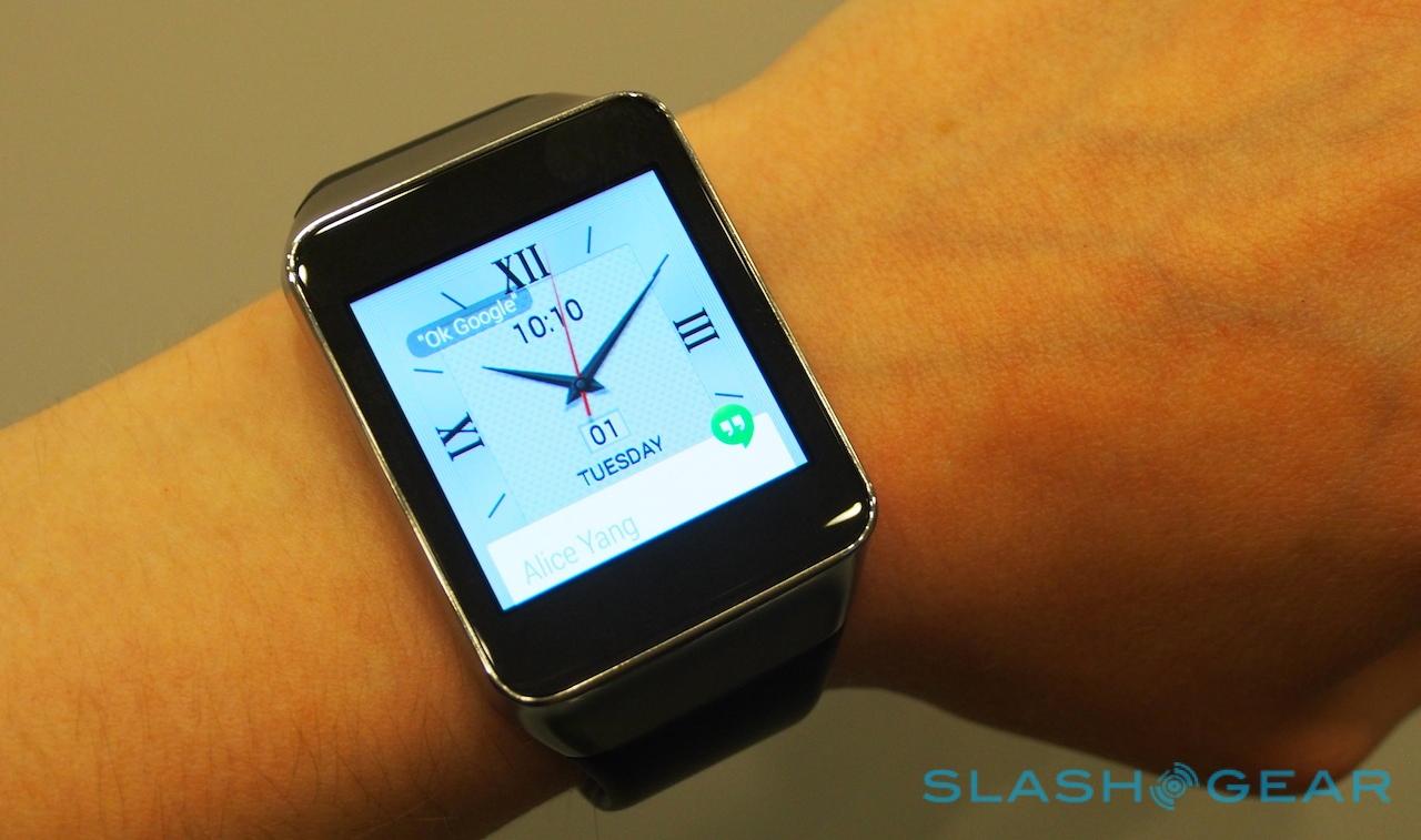
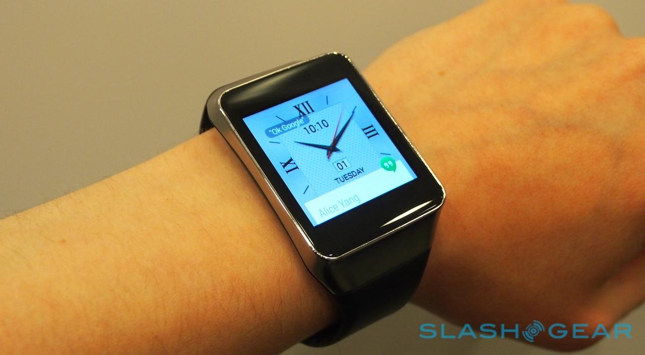
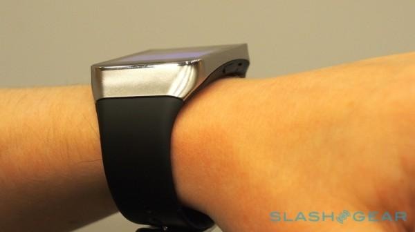
If you've seen – and worn – the Gear 2, then you won't be too surprised by what the Gear Live offers. Aesthetically they're almost identical, with the same combination of metal and plastic to the body. Where the Gear 2 has its home button underneath the display, the Gear Live has a far more discrete black plastic key on the side, which jumps back to the homescreen.

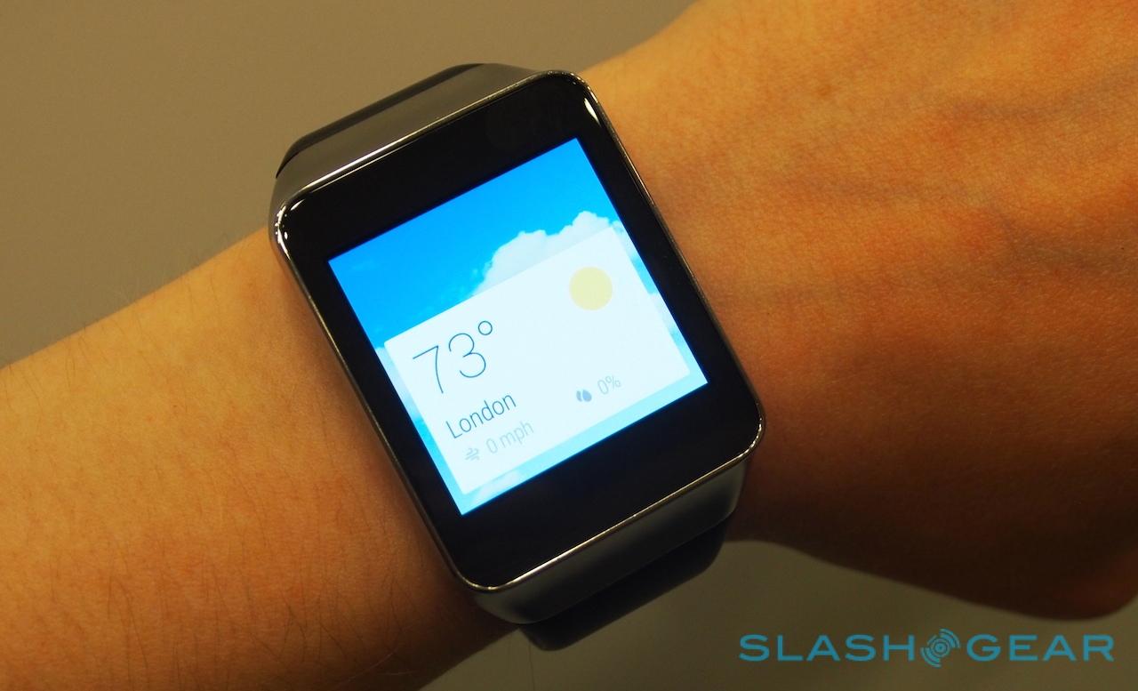
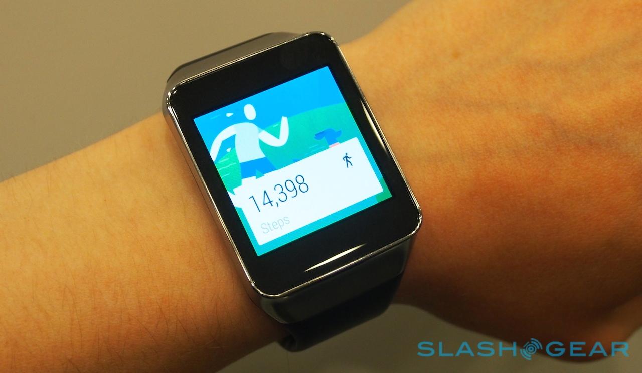
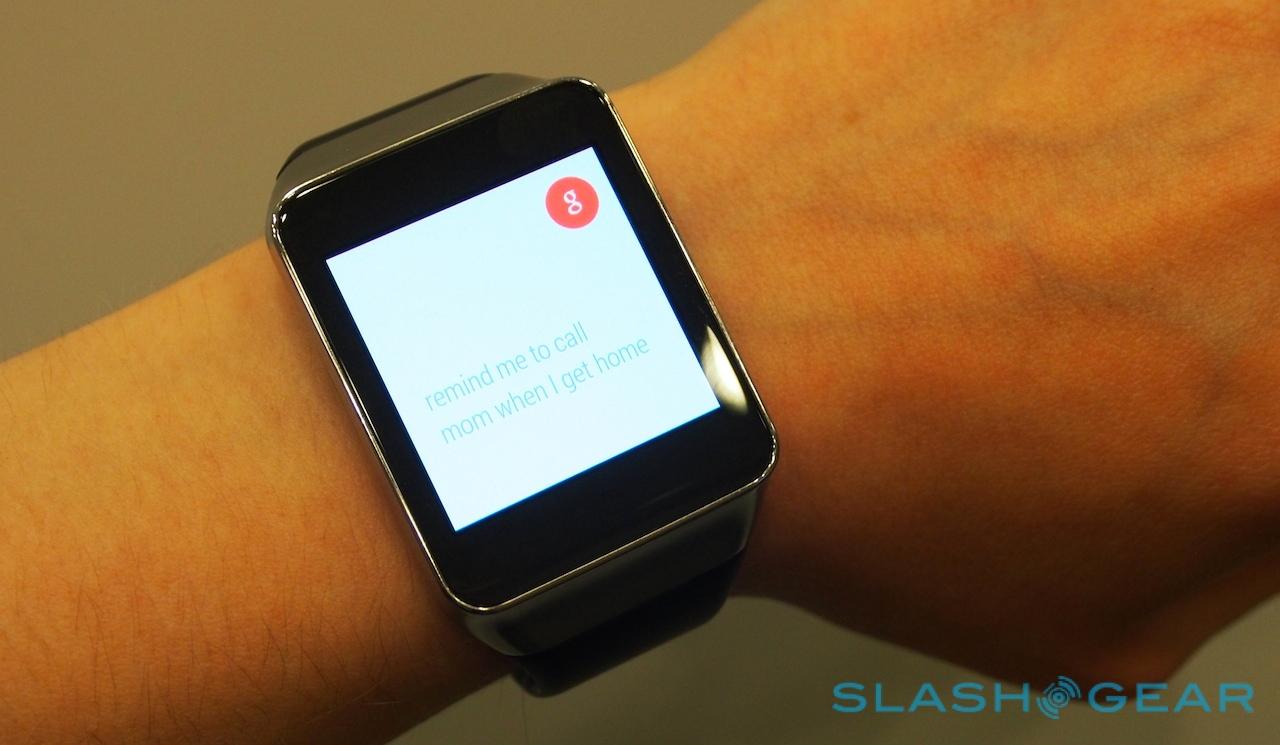
Importantly, the display is equally crisp and clear, and the touch functionality responsive. Although the demo mode all of the Android Wear devices are locked into is only semi-interactive, what we could try looked fairly polished; considering AT&T and others will begin shipping the Gear Live soon, that's probably a good thing.
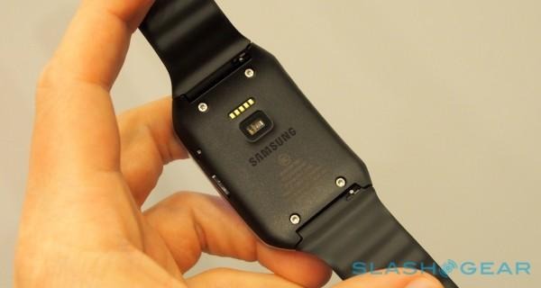
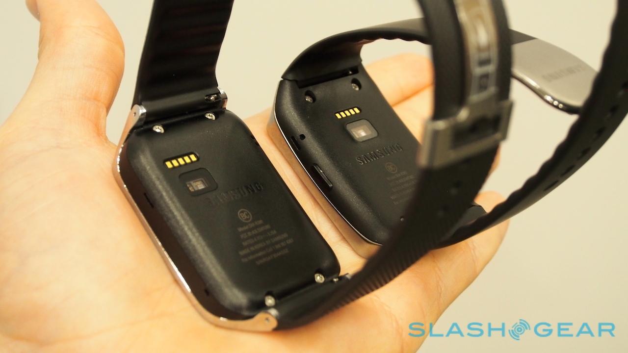
On the inside edge is one of Samsung's differentiating features from the LG G Watch, a heart rate sensor, which can feed data into Google's new Google Fit system. LG hasn't counted out heart rate functionality for future models (and Motorola hasn't let anybody see the inner edge of the MOTO 360) so for the moment, it seems if you want Android Wear and that extra level of health tracking the Gear Live is the watch for you.
There's also a price advantage. Samsung's watch comes in under the $200 mark, versus the $229.99 of the LG. With the broad functionality the same, and the extra bio-monitoring, we've a feeling many will plump for the cheaper option. We'll know how sensible a decision that is when we have a chance to put the Samsung Gear Live through its paces in a full review.
