Samsung Galaxy S8 Review: On The Shoulders Of Giants
- Beautiful design
- Curved Super AMOLED screen looks and works great
- Fast and lag-free
- Camera is among the best
- Fingerprint sensor is awkwardly placed
- No dual-camera optical zoom
- Bixby Voice isn't available at launch
In the cat and mouse game between Samsung and Apple, the user is the real winner, and never has that been so apparent as with the new Samsung Galaxy S8. Undoubtedly the most eagerly-anticipated Android smartphone of 2017, the Galaxy S8 is Samsung's first big opportunity to put the Note 7 battery debacle behind it, and instead wow consumers with its latest industrial design, services, and more. Question is, with the same camera as the old Galaxy S7, not to mention flagship feature Bixby Voice absent until later in the year, does the Galaxy S8 and its big S8+ sibling do enough today to overshadow the iPhone 8 tomorrow?
Hardware and Design
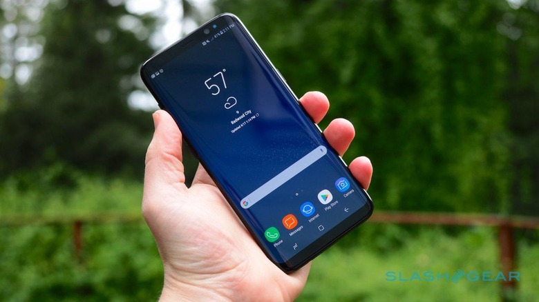
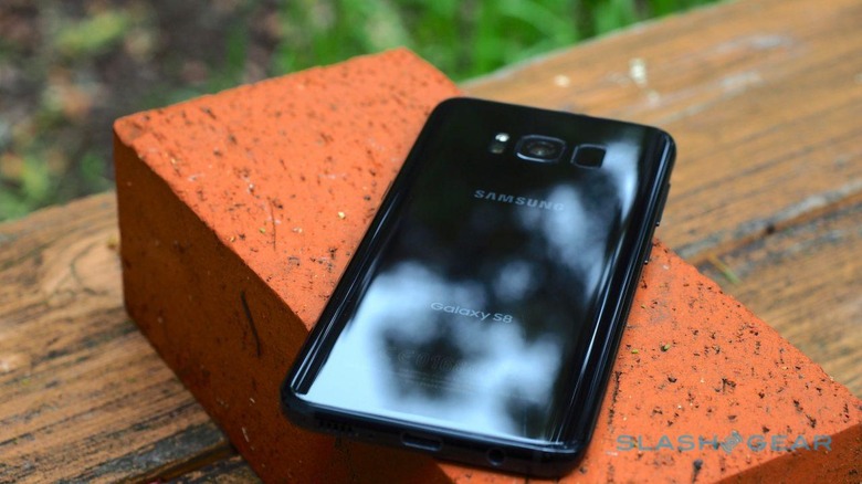
Make no mistake, Samsung has knocked it out the park, gone the distance, hit a home run, and any other sporting euphemism you'd like to level at the Galaxy S8's design. The US may not be getting the Maple Gold and Coral Blue versions, sadly, but the moody Midnight Black more than makes up for it in my opinion. The glass front and back curve smoothly into the metal frame which runs the periphery of the handset. It feels clean and expensive, and while the Galaxy S8+ is noticeably larger, it doesn't approach unwieldy.
They're slim, too. The Galaxy S8 is just 68.1 mm wide, while the S8+ is 73.4mm wide. I made a lot of how easy to hold LG's G6 was, with its unusual aspect-ratio display, but Samsung's phone is even more hand-friendly. Its tapered edges minimize what's already a thin device – 8.0mm for the S8, 8.1mm for the S8+. Since both phones are, aside from display size and battery size, fundamentally identical, moving forward when we refer to the S8 you can assume it holds true for the S8+ as well.
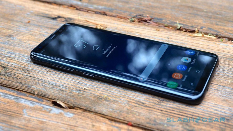
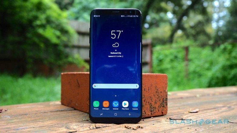
Unlike the Galaxy S7, which was offered in both regular and "edge" versions, the S8 doesn't give you a choice of having curved AMOLED or not. Now branded "Infinity Display", the panel extends smoothly around the left and right edges of the handset, on both the Galaxy S8 and the S8+. Combined with a black bezel top and bottom, along with curved corners, and you could almost mistake the whole fascia for being screen. Even though it's a 5.8-inch display on the S8 and a 6.2-inch display on the S8+, the handsets themselves are impressively compact.
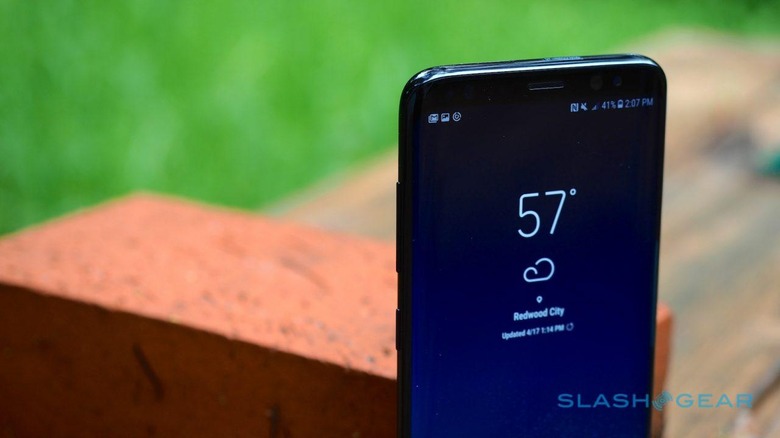
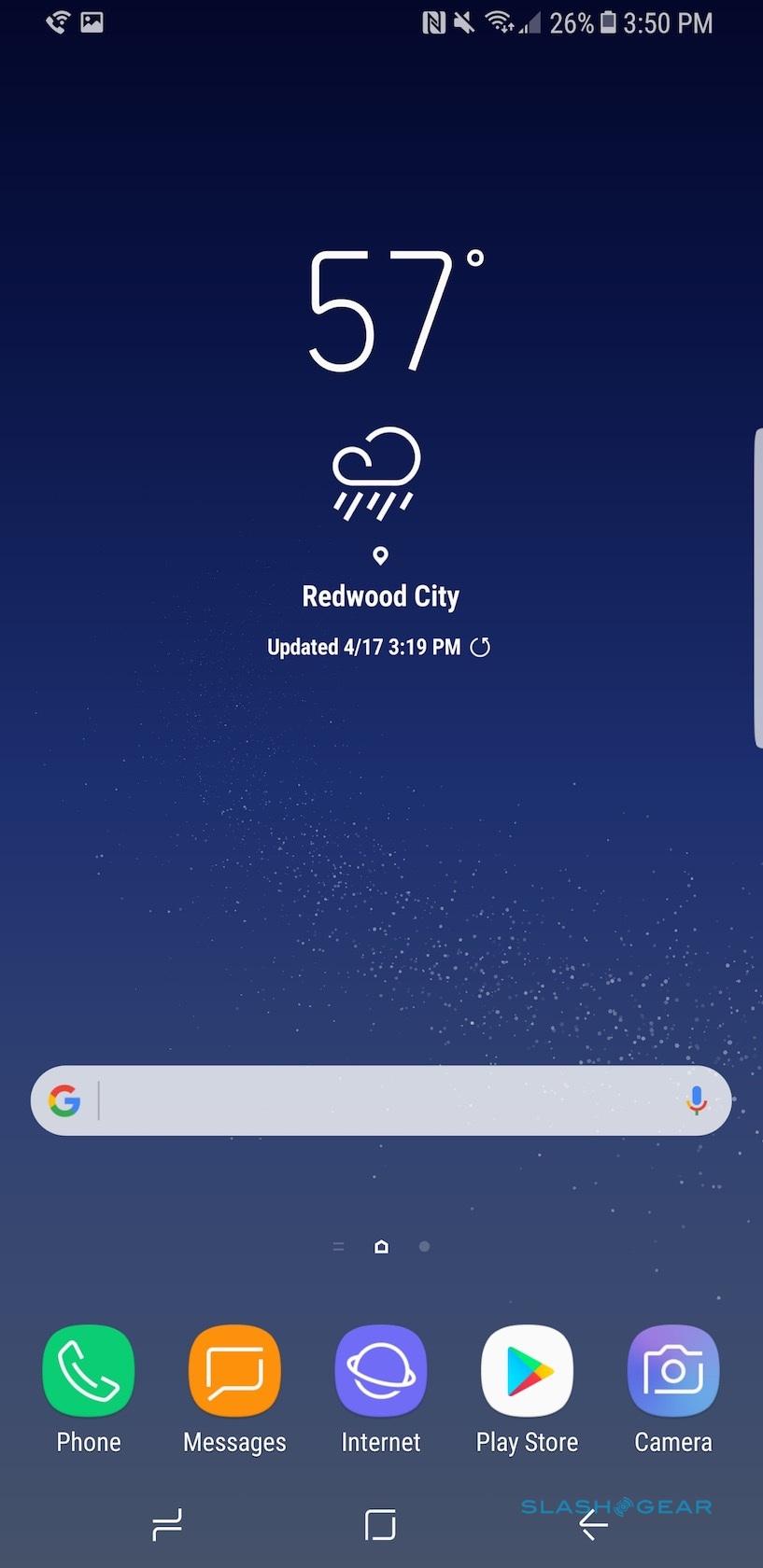
Some people undoubtedly prefer a flat display for day to day use, and will be annoyed by Samsung's decision, but there's no denying that the S8 looks incredible. Partly that's down to moving everything possible from the front of the phone. Gone is the physical home button and its accompanying app-switcher and back keys, replaced with a pressure-sensitive strip under the bottom edge of the screen that, when you press harder, summons virtual versions of those controls.
In reality, much of the time the on-screen home button is visible anyway. It only really disappears when you're playing a full-screen video, for instance; the rest of the time, it floats there as a discreet square. From the app switcher you can pin a section of an app to the top of the screen: Samsung calls it Snap Window, and it allows to crop a chunk of webpage, inbox, video, or something else to remain visible, and still use other apps on the rest of the display.
The Super AMOLED panel itself is, as we've come to expect from Samsung, a triumph. Colors, viewing angles, brightness, and outdoor visibility are superb. The panel itself ends just far enough away from the sides of the S8 so that it's not inadvertently triggered by your grip.
Maximum resolution is 2960 x 1440, though Samsung encourages you to change that. By default it sets to 2220 x 1080, or you can optionally scale it down to 1480 x 720, the argument being that battery life could be improved if you accept a lower res. My eyes couldn't really make out a difference between 2220 x 1080 and 2960 x 1440, but text got a little fuzzy around the edges at the lowest setting.
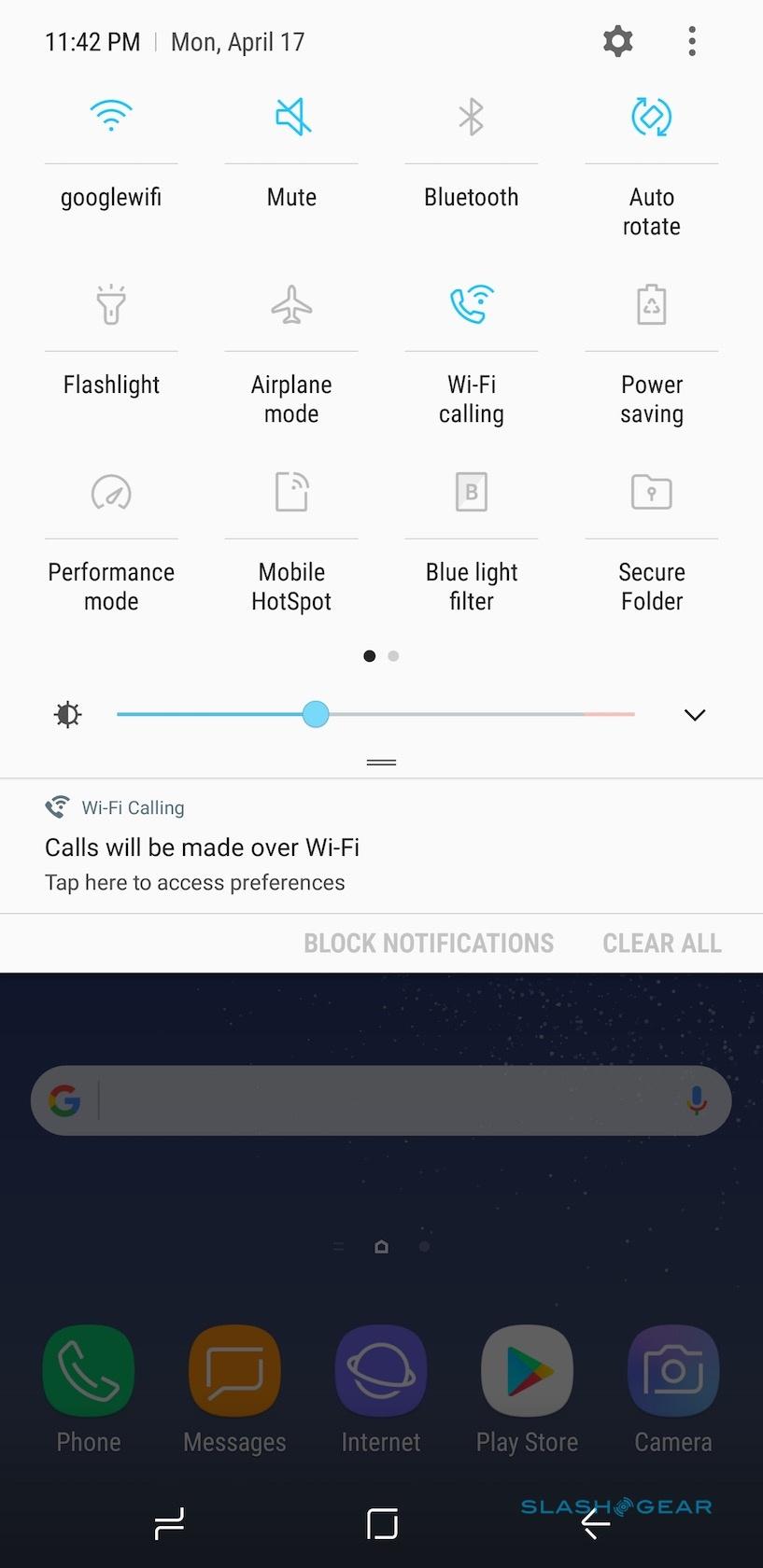
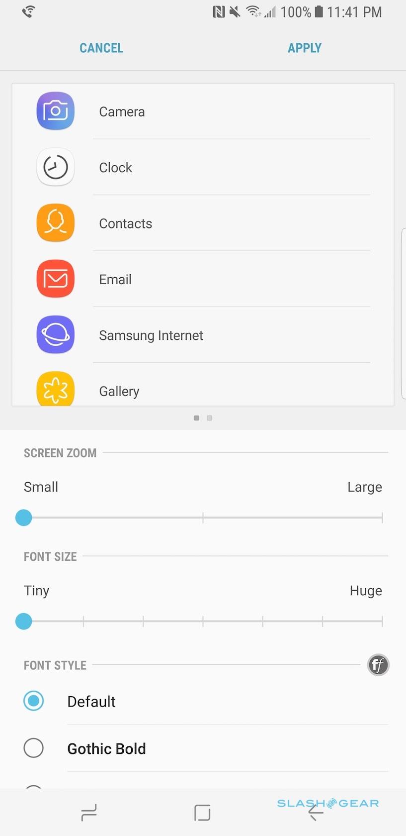
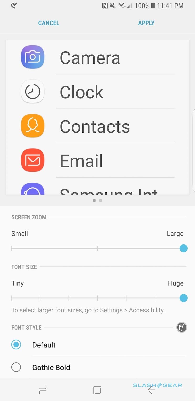
No matter which you pick, you're still seeing the same amount of content on-screen. However, there are also controls for adjusting screen zoom – either small, medium, or large – and text size – through seven settings from tiny to huge – depending on how good your eyes are. There's also the option to turn on not only a blue light filter (which, so the theory goes, reduces eye-strain) but a learning algorithm which promises to track the tweaks you make to the brightness in different settings and shape the auto-brightness to suit.
Of course, the big selling point of the Infinity Display is just how much of it you get to use when you're watching video. It's an odd aspect ratio – 18.5:9, in fact – which, in a similar argument to that of LG and the G6, Samsung says can be used by much more widescreen video than previous phones. Certainly, if you have 21:9 footage it doesn't give you black bars top and bottom when you're holding the S8 in landscape orientation. That's assuming you have 21:9 content, though, which is slowly gaining traction but still far from the default.
My biggest complaint about Samsung's design is the placement of the fingerprint sensor. Since the physical home button has been replaced by a virtual version, Samsung opted to put the biometric sensor it once contained on the back instead. Unfortunately it's in a less-than-convenient spot.
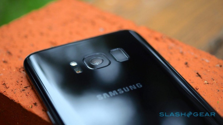
Positioned right next to the rear camera, and with only a very small ridge to help your fingertip locate it, it's all too easy to jab at the camera lens instead. Even when you do find it – which can be a stretch on the Galaxy S8+'s longer body – you have to make sure your finger is flat across the sensor. Otherwise, you get an error message about a partial print.
You can, of course, opt for iris recognition if the fingerprint system is too frustrating – there's also facial recognition, though Samsung admits it's not especially secure and can be fooled with a photo – though Samsung could've readily addressed it simply by moving the sensor down a little, to where its own logo is on the back. Even so, that wouldn't have solved my other complaint, which is that you can't just jab at the front of the phone to unlock it with one tap while it's lying on a desk or nightstand. All too frequently I gave up and punched in my PIN instead.
Inside, Samsung uses either its own Exynos 8895 or Qualcomm's Snapdragon 835; both are 10nm octacores, and indeed both are made by Samsung itself. In the US, you get the Snapdragon, along with 4GB of LPDDR4 memory and 64GB of internal storage. There's a microSD card on the top edge, to expand that.
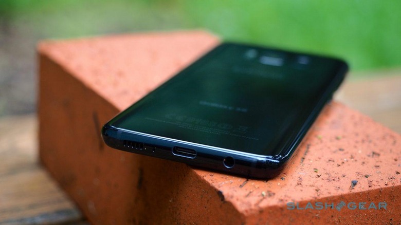
Connectivity includes LTE Cat 16, WiFi a/b/g/n/ac (2.4/5GHz) with MU-MIMO support, Bluetooth 5.0, ANT+, NFC, and GPS (along with Galileo, Glonass, and BeiDou). Alongside the USB Type-C port on the bottom is a 3.5mm headphone jack. Samsung includes AKG-tuned headphones in the box, though there's also Bluetooth Dual Audio support so that two sets of wireless headphones can be used with the S8 simultaneously.
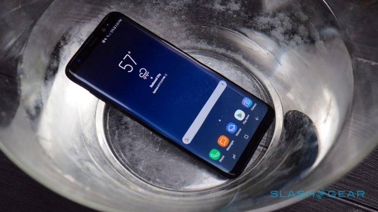
As with 2016's flagships, Samsung has sensibly opted to make the Galaxy S8 water and dust resistant. It's IP68 compliant, which means it'll handle up to 1.5m of freshwater for up to thirty minutes. If you've ever dropped your phone in a puddle then you'll know how much of a lifesaver this can be; even if you haven't, the ability to rinse the S8 under a tap means keeping its glass body free of fingerprints and smudges is a whole lot easier.
Software and Performance
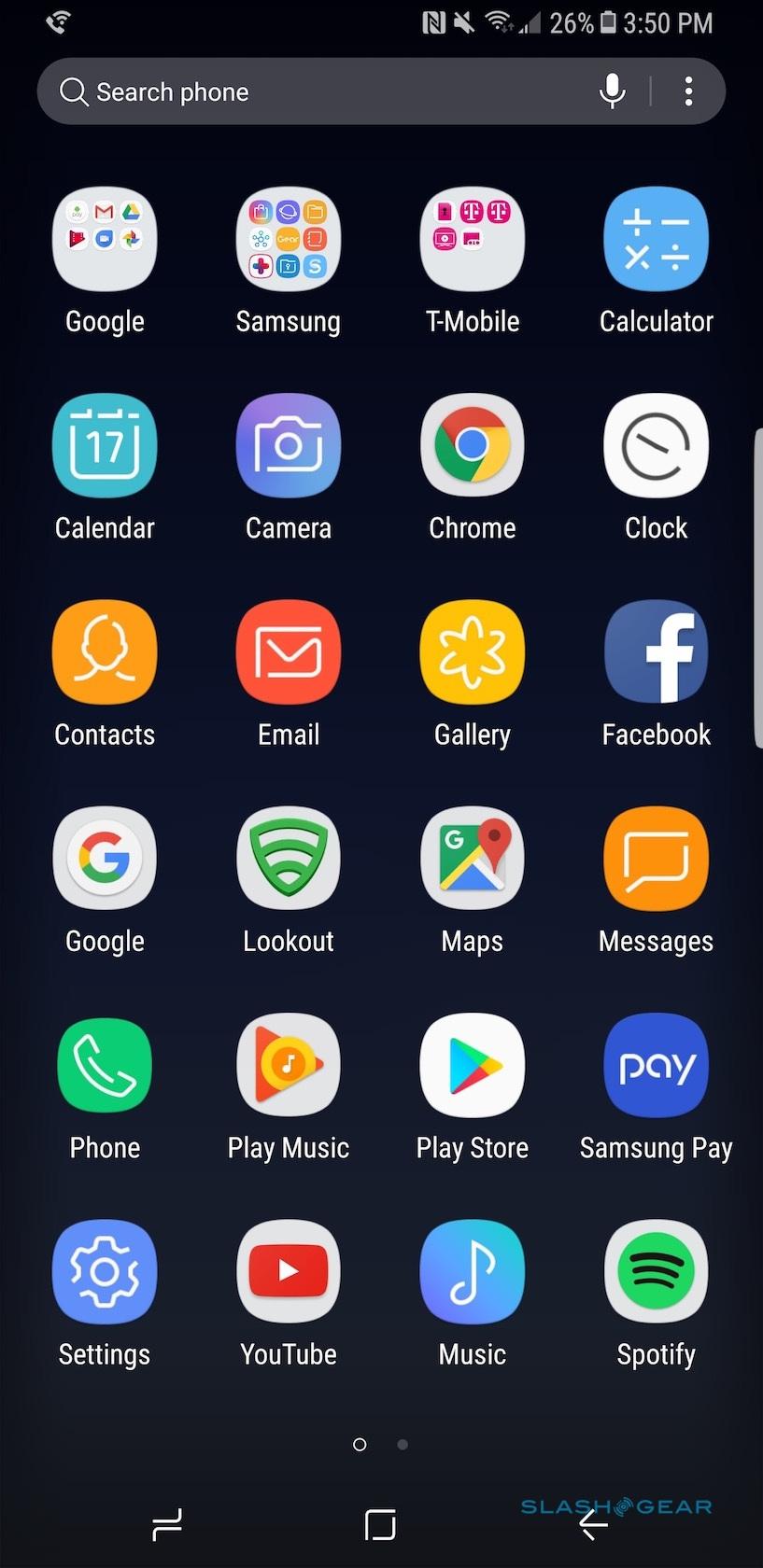
Out of the box, the Galaxy S8 runs Android 7.0 Nougat with the April 1, 2017 security patch and Samsung Experience v8.1. Obviously I'd prefer to see Android 7.1 as is available on Google's own Pixel right now, though the release of the Google Assistant to earlier versions of the OS means the most notable difference between 7.0 and 7.1 is no longer an issue. This particular S8 review unit is a T-Mobile version, and as such gets a few preloaded apps of the carrier's own: Device Unlock, the T-Mobile manager, Name ID, T-Mobile TV, and Visual Voicemail.
Samsung may no longer call it TouchWiz, but its customized interface certainly traces its roots back to that love-it-or-hate-it UI. For the S8, Samsung has made the "edge" shortcut bar, which is swiped in from the side of the display, standard now. You can flick between an app launcher, contacts shortcuts, and Smart Select screenshot tool as standard. Dig into the settings, however, and you can add a useful Clipboard edge, which keeps a list of previously copied items, a Reminder edge, Tasks edge, Weather bar, Quick Tools, Calendar, Music controls bar, and more. There are a few dozen more – either free or paid – in the Samsung store.
Some of the apps are new with the S8. Samsung Connect promises to be the hub of your connected home, putting networked devices – whether Samsung's own high-end refrigerators, freezers, or TVs, or third-party products like Sonos speakers and connected thermostats – in a single place for easier control. You can operate them individually or group different actions together into custom modes, such as turning everything off when you leave the house.
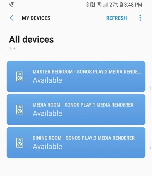
The reality hasn't proved to be quite the tame smart home I was hoping for. A set of Sonos speakers showed up and were readily added to my devices list, but I could only make selections from Samsung's own Music app; it wasn't even possible to pause the Spotify playback I'd started from another device. My Philips Hue lights didn't show up at all.
Using Samsung's own devices proved more successful. One of the company's connected TVs, for instance, populated the app with channel and volume controls. I was also able to stream video I'd recorded with the S8 directly to the set, without the hassle of setting up WiFi Direct.
Unfortunately, one of the accessories I'm most curious about trying wasn't supplied. The Samsung DeX dock promises the "Desktop Experience" of a PC, turning the S8 into a full computer with the connection of an HDMI display and a regular keyboard and mouse. No, you won't be able to do everything a full Windows or macOS machine might, but a combination of webapps and key titles like Microsoft Office with specially-crafted desktop UIs could certainly replicate the Chromebook experience.
I'll review how realistic that is when I get my hands on a DeX dock. However, I've few doubts that the S8 can keep up. Everyday performance has been excellent, with no noticeable lag or stuttering, even when dealing with heavy webpages.
Samsung Bixby
Apple has Siri, Google has its Assistant, Microsoft has Cortana, and now Samsung has Bixby. The fruits of its Viv acquisition, Bixby promises not only a way to check weather forecasts, send messages, and get directions all by voice, but effectively do anything on the phone that you'd normally have to tap and swipe to achieve. Throw in object/landmark recognition, a new homecreen with customized cards of user-personalized information, and location/time-based reminders, and you've an assistant that could eclipse either of its better-known rivals.
Sadly Bixby's announcement and the Galaxy S8's implementation don't deliver quite the same thing. The jewel in the crown, Bixby Voice, simply isn't available at launch. In fact, according to Samsung it'll come later in the year.
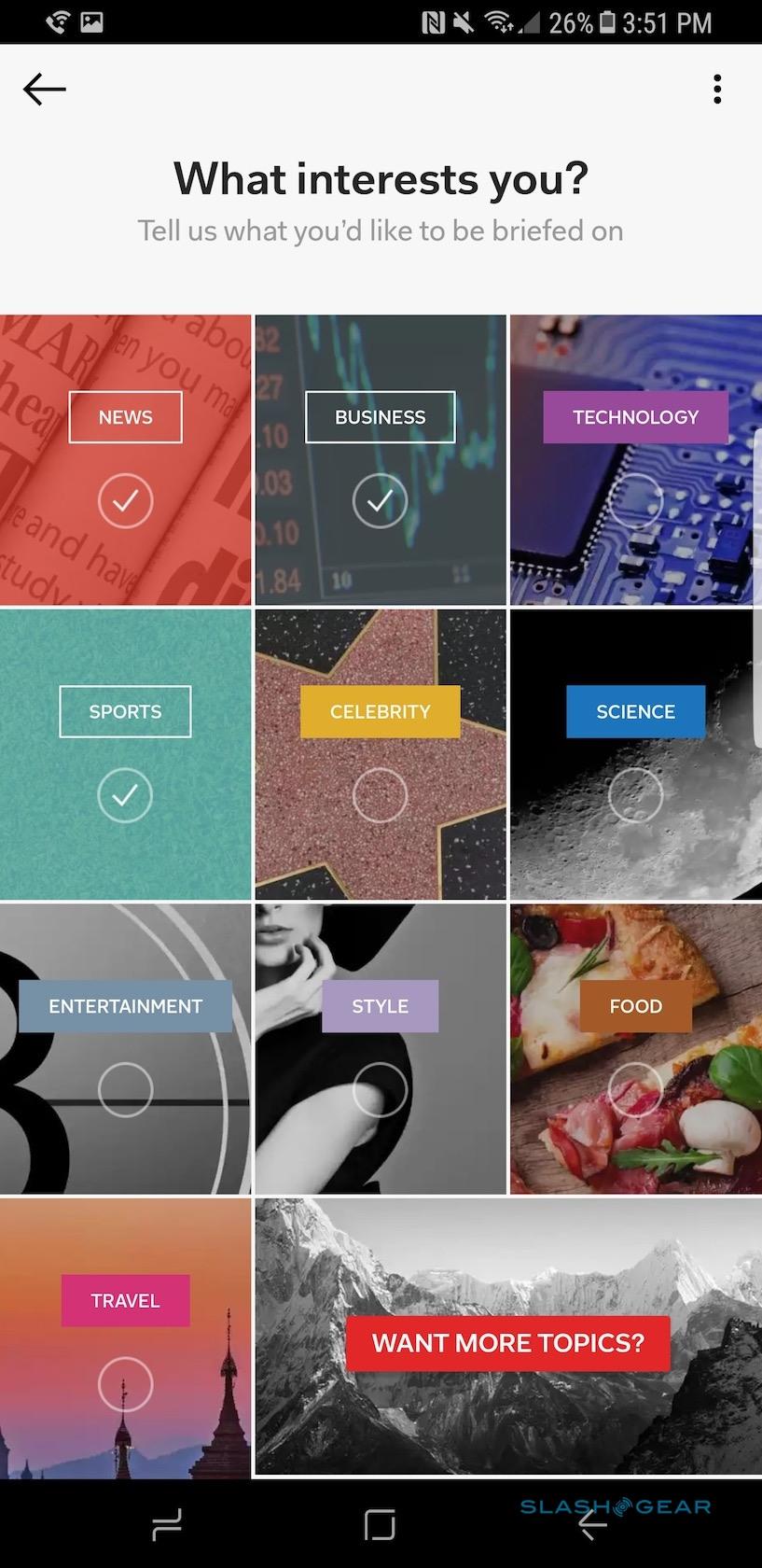
What you get is Bixby Vision, Bixby Home, and Bixby Reminder. Of the three, Bixby Vision probably has the greatest wow-factor: it's basically Google Goggles, mixed with Amazon's visual search, and Google Translate, all in a single interface. For instance, you can show Bixby Vision a product – like a bottle of wine – and it will tell you about that wine from Vivino's database.

Products, meanwhile, get linked straight to their Amazon pages. How accurate the search results are depends on how distinctive the packaging is, I found: Bixby could get confused by exactly which model it was seeing. Translation works more consistently, with the ability to snap a photo of a page of text – such as on a restaurant menu – and convert it into other languages.
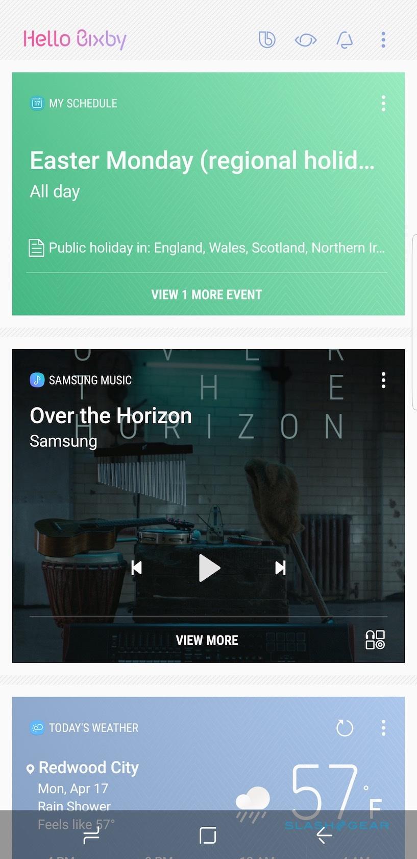
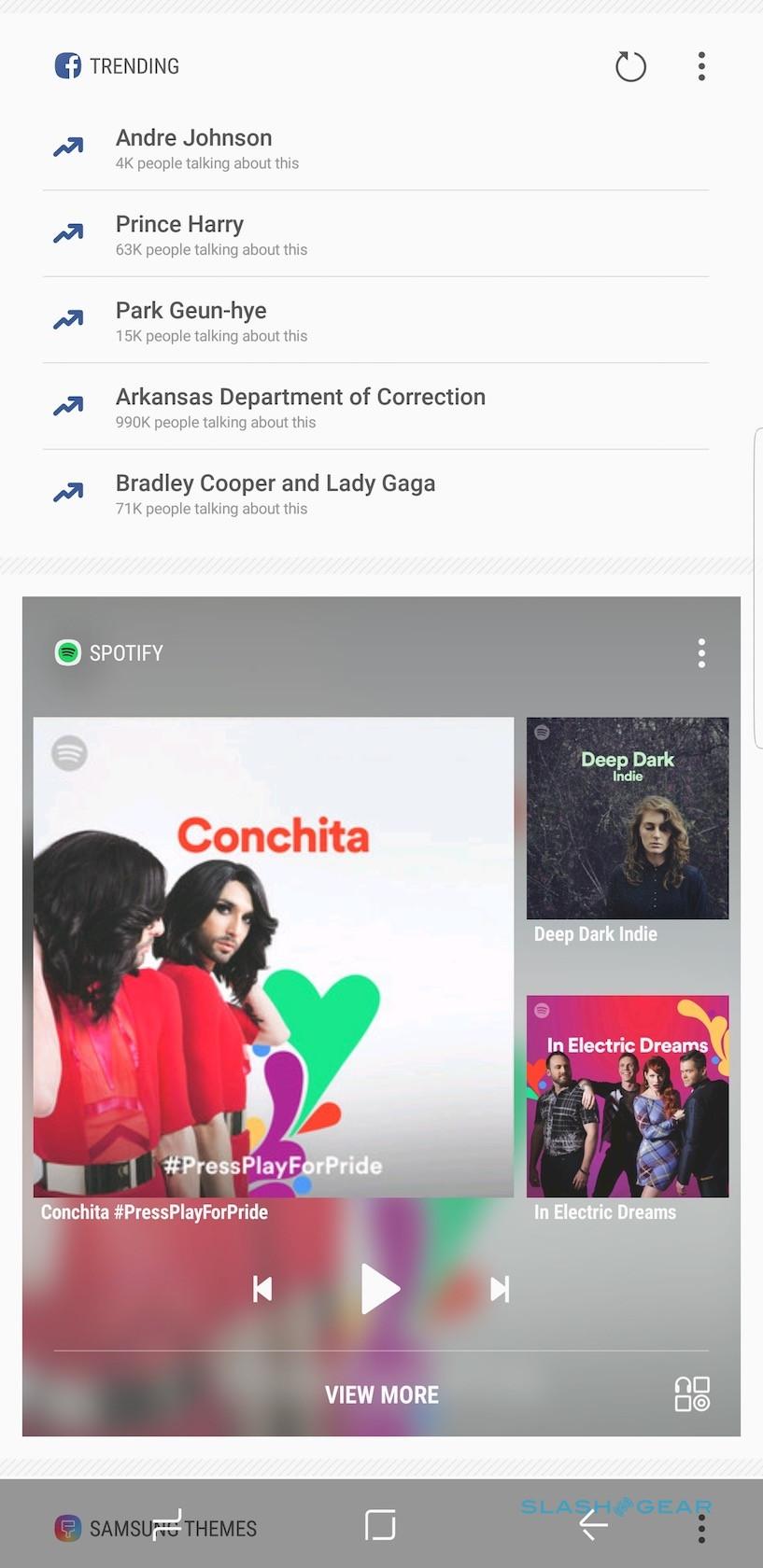
Bixby Home, meanwhile, is a new homescreen pane. Swipe all the way across to the left, and you'll find custom cards for your upcoming schedule, recent messages, news Bixby believes you'll be interested in, trending topics from Facebook, and recent additions to your gallery. The promise is that, over time, the assistant will observe how and where you use your phone and further customize what shows up, though I've not really noticed much personalization in my relatively short time with the S8.
Finally, Bixby Reminder is a task system. You can create new reminders for photos, webpages, or other information; build to-do lists; and set alarms for events. Those alarms could be at a certain time, or when arrive at or depart from a certain place. Upcoming reminders show up in your Bixby Home stream. It's useful, but it's not anything many other Android task apps can already do.
Indeed, while all of the current features work, they don't quite warrant a dedicated Bixby button right now. I can understand Samsung wanting to put a physical shortcut to its headline service on the S8, but the fact that not only is that service not available, but you can't reassign it to something else, undermines that. Initially it looked like third-party apps would be able to reassign the Bixby button to trigger something else, but Samsung appears to have closed that loophole too.
Camera
Did Samsung play it safe with the Galaxy S8's camera? On the face of it, using the same 12-megapixel Dual Pixel setup as the Note 7 and Galaxy S7 before it could be seen as treading water. While LG's G6 and the iPhone 7 Plus are doing interesting things with twin cameras, Samsung's approach almost seems old-school.
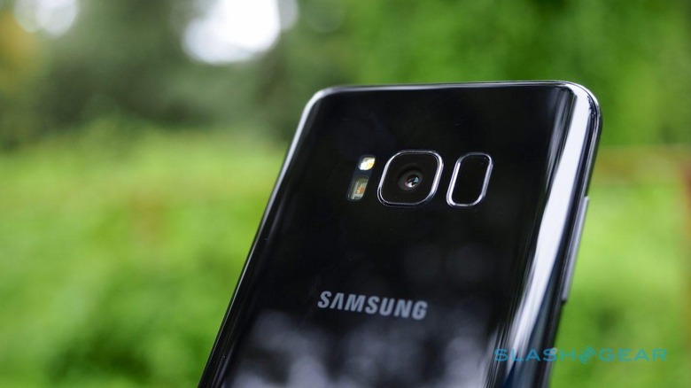
If there's one thing that's become clear over the past couple of years of smartphone camera design, though, it's that there's much more to getting a good photo from your phone than specs on paper. Starting from an excellent sensor on the S8 is no bad thing, and Samsung's refined software and algorithms coax even better images and video from its new flagship.
The results are certainly the equal of what you'll get from an iPhone 7, and I prefer them to the photos from LG's G6, too. Colors are accurate and don't stray too far into the over-saturation that earlier Galaxy phones sometimes suffered. Low-light performance is generally impressive, too, with plenty of detail, showing a broad dynamic range.
The camera app itself has some clever touches and a couple of annoyances. The default view is the fully-automatic mode; sliding your finger up and down the shutter button controls zoom. Swipe across and you get a menu of other modes: Pro, with manual controls for exposure, ISO, and other settings; Panorama; slow-motion; Hyperlapse; Food, which puts a circular frame of focus around your plate; Virtual Shot, for shooting 3D objects; and Selective Focus.
The latter does a surprisingly good job of picking out a subject and blurring its surroundings, even if can't call upon the help of a second lens as the iPhone 7 Plus' Portrait Mode uses. Meanwhile, if you're signed into your Samsung account there are several extra camera modes you can download. That includes an Animated GIF maker, Sports Shot, Dual Camera, the vaguely creepy Beauty Face, and Rear-cam Selfie.
If there's a frustration, it's that some of the various swipes and taps can get confusing. Miss the brightness slider by a half-fingertip's width and you find you've swiped up or down to switch between the front and rear cameras, for instance. Hold a finger down a little too long, and you can inadvertently break out the separate autofocus and autoexposure reticles.
At least the whole thing is whippet-fast. Double-tapping the power button opens the camera app, even if the S8 is locked; that takes a split-second, as does snapping an image or hitting the video record button. It's worth noting that, by default, Samsung wants to upload your photos and videos to its own cloud backup service, though it's an easy thing to switch off.
Battery
Somehow Samsung has finessed a 3,000 mAh battery into the skinny body of the Galaxy S8, and an even larger 3,500 mAh battery into the Galaxy S8+. The official runtime estimates are top to 20 hours of talktime on the S8, up to 16 hours of video, up to 14 hours of WiFi browsing, or up to 12 hours of LTE browsing. Those numbers increase to 24 hours of talktime with the S8+, up to 18 hours of video, and up to 15 hours of WiFi or LTE browsing.
In reality, with mixed use, the S8 lasted me a solid day. Obviously individual usage patterns vary from person to person, and I've no doubt you could stretch out into a second day with a little care (and maybe lowering the screen resolution too). It's still early days in our battery testing with both the S8 and S8+, so we'll update with more feedback as things level out.
As before, there are several ways to recharge. A 2A travel charger is included in the box, along with a USB to USB-C cable. Samsung also bundles a Type-C to USB adapter and a Type-C to microUSB adapter, which are welcome. With a Fast Charging compliant power supply a full charge should take about an hour and a half.
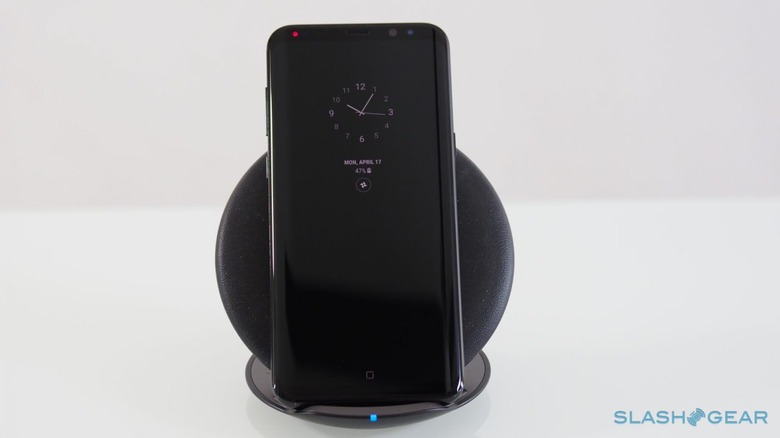
There's also wireless charging support, including the latest generation of fast wireless pads. The S8 will work with both Qi and PMA wireless chargers, so either you have already – or find built into the table at Starbucks – will play nicely. However, Samsung has its own new fast wireless charger which can flip between a flat pad or an upright dock.
Samsung Gear VR with Controller
Aside from the DeX dock and the new fast wireless charger, Samsung's other big accessory for the Galaxy S8 is an updated Gear VR with an Oculus-powered controller. Like Google's Daydream, the small handset tracks 3DoF movement in a VR environment when you slot your S8 into the bay at the front. A circular trackpad on the top effectively replicates the touchpad on the side of the headset previously used for navigation.
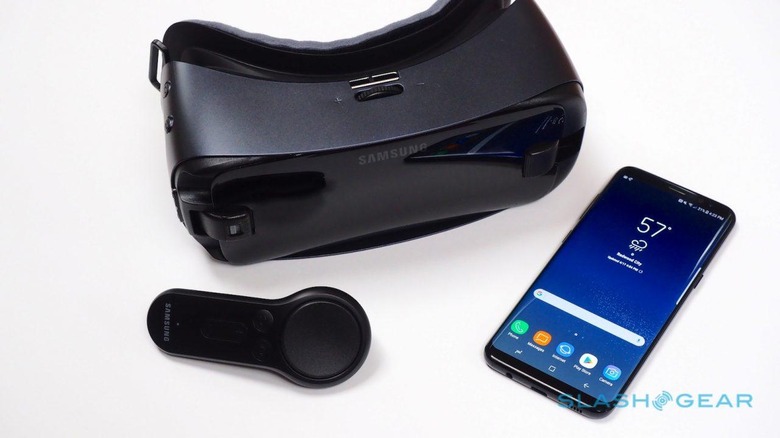
Not every game, app, and virtual reality experience is updated to support the new controller. Those that are, however, gain a new degree of interactivity: there's nothing quite like gesturing your way through a game or 3D environment. Those who already have a Gear VR can pick up the controller separately, meanwhile, at $39.99.
Wrap-Up
There had been suspicions that the fallout from the Note 7 battery fiasco might sour would-be Galaxy S8 buyers. Based on the degree of pre-launch excitement, however, those fears seem to have been unfounded. Whether it's the safety promise implicit in Samsung's new 8-point battery check, or simply a sign of our general appetite for the latest, greatest, and shiniest gadgets, it suggests neither apathy nor explosion anxiety will do much to dampen sales.
It's helped by the fact that the Galaxy S8 is a tremendously good phone. Samsung has wrapped the latest hardware in a sleek, premium-feeling design that, with its curved touchscreen and waif-like bezels, leaves the iPhone 7 feeling chunky and a little tired. The reappearance of Samsung's Dual Pixel camera only serves to underscore how ahead of the game the same sensor was last year.
Questions remain, though. Bixby in its current form is a faint outline of its overall potential: Bixby Voice could be an epic leap ahead of what Siri and the Google Assistant offer, but we won't know for sure until it rolls out later this year. Similarly, the DeX dock and Samsung's attempt to condense a desktop PC into a phone form-factor is ambitious and intriguing, but for now it's hard to say whether the reality lives up to the promise.
Happily, neither of those big questions undermine what is, essentially, an excellent device. The Galaxy S8 is easily the best Android smartphone on the market today, and in several ways it ousts the iPhone 7 too. Samsung's real battle will come with the arrival of the new iPhone 8 later this year, mind, and until we see just what Cupertino has been working on, all bets are off. At the very least, Samsung has set its highest bar yet for its arch rivals, and I couldn't fault you if you weren't able to wait it out.
Vincent Nguyen contributed to this review
