Samsung Galaxy S7 Edge Review
Lust. That's what Samsung was counting on with the Galaxy S6 edge: enough people seeing its curvaceous AMOLED screen and uncontrollably coughing up the premium over its flat-fronted sibling. Problem was, though the hardware was clever, the software made little use of it, and so with the Samsung Galaxy S7 edge arriving even sleeker and even swifter, we have to ask: has the functionality finally caught up to the flexibility?
Design
Everything about the Galaxy S7 edge is designed to emphasize its display. That was, of course, the case with previous edge models, but there's a sense this time around that Samsung has at least taken into consideration ergonomics on the side.
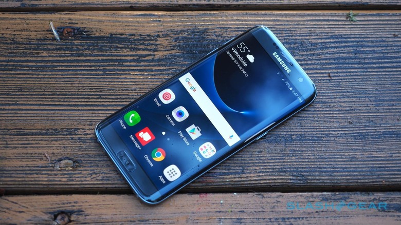
So, the S7 edge gets a slightly curved back panel too, just like the regular S7, and though it's a small difference it adds up to a big change in how the phone feels in your grip.
With the S6 edge, you were always hyper-aware of the sharp metal bezel running the periphery of the phone, primarily because it was normally digging into your hand. Now that the back panel adds its own curve, the S7 edge has smoothed away some of that discomfort.
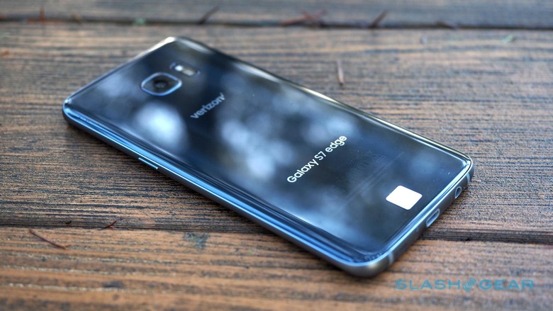
It's still noticeably thin – even if, in fact, Samsung has made it slightly thicker than the outgoing S6 edge. Depth has increased to 7.7 mm from 7 mm, primarily to accommodate a larger battery, though it has the side-effect of helping reduce the rear camera bulge.
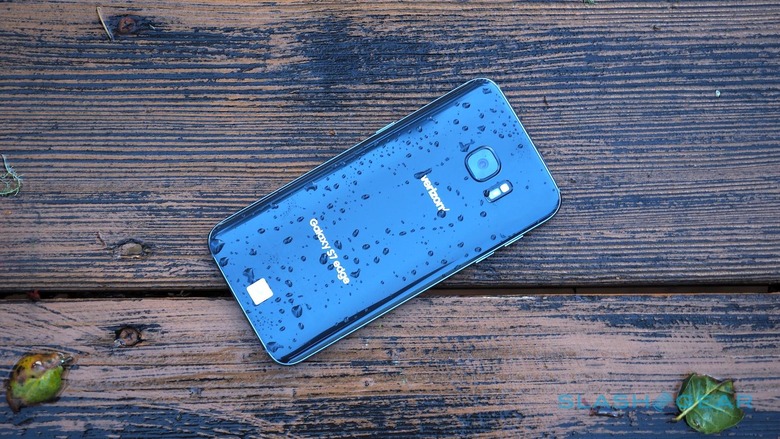
Samsung's days of plastic are long behind it. Instead, there's Gorilla Glass 4, smooth metal, and an overall premium feeling that you'd expect from a flagship in 2016. Just make sure there's a cloth to hand, since the shiny body has a real appetite for fingerprints.
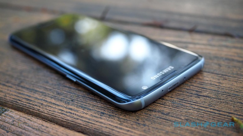
Overall, Samsung has pared back the Galaxy S7 range from the trio of its predecessor to just two devices. Whereas before we had the S6, S6 edge, and S6 edge+, now if you want a curved screen you need to have a bigger one, too.
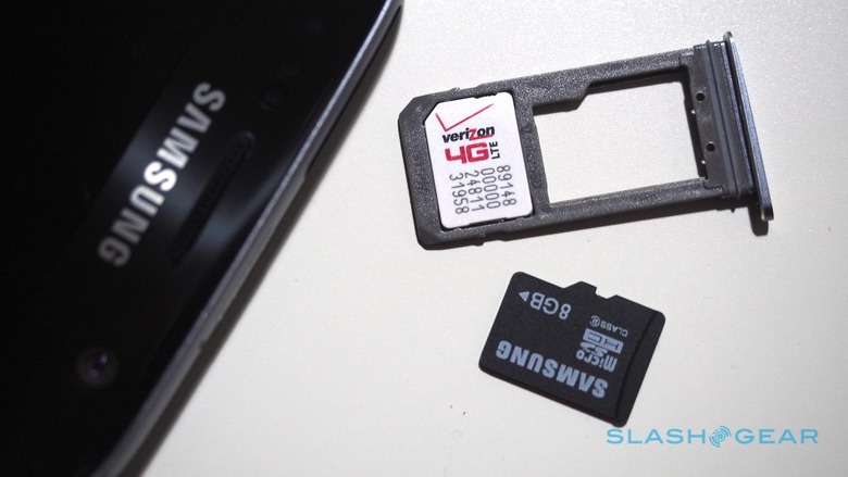
On the top edge there's a tray that now serves double-duty: it's where you slot both the nanoSIM card and, making a welcome return, a microSD card. With Samsung only offering the 32GB model in the US, the fact that you can add up to 200GB via a memory card is likely to be a welcome improvement over the old phone.
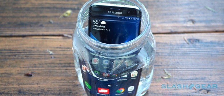
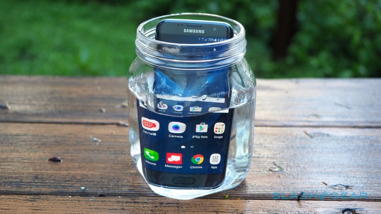
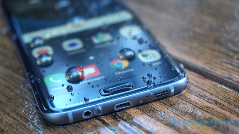
The same could probably be said for the IP68 waterproofing, which means the S7 edge can handle immersion in more than a meter of water. It's something people loved about the Galaxy S5 but which was dropped as a feature for the S6 series.
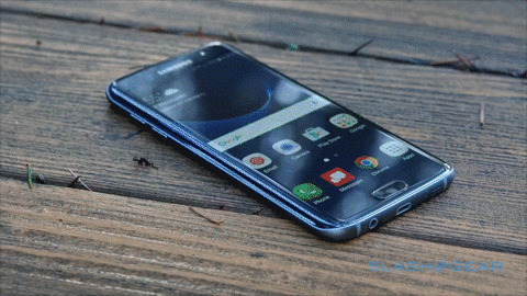
One potential cause for concern is chipping along the side bezel. I've not noticed any particular scratching during the time with my review sample, but it didn't take long for the S6 edge to pick up a notch or two, and I'll be watching closely to see if the same can be said of the S7 edge.
Display and Specifications
With its minimal bezels and hand-fooling taper, the 5.5-inch AMOLED display feels smaller than it actually is, however. At Quad HD resolution – the same as on the S7, though at a slightly lower pixel density due to the larger size – you'd need better eyesight than I to make out individual pixels.
Meanwhile, colors pop and blacks are darker than a book of Edgar Allan Poe's poetry.
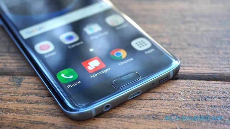
Samsung suggests that the curved edges have a benefit while watching movies with the phone in landscape orientation. Honestly, I'm not sure I've noticed the same, though I have found that webpages and apps that push their content right to the edges of the screen can be a little more difficult to consume thanks to a modicum of visual aberration.
Along the bottom of the phone there's a microUSB port – no USB-C, Samsung telling me it doesn't believe the market is quite ready for that – together with a headphone jack and a mono speaker. The latter may not have much room to play with but it's fairly loud.
Processor and Android Marshmallow
As before, Samsung is hedging its bets with chipsets: US phones, like the Verizon-spec model I'm reviewing here, have Qualcomm's Snapdragon 820. Their counterparts in Europe, meanwhile, have one of Samsung's own Exynos processors.
Samsung says that the performance difference between the two quadcores is negligible: the important thing is that they're both paired with a healthy 4GB of LPDDR4 memory. You also get Vulkan API support, which will be useful once the first games to use the new graphics technology start springing up.
Most of the time I had little to complain about the S7 edge's performance. For the greater part of my testing, it proved fast and difficult to phase.
Unfortunately a few intermittent blips prevented it from being an entirely clean record. I'm not sure what's causing the S7 edge to occasionally stutter and hiccup – it was often during simple navigation, and you'd assume the UI wasn't especially taxing on the CPU or GPU – but it was conspicuous when it took place.
Samsung's customizations to Android 6.0.1 Marshmallow are a more restrained TouchWiz than previous versions. The color scheme and iconography are still changed, but there's less bloatware. Many of Samsung's odder tweaks are still present, but you have to go looking for them in the settings. Unfortunately Verizon's bloatware is far more obvious, a folder full of apps with several shortcuts escaping out onto the homescreen, too.
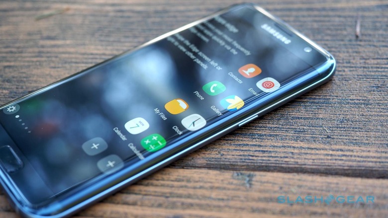
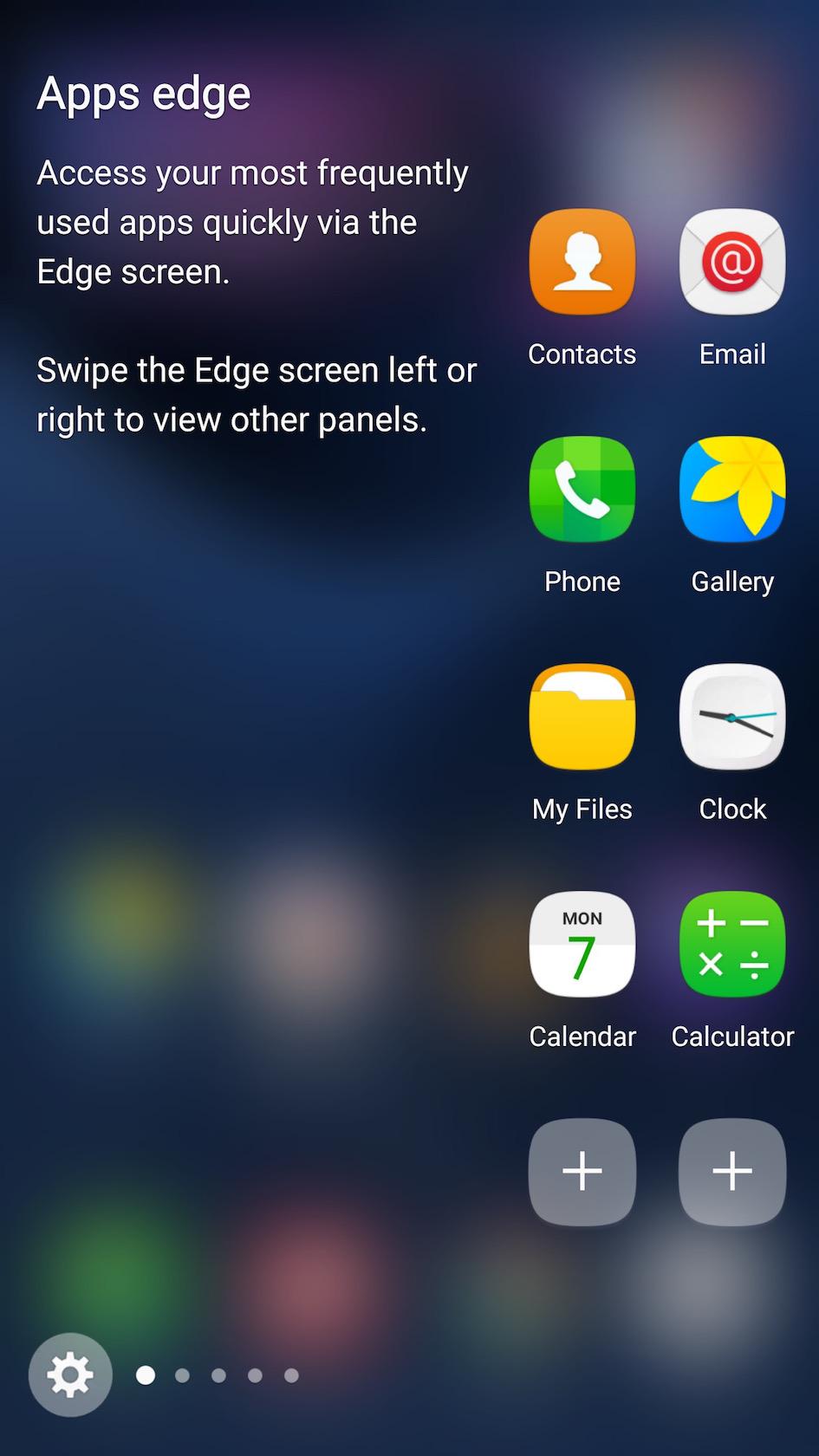
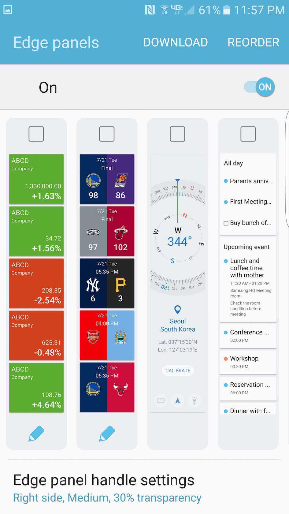
The raison d'être of the curved screen is Samsung's edge interface concept. Swipe a thumb in from the side – you can pick which side, and indeed whereabouts along it the tab falls – and you pull in a shortcut bar.
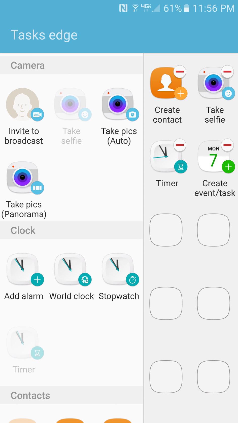
As before, there's an app launcher edge – now with double the slots for apps – and a people edge, but new is the tasks edge which puts a simple to-do list close at hand. The news edge is also new, with thumbnails and headlines of recent stories – by default fed from Yahoo – which open up to show the full piece when you tap them.
Samsung is opening up the edge system to third-party developers, though currently the pickings are slim. There's a compass edge and a sports score edge, along with a stock ticker.
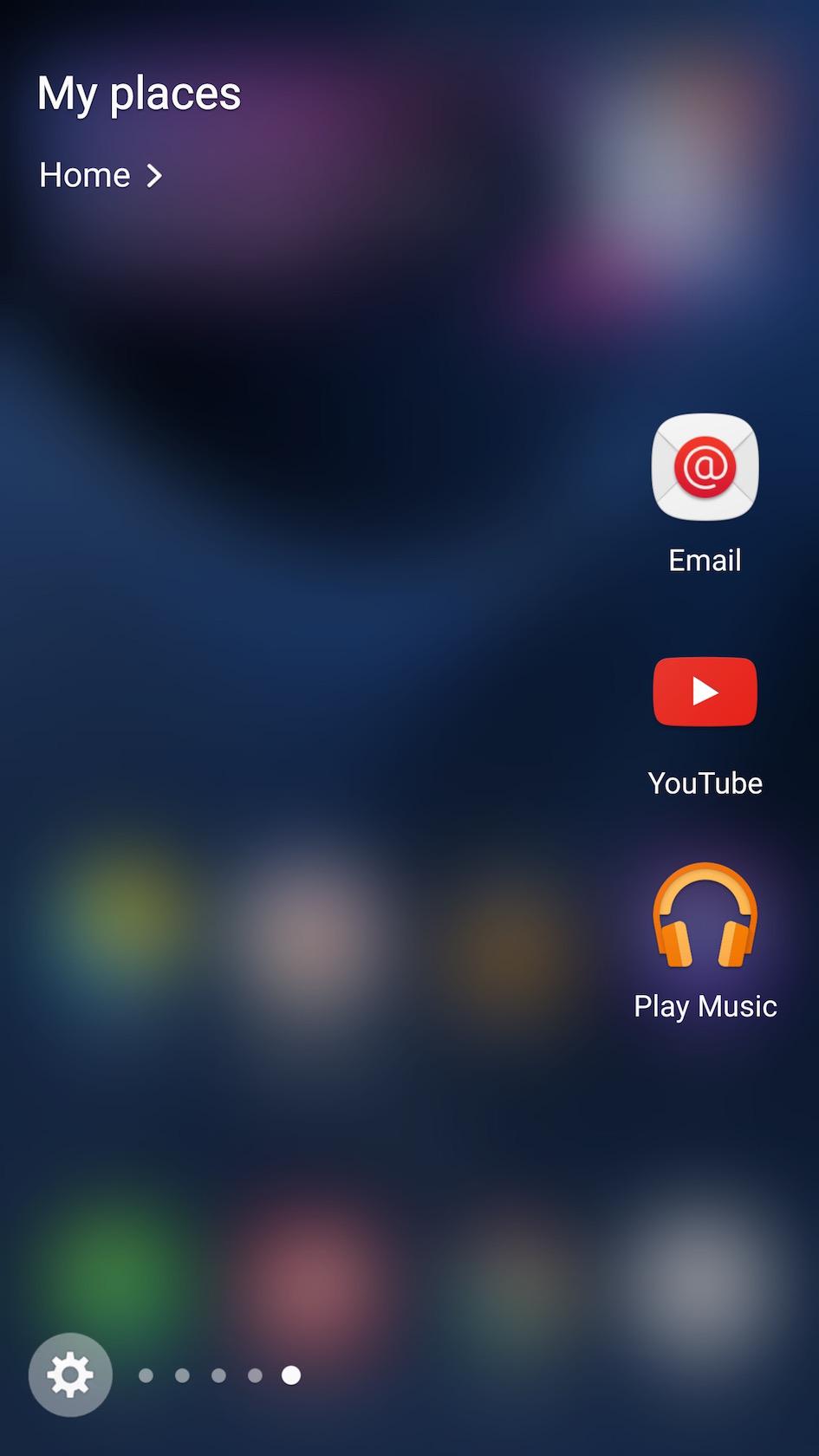
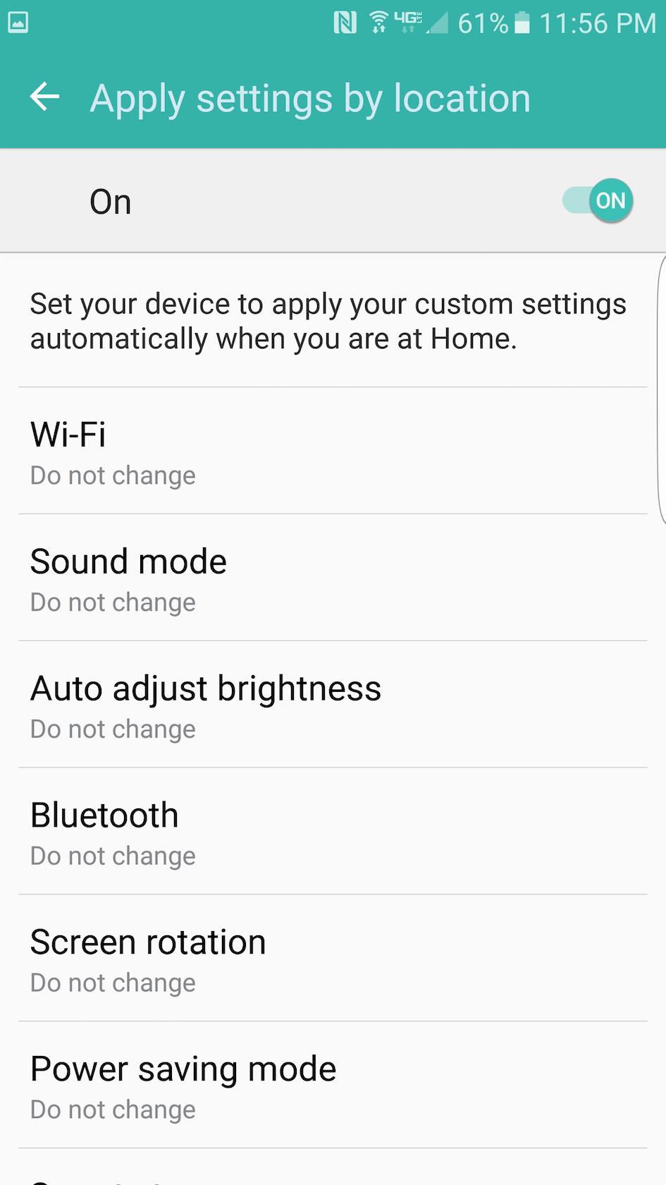
Possibly most useful is the My Places edge. That automatically recognizes when you're at home and when you're at work, and switches the app shortcuts you see depending on your location. So, if you're at the office you might have your email as a shortcut, but if you're at home it could be Netflix instead.
It's also possible to use My Places to do macro-style settings changes. Turning on WiFi, for instance, or switching sound mode. You can even have it automatically send an SMS to a preset contact when you reach that location.
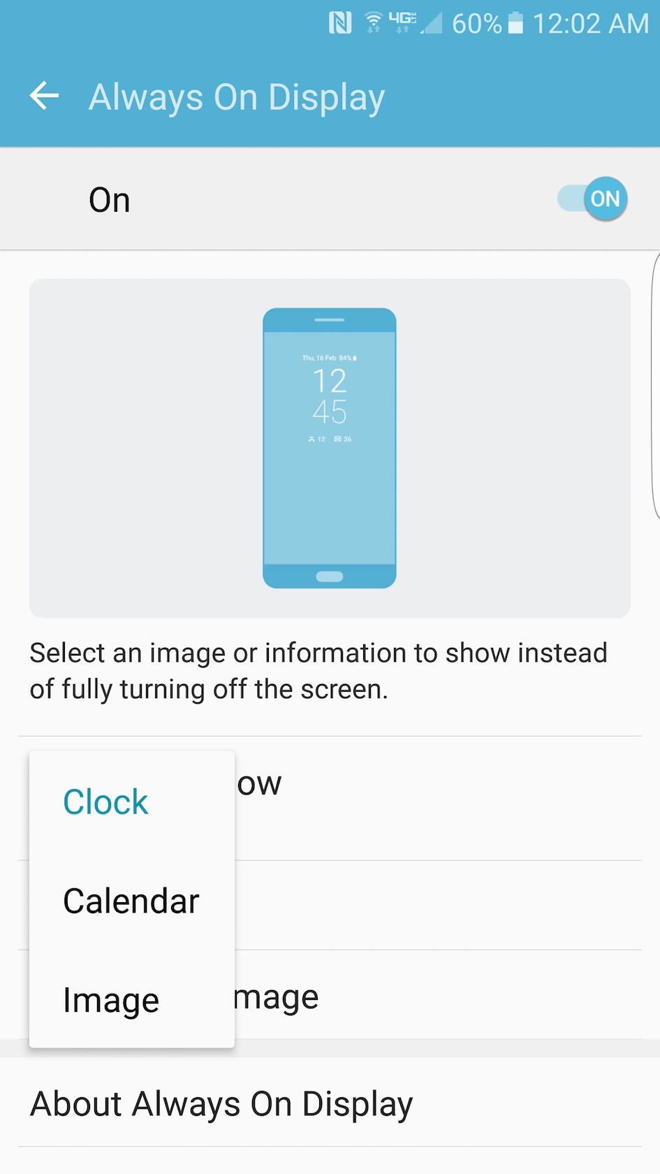
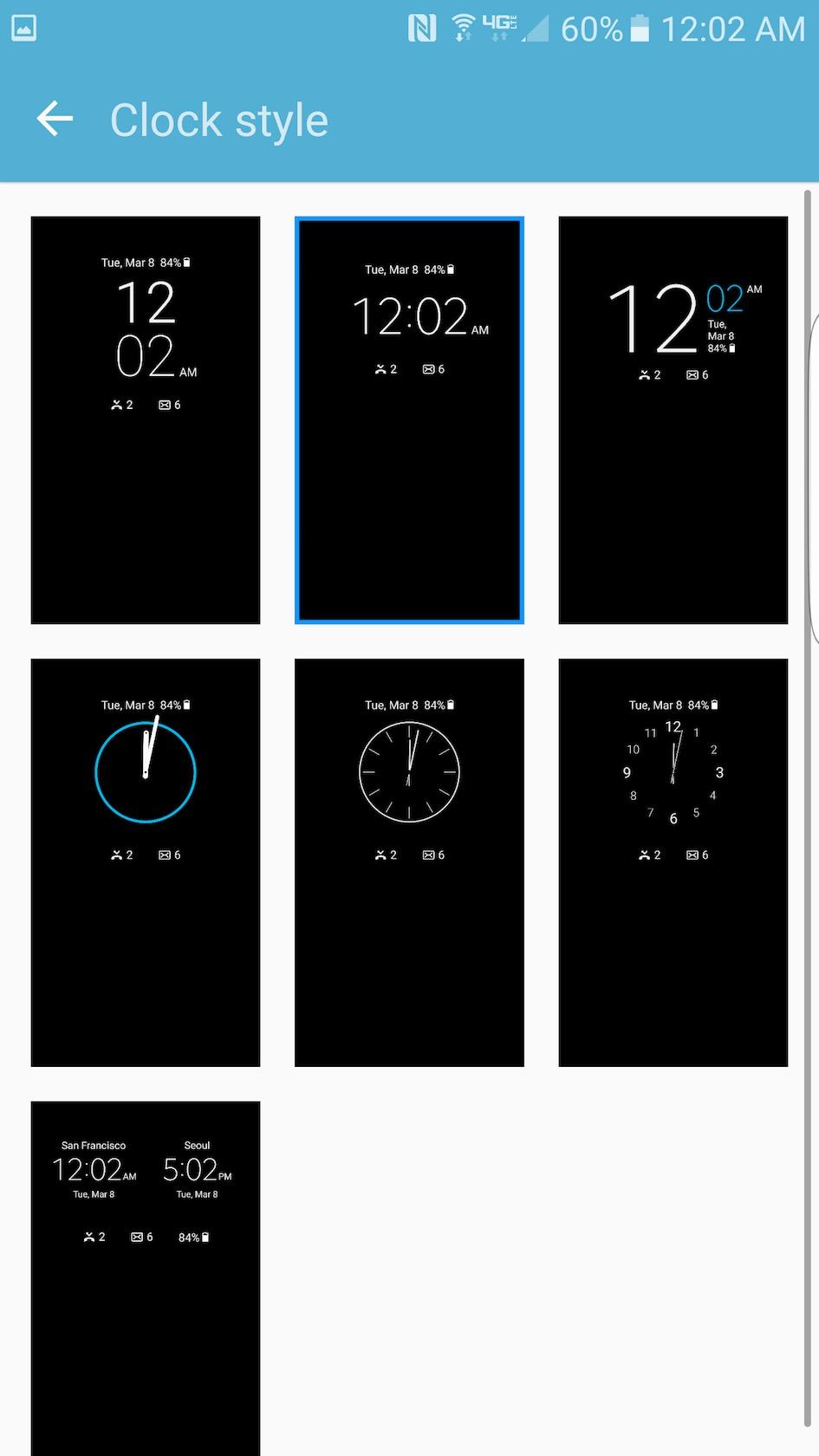
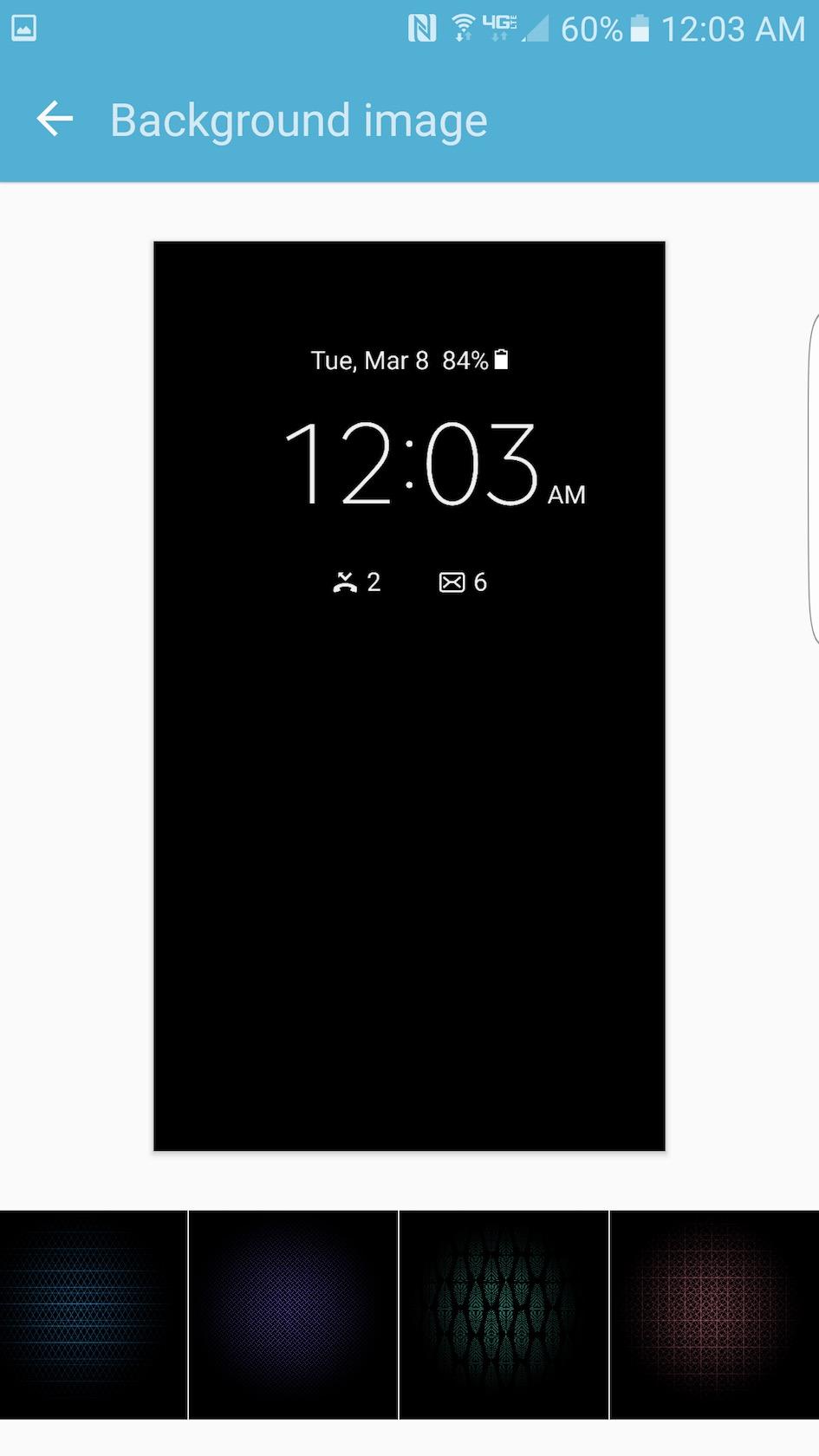
The new feature the company is most proud of is the always-on display. Since you can selectively power up a chunk of your AMOLED panel without fueling the whole thing, Samsung uses that to light a section with either the time and date, a calendar, or some simple graphics, complete with a count of recent notifications.
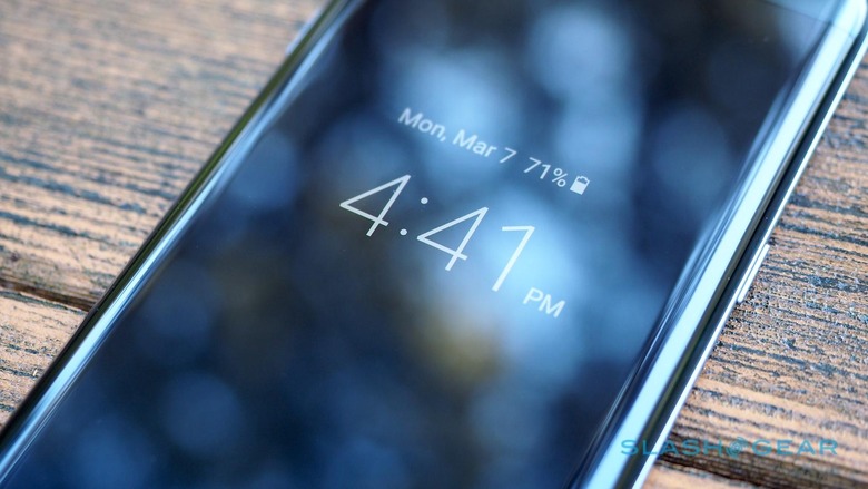
I like the idea – I liked it back when Nokia did it on the Lumia series, in fact – but I'm not convinced by Samsung's implementation. For a start the content is basic: you get a choice of one clock or two, to cover two different timezones, or a simple date grid that doesn't serve up your calendar and can't be swiped to show months other than the current one.
Worse, the notifications support is tremendously basic. You get a count of missed calls, new texts, and new email, but only if you're using the native apps for each. If your social interactions are done through Hangouts and Outlook, for instance, there'll be nothing on the always-on display to say there are new conversations awaiting you.
More worryingly, though Samsung told me it expects the always-on display to use around 1-percent of power per hour – less, considerably, than you'd waste repeatedly turning the screen on and off fully to check for missed notifications, something Samsung's research says we do hundreds of times a day – I found it to be more greedy on the S7 edge.
As with the Galaxy S7, there's an omnidirectional, tap-based fingerprint reader in the home button. I had no problems getting it to recognize me consistently, and it'll get even more useful as more Marshmallow apps tap into Google's APIs to integrate it with their own security.
Camera
The S7 and S7 edge share the same camera system, and it needs a little explaining because – on paper at least – you could see it as a step backward.
Rather than the 16-megapixels of the S6 and Note 5, the Galaxy S7 and S7 edge gets 12-megapixels. The difference is that they're each physically larger than before, and combined with an f/1.7 lens. Both improve the amount of light that makes it through to the sensor, and thus Samsung claims a big improvement in low-light performance.
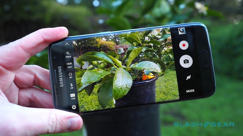
There's a second advantage, too. Samsung calls it dual-pixel, and it basically involves each pixel having not one but two photodiodes. That allows for phase-detection autofocus – aka "very fast autofocus indeed" – across the entire sensor, something you'd usually need a DSLR for, for both stills and video.
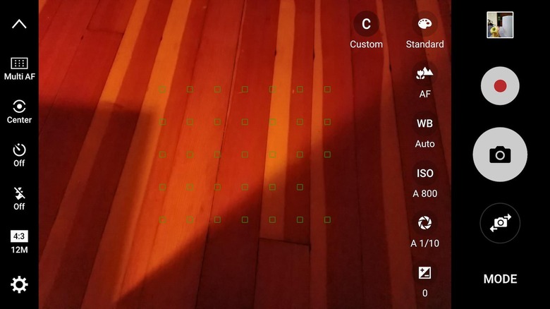
The result is quick: pretty much you tap on the screen and you're instantly focused. You notice the difference more in lower light conditions, where there's less of the hunting that some rival phones suffer from.
Samsung offers a variety of modes, from basic Auto and Pro – the latter with more control over variables like exposure – through panoramas, a Food mode which blurs all but the plate-shaped central portion of the frame, Hyperlapse, and Live Broadcast for streaming direct to YouTube.
Pro mode is also where you'll find the ability to capture in RAW as well as JPEG.
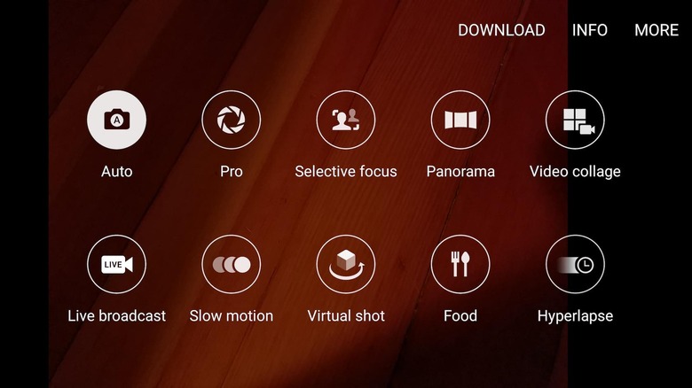
Shots themselves are impressive, particularly when light is in short supply. The dual-pixel autofocus system still struggled somewhat to keep up with Penelope, my cat, at times, but it made shooting close-ups of leaves easy, even though they were swaying in the wind.
Samsung's processing takes a more enthusiastic brush to the colors, but not in an unpleasant way. Regular days come out looking brighter, with punchier skies and more saturated greens. You could certainly tone all that down in-camera if you wished.
[gallerybanner p="430613"]
As for video, there's optical image stabilization and up to 4K recording support, though if you max out the resolution you do miss out on some of the extras: HDR video, tracking autofocus, and real-time effects all refuse to work when you're in the UHD, QHD, or FHD (60fps) modes.
After shooting a ten minute 4K video recording – at which point you run into the S7 edge's limit, and have to start a new clip – the phone was noticeably toasty to the touch.
Battery
Looking at the Galaxy S7 edge, you'd ask yourself where Samsung has found space for a 3,600 mAh battery. Certainly, the S6 edge before it only managed 2,600 mAh, and even the S6 edge+ topped out at 3,020 mAh.
It may not be removable, but the battery supports both Fast Charging and Fast Wireless Charging which – given the waterproofing – I'm content to compromise on.
Actual runtimes, mind, haven't been earth-shattering. The Galaxy S7 edge made it through the day, certainly, with my usual mixture of email, messaging, browsing, some Spotify streaming, and Google Maps use, but if you're hoping for two solid days you'll be disappointed.
Android Doze does do its level best to minimize idle power consumption, and there's a power saving mode of Samsung's own design that can be turned on when the battery gage is perilously low. Still, figure on a nightly recharge.
Wrap-Up
While the aesthetic and purely geeky charms of the Galaxy S6 edge weren't lost on me, I was never really convinced by it functionally. It felt like Samsung had put more effort into figuring out how to make the double-curved display than it had practical uses for it.
NOW READ: Samsung Galaxy S7 Review
That situation has improved some with the Galaxy S7 edge, though there's still no single, killer reason for why you should want a curved screen. The edge panel enhancements are moderate and it's too soon to say whether developers will embrace it with third-party content. The extra size over the regular S7 is nice, at times, like when you're browsing the web or watching video, but there's no denying that the smaller phone fits the hand – and the pocket – more neatly.
It pretty much leaves us with lust again, not an emotion to be underestimated but that, if I'm honest, I'd prefer to see the Galaxy S7 edge not have to rely on quite so much. Samsung has made a fantastic phone, but there are only really style reasons to opt for this over the Galaxy S7. Not the worst reason in the world, but I can't help but feel like the potential of the Galaxy S7 edge is for so much more.
[gallerybanner p="430637"]
