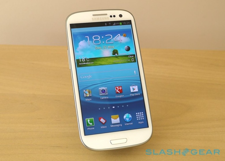
Samsung Galaxy S III Review
If there's such a thing as heritage in the relatively fledgling world of smartphones, the Samsung Galaxy S III has it. Seldom does a phone – at least, one not wearing an Apple logo – arrive to so many expectations, and this time around Samsung even managed to match its Cupertino rival for pre-launch hype, rumor and intrigue. If the original Galaxy S convinced us Samsung could indeed be a top-tier player, and the Galaxy S II played an instrumental role in overshadowing the rest of the Android ecosystem, then we probably won't be satisfied until the Galaxy S III trounces every other handset on the market. The Korean firm has the ambition, certainly, but does it have the device to do it? Read on for the full SlashGear review.
Design
Contentious. There's not much better a word to describe the Galaxy S III's aesthetic, one of the more hotly discussed elements of the third-generation flagship in the run-up to its launch, and perhaps the most divisive afterwards. Hopes were high that Samsung might break with tradition and opt for more premium materials for its casing, even whispers of a ceramic body (subsequently traced back to a poorly-translated South Korean report that referenced an early "ceramic white" color option).
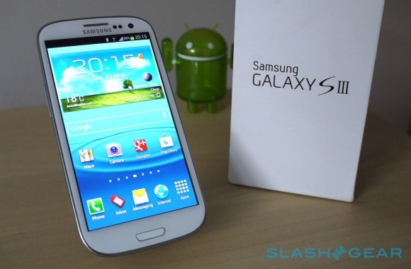
Those hopes were dashed when Samsung revealed the new phone earlier this month. It's resolutely plastic, albeit with a lacquer that, the designers claim, makes it more resilient to scratches and give it a somewhat "pottery glaze" feel. Perhaps we don't spend sufficient time in Korean tea ceremonies, but it feels like regular glossy polycarbonate to us. Samsung offers white and blue versions, each with a strip of silver trim around the bezel and a Gorilla Glass fascia.
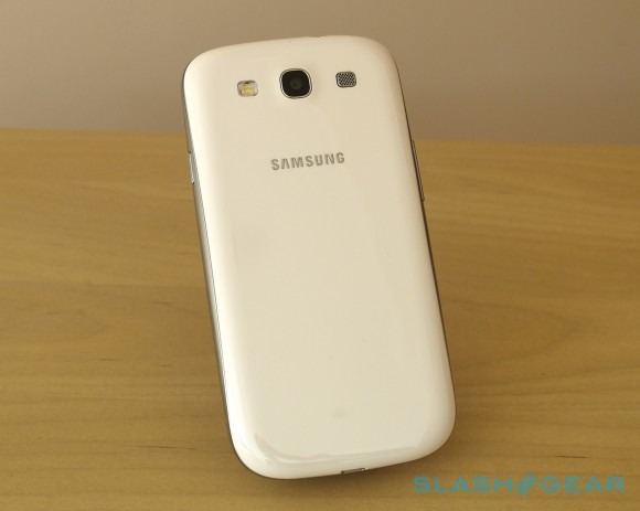
Is it going to break in your hand? Probably not, and though the back cover flexes considerably when pulled off the phone, it's sturdily held in place when attached. Does it feel cheap? That probably depends on what you're coming from: if it's an iPhone 4S or an HTC One X, then yes, there's a strong possibility that the glossy plastic of the Samsung will prove a tactile disappointment. Those stepping up from the Galaxy S II, however, will find a more cohesive design in the hand, with fewer contrasting textures.
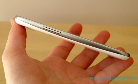
What first seems a simplistic design – reminiscent of a bar of soap, particularly with our white review unit – makes more sense as you live with it. There's no ridge on the lower back section, unlike the Galaxy S II and Galaxy Nexus, which means it feels slimmer than its 8.6mm thickness (just 0.3mm thinner than the Nexus, but a fair difference from the Galaxy S II which is 9.89mm at its fattest point). The curve of the corners has a shallower radius than on the Nexus, too, which helps the new phone feel softer and more comfortable when you grip it.
[aquote]It's not a daring aesthetic: there's no eye-catching experimentation[/aquote]
It's not a daring aesthetic, then – there's no eye-catching experimentation with the polycarbonate, as with Nokia's Windows Phones, for instance – but then Samsung probably didn't need it to be. This is a phone for the high-end mass market, and one which has already had time to cement its brand recognition: it doesn't need to surprise to gain market share, only turn up on the shelf in as inoffensive way as possible. We've tried to avoid dropping our review handset, but it's no worse the wear for a couple of trips in our pockets alongside keys and coins, and while fingerprint-prone it sheds grease and smears with a quick wipe.
There's an easily pressed volume rocker on the left edge and a power button on the right, while the 3.5mm headphone jack is on the top and the microUSB port on the bottom. The needle-punched slit of an earpiece sits in a silvery strip next to light sensors and a front-facing camera, with a multicolor LED indicator light hiding under the bezel on the other side. Two microphones, one on top and one on bottom, give themselves away with pinpricks, while the rear camera sits between an LED flash and a square speaker grill.
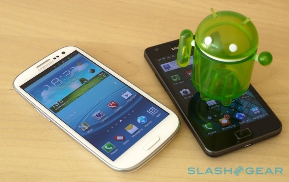
Samsung may have toed the party line with Google's pure Android guidelines on the Galaxy Nexus, but it has strayed from that path with the Galaxy S III. Like HTC, it opted for dedicated buttons rather than the Nexus' virtual Home and other keys. The broad, physical Home button is flanked by touch-sensitive menu and back keys, eschewing Google's preferred app-switcher shortcut. That feature is triggered by a long-press on the Home button (double-pressing it loads up S-Voice, more on which later), familiar to anyone upgrading from the Galaxy S II.
Video Review
[vms 18a679e48b31c72c30de]
Hardware
If the Galaxy S III runs the risk of being outwardly mundane, no such accusation can be leveled at its specifications. Just as its predecessor re-wrote the rulebook on what a top-tier smartphone should deliver, so does the new device push the envelope of today, the perfect showcase for Samsung's prodigious component manufacturing infrastructure.
Most obvious is the display, a step up to 4.8-inches and 1280 x 720 resolution from the 4.3-inch 800 x 480 of before. That puts Samsung on a par with the HTC One X and gives it more pixels than Apple's recent iPhones, though their physically smaller screens mean the Galaxy S III can't match the pixel density (around 306ppi versus the 4S' 326ppi).
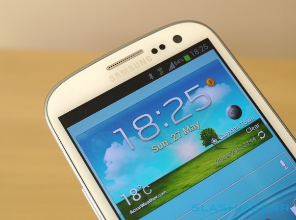
It's not that aspect of the pixels that has been prompting discussion, though, but Samsung's decision – forced, to be fair, by the current state of technology and the lacking availability of alternatives – to use a PenTile panel. PenTile, for those who have (wisely) steered clear of the Great Display Technology Debates of recent years, is basically a patented system of sub-pixel arrangement where green pixels are interleaved with alternating red and blue pixels.
Advocates argue it makes for a brighter screen at lower power levels, because it takes advantage of the human eye's greater sensitive to the color green. Critics claim PenTile panels have more obvious sub-pixel structures leading to visible grittiness or grain, or indeed blurring to text, particularly when the background is a strongly-saturated color.
The good news is that, despite being a Super AMOLED HD screen (rather than the non-PenTile Super AMOLED Plus that Samsung also makes, only not yet in 4.8-inch 720p form), the Galaxy S III is a treat to the eyes. Colors are bright and vivid; text is clean and readable. Go hunting for PenTile's flaws – slap the Samsung under a microscope, for instance, if you have access and inclination – and you'll unsurprisingly find them, but most owners will be content to bypass lab equipment and instead enjoy the broad viewing angles and generally premium feel.
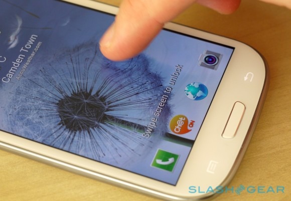
They might be tempted to fiddle with the brightness control, however. Samsung may have outfitted the Galaxy S III with one of the largest smartphone batteries around – 2,100 mAh, only 400 mAh smaller than the phone/tablet hybrid Galaxy Note – but it hasn't been able to resist a draconian auto-brightness regime that leaves the new phone noticeably dim for much of the time. Unfortunately there doesn't appear to be a way to avoid that, bar turning off the automatic adjustment altogether; while "Screen power saving" is a part of the optional Power Saving mode that's activated by default, toggling it off made no apparent difference.
[aquote]When the brightness is manually ramped up, it's a deeply immersive display[/aquote]
When the brightness is manually ramped up, it's a deeply immersive display. Direct sunlight in outdoor situations is still enough to all but overwhelm it – you can usually make out Caller ID, but navigating anything more complex requires a shading hand – but everywhere else it's plenty vivid. Is it better than a great Super LCD 2 panel such as on the One X? They're arguably more on a par now than the two technologies have ever been before, with the AMOLED tending as usual to some over-saturation in color that can admittedly be tweaked using the temperature options Samsung provides.
The other headline feature is the processor, Samsung following the quadcore crowd with a new chipset of its own. The Exynos 4 Quad runs at 1.4GHz, is built on power-saving 32nm processes, and throws in an ARM Mali-400 quadcore GPU too. That's for European models at least, set to be the first to market. In the US, among other places, Samsung will offer a version of the Galaxy S III with a Qualcomm Snapdragon S4 dualcore, itself a chip that, despite being short on cores, has nonetheless done a great job besting benchmarks.
Connectivity includes HSPA+ 21Mbps and GSM/EDGE, at least in our European model. In the US, there are likely to be a pair of models, most likely a GSM/HSPA+/LTE version alongside a CDMA/LTE device; it's that LTE requirement that forces the Snapdragon inclusion. Samsung US spokespeople told us back at the Galaxy S III launch that they were looking to be less profligate with their carrier-specific models; whether that means a faster update cycle as new versions of Android emerge – or, indeed, fewer silly names as Verizon, AT&T and the rest attempt to rebrand the Samsung to the umpteenth degree – remains to be seen.
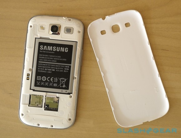
Elsewhere, there's WiFI a/b/g/n with support for WiFi Direct, Bluetooth 4.0, NFC, and MHL-HDMI output on the microUSB port. Peel off the back cover and, alongside the microSIM slot, there's a microSD slot too, happy with up to 64GB microSDXC cards. That way, owners will be able to take the Galaxy S III up to as much as 128GB of storage, assuming they pick hold off for the 64GB model that's due to follow on shortly after the cheaper 16GB and 32GB versions that will launch first. Of the 16GB in our review unit, 11.35GB was free for apps and data, and with the right microUSB to USB port adapter – not included – you can also mount external USB memory sticks.
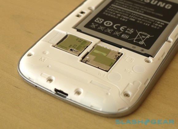
GPS, aGPS and GLONASS, together with a barometer, digital compass, accelerometer and a light sensor are all onboard. We had no problems getting a location fix in Google Maps, with none of the "Searching for GPS" lag forcing us to wait. Samsung's NFC uses a special battery with the NFC chip integrated, rather than building it into the phone itself, just as with the Galaxy Note; there'll be a special Olympics 2012 Galaxy S III using Visa payWave mobile payments, though there's no word yet on which payment providers will be supporting the regular handset.
[aquote]The Galaxy S III doesn't shirk on photographic specs[/aquote]
The Galaxy S II was known for its photographic abilities, and the Galaxy S III doesn't shirk on specs there. Unlike the 5-megapixel Galaxy Nexus, there's an 8-megapixel main camera with autofocus, Full HD 1080p video recording and an LED flash on the back, together with a 1.9-megapixel front-facing camera for video calls and vanity shots.
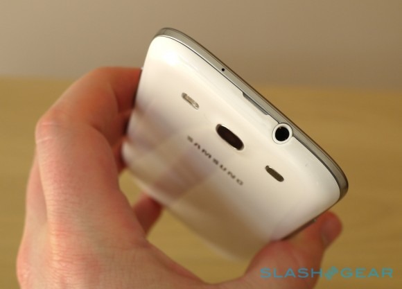
Samsung prompted a minor uproar among audio enthusiasts when it dropped the Wolfson DAP from the Galaxy S II, having previously included it in the original Galaxy S. That's apparently been rectified for the third-gen model, with early hands-on reports revealing a Wolfson Micro WM1811 DAC onboard for improved audio output. It'll obviously need high-bitrate or, preferably, lossless audio files in order to shine, however; Samsung's bundled wired headphones are surprisingly good when fed with 320kbps MP3s or lossless tracks, but throw in a decent aftermarket set and the Galaxy S III can really shine. It's worth noting that there's apt-X Bluetooth support, too, for higher-quality wireless audio (if you have compatible headphones), along with an FM radio, though that requires a wired headset to act as the antenna.
Software
Samsung can't help but fiddle when it comes to Android, and so it came as little surprise to see TouchWiz make a reappearance on the Galaxy S III. Gone is the Tron-esque black and electric blue of Android 4.0 Ice Cream Sandwich, redressed in Samsung's new Nature UX that according to the marketers is "designed for humans, inspired by nature."
TouchWiz was, to be blunt, a major sticking point on the last Galaxy flagship. The S II's UI felt cartoon-like and almost cheap, with gaudy icons that undermined the handset's prestige; that the dualcore CPU turned out to be so well suited to overclocking meant it was a popular target for unofficial Android ROMs.
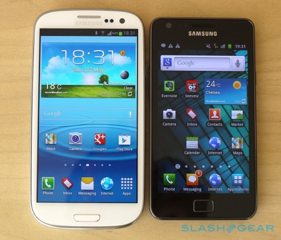
This new iteration of TouchWiz, however, is a considerable improvement. The iconography and widgets are less childish, while the somber black backgrounds only show up when you're digging through the settings pages, rather than turning the app launcher into a drab, uninspiring place. Instead, there's movement and sound inspired, as Samsung insists, by more natural elements. So, the lockscreen is now a shimmering pool of water, playing what Samsung claims are real recordings of droplets as you tap your fingers across it, while the wallpaper is carried over from the seven-pane homescreen to the app launcher too.
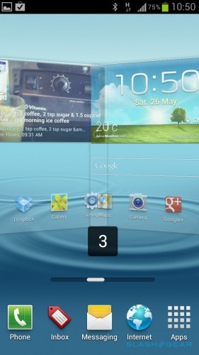
As on native Ice Cream Sandwich, there are four shortcuts running persistently along the bottom of the homescreen (and an app launcher button), then a 4x4 grid for icons and anything else up above. We wouldn't have argued with the extra column of icons found on the Galaxy Note, but it's no significant drawback. New icons and widgets can be added either by tapping and holding from the app launcher or via a long-press on the homescreen.
Oddly, the only way we've found to change the persistent shortcuts is by first dragging icons to a regular homescreen pane and then pulling them across to the bar along the bottom. Similarly, you can't create a folder by dropping one icon on top of another; instead, you have to manually create the folder via a long-press menu, and then drop icons into it. We wish we could change Samsung's default messaging icons, too: the SMS icon is particularly similar to the Gmail icon – they're basically the same shape but slightly different in size – rather than the default speech-bubble icon base Android uses for texts.
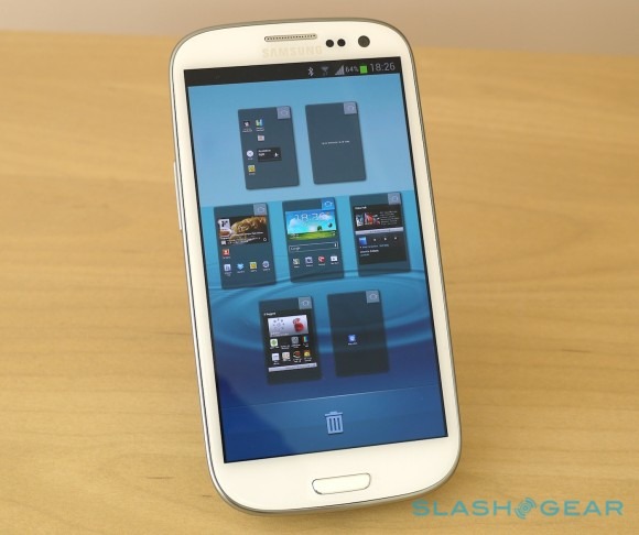
On the flip-side, there are some improvements brought by TouchWiz too. The drop-down notification pane not only has a shortcut to the settings pages, but a side-swiping row of toggles for WiFi, GPS, sound (cycling through on, vibrate and mute), screen rotation, Power Saving mode (which throttles the CPU, changes the background color in the email app and browser so as to save battery, and shuts off haptic feedback), [aquote]There are some improvements brought by TouchWiz too[/aquote]notifications mute, mobile data, Bluetooth, Driving Mode, and data sync. The pinch-zoom view of all homescreen panes has returned, having been dropped from pure Ice Cream Sandwich, and you can now optionally have a battery percentage next to the regular icon in the status bar.

In the app launcher, there's now the option to hide icons rather than fully uninstall them. That should come into its own when carrier-modified versions of the Galaxy S III reach the market, complete with the inevitable preloaded and unremovable crapware networks love to include. The lockscreen has four (customizable) shortcuts, triggered with a swipe up from the icon – you have to dig through into the security settings page to actually change them – as well as including direct access to new text messages and missed calls. Optionally, it can show weather and a news/stock ticker.
There are some new widgets, too, ranging from simple toggles for mono audio, negative colors and an "assistive light" that uses the LED flash as an impromptu torch (all surprisingly 2x1 blocks, where they could easily be single icon sized), to a Video Player that plays clips directly from the homescreen, the S Memo notes block carried over from the Galaxy Note, a Game Hub and several S Planner calendar widgets, including month and task views. Thanks to a temporary exclusivity deal – already undermined thanks to some judicious leaking of the APK installation file – there's the new Flipboard for Android app preloaded too, with the curated news experience looking great on the Galaxy S III's sizable display.
Another deal sees the app for cloud storage provider Dropbox preloaded on the phone, complete with an extra 48GB for two years on top of the basic 2GB included with every free account. That's twice as much as HTC offers with the One Series, and thanks to Android's proclivity to play nicely with third-party sharing services, actually uploading videos, photos and other content to the cloud is a straightforward matter.
That's not the only way to get media off the Galaxy S III. The most obvious is plugging in via USB, with the smartphone showing up as a regular external drive to Windows machines. We struggled with the Android File Transfer app for Mac, however, which refused to recognize the new Galaxy had been plugged in. Instead, we were left with Kies via WiFi – which connects with Samsung's free PC and Mac Kies Desktop app, used for backing up the phone, installing firmware updates and synching media; as the name suggests, Kies via WiFi allows you to do your synchronizing wirelessly.

However, there's also Kies Air, something we loved on the Galaxy S II, and curiously offered as an optional download from the Play Store for the Galaxy S III rather than coming preinstalled. Kies Air basically sets the smartphone up as a mini-server of sorts, giving you an IP address to punch into another computer on the same WiFi network, and turning a regular browser into comprehensive management window for photos, music, video, calendar, contacts, messaging and more. We're not sure why Samsung isn't opting to preload it still, though since it lacks firmware upgrade functionality it's possible the company is pushing Kies Desktop for that instead.
[aquote]Samsung's "designed for humans" tagline isn't just vague marketing hyperbole[/aquote]
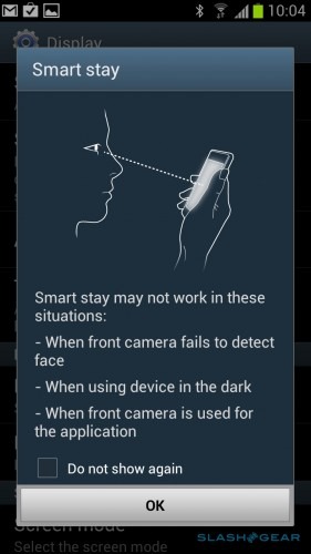
Samsung's "designed for humans" tagline isn't just vague marketing hyperbole: the company has boosted TouchWiz's design changes with some special functionality. As you might expect, it's of varying use. We had mixed success with Smart Stay, which uses the front-facing camera to track when you're looking at the Galaxy S III's display and make sure it doesn't go into standby, even when you've not touched it for a while. Sometimes it worked, but other times we still ended up with a dim screen, despite being dead-center in front of the phone. To be fair, Samsung does warn that it might be confused in low-light conditions, among others.
AllShare Cast and AllShare Play continue Samsung's quest to popularize DLNA streaming, dressing the underlying technology in different ways for screen-sharing and remote file access. AllShare Cast basically puts the Galaxy S III's screen onto your TV, turning it into a media remote or an impromptu games console. You'll obviously need a DLNA-compatible TV – though not necessarily one made by Samsung – on the same home network. As for AllShare Play, that uses a combination of DLNA and WiFi Direct to share photos, music, video and documents from the Galaxy S III to tablets and computers, as well as allowing the smartphone to access such content on those other devices.
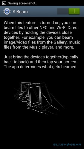
Also using WiFi Direct is S Beam, Samsung's supercharged update to Android Beam. Where Android Beam uses NFC to exchange URLs, contacts, YouTube links, directions and app shortcuts between devices equipped with the short-range wireless, S Beam tweaks it so that NFC is only relied upon for the initial "handshake" between gadgets. Once the impromptu pairing is established, it uses a far faster WiFi Direct link to actually complete the data transfer.
Unfortunately, while Android Beam worked with no issues between the Galaxy S III and a Galaxy Nexus, with only one review unit we were unable to test S Beam. We did, however, try the system at the Galaxy S III's launch, finding it to work as described albeit with a caveat. S Beam is turned on by default, but WiFi Direct is not, and when we first tried it simply gave us an error message regarding establishing the connection. What we'd have liked to have seen is the phone automatically realize we wanted to use WiFi Direct and turn it on itself, or at least take us to the appropriate point in the settings pages so that we could do so manually.
If you've ever been browsing the gallery on your phone and been overcome with the urge to call a friend and tell them "I saw your face and had to be in touch" then Social Tag might appeal. A combination of face recognition and (manual) contacts linking, it automatically picks out faces in photos – or allows you to point them out yourself – and presents you with a list of your contacts from your address book, Facebook and Google+ to link to them.
After that, the Galaxy S III attempts to flag up each appearance of that person with shortcuts to call them or message them, as well as access to their latest social network status. It's a good use of inter-app linking, certainly, but we're not entirely sure how frequently we'd actually want to call people based on seeing them while browsing through our gallery.
Then there are the gesture and sensor-based tweaks. Swipe the edge of your hand across the screen, right to left or vice-versa, and the Galaxy S III takes a screenshot; tilt to zoom/pan within the browser, gallery and when rearranging icons has been carried over from the Galaxy S II. You can also shake to update in compatible apps, rather than digging through the context menu, and as well as flipping the phone face-down to mute or pause it, you can also place your palm over the touchscreen to do the same. The latter is useful during speakerphone calls, when you might want to quickly confer without the caller hearing.
Direct Call automatically rings whatever contact is open in the messaging, contacts or call log apps when you put the phone to your ear, somewhat like a reverse of the screen lock that uses the proximity sensor to turn off the display when you're on a call. Less useful is Smart Alert, which gives the phone a mild buzz when you pick it up if there have been calls, messages or other alerts in the meantime. It's a little too blunt to be practical, though: power-users are likely to be checking their phone regularly anyway, and thus most times they pick up the Galaxy S III it'll be buzzing.
The big question is whether TouchWiz legitimately adds to the Galaxy S III or if Samsung would've done users more of a service by delivering untampered Ice Cream Sandwich instead. There's no doubt that Android 4.0 marked a vast improvement in native UX over earlier iterations, and we're big fans of ICS' simple UI too. Third-party reskins inevitably lead to delays in OS upgrades – and Samsung has a mixed track record for that anyway – while users new to the skin generally have a steeper learning curve.
On the flip side, those coming from an earlier Samsung device should be able to dive straight in, and will probably find at least one or two improvements in the Nature UX that work to their advantage. It's the cleanest version of TouchWiz so far, and while none of the tweaks are earth-shattering, there are undoubtedly several which we could easily see ourselves integrating into daily use. Side-swiping the Samsung on-screen keyboard to quickly flip between letters and numbers/symbols is a good example. In short, it's not the deal-breaker that many felt it was before.
S Voice
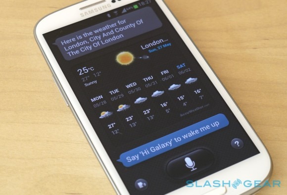
If the Galaxy S III's design is the most contentious point among Samsung fans, S Voice is probably the cause of the most arguments between them and users of Apple's iPhone 4S. The speech command system follows on the heels of Siri, Apple's still-in-beta version, and Samsung did itself no favors with the design of the app itself: the speech bubbles and dominant, flickering microphone key are both strongly reminiscent of Siri's UI, even if not identical, and the company must have known comparisons would be drawn.
[aquote]S Voice bests its rival with the range of commands supported[/aquote]
S Voice bests its rival with the range of commands supported – apps can be opened by voice, unlike on the iPhone 4S, and you can send out Twitter and Facebook status updates courtesy of integration with Samsung's Social Hub – though the basics like setting alarms and timers, calling or messaging contacts, search, triggering music playlists, storing memos and tasks, and programming navigation destinations are all onboard. Like Apple, Samsung queries Wolfram Alpha to answer questions regarding facts, measurement conversions and the like, offering to do a web search if the service doesn't deliver. As all of the speech processing is server-based, you need a web connection to get any answer, even if you're looking for content based on the phone itself.
S Voice demo:
[vms 1bf572b5940d7d9a8fa4]
Unfortunately, just like Siri, the functionality can be hit and miss. There's no one consistent flaw in S Voice, only an overall success ratio that's arguably lower than we've come to expect from smartphone feature performance in general. Misinterpreted questions or commands, sluggish response despite having access to a speedy network connection, and an incomplete answer-base all make for a system you can't rely on 100-percent of the time. The basics generally work as promised – calling a contact (which presents you with any numbers for that contact, and lets you choose from them by voice) and setting alarms or timers were usually hiccup-free – but S Voice often mangled number recognition and queries phrased in more regular terms.
Perhaps the most frustrating is the ability to wake up the Galaxy S III using a spoken instruction – "Hi Galaxy!" by default, but user-customizable. Samsung bills this as a way to access S Voice without even needing to touch the phone, but more times than not it ignored us entirely. Even when we set our own instruction, which requires repeating the chosen phrase until S Voice has four versions it thinks are sufficiently similar, our hit-rate didn't seem to improve.
The good thing is that, with so much of S Voice server-based, Samsung and its voice-recognition partners can continue to finesse the feature over time. It's not clear if, as Apple says of Siri, it learns the style of your speech and becomes more accurate, but hopefully there'll be an uptick in usefulness as early feedback comes through. For the moment, S Voice can be relied on for the basics, but you may find it's quicker to do more complex tasks the old-fashioned, manual way and deign to touch the screen.
Performance
"Maximized processing power and seamless performance" is the Samsung promise, and the Galaxy S III is undoubtedly a powerhouse when it comes to specifications. The outward design may split opinion, but it's hard not to be impressed by what's going on inside the phone: a 1.4GHz quadcore chipset paired with 1GB of RAM (2GB in the upcoming Japanese versions) and performance graphics.
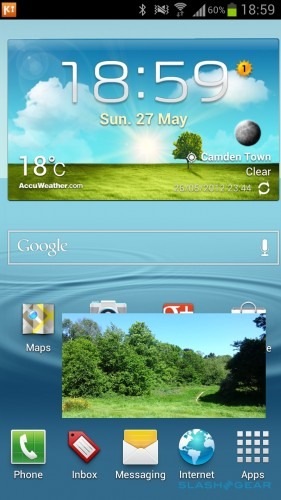
Samsung has even included a feature that seems purpose-made to show off the Galaxy S III's raw grunt, with "Pop up play" detaching a video clip from the media app and floating it in a repositionable box over any other app. It's certainly impressive – we saw zero stuttering or lag even when watching a high bitrate clip and browsing a full webpage simultaneously – but we're not entirely sure how useful it is. Perhaps if Samsung had extended support to video calling, allowing you to continue to see your counterpart while navigating elsewhere in the phone, it would make more sense, but so far it's limited to the video app only.
Still, you see evidence of the Exynos 4 Quad's strength all through the system. From the smooth water-ripples of the lock screen, through to homescreen pane transitions, the way the app launcher surges into life, apps themselves loading with alacrity, and Full HD video playing with nary a blemish or dropped frame, the Galaxy S III is Android at the speed it should be.
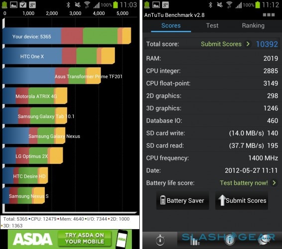
The raw benchmarks back that up. The Galaxy S III scored 5,365 in Quadrant Pro (4,078 in Power Saving mode), putting it neatly ahead of the S4 HTC One X's 4,835 and the Tegra 3 One X's 4,850. In AnTuTu, the Samsung scored 10,392 (AnTuTu got stuck on CPU testing in Power Saving mode and wouldn't complete); it managed 1,441.7ms in the SunSpider 0.9.1 test of JavaScript performance (1,962.0ms when in Power Saving mode).
Camera
Samsung's Galaxy S II made a name for itself as a great camera-phone, and while the Galaxy S III doesn't improve on megapixels, it's still a solid way to take photos and video. The combination of speed and quality are what sing here, the customized camera app loading quickly, shots being taken and stored without lag, and the end-results looking more than impressive. By default there's a camera shortcut on the lockscreen, though you can also turn on a gesture control which loads the app if you keep your finger on the screen and rotate the phone into horizontal orientation.
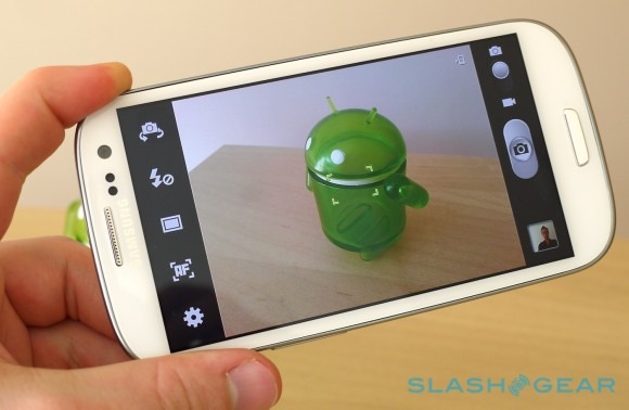
Colors are accurate, though the Galaxy S III does show a tendency to expose the frame more than we'd prefer. You can notch that down manually, but it would be easier if the tap-to-focus also set exposure as well. There are a range of shooting modes, too, including a burst mode that will continue firing off frames for as long as you keep your finger on the shutter release control (there's no dedicated camera shortcut button, unfortunately). Samsung also includes an optional "Best photo" setting which fires off eight pictures in rapid succession and then flags up the one it believes is the best, based on exposure, brightness, whether people have their eyes open and smiles on their faces, and other elements. You can override its decision if you disagree.
Then there's a very usable HDR (High Dynamic Range) mode, which combines several shots at different exposures and thus picks out more detail in brighter and murkier parts of the frame. Sharing rears its head again too, with a Share Shot mode that uses WiFi Direct to instantly squirt across a freshly-taken image to a nearby computer, phone or tablet, and Buddy Photo Share that uses face-recognition to suggest a possible recipient based on who's in the frame.
We've been spoiled in recent weeks by Nokia's 808 PureView, with its lossless digital zoom, but even without such technical prowess – and the accompanying bulk, of course – the Galaxy S III delivers decent crops and close-ups despite the dip in resolution. We wish Samsung would borrow Nokia's clever video zoom control, however, which allows you to pre-control the zoom level and then have the picture reframed when you lift your fingers, rather than the normal pinch-zooming which usually results in over-enlarging and then having to back off again.
1080p HD video sample:
Video in general is only marred by some occasional focus hunting, but otherwise free of shake, jelly-like motion during faster pans, or glitches in general. Up to Full HD 1080p resolution is supported, and the end result looks great, with plenty of detail in the frame. Playback via DLNA streaming using AllShare Cast was strong.
1080p HD video sample:
Phone and Battery
As all-singing, all-dancing multimedia, messaging, browsing, navigating and photographing machines, it's easy to forget that today's smartphones are also, well, phones. All too often voice performance feels like an afterthought, and thankfully that's not the case with the Galaxy S III. Voice calls were clear and crisp, with the earpiece cranking up to background noise-fighting levels, and the speakerphone taking over after that with a fullness and clarity that belies its down-facing position on the rear of the handset. We'd expected it to sound muffled when the Samsung was laid flat, but it doesn't.
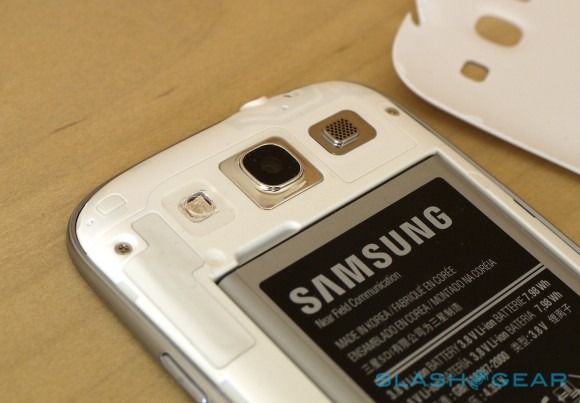
Samsung doesn't talk specifics for its noise cancellation technology, but the dual microphones seem to play their part well and we had no complaints from callers as to how well they could hear us. Not a single dropped call, either, though admittedly that's in the reasonably well covered environs of London. Nonetheless, if you frequently play it old-school and actually ring your friends and family rather than message them, poke them, Tweet them or IM them, the Galaxy S III has you covered.
It also scores points out of the box for its user-accessible battery. We've seen something of a shift among smartphone manufacturers toward sealed battery packs, generally in the name of increasing style and reducing bulk, but Samsung has avoided the temptation. Still, with a quadcore processor under the hood, we did wonder whether the decision was prompted more through fear of owner reprisals after heavily truncated runtimes, rather than for reasons more noble.
[aquote]We needn't have worried about battery life[/aquote]
We needn't have worried. With ample use through the day, including plenty of photography, push Gmail turned on, Google+ and Facebook auto-updating (and, for Google+, uploading new images over a mixture of 3G and WiFi connections), some GPS navigation in Google Maps, some web browsing, a few text messages and a couple of short voice calls, we reached the evening still showing around 20-percent of power left on the handy gage.
Benchmarking while running off AC power, as well as longer periods of video playback and gaming which required the screen be active, unsurprisingly took their toll on the battery. If you want to push the Exynos 4 Quad hard then you have to expect a corresponding hit on runtime. The good news is that, thanks to some judicious throttling – without necessarily showing itself in the actual immediacy of day-to-day use – Samsung does a solid job of balancing potency with longevity.
Accessories
The iPhone's accessory ecosystem is second to none, and so Samsung has done some homework for the Galaxy S III in an attempt to give eager owners something else to buy. Unfortunately, most accessories aren't expected to be available simultaneously with the smartphone's own launch, with the most anticipated – the wireless charging kit – now not due for a few months.
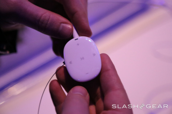
That will use a replacement back cover for the phone and a special desktop dock to wirelessly rejuice it, as we've seen from the Palm Pre and other webOS phones in the past. There's also the S Pebble, a compact MP3 player with 4GB of internal storage and a purported battery life of 17hrs, which can sync music directly with the Galaxy S III via a microUSB to 3.5mm headphone jack cable.
Those making ample use of the Full HD video recording, but who don't have a networked TV with DLNA support, might find the Allcast Share Dongle provides a suitable compromise. A small box hooking up via HDMI, works with AllShare Cast over WiFi on the Galaxy S III to put the phone's display on your big-screen TV, whether you're playing games, browsing the web, flicking through photo galleries or watching video clips.
Finally – beyond the usual array of cases and folios – there's the C-Pen, a capacitive touchscreen stylus for more accurate use as well as sketching and, supported by the Galaxy S III as an alternate input option, handwriting recognition. Unlike the S-Pen of the Galaxy Note, the C-Pen doesn't use the super-accurate Wacom active digitizer technology, the nib merely mimics a fingertip.
We'll review the Samsung Galaxy S III accessories in full when they're available.
Wrap-Up
[aquote]This isn't the epiphany in metal, ceramic and glass we were hoping for[/aquote]
No, this isn't the epiphany in metal, ceramic and glass we were hoping for from Samsung, but if the company had to compromise in some places on the Galaxy S III, we'd rather accept a somewhat plasticky handset with the incredible performance, brilliant screen and great camera than a nicely-dressed dog. We try not to read too much into raw benchmarking, but the day to day experience of the Galaxy S III suggests this is one of the best performing, most usable Android devices around, if not the best.
There's a chance that Samsung's dominance could be relatively short-lived. The iPhone 5 is expected within the next few months, and that will inevitably shake up the smartphone leaderboard. That won't make much difference to the cadre of Android enthusiasts who would never even countenance buying an iOS device, but the mass market – Samsung's bread & butter – could well be swayed. The Galaxy S III has a few months to cement its position, at least – though that depends on how quickly it can bring US models to store shelves – and if you've a taste for big-screen devices then we won't be surprised if your mouth is watering already.
Phrases like "best ever smartphone" are overplayed: the market moves so fast, for a start, and the range of sizes and features out there mean what may be a key priority for you might be a minor quibbling point for someone else. Still, if your phone has become your multimedia and entertainment hub; if you love a sizable display for gaming, browsing, navigation and multimedia; if you demand high-quality photos and video without bulk; and if you want to future-proof yourself over the typical two-year contract, then the Galaxy S III delivers all that in spades. We've a feeling Samsung will discover those are key motivators for many, many buyers, and they're unlikely to be disappointed with the Galaxy S III.
