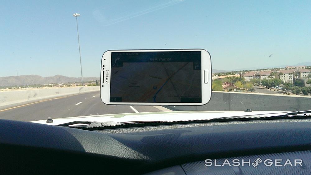
Samsung Galaxy S 4 Review
The Samsung GALAXY S 4 has a tough act to follow. Its best-selling predecessor, the Galaxy S III, is arguably the most well-known of all Android handsets, the strongest competition to Apple's iPhone, and the automatic go-to device for many smartphone shoppers. While the GALAXY S 4 may look, at first glance at least, much like the phone that came before it, in actual fact almost everything has been changed, adding up to a hotlist of in-demanded technology. So, is the GALAXY S 4 more than the sum of its parts, or have recent high-profile devices like the HTC One stolen its thunder? Read on for the SlashGear review.
Hardware and Design
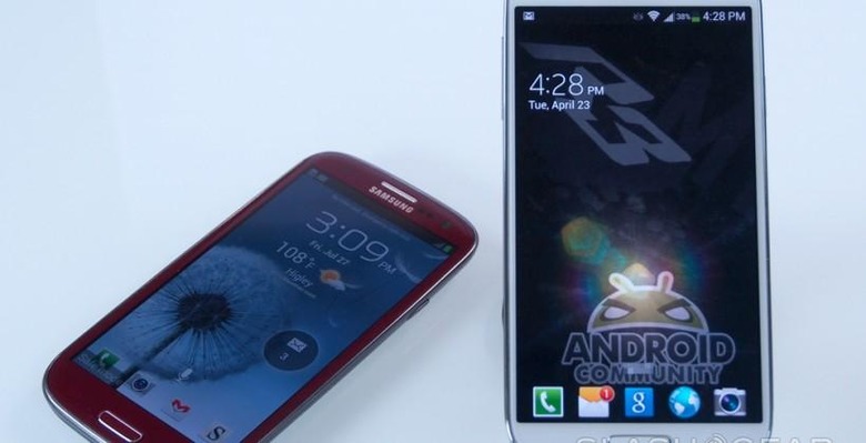
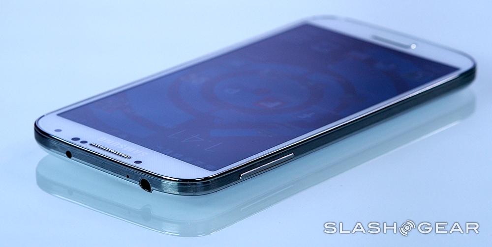
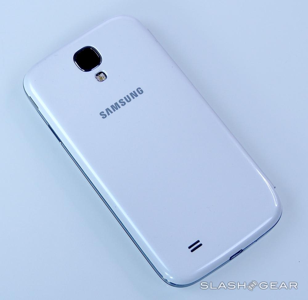
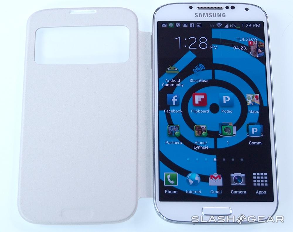
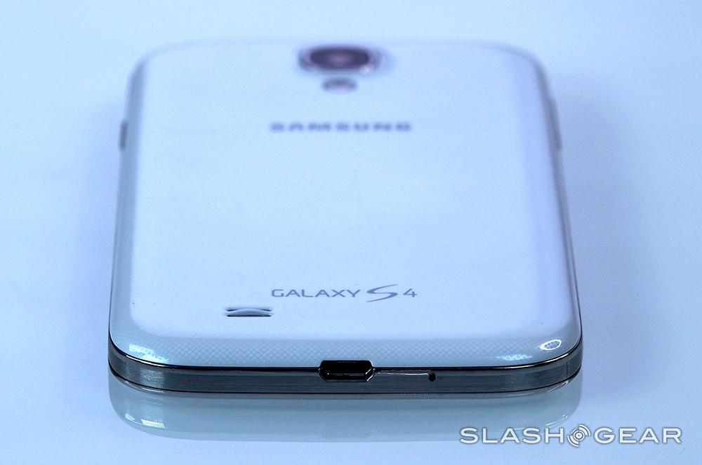
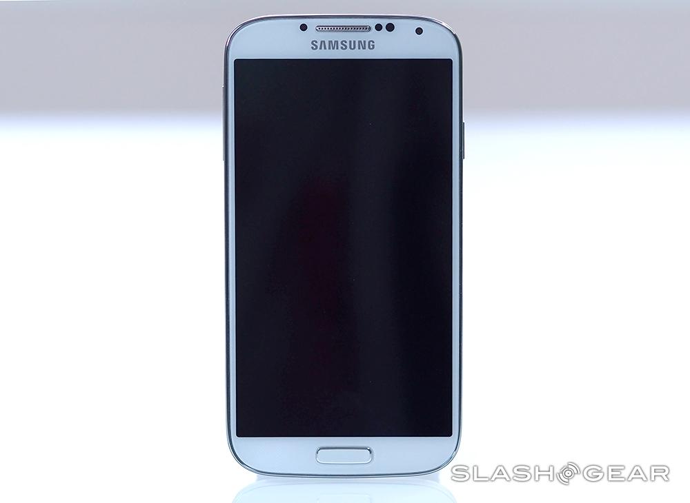
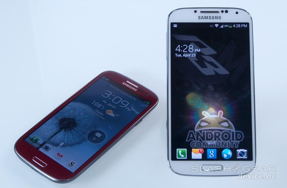
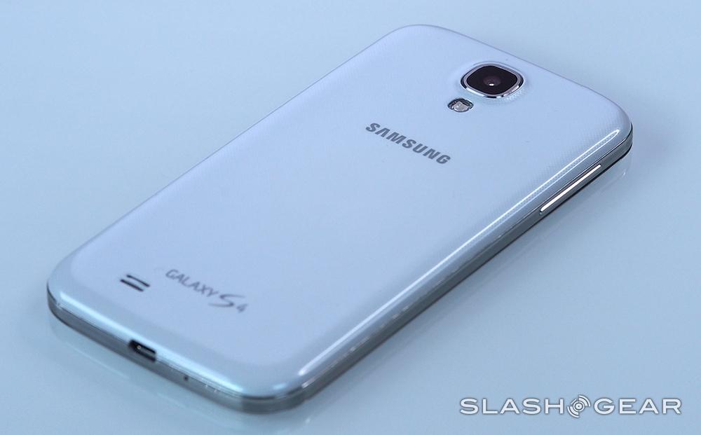
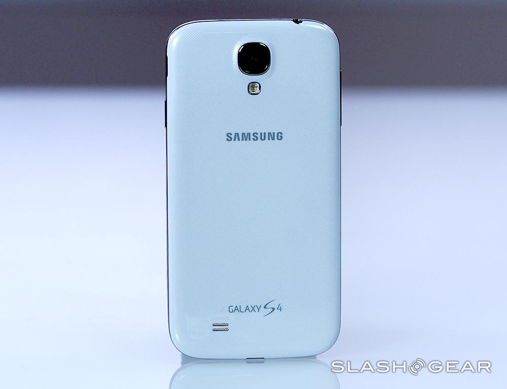
This is an all-new phone, but don't be surprised if nobody realizes it. The GALAXY S 4 ticks all the must-have boxes for a recent Android handset, but Samsung's decision to stick to the familial design language we've seen on the Galaxy S III and Galaxy Note II means that it's only really when you have them together that the differences become clear.
The display is obviously larger – more on that in the next section – but the dimensions of the GALAXY S 4 itself are little changed. In fact, although at 136.6 mm long it's identical in length to the Galaxy S III, judicious slimming of the bezels have left the newer phone narrower, at 69.8 mm versus 70.6mm, and thinner, at 7.9 mm versus 8.6 mm. That's impressive stuff, whether you like the design or not. At 130g it's a basically unnoticeable 3g lighter, too.
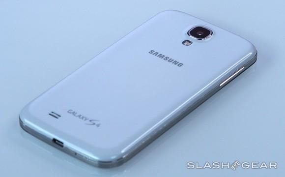
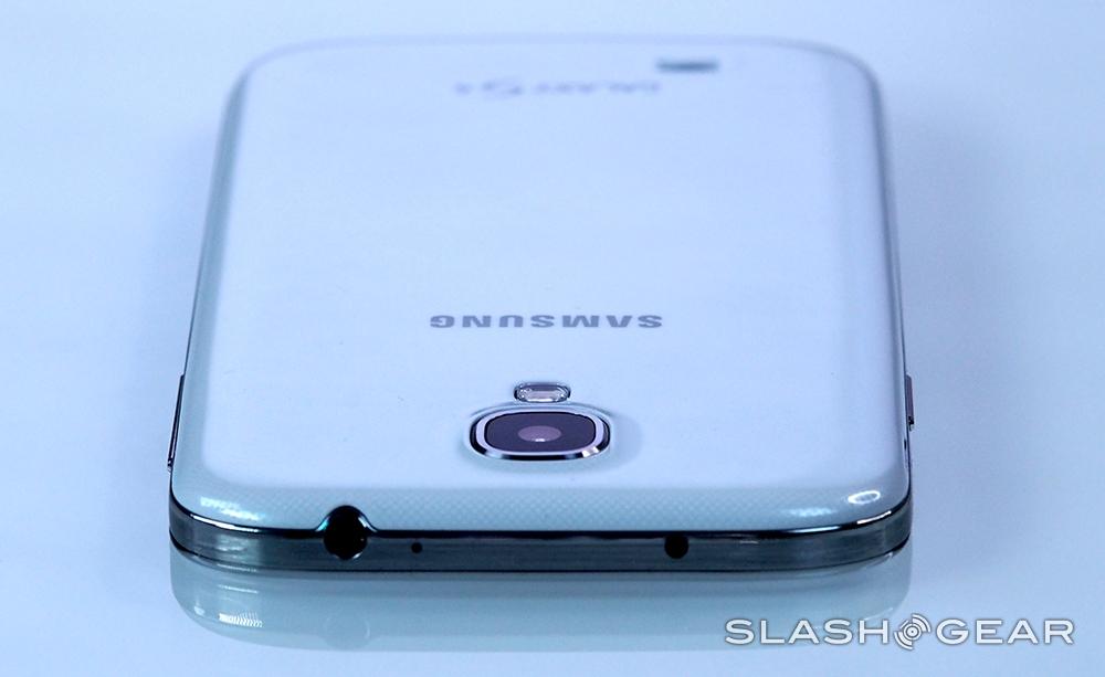
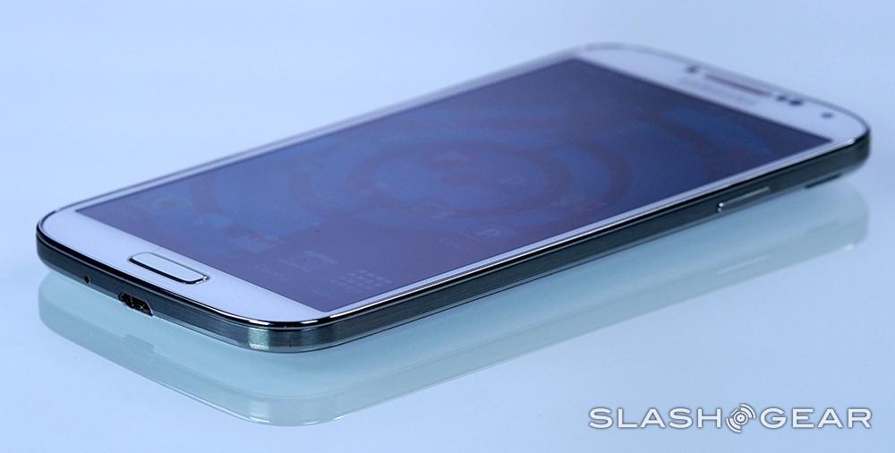
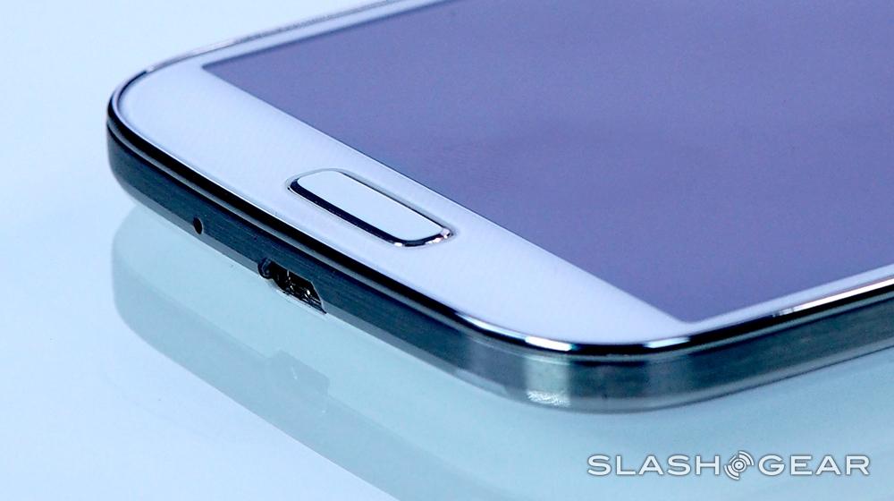
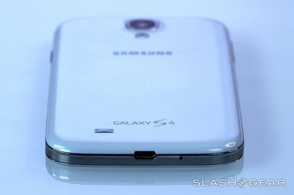
Side by side, and how Samsung has achieved that becomes obvious. At the top, the earpiece has been squashed up right next to the chromed plastic trim, flanked by the proximity sensor, ambient light sensor, and front-facing camera. The screen butts up closer to the sides of the phone, too, and extends further down into the chin, leaving the physical "home" button and touch-sensitive, backlit "back" and "menu" keys somewhat cramped. The angle of curve of the corners has reduced, losing a little of the "pebble" silhouette the old phone has. You still get the side-mounted power key and volume rocker, as well as a microUSB port and 3.5mm headphone socket.
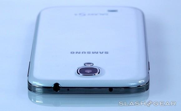
Interestingly, although it's officially thinner, the more squared-off sides of the GALAXY S 4 can leave it feeling thicker in the hand. The more pronounced taper of the Galaxy S III has the effect of making it feel like a slimmer device. Samsung has given the S 4's edges a slight knurling, which makes it a little easier to grip, though the plastics are still glossy and slippery. That makes slipping the GALAXY S 4 into a pocket or bag an easy thing, but does also mean it can be easy to drop.
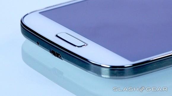
It's also miles away from the premium feel of the HTC One or the iPhone 5. Samsung's decision to go with plastic rather than metal (or even matte-finish polycarbonate, as we've seen Nokia use to good effect in its Lumia range) was one of our key complaints about the Galaxy S III, and keeping the lightweight casing has seemingly proved inescapable since the company wanted to announce a thinner phone. White and black versions of the GALAXY S 4 will be offered, both with a glossy finish, and they simply lack the high-end crispness that HTC and Apple deliver.
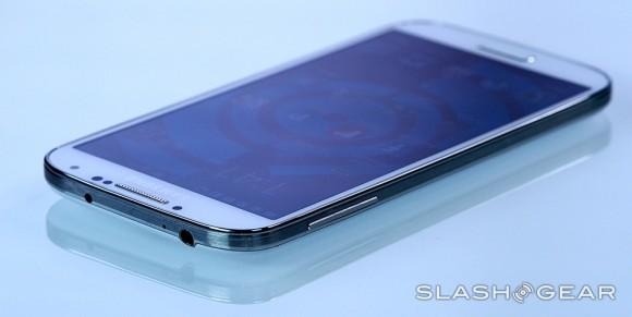
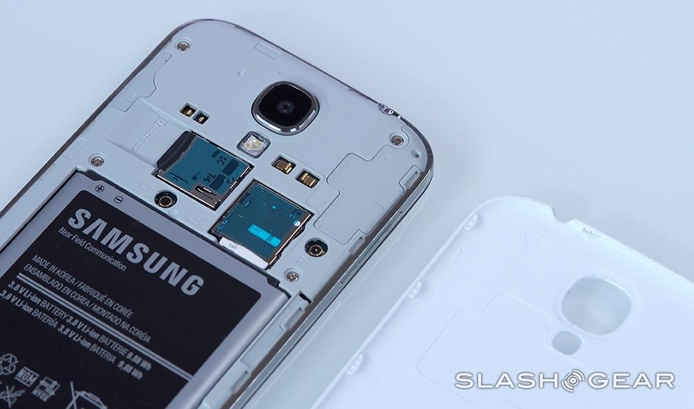
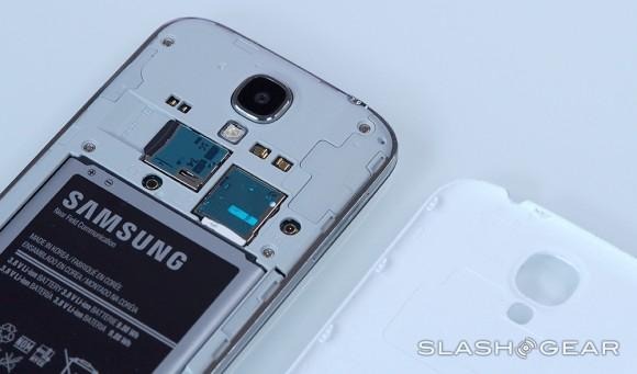
That's not to say the Samsung is flimsy. The phone is creak-free, and the removable battery door – though wafer-thin – flexes just enough to reassure you that it'll stand up to a trip in your pocket, rather than that it will snap as soon as you squeeze it. Samsung has used Corning's Gorilla Glass 3.0 to protect the screen, the latest iteration and rated as three-times more scratch-resistant than v2.0.
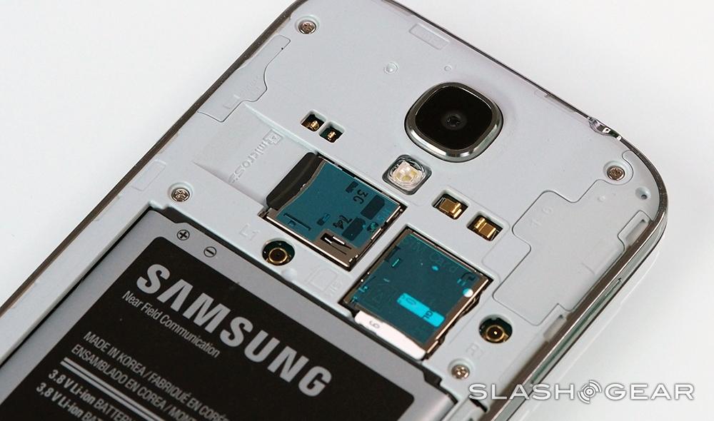
It's inside that things get really impressive, however. Samsung has boosted the memory to 2GB, and will offer 16GB, 32GB, and 64GB versions, all with microSD slots happy with up to 64GB cards. There's WiFi a/b/g/n/ac (2.4/5GHz) complete with WiFi Direct, DLNA, hotspot, and Miracast support; Bluetooth 4.0; NFC; GPS/GLONASS; USB On-The-Go for external memory and peripherals; MHL-HDMI 2.0 for hooking up a TV or projector (with the right adapter); and an infrared port to turn the GALAXY S 4 into a universal remote. Sensors include an accelerometer, gyroscope, and digital compass, but also a moisture-measuring hygrometer, a thermometer, and a pressure-tracking barometer.
Not all GALAXY S 4 units are created equal, mind, and the big difference comes in connectivity and processor type. Samsung will in fact make multiple versions of the phone, to suit different networks. In the US, Samsung will offer a model for each of the big networks, all powered by Qualcomm's Snapdragon 600 (APQ8064T), a quadcore processor using four 1.9GHz Krait 300 cores, and accompanied by Adreno 320 graphics.
The same chipset will be at the heart of the international LTE GALAXY S 4, but for the non-LTE version, and the KT and SK Telecom LTE models for South Korea only, Samsung has saved its new eight-core chipset. Named the Exynos 5 Octa, this combines four ARM Cortex A15 cores (running at 1.6GHz on the non-LTE model and 1.8GHz on the South Korean version) with four Cortex A7 cores (running at 1.2GHz), and is the first example of ARM's big.LITTLE architecture. Of the eight cores, only four are ever active simultaneously: either the Cortex A15 for when more processing power is needed, or the Cortex A7 for greater power efficiency. It also gets an IT SGX544MP3 graphics chip.
How well that system works will have to wait until we can get our hands on the octacore-powered phone, though for the US it's perhaps all academic since none of the carriers will be offering a version with the Exynos 5 Octa inside.
Display
Samsung's Super AMOLED technology makes a reappearance on the GALAXY S 4, this time a 4.99-inch panel running at 1080p Full HD resolution, versus the 4.8-inch 720p panel of its predecessor. Controversy continues to rage over whether a near-5-inch display makes for a manageable phone, though the Android segment seems wedded to the "bigger is better" ethos for at least the time being.
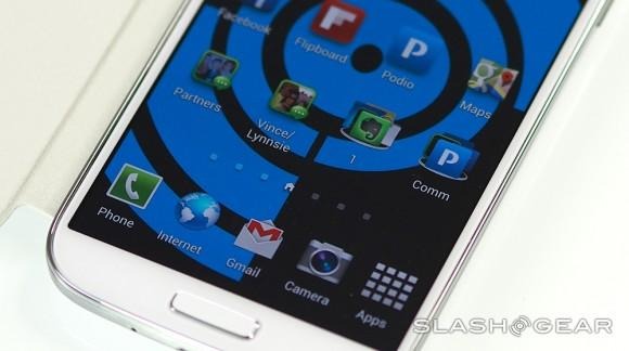
The screen itself is undeniably a beauty. AMOLED is known for its bright, vivid colors and excellent viewing angles, and the GALAXY S 4 has both in spades. That, combined with the 1920 x 1080 resolution, means that – though purists may shudder at the mention of PenTile on the spec sheet – the phone is a joy to look at. As ever, AMOLED tends toward the over-saturated, and side by side with the HTC One, the slightly smaller phone arguably looks a little more natural.
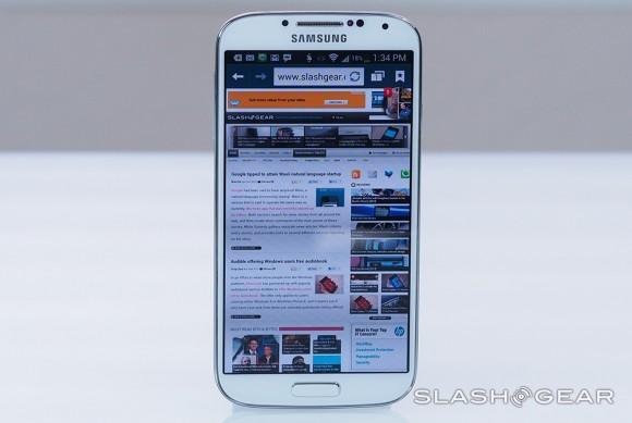
Nonetheless, it's a fantastic screen for multimedia, with video looking great while text is crisp even at tiny fonts. Web browsing also does well, with even full-site webpages easily navigable on the GALAXY S 4's capacious display.
Software and Performance
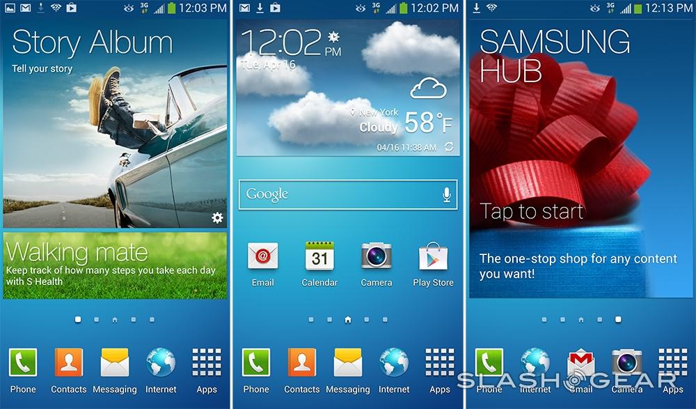
The GALAXY S 4 admirably comes with Android 4.2 Jelly Bean – the latest version – out of the box, at a time when rival firms are still launching new devices with older iterations. However, Samsung simply can't let Android escape without modifying it, and so you end up with the TouchWiz "Nature UX" and a long, long list of tweaks and new features.

Some are familiar from before: S Voice, for instance, Samsung's take on Siri, as well as S Health for fitness monitoring. S Health can keep records of how many steps you've taken using the phone's pedometer, as well as log the weather conditions around you using the various sensors; it will also work with a selection of new fitness-tracking accessories, too, though Samsung did not provide any for our review. ChatON, the voice/video/chat app is also preloaded, along with Samsung's Hub.
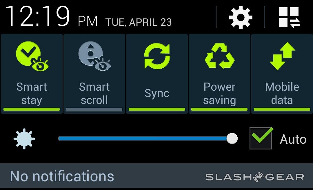
The old Galaxy S III used its front-facing camera to make sure the screen didn't go to sleep when you were reading but not tapping it; on the GALAXY S 4, that has been upgraded to what Samsung calls Smart Scroll and Smart Pause. The former tracks how you tilt the phone when you're looking directly at the display, scrolling through ebooks or webpages automatically, while the latter pauses video playback when you turn away from the phone, and resumes it when you look back.
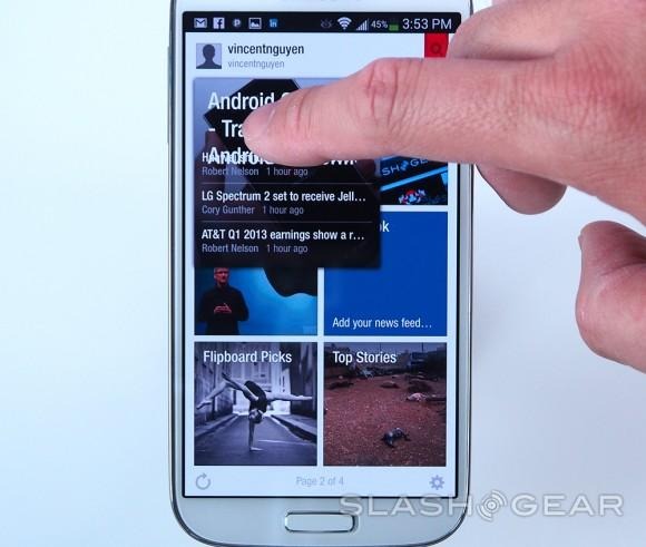
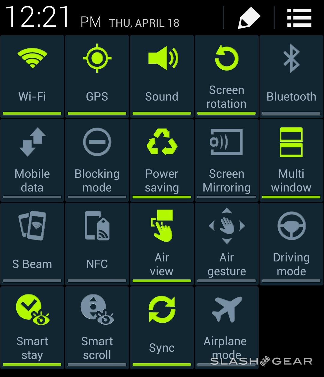
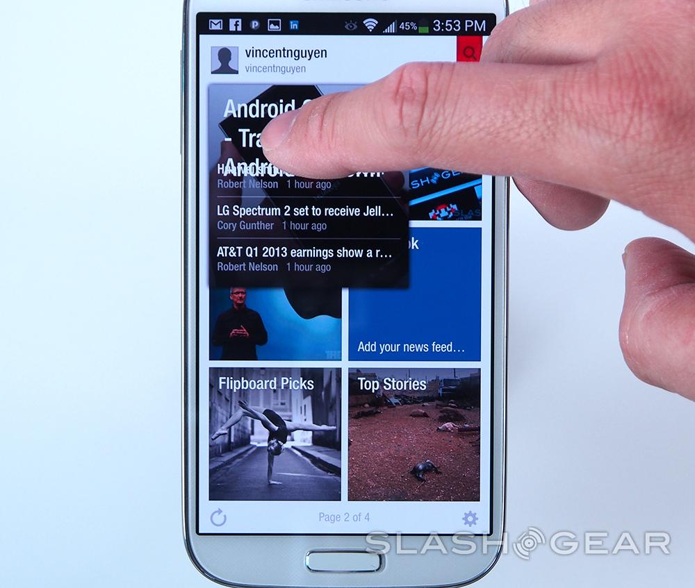
The screen itself has become smarter, too, with Air Gesture and Air View introduced. Just as the Galaxy Note II can track the nib of its S Pen stylus when it's hovering over – but not touching – the display, now the GALAXY S 4 can recognize a fingertip close to its screen. Hover your finger over a Flipboard story, say, or a calendar entry, and a preview window will eventually pop up. It works, but it's a little on the sluggish side for our liking: sometimes it proved quicker to actually tap in and then hit the back button, rather than wait for Air View to react. Not all apps support the feature, either: if you want Air View in your inbox, for instance, you have to use Samsung's email app, not the Gmail app we prefer. One plus is that the GALAXY S 4 can be used even when you're wearing gloves.
Air Gesture, meanwhile, builds on the Galaxy S III's screenshot function – which screen-grabbed when you swiped the side of your palm across the display – by tracking hand movements above the phone. Using them, you can navigate through photo galleries and slideshows, through webpages, music playlists, and answer or dismiss calls. We still like the screenshot shortcut, which is often easier to trigger than holding down multiple buttons, but the rest can feel gimmicky.
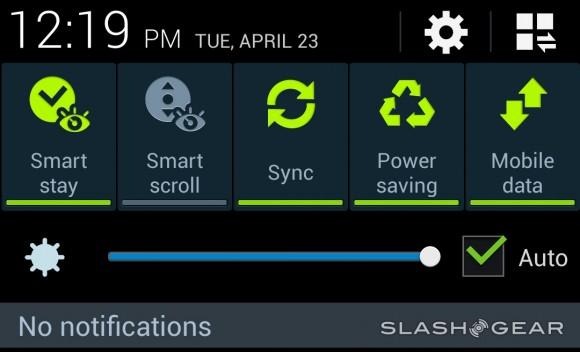
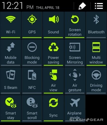
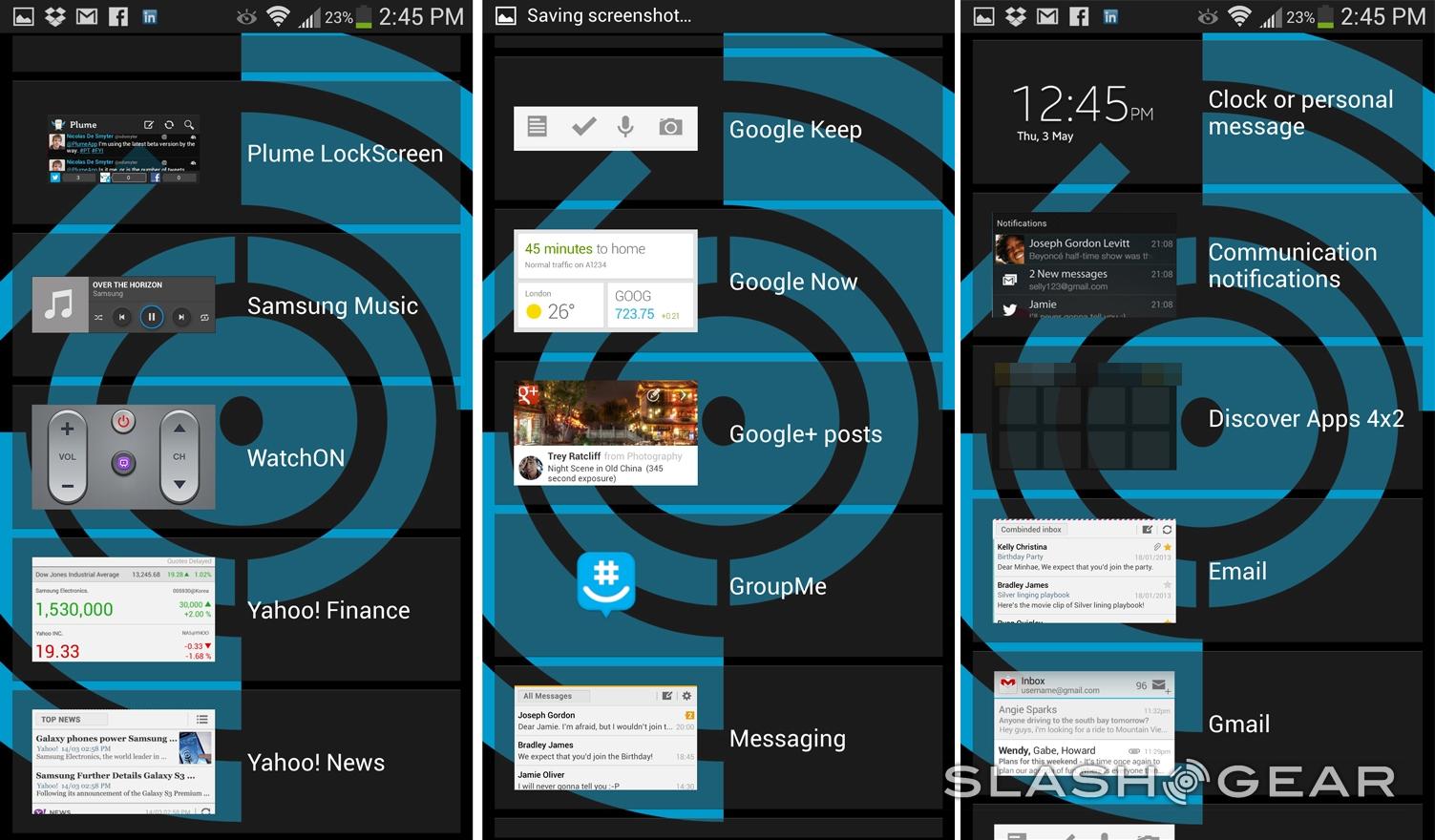
Thankfully, you can selectively disable those you don't want to use from an extended shortcut panel in the drop-down notifications menu. In fact, granularity of control is one of the big advantages of the GALAXY S 4: yes, there are plenty of add-ons and features that Samsung has thrown at its flagship, but it also recognizes that some people simply aren't going to want to use them, and doesn't make it difficult to turn them off.
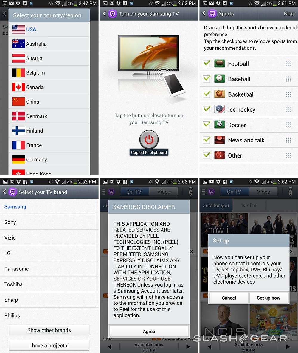
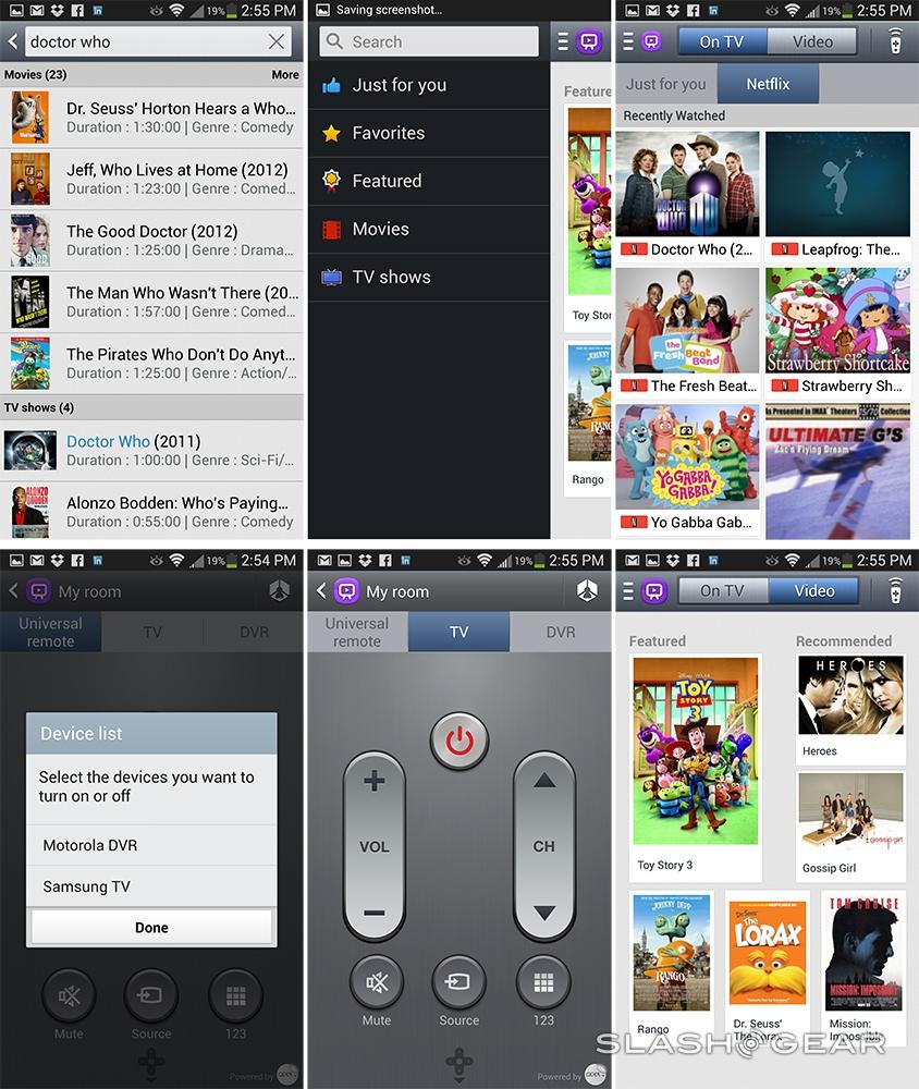
Samsung has been bundling universal remote functionality with its Galaxy Tab tablets for some time now, using Peel's Smart Remote software, but the GALAXY S 4 is the first of the company's flagship phones to see the company's home-grown technology. A small IR sensor on the top edge works with the new WatchON app, turning your handset into a touchscreen remote. Setup is straightforward – pick your TV, PVR, or cable box brand, and which cable, satellite, or other media provider you subscribe to – and you can start controlling channel selection, playback of recordings, and read through an EPG while you watch the big-screen.

So far, so like HTC's Watch app on the One. However, where the HTC software only reminds you of shows if you've previously favorited them, the GALAXY S 4 can actively learn from your viewing habits and prompt you with new shows the algorithm believes you might be interested in. By hitting the Like or Dislike buttons, you teach WatchON your preferences, though it takes a little time before the suggestions felt like they were truly relevant. Being able to simply tap view (or, indeed, record) and have the phone automatically switch to the right channel is useful, however.

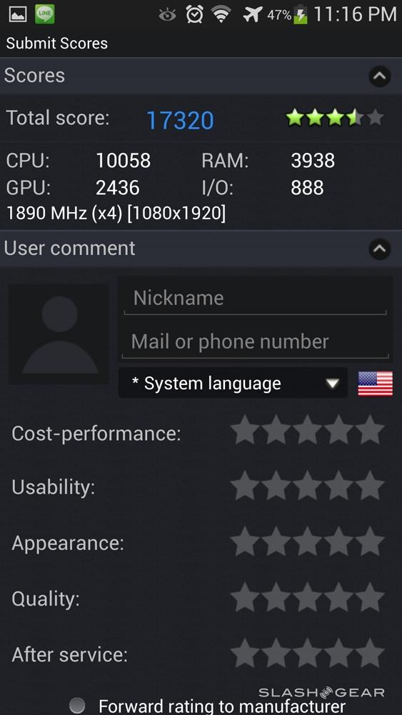
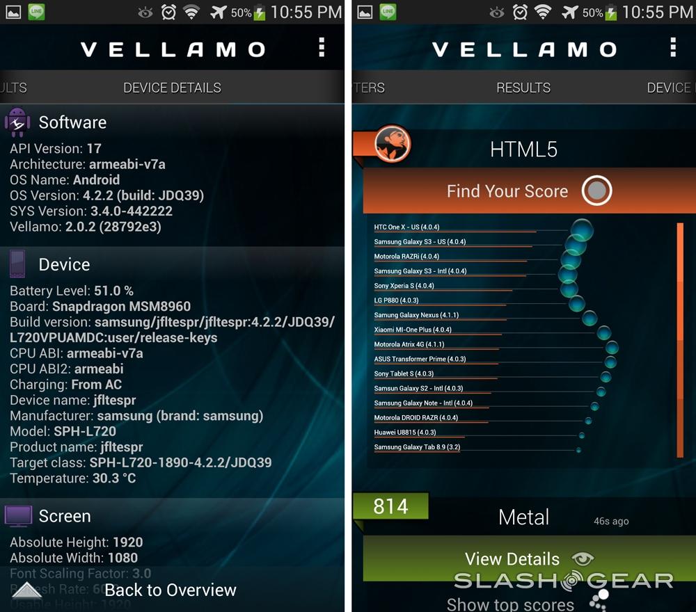
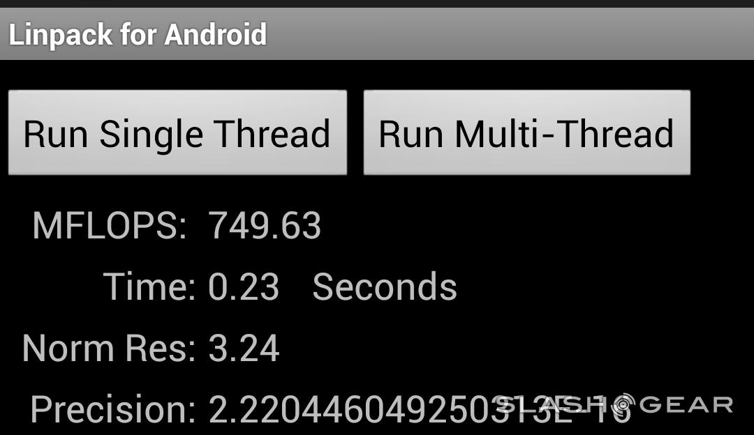
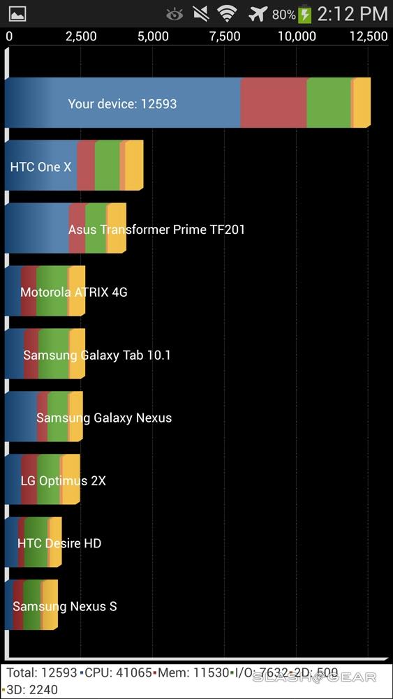
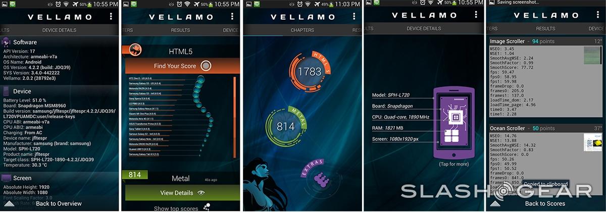
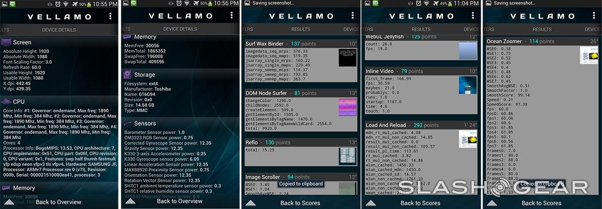
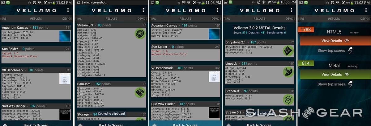
Happily, whether you're running Samsung's apps or third-party software, we've got no complaints as to how fast they run. In Quadrant, the GALAXY S 4 scored 12,593 overall – just slightly ahead of the HTC One – while in Linpack for Android it also bested HTC's phone, managing 749.63 MFLOPS compared to the One's 694.102. In Qualcomm's own Vellamo test, it scored 1,783 in the HTML5 category and 814 in the Metal category: worse, and better, respectively than the One. HTC grabbed the lead in AnTuTu, however, with the GALAXY S 4 scoring 17,320, nearly 7,000 points behind the One.
In practice, it's a smooth running, swift phone. No lag when hopping between apps or loading webpages, and no slow-down even when performing graphically-intensive tasks. Of course, our real interest is in how the big.LITTLE-powered variants do, since those models debut ARM's new heterogeneous architecture.
Camera
That Samsung would step up to a 13-megapixel camera from the 8-megapixels of the old phone came as no great surprise. That certainly looks the part on paper, in a spec-driven world where bigger is presumed to be better; however, in the meantime we've also seen rival phones, such as HTC's One, concern themselves with more than just megapixel counts. That raises the question: is the best way to improve your photos to throw more pixels at them?
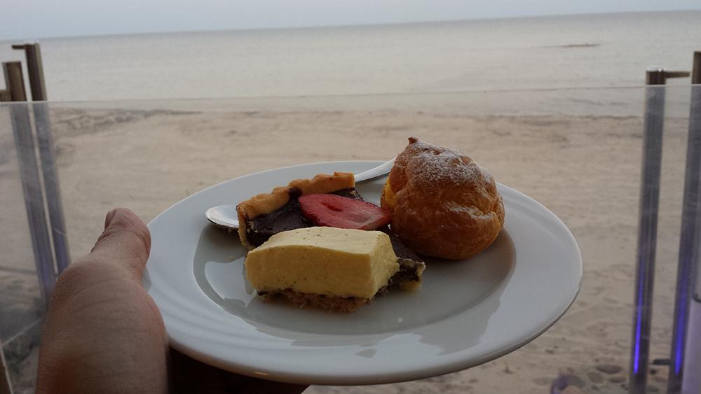
As you might expect, that all depends on shooting conditions. The surfeit of pixels show their worth in outdoor shots where there's plenty of light. That given, you get bright, saturated colors, impressive brightness, and grain only when you blow things up to near-maximum resolution. We did notice that the GALAXY S 4 prefers subjects to be at a distance, however: some close-up shots (that we wouldn't quite consider to be in macro territory) show the phone struggling to lock focus exactly onto the subject, leaving things a little fuzzy.
As for actual macro images, they're reasonable, though the GALAXY S 4's tendency to over-saturate bright colors can leave things looking like you have HDR mode permanently switched on. In the flower close-ups in the gallery, for instance, the detail of the petals is lost in a botch of bright red, while the paler grasses in the background look grainy and insipid.

When things start to get darker – indoor images, for instance, or in the evening – however, is when we started wishing for bigger pixels rather than just more of them. Low-light images see grain make itself known, the GALAXY S 4 overcompensating with its sharpening correction, and the absence of optical image stabilization (OIS) can often lead to blur as the phone tries to grab more light per frame.
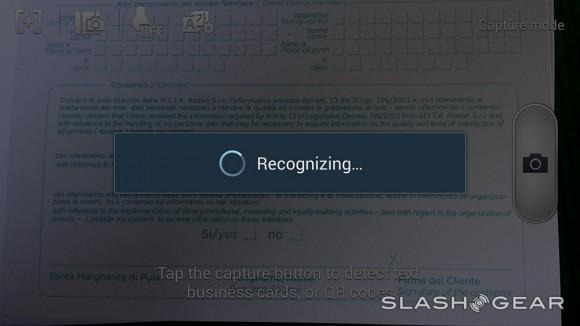
In short, it's an acceptable phone camera, but it's not the huge step up from what the Galaxy S III could deliver that, on paper, the megapixel increase might suggest. For low-light shots, too, we'd prefer Nokia's Lumia 920, the OIS of which does an excellent job of smoothing out blur during longer exposures, or HTC's One, which uses larger pixels (albeit fewer of them: 4-megapixels versus Samsung's 13-megapixels) and OIS to maximize how much light it can capture. There's a noticeably narrower field of view on the GALAXY S 4 compared to the One, too, with detail all around the periphery cropped out.

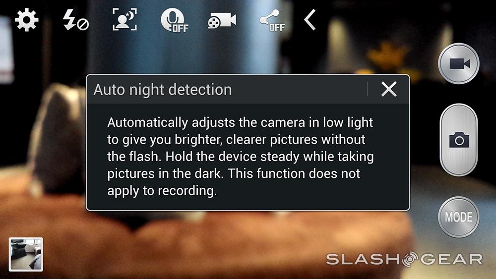
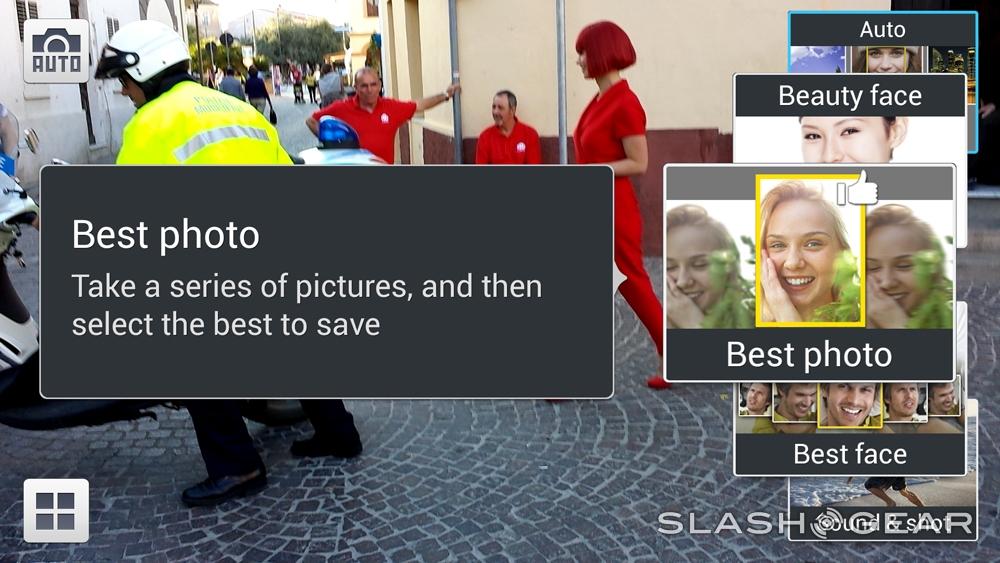
What you do get with Samsung's camera is a number of different shooting effects to choose between. Dual Shot, for instance, combines images from the main camera and the 2-megapixel front-facing camera into a single frame: basically slotting your own face into the image. You can move the inset around the frame, and give it different outlines such as a postage stamp or a bubble, and while it can feel gimmicky at times, it does mean that your holiday photos prove you really were there at the time, not just whoever is in front of the camera.
There's also Sound & Shot, which attaches a short audio clip to each still image – Samsung says it's to capture the mood when you took the photo, though we prefer HTC's combination of sound, images, and video with the Zoe system – along with Drama Shot, which combines a sequence of burst-photos into a single collage. You can create short gif images without needing to reach for a third-party app, or trigger a photo by calling out to the phone, just as we saw Samsung implement on the Galaxy Camera.
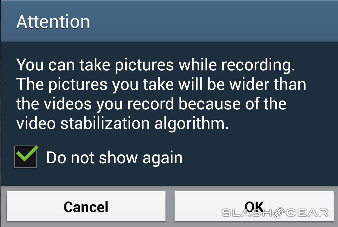
As for video, the GALAXY S 4 can capture at up to 1080p Full HD resolution both front and back. The camera app usefully adds a pause button along with stop, meaning you can halt and resume recording and still end up with a single file; with some careful timing, it means you may not need to post-process the footage before you upload it to YouTube. We're also left impressed by the fact that the GALAXY S 4 can use Dual Shot during Full HD video recording, combining footage from both cameras.
Above: full resolution photos with GALAXY S 4's back-facing camera in both standard and Dual Shot modes. Below: HDR photos with GALAXY S 4's back-facing camera.
The same strengths and weaknesses of the new Samsung's camera at stills are carried over to its video performance. Give it plenty of natural light and you end up with great colors and little noise, though the absence of OIS means clips can be shaky, especially if you're panning. The cropping is also the same as for stills. Get into darker situations, however, and the grain seeps back in, with the closely-packed pixels struggling to make out what's in front of them. The effect isn't as pronounced as for stills, however; overall it's not unusual for a phone camera, no, but it's also not the best we've seen. Worth a mention is the quality of footage from the front-facing camera, which is particularly good.
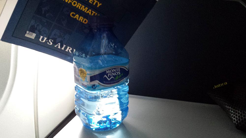
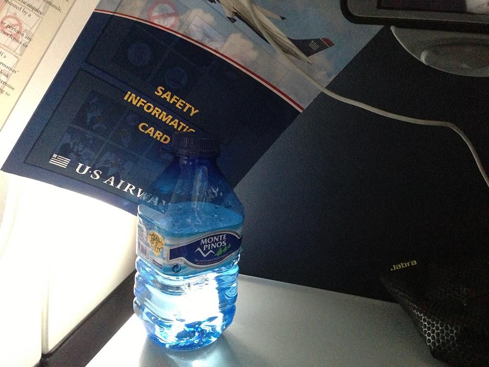
Samsung GALAXY S 4 Bottle Photo:

HTC One Bottle Photo:

iPhone 5 Bottle Photo:

Samsung GALAXY S 4 1080p Video:
HTC One 1080p Video:
iPhone 5 1080p Video:
Battery and Phone
Just as the GALAXY S 4 is larger than the phone that came before it, so is the battery. Now at 2,600 mAh, it's also user-accessible meaning that you can swap in a replacement should you run low during the day. There's also optional wireless charging, if you use the Qi-compatible replacement back cover Samsung offers (but which we did not have to review).
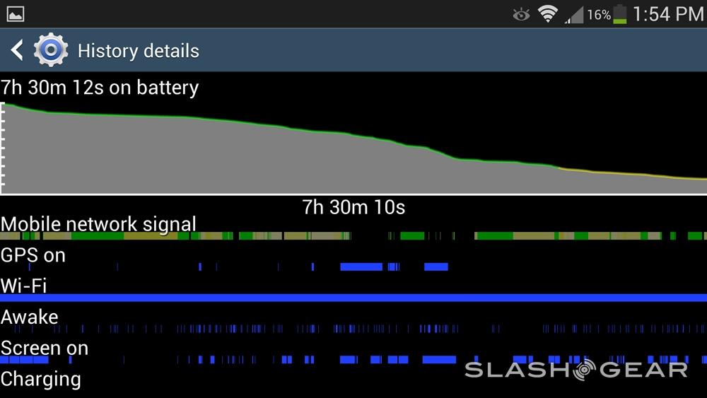
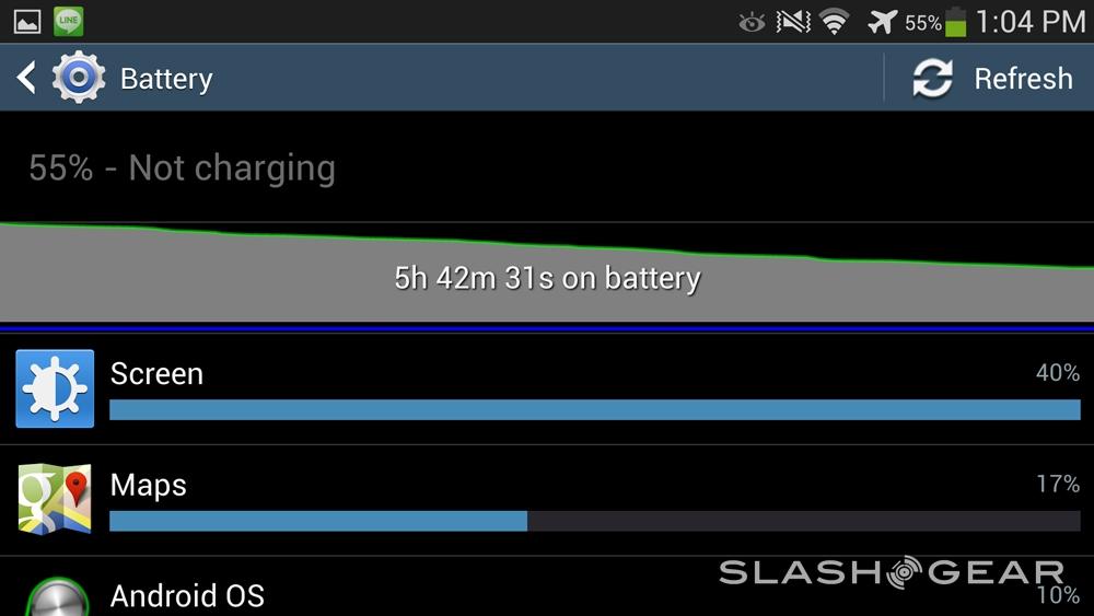
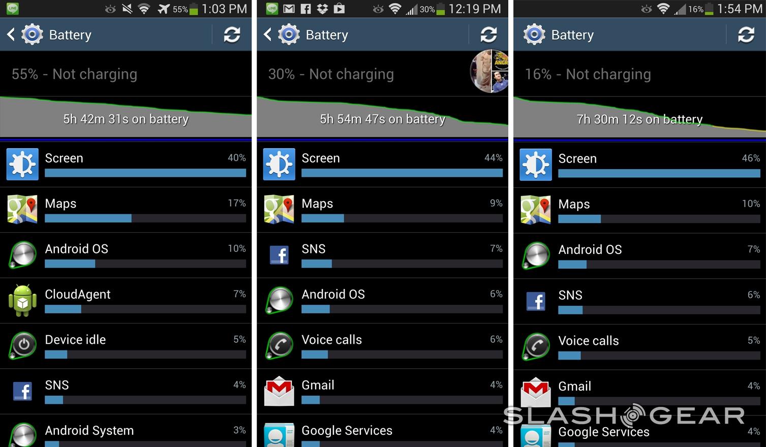
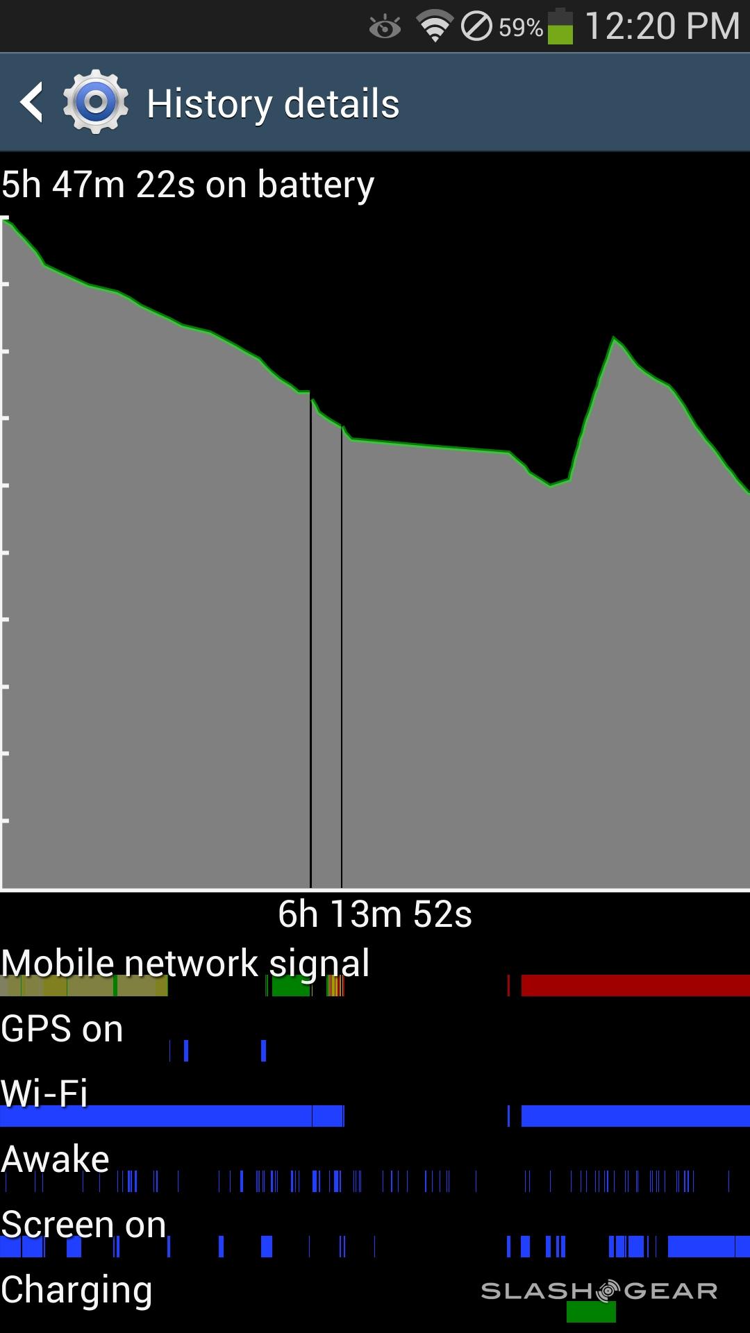
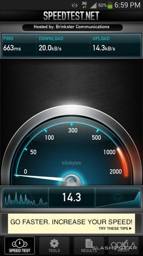
Our lingering impression is that picking up a spare battery may well be a very good idea. Loaded up for typical use – with push email active; some use of maps, multimedia, and the camera; a few calls; and some messaging – the GALAXY S 4 ran for around 13-14 hours before needing a recharge. Longevity was particularly affected by what apps it was running, however. With instant-messenger LINE active, for instance, we saw runtimes drastically cut, even when the phone was in Airplane mode with no cellular data connection active. In contrast, LINE on the HTC One had minimal affect on power consumption.
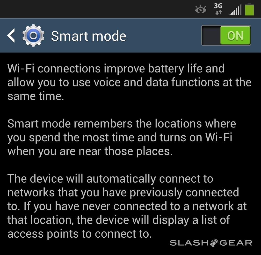
Even if you're draconian with your apps, that deliciously huge, bright display takes its toll on how long the GALAXY S 4 can run for. In fact it proved responsible for, on average, roughly 40-percent of the battery drain. Samsung does make some attempts at prolonging power, such as Smart Mode which remembers which locations you use WiFi and selectively switches it on and off when you get near, but even using WiFi we had mixed results. Unfortunately Samsung was unable to provide an LTE variant of the GALAXY S 4 for review, so battery testing while on 4G will have to wait.
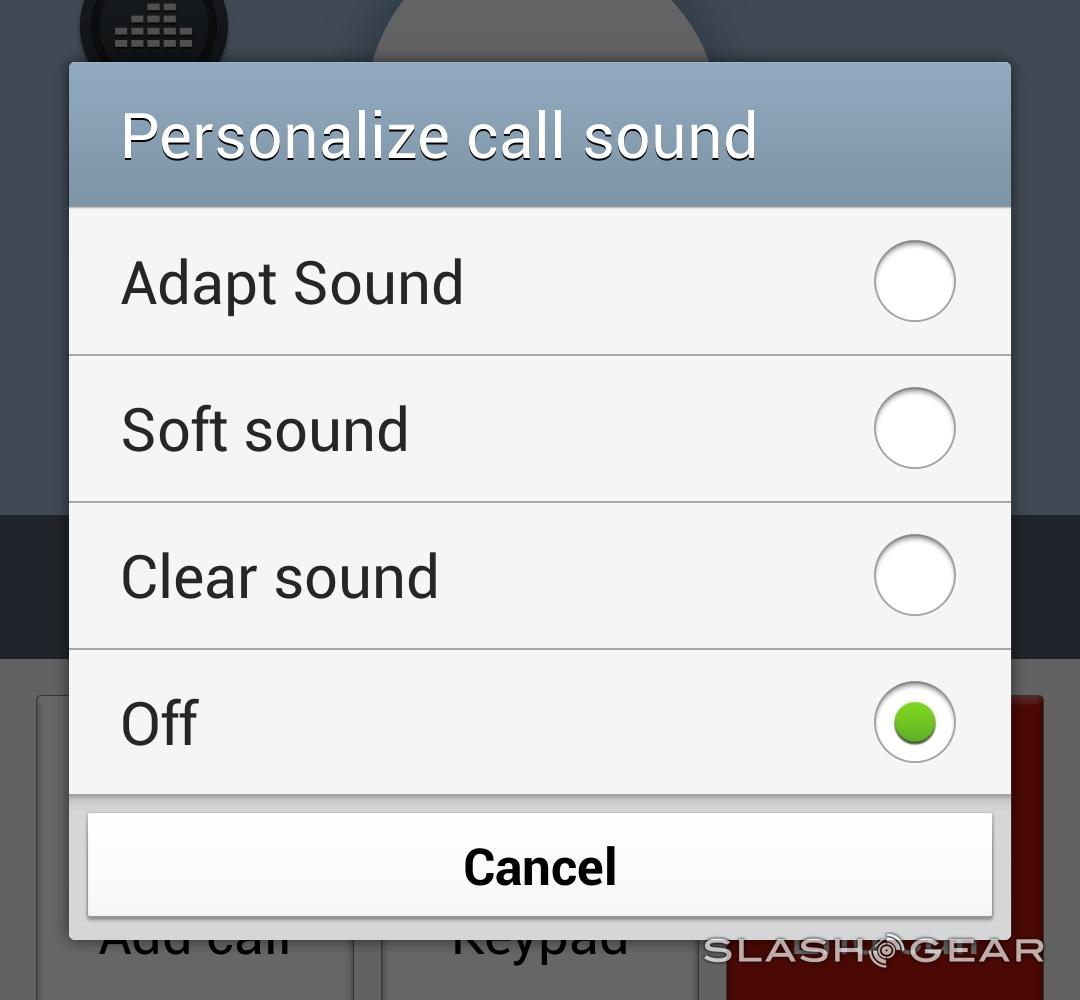
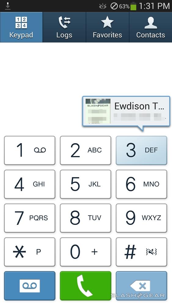
As for calls, the GALAXY S 4 held its own. We experienced no drops, and the earpiece is loud at maximum volume. Interestingly, callers said they preferred the audio when we turned off Samsung's adaptive DSP, which they told us made voices sound robotic and overly-processed. The main speaker can be cranked up suitably high, but it lacks the rich bottom end of HTC's BoomSound system.
Samsung S View Cover
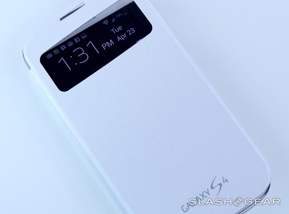
Samsung has a number of official accessories for the GALAXY S 4, but arguably the most interesting is the S View Cover. Like the flip cases the company has previously offered for the Galaxy S III and Note II, it flaps over to protect the display but adds minimal bulk, fixed to a replacement battery cover rather than fitting over the phone.
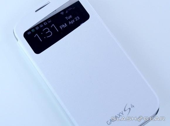
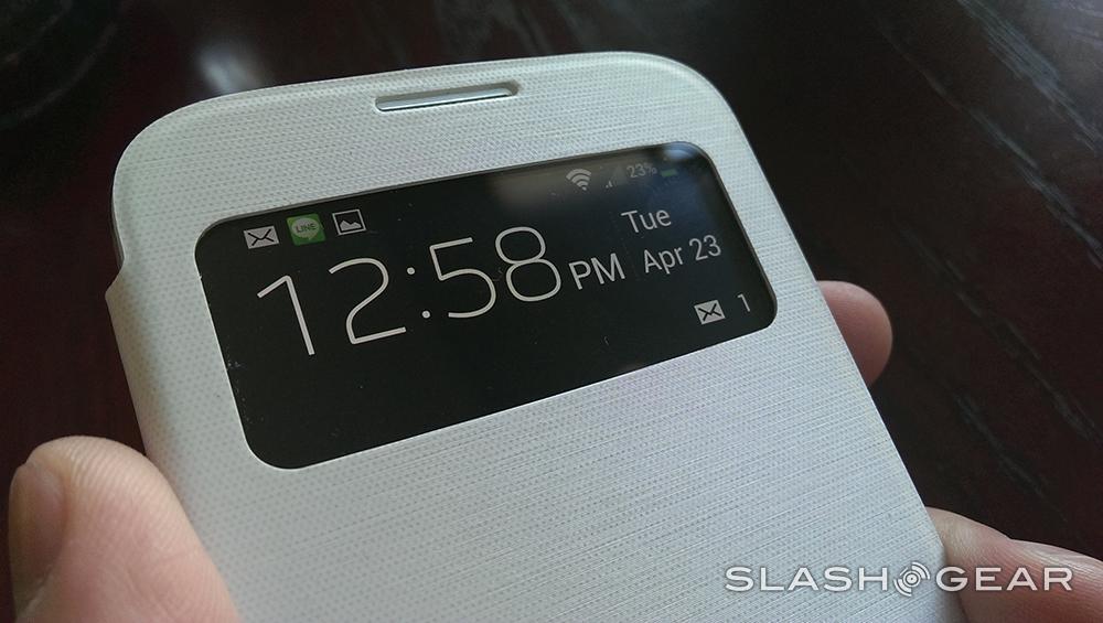
The difference, however, is the clear plastic window near the top of the cover, through which you can see a portion of the GALAXY S 4's display. This takes advantage of one of the advantages of AMOLED compared to LCD: namely, that you can selectively power up a part of the display, but not the rest, and so consume less juice overall.
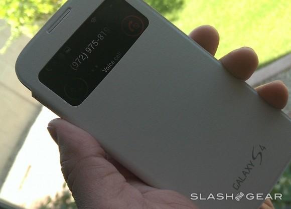
Here, Samsung uses that to put status information on the display, viewed through the window. You get the Android notification bar, with all of the usual icons including signal status and battery, as well as caller ID – and the controls to answer or reject calls – when someone rings. A cut-out above, matching with the earpiece, allows you to take the call without opening the cover. When you're not taking calls, there's room for a big clock and date display, as well as now-playing information for the music app.
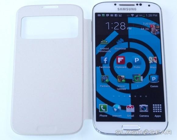
It feels high-quality, and the concept works well. By only using a section of the AMOLED, rather than turning it all on every time you want to check for new messages, it helps cut down on the screen's thirst for battery, and we quickly became used to pulling the phone out of our pocket just enough to glance at the status panel. At $59.99 it's not the cheapest case, however, though Samsung does also offer a traditional Flip Cover – without the cut-out – for $20 less.
Wrap-Up
That the GALAXY S 4 will be a best-seller is pretty much a given at this stage. A combination of cutting-edge hardware, blanket advertising, and no small amount of headline-grabbing sparring with Apple has left the Galaxy series as the de-facto Android option for many, and that mindshare and marketing positions the new flagship to pick up the reins as soon as it hits stores.
That's not to say that Samsung's improvements aren't impressive in places in their own right. The new Full HD AMOLED screen is a beauty, and there's no shortage of power or storage for running the latest Android apps or, indeed, those likely to arrive in the coming months. As we've found before, some of Samsung's software tweaks we used, and others we could happily leave; the exact mixture of which each user will come to rely on, though, will vary, and Samsung seems content to throw them all into the pot and let the individual decide. Video recording from both cameras is great too.
It's probably the similarities in design that make the GALAXY S 4 feel evolutionary rather than revolutionary, though we're left not entirely convinced that all of those developments are necessarily the best they could be. A 13-megapixel camera sounds great in theory, but it introduces compromises in low-light situations that HTC's more imaginative system on the One doesn't suffer from; Samsung's big, bright screen may be beautiful, but it also takes its toll on the battery.
Samsung was once the challenger, spurred into action by Apple and the best-selling iPhone. Now, at the top of the charts in Android, it too has driven other manufacturers to take more risks and raise their game. The end result is a device like the HTC One, which in some ways feels more suited to how smartphone owners are actually using their phones. The GALAXY S 4 is a safe, capable, and solid option, and though Samsung's flagship is perhaps no longer necessarily the best Android device on the market, it's still a tremendously polished phone with plenty to satisfy the crowds eagerly awaiting it.
