Samsung Galaxy NotePRO Hands-On: 12.2" Of S Pen Prosumer Slate
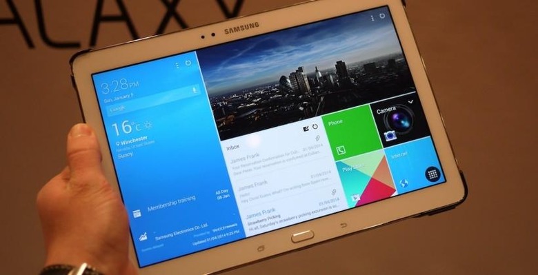
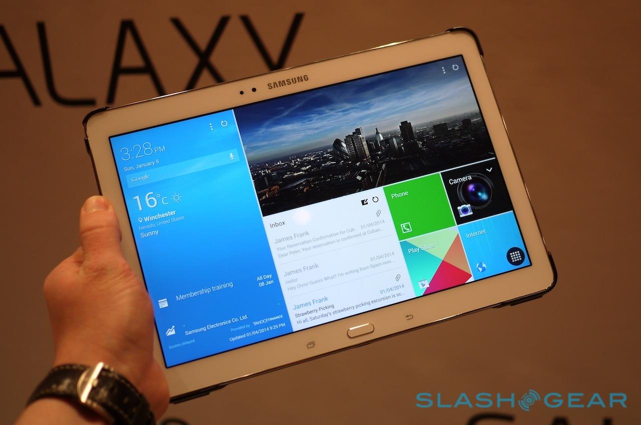
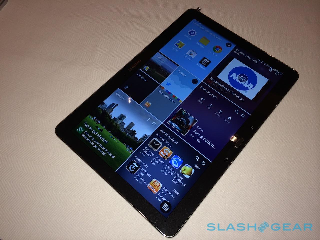
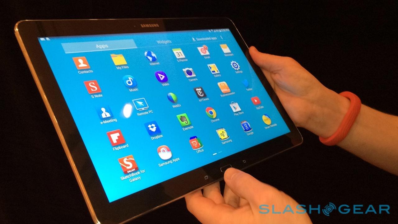
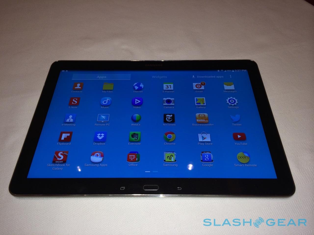
Samsung thinks it's time the tablet got serious, unveiling the new Samsung Galaxy NotePRO at CES 2014 today complete with a 12.2-inch high-resolution touchscreen, S Pen stylus borrowed from the Note series of phablets, and an all-new interface on top of Android 4.4 KitKat. Biggest of Samsung's Android tablets to-date, not to mention the most powerful, it's the company's take on what a keyboard-free slate needs to be in order to satisfy both work and play. We got to grips with the NotePRO here at the Las Vegas show; read on for our first-impressions.
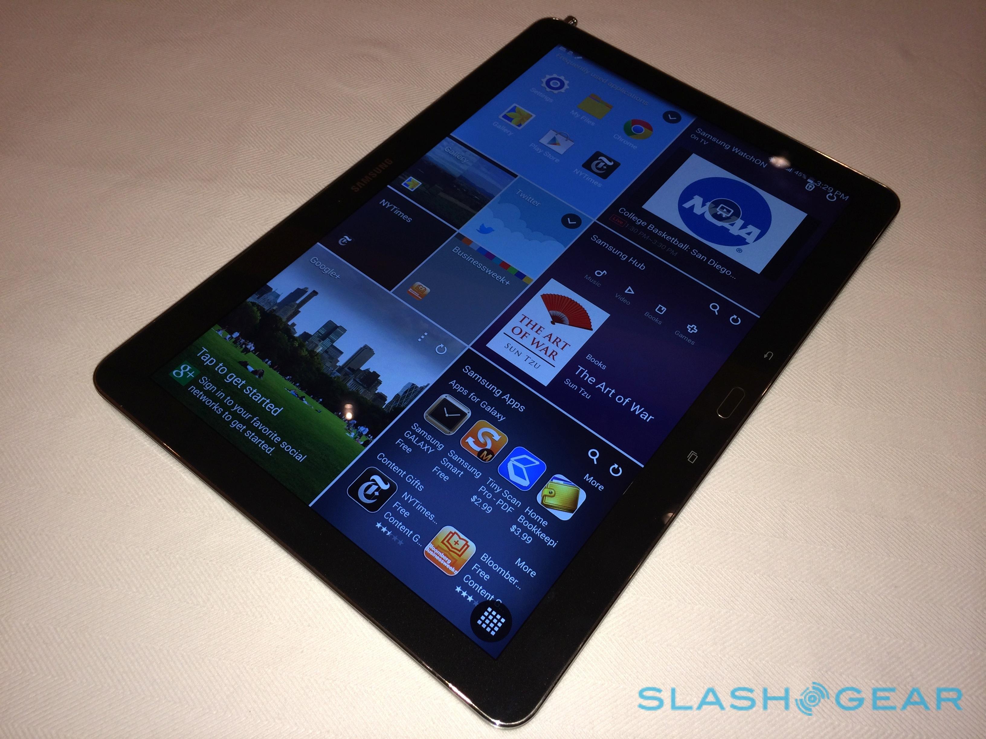
Samsung calls the Galaxy NotePRO its new flagship, and the specifications live up to that billing. It's fronted by a huge 12.2-inch WQXGA 2560 x 1600 Super Clear LCD panel, which is bright and sharp, and has great viewing angles. Inside, there's either Samsung's own Exynos 5 Octa chipset (with a 1.9GHz quadcore for intensive applications, and a 1.3GHz quadcore for lesser activities) in the WiFi + 3G models, or Qualcomm's Snapdragon 800 2.3GHz quadcore in the LTE version. Which each market will get remains to be seen.
Then there's the 3GB of memory and the 32GB or 64GB of storage, expandable with a microSD card by up to 64GB. Beyond the WiFi and cellular options, there's WiFi a/b/g/n/ac MIMO (2.4/5GHz) plus Bluetooth 4.0, and USB 3.0; Samsung also includes GPS/GLONASS, an accelerometer, gyroscope, digital compass, and a light sensor.

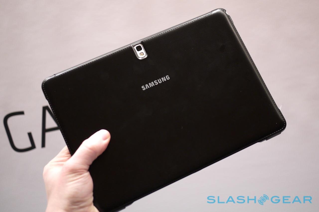
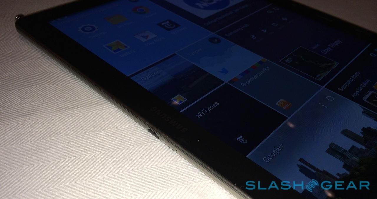
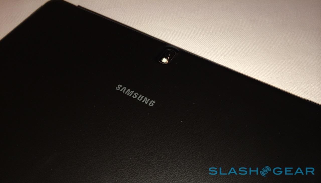
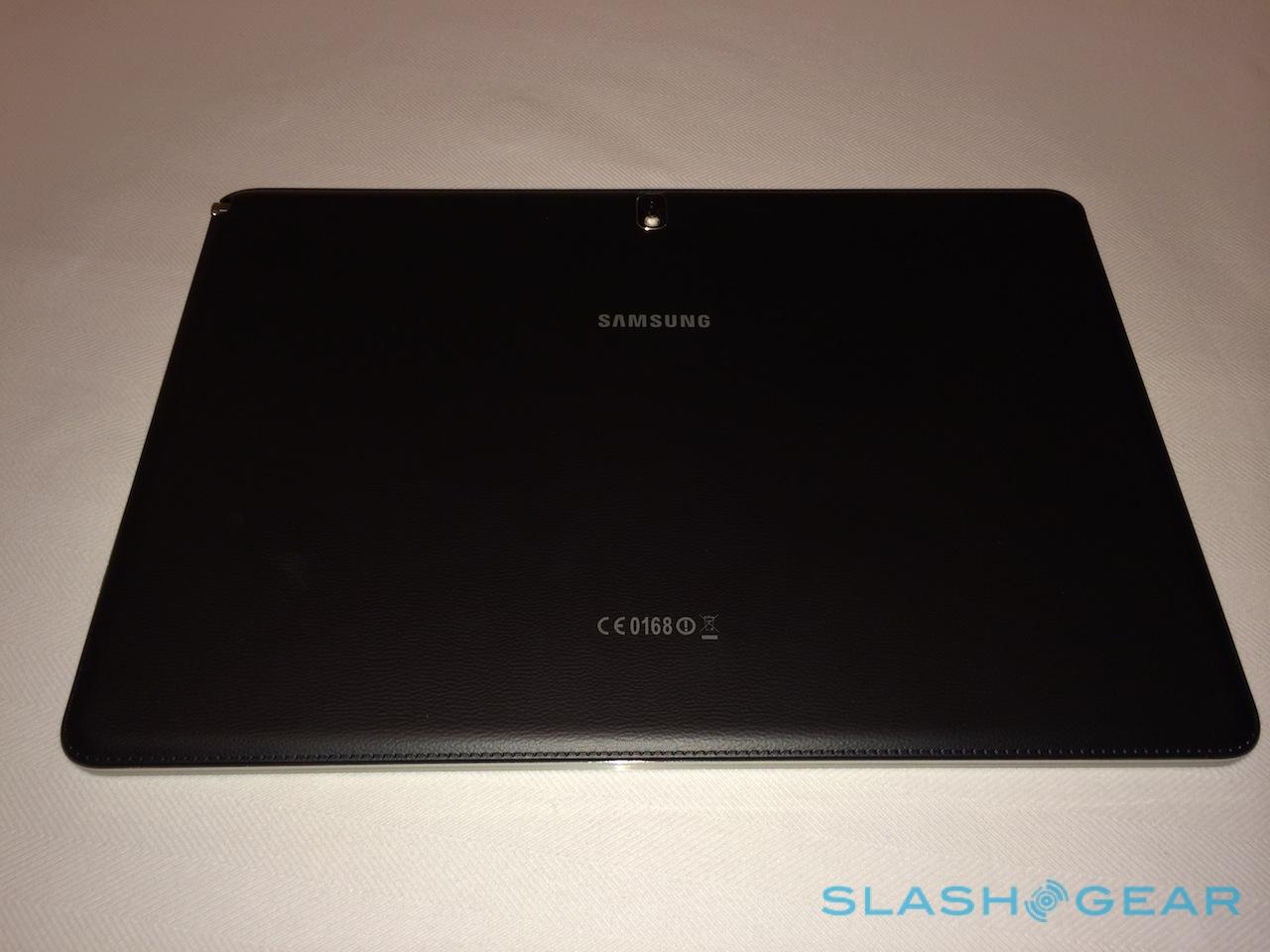
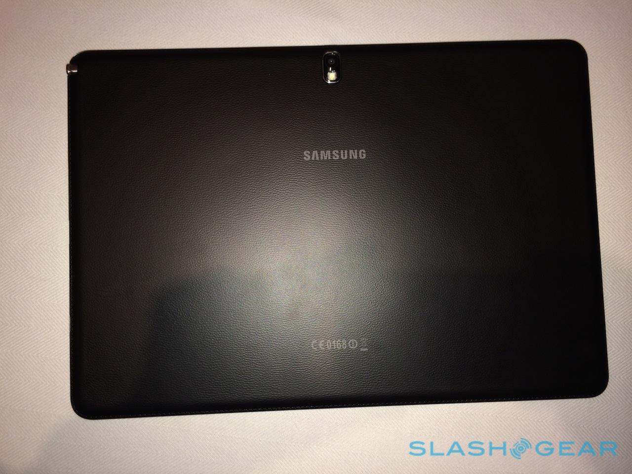
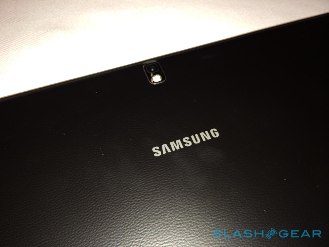
On the back, there's an 8-megapixel autofocus camera with an LED flash, while the front camera runs to 2-megapixels. The battery is a fixed 9,500 mAh pack – Samsung says that's good for over 10hrs of use – and the whole thing measures in at 295.6 x 204 x 7.95 mm and between 750g and 753g depending on model.
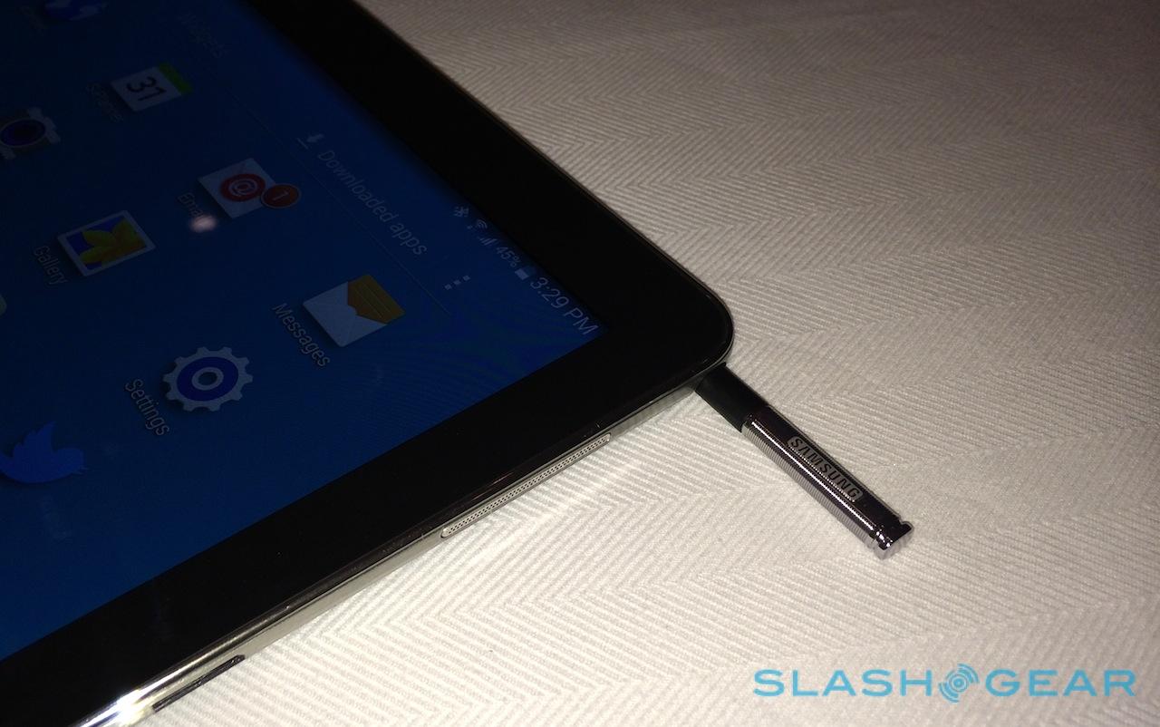
We've seen Samsung's S Pen before, on the three iterations of Note phablet and the Galaxy Note 10.1 tablet, but here the digital stylus gets even more room to play with. It pulls out of the upper right hand corner of a tablet that feels very much designed to be used in landscape orientation most of the time (though in portrait orientation it does feel like the sort of scale of a magazine, which could come in useful when reading), automatically triggering the Air Command menu with clipping and other tools.
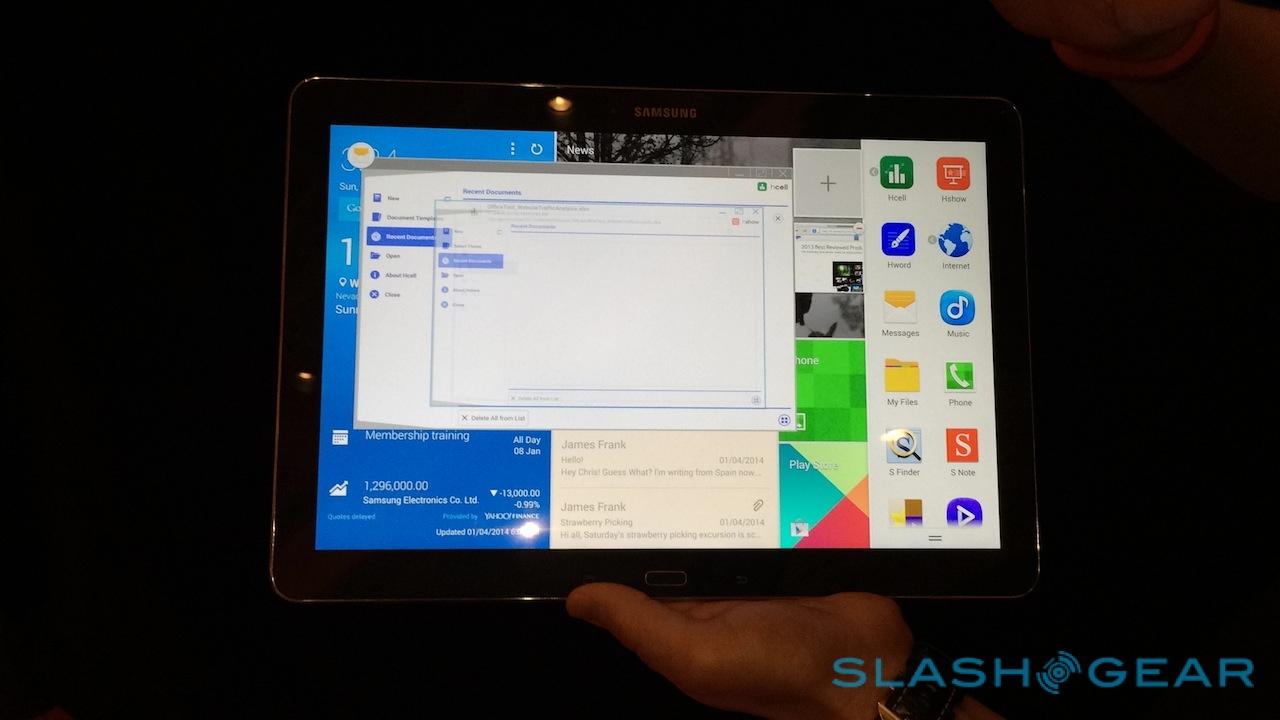
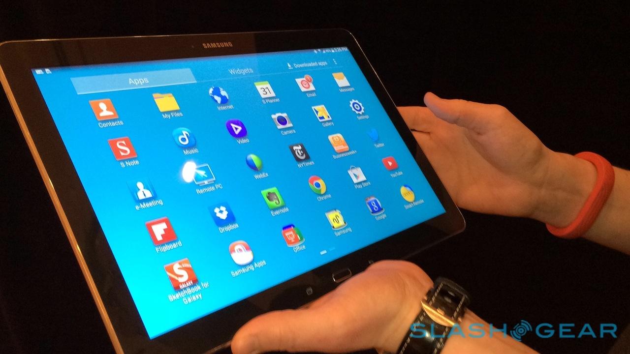
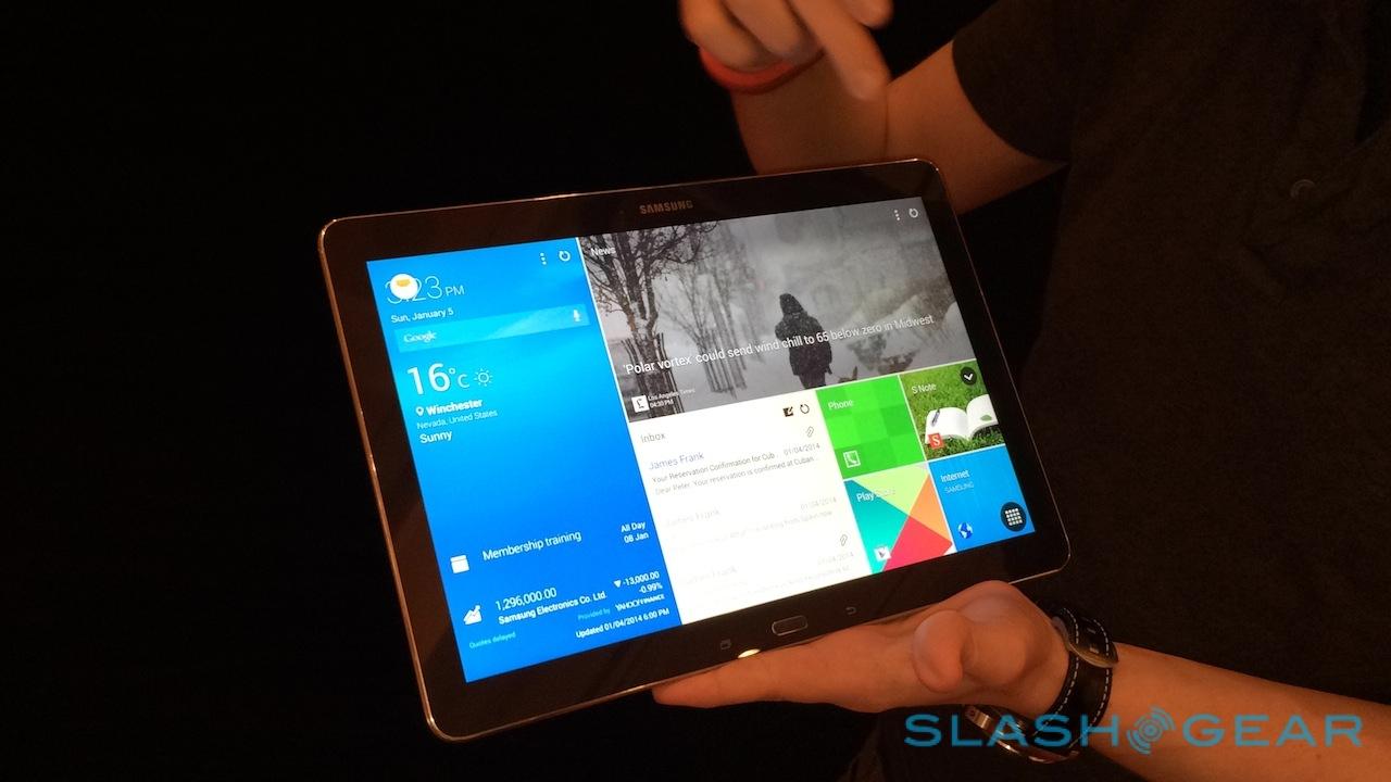
What's new, though, is the interface on top of which that all floats. Samsung refers to its new software environment as the "Magazine UX", doing away with the previous TouchWiz widgets and homescreens, in favor of an all new dashboard. Out of the box there are three homescreen panes – personal, business, and social – each populated with some combination of commonly used apps, favorite shortcuts, email inboxes (sadly only through Samsung's own email app, not Gmail), calendars, news feeds organized by topic, and posts to Google+. They update automatically as long as you have a data connection; a more traditional homescreen is an option, along with at least one Magazine UX pane.
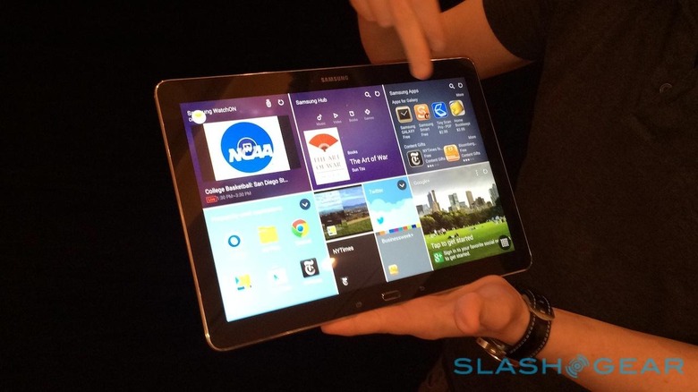
In addition to the three default pages – which can be deleted – it's possible to make your own; each Galaxy NotePRO can have up to five. That's a case of pinch-zooming on the homescreen and then tapping apps in the carousel on the bottom half of the display so that they hop to the new pane. The Magazine UX automatically organizes them, or you can do that manually or simply hit the "rearrange" button and have them juggled into a new layout.
Is it a legitimate improvement over what Samsung was doing before? It's certainly less gaudy than TouchWiz as we've known it, though Samsung's love of bright colors is still clear. Not every app has a Magazine UX widget yet: you get Google+, for instance, but there's no sign of a Twitter or Facebook widget. Samsung Hub and Samsung WatchON are included, but not content from the Google Play store.
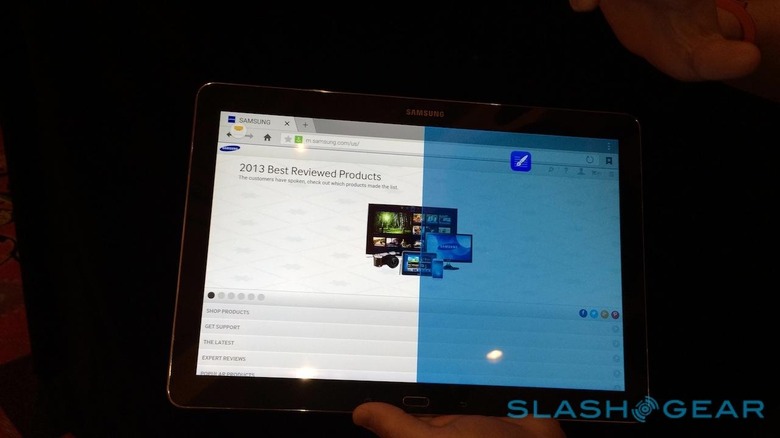
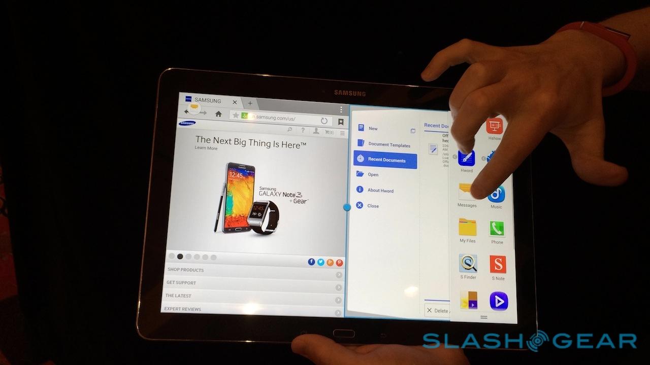
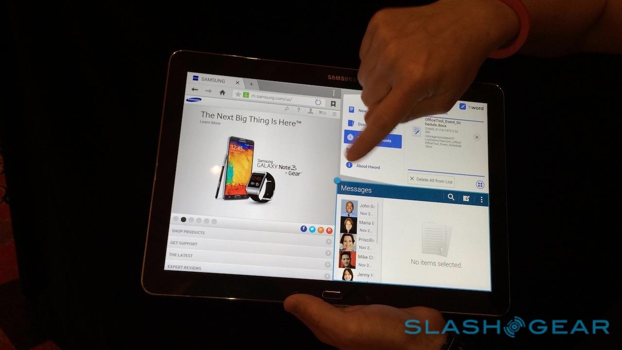
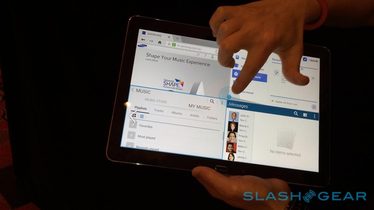
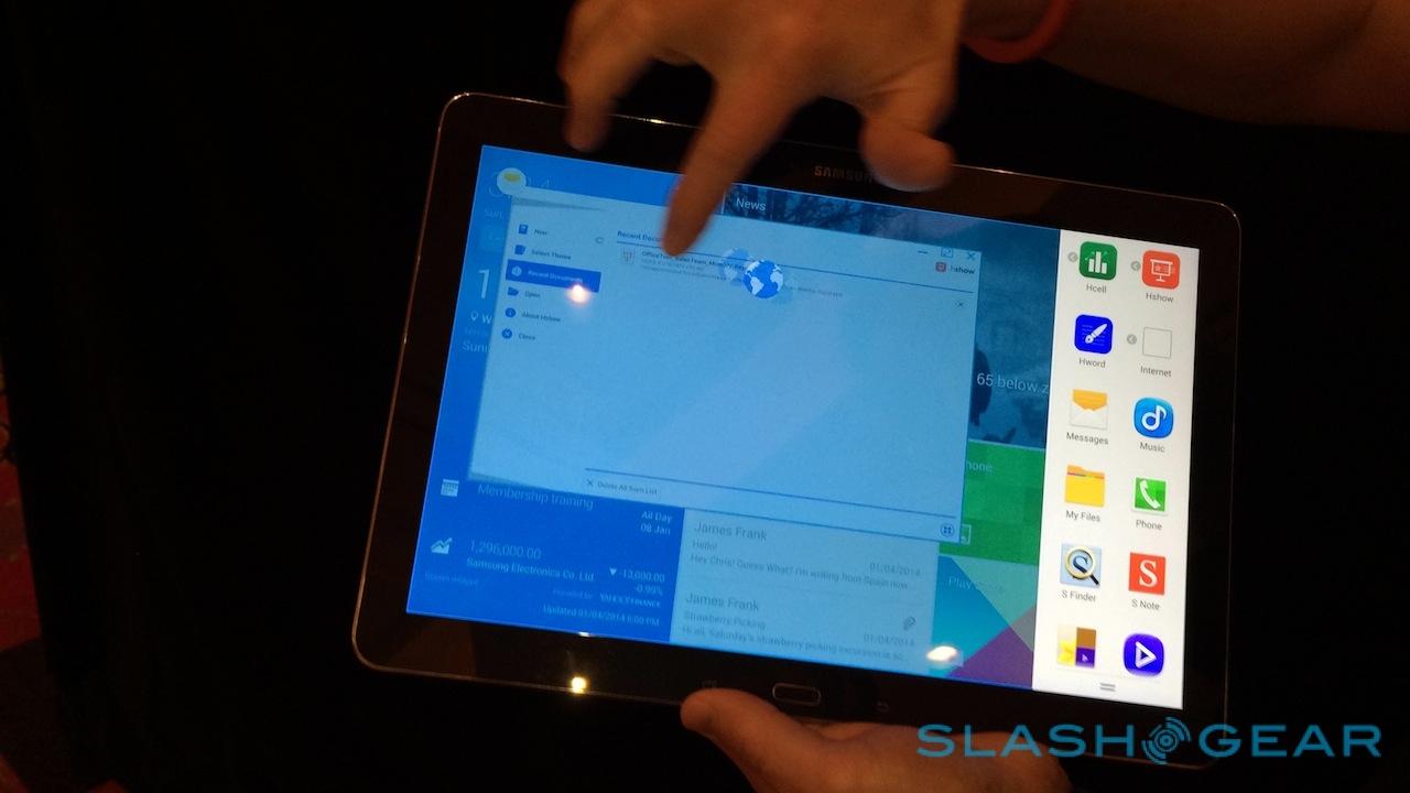
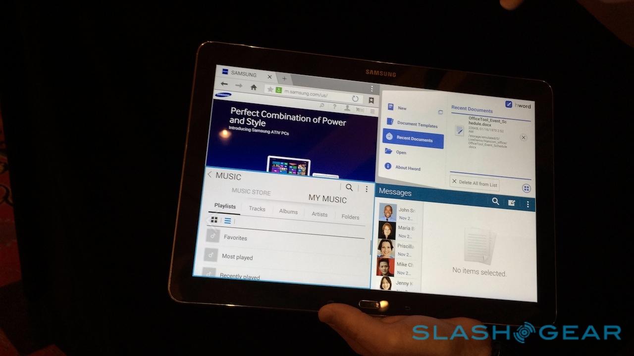
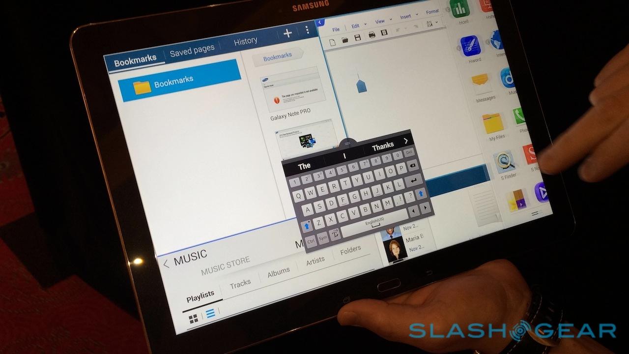
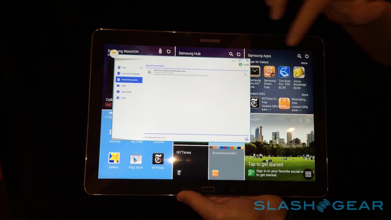
That's not the only unusual use of the display. Swipe in from the right side of the screen and you get a quick-launcher bar. Tap an app and it loads as a floating window on top of the desktop: you can resize it, maximize it, or close it as you would an app on Windows. Tap-and-hold, meanwhile, and you can drag out up to four apps to have shown on-screen simultaneously. They can be different – your calendar and email inbox, perhaps, plus the phone dialer (since the 3G/4G versions of the Galaxy NotePRO can make voice calls, carrier depending, though Samsung doesn't expect owners to hold them to their heads) and your messages – or all the same, such as four instances of the browser.
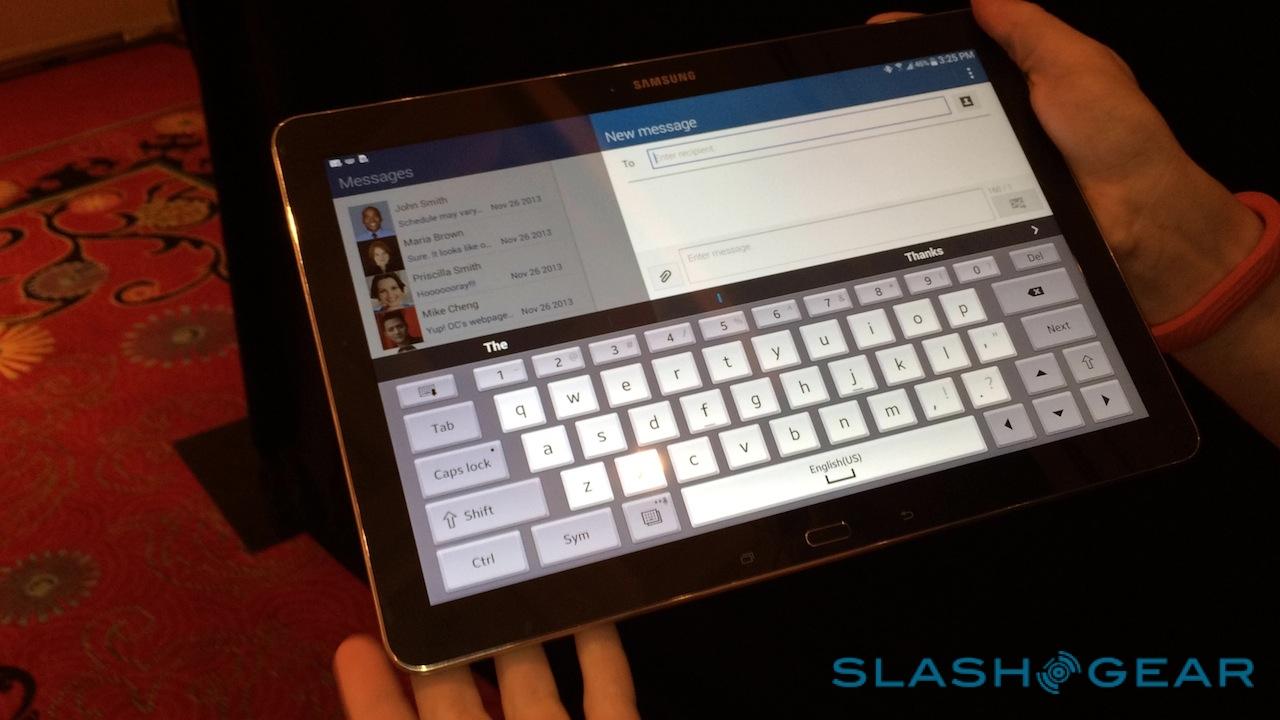
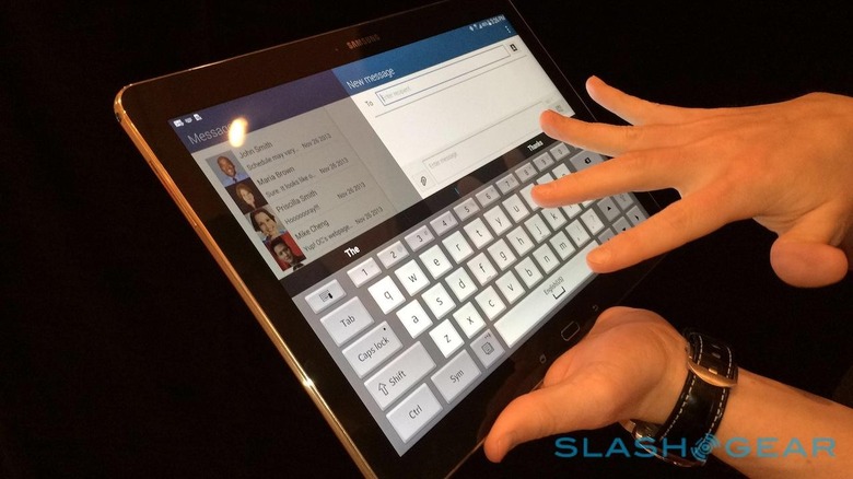
A circle at the intersection of the four panes can be dragged around to resize them, allowing one app to have more space than others. There are also two new keyboards for those times you're not in the mood to write with the S Pen: a full-width, more traditional 'board which uses the extra screen-space to fit in a "Ctrl" key for "Ctrl+C" and "Ctrl+V" copy and past shortcuts, along with a full number row, and a smaller, floating 'board that hovers over the app itself.
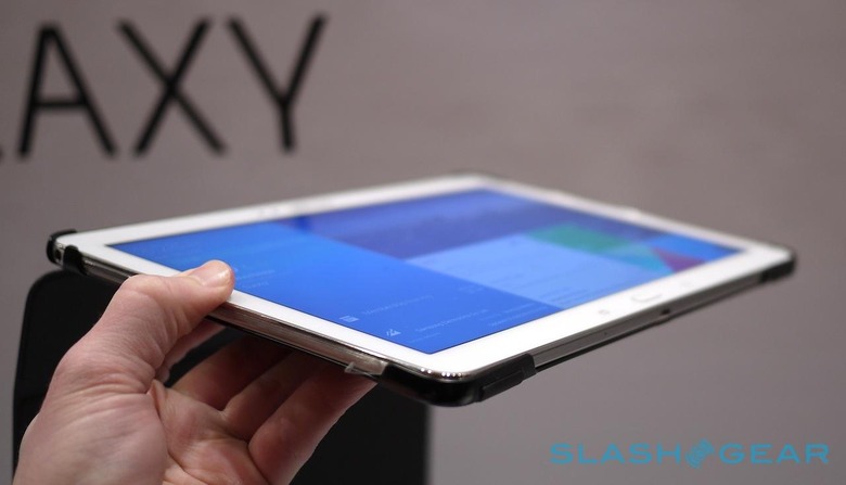
It's easy enough to type with the NotePRO lying flat on the table, though we did notice a little chassis flex when we did so. It's possible that's just a side-effect of using preproduction samples, but overall, the NotePRO isn't an especially comfortable tablet to hold. It's heavy – too heavy for any sort of extended one-handed use – and we found ourselves naturally resting the base on the table and holding it propped up.
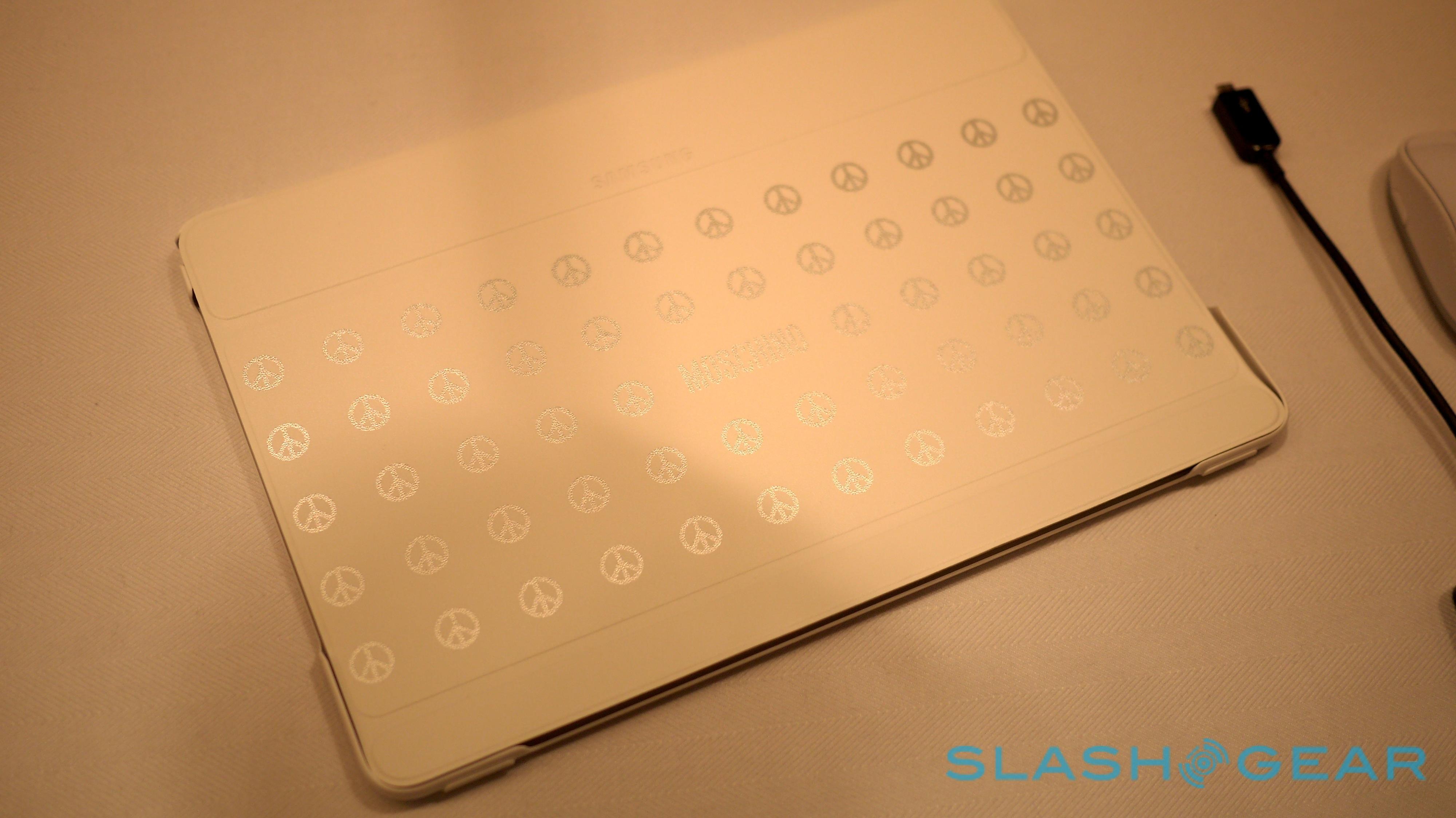
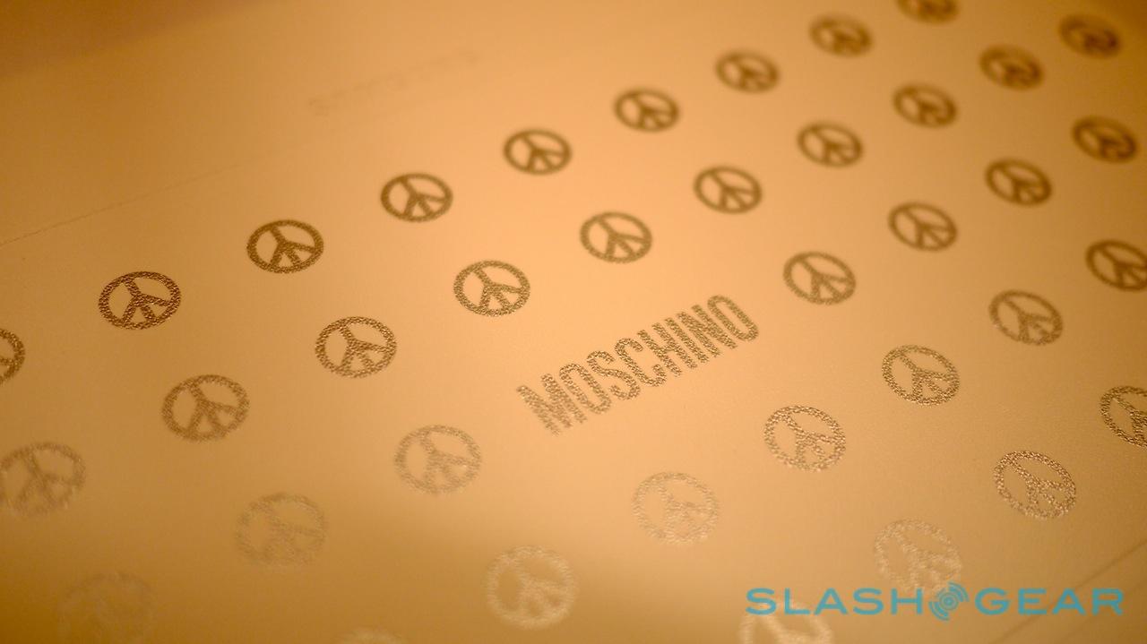
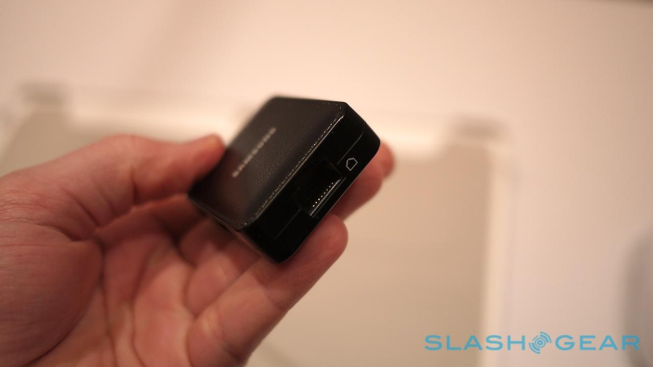
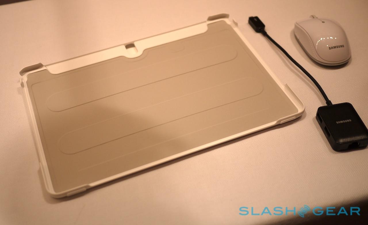
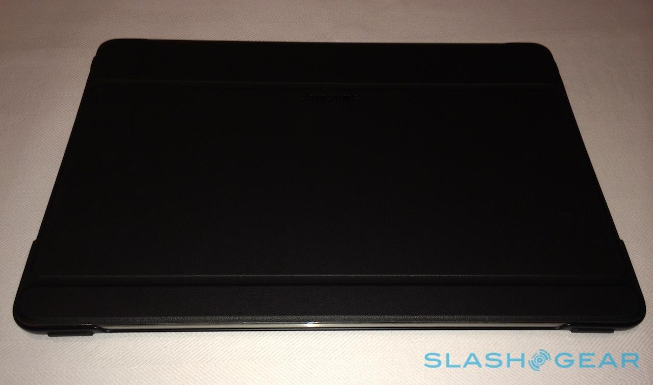
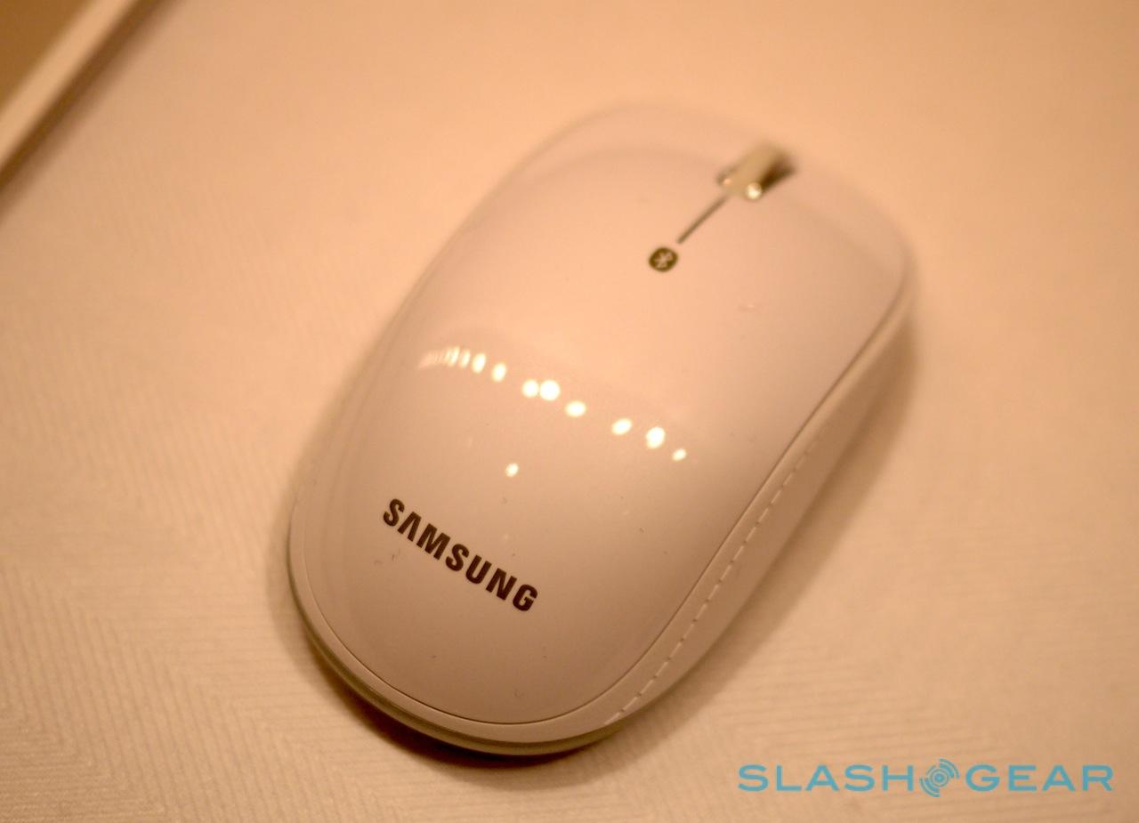
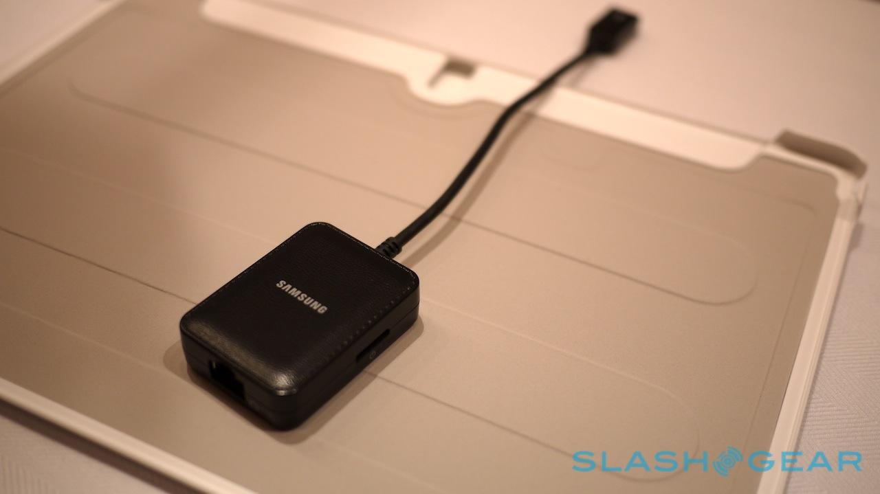
If that sounds like the sort of situation you might use a laptop in, then it's not the end of it. There's also an optional Bluetooth mouse and Bluetooth keyboard, as well as a number of flip-cases including some which have been custom-designed by companies like Moschino. There's even a USB LAN hub for a wired ethernet connection.
Whether you opt for a traditional method of text entry or otherwise, the NotePRO has a couple of preloaded apps to make using it more like a traditional computer. In fact, one of them just brings your regular computer to the tablet's display, with Samsung's Remote PC app connecting to a PC or Mac and allowing you to run apps, copy across files, and generally use it as if you were sat in front of it at home or the office. Samsung e-Meeting sets up impromptu workgroups among multiple NotePRO tablets, for collaborating on documents in real time, while Samsung will also include six months of access to Cisco WebEx Meetings including eight-person video calls and screen-sharing.
Meanwhile, there's what Samsung is referring to as its "Ultimate User Content Gift Package" with what the firm says is around $700 of apps and subscriptions to services like Bloomberg Businessweek+, Dropbox, and others. There'll be up to a year of Evernote Pro subscription, for instance, as well as a free copy of Sketchbook Pro.
There's certainly no doubting that tablets are primarily content consumption machines; while it's certainly possible to use a tablet to create something, it's generally not the most efficient of processes. The Galaxy NotePRO does address that, but it does so with a number of compromises along the way. It's not light, and while the onscreen keyboard is better than many we've used, it still doesn't allow for the speed of typing that a proper, physical 'board would offer.
On the other hand, there's certainly an audience out there asking for a larger tablet, and the combination of split-screen and multi-pane tools make Android more flexible than ever before. A lot will depend on pricing, which Samsung will announce closer to the Galaxy NotePRO's global launch later in Q1 2014.
