Samsung Galaxy Note 5 And Galaxy S6 Edge+ Hands-On - Phresh Phablets
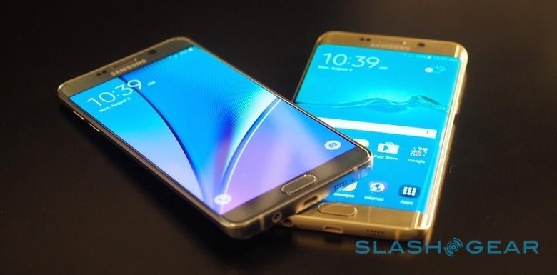
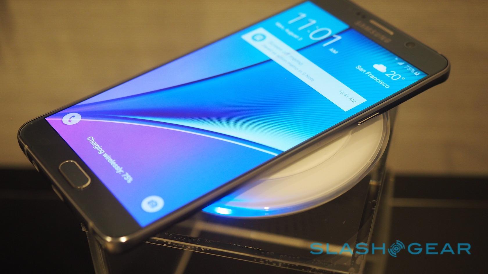
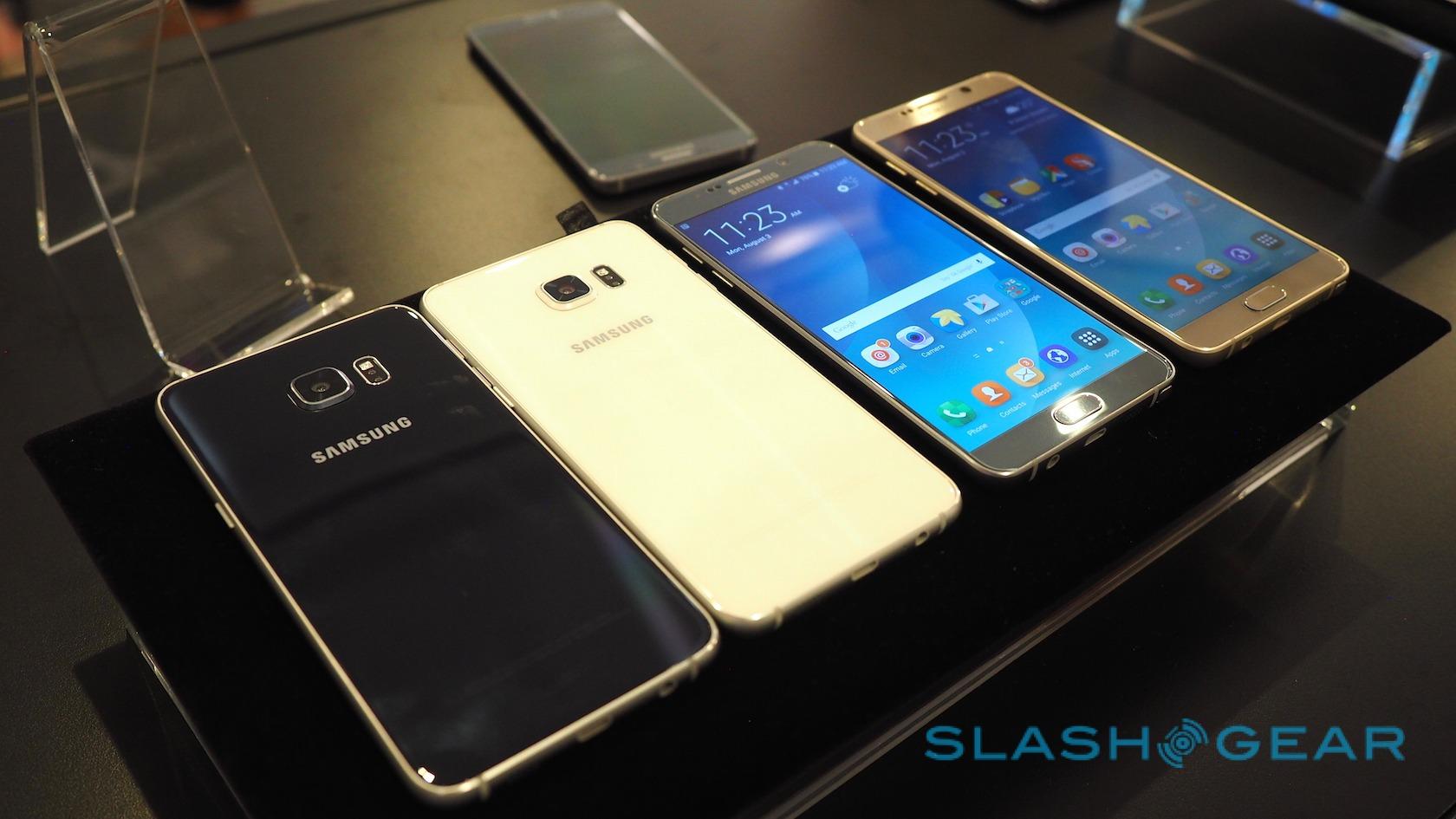
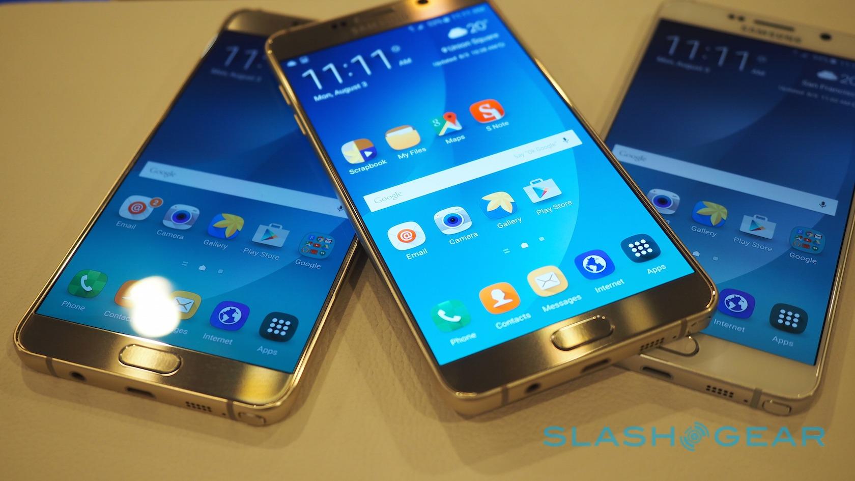
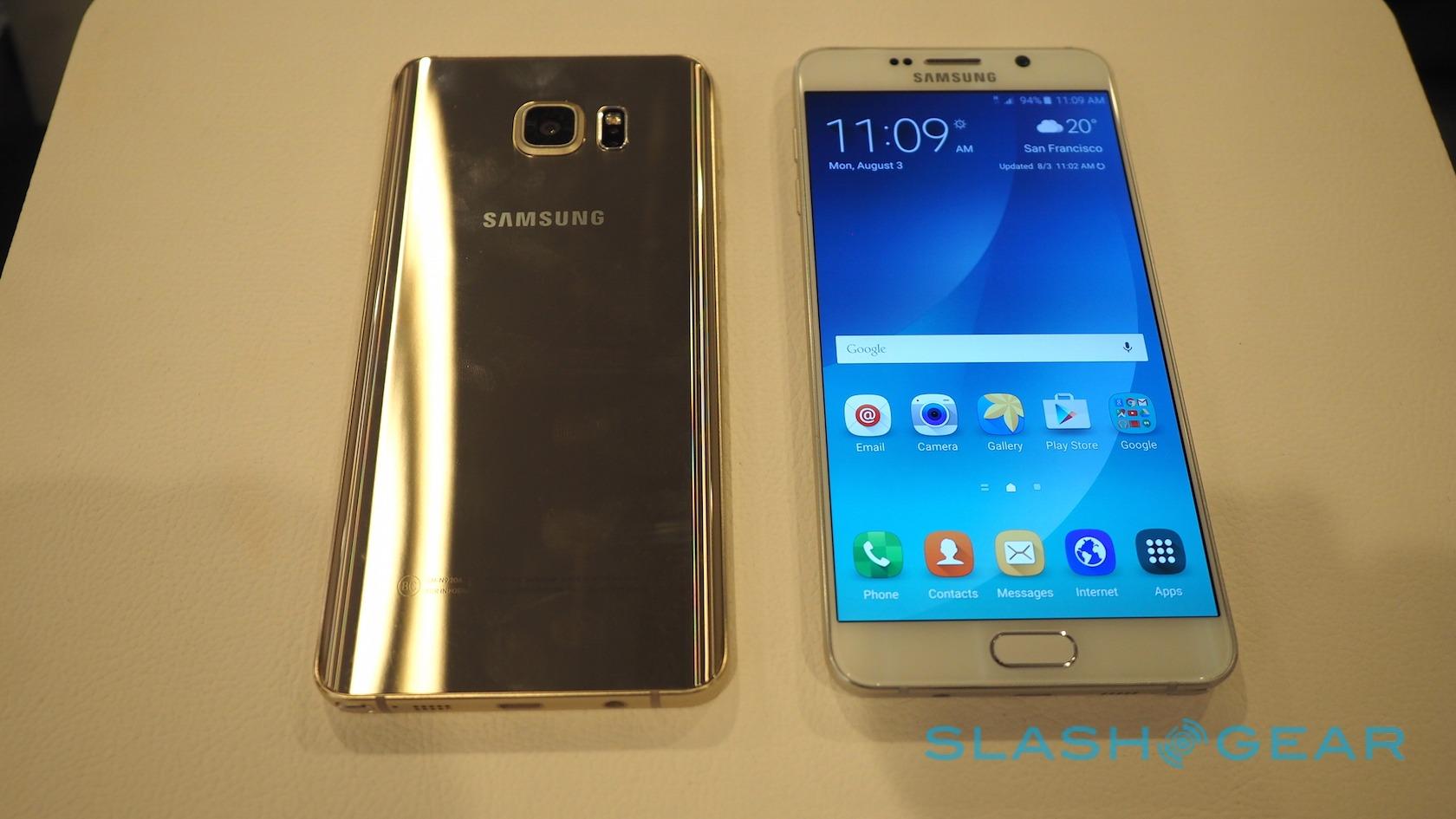
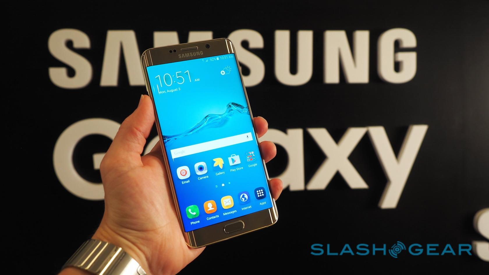
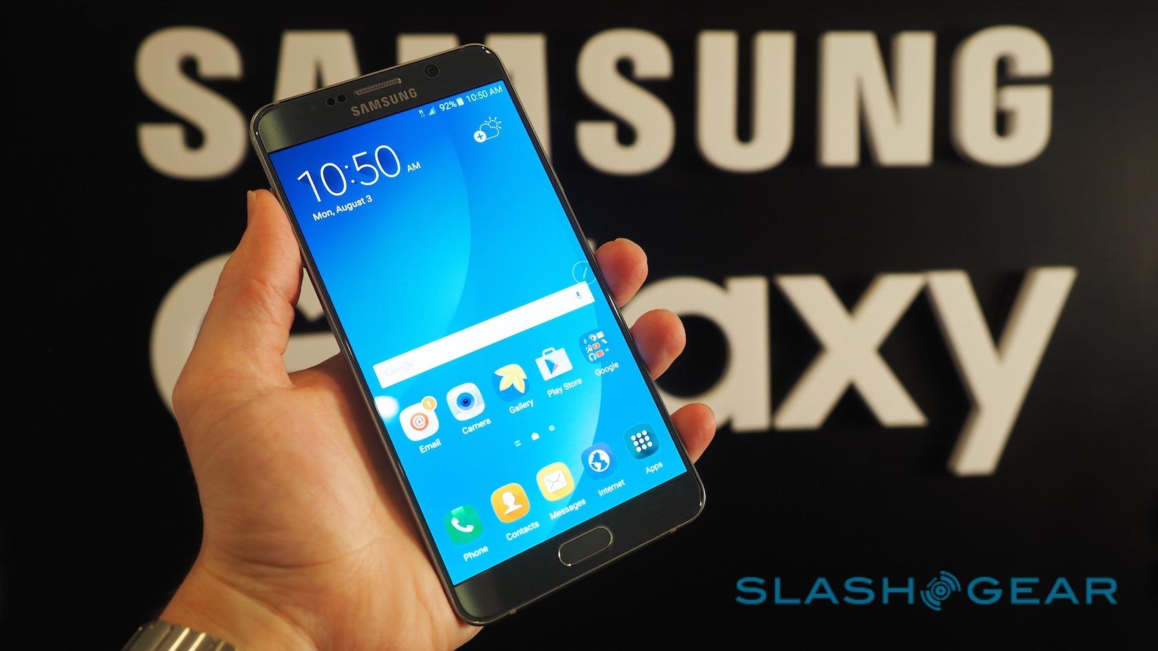
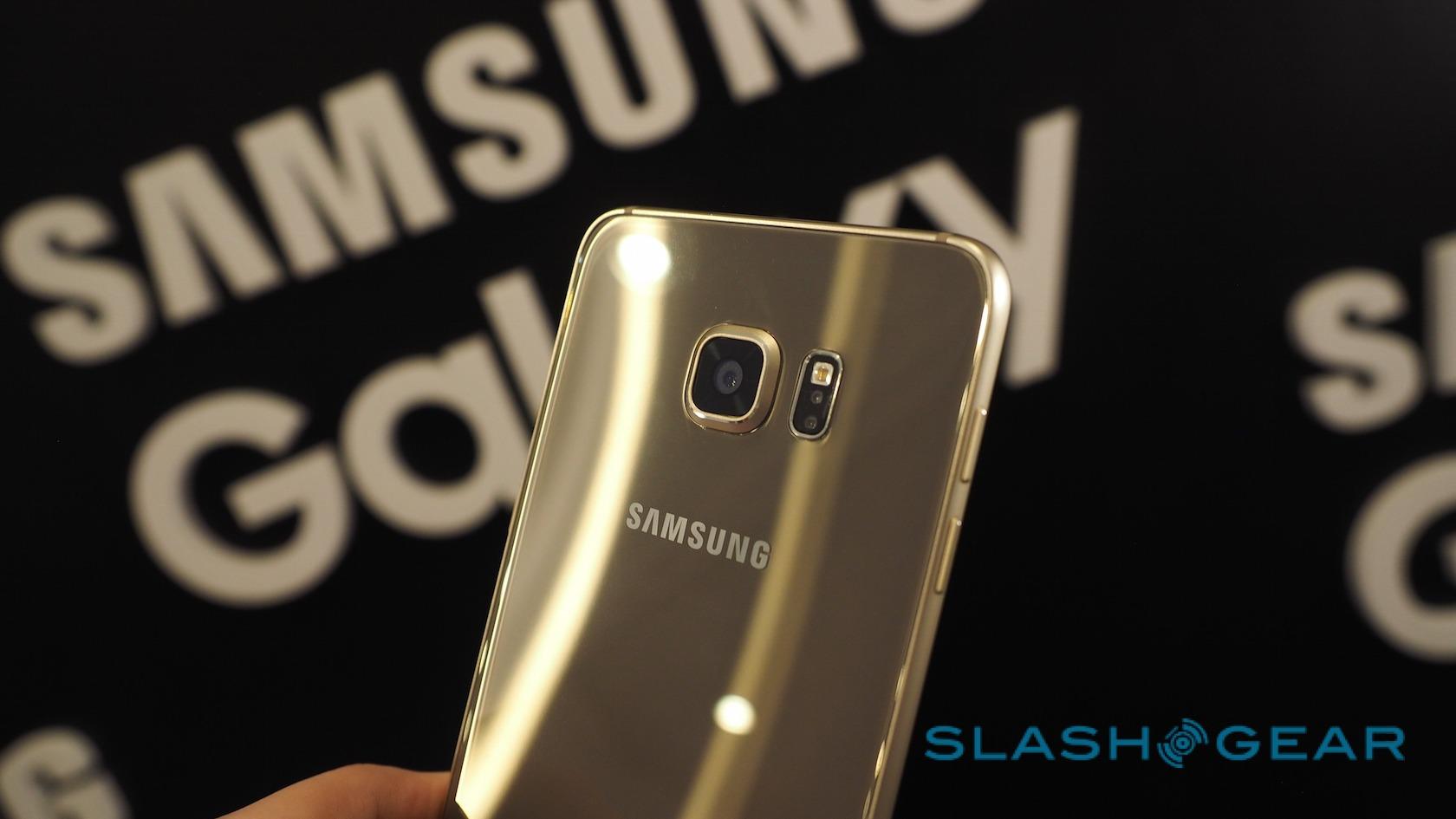
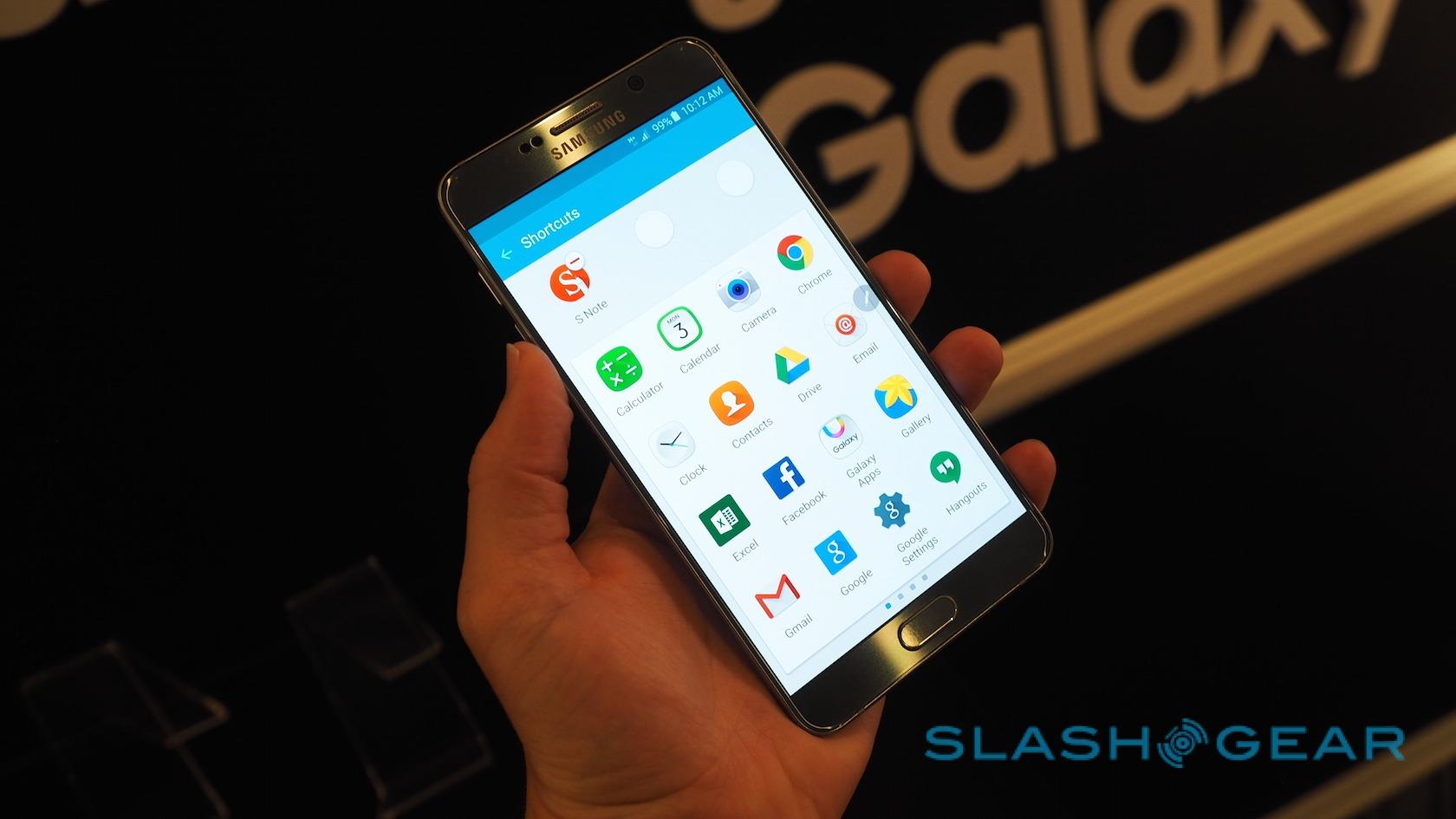
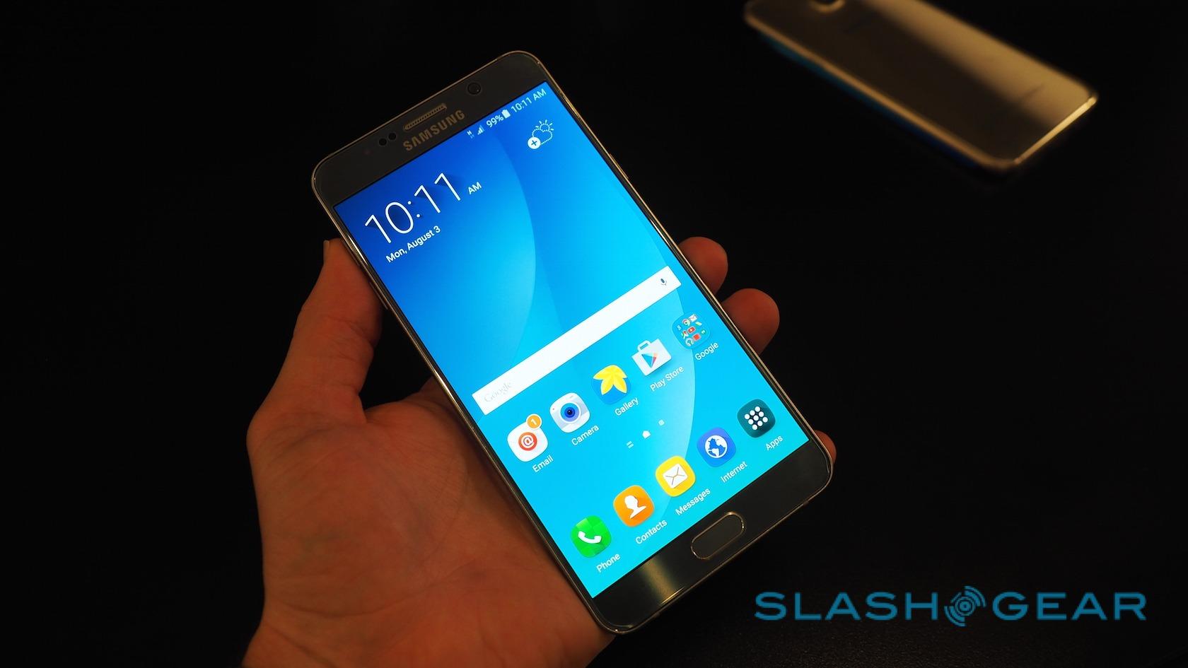
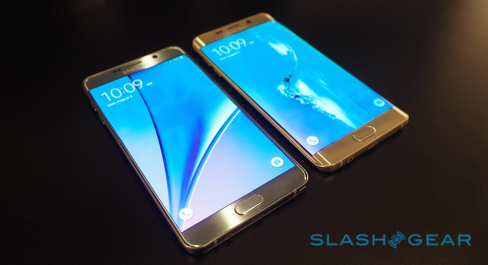
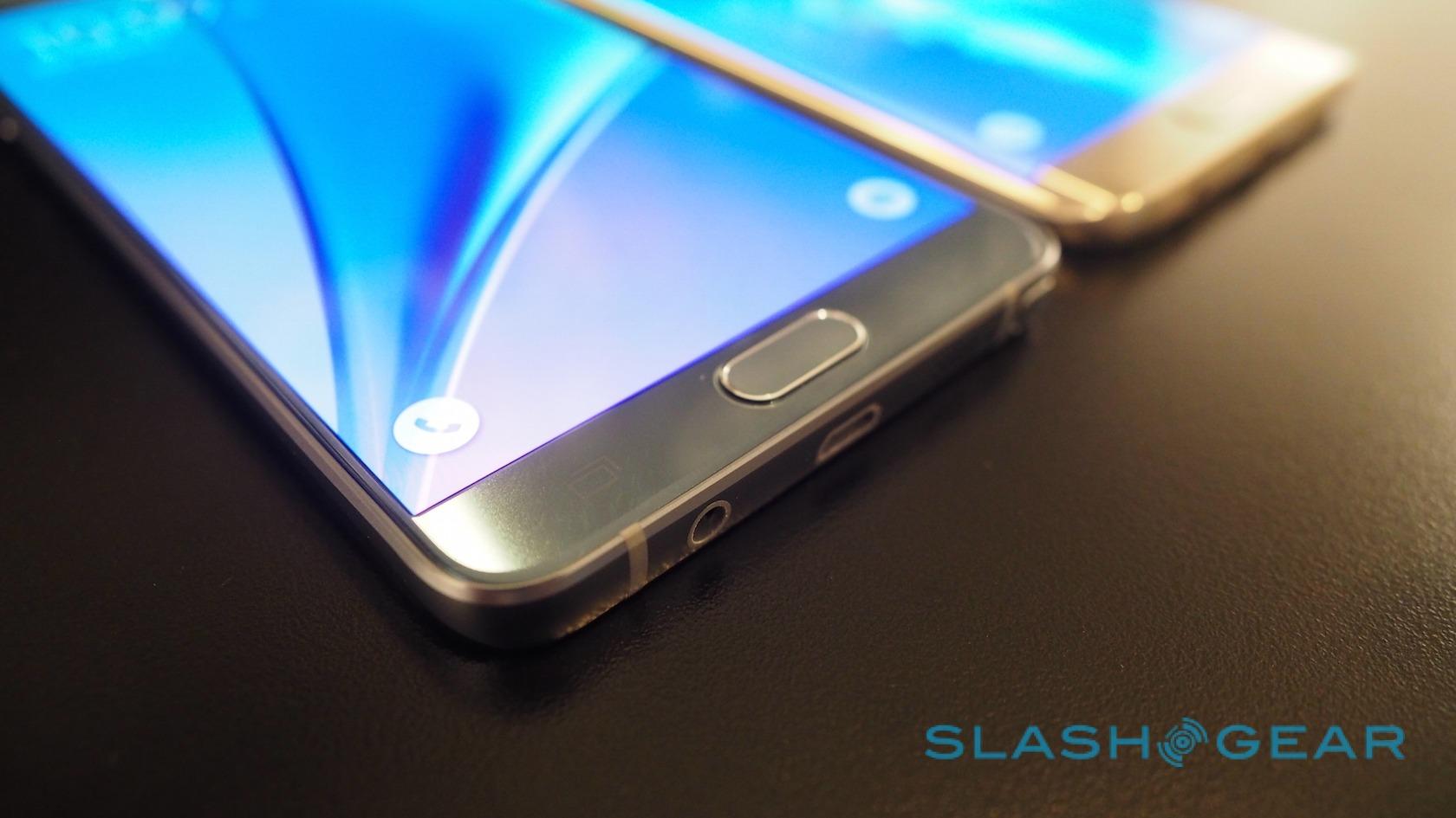
The new Samsung Galaxy Note 5 has arrived, and it's brought along a fancy cousin in the shape of the Samsung Galaxy S6 edge+. Each of the phablet-scale phones sit at the top end of Samsung's Android family, offering super-high-resolution displays, lashings of processing power, and the sort of build quality that proves Samsung is no longer playing around with plastic. As I found when I went hands-on with the pair, however, they're also surprisingly different despite the family relationship.
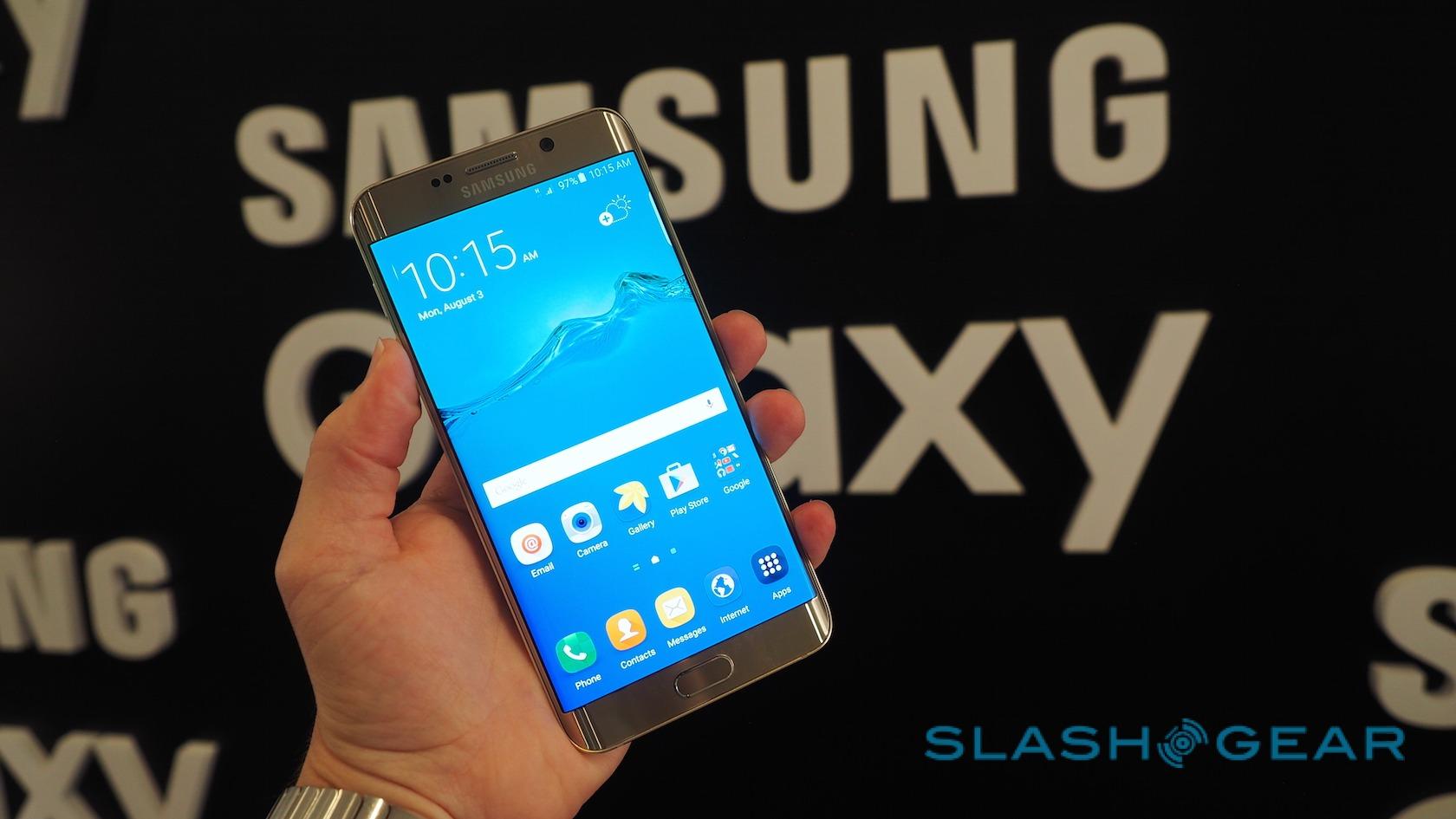
Both new phones share a common architecture. Each runs Android 5.1 Lollipop on Samsung's own Exynos 7420 chipset, a 64-bit, 14nm octacore (combining a 2.1GHz quad core and a 1.5GHz quad core) with 4GB of LPDDR4 memory. Dominating the front is a 5.7-inch Super AMOLED touchscreen running at 2560 x 1440 (518 ppi) resolution.
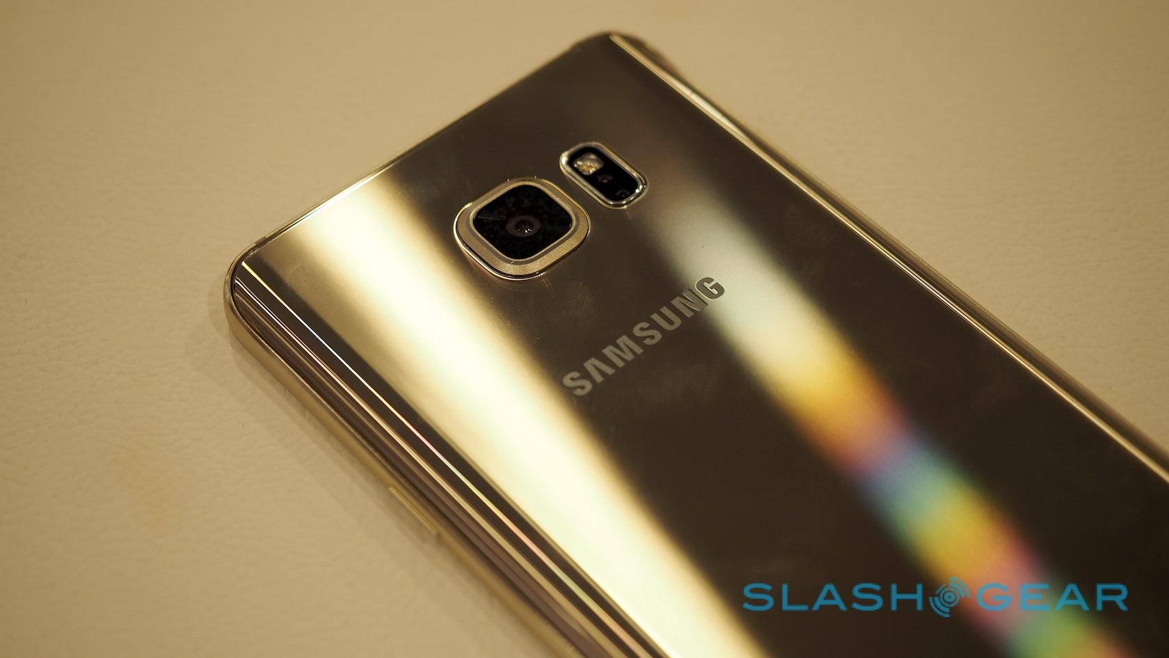
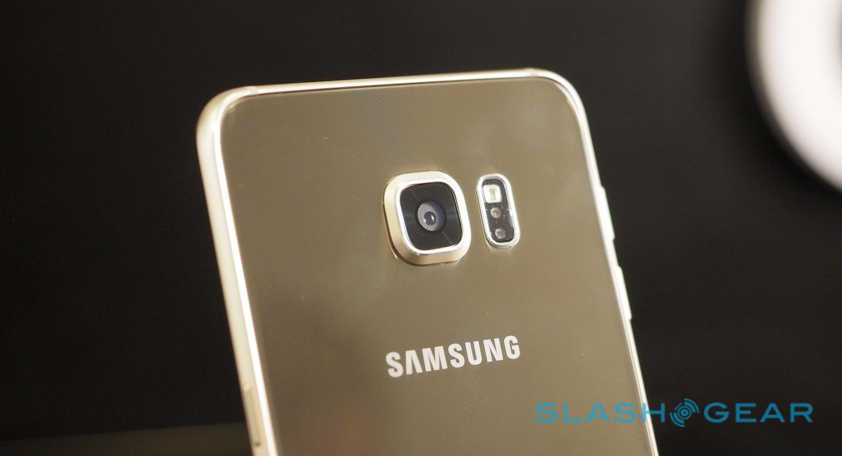
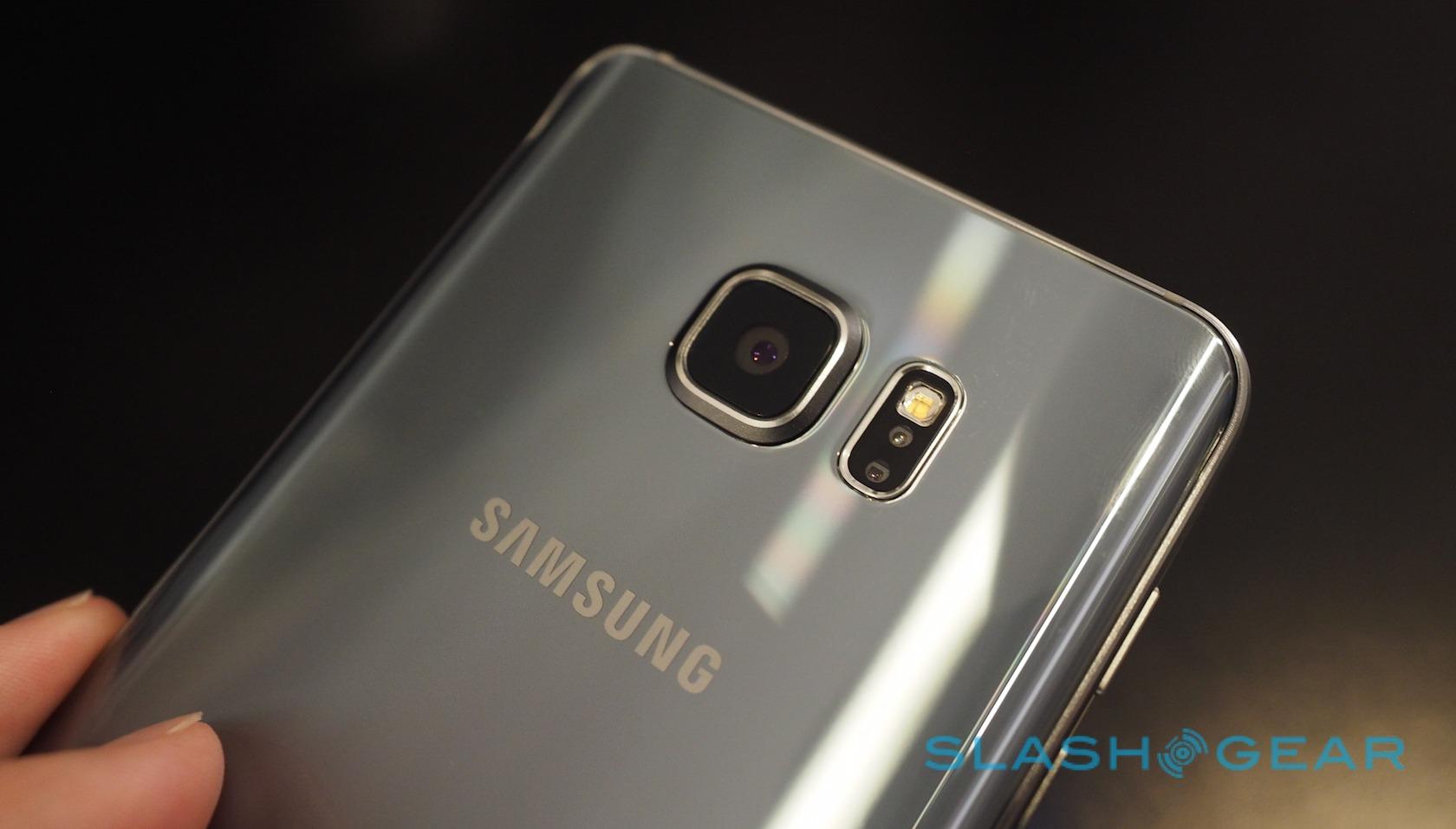
On the back, each has a 16-megapixel camera with optical image stabilization and an f/1.9 lens, while there's a 5-megapixel camera with f/1.9 lens on the front.
Inside, there's a 3,000 mAh battery with support for wireless charging across both Qi and Powermat standards. Sensors include GPS, GLONASS, and Beidou, together with accelerometer, proximity, RGB, geo-magnetic, gyro, barometer, hall, and HRM.
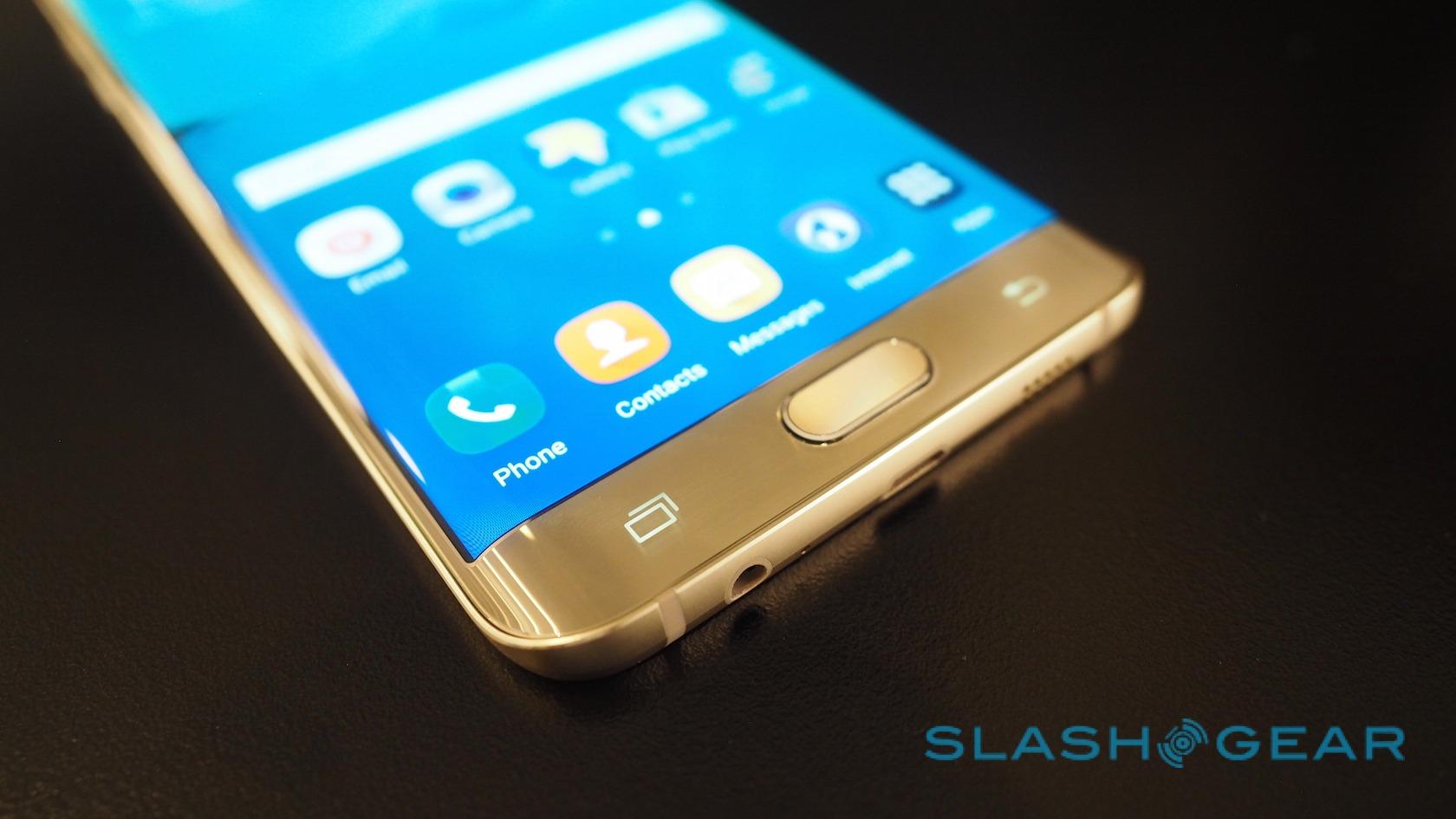
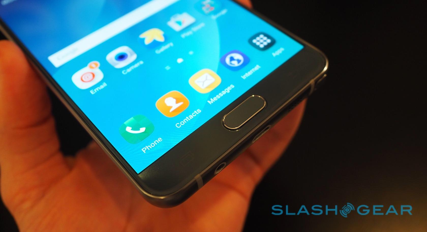
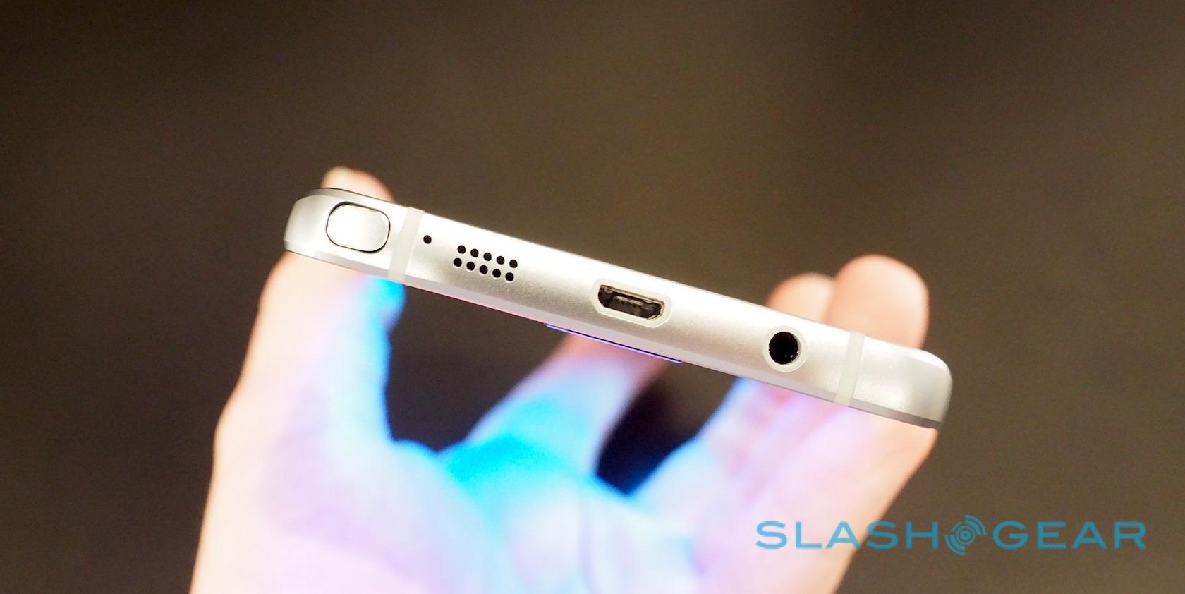
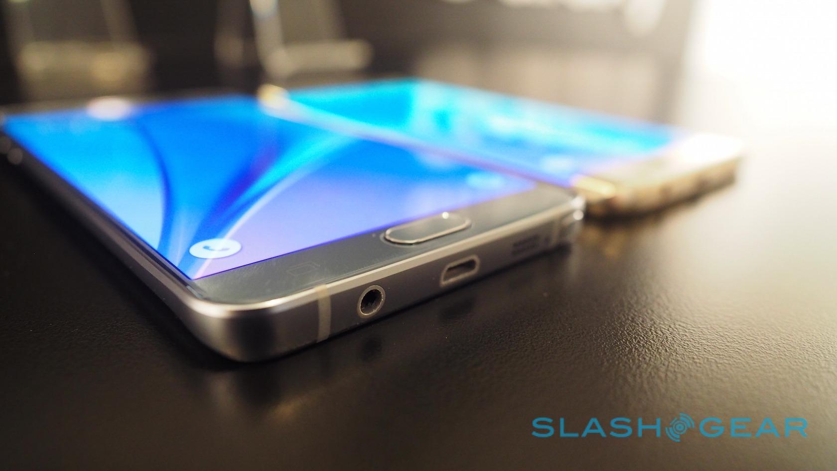
The slick no-swipe fingerprint sensor built into the home button on the Galaxy S6 makes a reappearance here, used for both device security and Samsung Pay (more on which later).

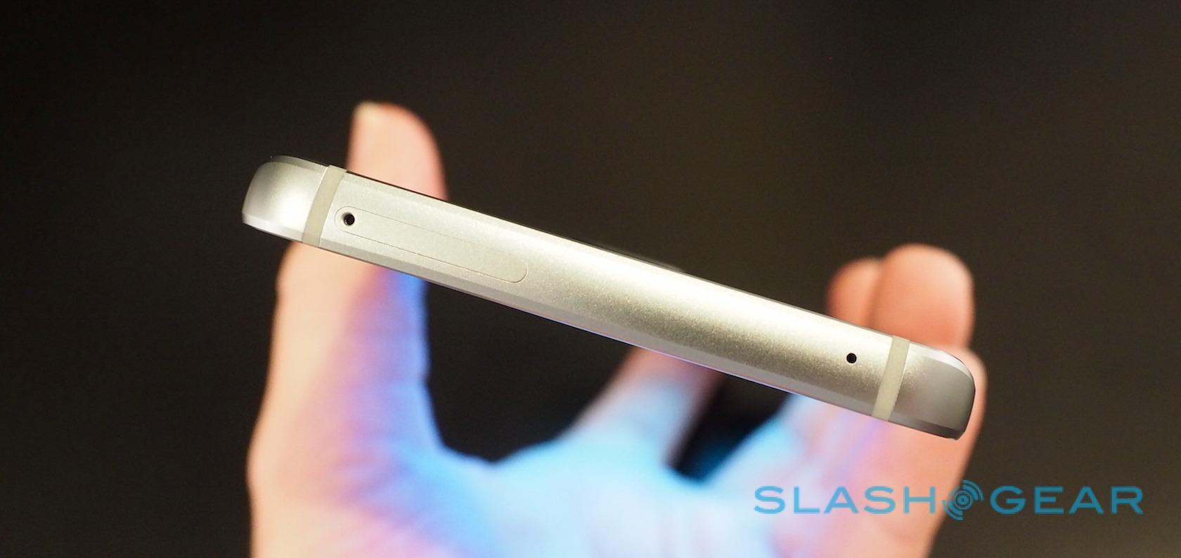
Samsung runs the risk of frustrating its power users, however. Non-removable batteries and no memory card slot are still contentious issues among Galaxy S6 owners, so it's no surprise that the S6 edge+ lacks both too. Note users, though, are facing their absence for the first time, and I've no doubt they're going to be vocal in their disapproval.
The transition hasn't even been smoothed over with a high-capacity version of the Note 5. Samsung will offer 32GB and 64GB models, but nothing larger, which means it's a trip to the cloud if you need any more storage.
At least your connection should be speedy in that case. Both devices support Cat.9 LTE for up to 450 Mbps downloads, network depending. There's also WiFi a/b/g/n/ac (2.4/5GHz) with 2x2 MIMO support for up to 620 Mbps connections, together with Bluetooth 4.2 LE, ANT+, and USB 2.0.
Despite the similarities, however, the two phones feel very different and have very different audiences.
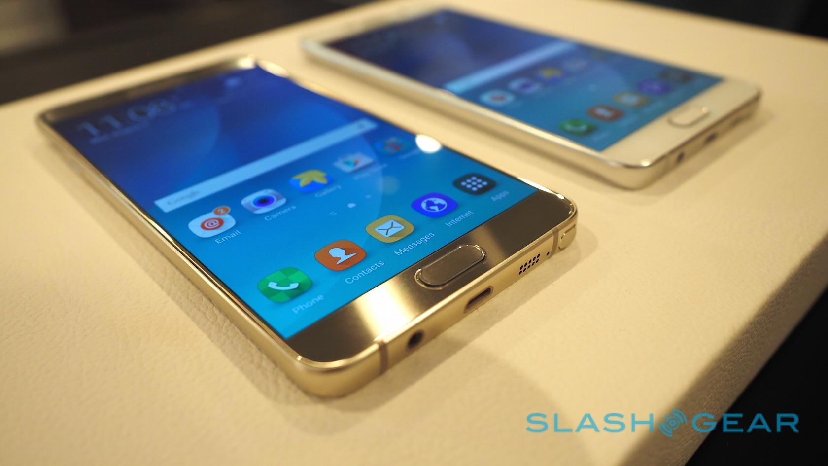
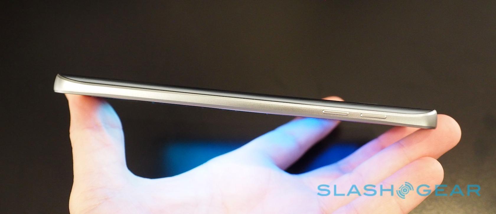
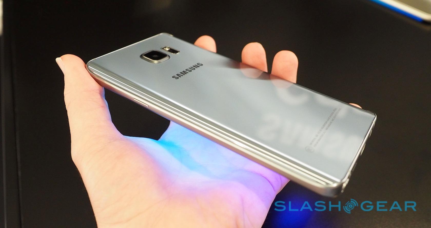
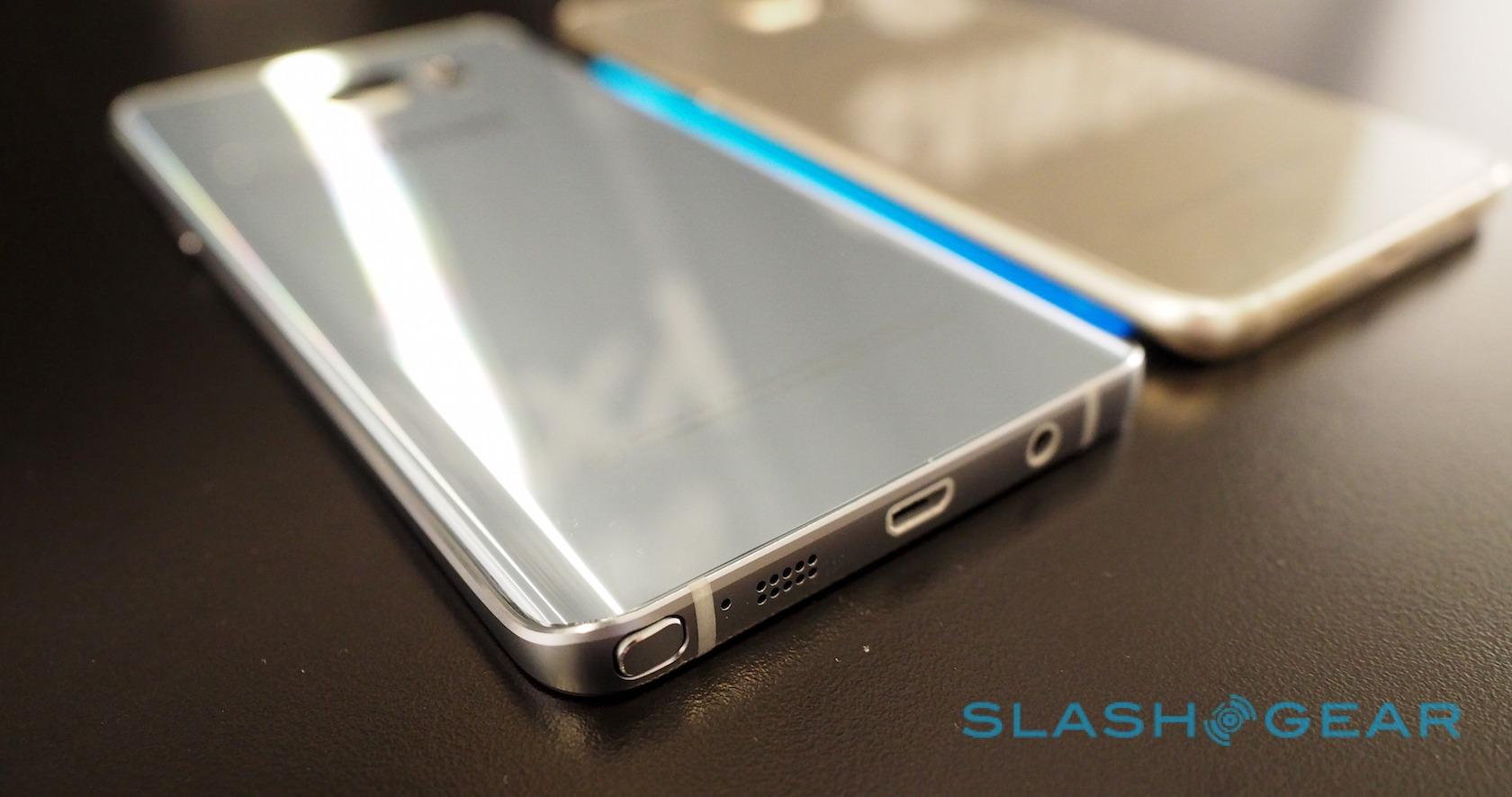
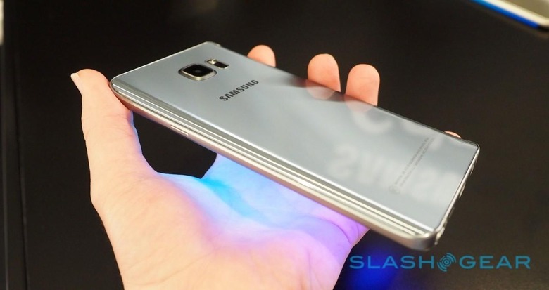
The Note 5 comes in at 153.2 x 76.1 x 7.6 mm and 171g, making it a little smaller and lighter than its predecessor. Samsung had showed its design direction with the Note 4, using metal for the edges, but still relied on plastic for the back cover.
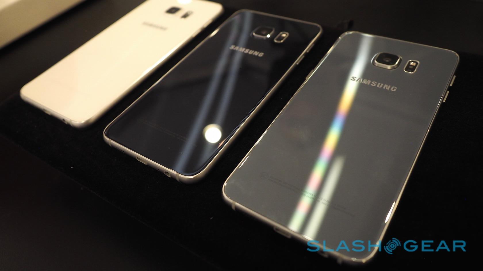
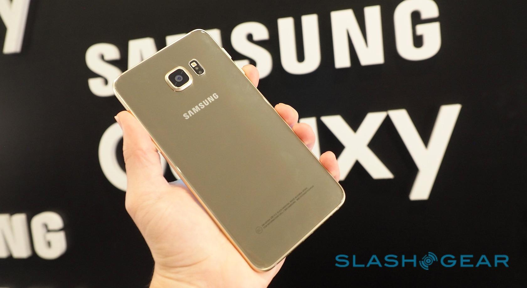
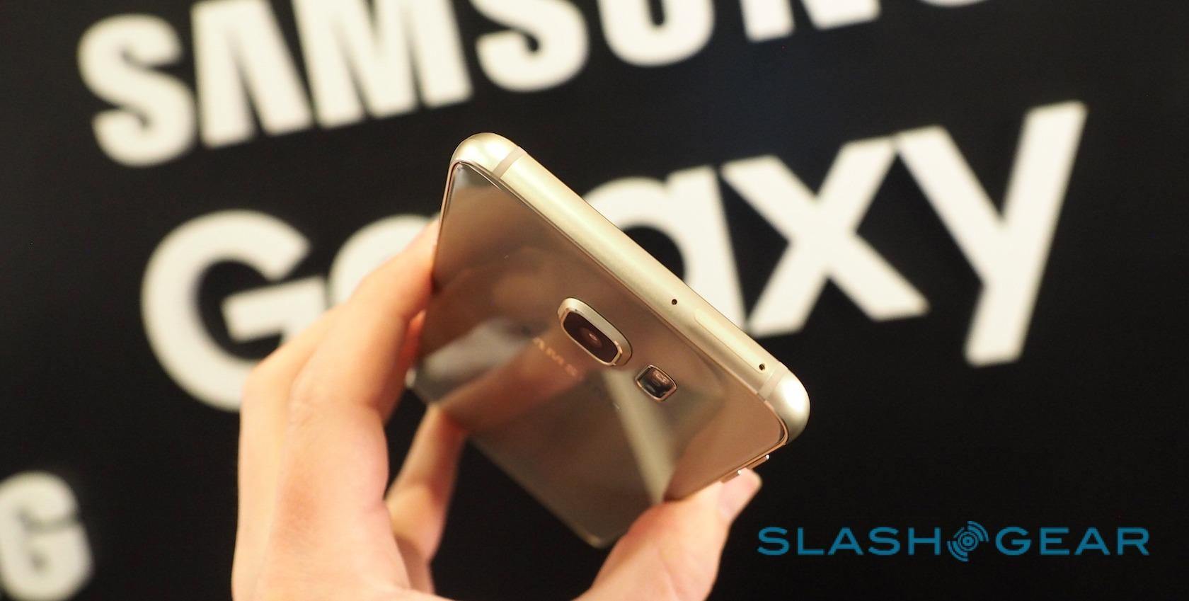
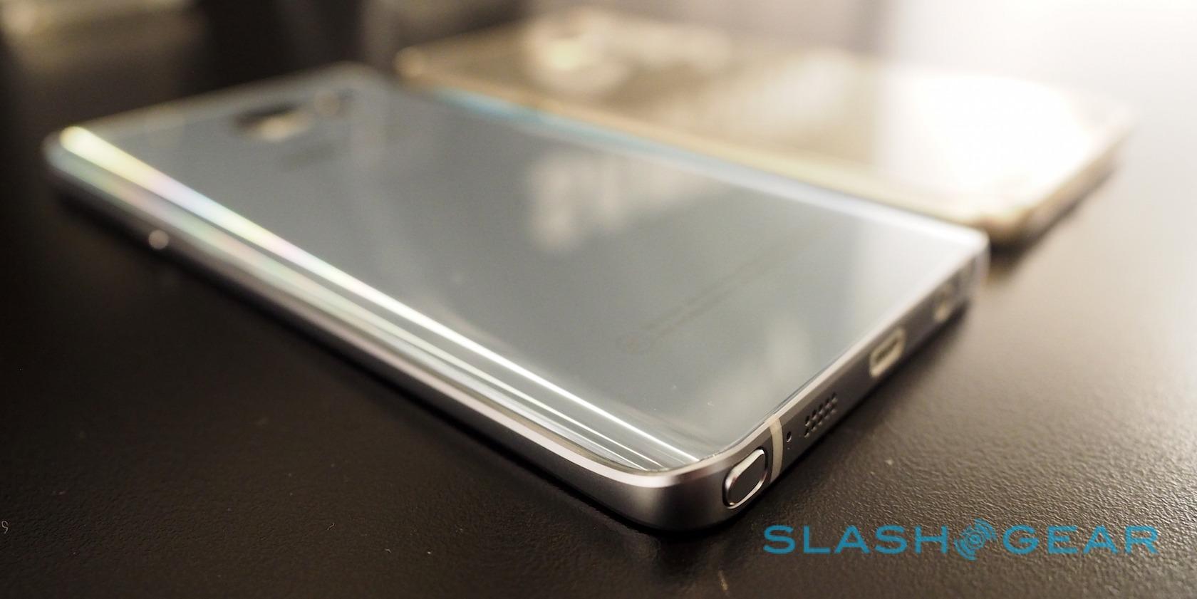
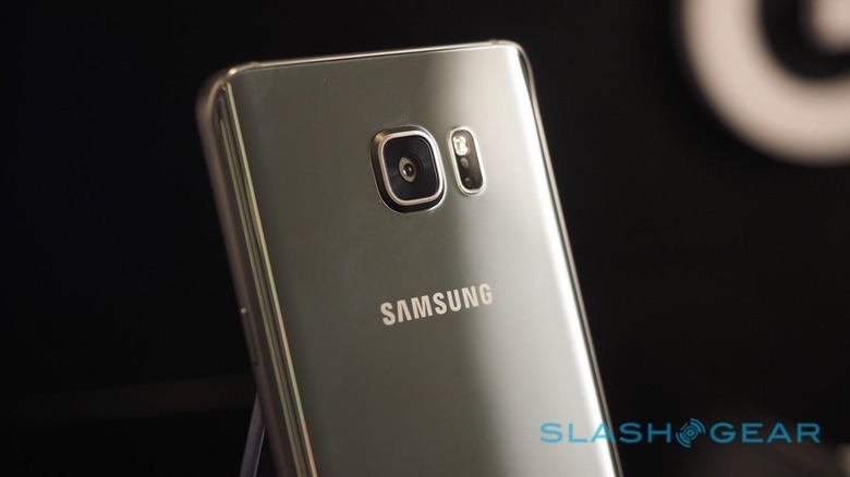
No such cop-out for the Galaxy Note 5. Now, it feels much akin to a large S6, with a matte-finish aluminum frame and Gorilla Glass 4 front and back. Just like the S6 it's a fingerprint-magnet, and sadly the US won't get some of the more interesting color options – at least initially – though the black sapphire and white pearl finishes are pleasing to the eye.

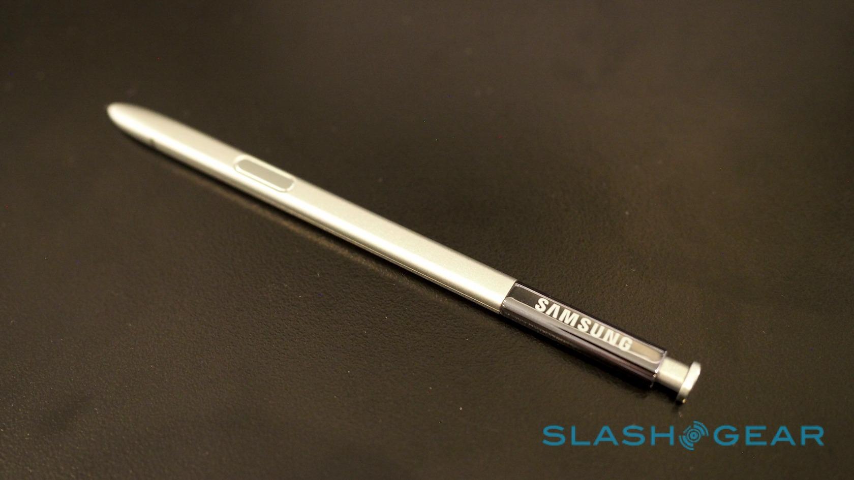
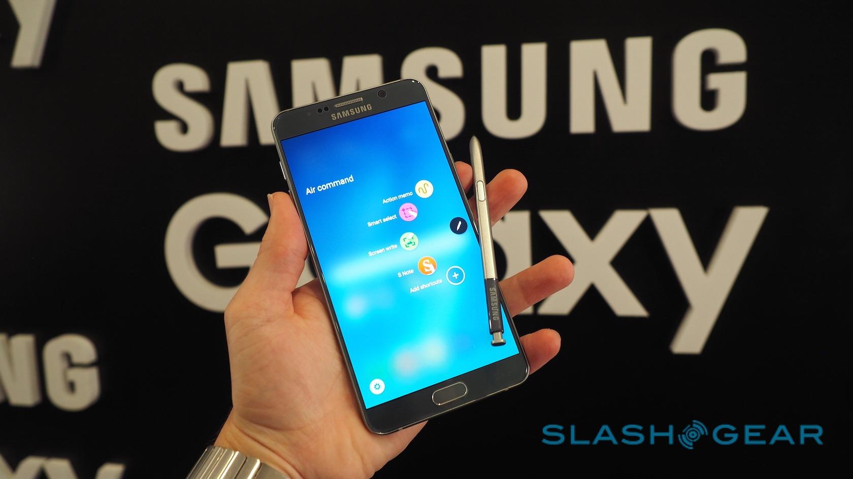
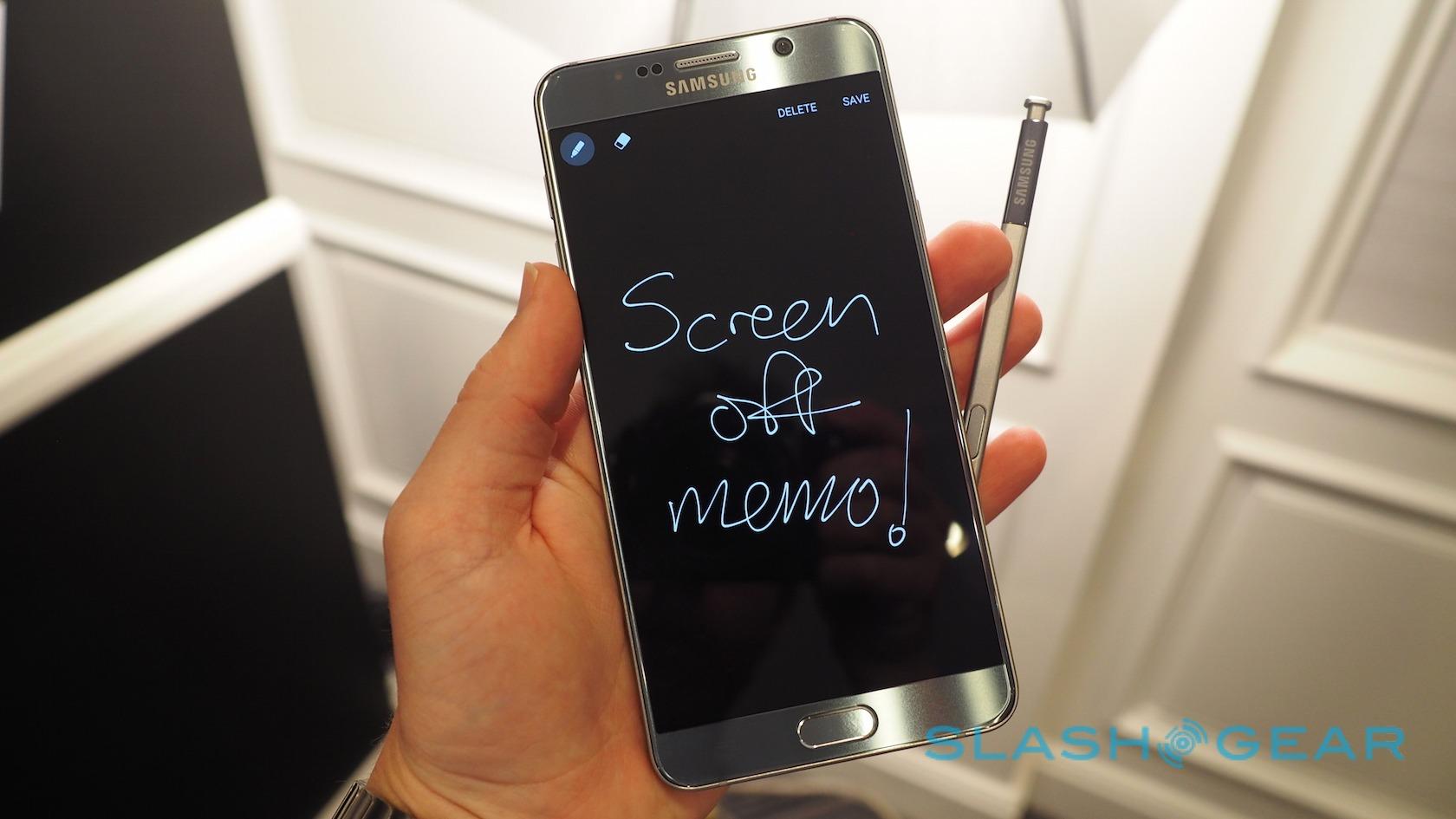
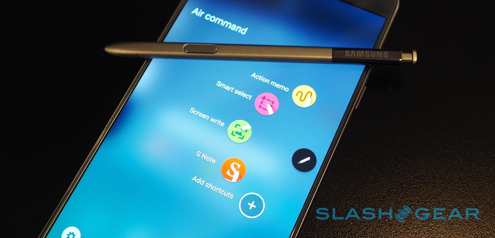
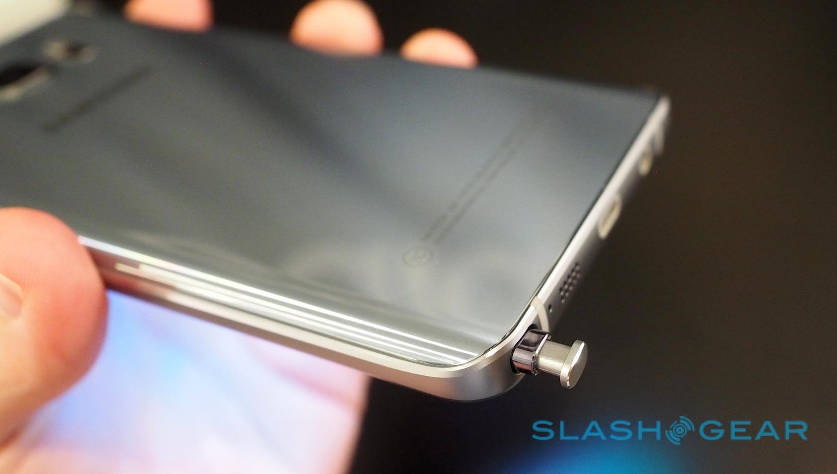
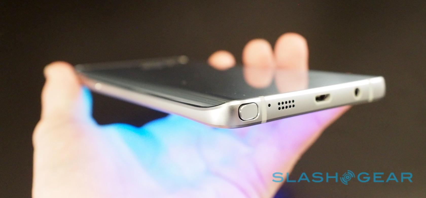
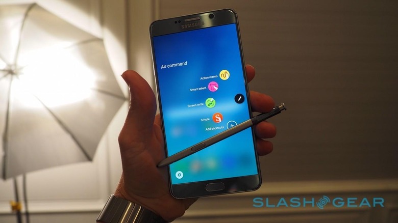
The S Pen has been retained, of course, but now gets a clicky mechanism – similar to a regular ballpoint – to hold it in its silo but also make removing it easier. Various software and hardware tweaks have been made to improve accuracy and reduce inking latency, though I'd need to spend time with old and new side-by-side to see quite what the real difference is. Suffice to say, it smoothly kept up with my scrawlings.

With each iteration of Note, Samsung has been increasing what you can actually do with the S Pen, and the Note 5 is no different. Most of the improvements focus on the speed at which you can start using the stylus: you can now start scribbling straight on the display as soon as you pull the S Pen free, for instance, without having to wait for the phablet to unlock or a notes app to load.

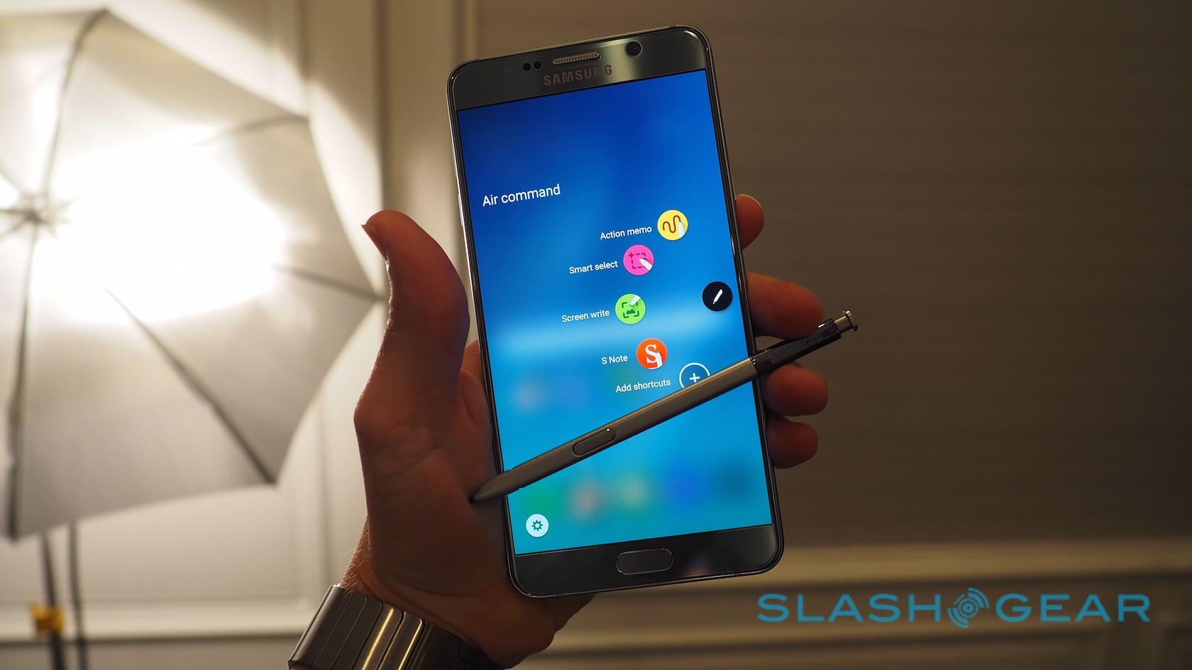
Air Command, the arc of shortcuts that appear when you take out the stylus, now supports user-customization with up to five apps. You can capture sections or the entirety of the screen as before, but there's also support for scrolling screenshots, useful if you want to save an entire webpage as a single image.
Any of those captures can be annotated, but Samsung has also added PDF handwriting support. If you've ever had to print out a document, sign it, and then scan or fax it, you'll know that being able to simply jot your signature on a digital version is a huge time-saver.
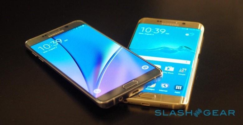
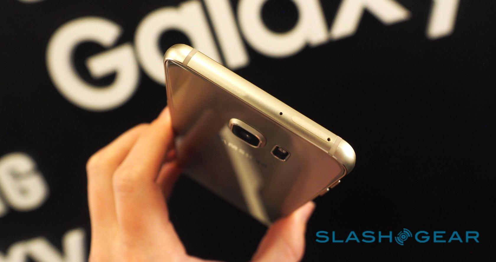
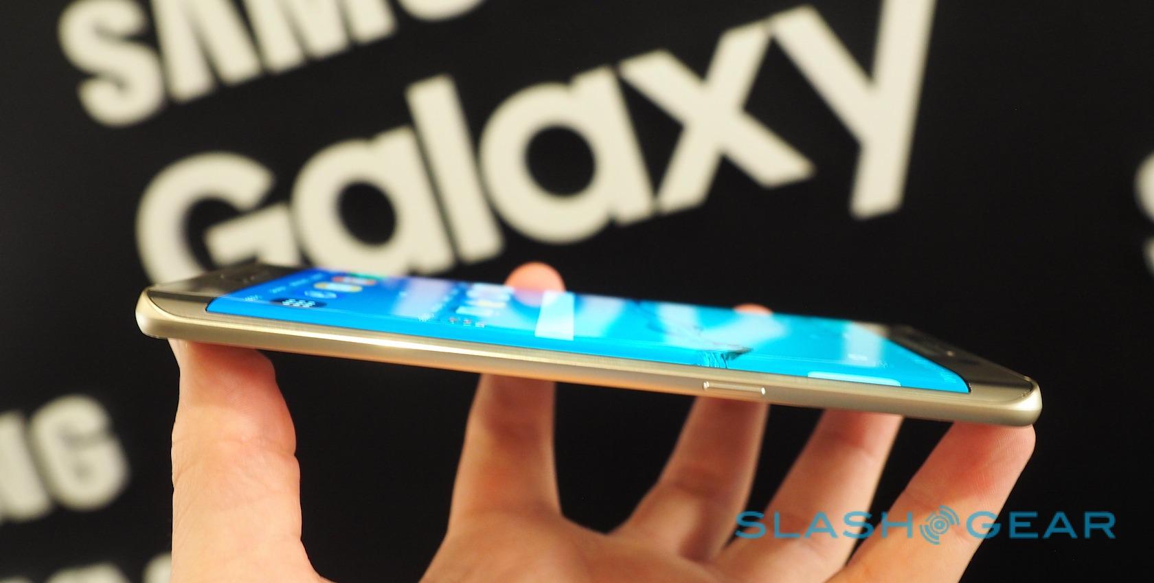
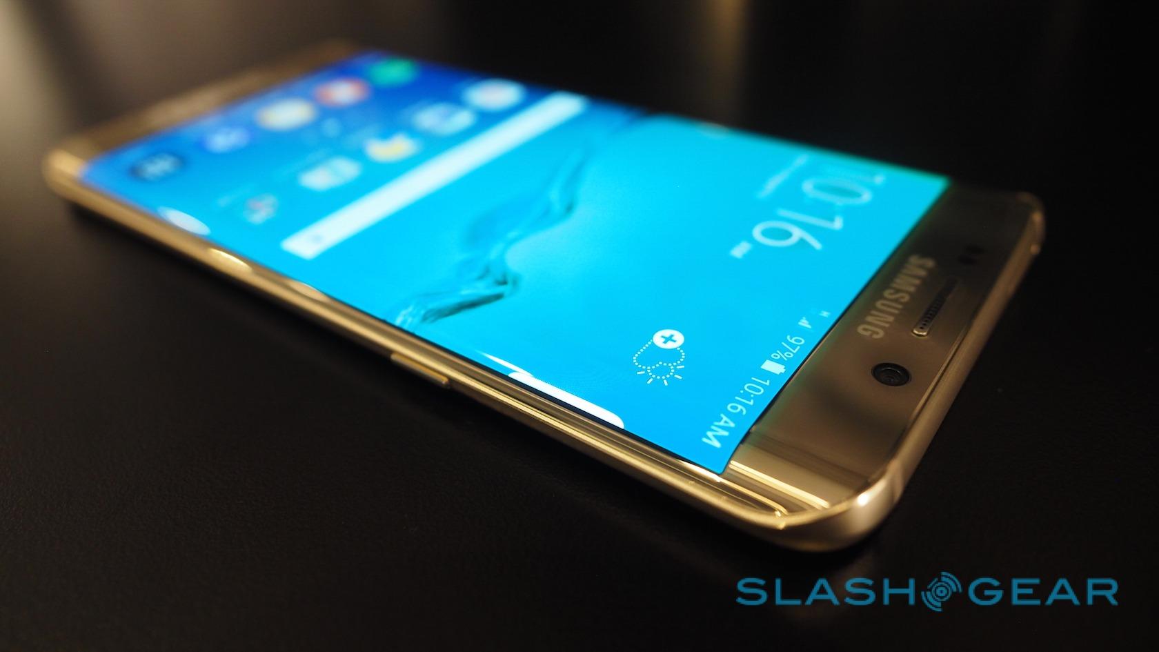
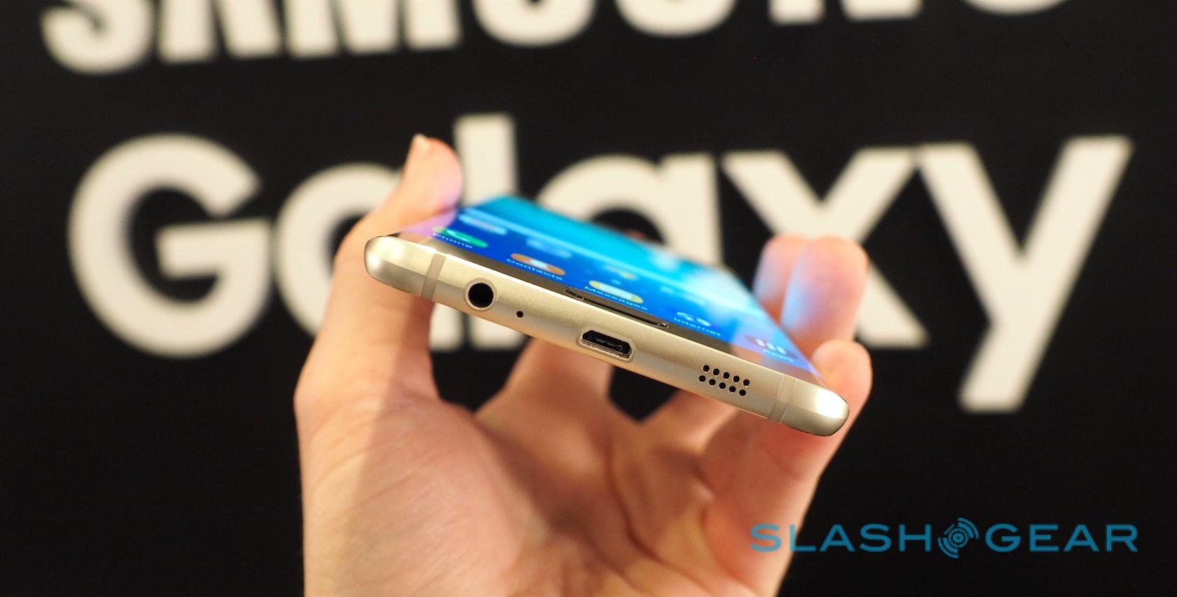
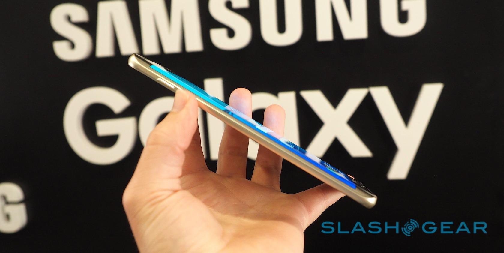
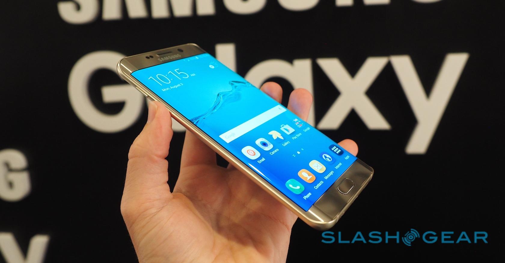
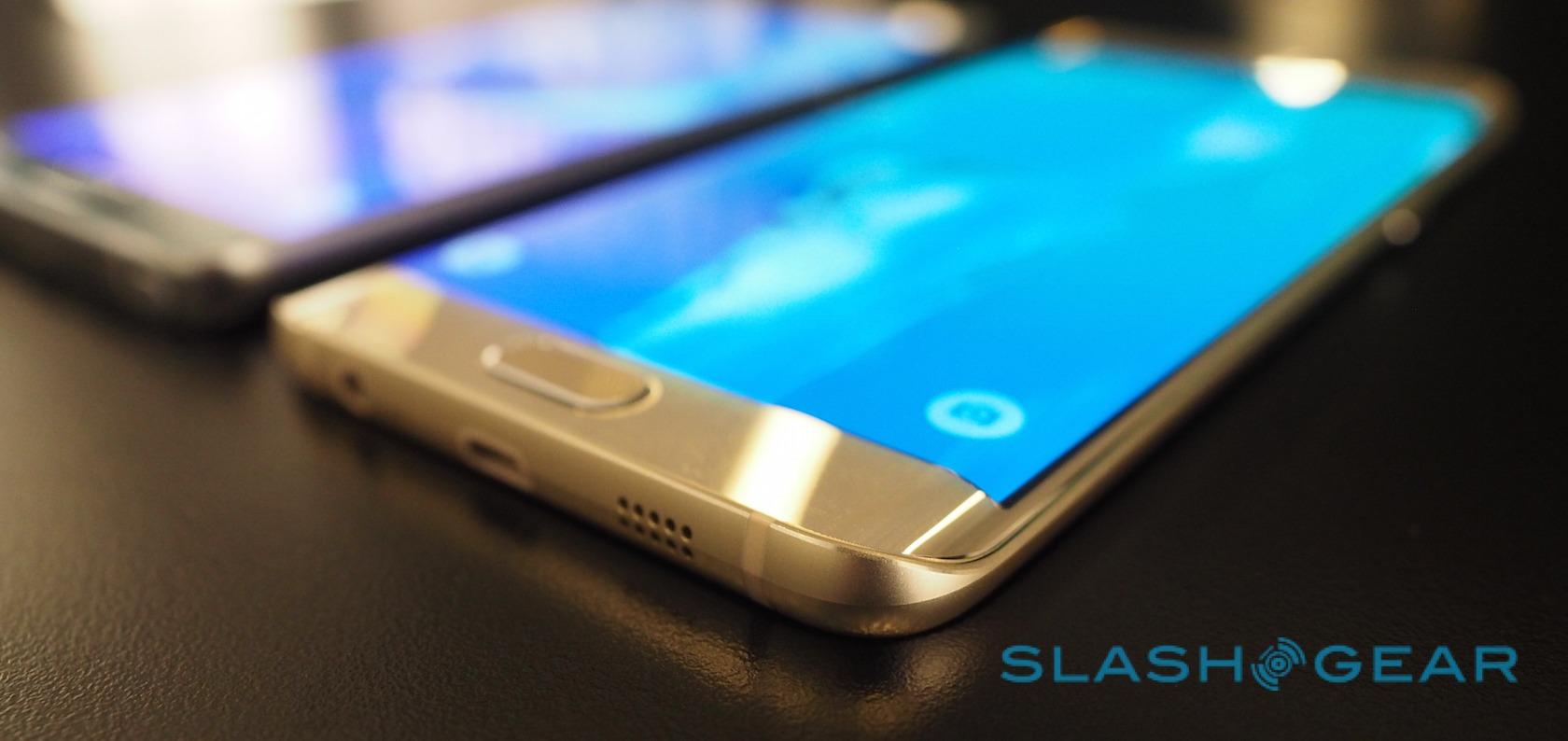
If the Note 5 is about Getting Things Done, then the Galaxy S6 edge+ takes entertainment and multimedia as its lode star. At 154.4 x 75.8 x 6.9 mm and 153g it's longer, wider, and heavier than the S6 edge announced back in March, though 0.1mm thinner. It also uses Gorilla Glass 4, with the US getting either black sapphire or gold platinum finishes.

Of course, what you notice first is the double-curved display. The flexible OLED wraps around the right and left sides of the handset, the edges tapering to a sharp ridge. You could, therefore, see the S6 edge+ as falling somewhere between the S6 edge, the form-factor of which it borrows, and the Galaxy Note edge, the scale it apes. Unlike the Note edge and the Note 5, however, there's no stylus.
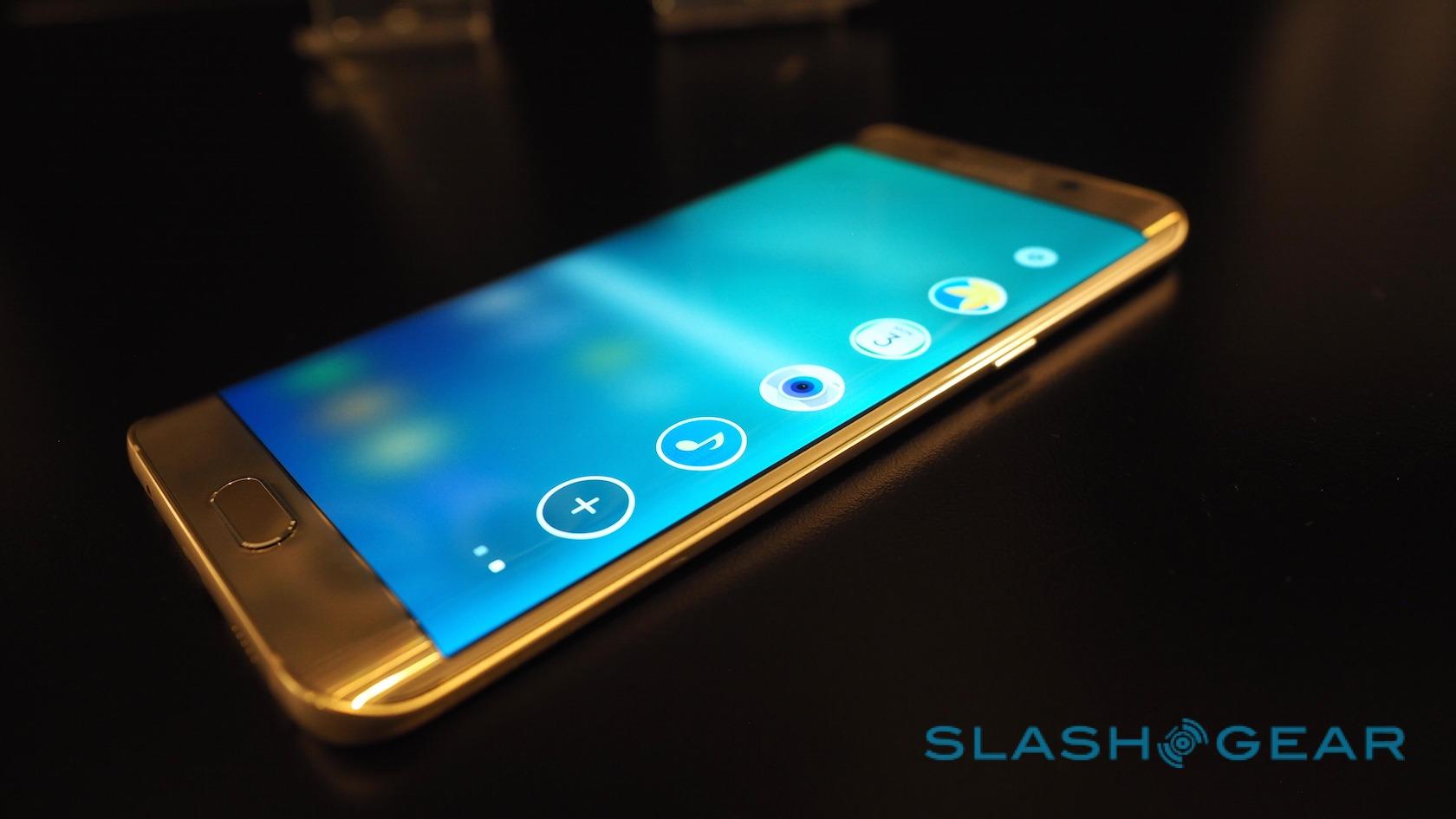
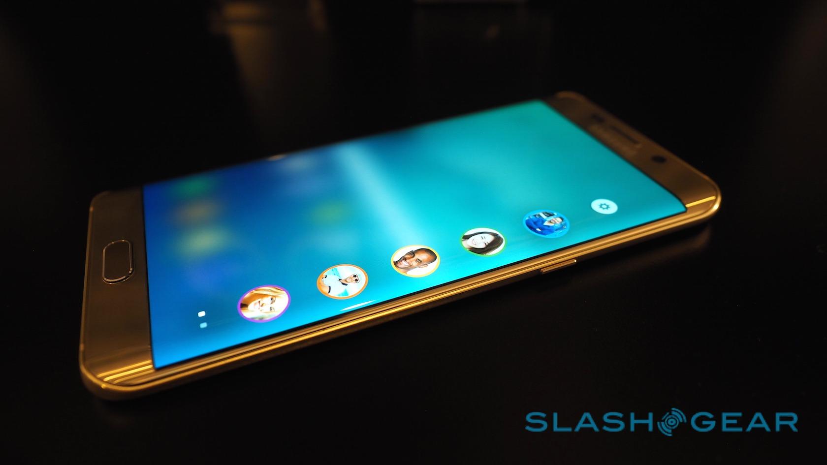
Instead it's your fingertips that are intended to slide across those curved panels, and Samsung has increased just what sort of usefulness that can achieve. Critics of the original S6 edge – myself included – pointed out that there was relatively little use made of the curve, but here the "People edge" widget summoned with a thumb-swipe in from the side has been joined by an "Apps edge" bar.

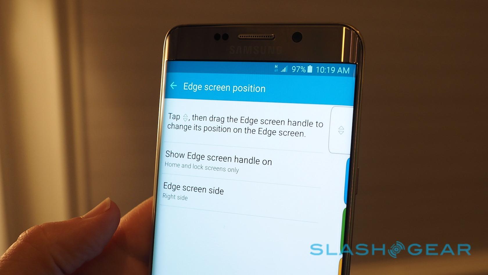
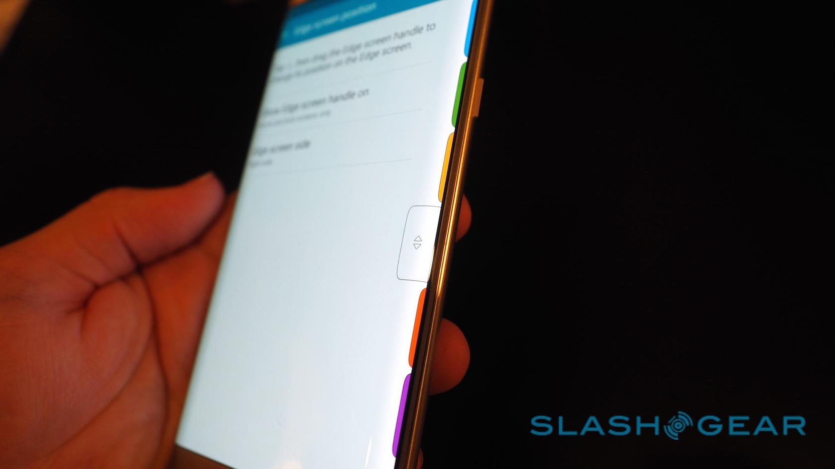
That accommodates up to five different applications, configured by the user themselves. Subsequent thumb-swipes flick between apps and people. The edge handler – the nub you drag in – has been tweaked, too: it's now visible wherever you are in the OS, and can be moved up and down the screen so as to fall most comfortably under your fingertip.

Better, then, but I can't help but think that Samsung is still relying on the geek-appeal of curved AMOLED to sell the concept, rather than actual functionality. Undoubtedly it's a smooth process, swiping in one of the launchers, but side-by-side with the Note 5 it's abundantly clear that you get far more added extras with the stylus.
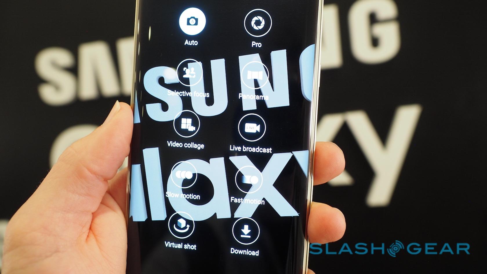
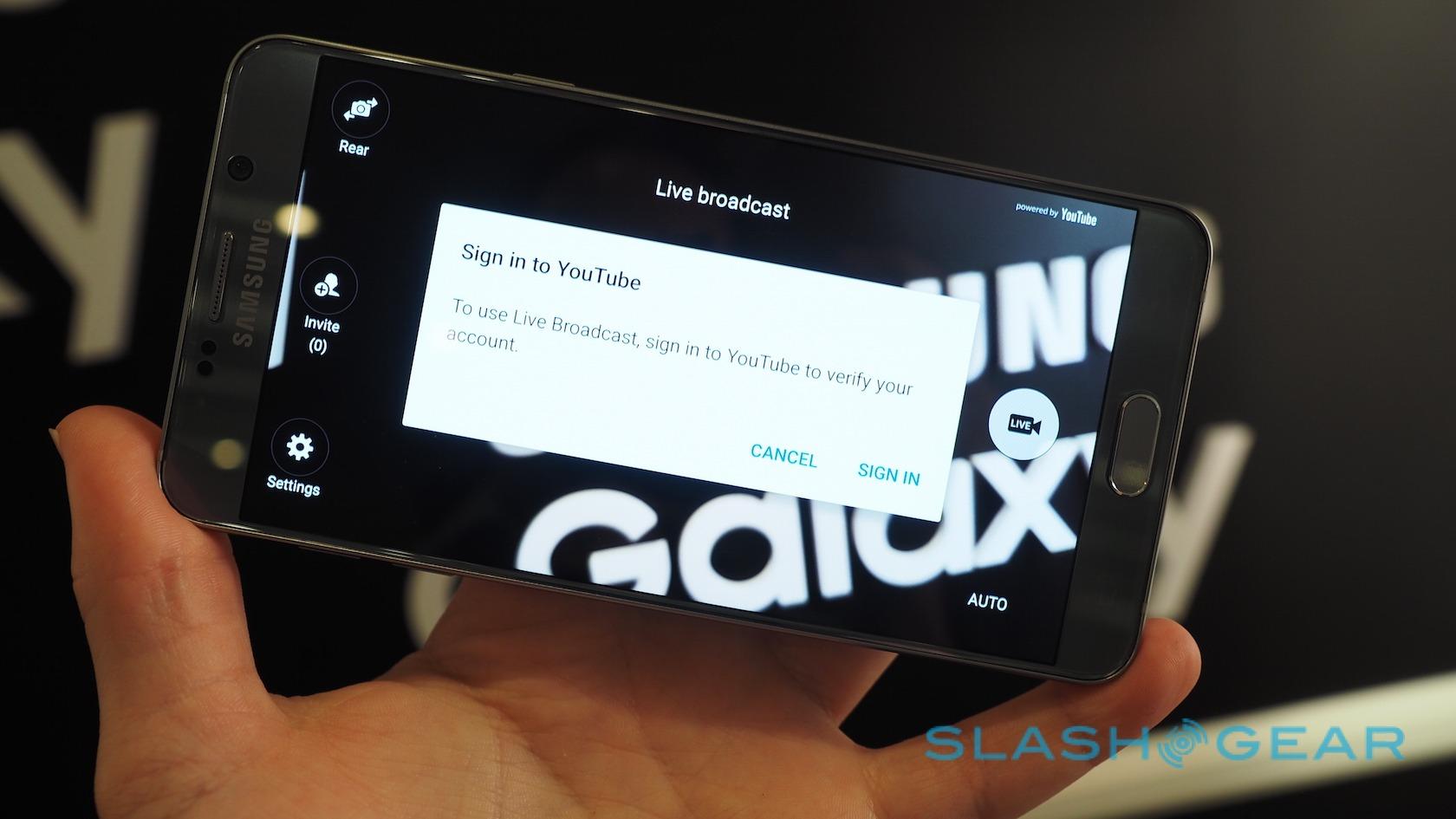
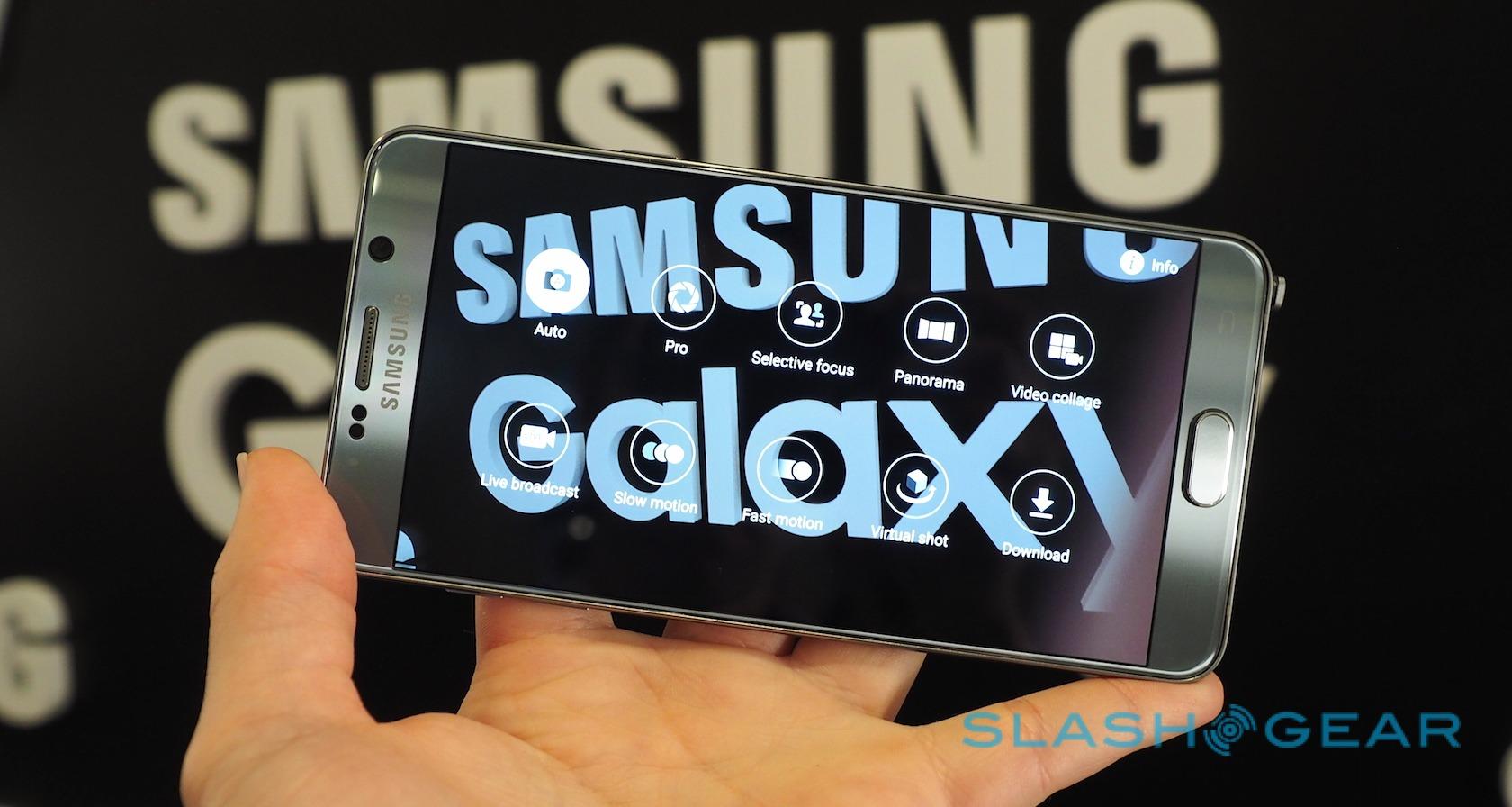
Happily most of Samsung's other improvements are shared between the two devices. Open up the camera app, for instance, and you'll find YouTube Live Broadcast in among the panorama, Virtual Shot, and other modes we've seen before.
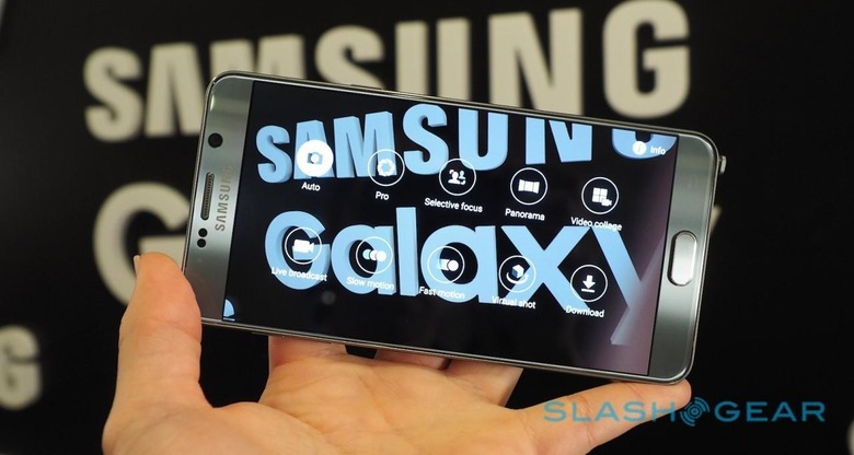
It's Samsung and Google's answer to Meerkat and Periscope, beaming a live stream of whatever your phone's camera sees to your YouTube channel. The advantage is that the viewer doesn't need any specific app in order to view it – they just have to go to the right YouTube page – and it's of course archived there for review later on.
Once you're logged into YouTube, Live Broadcasts can be either limited to just invited viewers – you pick them from your contacts and they're sent the URL – or as a public show.
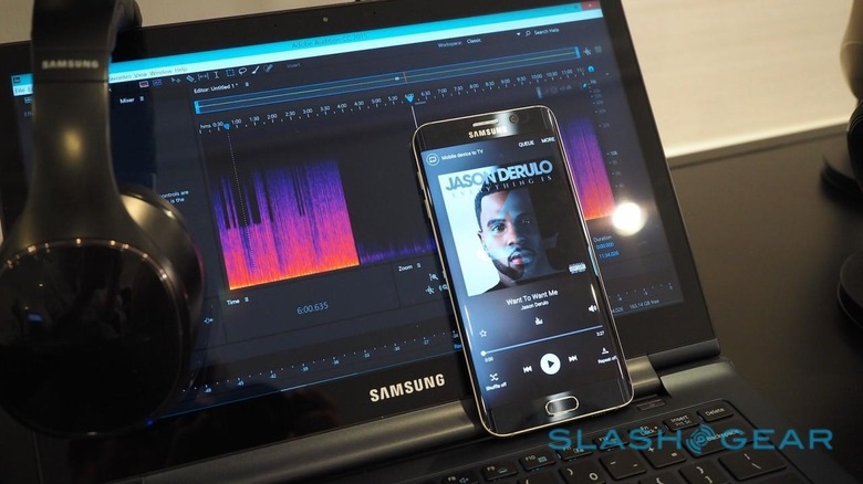
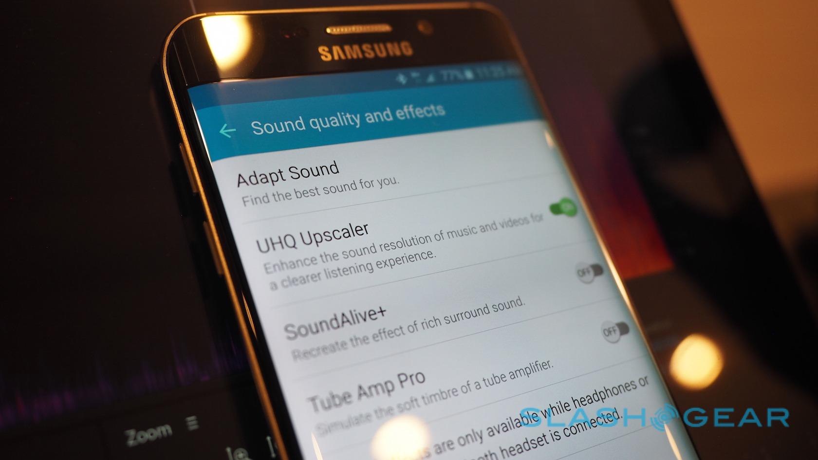
Meanwhile, Samsung has turned its hand to improving audio performance, too. The S6 edge+ and Note 5 support Ultra High Quality (UHQ) sound, and can upscale regular music (say a 16-bit/48kHz MP3 or a 16-bit/44.1kHz CD track) to UHQ 24-bit 192kHz, too.
A new UHQ-BT codec, exclusively developed by Samsung for use with its Level range of wireless headphones and speakers, delivers 24-bit/96kHz audio sans-wires, too.
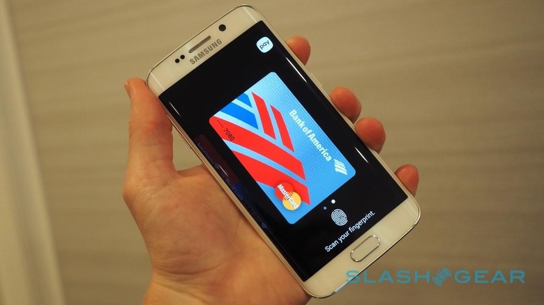
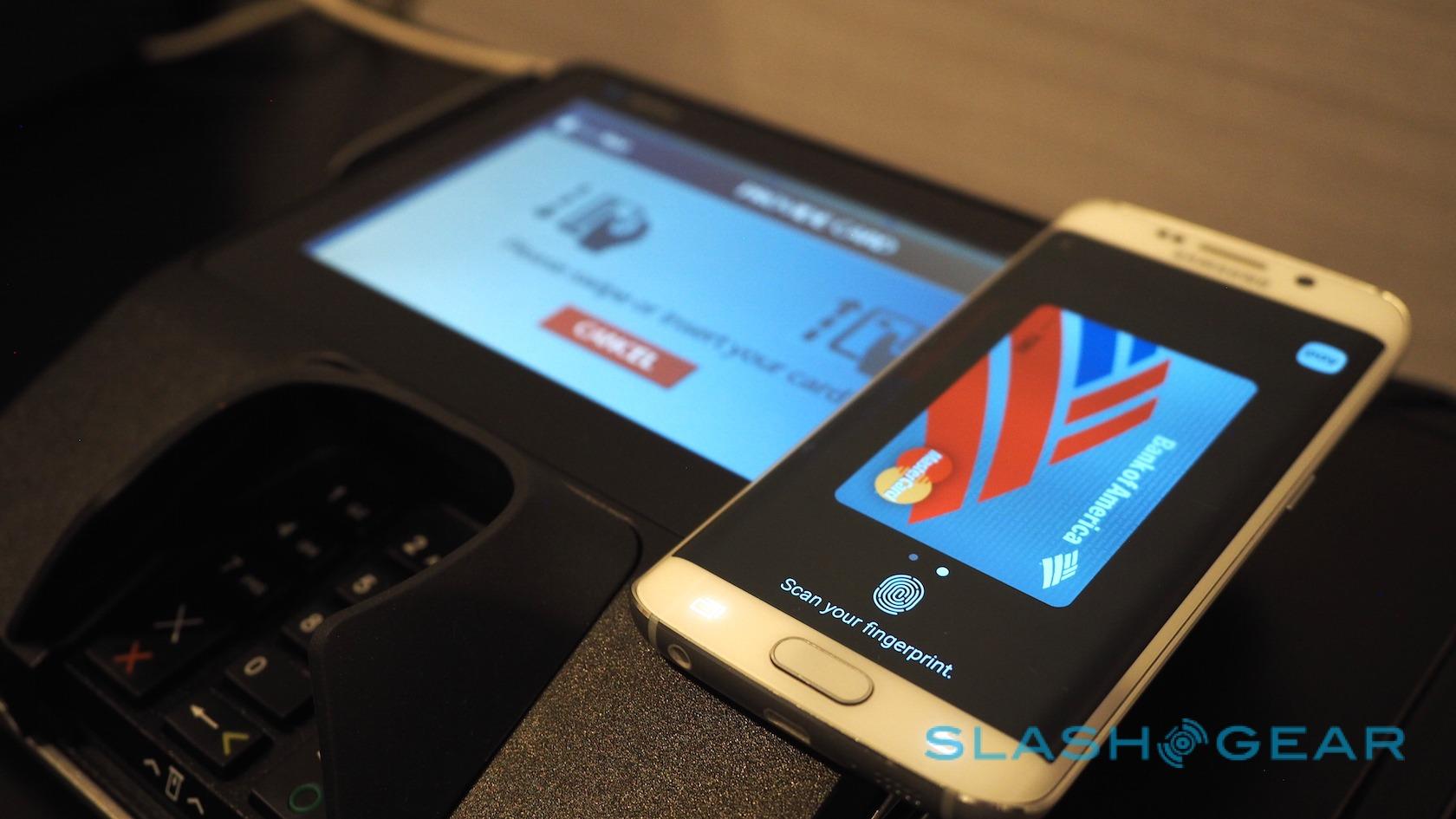
Then there's Samsung Pay. The mobile payments service might not be the first to reach the market – Samsung says it should go live in the US in September – but it could arrive carrying a wild-card that Apple Pay and other systems lack.
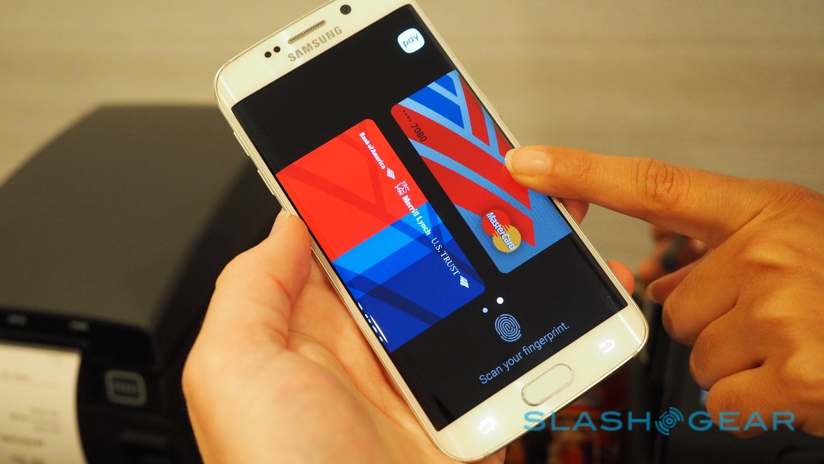
On the fact of it, Samsung Pay seems as straightforward as any of its rivals to use. Swiping up from the lock screen or the home screen brings up a gallery of registered credit or debit cards; swiping left and right switches between them. They look like the cards in your wallet, too, though Samsung sensibly masks the actual numbers.

To use one, you first tap your fingertip against the scanner and then hold the phone near the retailer's payment terminal.
It's here that Samsung's potentially huge advantage weighs in. Like Apple Pay, Android Pay, and others, Samsung Pay can use NFC to communicate with compatible point-of-sale terminals. However, not every register has been upgraded with NFC yet, and so Samsung also offers Magnetic Secure Transmission (MST).
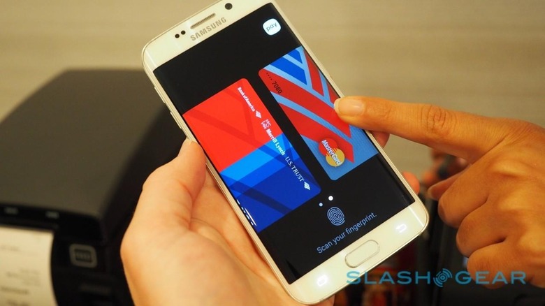
In effect, the Note 5 and S6 edge+ emit the same blast of data a magnetic strip would when swiped, just powerfully enough to be picked up by an old-style card reader. To the POS machine, it's as though a regular credit card has been swiped through. With NFC and MST combined, Samsung believes it should be able to ensure mobile payments "virtually everywhere".
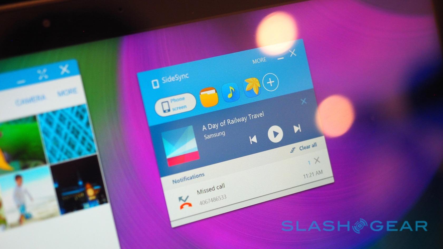
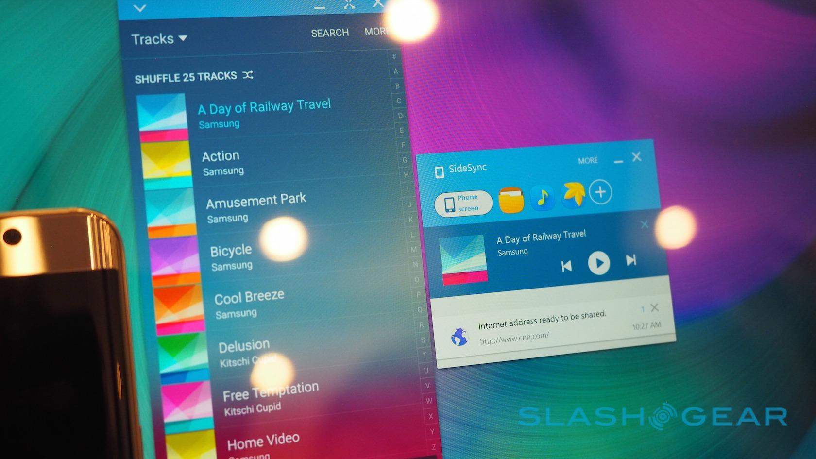
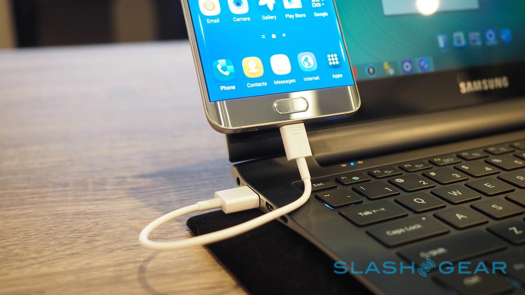
Like Apple has Continuity, Samsung will push out a new version of its own companion software alongside the Note 5 and S6 edge+. SideSync 4.0 allows for USB or Bluetooth connections between a PC, Mac, or Android tablet, mirroring the smartphone's display in a window on the desktop and allowing apps to be interacted with, as well as creating and replying to messages using your full-sized keyboard.
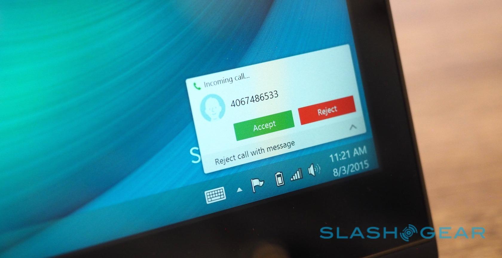
It's also possible to drag and drop files between the two, useful for grabbing photos and video from the Note 5's gallery and pulling them over to the desktop. Incoming calls get desktop notifications, too, and can be answered using your computer's speakers and microphone.
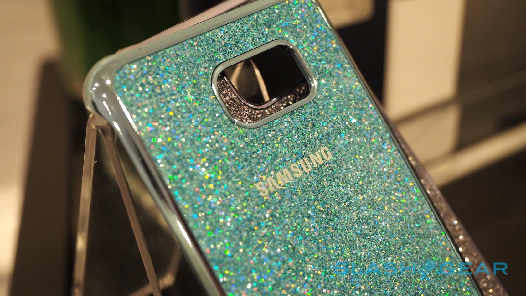
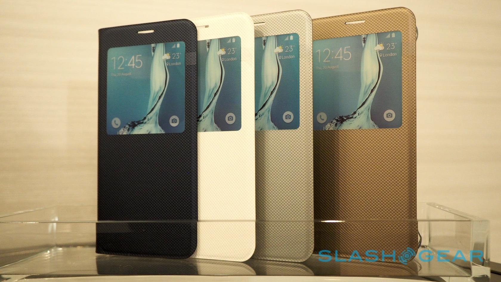
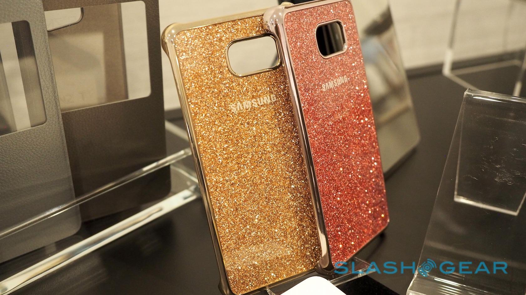
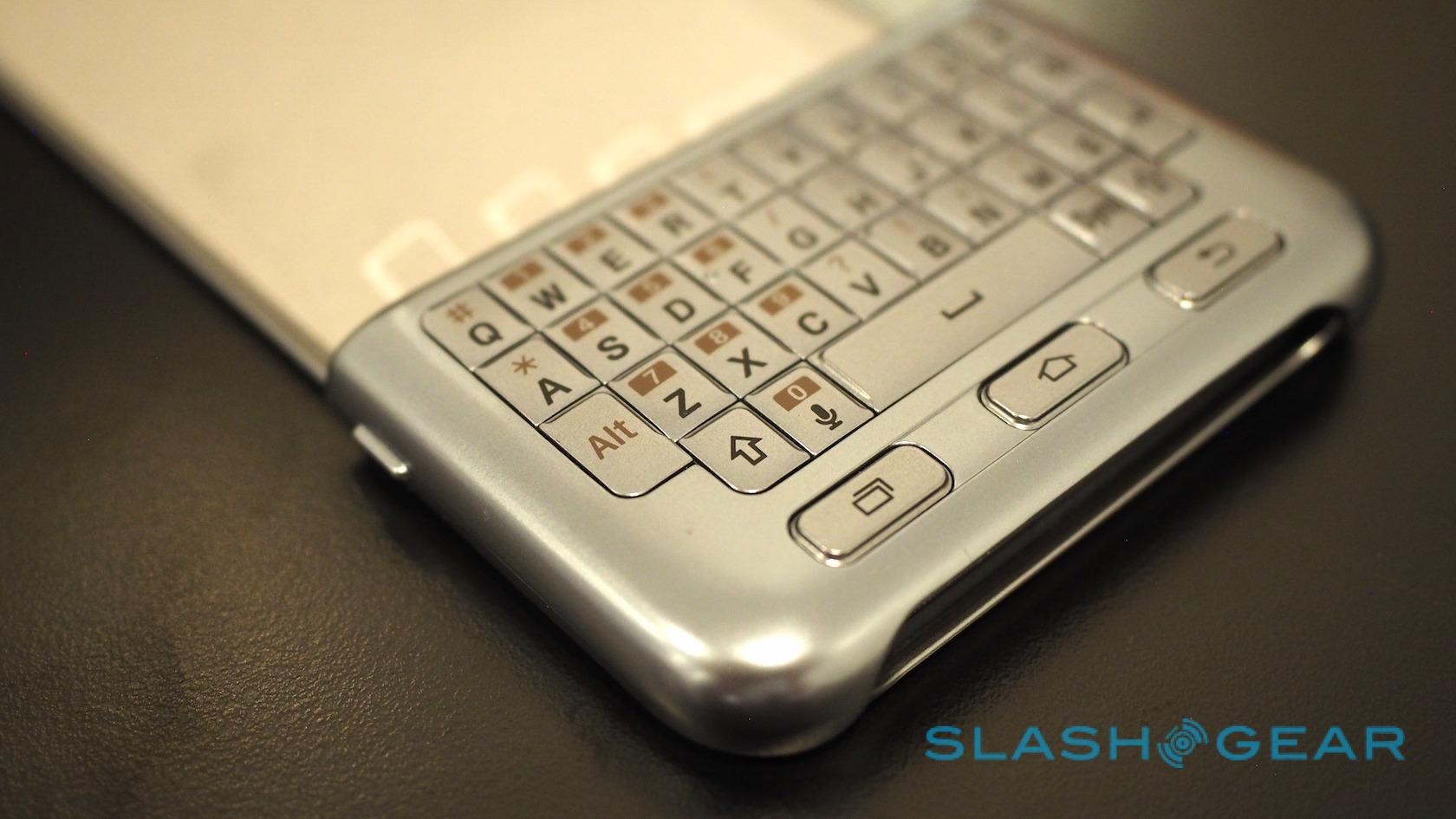
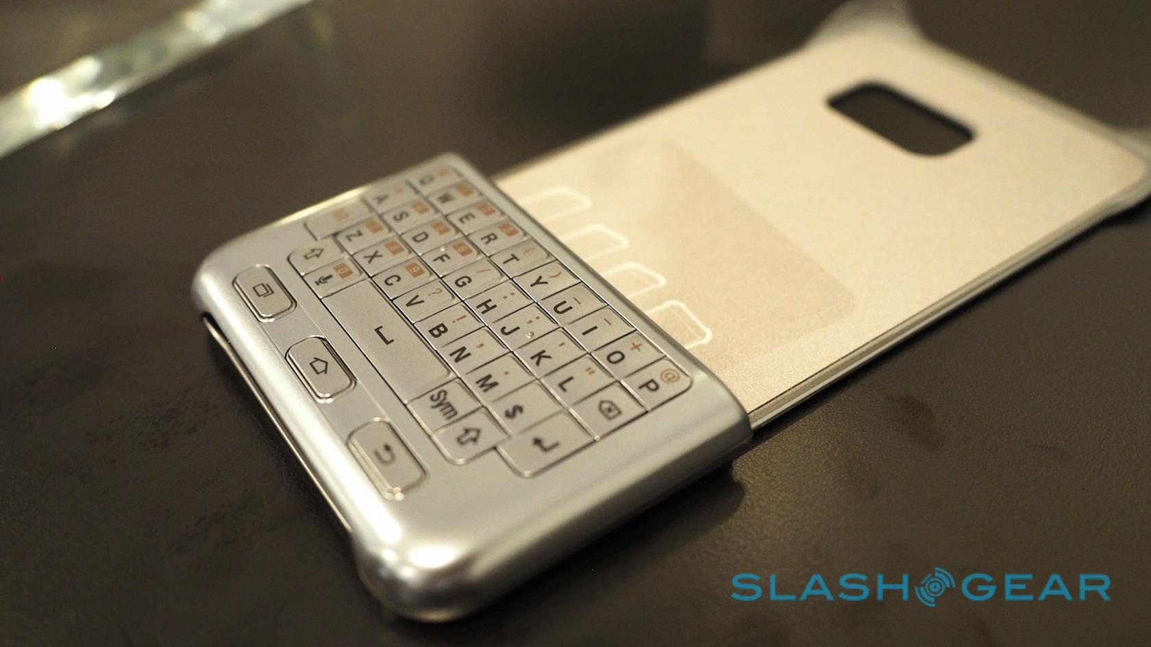
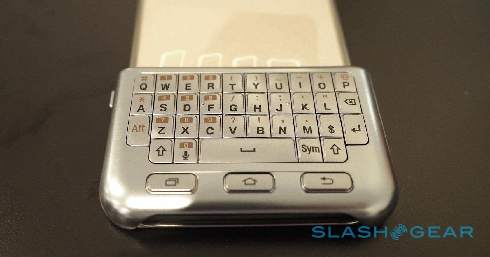
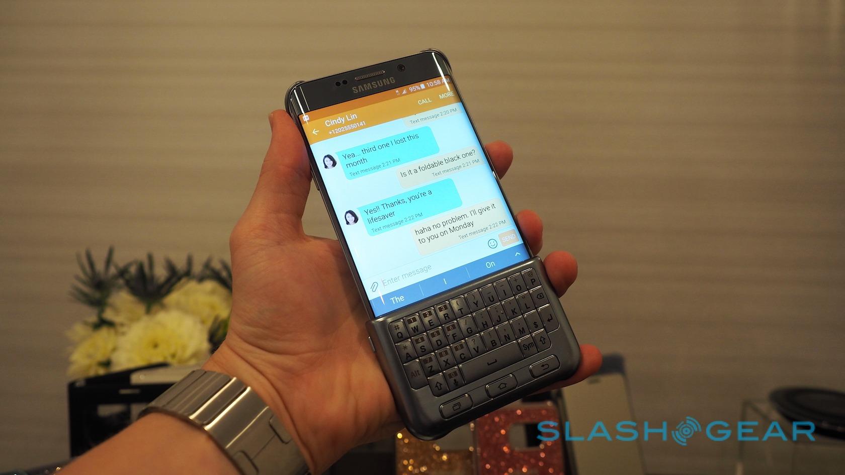
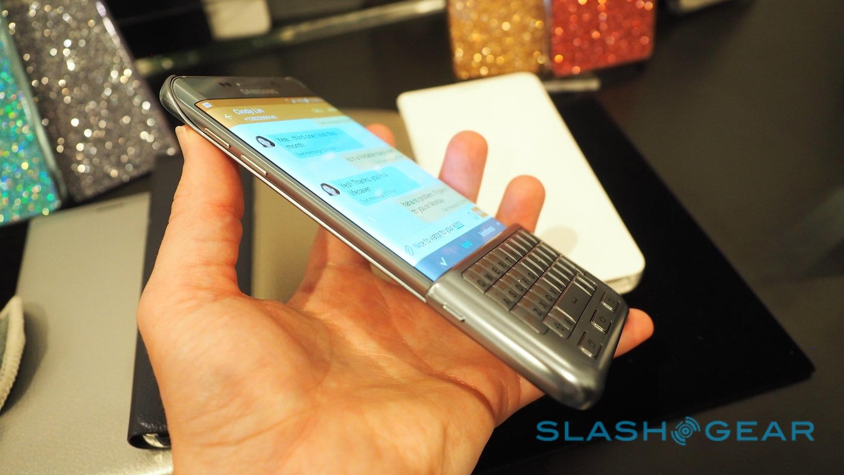
SideSync isn't the only useful add-on. Samsung unsurprisingly has a range of cases and shells waiting for both phones – including folio cases with windows through which you can see the display – but the most interesting is a keyboard case for the S6 edge+.
That snaps on to roughly the lower third of the smartphones display, providing a four-row QWERTY layout along with Android navigation buttons. Unsurprisingly, given that each button is basically pretending to be a finger pressing the touchscreen underneath, the responsiveness isn't as sharp as on, say, a BlackBerry keyboard.
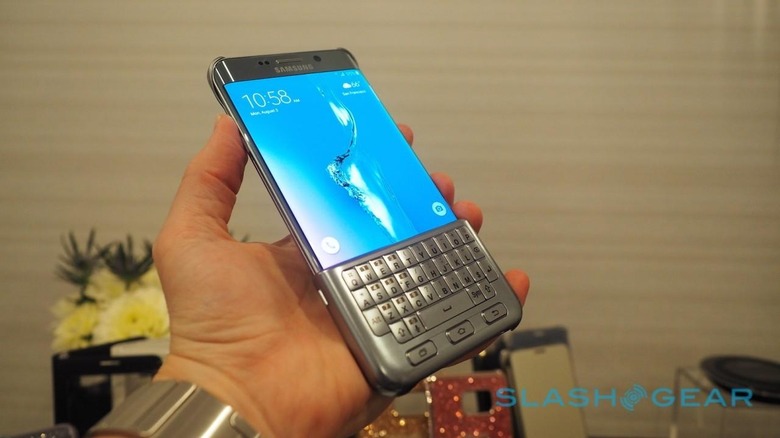
That's not to say it's entirely bad. The UI automatically resizes when the case is fitted, so that buttons and dialogs aren't covered up inadvertently, and if you simply must have physical buttons then Samsung's are serviceable. Bear in mind, though, that you're also covering the fingerprint scanner, and that the assembly as a whole can hardly be described as sleek.
It seems a shame, in fact, to cover up the handsome and premium-feeling Samsung hardware. That's not a statement I'd have made until this year, either, which makes Samsung's achievements all the more impressive.
Of the two, though the Galaxy S6 edge+ undoubtedly has the greater gear-lust appeal with its curving sides, I'm still not entirely sure that Samsung has done sufficient to make the distinctive form-factor actually functional. Handsome it may be, but the flexible AMOLED seems – dare I say it – wasted on just a quick-launcher and a contacts bar.

The Galaxy Note 5 makes a far better argument for its existence. Samsung's commitment to the stylus can't be questioned, its feature-set has improved in legitimately useful ways, and the whole thing is wrapped up in a design that now feels as top-tier as its pricing undoubtedly will be.
Exactly what those figures turn out to be we'll hear from individual carriers shortly; they'll be offered on AT&T, Sprint, T-Mobile, U.S. Cellular, and Verizon Wireless. Samsung says both phones should be up for preorder from this afternoon, and available on August 21.
