Revamped YouTube App Makes An Appearance On iPhone
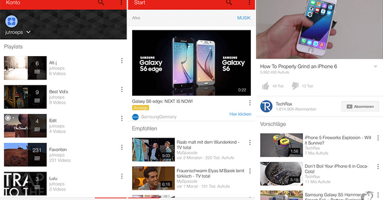
YouTube may be in the process of redesigning its app for iOS. Multiple users claim that a new version of the app was briefly available for iPhones last year. Although it has since changed back to its familiar design, one clever user took some screenshots to capture the design elements before it disappeared. YouTube is rumored to be redesigning the app for Android, along with a new player for Internet. New apps developed using Material Design have been cropping up on iOS and Android, so it makes sense that YouTube is toying with a new design layout.
These photos show a cleaner, sleeker layout to the app design. It looks like YouTube has added a new menu bar at the bottom of the screen so users can access menu options with their thumbs. Buttons for trending videos, home, and all videos have moved to the bottom menu for easy access.

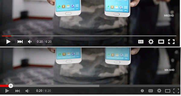
Giving more credence to the report, YouTube is also rumored to be developing a new HTML5 video player for web-users, perhaps as it are gearing up to go after a larger piece of the pie that is live streaming. According to the unofficial Google blog, Google Operating System, the player features a transparent control bar with bolded control icons at the bottom of the screen, and the control bar disappears completely after a few seconds of disuse. The video player in testing redesign the toggles for annotations and autoplay, and the "watch later" button doesn't appear on the control bar at all.
Keep in mind that we have no way of knowing if these leaked photos are authentic or not. It could be that a developer accidentally pushed an early version of the redesign to users, or the photos could be fabricated. So, we'll have to wait until YouTube gets around to releasing its new updated design to see.
Source: MacRumors
