Razer Phone Unboxing: Devil's In The Details
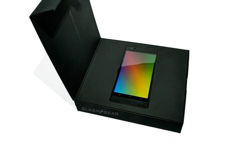
Inside the box sent to me for a SlashGear review is the Razer Phone – but more than that, it's a presentation of a phone worthy of the best on the market. It's almost as if Razer is trying to tell the end user that they've bought into a device that's more than just the Android phone they find at the top of this box. Inside is the work of a team of engineers that are obviously proud of the work they've done.
Most of the time when you purchase a smartphone, you get a basic box that protects the phone for its journey from manufacturing to the carrier. That's essentially it. If you look back a few years ago at devices from most manufacturers, you'll find mostly boxes with carrier names on their sides. Most phones sold by AT&T, for example, came in very similar looking orange and white boxes – simple, thin, throwaway boxes.
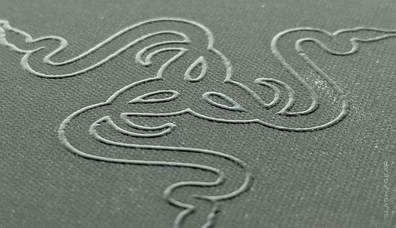
With the Razer Phone we see a presentation that fits the fact that you've just payed $700 USD for a pocketable computer. This is the sort of box you'll feel guilty throwing away. In addition to holding the phone tight for its initial journey, each individual component has its own tiny package, each with detailed elements on their outsides.
OF NOTE: I'm saying all of this with complete disregard for the environment. This massive amount of packaging is just about the opposite of what Apple does, at least as far as minimalism goes. But if you plan on keeping every single little container anyway, you're all good!
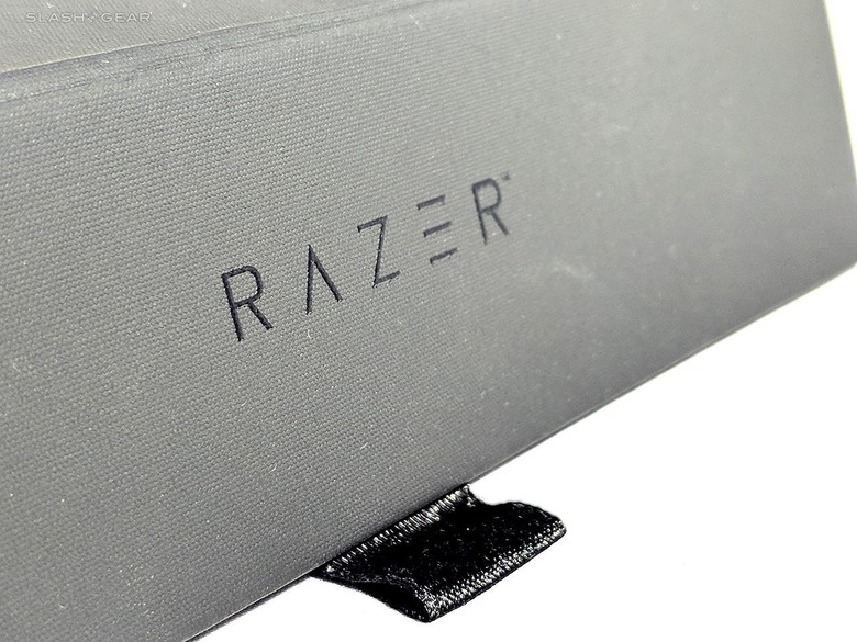
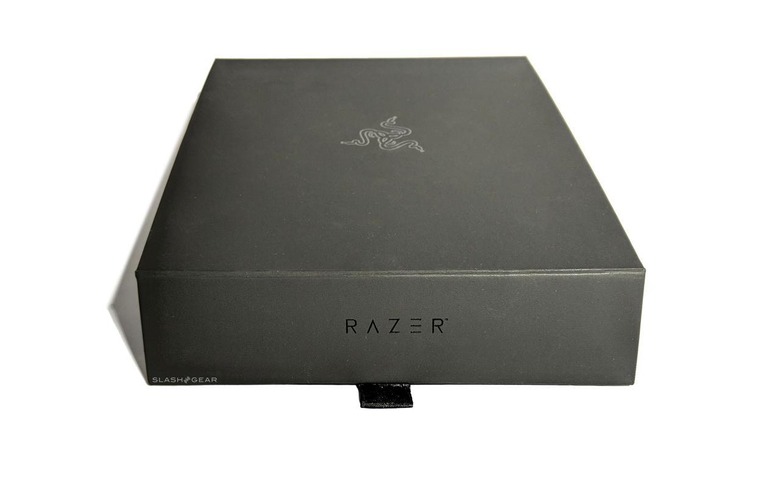
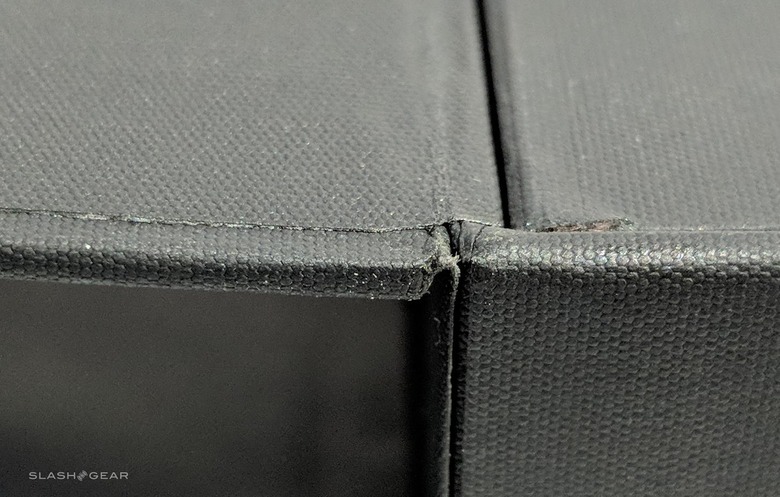
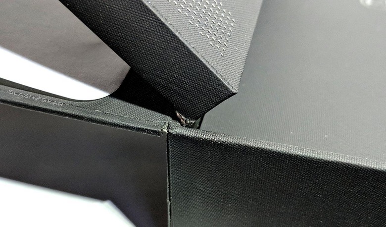
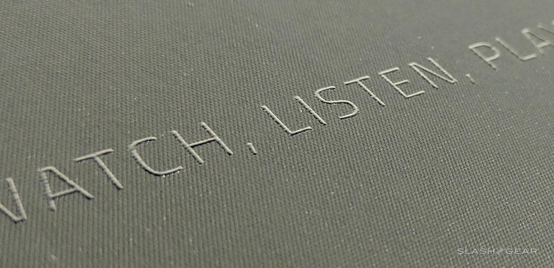
This device comes in a box made with bookboard sides, covered with black, textured paper finely wrapped around each edge. This box is a perfect example of what quality craftsmanship looks like. This box could act as an ideal example of what a finely crafted artists book cover looks like. I really, truly only found the most tiny of flaws – basically invisible to the average onlooker.
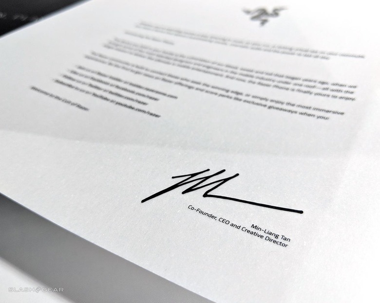
The top of the box is held in place with magnets that hide under the paper, loosened with a ribbon over the edge. A semitransparent piece of paper with the co-founder and CEO Min-Liang Tan's endorsement sit first in this stack of items. A similar paper rests in the boxes of some of Razer's other most elite products as well.
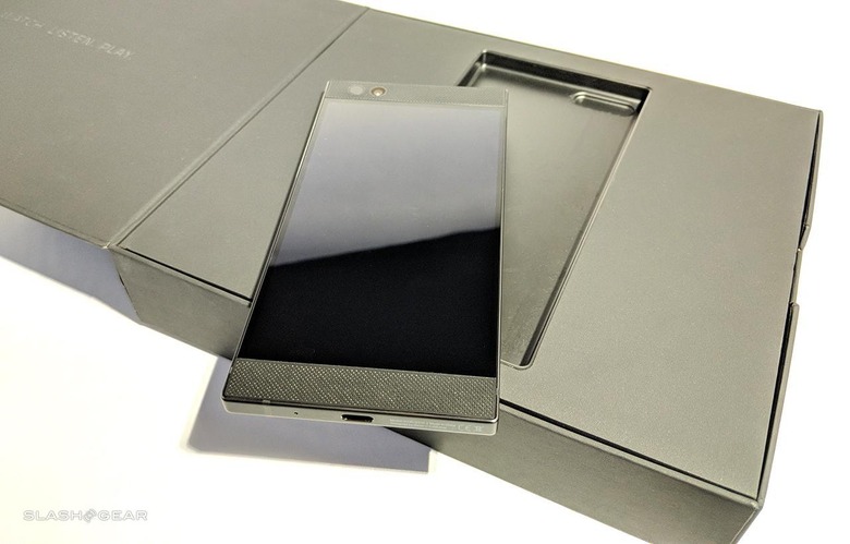
The phone itself is next, resting in the center of the box in a concave plastic dish. This layer of box is also wrapped in the same high quality textured black paper as the rest of the box. This layer moves on a hinge held by the same high-quality textured paper as the rest of the box.
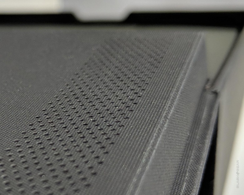
On the back of the phone layer are two long rows of dots, printed in black on the black of the paper. These are put in place for a tactile moment in the end user's unboxing – in black, there's no other reason why they would be here. They're just in place to keep the entire package cohesively stylish, classy, and elite.
The section that contains the phone doubles as a secondary lid. This lid lifts up and hinges on the same paper with which the rest of the box is covered. It's very easy to mess up a box made with this many parts, especially if you're using the same material throughout. This is precision work done well.
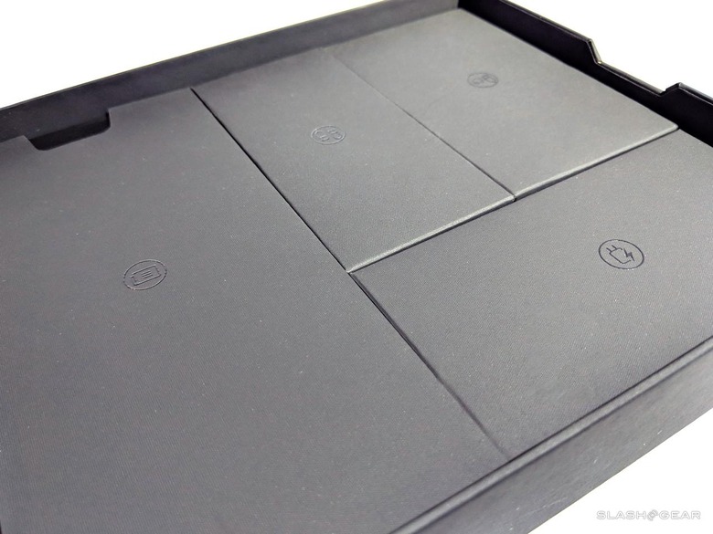
Under this second lid is a series of boxes. Each box contains another item or items that are part of the standard Razer Phone package.
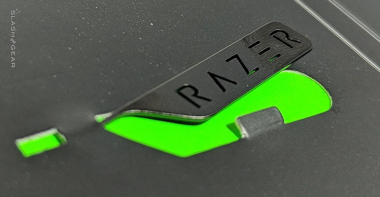
The first package includes some documentation, some Razer stickers, and the SIM Eject Pin. This pin has the brand name RAZER cut from its metal body – just in case you'd planned on mixing it up with the lesser eject pins of your past phones.
The box with the Audio Adapter (USB Type-C to 3.5 mm) has two steps to it. It has the box flap, then the drawer pull. The sides of this box have the same tactile dot grid printing the first layer had, too. The drawer flap pulls the contents of the box out in a bed of soft protective material shaped specifically for Audio Adapter.
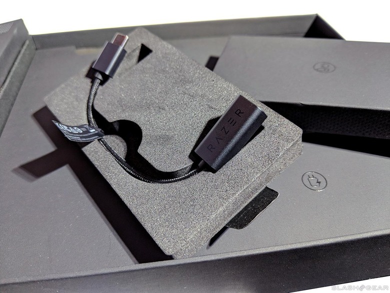
The same is true of the USB cord included with this package. The black-on-black printing, the drawer, and the icon. The iconography on this and each other package in the box are also printed in black – just shiny enough to be seen and used by the end user upon opening.
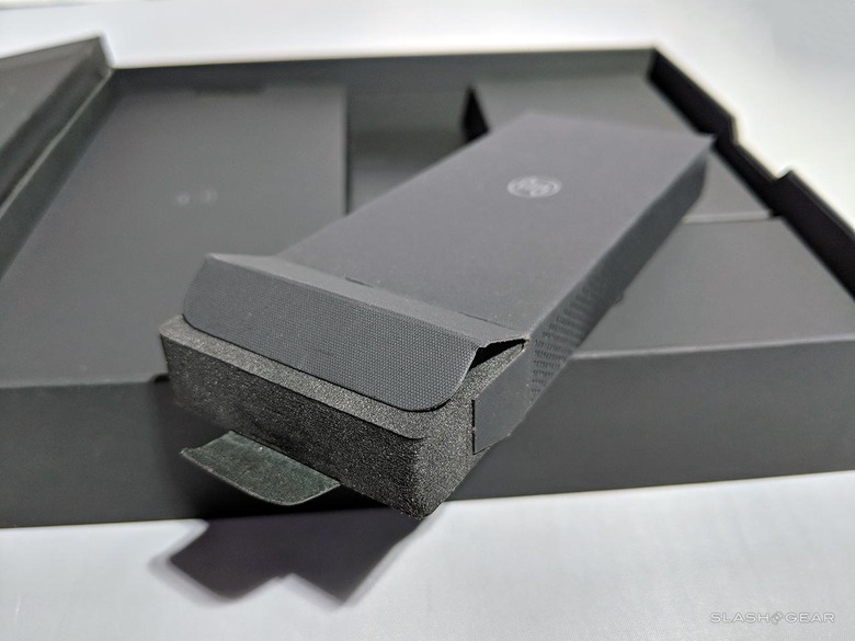
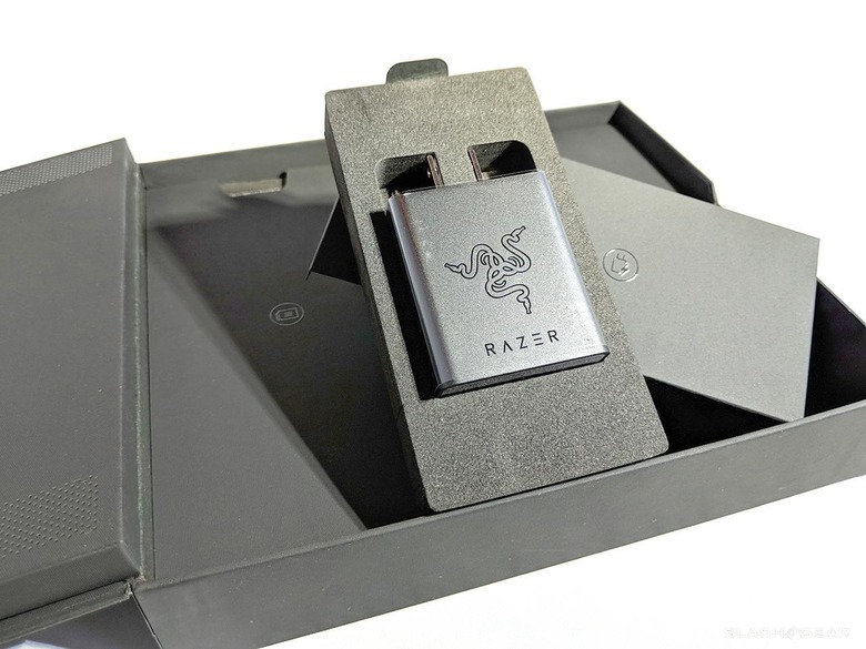
The final box contains the Power Adapter made for the USB-C cord. This box is larger than the adapter needs, thereby fitting in place with the other boxes, making a final package that fits together like a puzzle. Each of these smaller units also has the RAZER text logo printed on their hind ends.
This is easily one of the nicest packaging designs I've seen in a product in the past half-decade. I've reviewed a whole lot of products, and I can comfortably say Razer's done an outstanding job. And I've not even begun to review the phone (not when I've first written this text, anyway.) The review is nigh!
Stay tuned for our full review of the Razer Phone coming up quick! Join in the conversation about this device over at SlashGear on Facebook.
