Rainbow Motorola Mobility Logo Update Makes It "A Google Company"
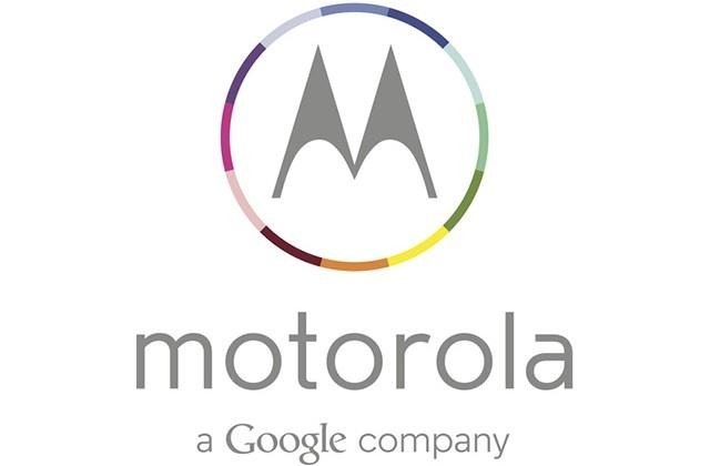
If the leaks of the MOTO X from earlier today weren't enough to pump you up about the future of Motorola, the new logo might. Released today by Motorola itself, the company has made their lettering a bit more laid-back with the only capital character being the G for their parent company. This logo is joined by a ring of colors around the big M, this signifying (we must guess), the colors you'll be able to get the multi-form "X Phone" in later this year.
The change-over to the MOTO X device (also known previously as the X Phone) was joined earlier this week by a mocked-up set of advertisements that should not be mistaken for the real deal we're seeing here. While the ring of color is reminiscent of the design by B.A. Bäkken, Motorola's official push will be a bit more subdued.

This updated logo (and its purple iteration) precedes the device we've head about direct from Motorola before, that being the all-American-made Motorola XT1056. Otherwise known (per Motorola) as the MOTO X, this device appears to be coming with a 4.7-inch 720p display, a 1.7GHz dual or quad-core processor from Qualcomm, and 2GB of RAM alongside 16GB of internal storage.
"It is going to be broadly distributed. There are a couple things we're going to be doing differently ... Motorola has always been good at managing ultra-low power sensors, such as the gyroscope and the accelerometer, and keeping those on all the time so the device knows different use states. The [Moto X] knows when it is in my pocket, it knows when I take it out of my pocket. I might want to do something, I might want to take a picture, so it fires up the camera." – Dennis Woodside for Motorola
This device was spoken about by Motorola's Dennis Woodside earlier this year as the machine itself rested in his pocket. We'll see more of this action with the newly modernized face of Motorola soon!
