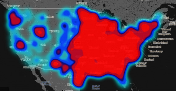
Project Maps National Racism Based On Geotagged Tweets
Twitter, at its most base level, is merely a means for individuals to share small snippets, links, and pictures with a wider audience, helping sort them via the judicial use of hashtags. It has many applications, however, because of the vast amounts of data it presents. Trends, for example, offer an immediate auto-updating way to get a feel for how those around you feel about a specific topic, whether it is a breaking news story or the latest meme. On the broader level, the information can be compiled to draw certain conclusions, such as the case with Humboldt State University's latest project – mapping national racism via geotagged tweets.
In 2012, Humboldt did a similar project shortly after President Obama was re-elected, using certain words in geotagged tweets to determine which areas of the country sent out the most hate speech in response. While interesting, the project garnered a lot of criticism because of the way it associated the data it gather, which had an inherent flaw – there was no distinction between intention. So, for example, someone using a word typically associated with hate speech in an unrelated context would be lumped in as a piece of data indicating racism.
This obviously resulted in numbers that weren't as accurate as they could be, and many were vocal about the issue. This time around, those involved in the latest project have tweaked the process a little so that the intention of tweets are factored in rather than simply categorizing tweets based on individual words taken out of context.
The tweets used in the project were sent between June 2012 and April 2013, and of them more than 150,000 were gathered containing homophobic and racial slurs. To avoid the aforementioned problem with lack of context, the students participating in the project then manually sorted through all of the tweets, categorizing them based on context as either "positive," "neutral," or "negative." Such a method removes the errors introduced by algorithms that are incapable of determining whether the use of a word was in an acceptable way.
Once categorized, the tweets were then sorted to the "county" level and normalized based on the total number of tweets that came out of that location. By doing this, locations that had higher hateful speech in comparison with total tweets than other areas show up red on the map, while areas with lesser levels show up as blue. The team responsible advises that blue areas still represent areas with a lot of hate, but don't show up as red because of their very large population, which reduces the overall hatefulness rating. Later on, the team hopes to test the instances of hate speech against its demographic, which can help look into the makeup of areas with high ratings.
You can check out the map for yourself here. Note that the farther you zoom in, the more refined and detailed the data becomes, while zooming out will result in more red and less detail.
SOURCE: Floating Sheep
