popSlate Review - iPhone Gets An E Ink Case
The back of your iPhone is little more than an advert for Apple, so why not make it functional? As YotaPhone has demonstrated, there's no shortage of things you can do when the back of your smartphone is a display as well, but tempting iPhone owners to cross the aisle to Android is a tough sell. Enter popSlate, a crowdfunded success story that embeds an E Ink screen into an iPhone case. It's taken a little longer than planned to reach the market, so is it a case of too-little, too-late?
Hardware and Design
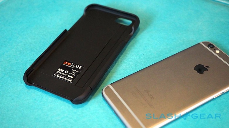
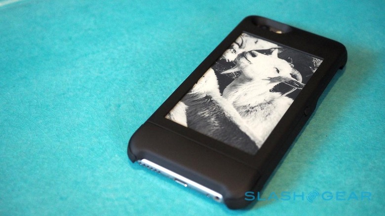
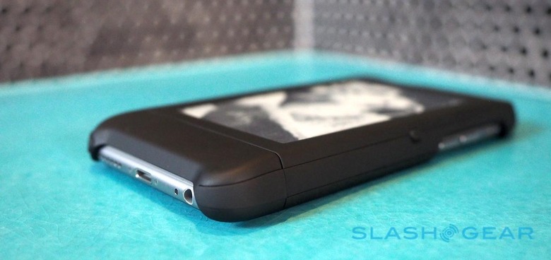
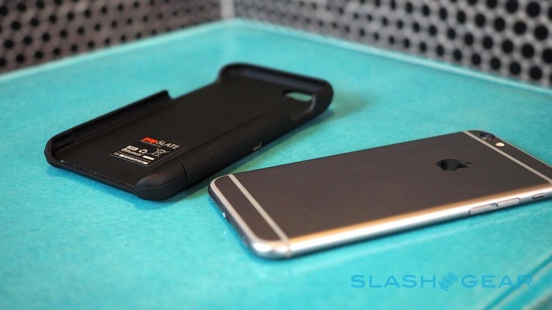
There are plenty of iPhone cases out there, and on a pure design basis I can't say popSlate's is the most attractive. Finished in matte black or glossy white plastic, it's a simple sled into which the smartphone slides, leaving the power and volume buttons, along with the Lightning and headphone ports, and the speaker, accessible.
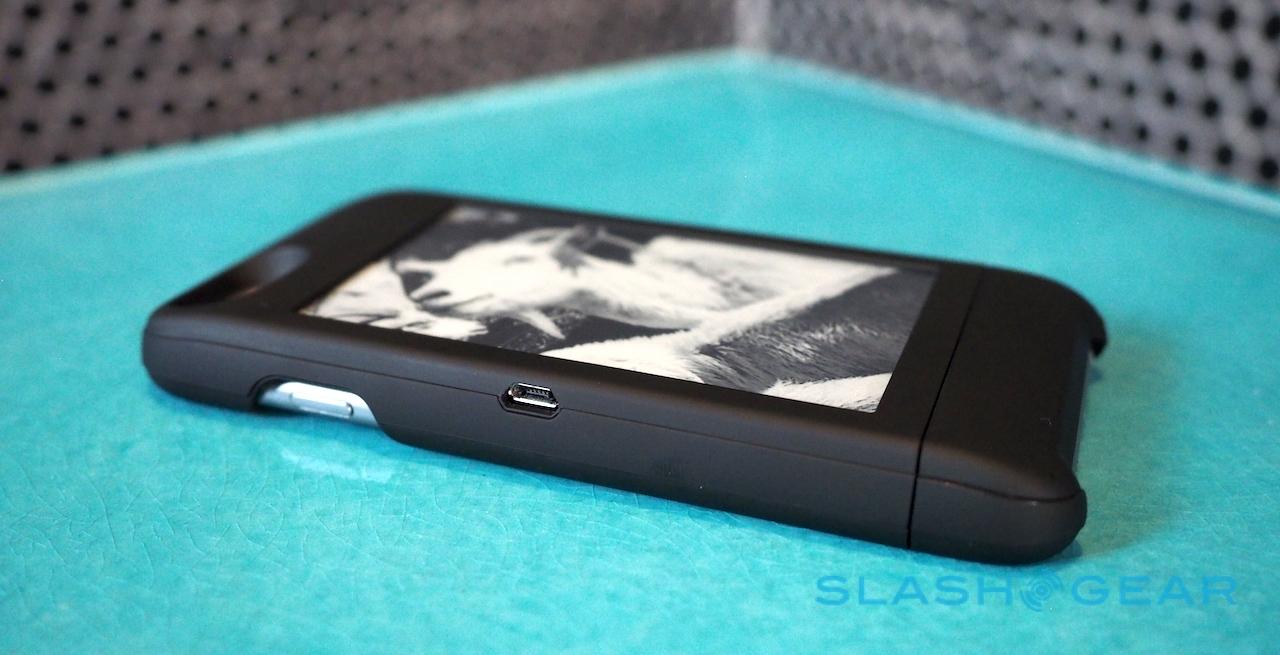
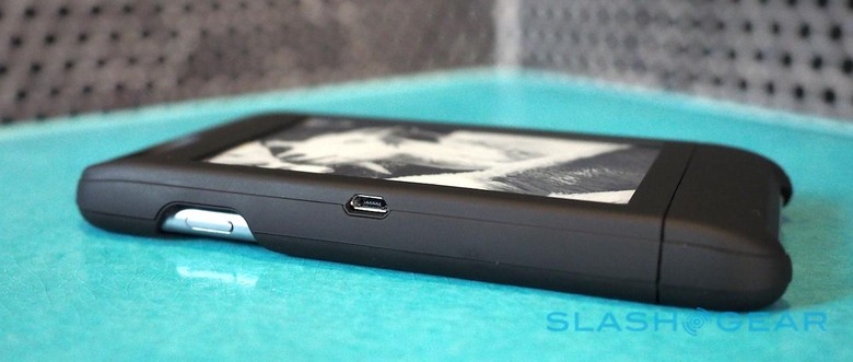
Physical ports and controls are limited to a microUSB on one side and a small button on the second, the latter used both to power-on and reset the case, and to cycle through images. The 240 mAh battery is good for 5-7 days of use, though that assumes a few screen refreshes every day. Unfortunately there's neither a low-battery warning or indeed a way of telling if the case is taking a charge; you just have to periodically stab the button and see if the image changes.
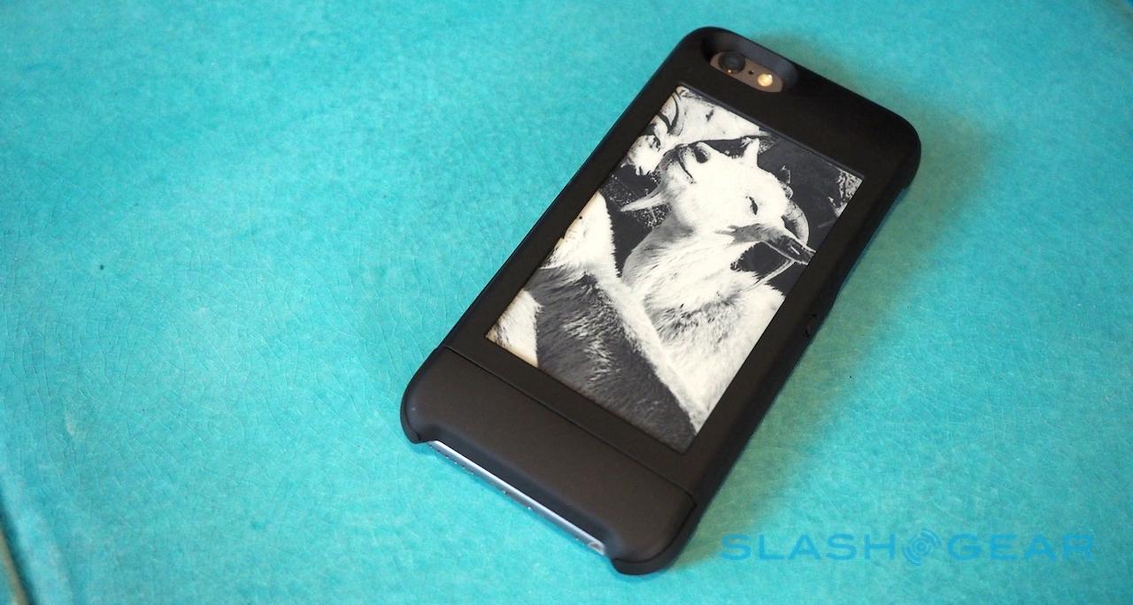
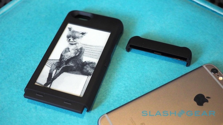
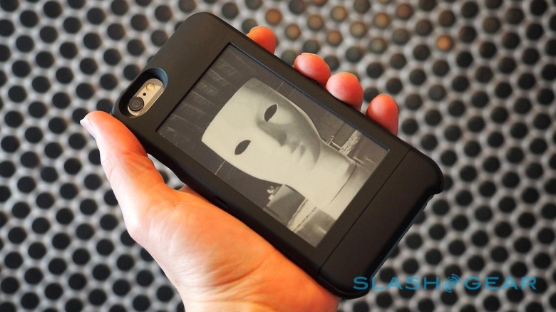
Dominating the back is the E Ink panel, a 4-inch monochrome screen running at 400 x 240 resolution. It's recessed slightly into the casing, but popSlate claims durability isn't an issue thanks to the flexible plastic substrate it's integrated with. Effectively there's nothing to shatter or smash.
Unlike the YotaPhone 2, popSlate hasn't opted for a touchscreen. That's partly down to the way the case integrates with the iPhone – via a low-power Bluetooth LE link, selected for its miserly battery demands – and of Apple's limitations between iOS and third-party accessories, but also because of a fundamental difference in how the two companies perceive the most efficient interaction.
popSlate's attitude, marketing chief Greg Moon had explained to me, is that there are really no use-cases where controlling an app from an E Ink touchscreen is more efficient than simply flipping the phone over and using the regular touchscreen.
Having spent some time with a YotaPhone 2 I'm not convinced that's entirely accurate – being able to swipe through notifications and documents you're reading on the e-paper is undoubtedly useful – but it certainly fits with the functionality popSlate offers today.
A Monochrome Gallery
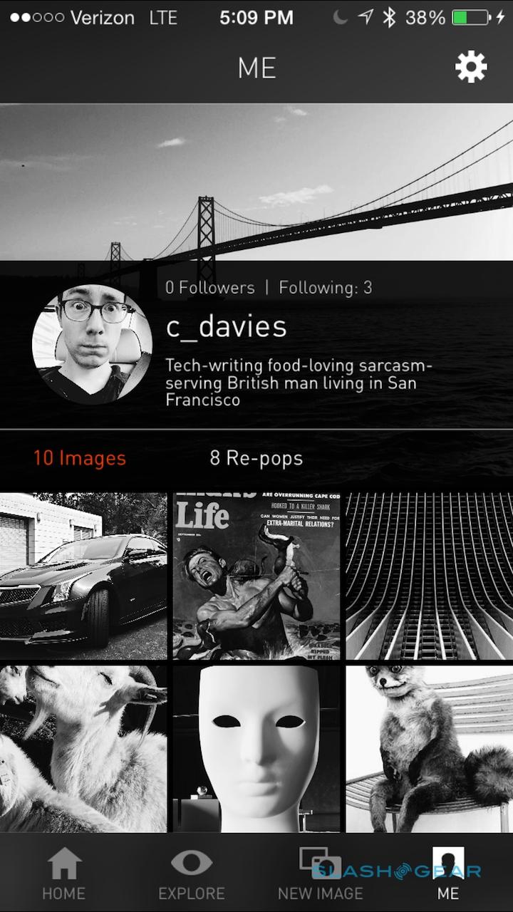
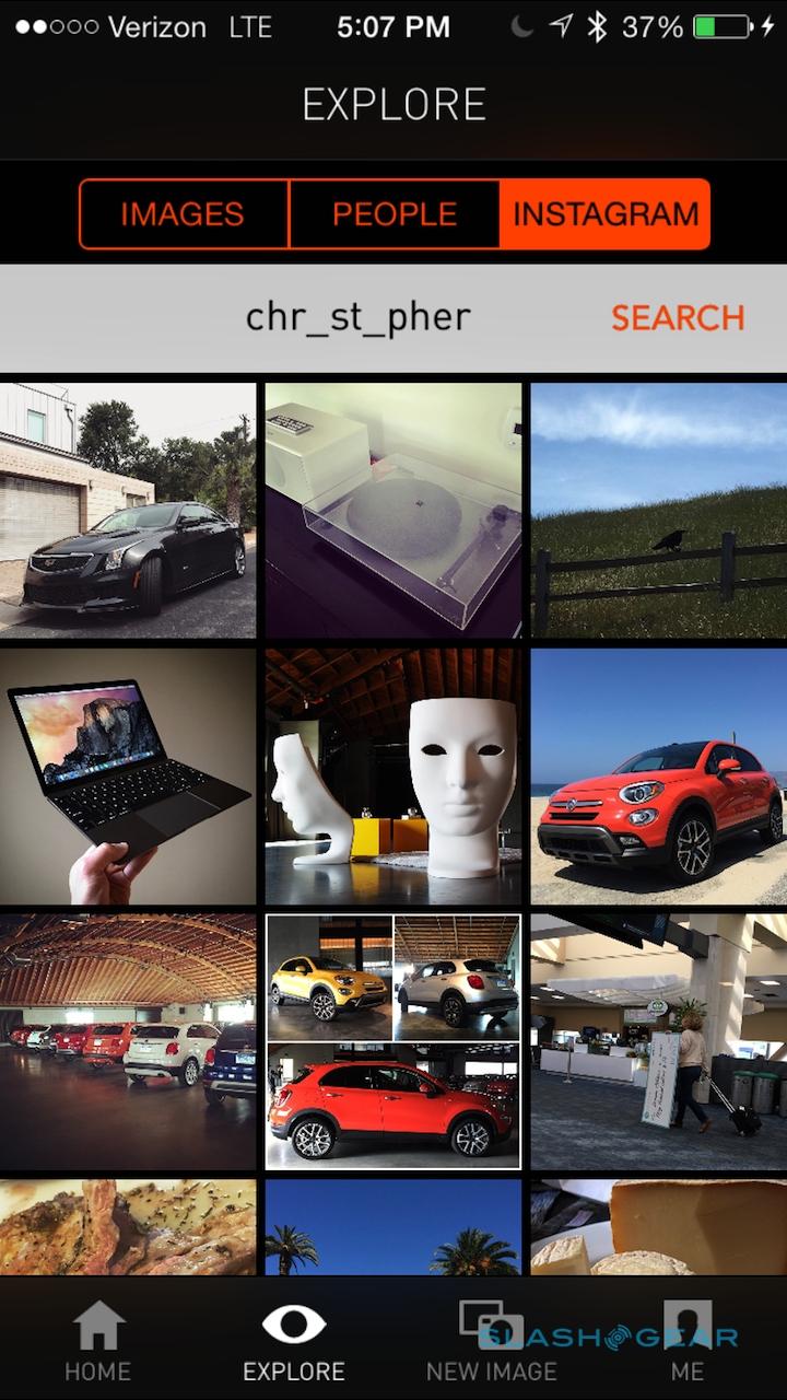
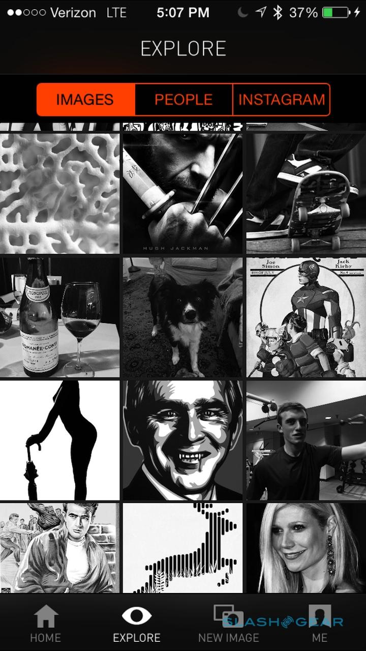
Right now, you could think of popSlate as an instantly customizable case. The company's app effectively builds a social network around monochrome images, pulled in either from your own camera roll or Instagram account, or from other popSlate users.
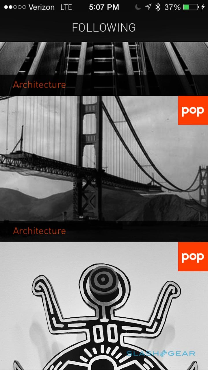
Navigating can be done by category – such as architecture or travel – or by user, or alternatively you can simply browse a continuous timeline. There are already a fair amount to choose from, courtesy of popSlate's roughly 150 beta testers (not to mention the beta program defaulting to publicly sharing every image, something which can be overridden entirely or on a per-picture basis) If you see a photo you like, you can hit the "Pop" button and in a couple of seconds it's beamed over to the E Ink screen.
popSlate calls that a re-pop, but you needn't be reliant on other people sharing images of note. You can either snap a photo or use a pre-existing one, choosing whether to also share that on your public profile (so that others can re-pop it) or keep it private.
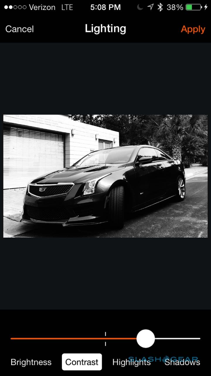
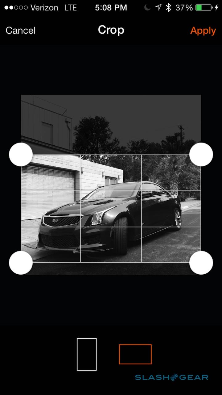
Since you're dealing with a monochrome screen and a not especially high resolution, some pictures work better than others. Graffiti and bold landscapes are particularly successful, whereas anything reliant on color or fine detail is less charming. popSlate includes editing tools that can be applied – though not to re-pops – before you sync with the case itself, and often a quick tweak of contrast and brightness is enough to get a decent result.
Still, it's a case of trial-and-error, made a little more frustrating at times by the simplistic way popSlate handles file management. The storage inside the case holds, in theory, eight different images (I say in theory, because my review unit proved reluctant to store more than six), and automatically deletes the oldest picture when a new one is loaded.
With no way to manually delete what's in the case's storage, or to reorder the sequence in which they're shown, try a few different edits and you can easily have three or four of the same picture queued up. The only workaround is to pop over more shots (the same goes if you've inadvertently popped a perhaps risqué picture; you'll need to quickly replace the whole cache with eight new images in order to be rid of it).
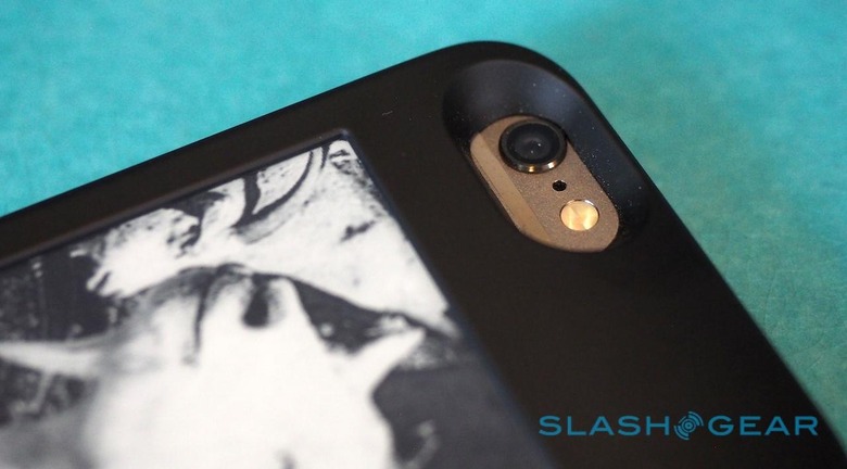
E Ink has some inherent advantages over the iPhone's regular LCD, not least the fact that it only requires power to change what's shown, not to maintain it. That means, even if your popSlate's battery is dead, whatever was on-screen last will remain.
It's particularly helpful if your phone is dying and you need your flight boarding pass, or your Starbucks card QR code, or a screenshot of the day's agenda. However, popSlate's minimal image management tools undermine it somewhat, at least at present. With no way to lock an image so it's not replaced, or indeed to specify which picture is loaded when the battery is about to fail, it's effectively just luck whether the content you want to be shown is in fact there.
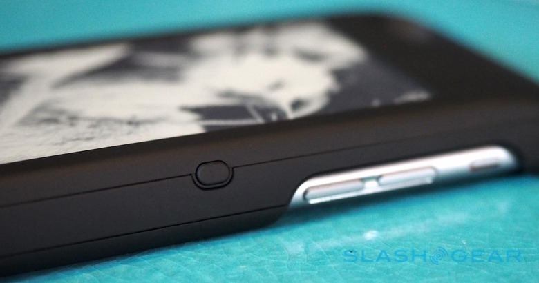
I also found the side button could easily be pressed accidentally while my phone was in my pocket, so that the picture shown when I pulled it out was different to that when I put it away.
Right now, then, popSlate is a gallery of sorts, a way to turn a single case into a wide range of them. Happily, though, the company's ambitions don't end there.
The Future
One of the things E Ink excels at is persistence without penalty. YotaPhone 2 takes advantage of that to show persistent notifications, keeping content on-screen in ways that would be too profligate to countenance on a traditional display with the average phone-scaled battery.
popSlate has ambitions in the same manner, though they're not available out of the box right now. Currently in closed beta testing is a system designed to push notifications, images, and alerts from apps and services to the secondary display.
Rather than use iOS' own notifications system, popSlate's initial implementation relies on IFTTT (If This Then That). So, Google Calendar can send a meeting reminder to popSlate, or your SmartThings home hub might notify you that your children have arrived home from school. Eventually, popSlate tells me, there'll be native support for the core notification features, not to mention ways other developers can integrate directly, but the company plans to use IFTTT to gauge just which are most in demand and see how they're actually used.
Meanwhile, the company plans to refine how the two displays interact. So, if you have a new notification from your messaging app on-screen, perhaps, if you then turn the iPhone over it'll be that app which is automatically shown.
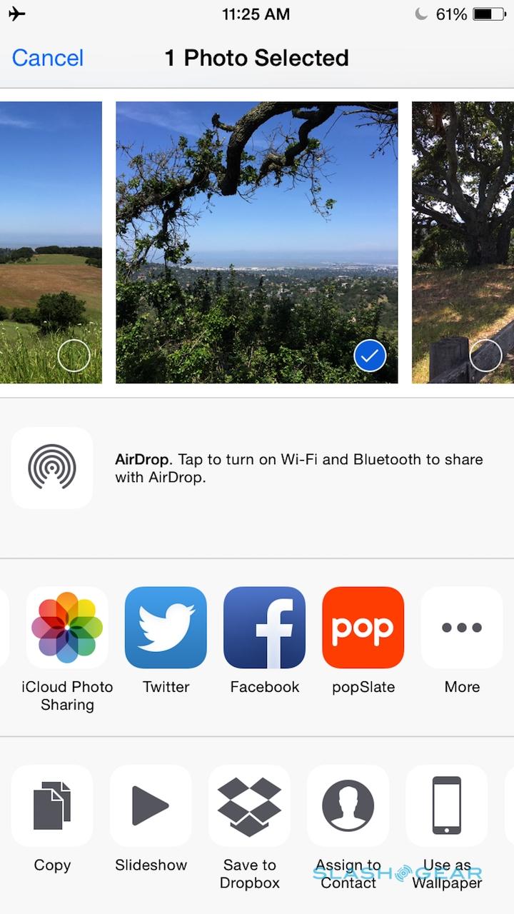
I wasn't able to test out the IFTTT integration, so had to resort to more basic ways to get content other than photos to show up. popSlate adds a button of its own to the iOS share menu, for the gallery at least, but if you want any sort of text – say, from the browser, the Notes app, or your email – you have to do a screenshot and then transfer that over as a photo.
Later in 2015, meanwhile, popSlate plans to launch retail-ready versions of its E Ink-equipped case. Exact details on what that will look like haven't been shared, but looking at the rest of the iPhone case space, it's not hard to piece together wishlist.
One the one hand, slimming the currently-bulky popSlate hardware would be an obvious route. The E Ink screen itself, with its plastic substrate, is not only slim but could be bent or wrapped around a more iPhone-hugging design.
On the other hand, popSlate could go the Mophie route, pairing an e-paper display with an external battery that could be used to recharge the iPhone inside.
Of course, there are other phones out there, not least Apple's own iPhone 6 Plus. popSlate intends to focus on iOS to begin with, though Android is certainly being considered, I'm told.
Wrap-Up
popSlate has been some time coming. The initial crowdfunding campaign closed in Januar 2013, raising more than $200,000 in the process, and it's only now that backers are seeing the fruits of their commitment. Even then, the first-generation case lacks the refinement of design to match its functionality: I've always been aware that I've dressed my iPhone in something roughly the bulk of a Mophie, but without the benefits in extra battery life.
Nonetheless, I'm impressed by the potential popSlate shows. Yota's smartphone may be more tightly integrated in how it pairs traditional and e-paper screens, but in doing so it forces compromise: you have to be comfortable with Android, and give up on the flagship devices of the bigger names in the industry.
Right now, popSlate feels more like a fashion frippery, but when the software gets its notifications upgrade and management of what images live on the case and how they're controlled is improved, it will quickly gain a far more practical edge. Being able to swiftly review new messages, tweets, Facebook updates, and more, all without powering on the greedy LCD, could not only streamline how I use an iPhone, but actually allow me to squeeze more out of its own battery.
popSlate's argument is that the back of your iPhone is dead space, so why not put it to use. In its first iteration the usefulness may be merely aesthetic, and thus perhaps a tall ask for $129, but if the company can trim bulk and make better use of e-paper's low-power skills, it could end up the perfect add-on for the power user addicted to checking and re-checking their phone.
MORE popSlate

