Plex Gets Sleek New UI With Improved Navigation On Roku, Apple TV
Home media server software company Plex is rolling out its sleek new user interface on Roku and Apple TV, the company has announced. The UI brings a new television navigation experience that was designed to offer a 'unified, consistent experience' on all the devices and platforms that Plex supports.
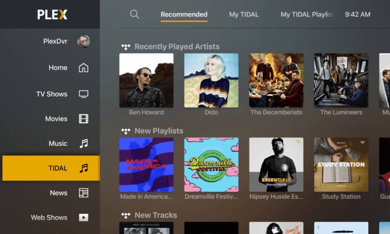
The new interface features a sidebar as the core of its navigation, enabling users to directly access the type of content they want, return home, and open their account. The UI meets the needs of different types of users while remaining simple enough for casual, inexperienced streamers to navigate.

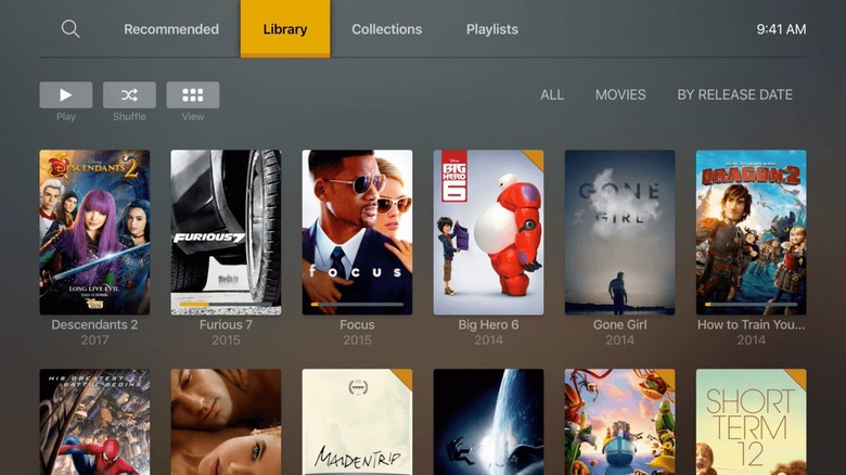
In addition to a customizable sidebar, which can be set up to present options like "Movies" and "News," users can also sort content based on Library, which presents a classic grid, and "Recommended," which sorts content based on categories like "Recently Added Movies." There's also a direct "Playlists" tab and "Collections."

Customization means users can easily remove and reorder categories based on their content and watching needs — someone who never accesses the "News" category can simply unpin it from the sidebar, for example, and someone who usually watches movies can move the "Movies" button to the very top of the sidebar.
This interface is first arriving for Roku users as a finished product and on Apple TV as a beta launch. Plex says it plans to bring this same interface to other platforms it supports, but the company didn't provide a timeline for that expansion.
