PlayStation 5 Box Art Is Thankfully And Disappointingly Normal
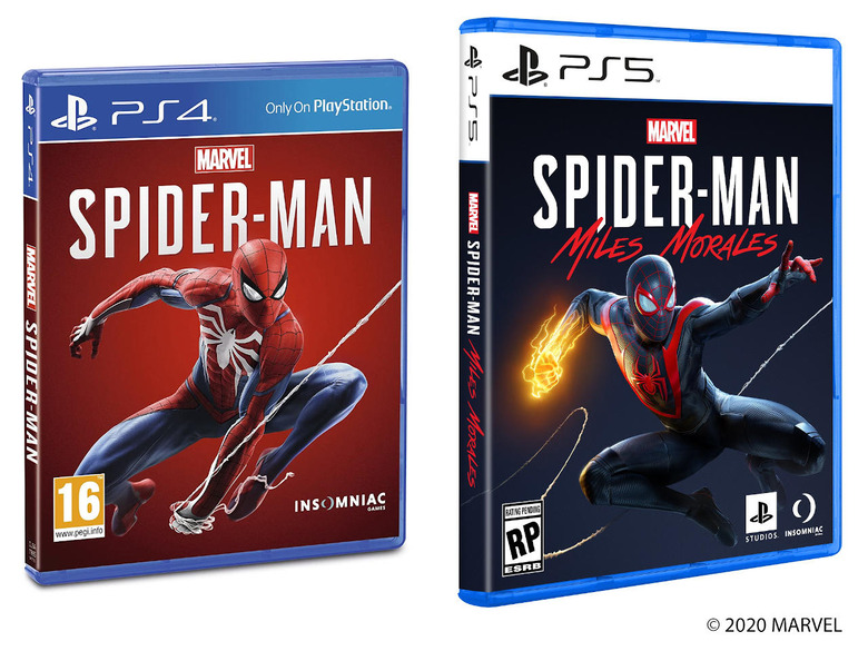
The formal revelation of the PlayStation 5 console has had fans and the Internet split over its design. The most neutral way to describe the box, if you can even call it a box, is that it's different. Because of that, there have been some concerns that physical copies of games, which will still come in good old-fashioned circular disc form, will come in some outlandish packaging. Sony has finally broken its silence on that matter and, for better or worse, PS5 game boxes will look pretty much like PS4 game boxes.
OK, there will be some subtle differences, at least aside from the "5" in the PS5 logo that looks too similar to the PS4 logo to be a distinguishing factor. Fortunately, Sony did give it some thought and found a way how to easily distinguish PS5 games from PS4 games should they be lumped together on shelves.
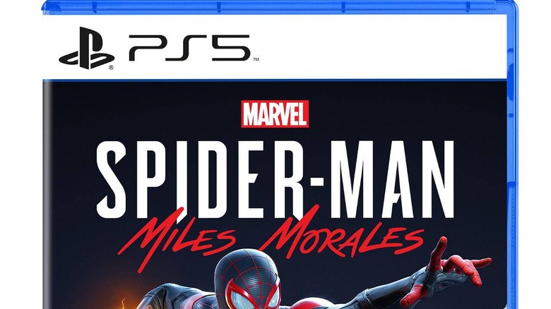
The first game whose box art has been revealed is unsurprisingly Spider-Man: Miles Morales, one of the few Marvel superhero franchises Sony owns. The thematic similarities with Marvel's Spider-Mn on the PS4 are probably no accident, designed to hint at the relationship between the two men that bear the same title. But while Peter Parker is simply swinging it, Miles is jumping into action full of energy that's both literal and figurative.
The biggest difference is, of course, at the top of the box. Whereas the old PS4 boxes had the white PS4 logo on a blue banner, the PS5 box has a black PS5 logo on a white banner. It definitely matches the Black and White (no, not Pokemon) theme of the console itself, not that the PS4 launched with a blue console anyway.

That should probably be enough to make sure you don't mistake one console's game for another, whether from the front or from its spine. It might be a sight for sore eyes wishing for something familiar and it's designed not to draw attention to itself but to the futuristic and out of this world console you'll be putting the disc into.
