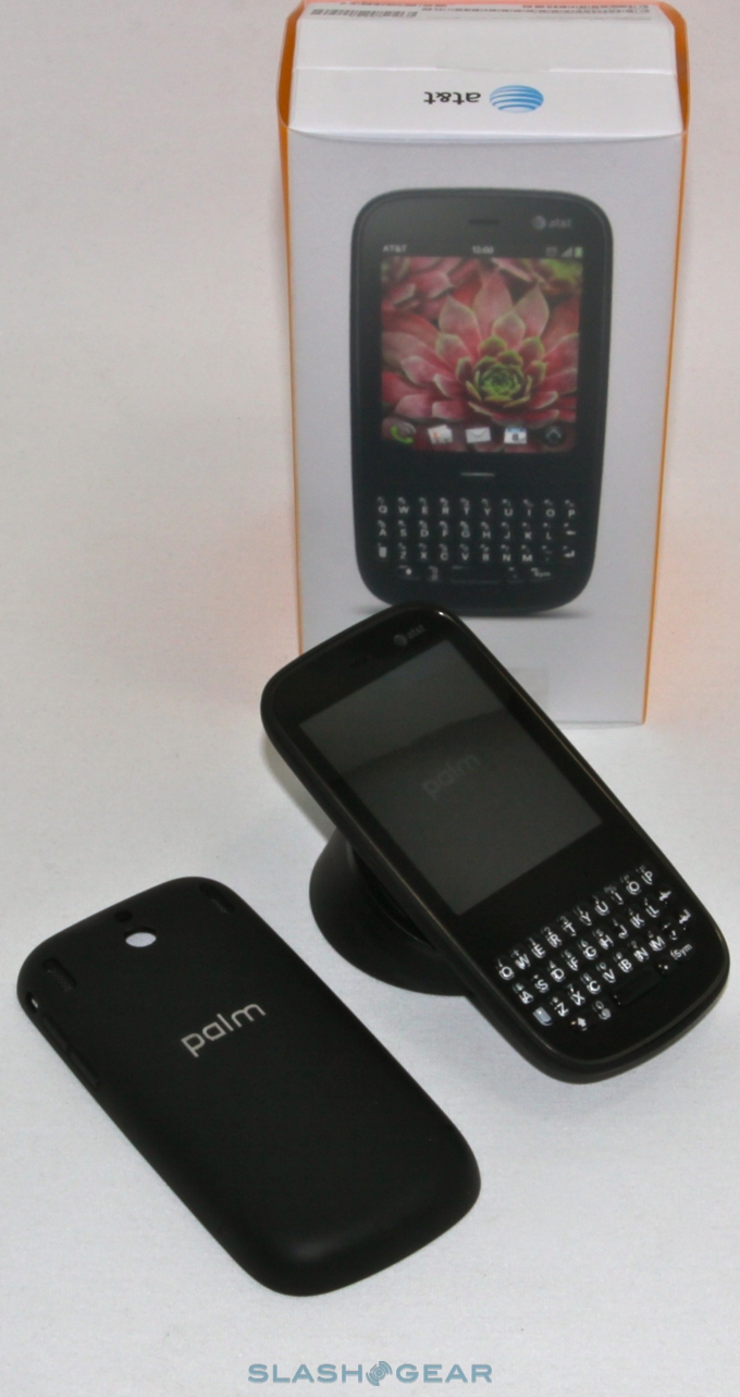
Palm Pixi Plus (AT&T) Review
The Palm Pixi Plus isn't exactly new, but its launch on AT&T this coming Sunday will mark the debut of the GSM version in the US market. Priced at a featurephone-rivalling $49.99 (with a new agreement, naturally), the obvious question is whether you're getting more for your money by opting for the webOS handset. Check out our review after the cut.
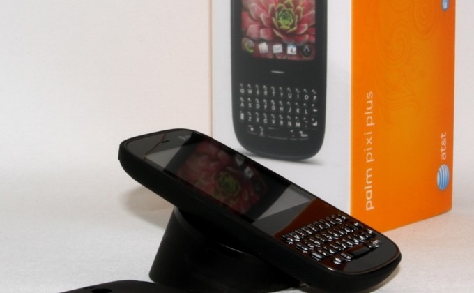
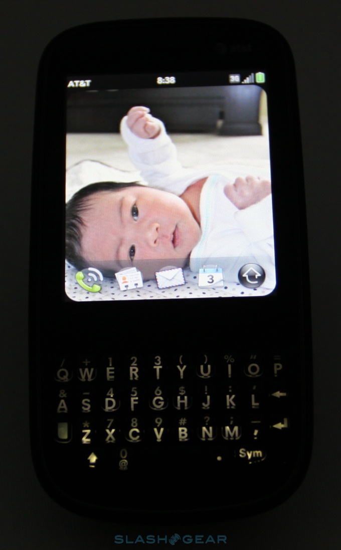
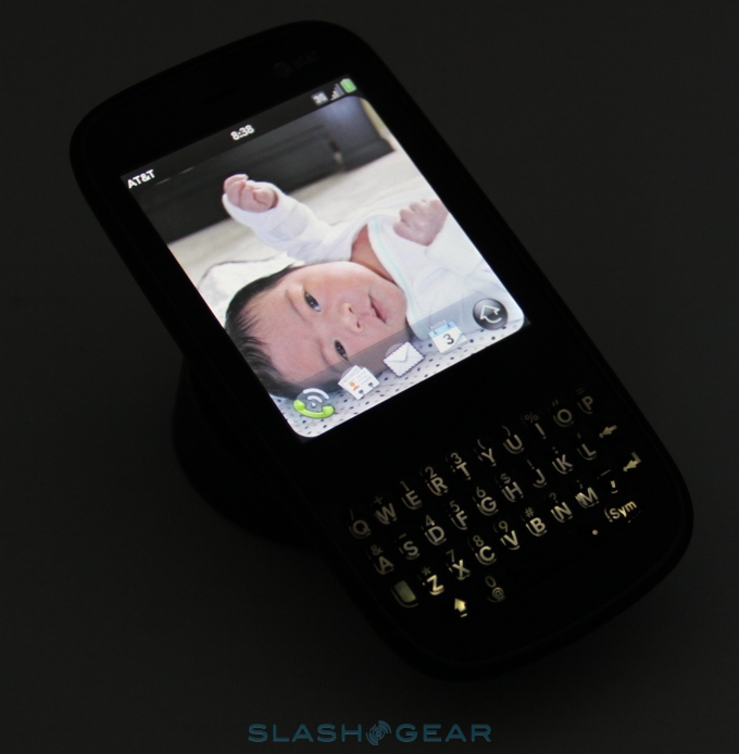
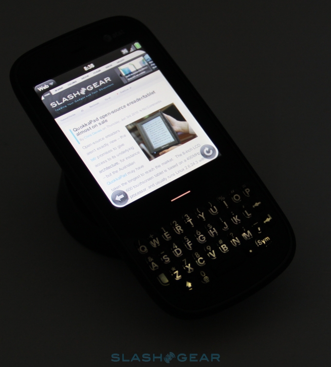
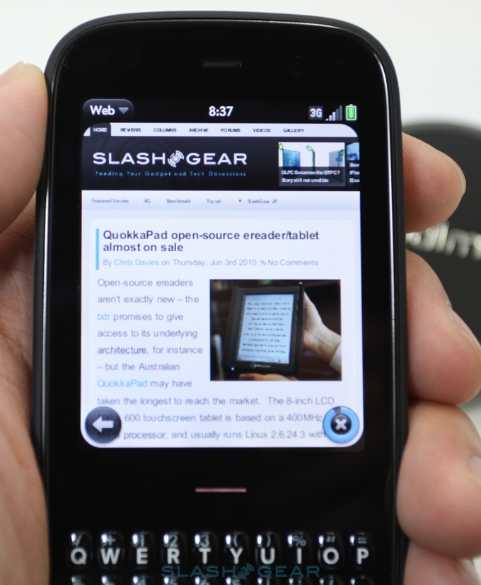
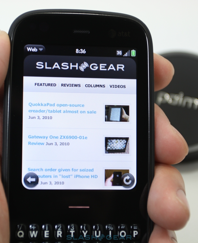
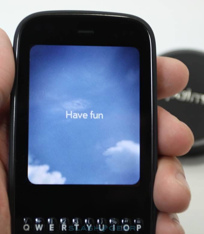
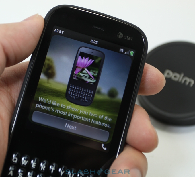
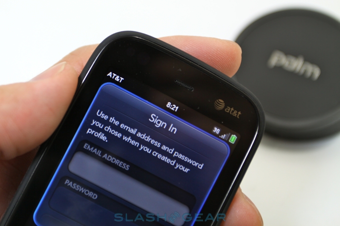
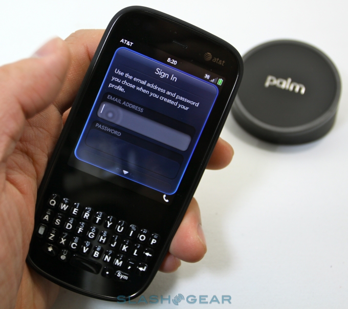
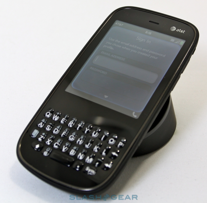
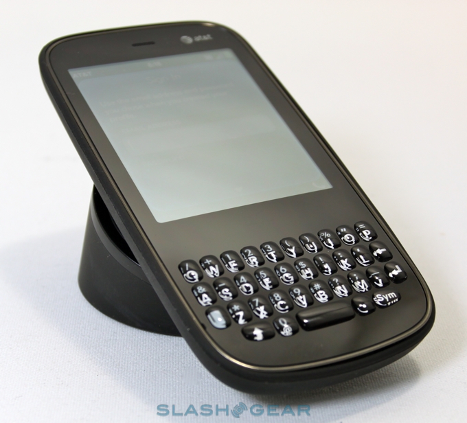
Physically the Pixi Plus obviously has a more straightforward design than the Pre Plus' sliding form-factor, instead a candybar with the QWERTY keyboard on show all the time. The display is a smaller, 2.63-inch panel, now running at 320 x 400, but is still separated from the keyboard by a horizontal "gesture strip". The center point of that strip lights up briefly whenever you tap it to go back to the Cards panel.
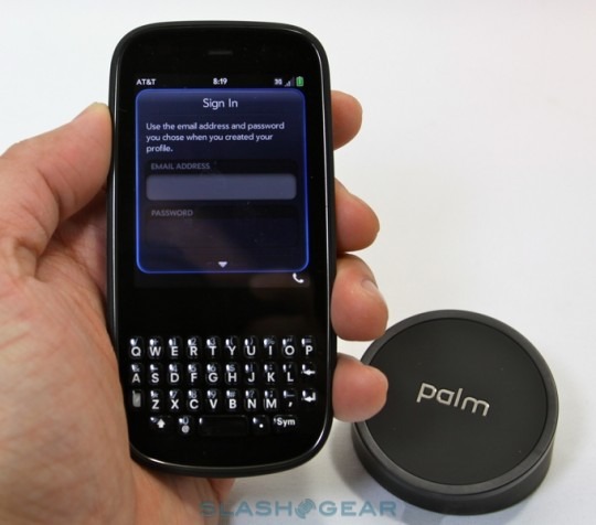
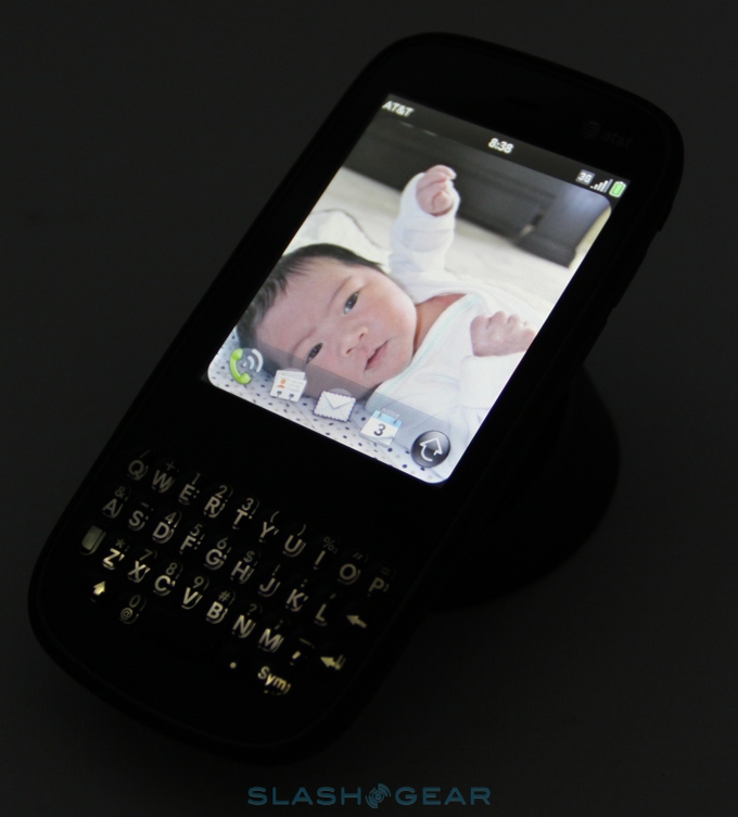
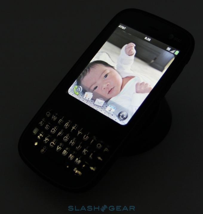
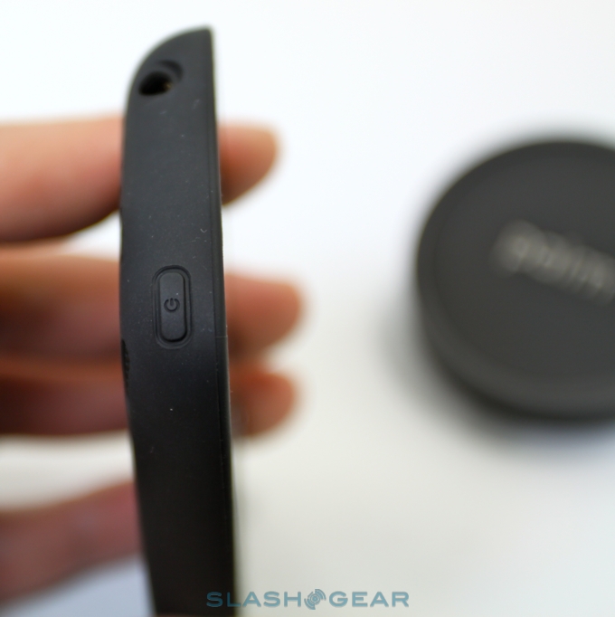
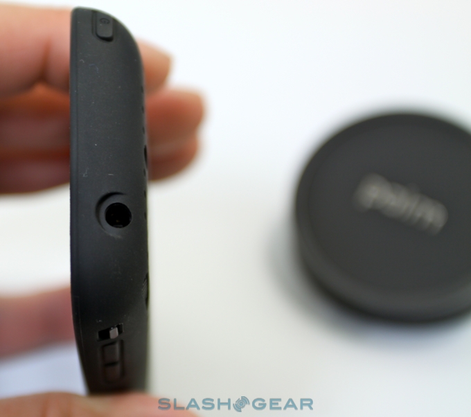
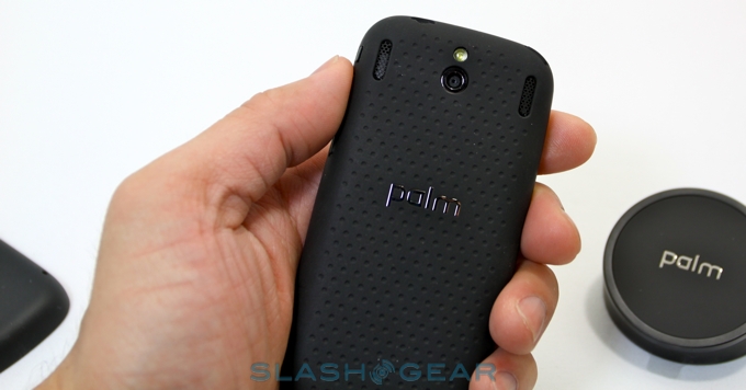
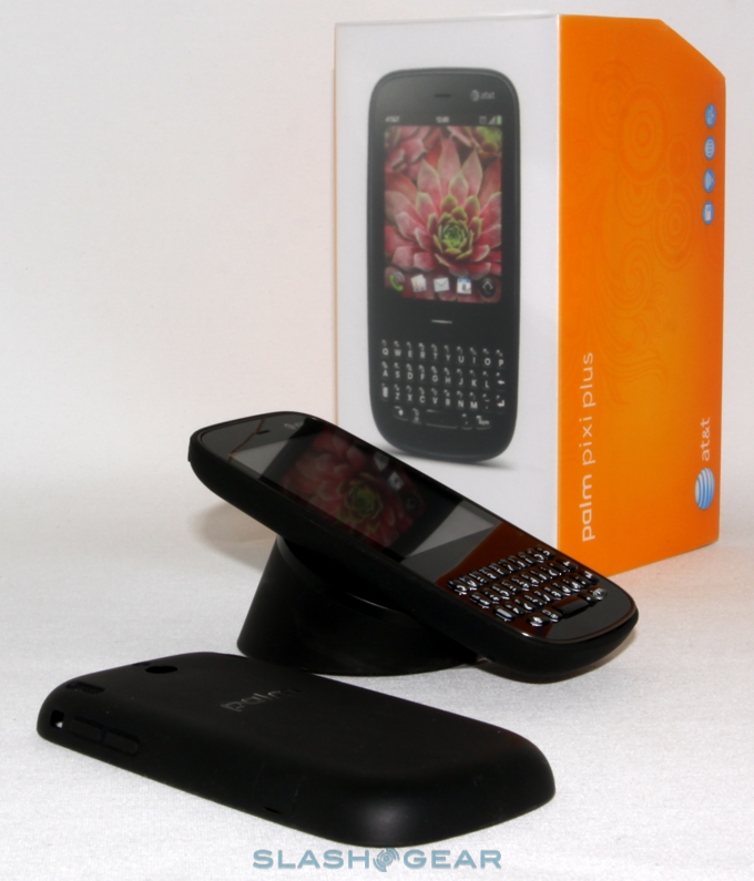
Other hardware controls are minimal. There's a power/sleep key built into the top left edge, volume controls on the upper right hand side, and a physical ringer switch just above that. The back of the phone holds the 2-megapixel fixed-focus camera with LED flash, which drops a megapixel or so of resolution from the Pre Plus, and there's still no dedicated hardware button for triggering photos. Prise off the back panel and there's a removable 1150mAh battery; you can also throw a Palm Touchstone inductive charger into your basket along with the smartphone, and then avoid having to pry open the slightly fiddly microUSB cover on the side. It's the same Touchstone as for the Pre, of course, so if you already have one you'll only need the replacement back-plate.

The whole thing measures a scant 0.43-inches in thickness, which makes the Pixi Plus ideal for slotting into an inside jacket pocket or front jeans pocket and pretty much forgetting about. Build quality is high, with some of the Pre's shake and wobble obviously missing what with the slider mechanism no longer present. The regular, non-Touchstone back panel uses soft-touch plastic, which feels better in the hand and is less of a fingerprint magnet than the original glossy back panels Palm used. AT&T will also be offering an exclusive blue cover.
Inside, meanwhile, there are more changes from the Pre, but we're less impressed here with some of Palm's decisions. While both handsets run the same webOS platform – more on which later – Palm have kept the Pixi Plus with its less capable processor, swapping out the first smartphone's OMAP3 chip for a 600MHz Qualcomm MSM7627. Storage is the same 8GB of non-user-expandable flash, and there's WiFi b/g along with 850/1900 UMTS/HSDPA and quadband GSM/EDGE connectivity.
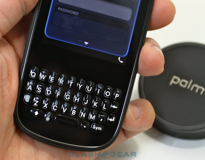
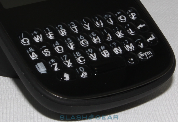
The biggest hardware revelation remains the Pixi Plus' keyboard, which is actually better than that of the Pre Plus. Palm's first handset had relatively shallow key profiles so as to fit neatly into the slide mechanism; the Pixi Plus can afford more key definition, and it uses that to great advantage. Buttons click more positively than on the Pre Plus, and despite the reduced width we were faster on the Pixi Plus at typing. Unfortunately, even with the latest version of webOS, the auto-correction software Palm employ is dramatically sub-par in comparison to the iPhone and Android, though if you're making fewer mistakes on the Pixi Plus in the first place that at least is less of an issue.
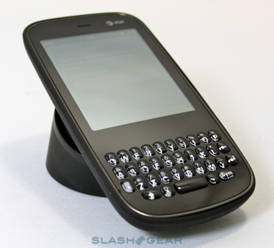
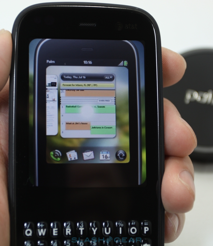
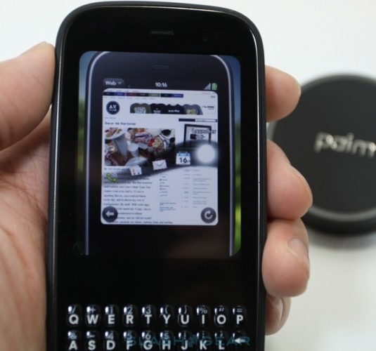
webOS' central concept is that individual apps and webpages are represented by cards, and these can be viewed in a row along the homescreen by tapping the center portion of the gesture strip. Each card is active while in this overview, so webpages continue to load and inboxes show the latest messages. On the Pre Plus, you can effectively triage your email and SMS conversations by glancing at the shrunken card rather than need to actively dive into the respective app; however since the Pixi's display is a rather more compact 2.63-inches, text is far harder to make out in card view. We still wish Palm had at least scaled up the cards themselves.
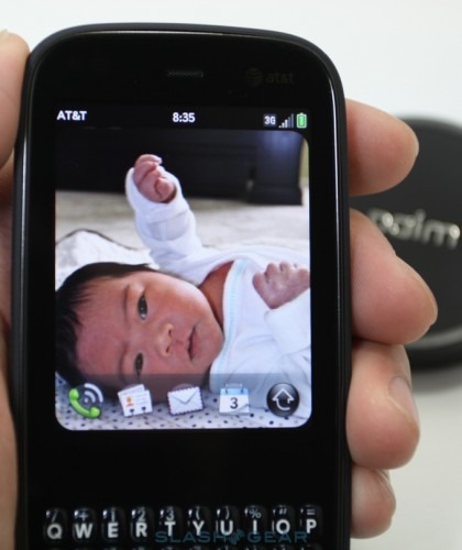
Otherwise, webOS is pretty much the same as we've seen before, which means you're looking at one of the more elegant platforms in the smartphone world right now. Palm have made heavy use of gestures, along with multitouch support for pinch-zoom in the browser and mapping app, for instance, with elements like "flicking" cards off-screen to close apps that quickly become intuitive. Meanwhile notifications are discretely pushed up at the bottom of the display – again, dismissed with a flick – while you can drag up a launcher bar of your frequently accessed apps by pulling a finger up from the center gesture area.
Thanks to the slower processor, the Pixi Plus drops some speed over the Pre. Some of the shine gets taken off webOS when you suffer slow-downs and the usually responsive capacitive touchscreen decides to take a break while the guts of the phone catch up. It's not the only hardware disappointment, either: while the fixed-focus camera is quick to snap shots, the end results are mediocre and gritty, with poor color balance outdoors and temperamental exposure indoors. The LED flash has a markedly narrow cone of effectiveness, and generally either over-saturates a nearer subject or proves insufficient for broader scenes.
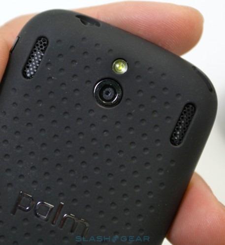
As for media playback, while the Pixi Plus may have two speaker grills on the back, flanking the camera, only the right-hand one actually hides a speaker. Of course, you'll more likely be using a headset, and thankfully there's a standard 3.5mm socket up top. Flash support in the browser is still absent, but the standalone YouTube client is functional. Audio and video playback quality is good, and while the Pixi's display may only support 65k colors compared to the Pre's 16m, any difference is not especially noticeable.
Call quality, meanwhile, is decent as long as you're using the regular earpiece. The speaker, meanwhile, is less successful, proving too quiet to serve as, say, a standby in-car option when you don't have a Bluetooth headset to hand. Battery life is rated at up to 5hrs talkative or 350hrs standby, which Palm suggests is enough "to get most users through the day". Having push email and Synergy account sync turned on generally means you'll be recharging nightly, just as with any smartphone, but given the smaller battery pack than the Pre Plus any significant web browsing or media playback might see you fall short earlier in the day. Given the Pixi Plus' target audience, that probably is an acceptable compromise between size and functionality.
In fact, defining the target audience is the core issue at the heart of understanding the Pixi Plus. In comparison to the Pre it has a smaller design and better keyboard in its favor, but drops speed, screen size and resolution, camera performance and connectivity. The entry-level Palm Centro proved a quiet success story, helping keep Palm's bottom line buoyant by appealing to younger buyers and women – the so-called "soccer mom" segment – while the appeal of their Treo range petered out among mobile pros. In the same way, the Pixi Plus (and its Pixi forbearer) is the solid entry-level handset, hopefully tiding Palm over until HP decide they're happy for them to make more advanced devices.
The Palm Pixi, then, is designed to appeal not to the geeks but the regular users who might otherwise pick up a featurephone. At that level, $49.99 is less than you'd pay for some QWERTY feature phones, and AT&T's new smartphone data packages mean that you needn't bankrupt yourself if you just want to dip a toe into mobile use.
Viewed in those terms, it's hard not to see why Palm has made some of the decisions they have with the Pixi Plus. It still adds up to a device that's frustrating in certain ways for established smartphone consumers, but is also likely the best way forward for a company – despite new owners – that still looks to be on relatively shaky ground. The Pixi Plus' strengths are in webOS' extreme ease of use, and if you – or your less tech-obsessed family and friends – have been considering stepping up from your featurephone then there's far less of a learning curve involved than rival devices running, say, Android. The AT&T Palm Pixi Plus will land on Sunday June 6th, priced at $49.99 with a new agreement.
