OS X Yosemite Preview (Public Beta)
Apple's Mac platform has had a great year. At a time when traditional PC consumption is shrinking, more people are diving into OS X, and the next big upgrade is Yosemite 10.10. Revamping the interface, eroding the barriers between iPhone, iPad, and your MacBook, and seamlessly connecting local apps and the cloud, Yosemite promises to be not only an ambitious upgrade, but a capable one. Now, on the eve of the new OS X Yosemite Beta Program, we've been putting the latest release through its paces. Read on for our full preview.
Design and Interface
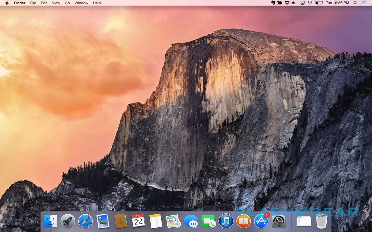
If Mavericks saw Apple make its big under-the-hood improvements to OS X, then Yosemite is the user-facing follow-up. The impact of recent versions of iOS on the design language of Yosemite is also clear to see, with numerous aesthetic changes that leave the Mac looking cleaner and fresher.
Perhaps most significantly, the font has changed, with Apple opting for a new default it says is easier to read at different sizes. It's also been selected with Retina resolution displays in mind, and looks particularly good on the latest MacBook Pro.
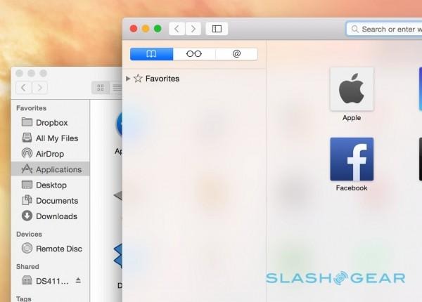
Look at Yosemite side-by-side with Mavericks, however, and other changes become clear. The chrome has been slimmed, toolbars trimmed, and new translucency added so that there's more room for content and a greater sense of depth. It's also more consistent; little things, like the forward and back buttons now being the same across apps, and toolbar buttons that have been redesigned so that they more closely resemble their actual functionality.
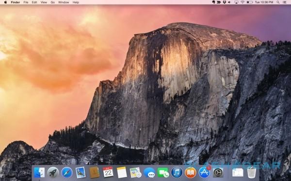
The dock has seen another significant change, now squared off rather than faux-3D, and the app icons that fill it are flatter. It can look a little cartoonish in places, but I quickly got used to it, and on moving back to a Mac running Mavericks the UI felt felt fussy and over-complex.
Spotlight and Today View
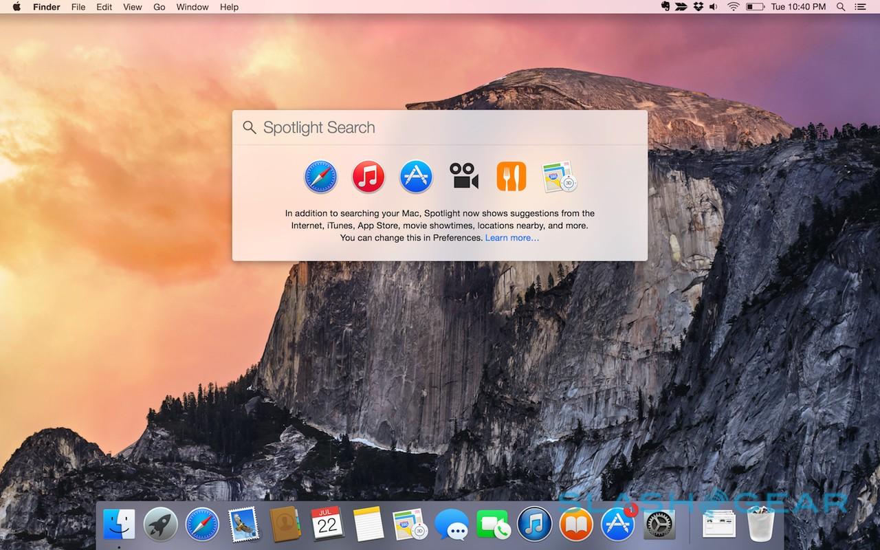
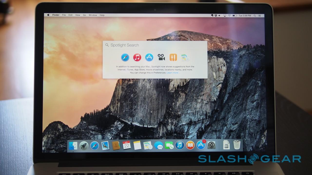
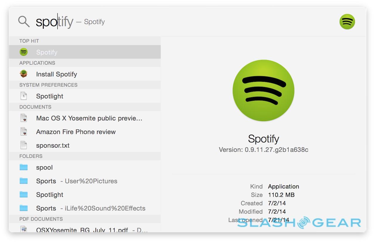
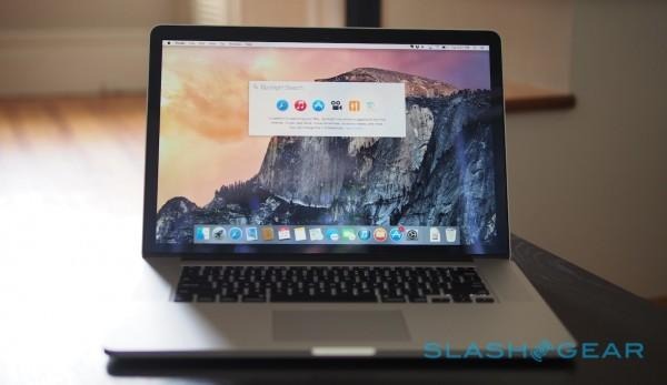
Spotlight has always been about more than just search, with the familiar cmd+space shortcut almost certainly inked into most long-time Mac users' brains. In Yosemite, Spotlight finally graduates to getting the attention it deserves, breaking away from the top right corner of the display and instead sporting a larger dialog in the center of the screen.

The goal of the old Spotlight always seemed to be to get out of the way as soon as possible. New Spotlight, however, is more confident in holding your attention. Start typing, and a twin-pane dialog spools open below, auto-completing as you go.
As always, your results include apps, documents and files, recent internet pages visited, contacts, and the ability to look up the searched word in the dictionary or online. New to Yosemite, however, is a far greater degree of detail from within the Spotlight pane itself.
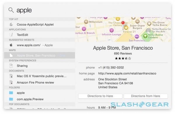
Contacts, for instance, now show their full entry, allowing you to kick off a new email or message right from the Spotlight results. Upcoming appointments in Apple's Calendar app are included, while documents and photos are previewed right there. More useful still is the ability to do unit conversions within Spotlight, changing currency, measurements, and more.
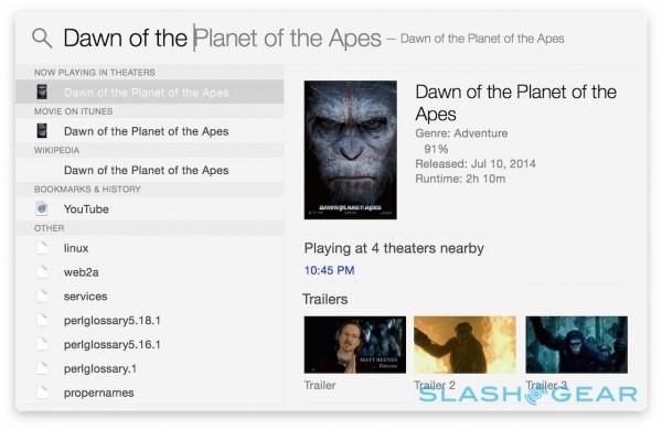
That's not the limit of where Spotlight casts its net, however. Results also now come from Wikipedia and Bing, as well as the contents of the App Store and iTunes Store. Apple Maps can show locations, complete with maps, shortcuts to directions, and contact details, while typing "Movies" or the name of a specific film calls us nearby theater times, ratings from Rotten Tomatoes, and links to the trailers.
There's also news, with Apple surfacing trending headlines related to whatever keywords have been entered. To begin with, the company plans to be conservative about how much news is shown, refining the results by factors like location and time, but over time Yosemite will learn from what gets attention and refine what's shown.
Unfortunately there's little manual control over what appears in Spotlight. For the moment, only Apple's own apps can filter their results into Spotlight, a shame since it's already considerably more useful as a launcher than before.

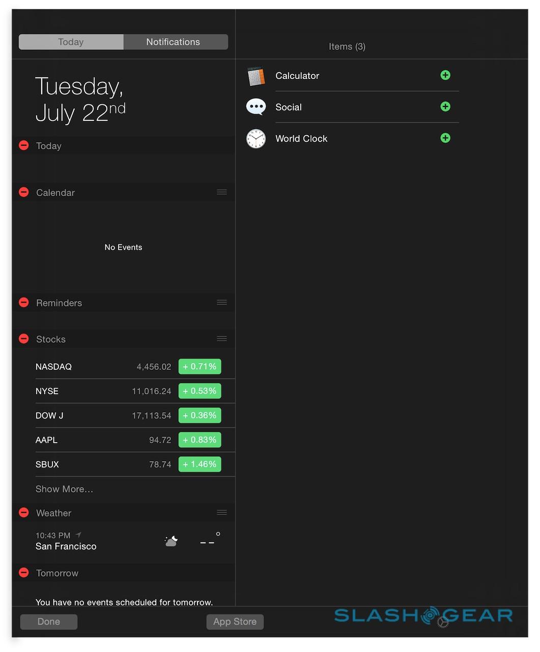
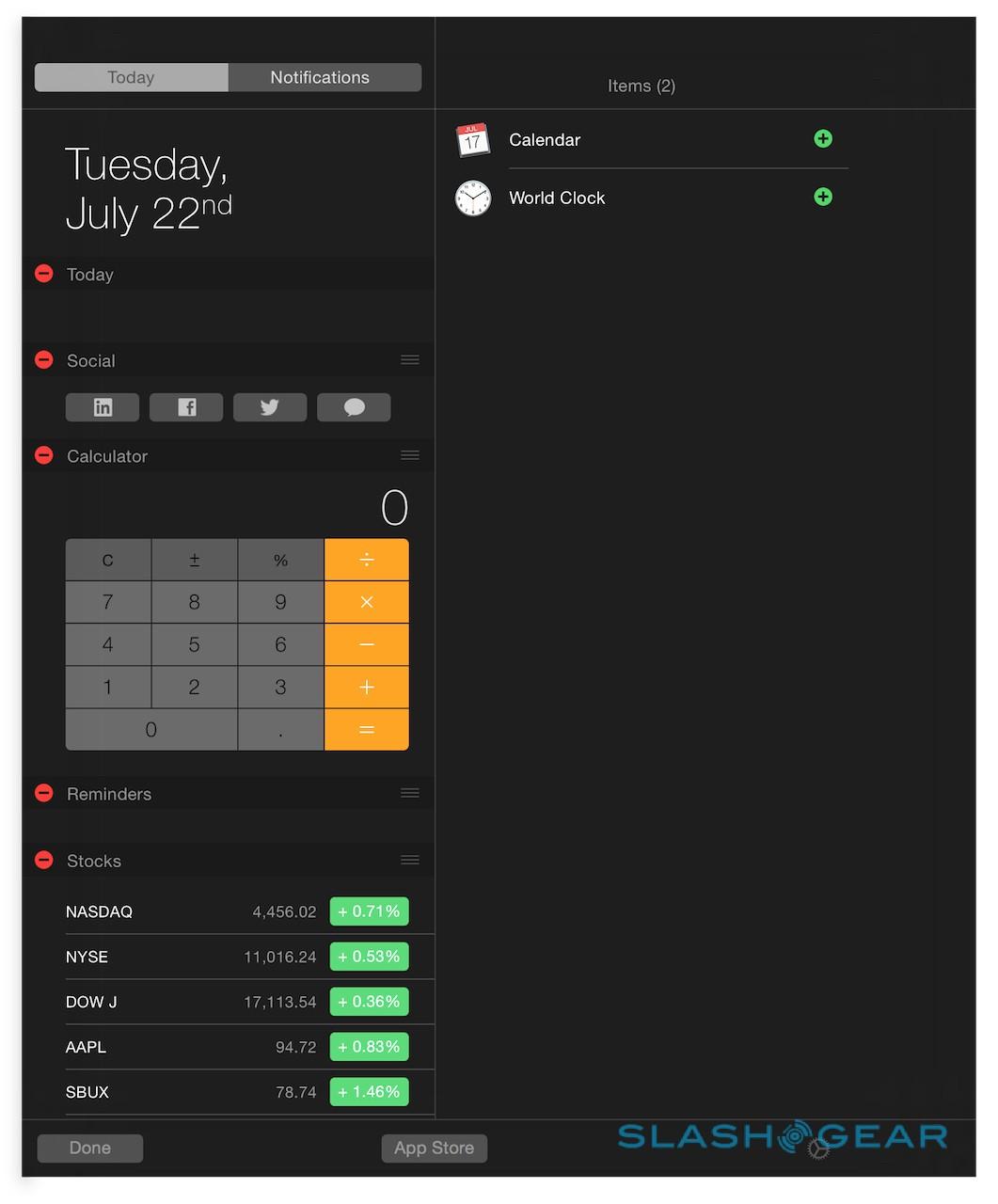
It works hand in hand with the new Today View, too, which also pulls in far more detail than before. As with the updated notifications pane on iOS, the new Notification Center addition curates what's on your schedule for the day, any upcoming reminders, and birthdays. Of course, for it to be really useful you'll have to be using Apple's apps – Mail, Calendar, Address Book, etc. – for your data. If you're the sort of person who logs into Gmail in their browser, or uses a different third-party email app, you won't get the Today View information.
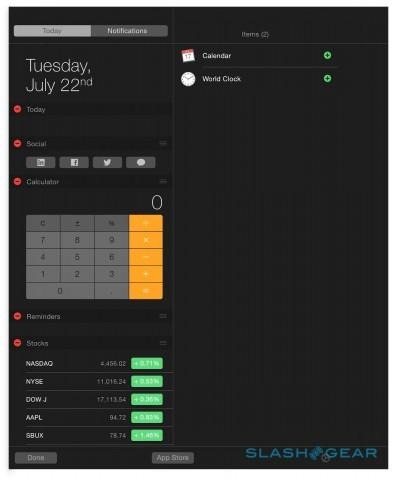
The other addition to the Notification Center is widgets, several of which have been borrowed from iOS. Apple provides weather, world clock, stocks, social shortcuts, and others, but there's also a widgets API which developers can use to create their own, including synchronization of content between software on Yosemite and iOS 8. Widgets can be distributed through the App Store, or bundled with desktop software, though there's no way to create a bundle with both OS X and iOS apps.
AirDrop
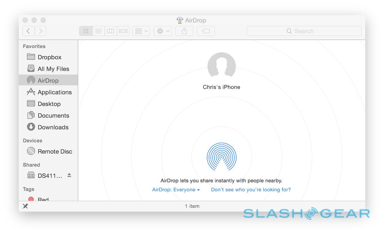
It's one of the most commonly requested features of iOS and OS X, and it's finally arriving with Yosemite. AirDrop is Apple's easy way to make ad-hoc file exchanges, but until now it's been platform-limited: iOS devices could only share with other iOS devices, and OS X could only share with OS X.
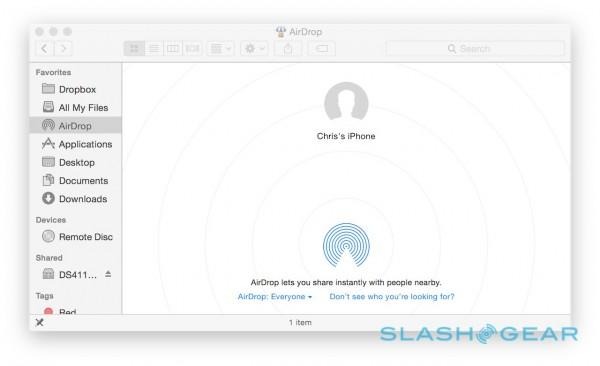
Happily that all changes with this latest Mac version, allowing iOS and OS X to gleefully switch content with each other. Best of all, you don't even need to be running iOS 8 in order to use it; Macs running Yosemite simply show up as a sharing option in the Share dialog on iPhones and iPads, and vice-versa on your Mac.
Safari
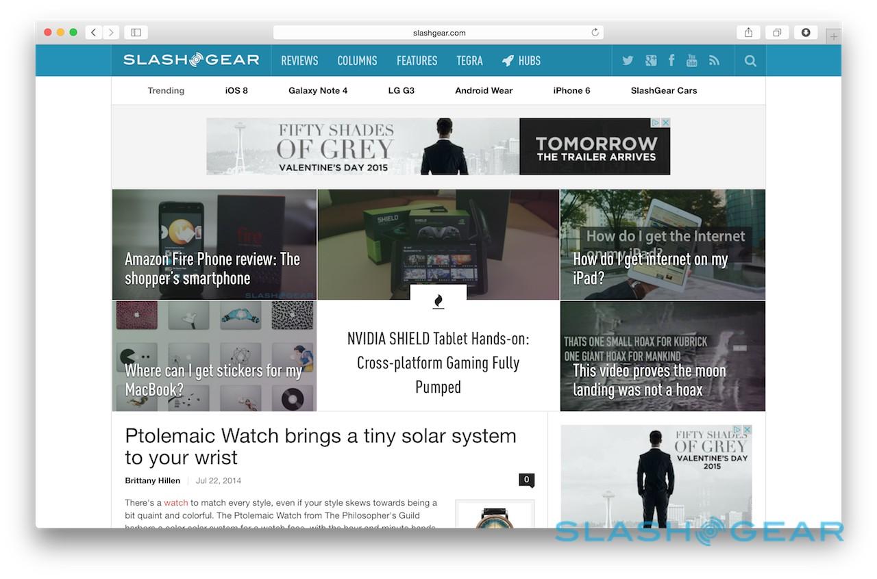
The browser wars may have been raging for some years now, but they're showing no signs of slowing any time soon. Safari gets an update for Yosemite, starting with the simplified UI design, but including a number of new features along with performance upgrades.
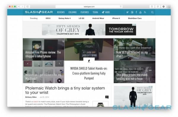
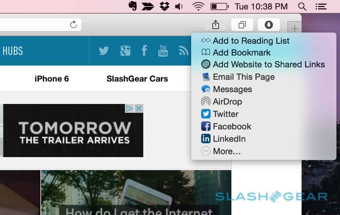
Controls like forward and back have been regrouped and the overall chrome trimmed, while the Share button now includes adding the page to the Reading List, posting it to Facebook, Twitter, or LinkedIn, and sending it out via Messages, Email, or AirDrop. A new section at the bottom shows frequent sharing recipients, complete with the method you usually use to contact them: so, your mom might be a shortcut via email, but your friend could be via Messages.
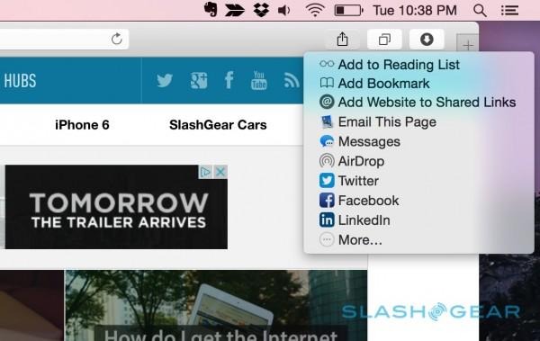
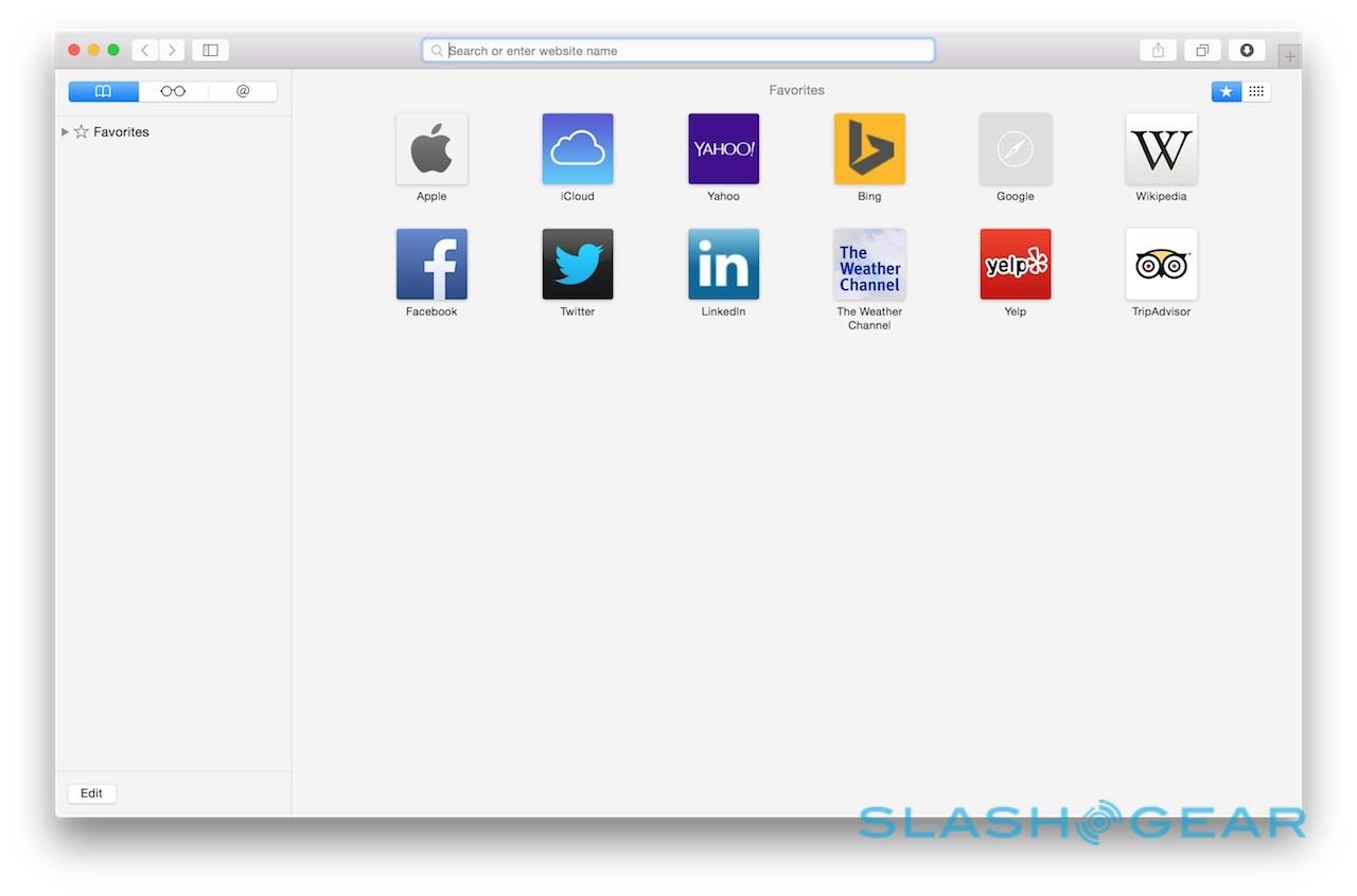
The new Smart Search box gets a revamp too, with a "+" button that now manages Reading List, Favorites, and Bookmarks. Favorites themselves are shown on a new grid – either when you click the Smart Search Field or when you open a fresh tab – while just as Wikipedia, Maps, iTunes, and other apps and services feed suggestions into Spotlight, so they appear in the Safari search box.
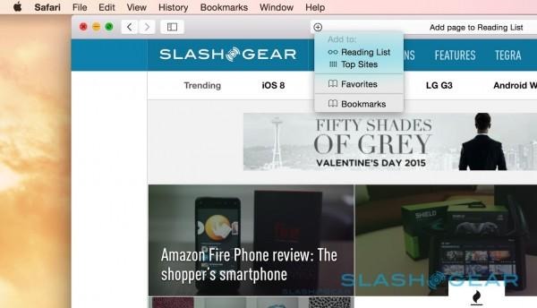
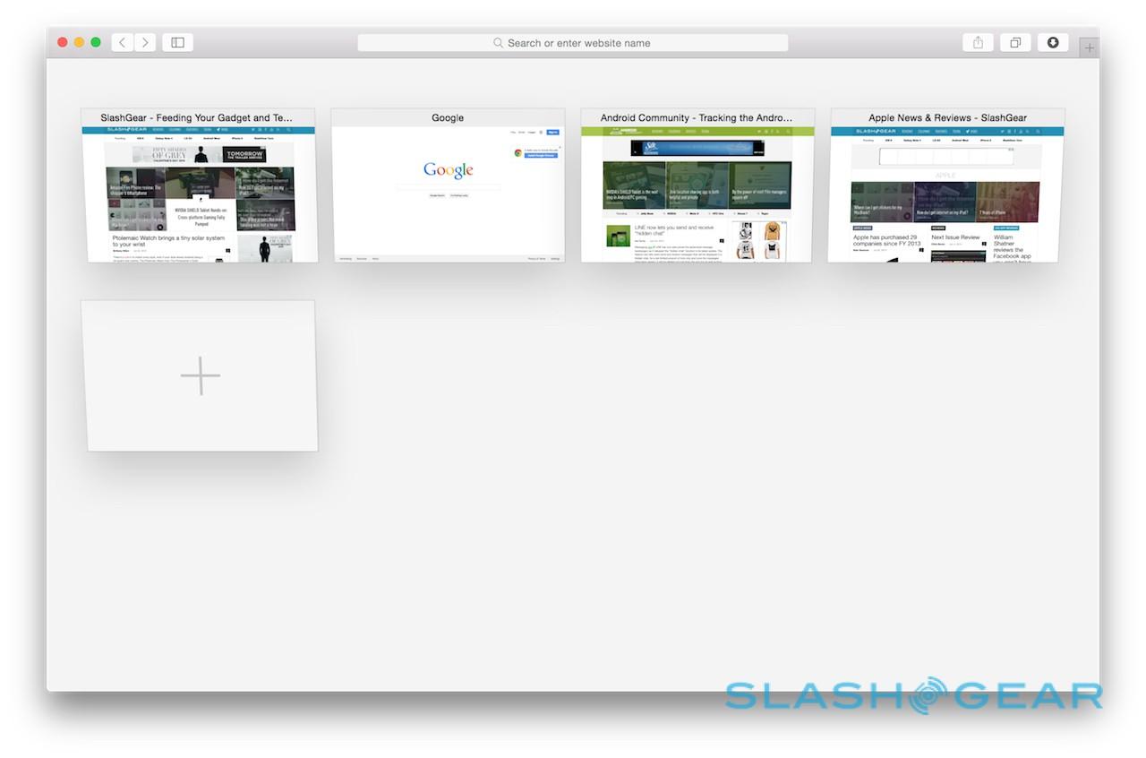
A new tabs view – triggered with a button next to the Share key – shows all the open tabs, grouped by those from the same website if you have multiple open. At the bottom of that same page, any open tabs on other devices signed into the same iCloud account, like your iPhone or iPad, are also listed. It's now possible to scroll through tabs in the tab bar with a two-finger swipe, which is a much easier way to handle a large number of pages being open.

Private searching has been refined, with the addition of Google-rival DuckDuckGo as one of the default choices for Safari search, and a new cleaning tool for more granular control over cookies, history, and general browsing data. A new cookie-blocking option prevents any trackers from sites other than the one you're actually looking at right there, while Private Browsing can now coexist with regular browsing. Opening a new Safari window for untracked internet use leaves the regular one still in the background.

The new features are great, particularly the cross-platform tab sync, though more useful are the improvements in speed. Apple says improvements in Netflix playback can add up to two hours of playtime, and while I didn't test that out in lab conditions, some casual viewing made a minimal dent on the battery gage.
Apple says the new Safari is twice as responsive than Chrome, and more than six times swifter at JavaScript than Google's browser. In general use, it's certainly snappy, though your network connection will obviously have a big impact on your overall internet experience.
Mail and Messages
As one of the core apps in OS X, Mail gets a couple of tweaks in Yosemite, most of which are centered on letting you spend more time in-app rather than jumping between other software and services.
Mail Drop, for instance, tackles the issue of transferring large files, which can often be unfriendly to email servers. If your parents have ever tried to inadvertently send several gigabytes of photos as an attachment, then wondered why their system suddenly freezes up, Mail Drop may be the answer.
By automatically uploading larger attachments to iCloud, and then appending a link and a thumbnail preview to the message itself, Mail Drop intelligently divides the inbox clutter. If the recipient is using Yosemite Mail themselves, then message and attachment are automatically reunited. If, though, they're using a different app or service – Gmail in the browser, perhaps – then they get a link to click to access the file, which is stored in the cloud for up to 30 days.
Mail Drop works with forwarded emails, and attachments are encrypted in iCloud. Up to 5GB can be shared with any one message, though it's worth noting that there's no granular control over what gets downloaded to your inbox: if someone sends you a couple of emails with large Mail Drop attachments, and you have synchronization switched on, Mail will automatically pull down local copies of those attachments.

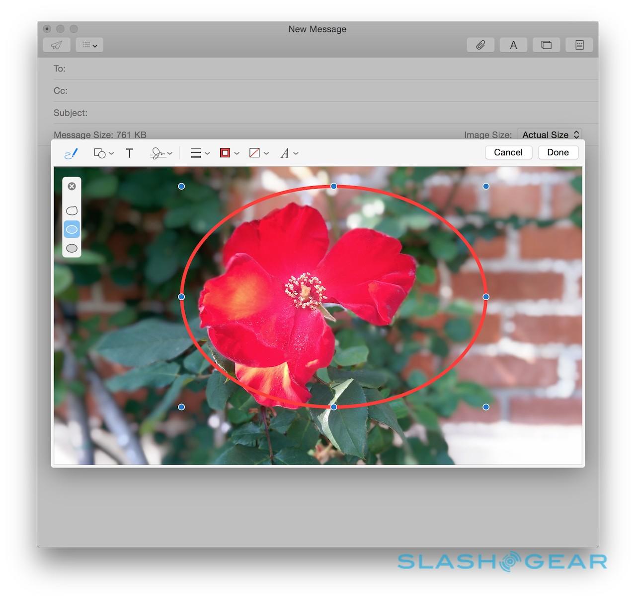
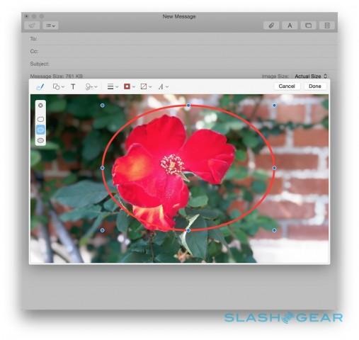
Other changes in Mail affect how messages can be customized. New annotations tools mean signatures can be pasted into contracts and agreements, all within the email window itself, while PDF forms can be completed in-app too. Shapes, arrows, and other annotations can be added to graphics and text, with Mail automatically straightening lines and correcting poorly sketched shapes drawn out on the trackpad. You can even add an adjustable magnifying loupe.
The changes aren't limited to email, either. Messages has also been improved, adding in Soundbites – short audio clips – which can be recorded in-app, as well as refreshing how group chats are handled. Now, it's easier to add or remove participants from the group, as well as rename them to something more memorable; everybody in the conversation sees the changed name. Notifications can be muted on a per-conversation basis, too, which is a good way to handle noisy groups that you nonetheless still want to be a part of.
iCloud Drive
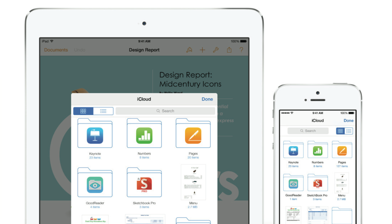
iCloud gets an upgrade alongside Yosemite, becoming iCloud Drive and a legitimate Dropbox, Google Drive, or OneDrive competitor in its own right. Unfortunately, it isn't quite ready for primetime yet, so while I can tell you the theory, we'll have to wait a little longer to see how exactly it works in practice.
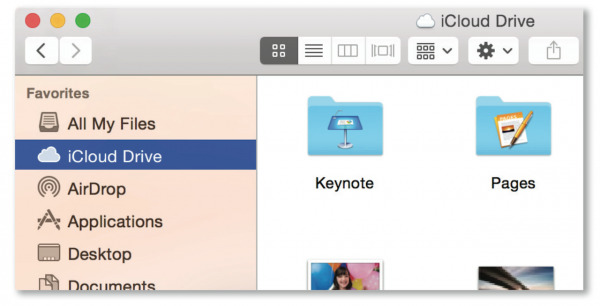
Any document or media can be dragged to iCloud Drive in the Finder sidebar, and folders and tags are preserved and synchronized too. Spotlight treats the online storage just as it does a local drive, so results from there show up in searches too, while over on iOS there's access to the same file types as on your Mac, not just photos and video.

Synchronization is automatic: a local copy is kept on every Mac with iCloud Drive activated, and if you make changes while you're offline, the amendments are automatically pushed when you're next connected. There's a little room for improvement there, mind. Unlike, say, Dropbox, you can't choose which specific iCloud Drive folders are synchronized locally, which could end up being something of a storage hog if you've a relatively small drive on your Mac.
Continuity
Continuity is, perhaps, the feature of Yosemite I'm most excited about, blurring the lines between mobile and desktop. Unfortunately, since there's no official iOS 8 Beta – beyond what developers are using – Apple has asked that we don't directly review Continuity.

Still, I've kicked its tires on a number of occasions, and I'm already impressed by how much thought Apple's engineers have put into making iPhone, iPad, and Mac work together more seamlessly. Continuity is actually an umbrella that covers a number of integrations, spanning iCloud, Bluetooth, and WiFi.
So, if your iPhone is on the same WiFi network as your Mac, and you're signed into the same iCloud account on both, you can answer an incoming call through Yosemite. A notification pops up in the top right corner, and switch from voice to FaceTime call if the other party supports that. Switching an ongoing voice call from Mac to iPhone is supported, too, though not in the opposite direction or if it's a FaceTime call.

Yosemite's integration of Continuity means it's also possible to trigger calls from across OS X. Any phone number shown in Apple's apps – Safari, Calendar, Mail, Messages, Contacts, or Spotlight – can be clicked and dialed. Even though you're using your Mac as a speakerphone (or with a headset connected), the caller will see it as coming from your iPhone.
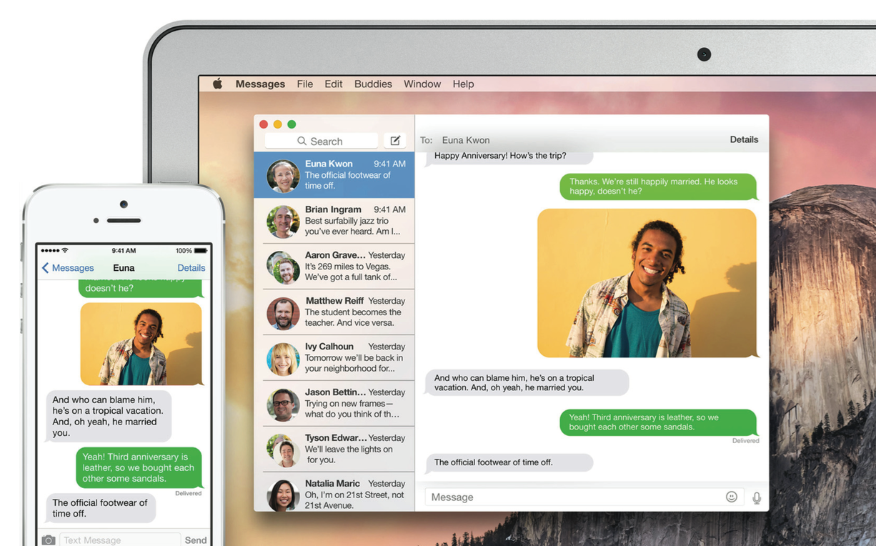
There's similar crossover in Messages, too. Until now, the OS X app would show any "blue bubble" conversations held using Apple's own iMessage system, but regular "green bubble" SMS and MMS would be limited to the iPhone they were sent to.

In Yosemite, however, those normal texts and picture messages get copied over to the iMessage backbone, and so show up in the app on the desktop or your iPad, just as they do on your iPhone. You can reply to them, too, with them routed through your regular cellphone number so that your friends don't even know what platform you're using to send them.
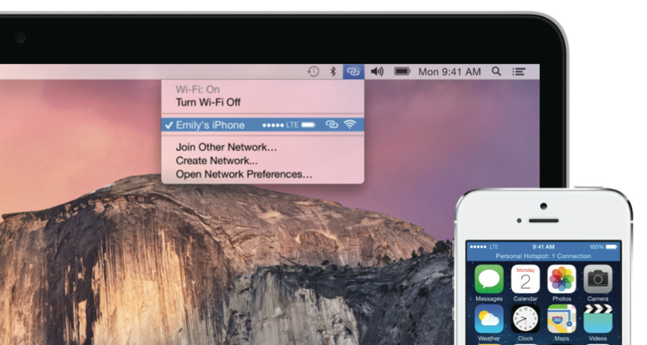
That's voice and messages handled, but Continuity also covers data. Instant Hotspot builds on existing iPhone and iPad hotspot functionality – sharing the data connection from your smartphone or tablet via WiFi – with ridiculously simple setup. Yosemite automatically spots your iPhone nearby, introduced by Bluetooth and authenticated by iCloud, and an entry for establishing the hotspot appears in the WiFi drop-down on your Mac.
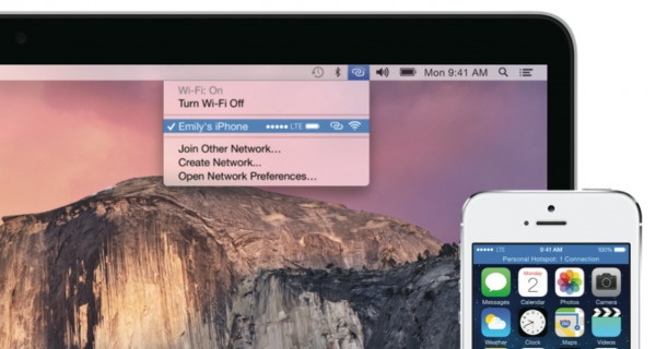
Battery status of the phone is shown there, too, and the next time you're without a connection but nearby your phone, your Mac automatically asks if you want to resume the tethering.
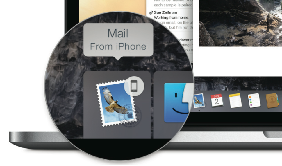
The final aspect of Continuity is arguably the most interesting. Dubbed Handoff, it's designed to make completing apps seamless, despite moving between devices and platforms. Start a new email on your iPhone, for instance, and when you're near your Mac a Dock icon appears on the far left: click it, and the work-in-progress email pops up on Yosemite instead.
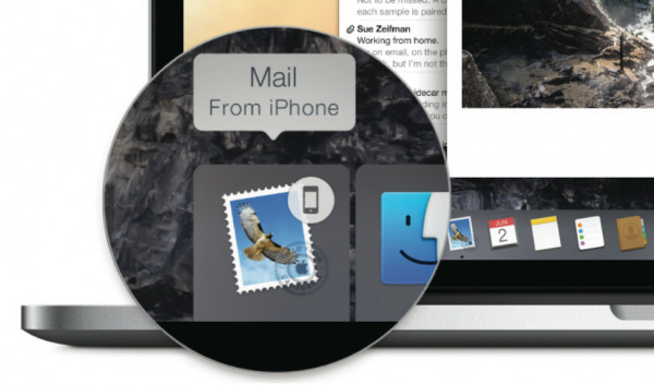
Alternatively, you can be working on something on your Mac, and then resume it on an iPhone or iPad: an icon appears in the bottom left corner of the iOS lock screen, and swiping up on it opens the partially completed email. It's not just mail, either, with support for Safari, Maps, Messages, Reminders, Calendar, Contacts, Notes, Keynote, Numbers, and Pages all out of the box. Third-party developers get APIs to integrate their own apps, including browser-based services.
What makes Handoff clever is how much thought Apple has put into the various permutations. Bluetooth is used for proximity and iCloud for authentication, but the two devices don't need to be on the same WiFi network in order to collaborate: an ad-hoc AirDrop connection can automatically be established, so it'll all function even without internet access. You can even attach files to an email on your Mac and then pick up the message on your iPad, attach further files, and then pass it back to the Mac for further editing.
OS X Beta Program
Soon, though, you won't need to take my word for how OS X Yosemite is: you'll be able to try it yourself. Apple is kicking off its OS X Beta program on July 24th, a free opportunity to get an early taste of the latest version. Spots on the program will be restricted in number, initially to one million, though the company tells me it may increase the number based on how much interest there is.
There'll be a few limits compared to what ships later in the year, however. iCloud Drive won't be available in the beta, and – since there's no equivalent for iOS 8 – Continuity won't be supported, either. Still, it's otherwise the same OS as Apple is providing to developers to get ready for the official release, and Apple has baked in a bug reporting tool through which early users will be able to flag up any glitches they spot.
Wrap-Up
OS X Yosemite is an ambitious software update. Not only does it narrow the gap between Apple's mobile and computing platforms, but it does so in a way that doesn't try to treat them as one and the same. Yosemite is still resolutely a Mac environment, but the familiar interface and tight integration through things like AirDrop, Continuity, and iCloud Drive allow it to be its own platform while still meshing comfortably with iPhone and iPad.
You could, realistically, expect Apple to charge for Yosemite, but in actual fact it'll be a free upgrade when it lands later this year. Apple is unsurprisingly proud of the proportion of Mac users on the latest version of OS X, and that's unlikely to change once Yosemite gets pushed out.
For me, it's the Continuity features which herald the most interesting changes for Mac. Some have predicted a gradual erosion of the OS X experience as Apple makes it more "iOS-like", and yet while Yosemite feels familiar as an iPhone and iPad user, it does so without sacrificing its flexibility. The cohesiveness of ecosystem is what makes Yosemite such a success, even at this beta stage.


