OS X Yosemite Review: Blurred Lines
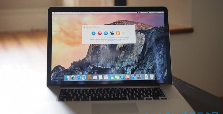
Apple's morning may have brought new hardware, but it's OS X Yosemite that could affect the most people today. The Mac OS update has been punctuated with firsts for Apple, with a hitherto-unknown public beta program, along with new degrees of integration with iOS devices. Officially released today, as a free download the price is certainly right, but does Yosemite hold up in everyday use?
We've already taken an in-depth look at OS X Yosemite back in our Developer Preview, and the vast majority of the features are the same, albeit with some polish over the intervening months.
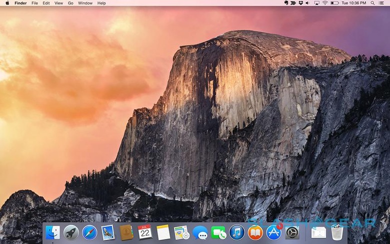
I've been using a MacBook Pro running Yosemite as my everyday machine since that point, and the evolution has been one primarily of stability. That's not to understate the scale of the changes from Mavericks before it, of course.
While it felt a little simplistic and more than a little flat at first, Yosemite's smoothed out design feels more mature than the faux-3D of iterations before it. While Mavericks tried to buck the skeuomorphic trend of earlier OS X versions, it still gave the impression of trying to push its UI out, through the display. Yosemite's use of transparency gives depth beyond the screen, windows and chrome blurring and mixing like translucent layers.
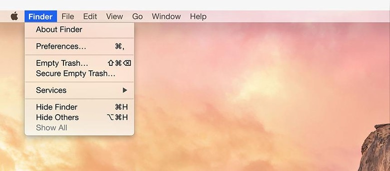
The font change, to Helvetica Neue from Lucida Grande, helps there too. Text is easier to read, not to mention looking better on Retina display panels, and even with the MacBook Pro pushed to its maximum resolution the smaller graphics demand less squinting than in Mavericks.
It's also closer in feel to iOS 8, and indeed OS X Yosemite continues Apple's gradual narrowing of the gap between desktop and mobile computing. A shared design language helps, certainly, but more useful are features like Continuity, Handoff, and the cross-platform AirDrop.
The latter is easy to understand: now, you can share files on your Mac with your iPhone, or vice-versa, whereas in Mavericks AirDrop was only Mac-to-Mac, or iPhone-to-iPhone. AirDrop works seamlessly, too: I particularly like how your devices needn't be on the same WiFi connection in order to "see" each other, or, indeed, have an internet connection at all.
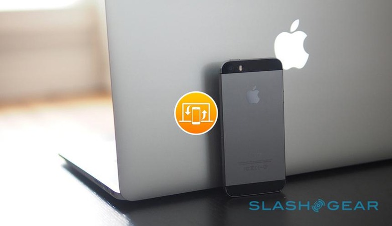
Continuity and Handoff require a little more explanation, though once you've got things set up the complexity fades for the most part into the background as long as you're logged into the same iCloud account.
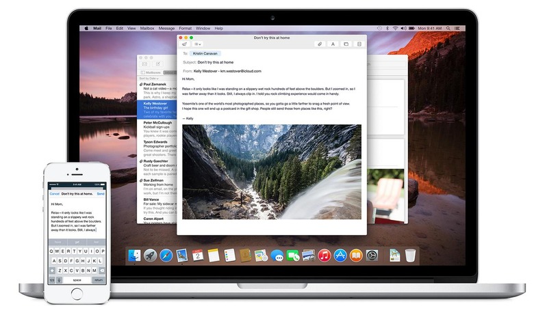
Start writing an email on your iPhone and, when you're next near your Mac, a new icon representing the draft-in-progress is tagged onto the left of the Yosemite dock. Click it, and Mail opens up with the draft pulled straight across from your phone. It works in reverse, too: swipe up on the discrete little icon in the lower left corner of your iPhone's lock screen and the draft you were midway through on your Mac appears.
It's fast, and it works surprisingly well. There's no limit to the number of times you can flip between platforms – Mac, to iPhone, to iPad, or in any combination – slotting in attachments along the way. It also works for documents, right down to the very point you had the cursor at. The only slight disappointment is that, while Handoff will pass your current webpage in Safari between devices, you'll always start from the very top of the page, rather than automatically scrolling to whatever point you'd reached initially.
Handoff works using Bluetooth LE 4.0 to spot when your phone, tablet, and computer are near each other, and the same system supports Instant Hotspot, which can automatically turn on wireless tethering on your iPhone once you've paired them the first time. Sensibly, Yosemite hits the pause button on non-essential background data use when it knows you're using your phone's LTE, though I'd have liked to have had access to more manual settings over what apps could, or couldn't, get online.
A similar connecting system allows for placing or answering calls from your iPhone but through your Mac. Incoming calls pop up as a Yosemite notification – you can either answer them or reject them, optionally sending a message to explain why – and play through your Mac's speakers or whatever headphones or headset you have connected.
As long as your iPhone and Mac are on the same WiFi network, they can be effectively anywhere and it will still work. I took calls while sat on the sofa, while the iPhone was charging on the nightstand several rooms away. You can instantly switch an ongoing call back to your iPhone, too – from the familiar green "call in progress bar" – though you can't flip it in the opposite direction.

Indeed, call support seems rather like a 1.0 solution in some ways. You can make an outgoing call by clicking a phone number in an app like Mail or Safari, but there's no dialer to manually place one. Its absence is a little more frustrating when you're trying to deal with a telephone menu system: Yosemite is clever enough to trill out the necessary meeting ID and passcode if you join a conference call through its calendar entry, and it has all those details attached, but you'll have to reach for your iPhone if you need to do it manually.
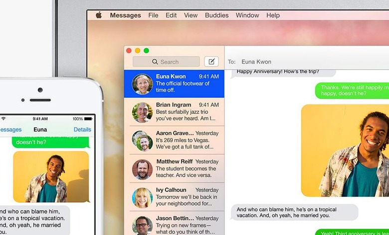
The blurring doesn't stop there, though. Yosemite's Messages app now supports the "green bubble" SMS and MMS messages on your iPhone, those sent to and received from people not using Apple's own iMessage. You need to authorize your Mac first – by punching into your iPhone a six digit verification code Yosemite generates – and on a couple of occasions I had to repeat the authentication process, and as with calls you can start a new SMS/MMS conversation with a known contact or a number in Safari, but not by dialing from scratch.
Yosemite's cohesiveness hinges on how willing you are to embrace Apple's own platforms, and sometimes that's more obvious than at others. Obviously, if you want the Continuity features, then you need to be an iOS user, and an iPhone if you want the full range of remote calling and SMS messaging integration.
Its other demands can be more subtle. Handoff for instance, for the moment, requires you to use Apple's Mail client, both on your Mac and your iOS device. If you're a devoted Gmail app user on your iPhone, or you prefer different email software on your Mac, you'll have to switch if you want the ability to switch drafts-in-progress from platform to platform. The same is true for documents: right now, you have to be using Apple's own office suite.
This will all undoubtedly change as developers embrace the Handoff API, but whether your app of choice supports it sooner, or later, or never, depends on the willingness of the coders behind it. Meanwhile, there's no Android equivalent, so if you're one of those people who loves their Mac on their desktop but their Android smartphone in their pocket, you're also out of luck.
That's not to say Apple has been entirely prescriptive. Maildrop, for instance – in which Mail automatically uploads email attachments up to 5GB in size to a temporary chunk of iCloud storage, appending a link to your message rather than the potentially inbox-clogging file itself – works with any email account you have set up, not just Apple's own.
Again, I'd like to see more granular control over how it works: in Maildrop's case, you can opt to either have incoming files automatically downloaded or left in the remote store, but there's no selective option to whitelist certain senders while holding off on others.

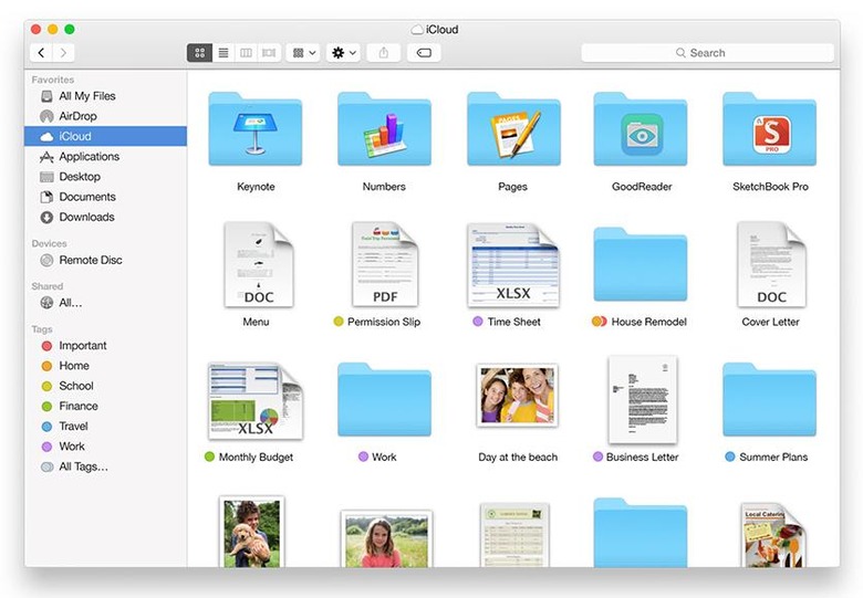
iCloud Drive, too, has cross-platform aspirations, the multi-purpose file store accessible not only from the Yosemite Favorites bar in Finder and within the apps on iOS, but integrated into Windows with the free iCloud for Windows 4.0 plugin, and through the browser as a last resort. One caveat, though: while iCloud Drive might even play nicely with Microsoft's platform, you should hold off from upgrading if you still have a pre-Yosemite Mac, since they're not so lucky.
There's plenty more to OS X Yosemite – tweaks and enhancements that bubble up in everyday use. Group conversations with the ability – finally – to mute notifications and bow out of them altogether if you prefer. The Today view with its corral of widgets, weather, and upcoming appointments. Spotlight's new, prominent position in the middle of the screen, now showing live results from Wikipedia, Bing, movie showtimes, and (simple but, so I've found, most useful) conversions for currency and measures, along with dictionary definitions.
Whenever Apple makes moves to narrow the gap between OS X and iOS, there are always some concerned that the power of their Mac will be diluted in the process. Flexibility lost, perhaps, even as iOS 8 sees Apple's grip on user-customization around keyboards and sharing apps loosen.
True, the headline features of Continuity may be limited for the most part to Apple's own applications right now, but developer APIs mean it's a matter of when, not if, third-party software and services can join in. What's striking about the new Mac OS is how well it plays the mobile game while still keeping its own distinct identify – and its functionality. OS X Yosemite is not only a refined and capable Mac platform, but a compelling reason to embrace Apple's ecosystem as a whole.
So how do I get it?
Yosemite is a free release, as long as your Mac is recent enough. That list includes the iMac (mid-2007 or newer), MacBook (late 2008 Aluminum, or early 2009 or newer), MacBook Pro (mid/late 2007 or newer), MacBook Air (late 2008 or newer), Mac mini (early 2009 or newer), Mac Pro (early 2008 or newer), and the Xserve (early 2009).
You'll need to be running a version of OS X from Snow Leopard (10.6.8) on, and have 2GB of memory and 8GB of available storage. Certain features, though, will require more recent hardware: Handoff and Instant Hotspot, for instance, only works on 2012 Macs at the earliest, as does AirDrop between Mac and iOS.
As long as you tick the boxes, you can find OS X Yosemite in the Mac App Store and download it directly. If you haven't got broadband – or it's painfully slow – then you can take your Mac to the nearest Apple Store and download Yosemite there, instead.
