OPPO F1 Review
Let's face it, selfies have become an inescapable fact of the digital, mobile lifestyle today. No matter how we snicker or glare at those usually obnoxious selfie sticks (and their sometimes inconsiderate holders), selfies are not going away any time soon. Seeing the potential market, not to mention profits, even digital camera makers have started to pander to this crowd. Of course, smartphones were there first, with almost each new generation advertising selfie-friendly features. Calling itself the "Selfie Expert", the OPPO F1 is, perhaps, the most ambitious. But how does it actually fare beyond the advertising materials? We take a dive into the smartphone selfie world to find out.
Specs
Let's get the technical specs out of the way first. The OPPO F1 is unabashedly a mid-range smartphone, though somewhat on the higher end of the spectrum than others. Qualcomm has reserved its Snapdragon 600 series just exactly for this tier, so it isn't surprising to see the Snapdragon 616 running inside. That's a 64-bit processor with eight Cortex-A53 cores running at 1.7 GHz. Paired with this CPU is the Adreno 405 GPU as well as Qualcomm's own Hexagon DSP for audio and video processing. For RAM, the F1 is no underdog with 3 GB. Storage, however, is too tight for comfort at 16 GB, though a microSD card slot at least tries to compensate.
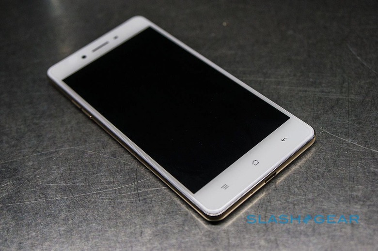
We'll get into more details about the OPPO F1's other parts later, but here's a quick rundown. The display, which spans 5 inches on the diagonal, does barely well with a 720p resolution. The rear camera is also barely decent with a 13 megapixel sensor, f/2.2 aperture, and LED flash. But the real star of the show, as far as cameras go, is the front shooter with an 8 megapixel f/2.0 sensor.
Powering these all is a 2,500 mAh battery. It might seem quite small but is just enough considering the not so resource-intensive hardware it needs to juice up. That said, it is disappointing that OPPO left out its much bragged about VOOC fast-charging, just one of the many compromises this smartphone makes to keep the price tag down. No fingerprint scanner on this mid-ranger either.
Design
It's admittedly harder these days to come up with a completely original smartphone design that doesn't call to mind any existing popular models. However, some OEMs have taken that to mean it's perfectly fine to "be inspired" by others' designs, especially those that seemingly sell well. On the one hand, that does have the effect of forcing such device makers to put an emphasis on quality design. On the other hand, smartphones start looking alike more and more.
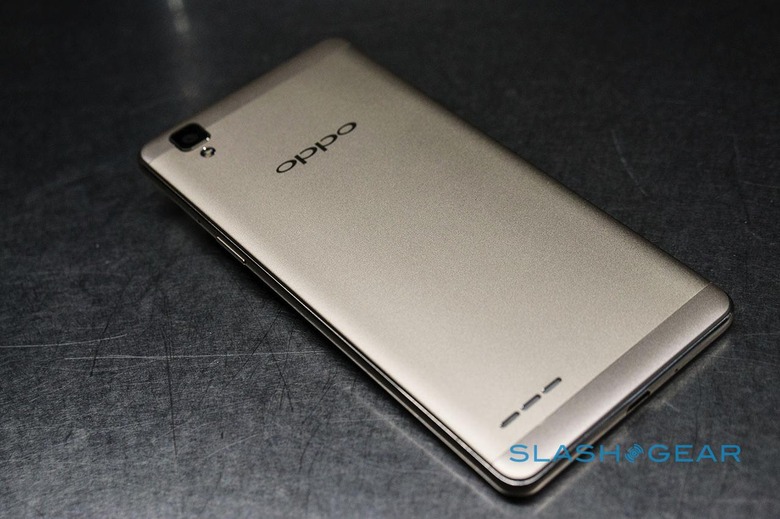
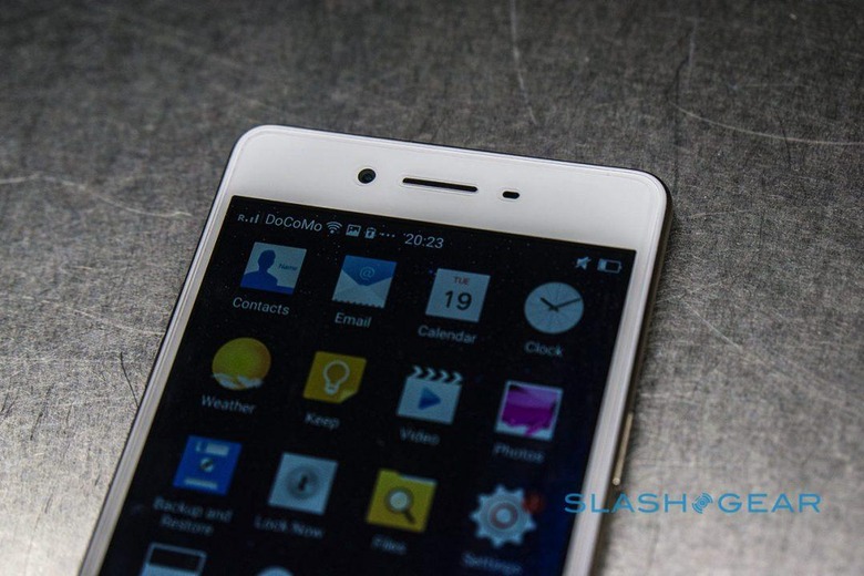
In that context, it is somewhat encouraging to see OPPO stick to its own unique design language. Well, almost. At least on the front and on the back, the OPPO F1 bears a design similar to its brethren, like the R7, the Neo 7, and the Mirror 5. That basically means a clean facade devoid of physical buttons, though there are indeed capacitive buttons for navigation. Thankfully no obnoxious OPPO branding on the face either, unlike the OPPO R7 Plus and R7s. That company logo, however, is on the back, which is one of just three things you can find on that side. The other is, of course, the rear camera. And the last is a back-facing speaker, not exactly our favorite location for a good listening experience.
Once you turn the OPPO F1 around, however, you start getting a sense of deja vu, particularly of Apple's newest iPhone design. OPPO gives a formal name to this rounded edge convention, the Micro-arc frame. Admittedly, it's a design that complements well the 2.5D arc glass on the display. Still, it's a noticeable, and perhaps unfortunate for some, deviation from the sharp, flat edges seen on the OPPO R7.
Overall, the OPPO F1's design looks and feels rather well done, a pleasant surprise given its $250 tag. OPPO boasts of its use of metal in the F1's body but, while mostly true, there are some areas that feel less than metallic. Those concerned about the smartphone accidentally slipping because of its smooth design need not worry to much. That said, the rear finish that gives it a better grip also makes it feel a bit less premium than a classy full metal smartphone should be.
Display
While the screen isn't exactly the biggest pull of the OPPO F1, considering we spend the most time on it, it deserves special attention. Sadly, it is perhaps the one place where OPPO cuts corners the most. Don't get us wrong, In our extensive test of the display, we found it to be quite bright and sharp. Our biggest gripe, however, is the resolution. 1280x720 pixels on a 5-inch screen is actually fairly below decent, even at this price point. You can very well get Full HD equivalents for the same price from some of OPPO's fiercest rivals. It isn't a terrible flaw, admittedly, but we will always be left wishing for something better.
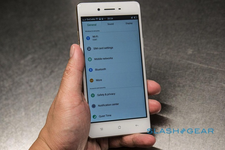
The screen also uses IPS TFT LCD technology and all the advantages and disadvantages that brings, especially when it comes to blacks and contrast. The latest Gorilla Glass 4 protects it from scratches and drops. Like many smartphone screens these days, it can support some degree of use even when wearing gloves or with wet fingers. All in all, the OPPO F1 doesn't exactly wow with its screen but it is at least usable.
Camera
All of the cost savings that OPPO were most likely diverted to the camera, especially the front one. Let's get to the rear camera first, since it will be used more often, even for a Selfie Expert like the OPPO F1. Here, you get a 13 megapixel sensor. That might sound decent, but we've already seen how megapixel count is never the full story when it comes to cameras. Unfortunately, like with its screen, the OPPO F1 doesn't exactly impress in this area either, though it can be best described as decent. The rear camera has a rather small f/2.2 aperture and that detail shows when trying to do low-light photography. Which is to say, don't even bother. In regular, bright light, however, the OPPO F1 does fairly well, and the auto focus is surprisingly fast. Try not to move too much, however, as there is no OIS here.
OPPO would, of course, like buyers to focus on the front-facing camera instead. Here is where OPPO splurged, at least as far as budget allowed. By far not the highest, the 8 megapixel sensor on the OPPO F1's front side is still one of the better ones, at least compared to the 5 megapixels common on this price tier. But, as we said, megapixel count isn't the only important factor to a good digital photograph. OPPO paired that sensor with an f/2.0 lens, which is even bigger than the f/2.2 of the rear side camera, allowing for more light to enter. In theory, that means it should at least be able to handle low light situations better. In practice, however, the selfie camera does falter a bit in low light. Specifically, auto focus is slow to adjust. In times like those, the OPPO F1's "screen flash" tries to shine some light on the subject, which, in this case, is your face. For those unfamiliar with the feature, it basically turns the smartphone's screen into a makeshift flash to make up for the absence of an actual front LED flash.

Software features like that also try to complement the OPPO F1's cameras, particularly the front one. Beautify 3.0, for example, adjusts screen tone and removes blemishes for the perfect selfie, so that you won't have to edit the image in Photoshop anymore. Or at least not as much. Our favorite is the Palm Shutter, which recognizes an open palm gesture in front of the front camera to start the timer. It's a habit-forming convenience that takes out the shakiness caused by trying to reach for that shutter button on the screen while keeping everyone within view.
Performance
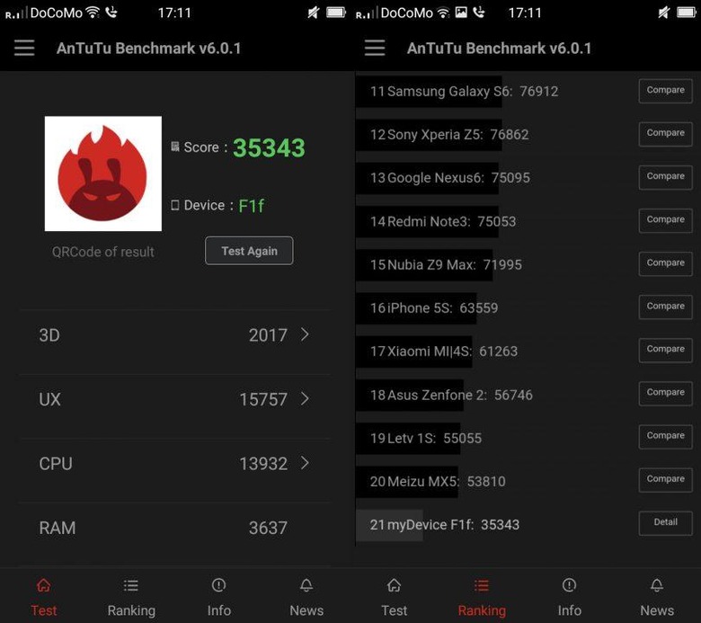
All those features will be for naught if the smartphone couldn't handle the load. Given the OPPO F1's less powerful processor and its less than encouraging battery, there might be some concerns about its everyday performance. As far as switching juggling between apps, performing the usual smartphone functions, and standing up to our barrage of tests, the OPPO F1 proved itself up to the task. Sure, it's not the fastest by any account. Going through AnTuTu, the smartphone scored a measly 35,343. That placed it at 21st, way below not only other mid-range smartphones in its category, like the Meizu MX5, but even below 2014 devices, like the iPhone 5s, which isn't exactly surprising.
Benchmarks are one thing, but real world experience sometimes paints a different story. Our experience with the OPPO F1 was largely favorable. Although it won't be winning races, it handled our tasks remarkably well. And that's despite having a heavily customized Android experience. Like many of its Chinese rivals, OPPO uses its own flavor of Android, called ColorOS. The likes of Xiaomi, Huawei, and OPPO are just as notorious as Samsung when it comes to giving Android a facelift, but it seems that OPPO learned its lesson well and faster than the Korean company.
ColorOS 2.1, the version that came with the device and is based on Android 5.1 Lollipop, was fast and smooth. There was very little in way of bloatware, but there were still a few custom apps available. In particular, ColorOS offers a utility that helps keep the OPPO F1 in tip-top shape by clearing caches, shutting down unused apps, and doing general housekeeping. Users of apps like Baidu's DU Battery Saver or Greenify will probably be familiar with the concept. Still, we would have preferred a near vanilla Android experience, but we're not too peeved with OPPO's customizations.
Battery might be a problem, however. Given the size, you shouldn't be surprised if you're reaching for that battery pack or charger even before the sun sets. In our test, we got to around 8 hours and 20 minutes before the battery died. And that's with a continuous barrage of activities like playing videos, browsing the web, and going through social network, all on LTE, without Wi-Fi enabled. On more normal scenarios, you'll probably make it to 12 hours or more, depending on your usage. Fairly decent for a 2,500 mAh pack but still cutting it close. The lack of VOOC fast charging definitely hurts when that time comes.
Wrap-up
Sometimes, making gadget purchases can be seen as a series of compromises. Sometimes, the question is no longer whether it's the best out there but whether we can live with its flaws. Nowhere is that truer than with the OPPO F1, where the company had to cut corners to keep the price within range while still putting its best feature forward. A 720p display and a small battery coupled with the lack of fast charging could pretty much disappoint many who can see better specs in other smartphones within the same price tier. Even the f/2.2 main camera mars the F1's photography spiel.
That's not to say the OPPO F1 is without its convincing traits. The Snapdragon 616 is definitely formidable among its peers, and the 3 GB RAM doesn't hurt either. The build quality and design is more than passable and performance is within reason. The front-facing camera, its key feature, isn't exactly the best, but it is far from being the worst. And, most importantly, the $250 price tag reminds you to keep your expectations in check. Don't expect too much and you'll actually be surprised at what the OPPO F1 is really capable of.
Sure, there might be others that are better selfie experts than the F1. The HTC 10, for example, is trying to start a selfie revolution with its 5 megapixel, f/1.8 front camera with OIS. Imagine that! OIS on a selfie camera! But that comes at a very, very steep price. $699 to be exact. If you're low on budget but still want a decent, not spectacular, selfie smartphone, the OPPO F1 is definitely worth considering. Just keep in mind what you're compromising on. And try not to take too much selfies in the dark.
