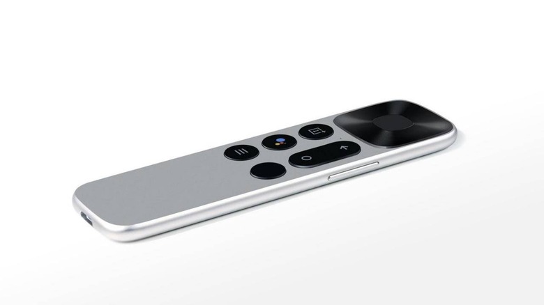
OnePlus TV Remote Looks Very, Very Familiar
Some manufacturers and designers are only now trying to aim for minimalist designs but Apple has long been touting minimalism for ages. So much so that almost every attempt at adopting such design would inevitably be compared to Apple. Sometimes that is warranted, sometimes it's quite a stretch. Whether by design or by accident, the OnePlus TV's newly revealed remote will suffer the same fate and, from the looks of it, could also suffer from Apple's missteps plus some of its own.
The Apple TV remote is dead-simple in its design and was supposed to be dead simple to use, mimicking the simplicity of the earliest iPods. Eventually, Apple added more and more until Siri jumped on board. And then there was the touch-sensitive area that seems to still be a hotly-debated topic today.
The OnePlus TV remote, revealed by CEO Pete Lau himself, is almost exactly the same. It, too, has four circular buttons and a long oval one, except the order is in reverse. There's also a large square area at the top that implies a touchpad. Fortunately, unlike the Apple TV Siri remote, it's clearly indicated to be a distinct part of the remote.
We see buttons for the usual Android navigation items, not all on the same side. There's a Google Assistant button and a OnePlus button whose extra purpose is still unknown. Even more mysterious is the blank button in the corner, hopefully something programmable and not just an extraneous power button. Amusingly, there's also what looks like a volume rocker at the side.
There's really not much to say about an item that has everything laid out in plain sight. Granted, we can't see what's on the other side but there probably won't be anything there. We won't have to wait for confirmation when the OnePlus TV is fully unveiled this month. It will, however, be a much longer wait for the Android TV to break out into other markets outside of India.
