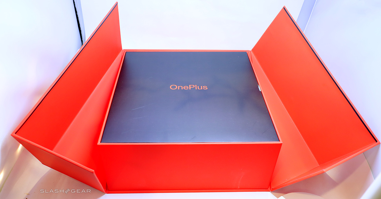
OnePlus 7T's Most Important Feature Is The Box
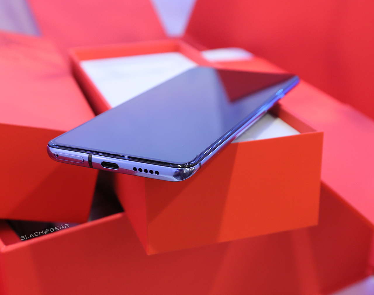
Earlier this month we got a box in the mail that contained the a sort of review kit for the OnePlus 7T. This is not out of the ordinary for a device such as this – OnePlus has done a decent job with design since inception. It's just that, this time, OnePlus had a sort of design renaissance at some point between the OnePlus 7 and the OnePlus 7T – and the box made that rebirth of image very, very clear.
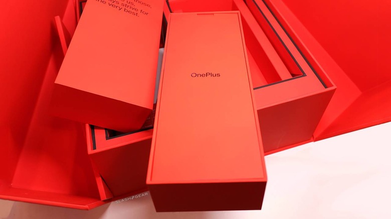
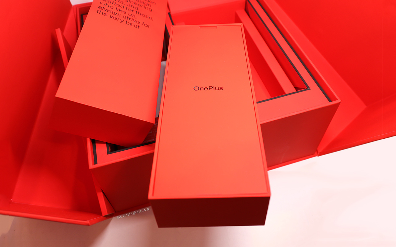
Out of a cardboard box came a big red box. This big red box had a clear gloss print of the phrase "NEVER SETTLE" on top. The box doesn't so much open as it transforms, with the front and the top opening together in two door-like parts diagonally to the sides. It was very apparent that OnePlus wanted this presentation to feel more intense than any that'd come before.

It was details like this that instantly drove home the OnePlus claim (here in late September, as a sort of refresh of what they've always said) that "no detail is too small to be perfected." The design isn't necessarily perfect – it's the idea that they're striving for said perfection that matters. The direction implies something greater than the contents of this box.

SEE TOO: Our OnePlus 7T Review: Even Better
OnePlus in-house Creative Director Mats Hakansson and team created what was described in the OnePlus forums by OnePlus as an "amplification of our visual look." Though this new look, said Charles C., creative copywriter at OnePlus HQ, "we believe we can better communicate who we truly are: detail-driven, passionate, and community-focused."
The design utilizes the digital font Neue Haas Grotesk – similar to what we usually see everywhere with Helvetica, but based instead on the origins of the Helvetica font, pre-digitization to digitization with, appropriately, the original name for what became Helvetica.
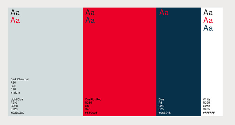
The color pallet still uses RED, but the exact way in which the company uses color is ever-so-slightly changed. This is a bold, clear, direct design. This is OnePlus making certain they stand out, while still living well within the bounds of modern, smart, readable, clear graphic design sensibilities.
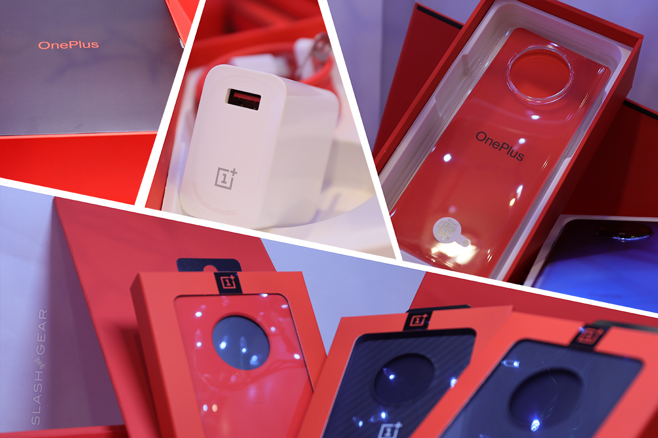
OnePlus included this in their official OnePlus 7T consumer sale box for the phone, in their official case accessories, and in the presentation materials for the press, reviewers, and etcetera. It'll be interesting to see where OnePlus moves from here. Wherever it is, it's pretty clear at this point that they'll always be using red, of that we can be sure.
