OnePlus 3 Review Part III: What No Other Smartphone Has
The OnePlus 3 is a smartphone that'll cost you $400 – thereby making the average Android user expect there'll have been some compromises made. In fact, based on our review series thus far, the elements that might be perceived as compromises can also easily be seen as strengths. This device also has a number of features that no other device has – or that no other device has yet, that is to say.
0. Compromise
While other devices have had 1080p displays in the past, the OnePlus 3 unabashedly employs a 1920 x 1080 pixel 5.5-inch display here in the year 2016.
See Part I of our OnePlus 3 Review
That's relatively odd. Even devices like the Nexus 6P have moved to 2K displays in their efforts to keep up with the baseline in sharpness for smartphones running Android.
But OnePlus doesn't seem to care. Instead, they've installed a custom Samsung display they're calling Optic OLED. As a result of using a 1080p display instead of a sharper 2K, battery life lasts what we must imagine is a lot longer than a sharper display would. In our tests, the OnePlus 3 lasted well over a day on average, and could be coaxed to last longer.
1. Optic OLED
While OnePlus uses a Samsung display they suggest comes from the "current generation" of Samsung displays – and is customized, as OnePlus co-founder Carl Pei says, as "no serious manufacturer uses off the shelf displays."

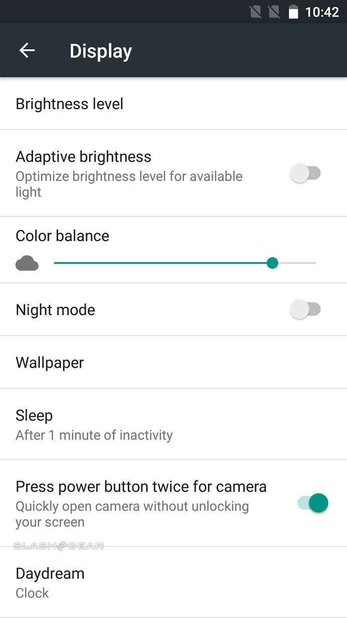
Customization includes "[OnePlus'] take on contrast and color temperature," as Pei said. Color temperature is one of a variety of settings the user has the option of adjusting. In the device's Display settings, the user is able to move between extra-cool and extra-warm tones at will.
See our OnePlus Review Part II: Display Wars for more data on how this display compares with the high-end smartphone market.
2. Shelf
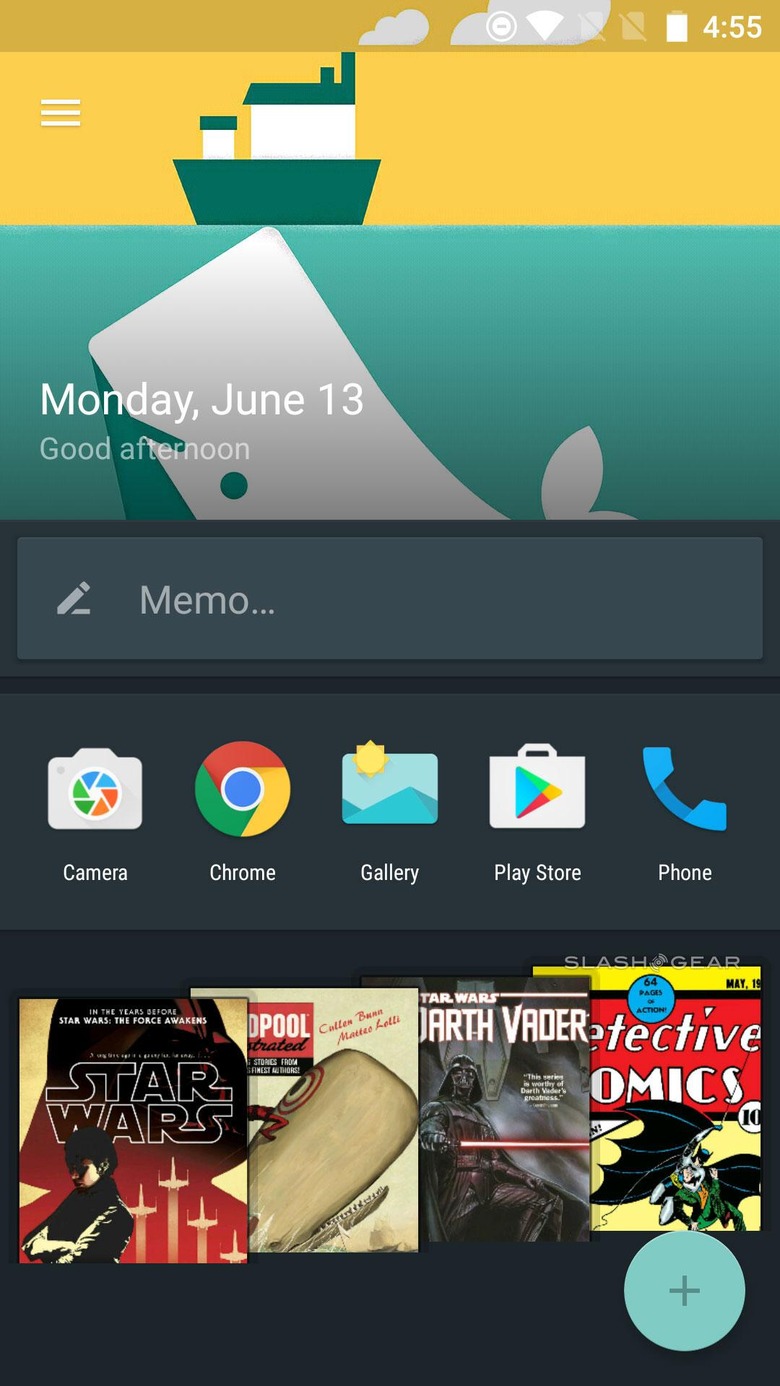
A feature that sits to the left of the rest of the device's standard home-screen panels, Shelf is a unique take on what an Android home-screen can be. At the top is a sort of wallpaper (customizable, of course), along with the date and a greeting. Right now the unit I'm reviewing says "Good morning." I can also allow this section to show me the weather.

Users can set the rest of the Shelf to look however they like, with widgets of all sorts able to be placed in rows. My implementation here has a place for memos which can be attached to Google's Reminders and/or Google Calendar. I have a set of app shortcuts set after this, then a miniature library of books that link directly to Google Books I have purchased.
One can potentially set a seemingly unlimited number of widgets, some made by OnePlus, the rest set to appear the same way a widget would on any other home-screen.
3. Alert Slider (the switch)
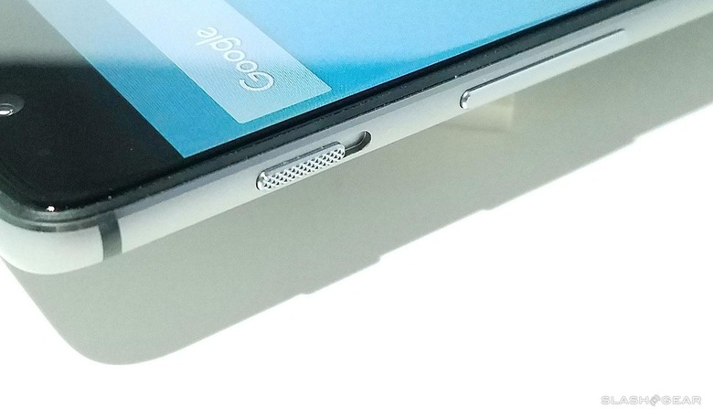
While we do wish we were able to customize this switch to do other actions, what it does (for now) is enough. Three different settings are available here with each of three different switch positions. Silent, Priority, and All – those correspond to notifications.

The textured metal switch is easily the most elegant solution for switching between settings for a smartphone we've ever seen. A gentle bit of vibration feedback switching between settings notifies you that you've switched, and the smooth switch between each of the three settings is perfectly tuned (hardware-wise, that is).
To Be Continued
The OnePlus 3 is proving to be an extra-interesting bit of device as far as reviews go. Expect more from SlashGear in the near future – hit up our OnePlus tag portal for more!
