Official Moto 360 Video: Round Watch, Not A Round Screen
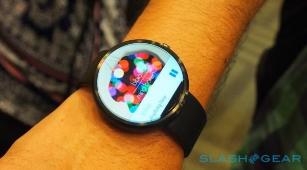
The Moto 360 is a gorgeous piece of kit, we'll give it that. A classic shape that reminds us of a simpler timepiece, the 360 is hotly anticipated. The cheers at I/O when Developers heard Google would ship them one once they came available was enough to remind us this one is already a winner. Is it really round, though? Sort of.
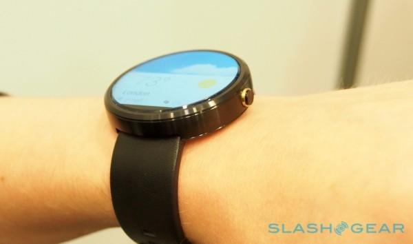
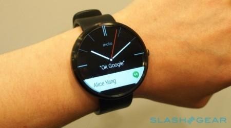
Below is the official video Motorola just released, giving a quick walk-through of the Moto 360. Throughout, you see the bottom of the screen is not lit up. The issue is that Motorola chose to house their screen circuitry there, meaning it was dead space — a bezel where we didn't want one. The smartwatch, already a touch bulky for the likes of some, also has some heft on the front end as well as the back.
To be fair, the G Watch (and Gear Live) also has bezels, they're just the kind we're used to. All the way around the rectangular screen, there is a noticeable, thick bezel. We simply forgive it because we've spent so much time looking a that on our smartphones. The 360's blacked out portion is noticeable because — well, because it's the lone aesthetic issue in an otherwise gorgeous design.

Could round screens actually happen, though? Of course. Sharp recently showed off their Free-Form display tech, which could give a display in just about any shape we like. Android Wear currently only supports round and squared devices, so some kind of oval wouldn't really work. For truly round, though, it's possible to do.
It may have been possible on the 360, too — it would have likely added quite a bit of bulk, though. If Motorola could stick their circuitry beneath the screen instead of under it, the 360 would have stuck up off the wrist quite a bit more. Think of the LG G3 — almost no side bezels because they moved what they could to the rear of the device. It takes away from how slim they can actually get that smartphone, though. The 360, unlike the G3, wouldn't be able to hide that aspect by curving the rear of the device.

This also calls into question concepts like the Minuum keyboard we recently told you about. If the screen really can't light up toward the bottom — at all — their concept is just not going to work. We'd hoped for limited functionality at the bottom of the device, but it's just not going to happen.
Does this make the 360 a flawed device? Not at all. Now that we've officially seen the darkness at the deepest part of the screen, we know what to expect. I'd venture that more people will want a round design as opposed to a squared-off one, and that future round Android Wear devices — and possibly the iWatch — will take strides to avoid this round-watch grey (or black) area.
