O2 Palm Pre GSM Review
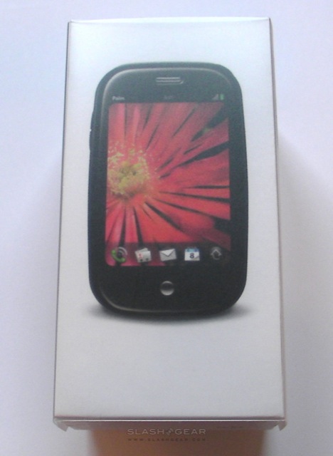
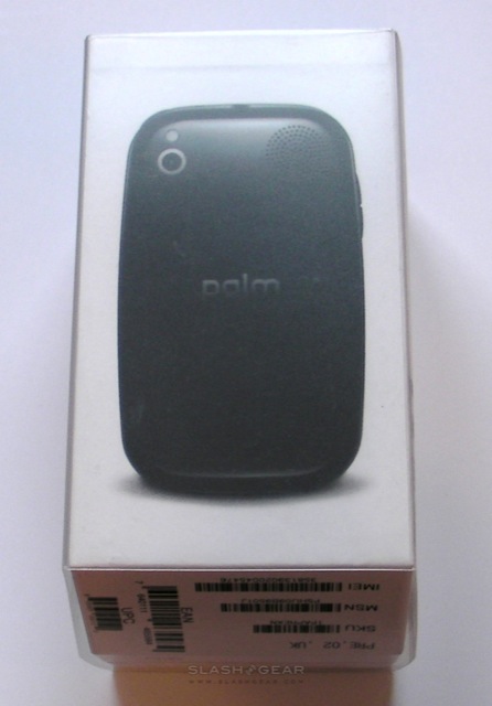
For European consumers, the Palm Pre has been a long time coming. Announced – in CDMA form – back in January 2009, with Palm coyly dancing around the matter of a GSM version until its Sprint launch took place in June, the smartphone has even gained a sibling (in the shape of the Palm Pixi) before those across the Atlantic have had a chance to play with the original. That's all finally changing this month, with carrier O2 exclusively offering the Pre in the UK and Ireland from October 16th and Germany from October 13th. Has time dulled the Pre's appeal? SlashGear have been testing out the GSM Palm Pre; check out our full review after the cut.
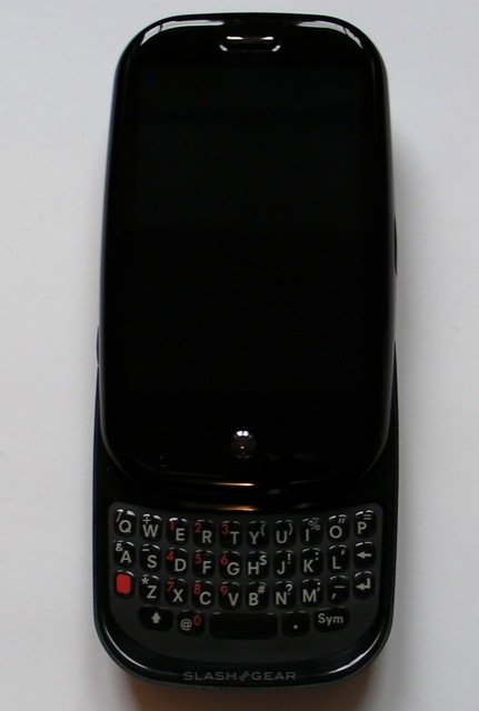
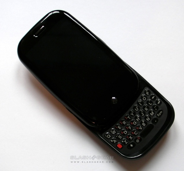
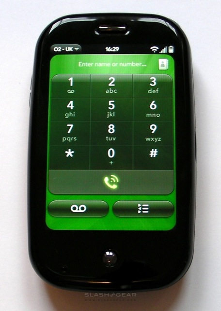
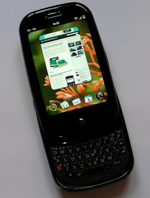
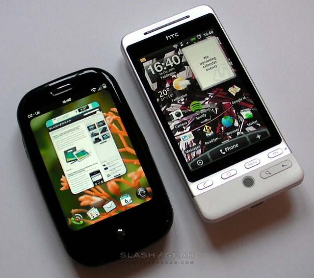
In terms of hardware, the O2 Pre is almost exactly the same as the Sprint Pre we reviewed back in June. That means you get the same 3.1-inch 320 x 480 capacitive touchscreen, the slide-out QWERTY keyboard, a 3-megapixel fixed-focus camera and both Bluetooth 2.1+EDR and WiFi b/g. Where they differ is in the 3G connectivity; while Sprint's Pre uses EVDO Rev.A for its high-speed mobile browsing, the O2 version has UMTS/HSPA with EDGE/GSM support.
What the GSM Pre won't have, at least initially, is the latest version of webOS. For manufacturing deadline reasons, Palm and O2 will ship the Pre with webOS 1.1.3, a few updates behind the Sprint CDMA model. According to Palm, the eventual aim is "parity" between the two devices, but that won't come until later on in 2009.
There's also, despite it being ten months since the Pre made its surprise debut at CES in January, no microSD memory card slot; the handset still makes do with 8GB of onboard storage, of which around 7GB is available to the user. That seemed short-sighted in January, miserly in June and now, in October, feels downright unacceptable. When Apple's iPhone 3GS offers 16GB as a baseline, and other platforms – Android, Windows Mobile, Symbian – use microSD cards for up to 32GB of swappable storage, for Palm to limit their flagship device in this way seems ridiculous.
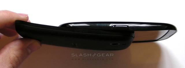
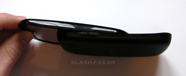
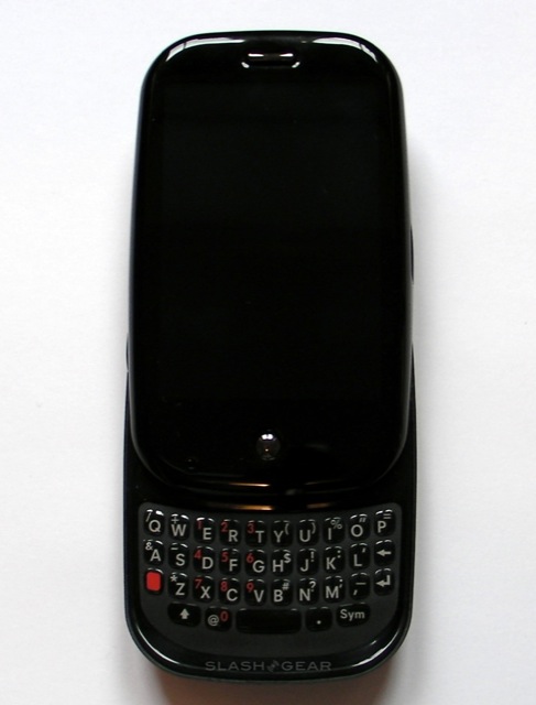
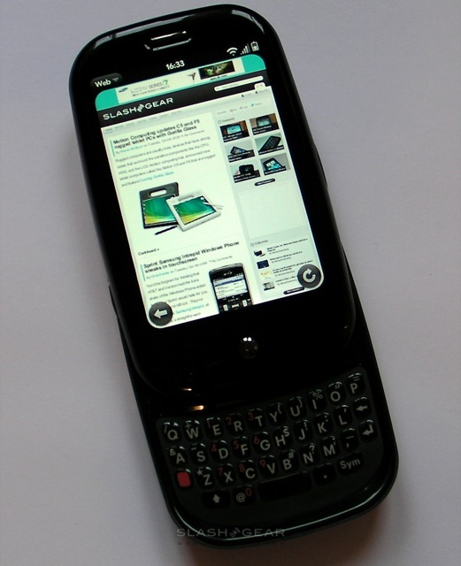
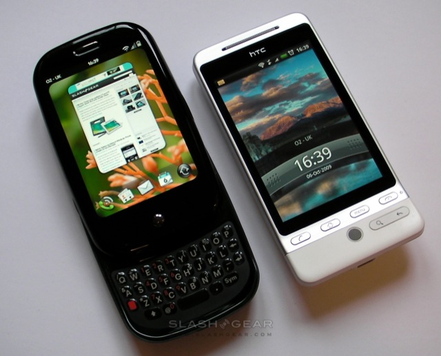
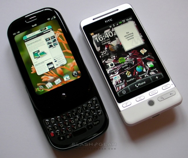
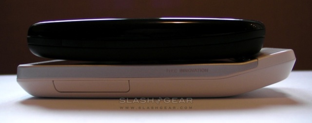
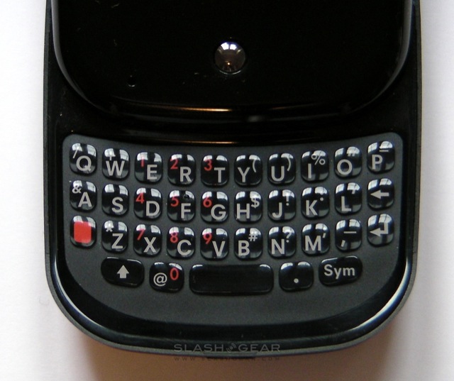
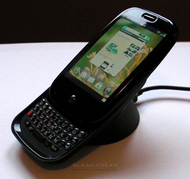
The physical design is still a mixed bag, with what feel like high-quality plastics let down in places by unduly sharp edges to the keyboard-slide lip and elsewhere at the split-point. While the Pre opens with a satisfying click, there's side-to-side wobble in the screen hinge which is disappointing. As for the QWERTY keyboard itself, that's provoked different responses; the keys are hard rubber and are reasonably spaced given the limitations of the hardware – the Pre is a surprisingly compact handset – but we don't feel they offer a significant knock-out blow over and above an on-screen keyboard.

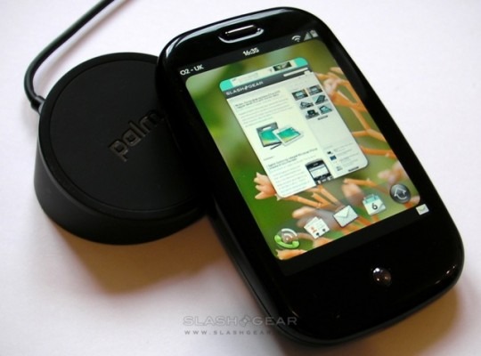
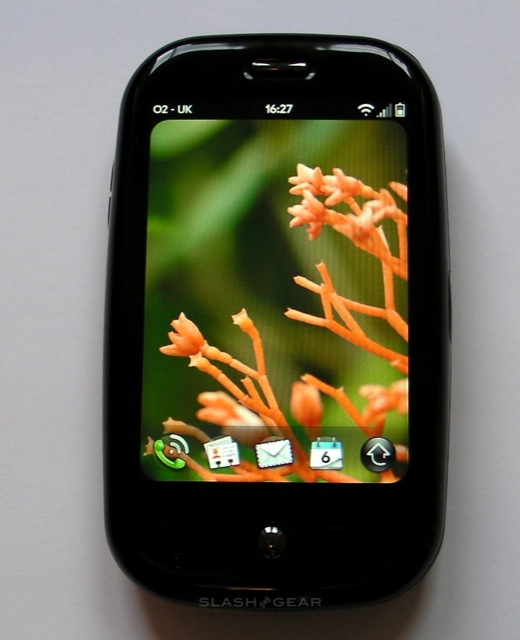
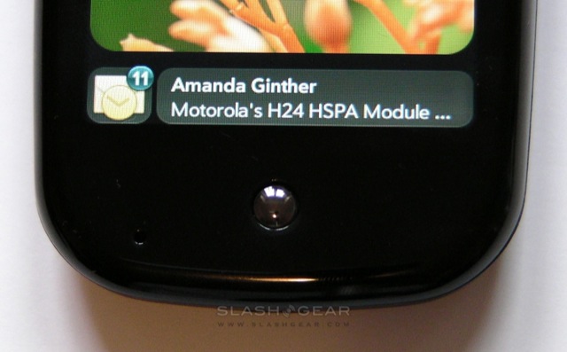
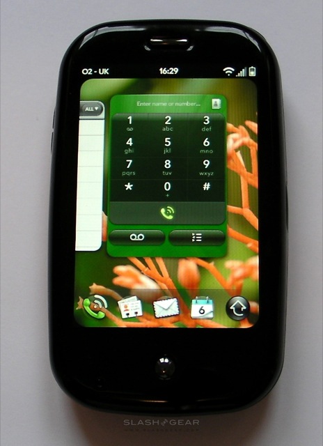
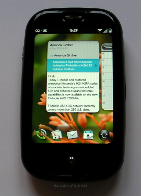
Where the Pre really shines is in its software, and webOS has proved an ongoing pleasure in its harmonious use of gestures and multitouch. The central concept is that open applications are "cards" splayed across the main display, and which you can reshuffle by dragging them into new orders, or dismiss by flicking them up off the top of the screen. New alerts are quietly pushed up at the bottom of the display in the form of tiny icons – an envelope for new email, a speech bubble for an SMS message, etc – and are then previewed when you tap on that icon; a further tap opens the message, while a sideways flick dismisses it.
These sideways flicks also feature in the messaging inboxes, used to delete unwanted emails and texts. We've been impressed by how quickly it's possible to triage a hectic inbox on the Pre, in many cases without even needing to open most messages. As well as showing sender, subject and part of the first line by default, you can also pinch-zoom on an individual message to see a bigger preview, even with HTML formatting maintained. Unlike in loading new cards, which can be punctuated by the occasional lag as the Pre's CPU catches up, churning through email is generally slick and speedy; the handset supports POP and IMAP accounts, together with Exchange push-email.
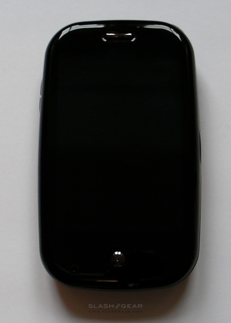
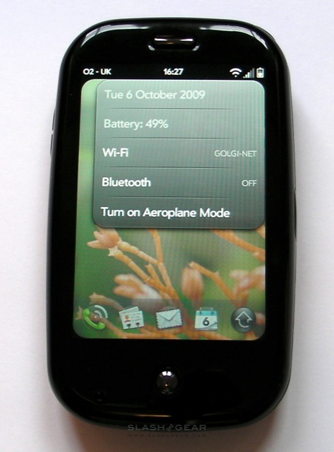
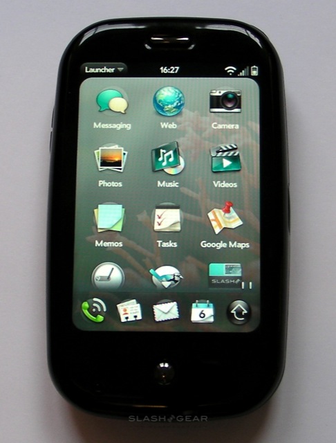
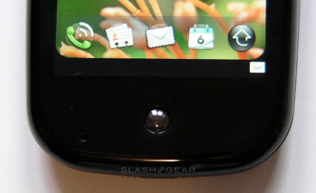
The Pre's main menu is split into two, with a quick-launch bar of four shortcuts and the menu launcher that runs along the bottom of the homescreen, and the full menu itself. The launcher can be called up by tapping and holding in the black section under the display – what Palm call the gesture area, and which has an invisible capacitive touchscreen layer – then pulling up, at which point the launcher floats above the active card. In the center of the gesture area is a small silver stud (illuminated when new messages arrive) which takes you back to the card view. We covered more of the basics of webOS navigation back in our original Pre review, and they haven't changed in this new GSM version.
Something else that hasn't changed – unfortunately – is the accuracy demands of webOS, and we've been caught out a few times when taps fail to be recognised. The Pre's small, round function buttons, such as the trash or reply controls, are particularly prone to this, as is the small drop-down menu button in the top left-hand corner of the display.
Back at launch, Palm made much of their universal search and Synergy on the Pre, two areas where rival platforms have quickly caught up. Despite the name, universal search isn't quite all-encompassing; start typing from the homescreen and it will pull up apps and contacts, then offer Google, Google Maps, Wikipedia and Twitter search, but in 1.1.3 there's no email or calendar searches. As for Synergy, this pulls together Facebook, Exchange, Google Contacts and other sources of contact-data and harmonises them into a single address book; it works reasonably well, though as with any data-convergence system it depends on how many contacts you have in each source. Meanwhile calendars are also combined, intelligently showing empty space for new appointments; however you still can't add a single new entry to multiple calendars at once.
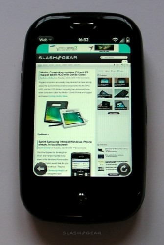
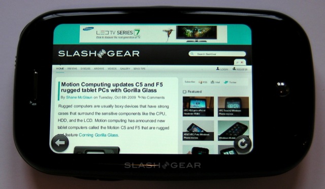
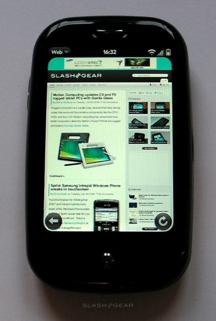
The Pre's web browser is webkit-based, like that of the iPhone and Android versions, and handles most pages well. Rendering is quick, as is zooming, and you can do the latter with either a pinch-zoom or by double-tapping to make a paragraph of text or an image fill the display. Flash support is notable by its absence, however, and if you want to watch streaming video then your only option is the separate YouTube app. Tapping on a YouTube video automatically opens it in the standalone player app, while web pages are presented as individual cards.
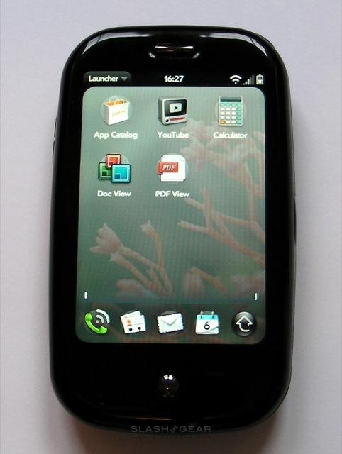
Another limitation of webOS 1.1.3 is the absence of paid-apps in the Pre's App Catalog. Palm's version of the on-device download store is filled with free applications in its European guise, but that should change once 1.2.1 or later is introduced. Still, the overall impression is a relatively sparse selection, something we're hoping that Palm's sop to open-source and recent push for developers will remedy before too long.
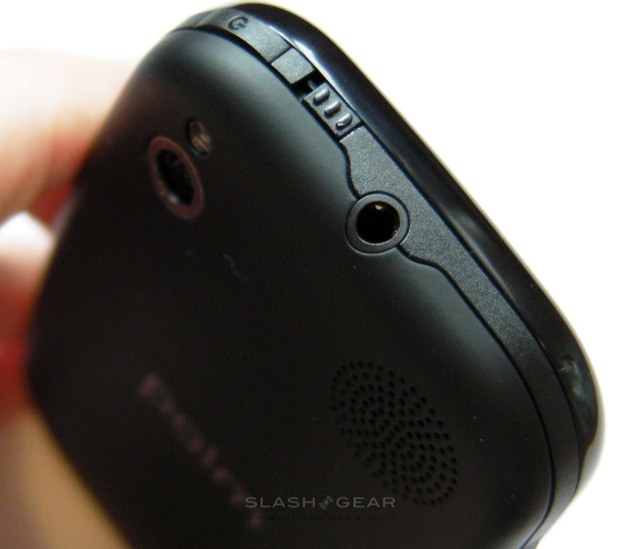
Media on the Pre is another mixed bag, and not least because you're limited to that 7GB overall storage for any music or video you want to carry. A streaming media app would alleviate some of the strain, but the App Catalog currently has a US-friendly Pandora client but no European option; we're hoping Spotify will step into the fray before too long, though of course their mobile player demands a monthly subscription. The Amazon MP3 Store app preloaded on the US Pre is also conspicuous by its absence on the European version. Audio quality from the 3.5mm headphone jack is good, especially when you junk Palm's included earbuds and use a reasonable aftermarket set, while the Pre's bright (but compact) screen makes for fair video playback.
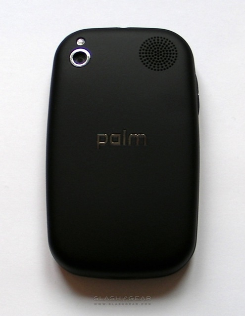
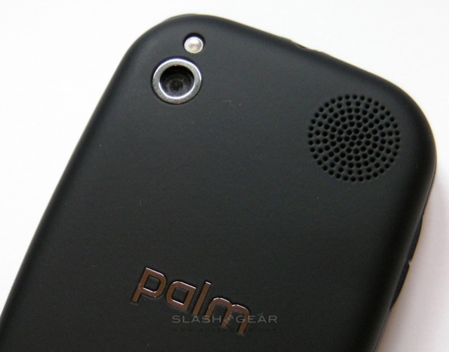
Unfortunately, despite the work Palm claim to have done tweaking their camera optics, the fixed-focus 3-megapixel shooter didn't hold up well compared to autofocus lenses on rival devices. Long and medium distance shots are reasonable, in bright indoor or outdoor lighting, but close-ups proved less impressive and were often washed out by the LED flash. There's still no video recording functionality, either, despite Palm's assertions back in June that it would be added as a firmware update.
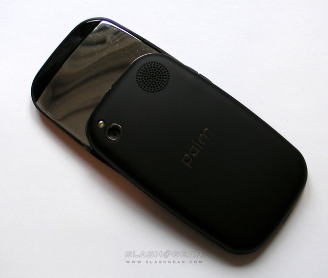
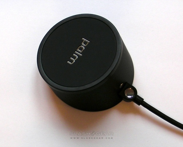
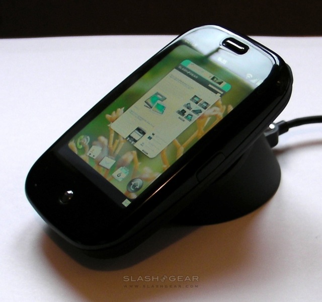
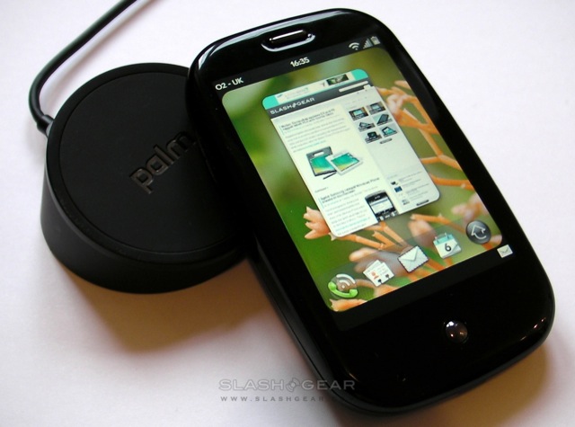
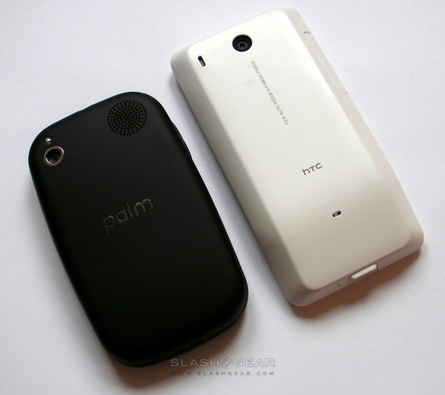
Call quality is high, in no small part because the sliding keyboard section brings the microphone closer to your mouth, and the removable battery lasts for around a day with push-email active. Palm talked us through various power-saving tips – including using WiFi over 3G whenever possible, manually dimming the display backlight rather than allowing the ambient light sensor to work its magic, and switching email polling to periodic rather than push – but we're of the opinion that a business-class device should be able to last a full day's use without us artificially holding its hand. That's made easier by using Palm's Touchstone inductive charger, a compact base station which sticks tenaciously to a desk and to which the Palm – with a custom matte-finish battery cover – magnetically adheres, charging at the same time. It's certainly a slicker way to rejuice your phone than pulling out the fiddly microUSB cover and plugging in the power cable, but we still reckon it's cheap of Palm not to include a second AC adapter in the box with the Touchstone.

There's plenty to like about the Palm Pre. It's a compact, attractive handset that doesn't allow its relatively small display to get in the way of intuitive gestures and a visually-rich UI. Nonetheless, there are also a fair few shortcomings, and we'd particularly encourage would-be owners to try out the keyboard to see how well it suits their finger size; hardware 'boards don't necessarily trump their on-screen counterparts. The limited storage is another frustration, though the news that Adobe plan a webOS Flash 10.1 beta later in 2009 does at least promise improved streaming multimedia at some point in the future.
As before, though, we're most excited about webOS. The OS continues to stand apart from rival platforms, not so much for its Synergy and universal search, but for its excellent use of a relatively smaller display and its intuitive gestures. We've said it already, but many of the little frustrations we've experienced could be fixed with firmware updates, and Palm has shown itself fleet-footed with issuing those. Europe has had to wait a long time for the Pre – longer, perhaps, than its mature smartphone audience is used to waiting – and while some of the newness shine has been lost along the way, the Pre is still a decent contender.
