Notification System, App Optimization Detailed At Google Android Honeycomb Event
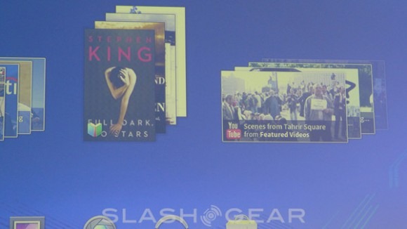
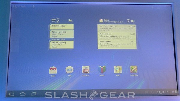
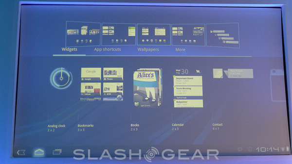
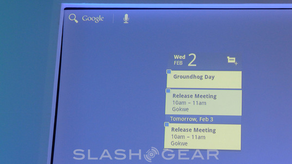
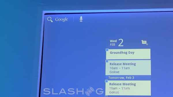
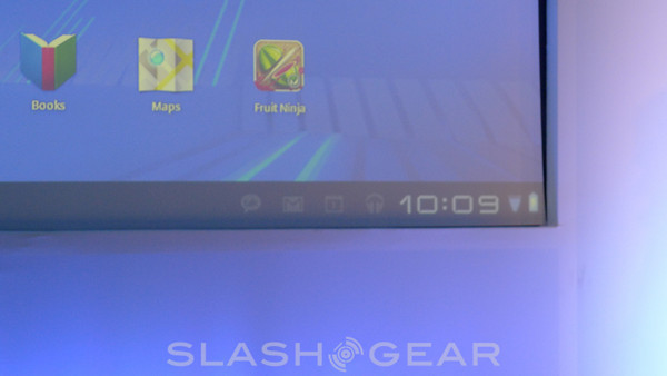
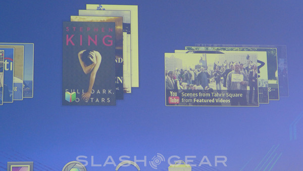
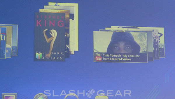
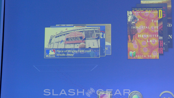
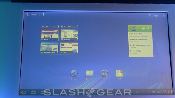
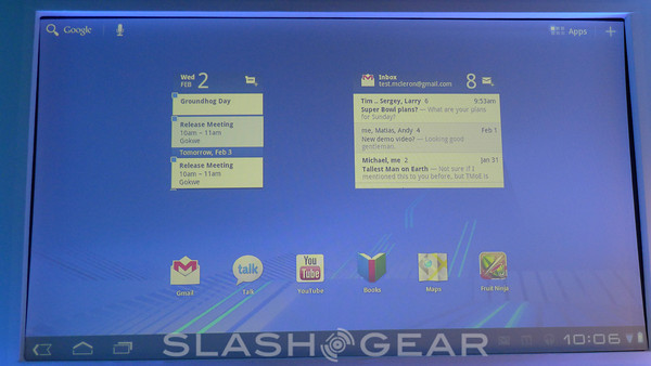
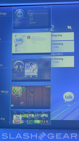
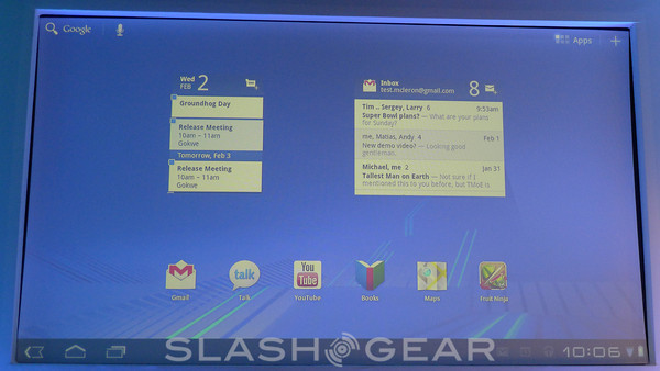
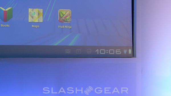
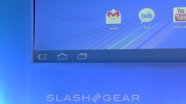
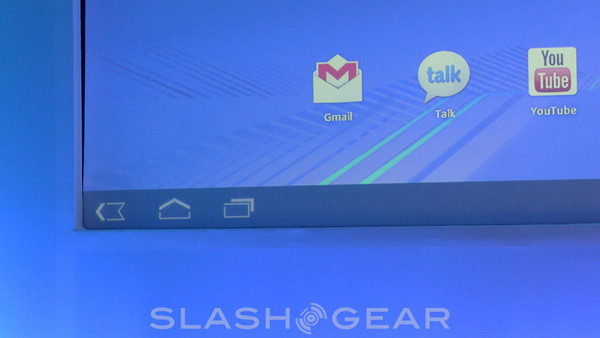
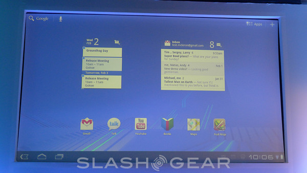
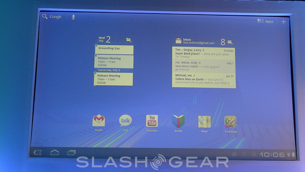
The presentation begins with the basics of the Honeycomb UI – Back Button, Home Button, and Multitasking Button are on the lower left. In the lower right, notifications and the clock. The rest is dedicated to working, gaming, and widgeting. Widget systems are now backed by collections of data, and are much more versatile than ever before. While flipping back and forth between screens, it's revealed that two widgets with scrollable content can be flipped through at the same time, such is the power of multitouch in this new system. Next – the Notification System
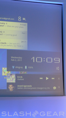
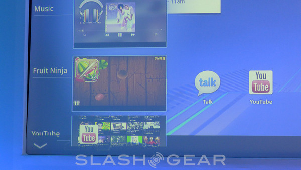
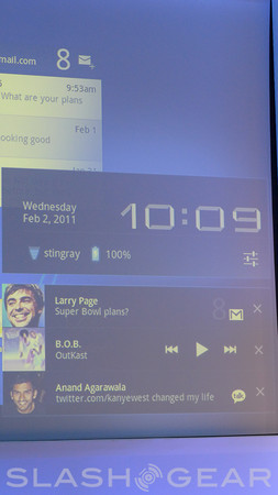
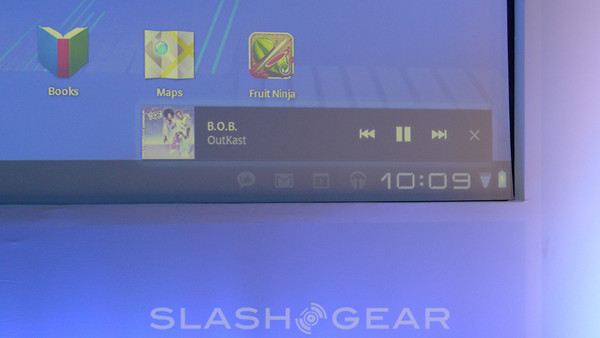
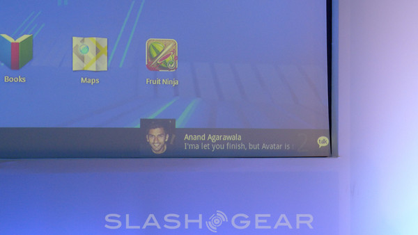
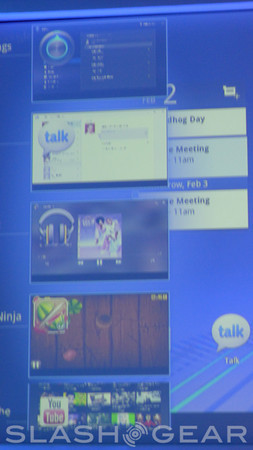
This is one of the bigger items in Honeycomb, this Notification System, as it can occur in front of or behind apps, now helping you have a much more rich experience than you were able in any previous form of Android. One example is getting an instant message, it sneaking up out of the bottom of the screen. The other example is your music player controller popping up when another task presents itself.
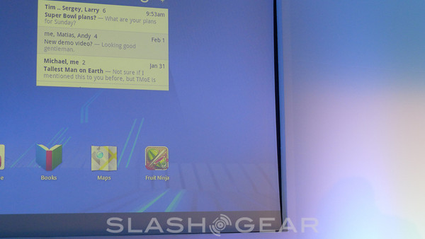
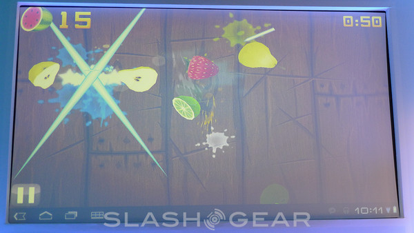
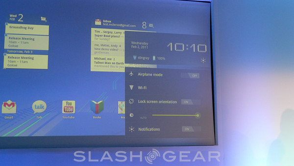
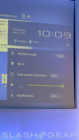
Several simple buttons are also able to pop up in the lower right hand corner including airplane mode, power, and the like. Fruit Ninja is the first game that's presented on stage, a simple slash and chop game you play by swiping your fingers across the screen. This version is a completely unmodified state, yet works perfectly well without any change, but Google wants you to modify your apps to work especially well with this new tablet form.
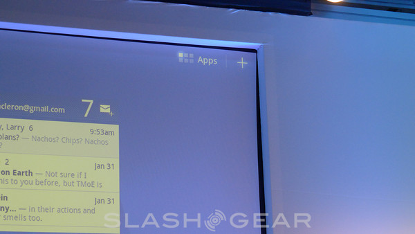
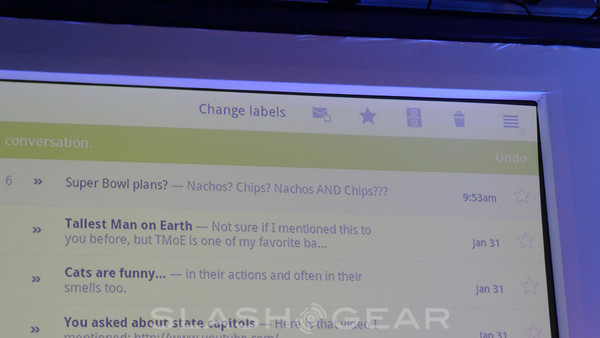
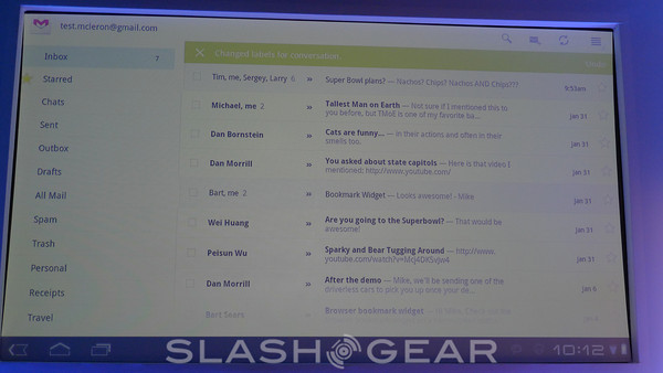
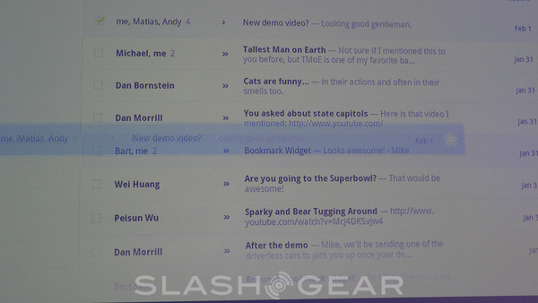
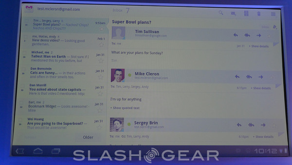
Fragments and picking up, dragging, and dropping are also featured in this new world for apps, as well as well as the Application Bar which can appear over your apps at the top of your screen if you wish (if you're a developer). This Application Bar can do many things, or can be nothing at all, if you've got no user for it (again, as a developer.)
Find out more about these subjects in our full Honeycomb Guides:
Android 3.0 Honeycomb Full Preview Guide [DEVELOPER FEATURES]Android 3.0 Honeycomb Full Preview Guide [USER FEATURES]
