Nokia N9 Hands-On [Video]
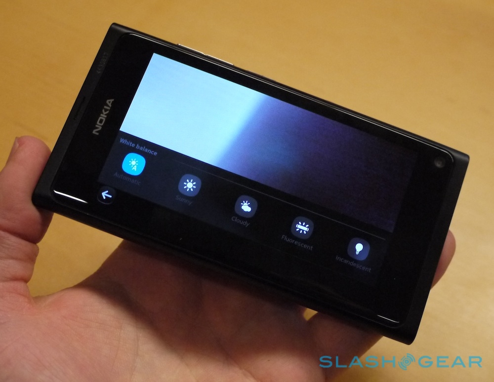
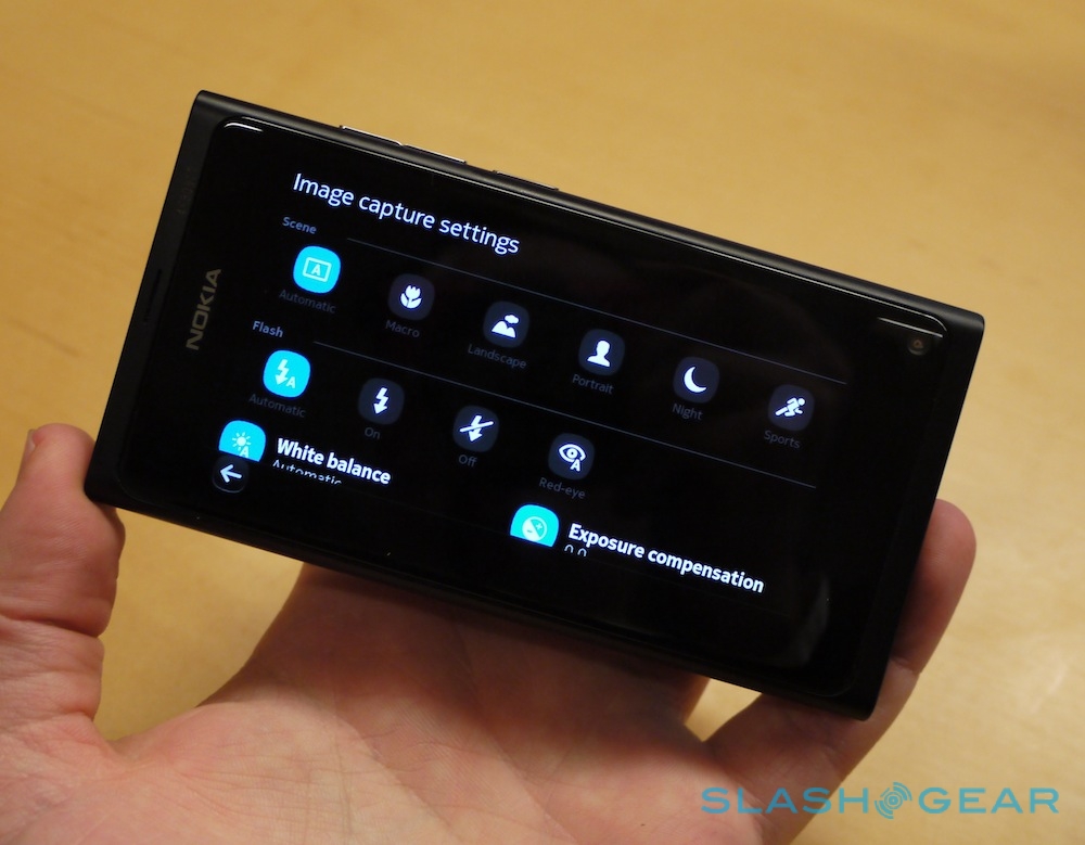
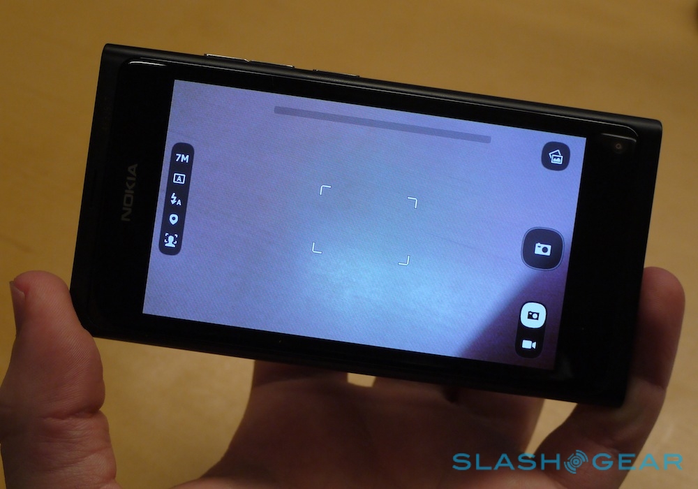
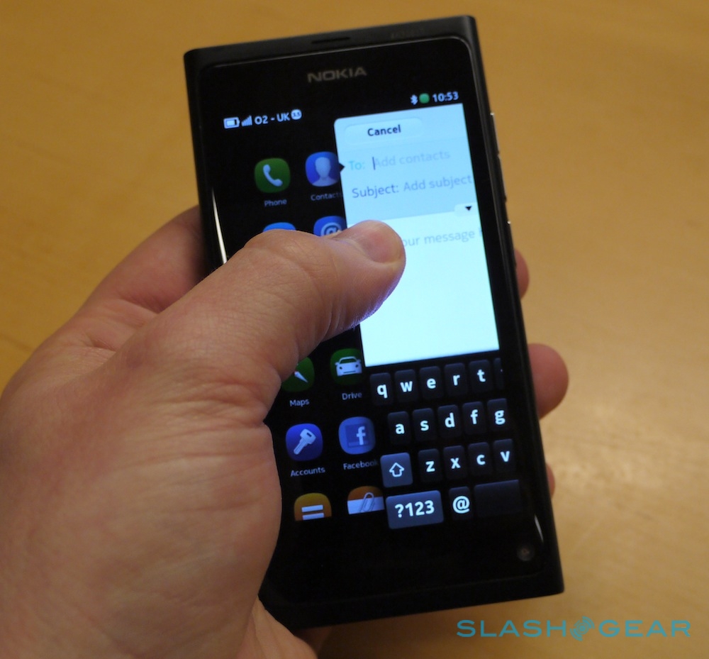
Nokia has managed to grab the news cycle again, and this time around it's not with talk of delays or dreary share prices. The Nokia N9 may be the only MeeGo device expected to launch this year, but then again Apple made a pretty decent splash with one model every twelve months. Does MeeGo and the slender N9 have what it takes? We've been playing with the smartphone today, so head on past the cut for all the hands-on details.
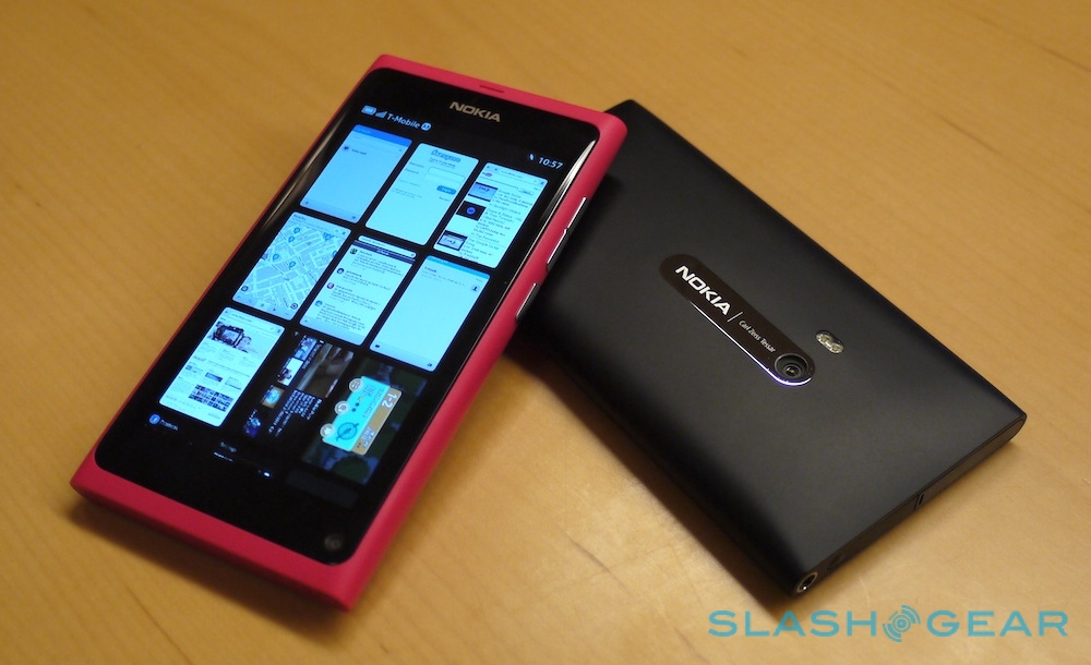
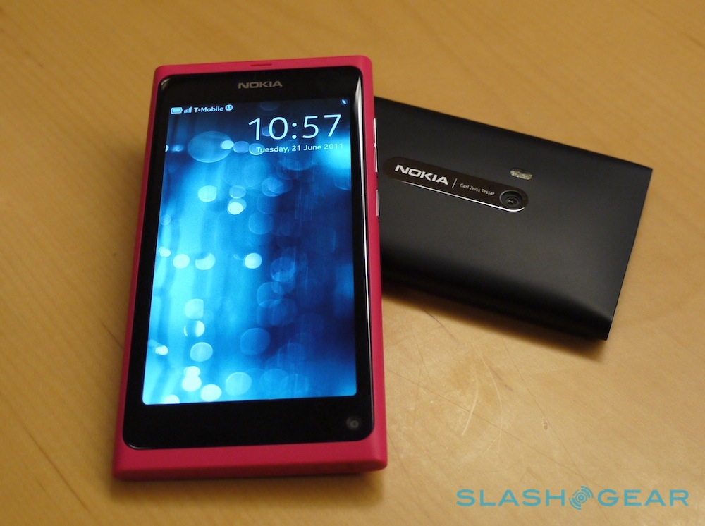
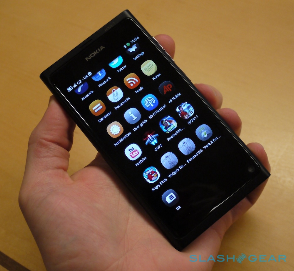
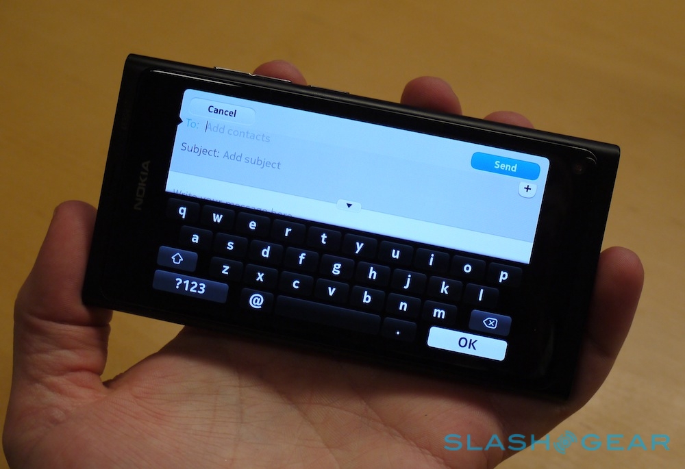
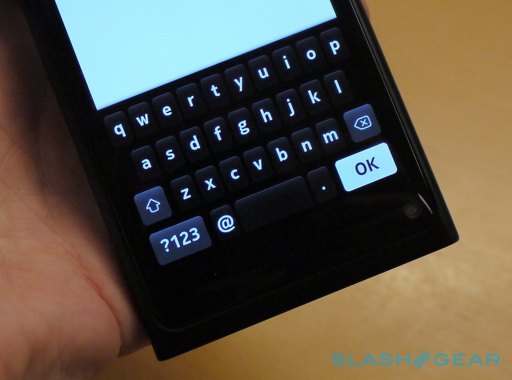
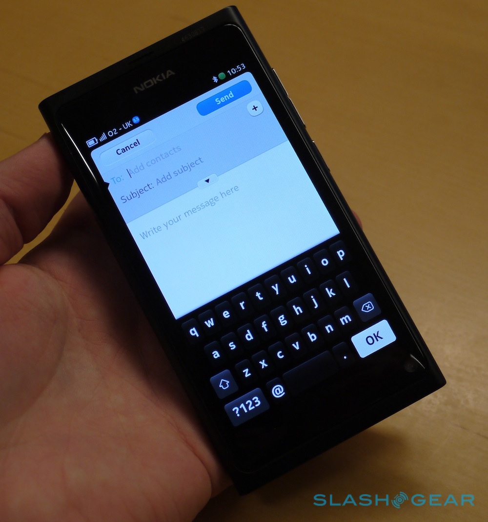
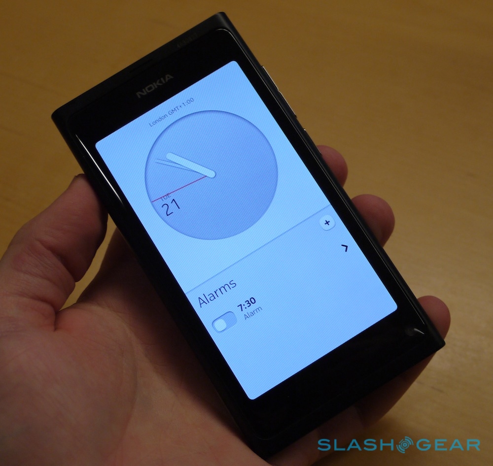
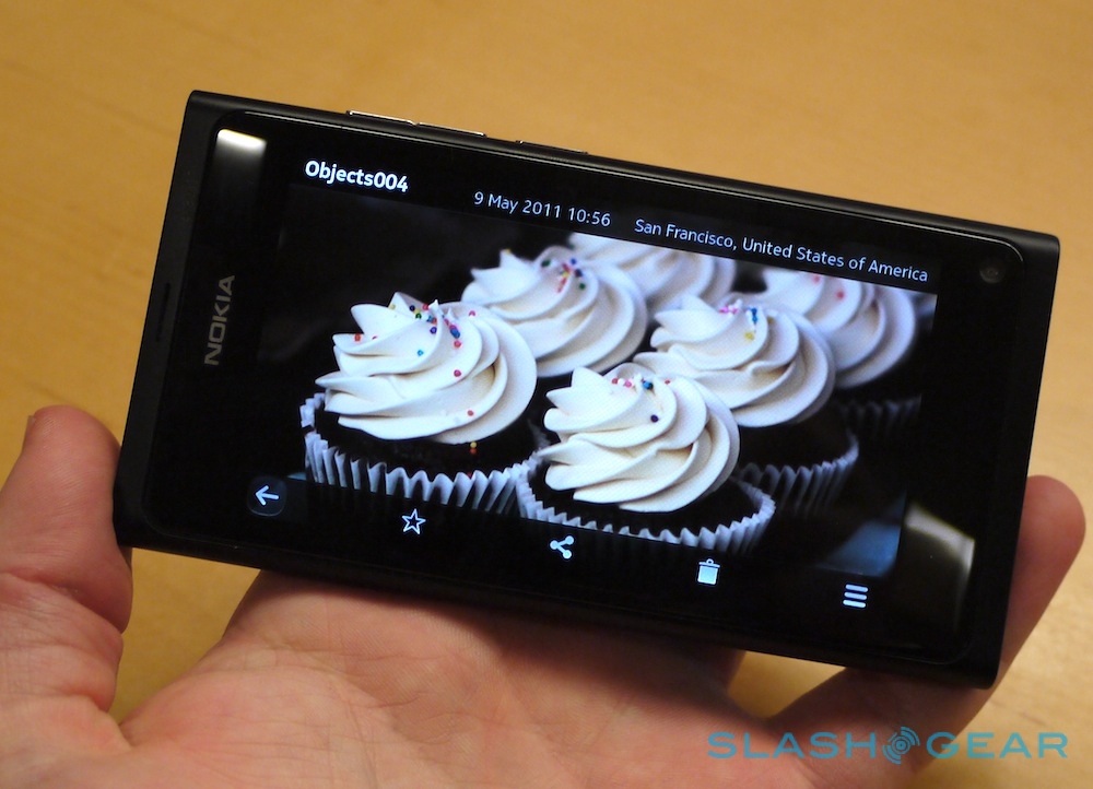
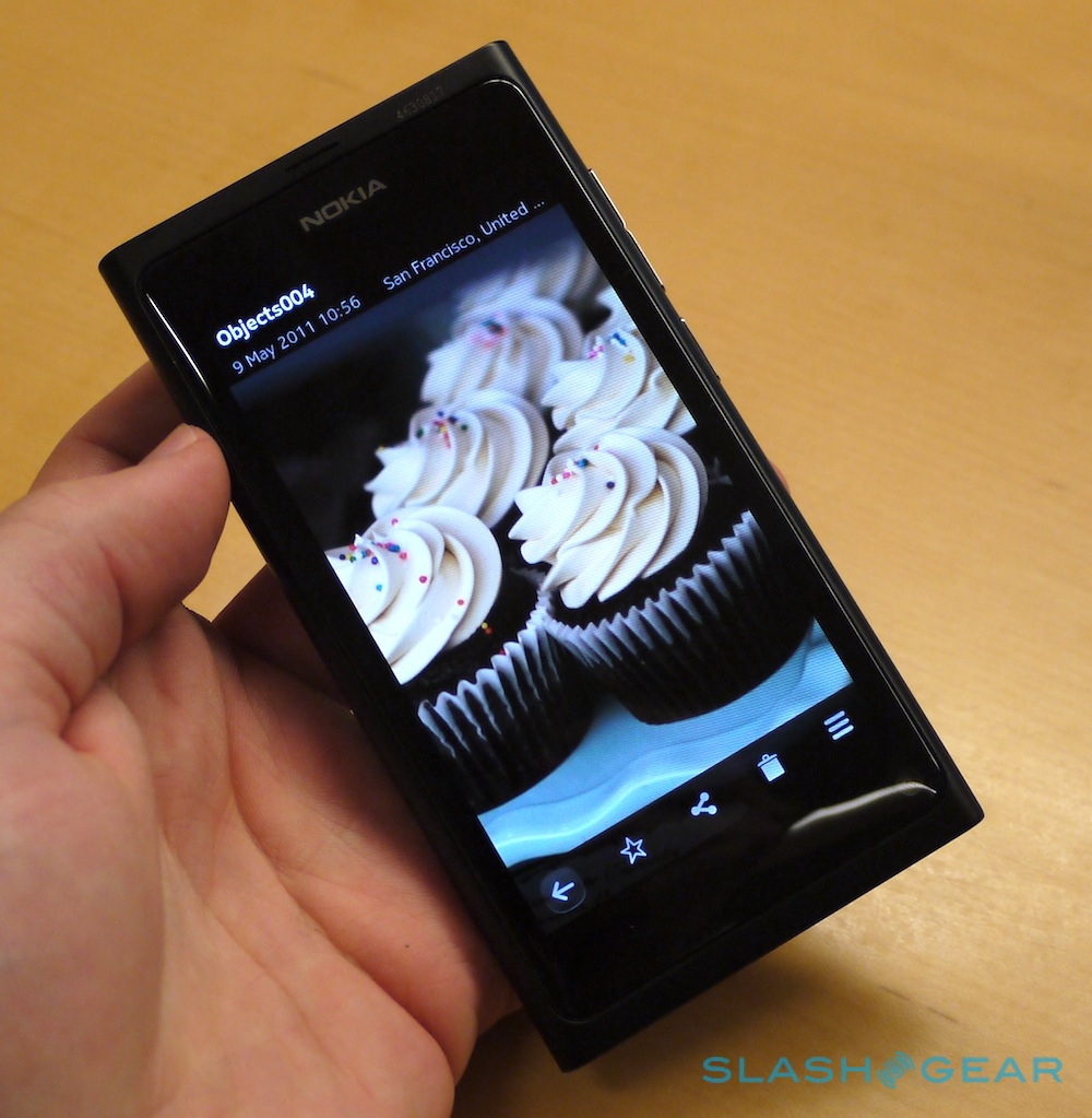
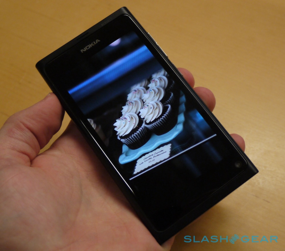
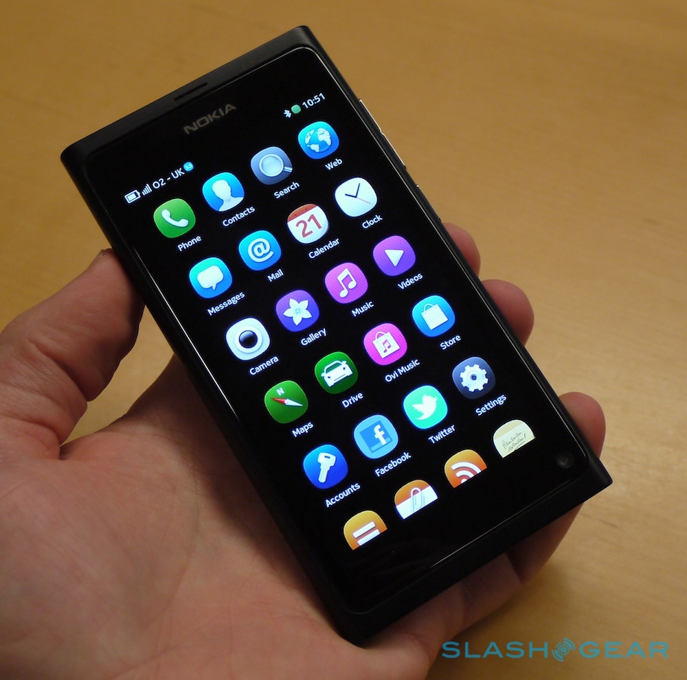
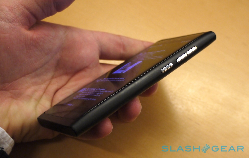
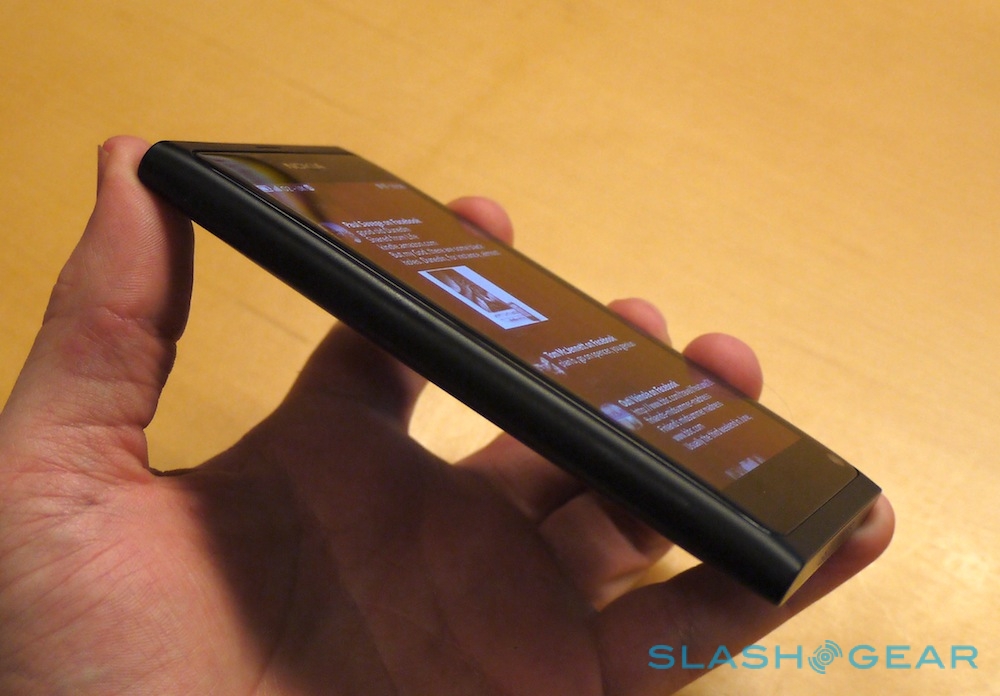
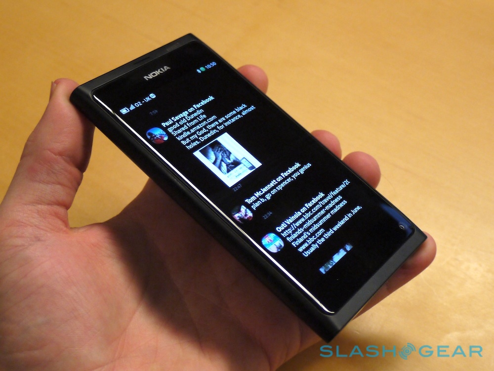
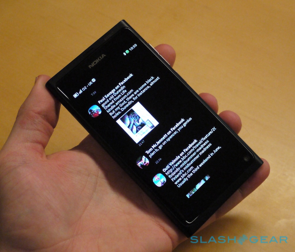
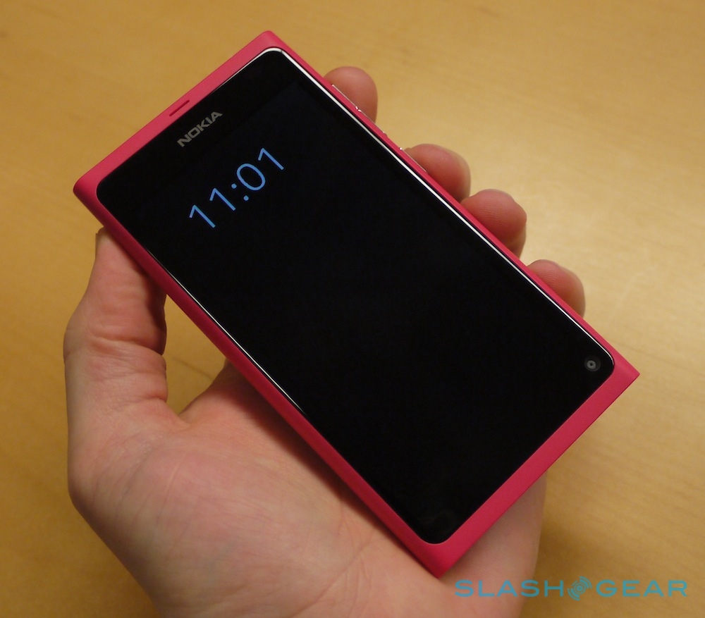
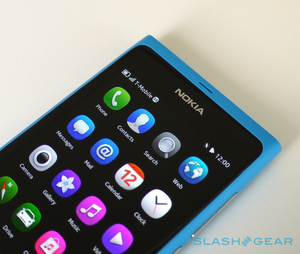
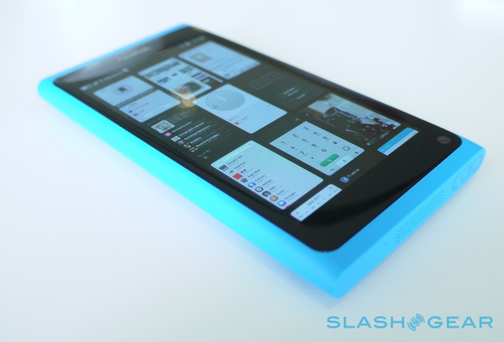
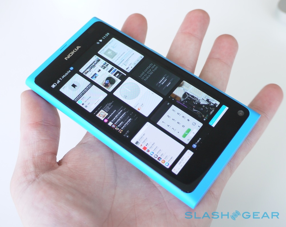
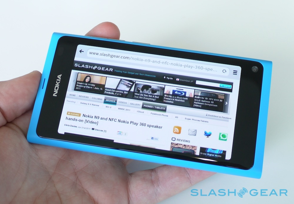
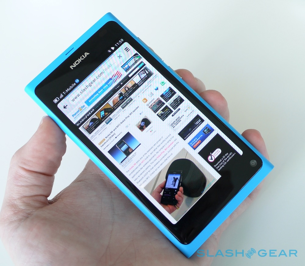
The N9's design may be minimal, but it's definitely a Nokia. The 3.9-inch 854 x 480 display is a rich, colorful panel capable of inky blacks; Nokia calls it "Clear Black" but we know it better as AMOLED of course. It may lack the qHD resolution of some high-end Androids, but we're hardly disappointed. The icons seem to float at the very surface of the display.
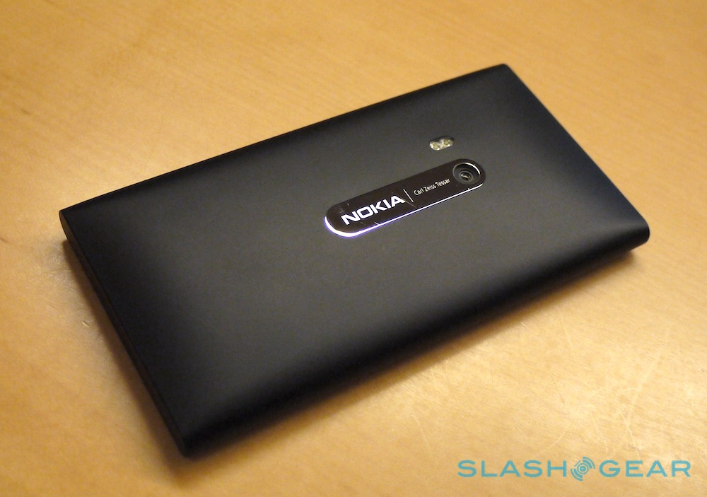
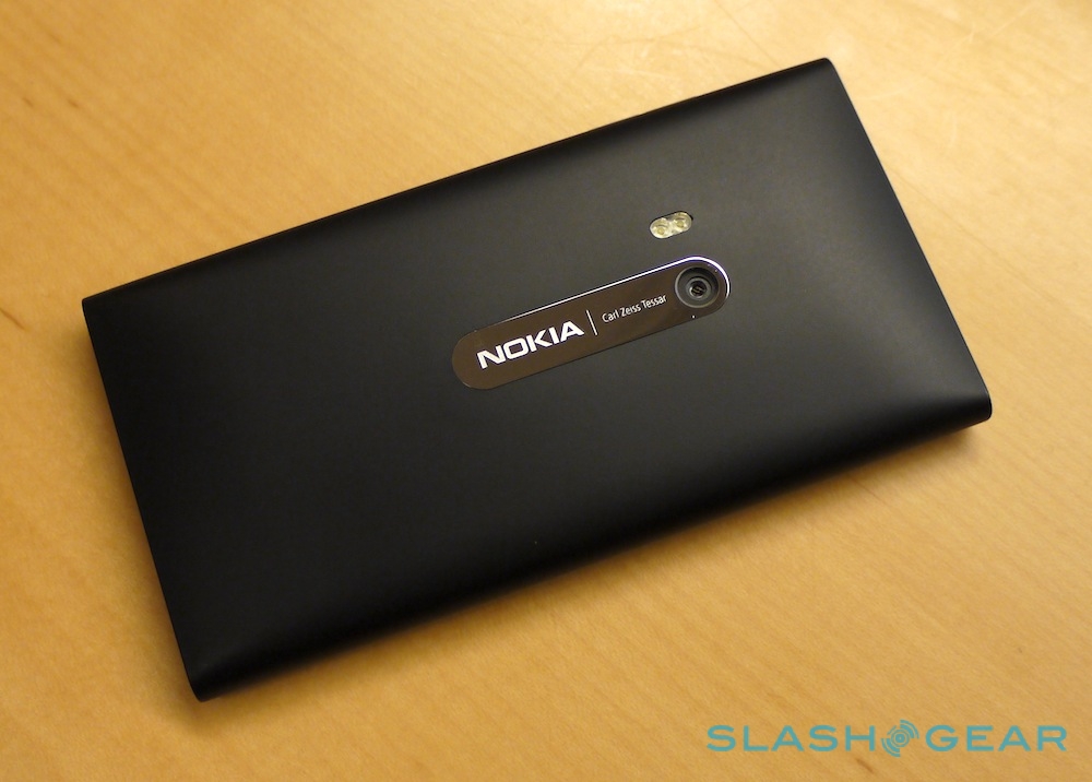
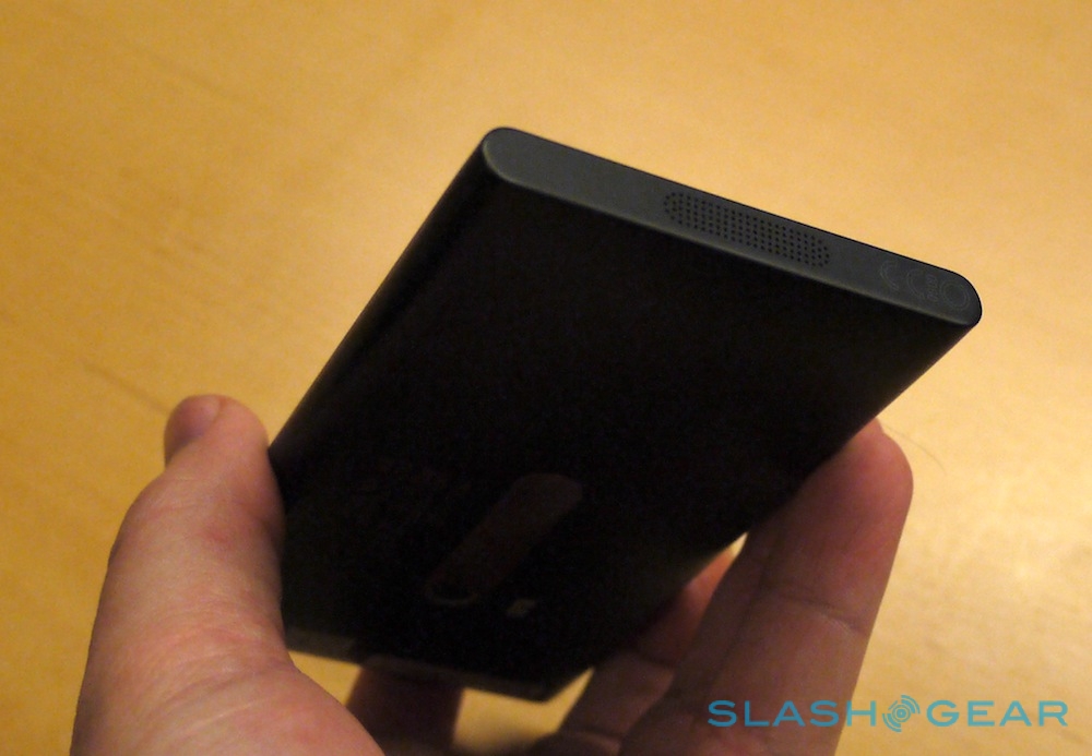
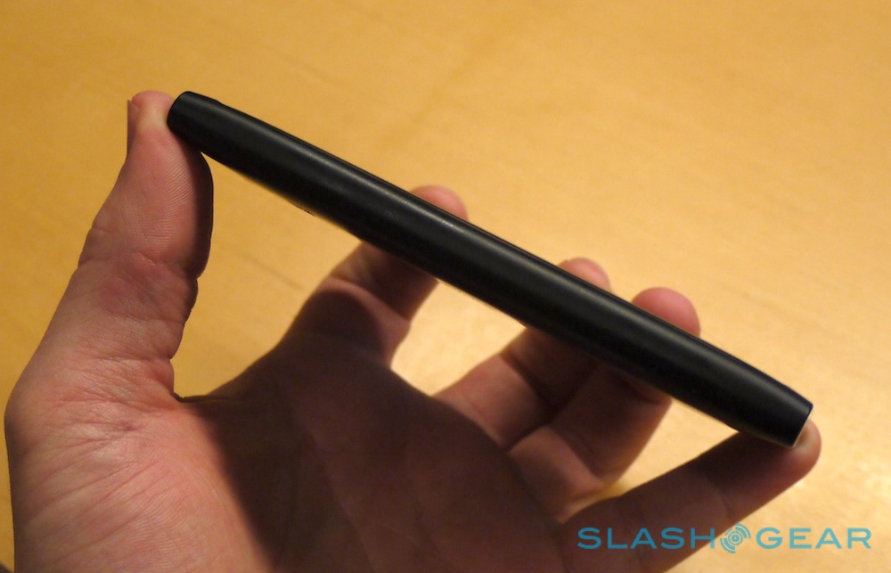
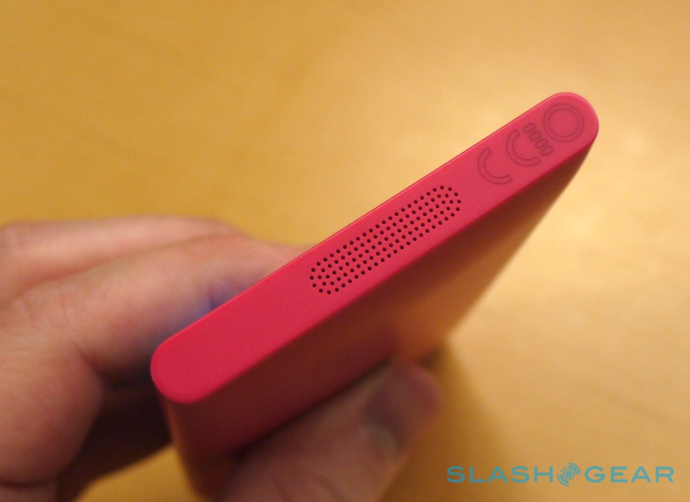
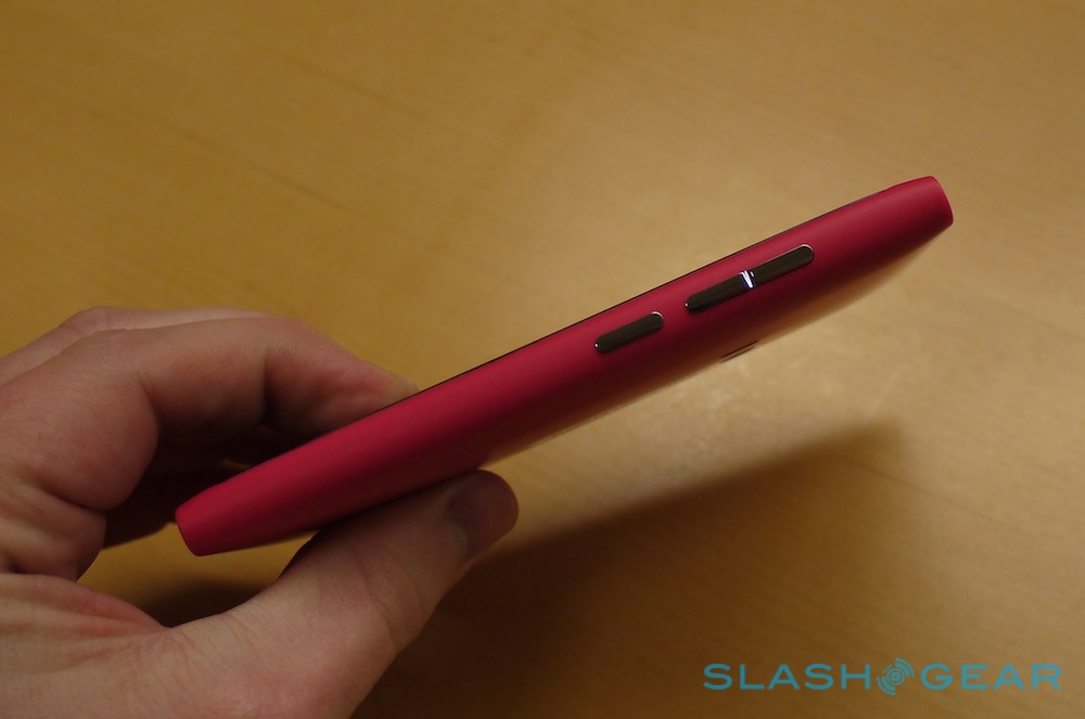
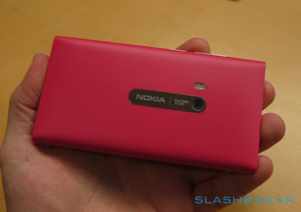
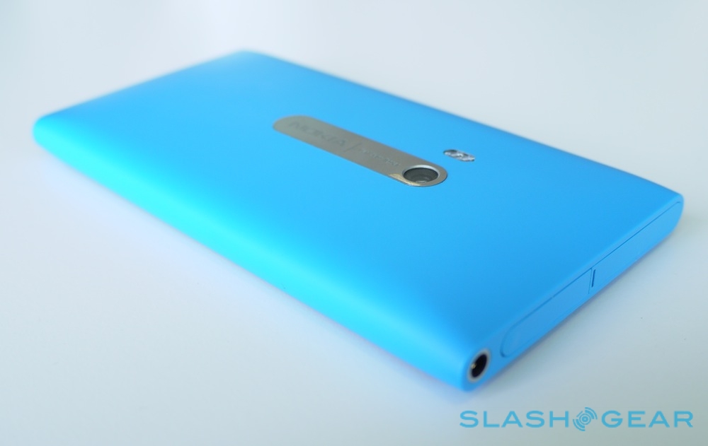
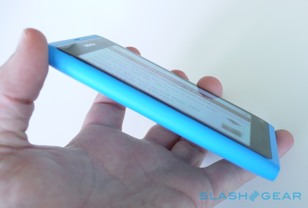
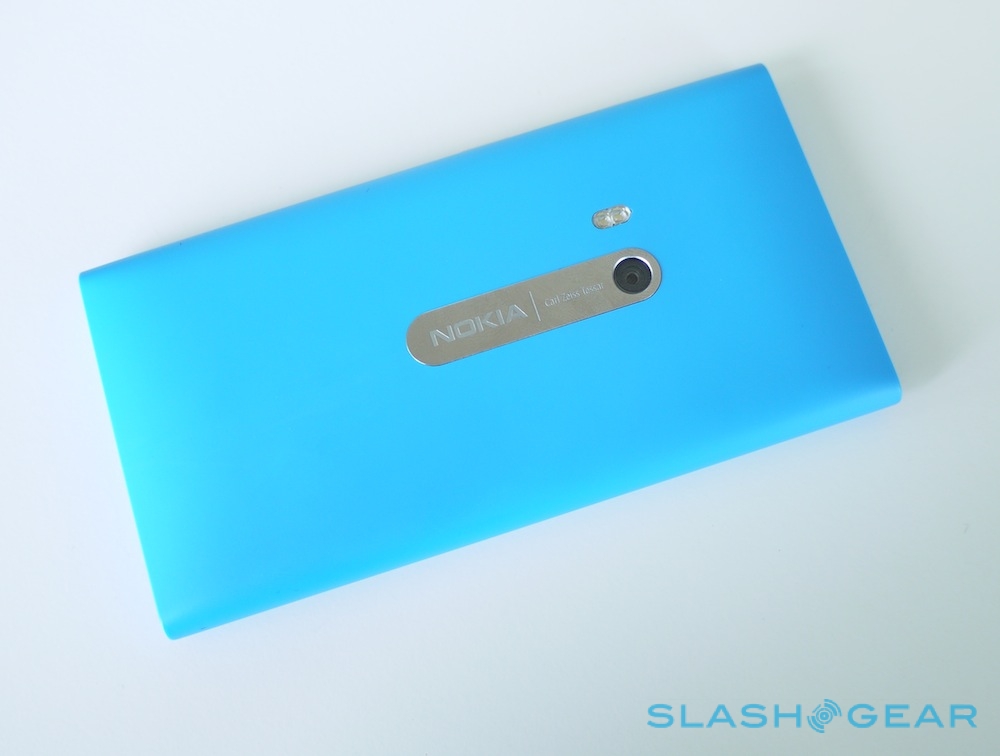
We'd expected aluminum for the N9's chassis, though the polycarbonate casing Nokia has actually delivered is eye-catching in itself. Milled from a single block of material, with 116 holes punched through, the polycarbonate is inherently colored rather than painted, which means that if you scratch it you won't find raw metal or beige plastic underneath. According to Nokia, by opting for plastic rather than anything else, it means there's better antenna performance no matter how you hold it.

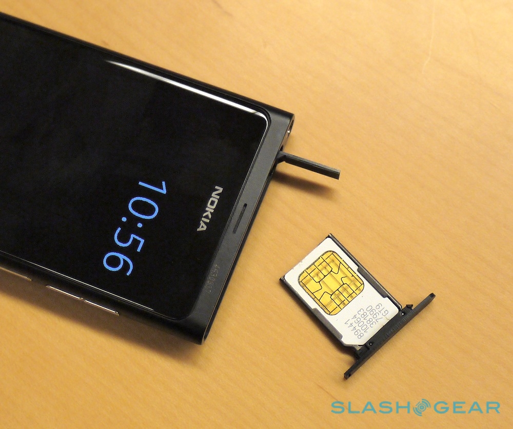
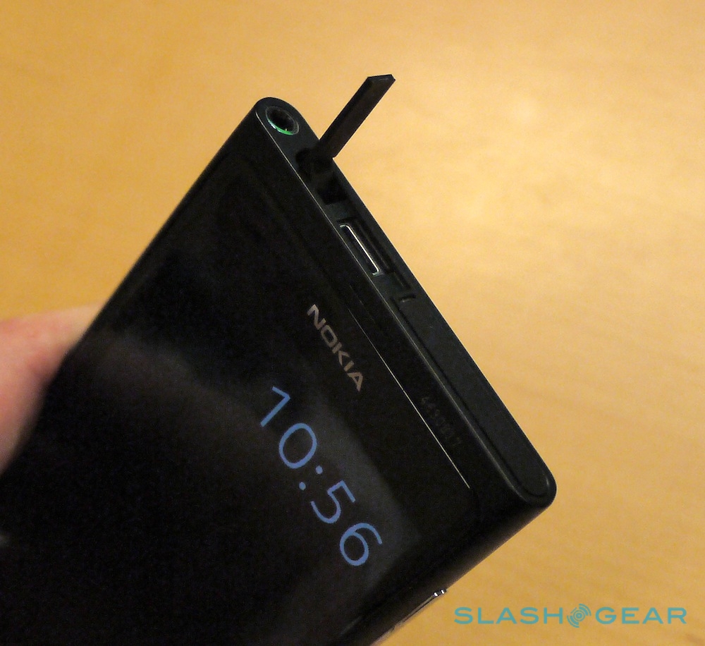
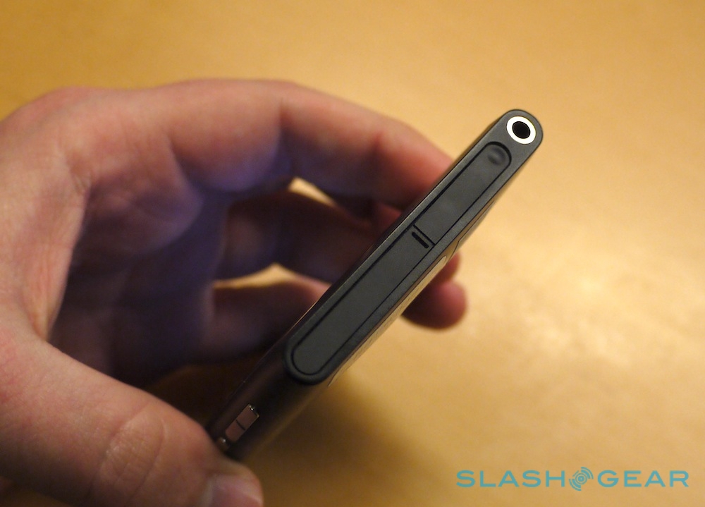
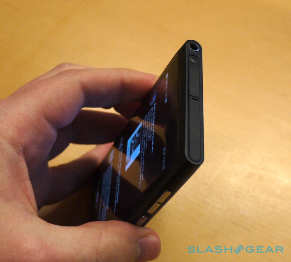
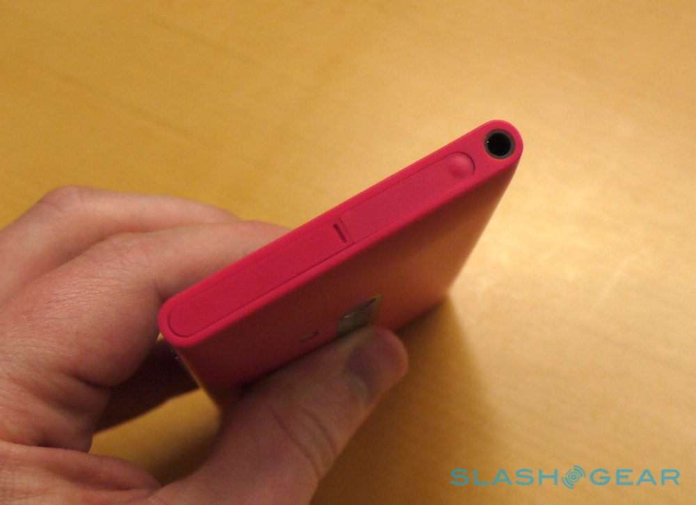
Into that carved out chassis Nokia slots the internal components, similar to how the HTC Sensation fits together (though non-user-accessible). At the top edge there's the 3.5mm headphone jack, next to a hinged-up flap hiding the microUSB port (which unfortunately doesn't support MHL for HDMI output) and a pop-out micro SIM holder, just like you'd find on the iPhone 4. It all feels solid and creak-free, as you'd expect from a monoblock design.
Nokia N9 demo:
[vms cb2651801455c86d78f2]
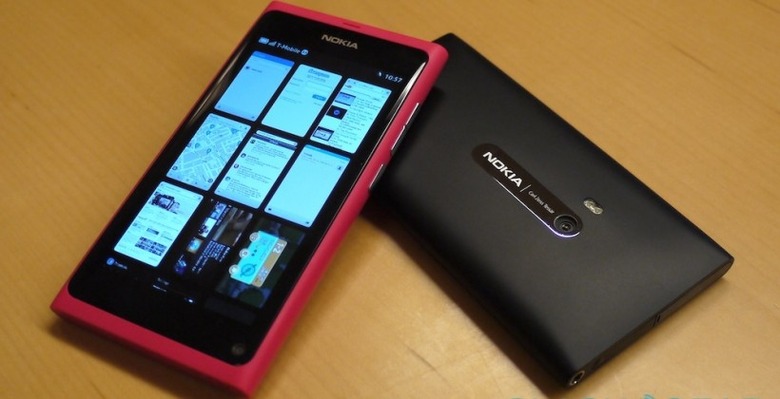
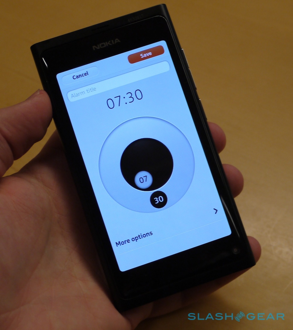
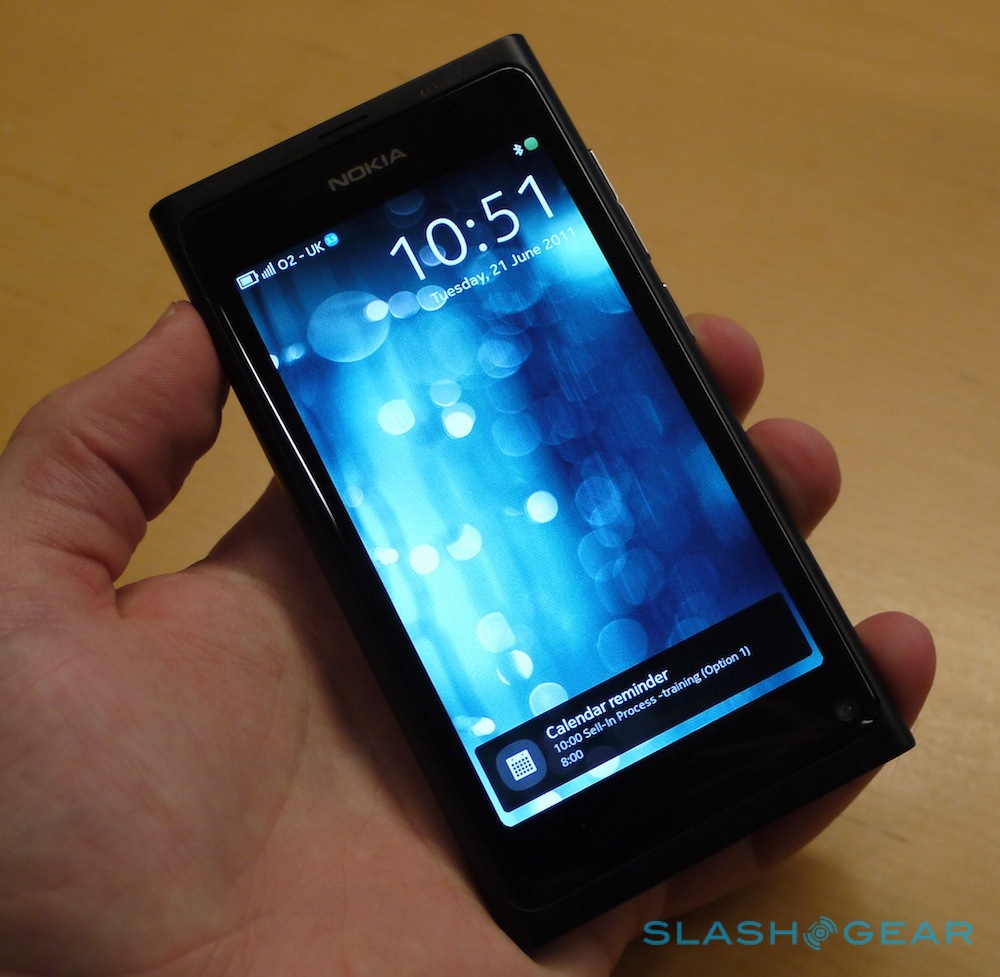
Power is courtesy of a 1GHz single-core OMAP3630 processor paired with a PowerVR SGX530 graphics core. It's lacking a core on high-end Android devices – as well as what we're expecting from the fifth-gen iPhone – but as we all know it's what your OS does with the chipset that really counts. In practice, MeeGo is swift and surprisingly usable. Nokia has prioritized one-handed use, with your thumb sliding nicely across the seamless edge where the curved display meets the frame. Unlocking and task switching is done with a swipe, dragging a finger in any direction – left, right, up or down – from the edge of the screen.

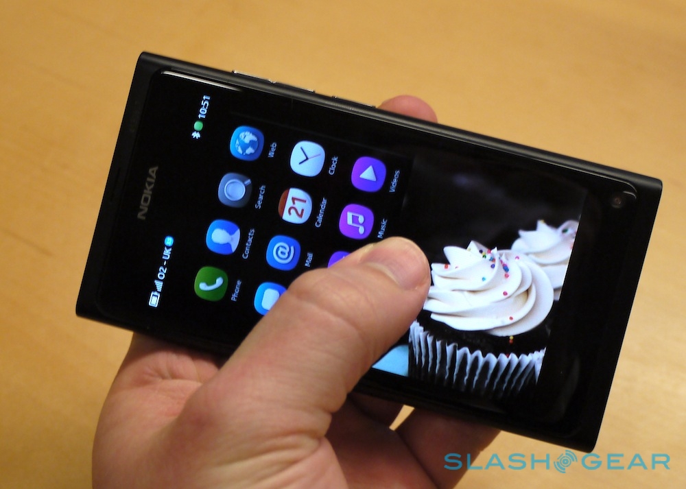
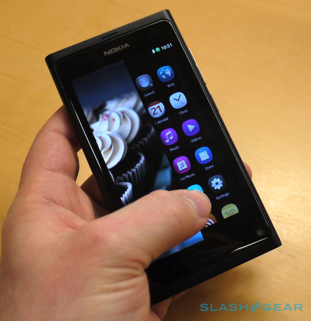
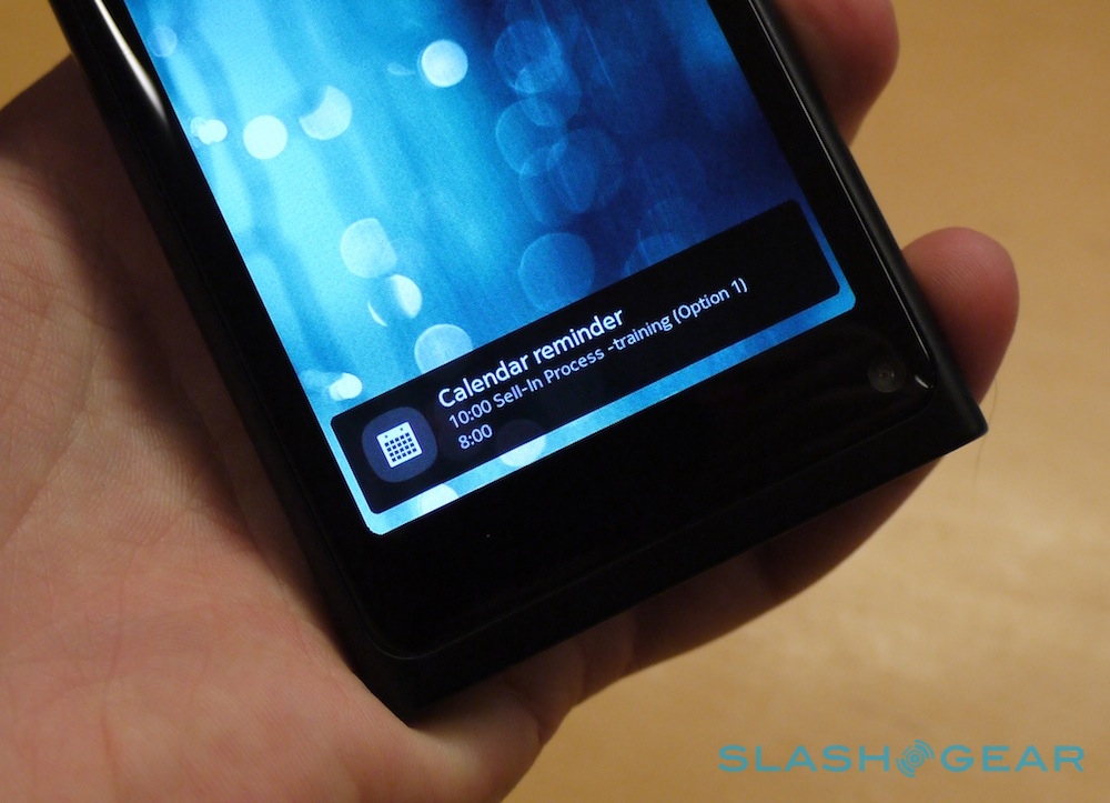
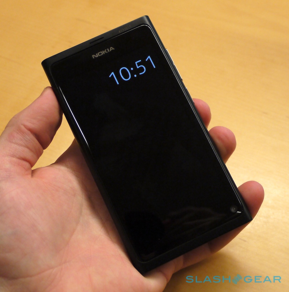
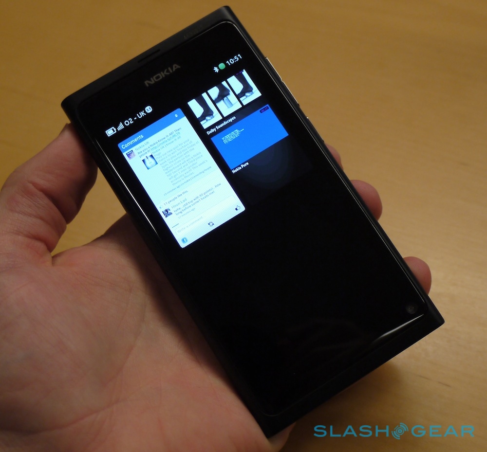
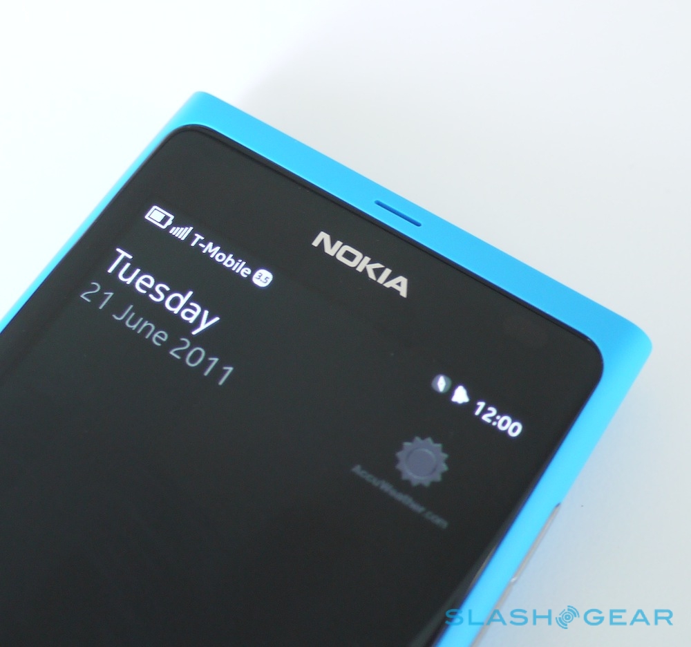
Double-tap the lock-screen – which normally shows a discrete clock and notifications like missed calls and new messages – and then swipe it off the screen, and you're at the three-pane homescreen. An endless carousel, there are discrete screens for launching apps, for reviewing notifications – calls, messages and calendar alarms up top, and social network updates underneath, with new alerts discretely ghosting into view – and then all of the live applications on the third pane, frozen at their last-used state. The most recent app is always at the top left, and by long-pressing on any of those apps you can tap a red cross to shut them down permanently. Alternatively, MeeGo can be left to manage running apps itself, automatically hibernating those titles you've not used in some time.
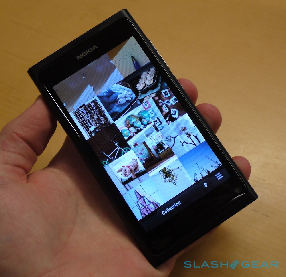
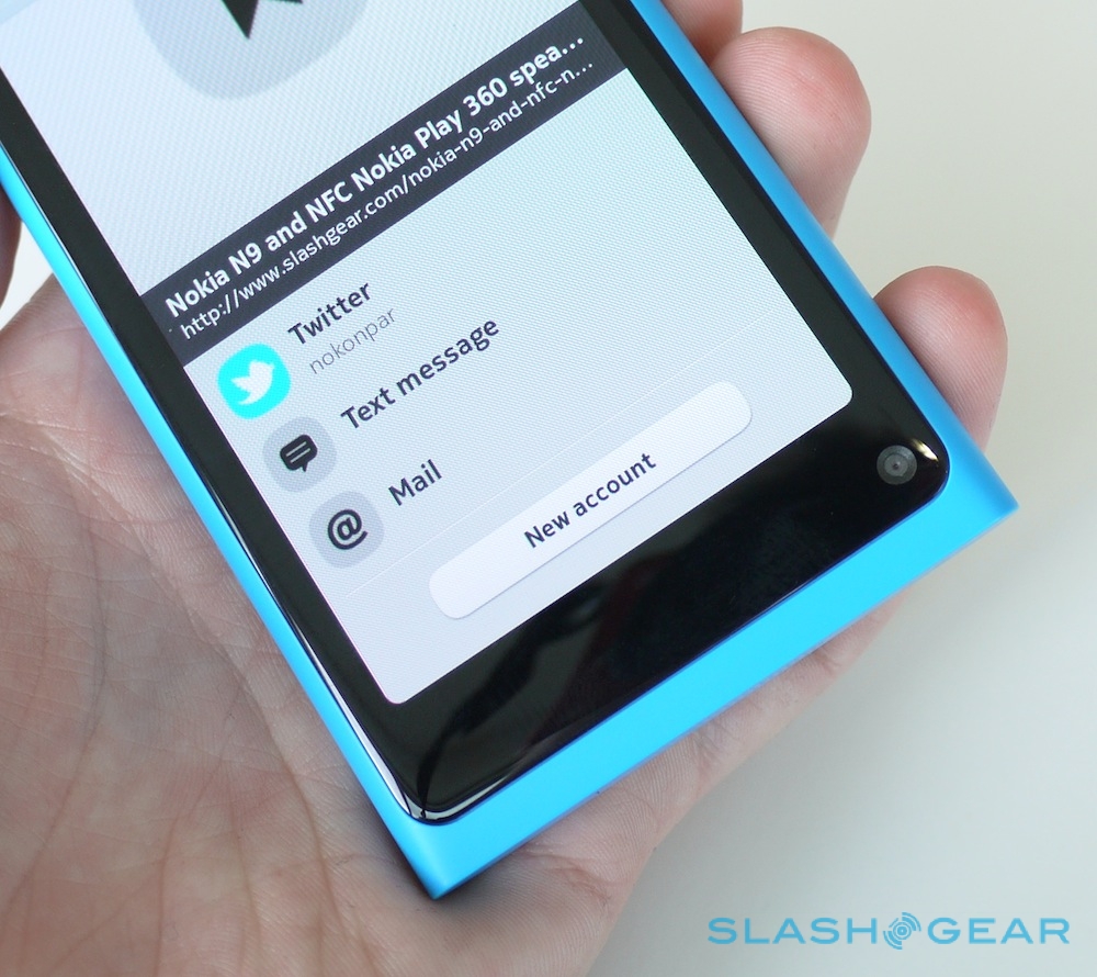
There are some neat animations, too. The apps flip aside smoothly, the homescreen rising back up into view, and if you swipe a playing video off the screen, it continues running until it reaches the end. The live applications screen can be viewed either in a 2 x 2 layout or 3 x 3, flipped between with a pinch-zoom gesture. When you swipe away an app, you're always taken to the homescreen pane you were looking at last, making it easier to move between apps without needing a pop-up task switcher as you'd find on Android, say. With Qt support there'll be plenty of apps at launch, with full compatibility with the Qt APIs, and Nokia will allow third-party apps to integrate into the notifications pane.
It takes a little getting used to initially – we found ourselves reaching for a dedicated home button, then remembering we had to swipe – but after a while the switching mechanism is surprisingly intuitive. Check out our hands-on video walkthrough for more!
Nokia N9 walkthrough:
[vms 43e61576081a2f250f84]
