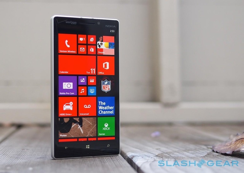
Nokia Lumia Icon Review
Verizon has needed a new Windows Phone 8 flagship, and Nokia was the obvious choice to deliver it. Don't mistake the Lumia Icon for a side-thought in Nokia's smartphone schemes, however. On paper, at least, it takes the key things we loved from AT&T's Lumia 1520, and distills them down to a more hand-friendly scale. Does reality live up to those high expectations? Read on for the SlashGear review.
Design
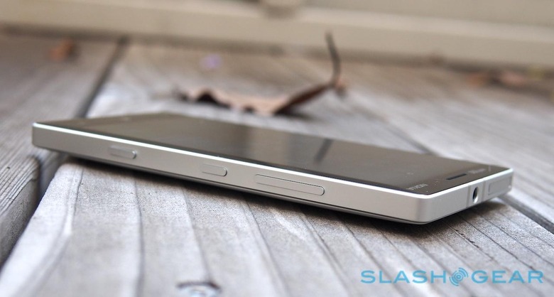
The Lumia Icon's design is a little as though the Lumia 925 of last year went into prison, spent most of its days pumping iron in the yard, and then emerged at the end of its sentence big, blocky, and a little intimidating. Nokia has reused the idea of smooth, matte metal around the edge, with glass on one side and polycarbonate plastic on the other, but where the Lumia 925 was curved and almost organic in the hand, the Icon feels more imposing.
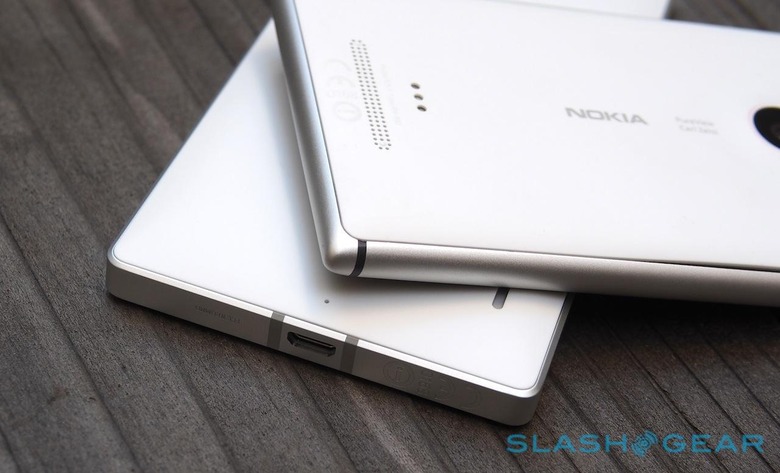
You can look at the Icon in two ways. Those feeling charitable will contrast it to the phablet-scale Lumia 1520; those less forgiving will just call it hefty. At 5.39 x 2.79 x 0.39 inches and 5.86 ounces it's certainly no lightweight, and the crisp edges to the metal chassis – which actually extends through the body of the phone, leaving the Icon flex-free – had some we handed the Icon to complaining that it cut into their fingers when gripped.
Overall, though, we're inclined to approve of what Nokia and Verizon have done. The matte finish of both edges and plastic back are far preferable to our eyes – and hands – than glossy, and the decision to bridge the antennas at the top and the bottom, rather than on the sides, makes sense both in terms of keeping a signal while being held and giving the Icon some distinctive "go faster stripes" that we almost wish had been continued down the back panel.
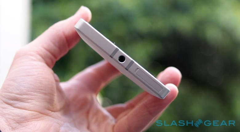
Sure, side by side with an iPhone 5s it looks pretty huge, and the decision to bow out the back so that there would be no bulge around the camera does leave it relatively thick, but there are plenty of little details we like. The physical buttons are close to ideal, easy to find with the fingertips, and only let down by some squishiness in the second-stage of the camera key.
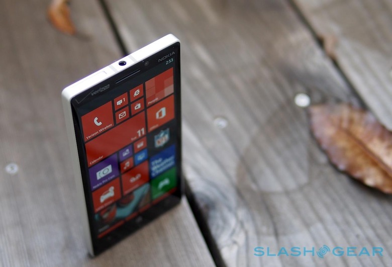
Meanwhile the Gorilla Glass 3 front, with its tapering edges that allow your thumb to trail off to the edge is something we've loved on previous Lumia, and unlike the 1520 we can just about reach across the display and use the phone single-handed.
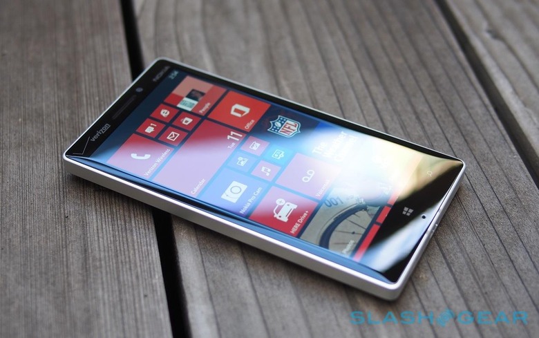
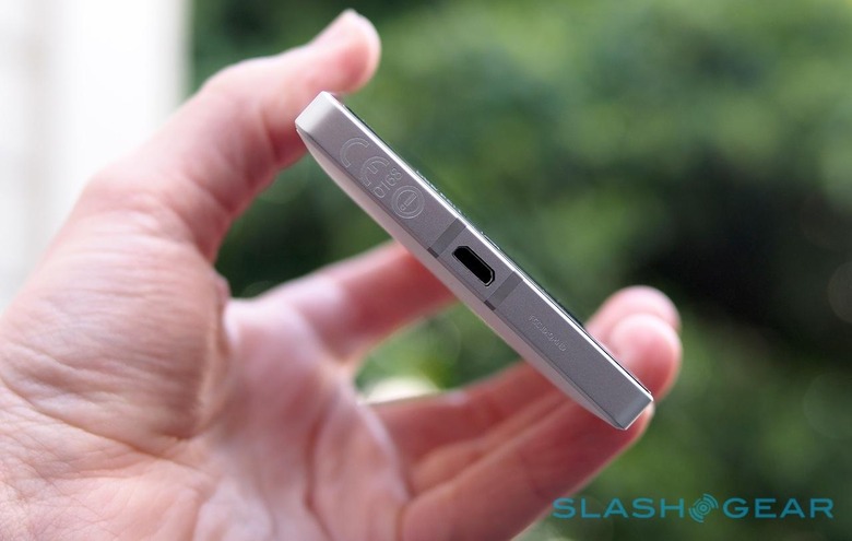
On the downside, while the SIM tray at the top does away with an annoying pin for release, it does so in a way that looks pretty ugly to our eyes. Verizon's badging is also excessive: its logo both front and back, as well as a 4G LTE logo, joining two Nokia badges and the PureView legend. It's a shame when Nokia has clearly put so much thought into how the Icon appears even when not in use, such as even minor details like engraving rather than printing on the regulatory text across the bottom edge.
Hardware and Display
Back when we reviewed the Lumia 1520 in November, we concluded that while Nokia's hardware was solid, Windows Phone wasn't quite ready to do phablet duties on a 6-inch display. With the Icon, Nokia gives Microsoft's OS a somewhat more conservative place to do battle.
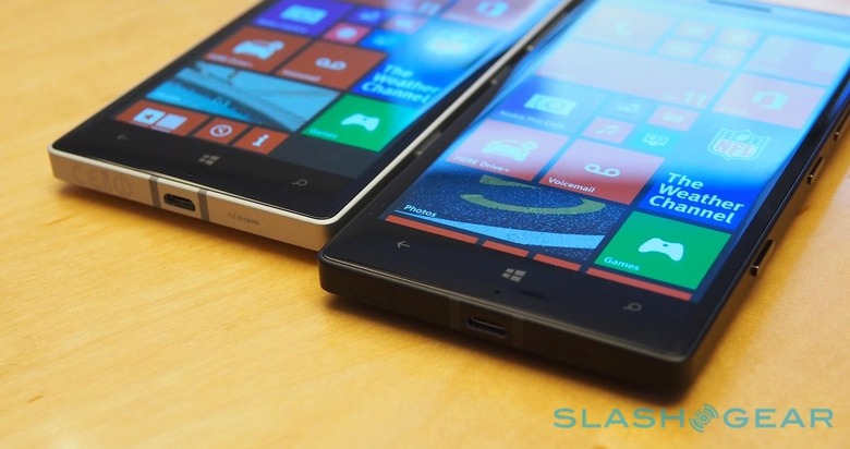
Smaller phones usually mean reduced specs, but not with the Lumia Icon. The screen is 5-inches now, but still 1920 x 1080 Full HD resolution, coming in at an impressive 441ppi. It's OLED instead of LCD, with blacks that meld inkily into the bezel, though while Nokia allows for color temperature and saturation to be tinkered with, whites aren't quite as clean as they could be. You'll only really notice that if you're comparing, say, the 1520 side-by-side with the Icon, however, and for most we'd suspect the vivid colors – particularly suiting Microsoft's blocky Live Tiles – will provide satisfaction enough.
You also get Nokia's outdoor visibility improvements, which mean the display can be used even in bright sunlight, and supersensitive-touch for using the phone even while wearing gloves. Unfortunately, Nokia Glance is missing, which means no status indicators while in standby mode. It's a disappointing omission.
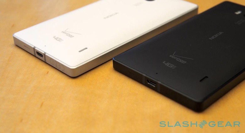
Inside, there's Qualcomm's Snapdragon 800 MSM8974 2.2GHz quadcore chipset with Adreno 330 graphics, 2GB of memory, and 32GB of storage. The 7GB of bundled OneDrive (nee SkyDrive) space doesn't quite make up for the fact that there's no microSD card slot, to our mind. However, Nokia has sensibly included wireless charging support as standard – using the Qi standard – rather than demanding you attach a particular case or shell.
Connectivity includes LTE, EVDO Rev.A, and quadband GSM/UMTS making the Lumia Icon a world-phone for international use. There's also WiFi a/b/g/n/ac (2.4/5GHz), Bluetooth 4.0, NFC, A-GPS, GLONASS, and all the usual sensors like an accelerometer, digital compass, gyroscope, proximity, and ambient light. Nokia finds room for an FM radio, too.
Software and Performance
Like the Lumia 1520, the Icon runs Windows Phone 8 GDR3 out of the box, with Nokia's own Lumia Black firmware. There's the third column for Live Tiles on the homescreen, and all of Nokia's usual value-adds – such as HERE Drive+ with offline mapping, Nokia Music for free streaming radio, StoryTeller for creating life-logged scrapbooks, and Creative Studio for tweaking photos – are present.
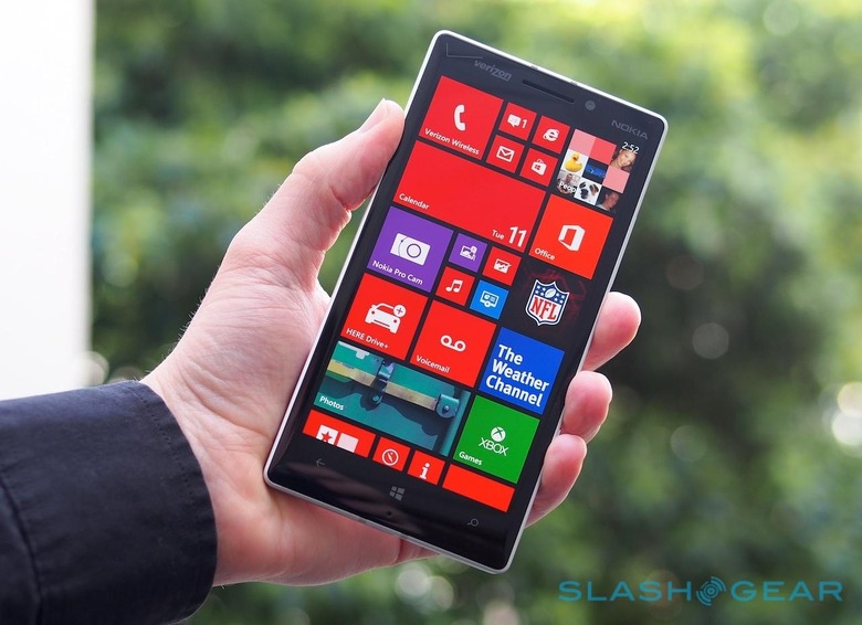
Verizon throws a few apps of its own at the Icon, such as Verizon Tones and VZ Navigator, but happily you can uninstall them. Meanwhile there's the Windows Phone Store which is finally starting to cover many of the must-have apps. Nokia tells us that with the exception of some Google-specific titles, Windows Phone now has the majority of the top twenty titles from iOS and Android, or at least equivalents.
App choice will always be a personal thing – one person will miss Google Hangouts and be unable to get past the fact that it's missing; others won't care in the slightest – but you can't argue with the Lumia Icon's performance. Side by side with the Lumia 1520 it feels just a little faster, though metrics like the near-identical SunSpider results – 548.3ms on the Icon, versus 537.3ms on the 1520 – suggest they're effectively the same.
Day to day, though, the combination of a fast processor and a reasonable – but not vast – display makes the Lumia Icon far more usable than the Lumia 1520. There, the fact that Windows Phone doesn't yet have an onscreen keyboard more suited to bigger displays is less of an issue, while apps whip along on their merry way and images are processed swiftly.
Camera
The processor isn't the only thing the Icon shares with the Lumia 1520: the camera system is the same, too. Nokia's 20-megapixel PureView system may not have the 41-megapixels of the photo-flagship Lumia 1020, nor its Xenon flash (making do with dual-LED instead) but it's still very capable.
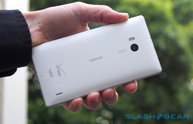
So, there's optical image stabilization, a six-element lens, and a roughly 2x lossless digital zoom, now controlled either by pinch-zooming or, for when you can only spare a single finger, dragging your fingertip up and down the display in either photo or video mode. Stick to the widest view from the f/2.4 Zeiss Optics lens and you'll get Nokia's clever oversampling too, which uses data from proximate pixels to iron out any glitches in the frame.
By default, the Lumia Icon spits out both a full-resolution original image (either 19-megapixels in 4:3 aspect, or 16-megapixels in 16:9) and a roughly 5-megapixel oversampled image. The former means that you can zoom in or out even after you've taken the picture, while the latter is smaller for swifter sharing online. Optionally you can just choose to have one 5-megapixel frame.
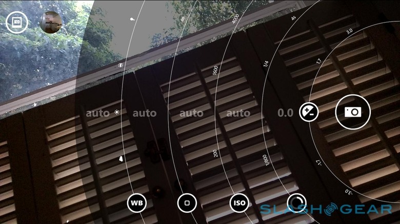
Where the Lumia 1020 had noticeable processing lag after capturing an image, that's been pared back to a second or so of crunching on the Icon. Similarly speedy is Nokia's Pro Camera app, now the default way to take images, which has both an auto mode for casual shooting and a workable manual mode with radial wheels for adjusting white balance, focus, ISO, shutter speed, and contrast.

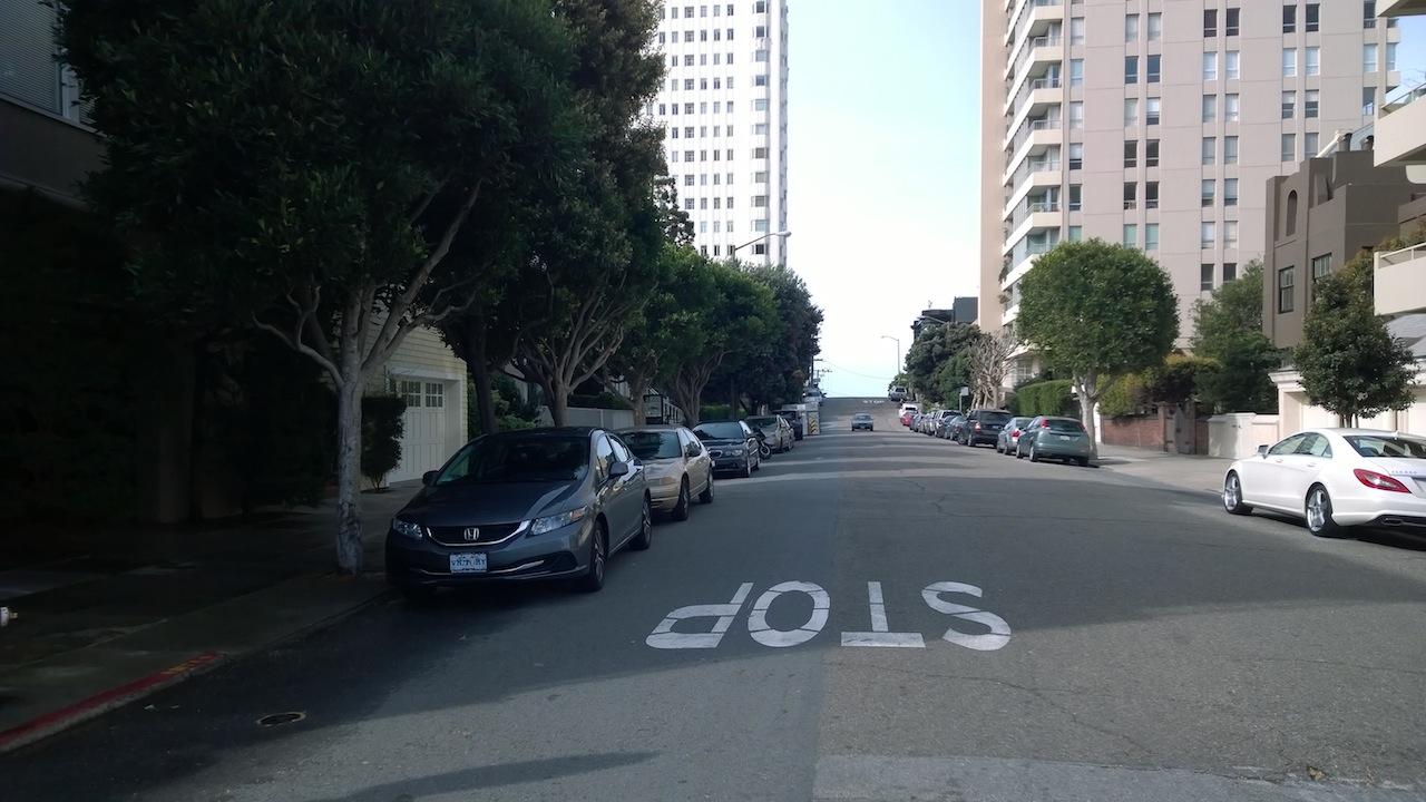
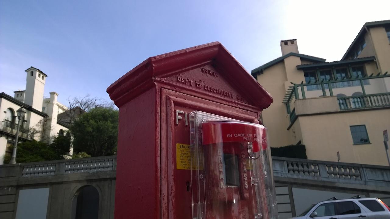
As you'd hope, then, images taken from Verizon's new Nokia come out well. Low-light situations are handled with aplomb, while colors and contrast in daylight scenes are excellent. At times we noticed a little sluggishness with the autofocus, though nothing serious.
Over in video, the Lumia Icon can record in 1080p or 720p, at either 30fps, 25fps, or 24fps, with continuous autofocus and manual control over the white balance and flash. Nokia is arguably more proud of its quartet of microphones, however – two on the front, predominantly used during calls, and two on the rear, used during video recording – which effectively target what the camera is pointing at and cut out noise from behind and to the sides. You also get a selectable bass filter, either off, cutting at 100MHz, or cutting at 200MHz.
Unfortunately we had mixed results with video. Picture quality is great, with accurate colors and balance, but the autofocus has a tendency to get jumpy. That leaves the final video bouncing in and out slightly, which is distracting. Audio performance is much better, with the Icon doing a good job of scything out background sounds.
Phone and Battery
As a phone, we had no problems with a Verizon signal, though we did find the Icon would occasionally drop into 3G where other devices on the same network were getting LTE. Nokia's twin microphone system and DSP did an excellent job of isolating our voice during calls, and we had no complaints from test callers about how clearly they could hear us.
The 2,420 mAh Li-Poly battery is sealed inside the Icon, and non-user-replaceable. Nokia rates it for up to around 16hrs of talk time, though with more typical smartphone use – a combination of push email, some browsing and HERE Maps use, using the camera, streaming through Nokia Music and Spotify, messaging, and some other tasks – we got to the end of the day with a wedge of the battery meter still remaining.
Nokia sensibly equips the Icon with wireless charging as standard, though you'll have to spend extra to actually get the charger itself. In the box you get a regular wired adapter, though since the Icon adheres to the Qi standard any existing charger you might have that uses that will work.
Wrap-Up
You could accuse Nokia and Verizon of tempting fate, hopping off the traditional numbered Lumia naming scheme and giving their new phone an ambitious title like Icon. To do so invites all manner of comparisons, and while Nokia's Icon may be one of its more beautifully crafted phones, little things like over-badging, some glitches in how the camera performs, and the overall bulk mean it's not quite ready for sainthood.
What's iconic to one is unimpressive to another, however, and that's just as true in religion as it is in the near-religious segmentation of iOS fans, Android fans, and Windows Phone fans. For the latter group, the Lumia Icon is to our mind the best option among devices running Microsoft's platform, without the undercapitalized bulk of the 1520 or the performance compromises of the 1020.
Nokia and Windows Phone as a whole need to do more than just convince existing converts, though, and there the Icon faces a bigger challenge. There's a taste among consumers for bigger screens, a box which Nokia has ticked, and we can't question the performance; the camera too is highly capable. Side by side in-store, the initial bulk – albeit very well constructed bulk – could prove a turn-off when compared with other devices.
As with any good icon, then, the Lumia Icon can't simply show up and expect to be worshipped. Nokia will need to make sure the sales staff out in stores are proselytizing its message if it wants what's a great smartphone to get the attention it both needs and deserves.
