Nokia Lumia 925 Review
Nokia is on a roll with Windows Phone 8 – when it comes to filling out its range, anyway. The Finnish company has spent 2013 slotting a Lumia into almost every possible gap in the market, and now has a third flagship-spec model in the shape of the Nokia Lumia 925. The latest to bear PureView branding, and arguably the best-quality handset running Microsoft's platform that we've seen to-date, the Lumia 925 ticks all the boxes on paper, certainly. Is this the smartphone to sign two years of your cellular life away to? Read on for the full review.
Design
Nokia's smartphone design language has evolved nicely since it previewed what would become trademark Lumia polycarbonate style with the MeeGo-powered N9. We've perhaps not seen anything quite so minimalistic in its pillowy plasticness since that – even the first Lumia, the 800, seemed a little fussier than the N9's finish – but Nokia has certainly remained distinctive, opting for bright color options where its rivals go muted, and hand-pleasing organic forms rather than sharp edges.
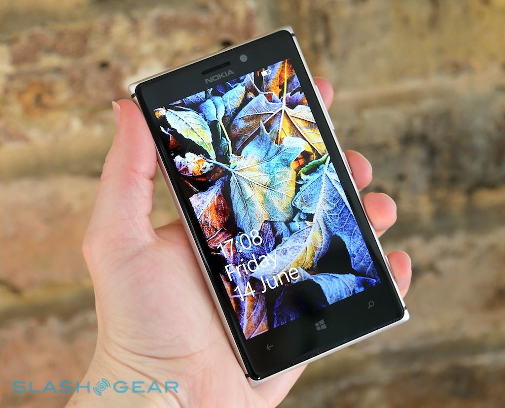
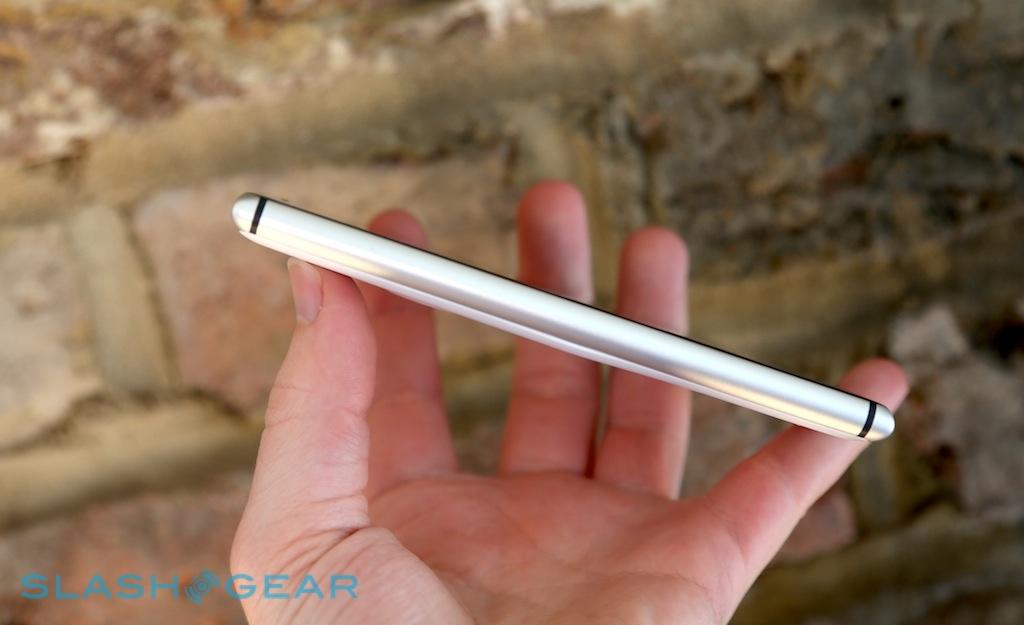
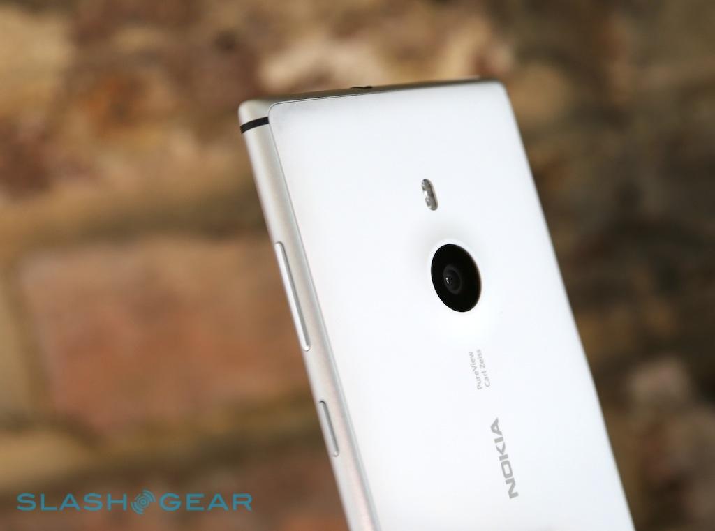
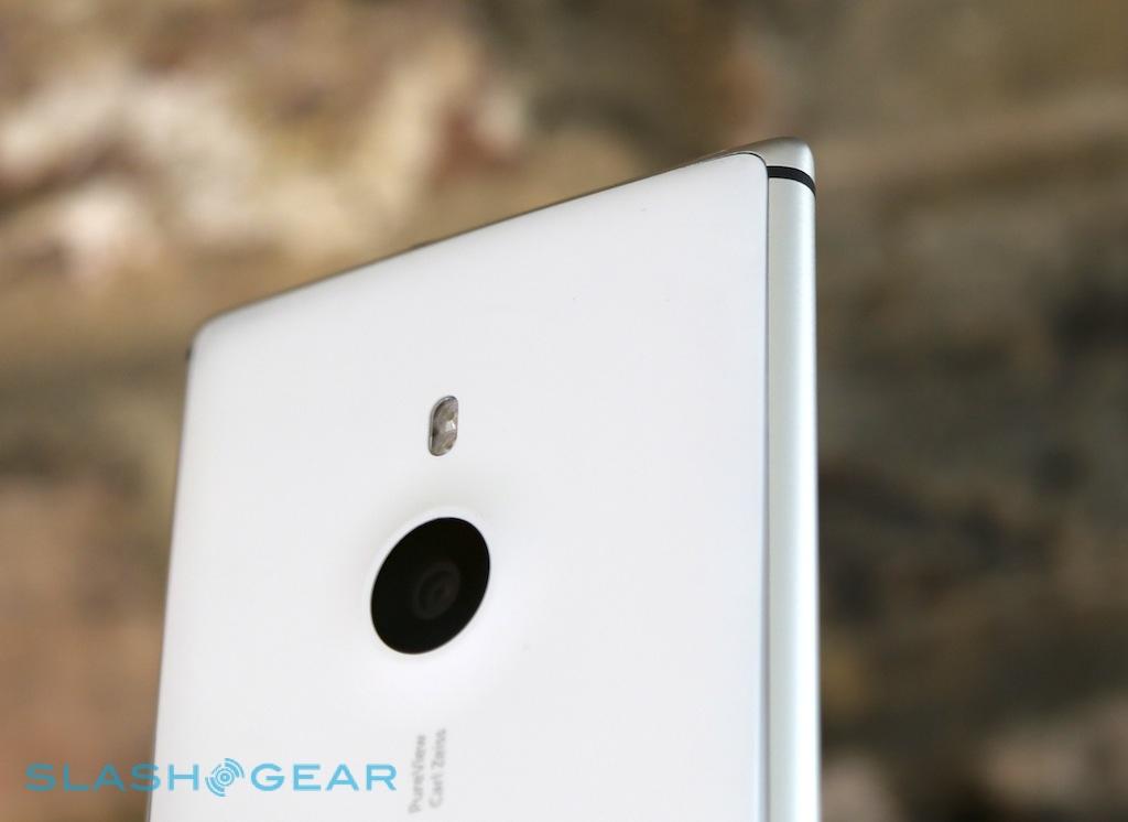
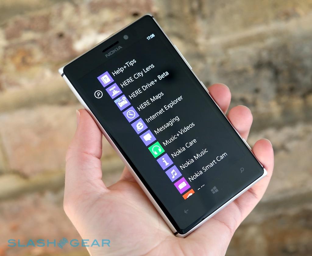
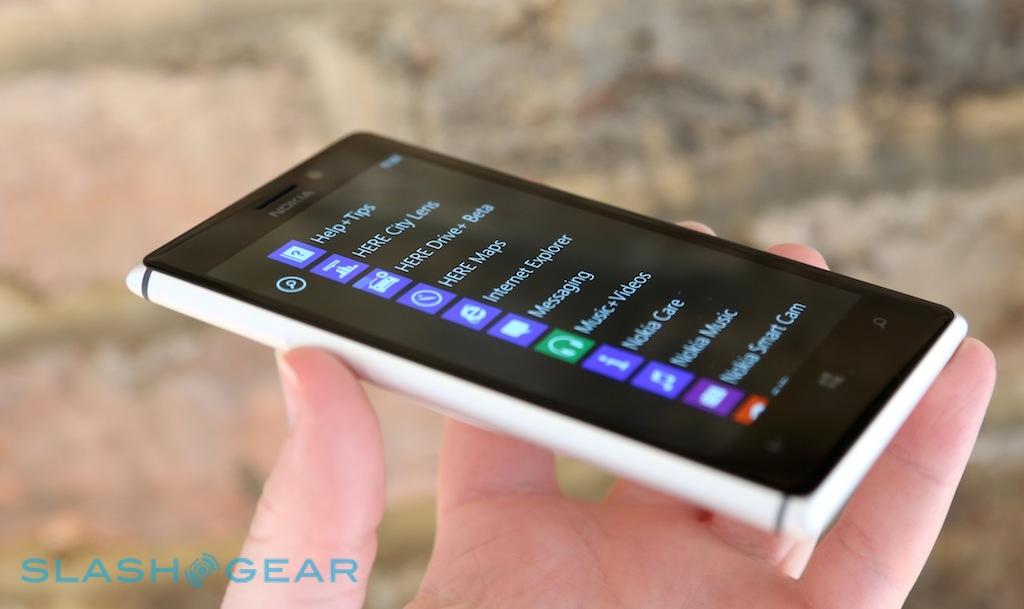
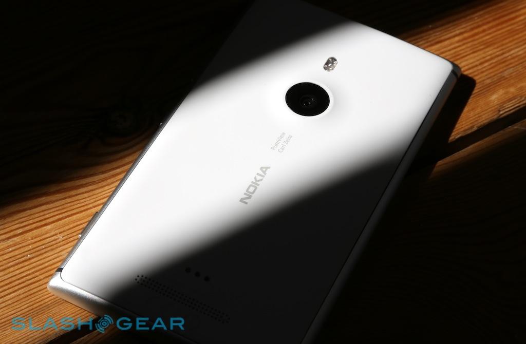
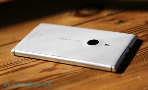
Into that legacy wades the Lumia 925, a variant of the Lumia 920 and Lumia 928 (the latter a Verizon exclusive, and currently only headed to the US) but bringing a new refinement of Nokia's aesthetic. At first glance, the smooth curves of the frame look generally similar to, say, the Lumia 720, but now they're made of metal. Plastic still plays a part, however, with a sheet of polycarbonate inset into the rear panel of the smartphone, complete with a gentle pucker for the PureView camera.
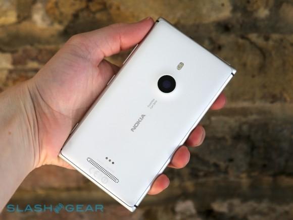
It's already our favorite of Nokia's recent designs, both for its appearance and how it feels in your hand. There's a holistic completeness to how each of the parts fit together: the matte-finish plastic is smooth and creak-free, blending into the soft-touch brushed aluminum of the outer frame. There, like an iPhone, Nokia has used the metal chassis as its antenna, though the company is at pains to point out that it shouldn't have the same radio issues as Apple did originally with the iPhone 4.
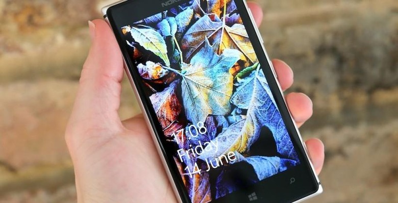
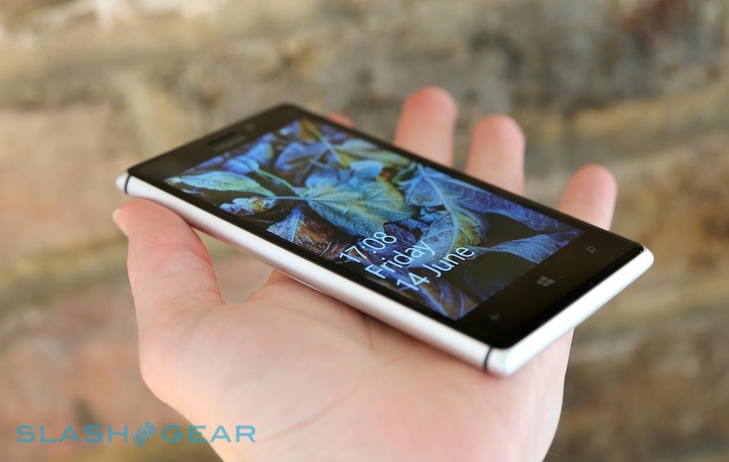
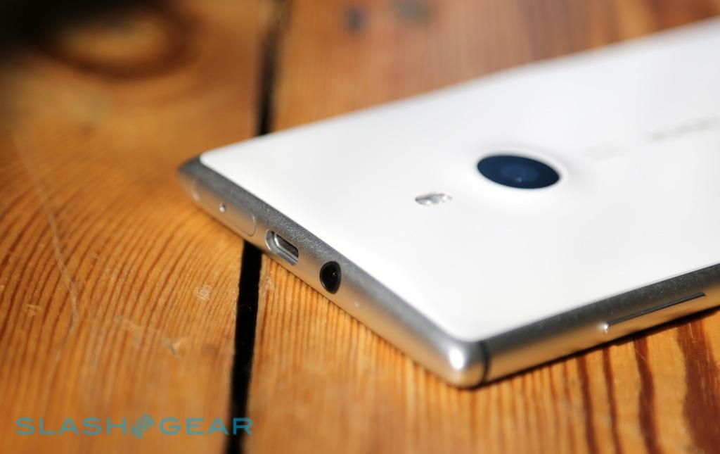
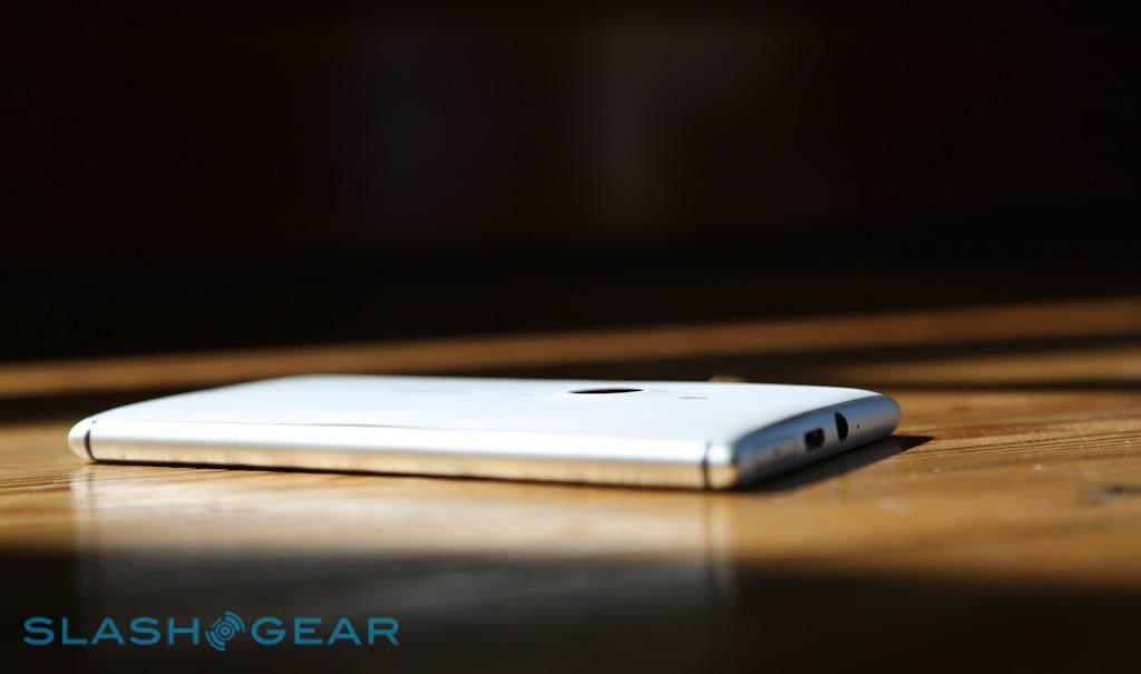
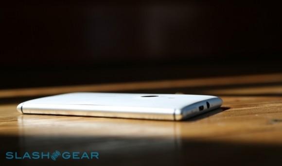
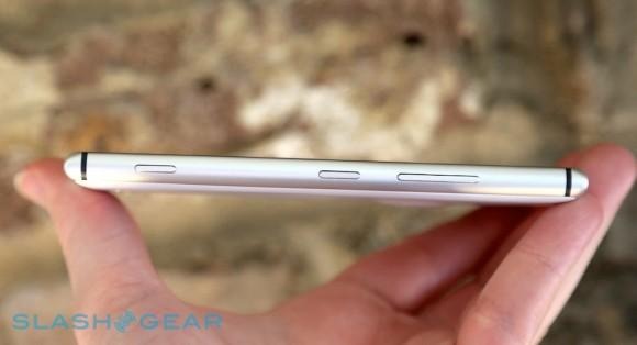
On top, like a meniscus bubble of liquid, is the toughened glass display, unmarked aside from the earpiece notch, Nokia's logo, and the three touch-sensitive buttons under the 4.5-inch screen. The only physical controls run down the right edge, narrow slivers of metal that have good tactile feel, while the top edge has the microSIM tray, a 3.5mm headphone jack, and a microUSB port.
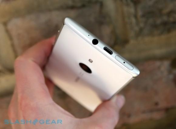
In another departure, Nokia will offer the Lumia 925 in a more subdued range of colors. Gone are the print-primary hues, replaced with either a silver metal paired with white or grey polycarbonate, or an all-black variant with black plastic and a black finish to the aluminum. It's a more reserved look altogether, and though it suits the grown-up design of the 925, we can't help but wish Nokia had also thrown a couple of brighter versions into the mixture too.
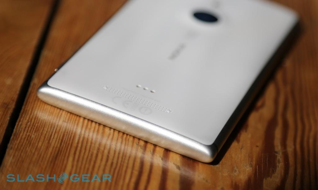
Instead, you can add color using optional clip-on cases – which weren't ready in time for our review – that cling to the corners of the phone and cover the back panel. These don't just protect the Lumia 925, but add wireless charging support, which Nokia (still stinging, perhaps, from criticisms that the Lumia 920 was something of a tank) opted to leave out of the phone natively in the name of keeping bulk down.
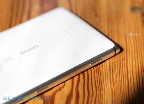
The covers snap on easily, and make contact with a row of three contacts on the lower part of the rear panel, just above the speaker. We can understand Nokia's motivations, but we can't help but think that the company's flip-flop attitude to native wireless charging is a mixed message. What could be a differentiator if, with some consistency, Nokia made it ubiquitous across the line-up – opening the door to marketing taglines like "A Lumia for everyone in the family, and a charger to match" to encourage multi-device households all loyal to Nokia – instead gets confusing.
Still, it's a relatively minor blip on what's overall a well designed handset, which is certainly capable of going up against the current smartphone style champions (in look and feel, at least), the iPhone 5 and HTC One.
Hardware
Nokia has pretty much thrown the works at the Lumia 925, butting up against the limits of Microsoft's Windows Phone maximum specification in the process. Inside, it's broadly the same as the Lumia 920 before it, so you get a Qualcomm Snapdragon S4 dualcore processor running at 1.5GHz, paired with 1GB of RAM and up to 32GB of internal storage. Like the 920, there's also no microSD slot, so you can't extend that onboard capacity with more local memory; instead, Nokia and Microsoft hope you'll use SkyDrive, 7GB of space of which comes with the phone.
Connectivity covers everything from pentaband LTE and quadband HSDPA (up to 100Mbps and 42.2Mbps downloads, respectively, network-depending), through GSM/EDGE, WiFi a/b/g/n, and Bluetooth 3.0. There's also NFC, A-GPS, A-GLONASS, and a digital compass. The main camera packs an 8.7-megapixel sensor with autofocus, a special Carl Zeiss lens (more on which later), and an LED flash. Above the display there's a 1.2-megapixel camera for Skype video calls.
The display itself bears some examination, switching from the LCD of the Lumia 920 to the same luscious AMOLED of the Lumia 928. It's running at the maximum resolution that Windows Phone currently supports, 1280 x 768, and bears some branding hyperbole in the shape of "PureMotion HD+ ClearBlack". We're inclined to forgive Nokia the marketing-speak, however, given the overall quality of the panel.

Colors are beautifully vivid, viewing angles so broad as to edge on the pointless (Do you ever use your phone 177-degrees from straight-on? If so, the Lumia 925 is the device for you), and ink-rich blacks that we've come to associate with OLED-based panels. A slice of Gorilla Glass 2 keeps things safe from bumps and grazes, and there's extra sensitivity so that you can use the Lumia 925 even if you're wearing gloves.
Software
Windows Phone remains the great divider, now – by the measurements of most – the "third ecosystem" Microsoft hoped to make it, but still yet to convince many of its superiority against iOS and Android. Nokia does its level best to weight things on the side of the platform it has controversially staked its future on, and indeed there's a sense that most of what's unique or notable about the Lumia 925's software is there because Nokia did it, not Microsoft.
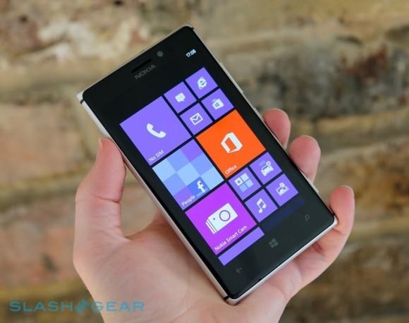
The core platform, Windows Phone 8, is what we've seen on devices over the past six months or more. It remains one of the most straightforward and easily-understood of the smartphone OSes, with its distinctive Live Tile homescreen a readily learnt premise for new users, while still offering a surprisingly broad degree of customization for power users. Updates flood the tiles with animations and lead you into Microsoft's various hubs, for Office, Xbox gaming, "People" for your aggregated Facebook and Twitter friends, and more.
In with that, Nokia injects its own handiwork: a suite of apps and tweaks that set its Lumia line-up apart from other Windows Phone OEMs. It's a more tempered approach than, say, Samsung's TouchWiz modifications to Android, additive rather than replacing everything with a new skin.

Of most use is probably the HERE mapping suite, which is beginning to spread out to Windows Phone in general thanks to Nokia's agreement with Microsoft. You get the best of it, first, on a Lumia however: HERE Maps, HERE Drive+, and HERE City Lens. HERE Maps is the core mapping software, offering regular and satellite views, public transport and traffic information, and offline maps which is particularly useful when abroad and looking to avoid roaming charges.
HERE Drive+, meanwhile, redresses Maps for turn-by-turn navigation purposes, again with offline map support, a choice of voices, points-of-interest, 3D landmarks, and more. It gets a more car-friendly UI, too, with oversized icons and buttons; Nokia also offers a new in-car cradle, which also works as a wireless charger dock if you have the right cover for your Lumia 925.
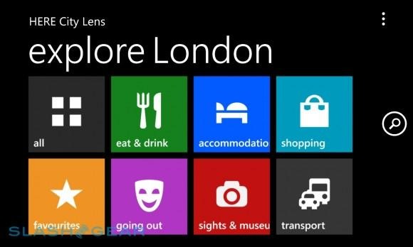
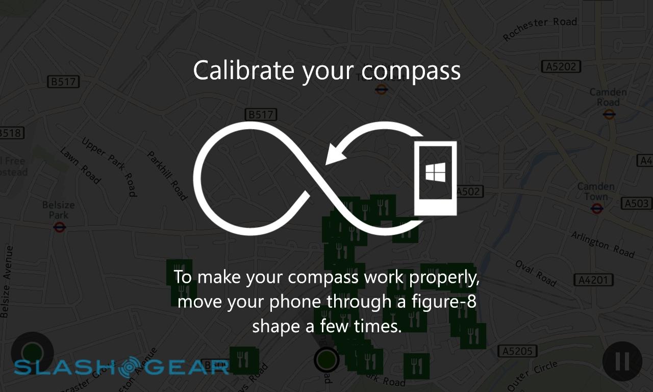
Finally, there's HERE City Lens, which is Nokia's stab at augmented reality. The concept is one of discovery: you can choose from a category, such as "eat & drink", "shopping", or "transport", or show all of the potential attractions, and by holding the Lumia 925 up see their location float over a view of the real world from the camera. Tapping an individual record brings up its address, physical distance away and an option to get directions, and the ability to share it or see more information.
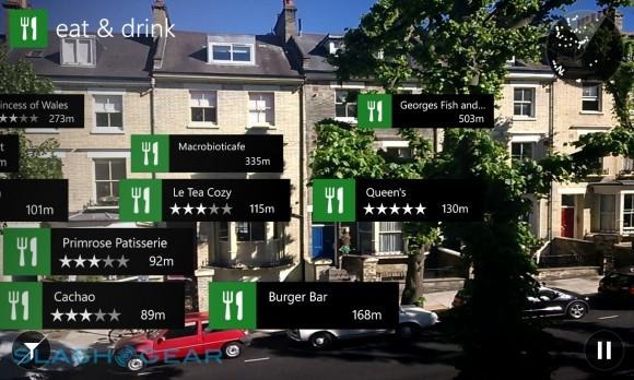
It's a little gimmicky, perhaps, but it works and can be easier than trying to translate a 2D map on-screen with how to get to, say, a train station in an unfamiliar city. What we'd love to see is integration with the People hub, pulling in not only businesses and transport options, but the physical locations of your nearby friends, but so far that's not supported.
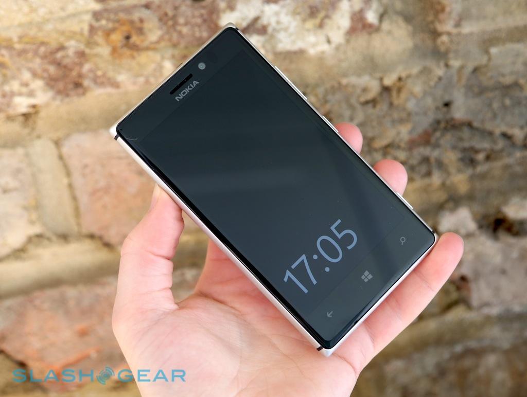
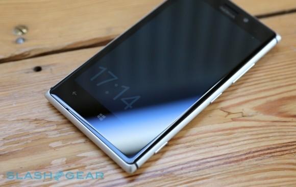
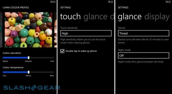
New to Lumia with the 925 is Nokia Glance Screen, currently in beta but eventually expected to reach all of the company's devices. This simply puts a clock on the display when your'e not using the phone, similar to the much-appreciated feature on the N9, and takes advantage of AMOLED's power-sipping frugality to avoid draining the battery in the process. You can set the clock to stay on-screen permanently or to disappear after 15 minutes, as well as switch into a more nightstand-friendly red between certain hours, while double-tapping the display takes you straight to the lock screen.
It's not the only display tweak, either. Nokia has added more granular control over color saturation and temperature, following complaints about the default settings on earlier phones. A set of photos show you exactly what difference you're making as you adjust the two sliders. It's not something most people will adjust more than once, but it's a welcome addition to the settings, as is control over touchscreen sensitivity and whether the screen kicks into extra-bright mode when outdoors.
The other big draw is Nokia Music, the company's free media service. Exclusive to Lumia, it offers multiple radio stations of streaming content curated by local teams of music experts Nokia has spread around the world. Pick a Mix Radio theme – such as "The best of 2012" – and it begins streaming instantly, with no subscription or sign-up required. It's also possible to download a number of Mix Radio playlists for offline playback, and you can pin your favorites as Live Tiles to the homescreen.
If the presets aren't to your taste, you can create a custom mix, spawned from up to three artists of your choice. They, too, can be downloaded for offline playback. Stump up the monthly subscription fee for Nokia Music+ – currently £3.99 in the UK, for instance – and you get unlimited track-skipping, better quality streaming, lyrics support, and unlimited offline playlists. It also unlocks access to an HTML5 version of Nokia Music, which means you can access it from any browser, such as on your desktop.
Camera
To say Nokia is proud of the Lumia 925's camera is an understatement. The company has rolled out its PureView branding once more, and built on the well-esteemed features of the Lumia 920 with a few extra modifications to deliver better shots.
At its core, the Lumia 925 uses the same 1/3-inch 8.7-megapixel CMOS as the Lumia 920, complete with optical image stabilization and support for up to 1080p Full HD video recording. However, the Carl Zeiss-made f/2.0 lens has been updated for the newer phone, now consisting of a six-segment assembly versus the five more commonly found on phone cameras. That extra piece – glass, rather than the plastic of the rest of the lens – adds sharpness and improves low-light performance, Nokia claims.

Along with the new camera assembly comes a new app, Nokia Smart Camera. Again, like Glance Screen it will eventually roll out to Nokia's entire Windows Phone 8 line-up, but for the moment it's exclusive to the Lumia 925.
Smart Camera is an entirely separate app to the regular camera software, and takes a more interactive approach to photography. Rather than capture one shot, it snaps ten over the course of a couple of seconds – albeit at only 5-megapixel resolution apiece – and then offers a range of editing and manipulation features based on that cluster of stills.
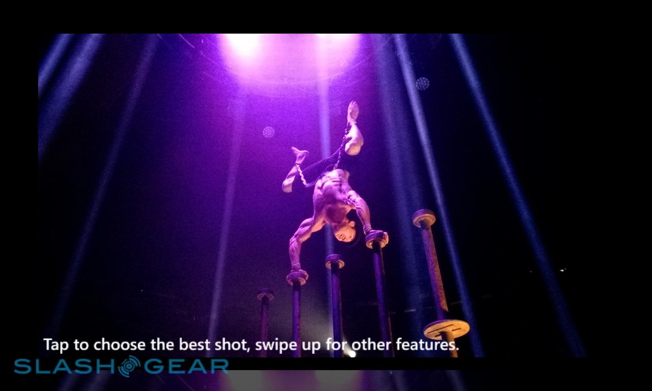
Most straightforward is Best Shot, which automatically picks what it deems the most polished of the ten (based on things like faces in-frame and absence of blur) though allows you to override that with your own pick if you prefer. Face Finder automatically picks out the faces in the shot and lets you combine different expressions from different stills, so that you can piece together one where everybody is smiling and has their eyes open. Object Removal does a similar thing for rogue objects in-frame, letting you cut out passing cars for instance, or pedestrians walking across the scene.

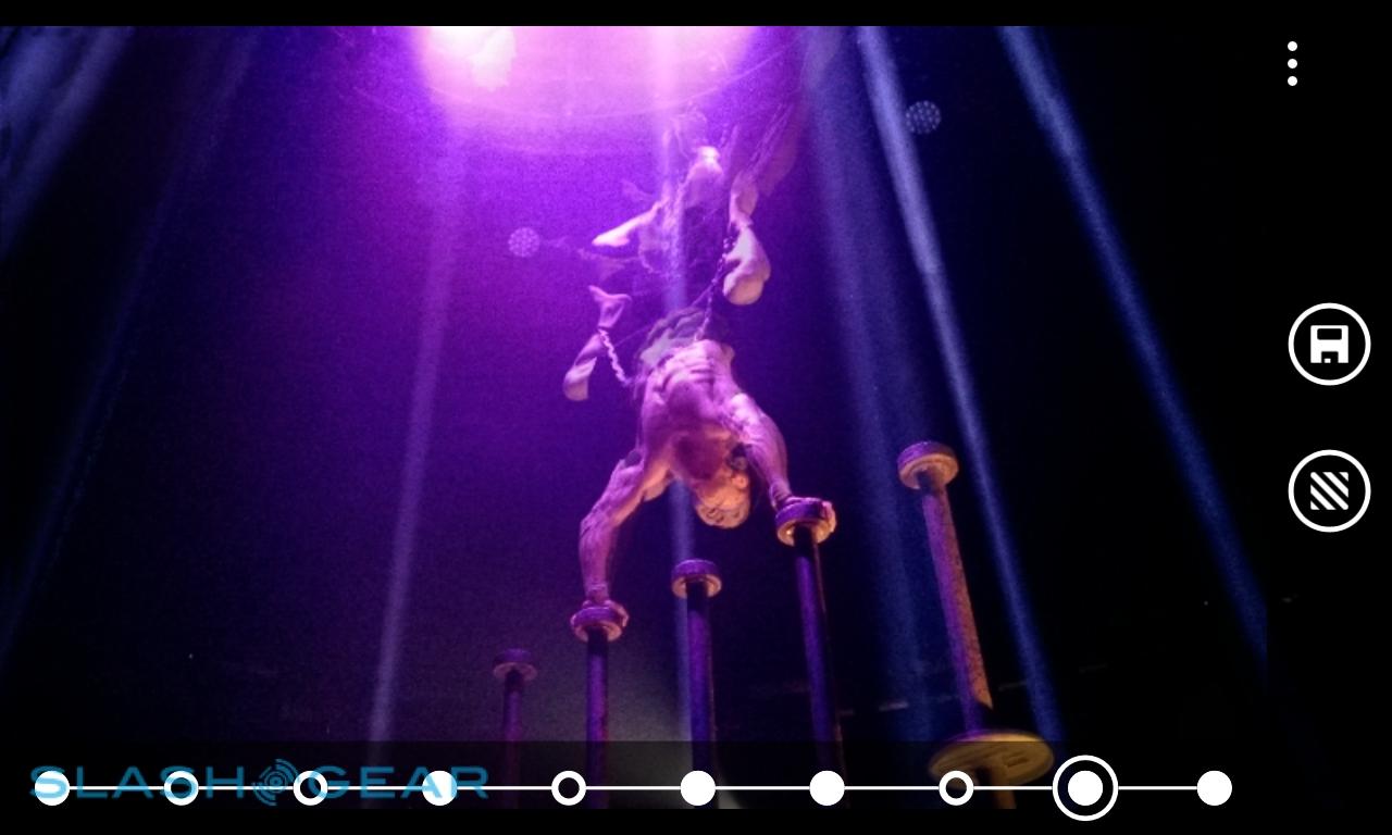
Action Shot is probably the one Nokia is most excited by, though. Like its Cinemagraph animated GIF-maker, it's intended to add some drama to stills, in this case by layering in different views of moving objects. Nokia generally demonstrates it with a skateboarder crossing the frame, with Action Shot used to include ghostly echoes of his jump; a row of buttons across the bottom of the display, one for each of the ten shots, lets you toggle their visibility, while holding your finger down and sliding it across the buttons allows you to pick a primary frame, made fully visible while the rest are faded.

As you might expect, it works, but not every time. Sometimes it's the face recognition at fault, not picking out people, and sometimes the phone struggles to differentiate between subjects and backgrounds. Other times, movement isn't recognized at all – one of our sample images, with an impressive mushroom cloud of flames from the mouth of LIMBO circus' fire swallower Heather Holliday, was deemed to be completely free of movement whatsoever by Smart Camera, which also decided the Best Shot of that particular bunch was one in which the frame was almost entirely dark.
In short, there's a lot of complicated processing going on, and the Lumia 925 not only doesn't always get that right, it also takes it a while to do it. There's a wait involved when you open up a Smart Camera shot, as well as when it processes each different effect, and since there's apparently no caching of that processing you have to sit through it each time. You can't even see each of the ten frames without the Best Shot analysis being completed first, which means if you've got several similar Smart Camera images it can be a chore trying to find which has the best constituent parts so that you can get down to editing.
Nokia Smart Camera samples:
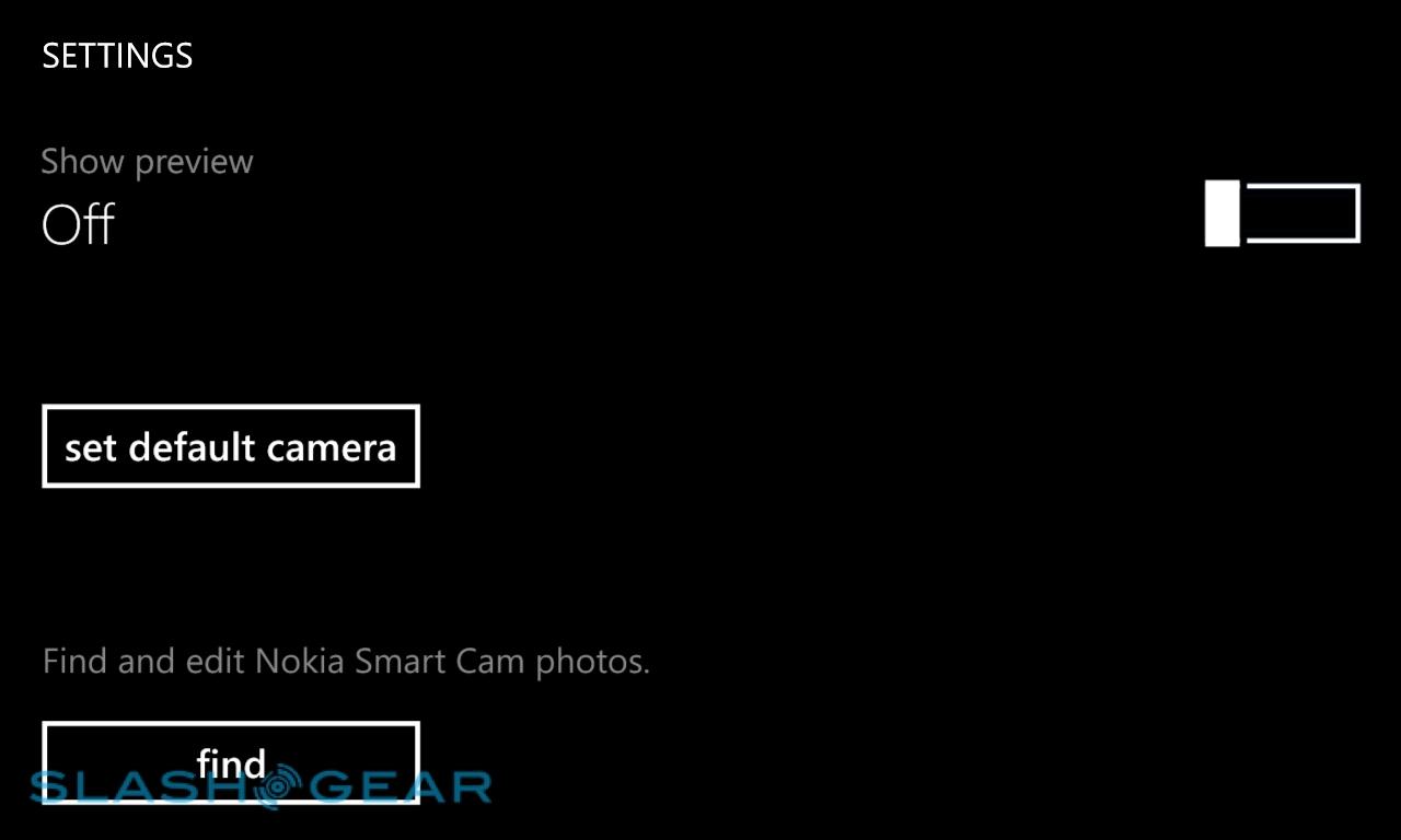
Our complaints don't end there, though. You can set Smart Camera to be the default camera app, loading in preference to the native app when you press the two-stage camera key, but there's no way to start video recording from it. In fact, there's no way to turn off the 10-shot feature at all – it's ten stills or nothing each time – and so if you want to take a full resolution image or some video, you need to jump out and into the regular camera app, or vice-versa if you're in the regular app and want the Smart Camera burst mode. All too often we found we'd missed the moment by the time we got the right app loaded; we prefer HTC's approach with its similar Zoe system on the One, where there's a single camera app and a toggle to quickly turn burst mode on or off.
Nokia also takes a different approach from HTC with how burst shots are handled. Perhaps mindful of complaints some had – ourselves included – about how the One quickly became full of near-identical Zoe burst images, Nokia instead condenses the Smart Camera data for all ten frames into a single image. Viewed normally, or transferred off the Lumia 925 and onto your computer or another device, and you see a single frame; it's only when you open it in the Smart Camera app on the phone that you can access the other nine.

That keeps photo size down – a single 5-megapixel Smart Camera image is roughly the size of an 8.7-megapixel regular shot from the Lumia 925 – which is good considering the absence of expandable storage, but it limits you in other ways. Since there's no way to browse the other frames on anything other than the phone, you need to make sure you've picked your favorite before you offload: otherwise, you get just the first frame of the ten. That means going through the extended Best Shot processing with each still. We'd love to see Nokia offer a web-based viewer, or perhaps a native Windows/Mac app, which could unlock the Smart Camera data and take advantage of faster processing speeds.
We got some good novelty stills with Smart Camera, but the best regular photos with the normal camera app. The difference between the Lumia 925's camera and that of the Lumia 920 is minimal – there's perhaps a little sharper focus at time, and a little more detail in some images, but it's not something we'd say was worth upgrading for if you're already a 920 owner – but since the older phone was already such a great performer, that's not really a bad thing.
As before, the PureView system does particularly well in low-light conditions, grabbing visible shots where other phones struggle to produce more than murkiness. We noticed more grain in Smart Camera low-light images than in stills from the regular camera, however, which is worth bearing in mind when you're picking the right app to suit the scene. Macro performance is also good, with the 8cm minimum focus distance letting you get up close to subjects, and the results looking crisp and clear. In general, the Lumia 925 produces accurate colors and great contrast.
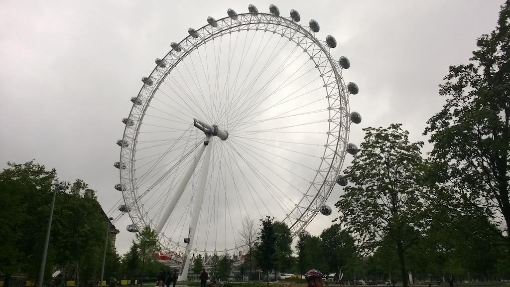
Nokia Lumia 925 camera samples:
Video, meanwhile, also holds up to scrutiny. We actually prefer the quality of the 720p HD sample, in this case of acrobat Danik Abishev, which shows the Lumia 925's excellent grip on light levels in what was a tough mixture of extreme light and dark. The 1080p HD daytime scene is solid, though looks a little over-saturated at times. Audio performance is strong, though there's noticeable wind-noise in the daytime clip, despite it not being especially windy on the day itself.
Lumia 925 720p HD sample:
Lumia 925 1080p HD sample:
Phone and Battery
Despite Nokia's assurances, we were left wondering whether the the new antenna design would leave the Lumia 925 at a disadvantage when it came to call and data performance. Happily any concerns were unfounded, as the smartphone had no issues clinging to a connection. We experienced no dropped calls, and in-call audio was glitch-free on both ends.
Nokia fits the Lumia 925 with a 2,000 mAh non-user-accessible battery, rated for up to 440 hours of 3G standby or up to 12.8 hours of 3G talk time. Alternatively, the phone will browser over a cellular data connection for 6 hours, Nokia claims, over WiFi for 7.2 hours, or play music – with the screen off – for 55 hours.
In practice, like all modern smartphones, the Lumia 925 is wildly dependent on what you're doing with it. We got a full day of use with push email turned on, a couple of brief calls, some messaging, a little photography and HERE Maps use, and playing a short Nokia Music Mix Radio. Stream more music, however, or make significantly more use of the Smart Camera app and its companion processing, and the battery gage drops more rapidly.
We wish Nokia had included the wireless charging kit in the box, but the company argues that piecing together separate kits for every color combination would be technically unfeasible. Some carriers may bundle them together, but that'll be dependent on individual network promotions.
Wrap-Up
It's clear from the off: the Nokia Lumia 925 is the best model in Nokia's range, and the best Windows Phone 8 device today. The design may have lost some of the colorful whimsy of its Lumia 920 cousin, but it has gained even better build quality, premium hand-feel, and handsome looks. The display is superb, performance the best we've seen with Microsoft's platform, and the bundle of apps and services Nokia throws in continues to make for excellent value.
The camera is the primary draw, though, and it's ironically both the most satisfying and the most frustrating part of the Lumia 925 experience. Low-light performance remains a stand-out feature, and though we wouldn't say the sixth lens element adds enough to coax 920 users to upgrade, Nokia's proven photography talents mean Lumia must be on the shortlist if mobile photography is your goal. Smart Camera shows potential but still feels somewhat half-baked; luckily, outstanding normal images salve any lasting annoyances by the more novelty side of things.
Windows Phone is slowly bedding in, and while it still lacks apps – and the level of developer commitment that iOS and Android can claim – the situation is improving. In a similar way, Nokia has found its feet in crafting solid, appealing devices. The Lumia 925 marks a turning point, then, and while it may not be perfect, it's the most compelling phone in Nokia's range, and a more than capable handset in its own right.
