Nokia Frame Concept Pushes AR UI [Video]
Concept cellphones are ten a penny, but it's always interesting to look back at what was considered "futuristic" a few years ago and compare it to the state of the market today. Recombu dug up a 2008 concept project by Daniel Kwast, Vicky Müller and Carl Dahren called Nokia Frame; spurred on by the Finnish company themselves, the device the trio envisaged pairs augmented reality with a refreshingly minimalist UI.Video demo after the cut
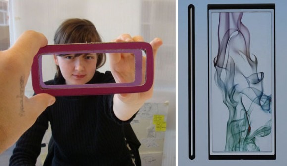
Rather than attempt to overlay the real world with huge amounts of data, the Frame concept uses augmented reality to improve navigation and control. The camera on the rear of the handset shows a live view of the surface it's held over, and tracks your hand as it calls up various menus and pages through information.
It's tricky to explain but looks mighty intuitive in practice; check it out in the video demo below. The whole thing is reminiscent of the Nokia Vision of 2015 video demo from back in November 2009: a UI that's useful rather than overwhelming.
[via Recombu]
