Nokia 5800 XpressMusic 'Tube' Review
Nokia's first touchscreen handset, the Nokia 5800 XpressMusic, has finally found its way to our doorstep, and we've been playing with it for a week or so now. That's plenty of time to play around with all the available features, and a lot of our holiday shopping time went into this device. Codenamed the "Tube", this handset brings a touchscreen element that Nokia has not really taken part in before. Being a mid-grade phone that is not aimed directly at Apple's iPhone, how does it stack up?
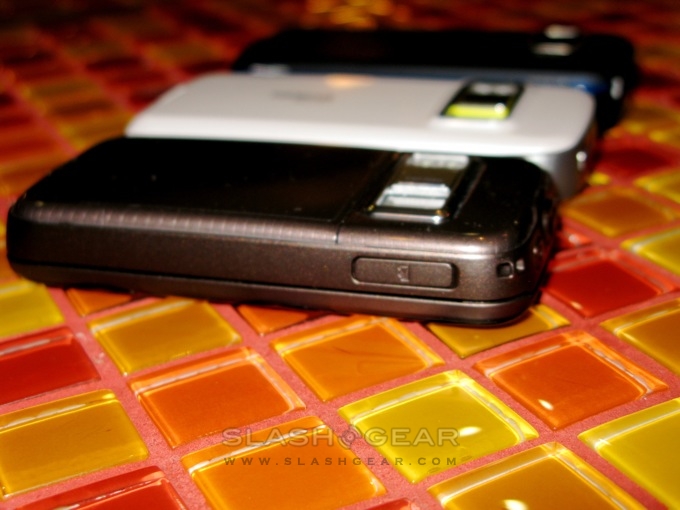
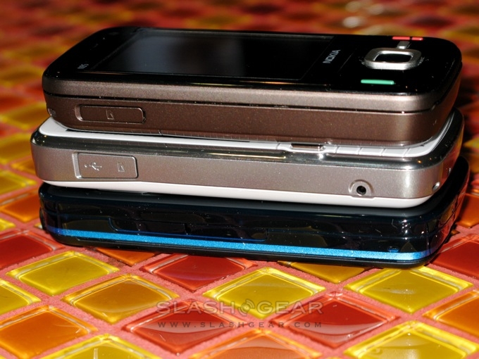
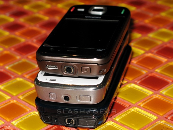
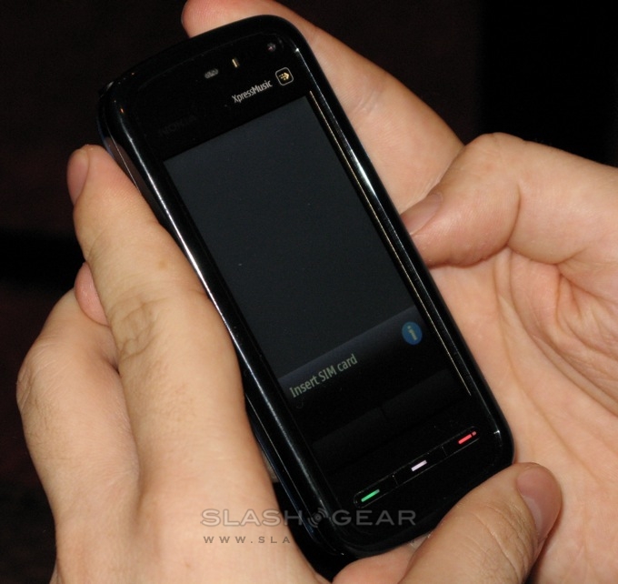
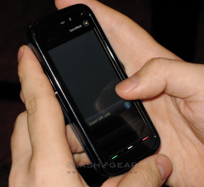
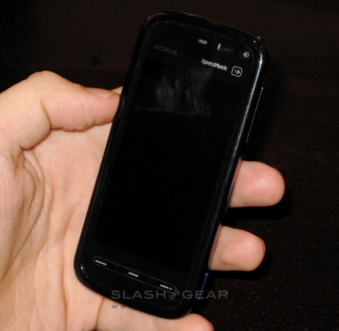
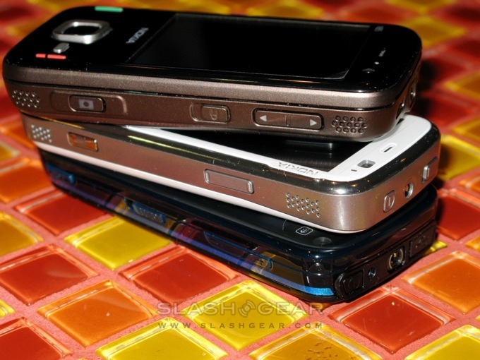
The device has a call, menu and end button on the face as well as a media button just above the touchscreen. As with many Nokia handsets there is a forward facing camera that is not of the best quality. On the left side of the device you will find the SIM card and microSD card slots under two protective flaps. The top is crammed with the USB, 3.5mm headphone jack, power supply port and power button. Along the right hand side, from the top down, there are the volume keys, a key guard/hold switch and dedicated camera key. The built-in speakers are a bit hard to find as they are hidden in the groove on the side of the handset. While not the best we have heard, they are nonetheless clear enough to hear what someone is saying or listening to your favorite track.
In the box there are earphones, earphone covers, a headphone extension cable with music and volume controls, a USB data cable for syncing your information and media transfers and an AV TV-out cable. Nokia also include an odd case that covers the front and back of the device, as well as a few charms intended to dangle from the lanyard. The guitar pick charm is the same as we have all seen in the past; more interesting is the cradle charm that allows you to set your phone on a table to view your favorite videos. You don't see such an item as a charm very often.
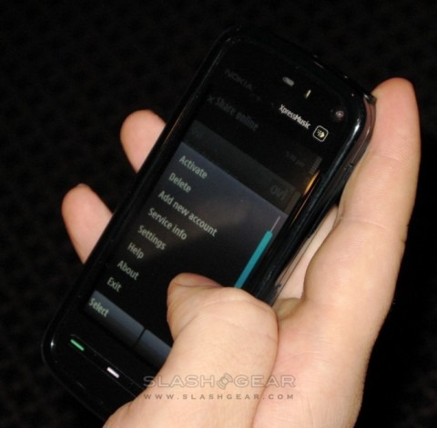
The Nokia 5800 XpressMusic has a resistive 640 x 360 touchscreen that Nokia claims was chosen to appeal to the world market; this is more than likely for Asian markets who prefer handwriting recognition to onscreen keyboards. There is a stylus included with the handset that is seemingly only used for the handwriting recognition, as everything else works very well with the touch your fingers. The included guitar pick works exceptionally well in place of the stylus if you can handle having it dangling from your phone. The screen does require you to press harder with the tips of your fingers rather than the flats of your thumb.
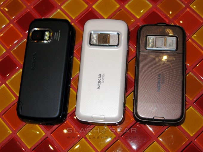
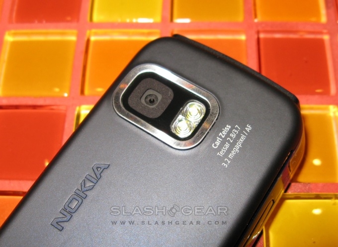
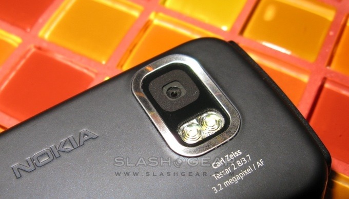
Unlike the N95, the camera is only 3.2-megapixels with a dual LED flash to help with taking pictures in the dark. Pictures in the daylight are about as good as you would expect from any 3.2-megapixel camera. Colors are a little washed-out at times but generally were bright. Taking pictures indoors however is another story; if the room is well lit the pictures turn out pretty good. For rooms without much lighting, though, the flash does not seem to help. To be fair, this seems to be the case among just about every phone. Overall the camera is pretty good for taking pictures while on the go.
The device overall feels very solid, however we just do not like how thick the 5800 XpressMusic is. The edging around the screen does protect from scratches a lot better than a recessed screen, but gives the handset more of a boat feel to it. You can't go a day without having a bunch of lint gathering in the corners of the screen. The side keys are all made of a dark red or blue plastic (whichever color your device is) which colors can be seen in the sunlight. The handset does not fit into your jeans pocket as well as many other single piece phones do, but the overall size makes reaching for anything with one hand fairly easy. The designated keyguard switch on the side is a godsend for quickly putting the device into standby mode.
Symbian S60 has been changed a little to better fit the touch of a finger, but surprisingly enough there have been no big changes made. Any Symbian user will be able to pick this handset up and navigate without any trouble at all. As said before, the changes cater more to fingers than the included stylus; in fact the only time we found ourselves pulling it out was for handwriting recognition input. Thumbing around the menus though is not always as easy as you may expect. Too often we found ourselves double tapping when we should not have and vice-versa. Scrolling, too, is not what you might think; the scroll bar must be used in just about every menu you go through. The ability to flick a menu to scroll to the bottom is not present in this version of S60. While this is not the way we would prefer it, it's certainly functional enough.
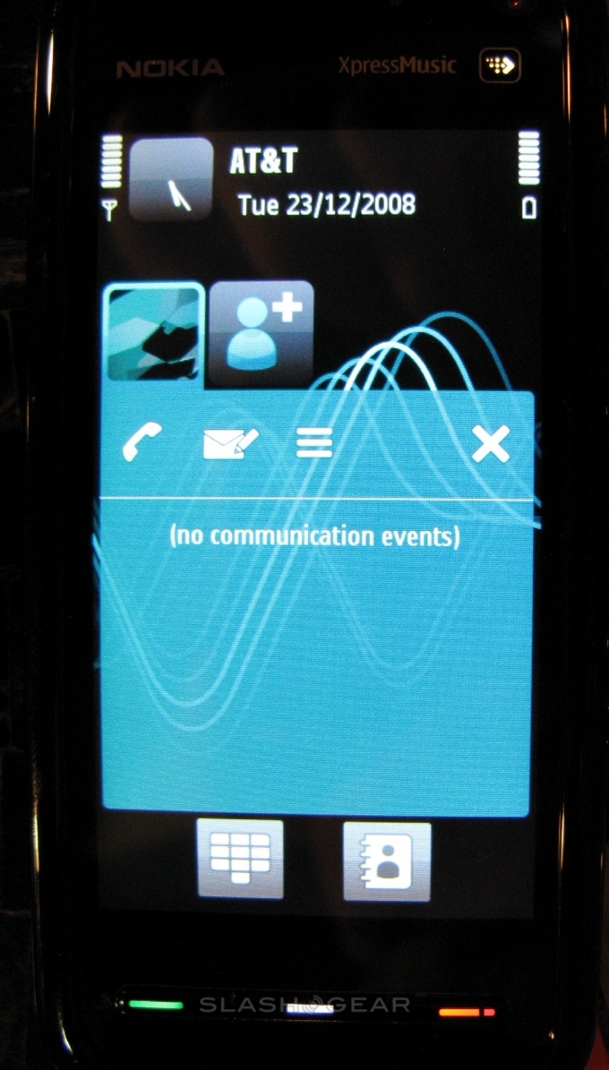
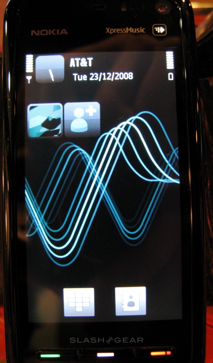
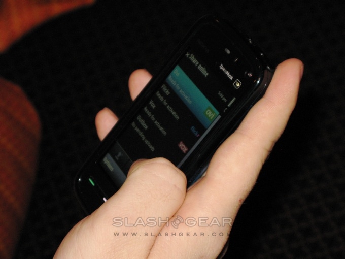
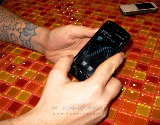
There is a very interesting touch-sensitive media button just above the touchscreen that allows access to music, movies, photos, the browser and sharing. There is also a widget feature that allows you to place contact card icons on the home screen for one-touch info about that contact such as recent calls, messages and even related RSS feeds. With this feature you can compose a text message in as little as two clicks. Alternatively, you can choose the more traditional S60 home screen that Symbian users are more used to.
The accelerometer is very responsive and quick. Tilting the device in either direction triggered an immediate screen flip with a very smooth transaction. The touchable browser was not quite the experience we had hoped it would be, though. Scrolling and zooming is just not fluid as it should be. Zooming is choppy and only moves from level to level rather than being able to zoom smoothly in-between levels. Scrolling down the page is more directly related to how long you drag, you can flick the page and expect it to continue scrolling. This may be updated and fixed in a later update.
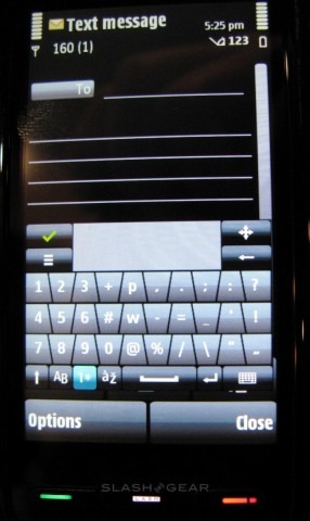
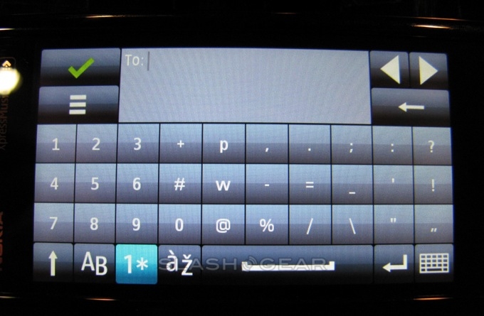
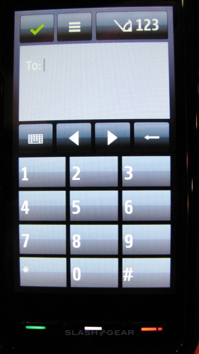
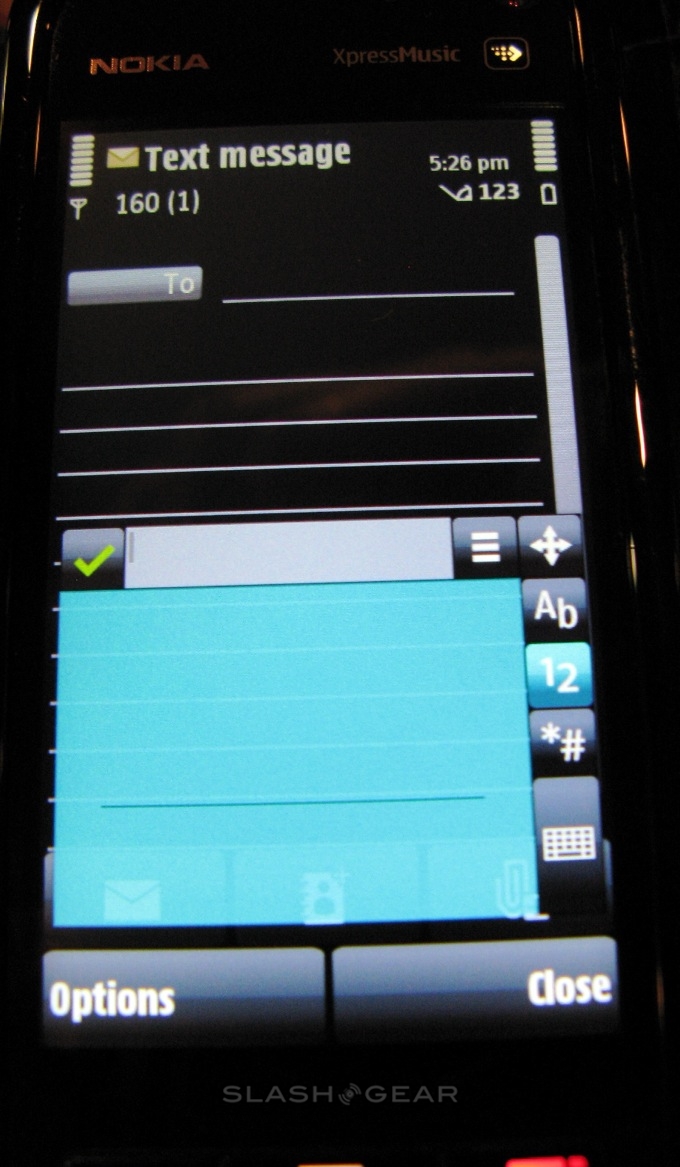
When composing a text message there are a wealth of text input methods to choose from. You can choose to use the full screen QWERTY keyboard, mini QWERTY keyboard, alpha numeric keypad or, my favorite, handwriting recognition. For the latter you can use the included stylus or the guitar pick charm. Handwriting recognition is extremely intuitive on the 5800 XpressMusic. Just write out the letters as you would on a page using a forward swipe for space and a backwards swipe to backspace. Typing on the QWERTY keyboard is not the most enjoyable experience, but it is not a pain in the neck. You must use the tips of your fingers rather than the pad, which may be a little bit of a hassle if you're trying to type one-handed. For those of you who still rock the T9 method the alphanumeric keypad works really well in portrait orientation.
It is clear that this device was not meant to impress users the way that, say, the Nokia N95 has for so long. The Nokia 5800 XpressMusic is a very well rounded feature phone that gives well working basic phone functions. Nokia did not leave out the multimedia goodies that we have come to expect out of their handsets, and video and music quality are every bit as good as you would expect them to be. Nonetheless, Nokia didn't aim as high as we expected with this handset, it is clear that this phone was not meant to compete directly with the iPhone.
For the price, the 5800 Xpress Music is well worth the €279 unlocked that you would pay for it. We recommend this phone to the non-power users who want a nice touchscreen but do not expect a powerhouse. This phone is certainly a fun device, but falls short of exceeding expectations. Those of us in the US can expect this in device to hit next year, more than likely in the first half of 2009. With no branding in the recent FCC photos it looks like this could be an unlocked US release.
