Nexus S Review
Google shook up the Android world with the Nexus One, throwing down the gauntlet to manufacturers to step up their hardware game and pushing the open-source platform to the bleeding edge of smartphone functionality. Now the search giant is back with its second self-branded device, the Nexus S, a Samsung-made handset with a few unique features of its own. Is this the best Android smartphone today, or just another Galaxy S sibling? Check out the full SlashGear review after the cut.
Hardware
With the Nexus S, Google shifted its allegiance from HTC – who produced the Nexus One – to Samsung. It's perhaps a timely move, too, echoing Samsung's recent announcement that the company's phones have seized the top sales spot in the US Android marketplace. That's primarily down to the success of the Galaxy S family of devices, a range with which the Nexus S shares significant overlap.
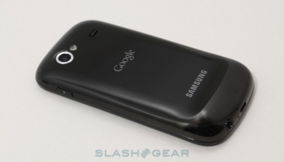
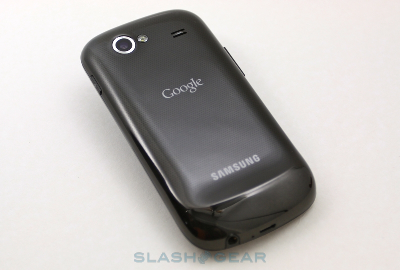
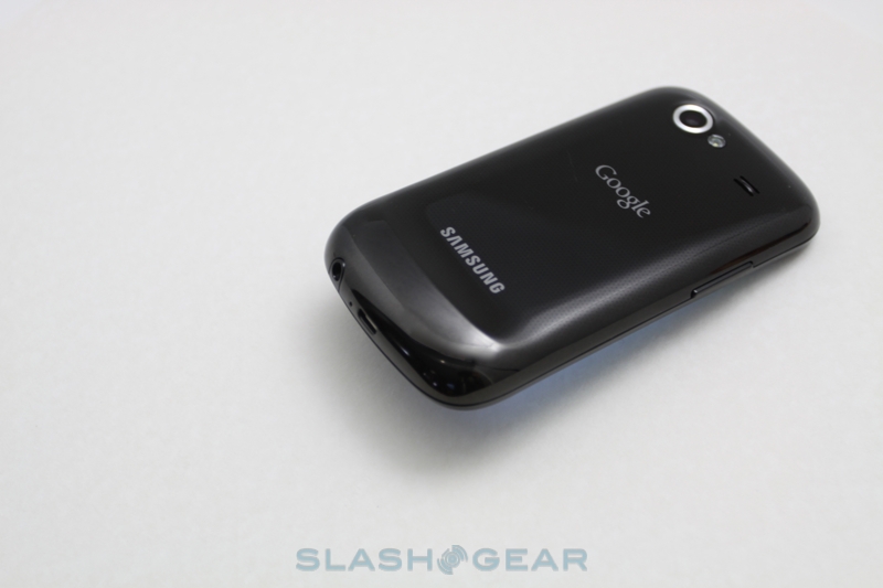
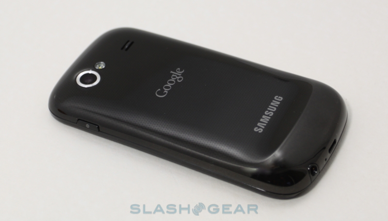
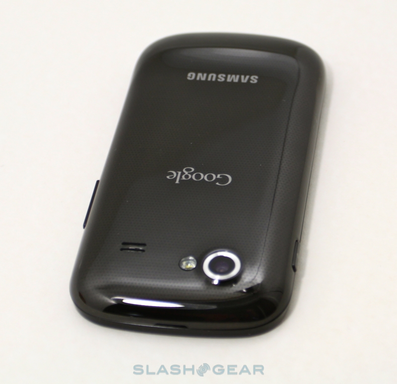
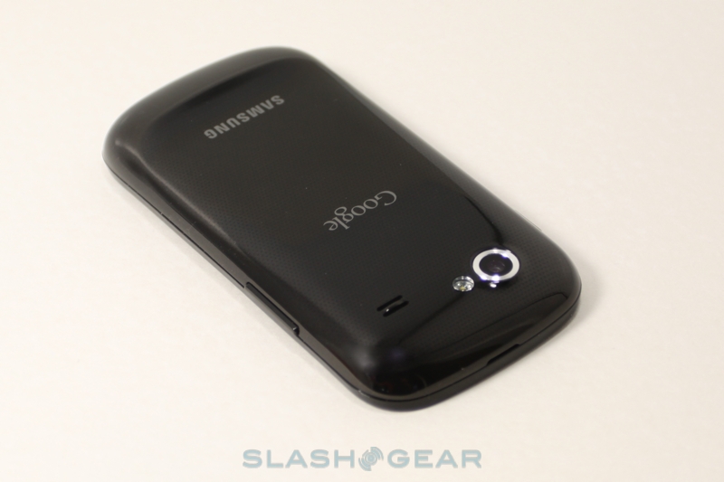
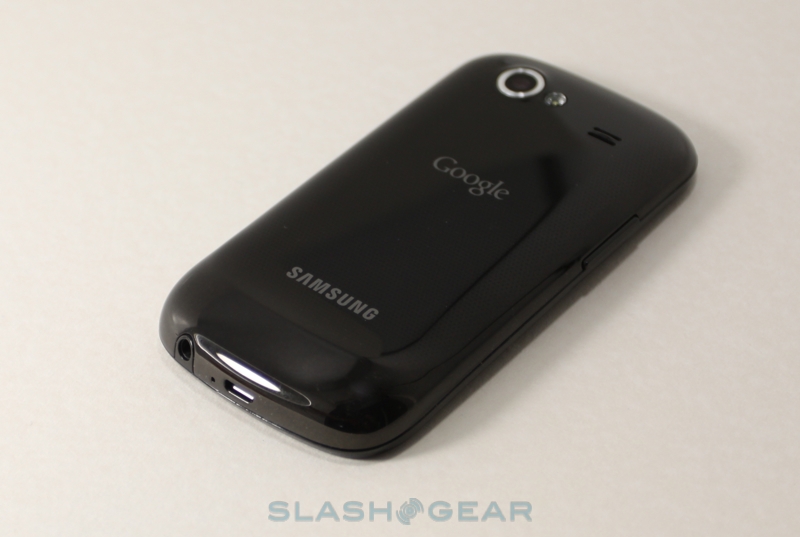
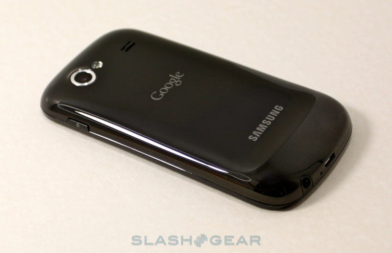
Out goes HTC's over-engineered metal chassis and matte-finish casing, replaced by Samsung's glossy black plastic. It's a design decision that has earned the Nexus S some criticism, but in the hand it doesn't feel cheap. There are only a few grams between the two devices, but we prefer the lightweight Nexus S and a willing to make the trade-off. Samsung's weight distribution also makes a significant difference to hand-feel; the HTC-made myTouch 4G feels far heavier, despite only a minor difference on paper, predominantly because of how the handset is balanced.

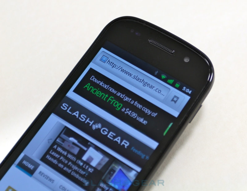
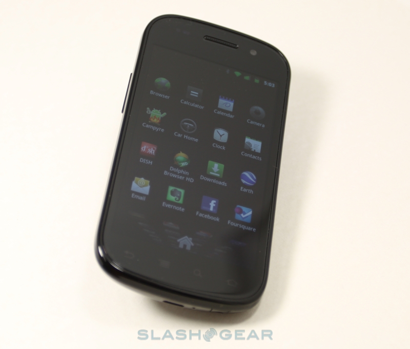
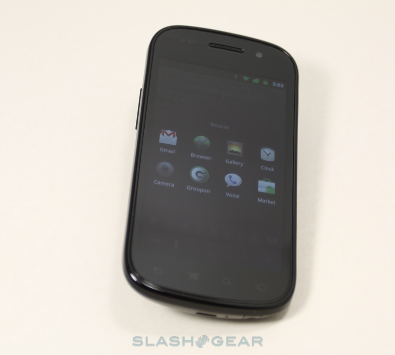
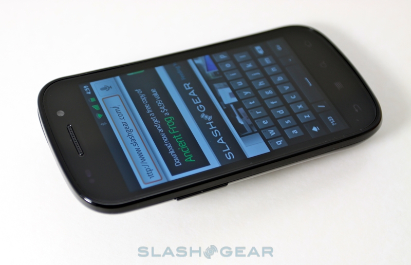
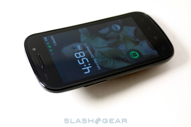
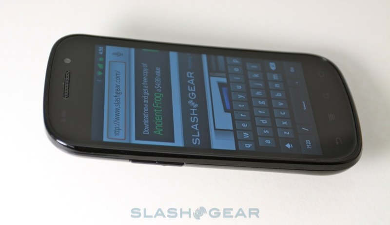
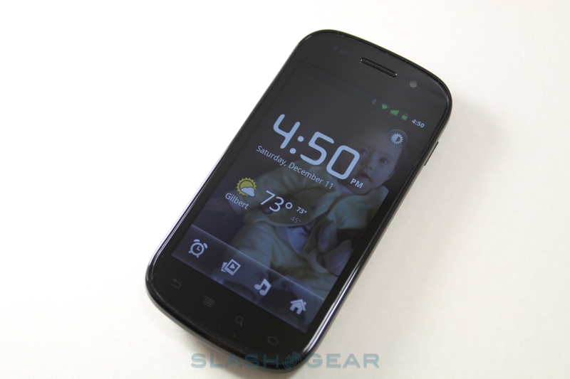
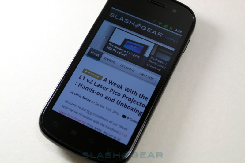
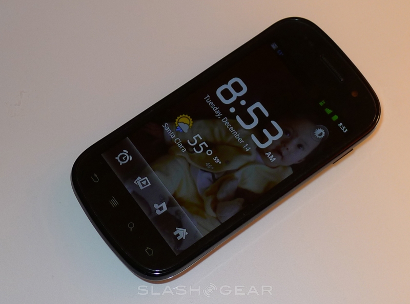
Up front is Samsung's 4-inch Super AMOLED display running at 800 x 480 WVGA resolution, just as on the Galaxy S. As ever it's a beautiful, color-saturated panel with inky blacks and crisp edges; in daily use, there's little difference between it and the iPhone 4's Retina Display, despite the Apple handset's greater resolution. New with the Nexus S is the so-called Contour display technology, a single, curved fascia that leaves the handset with a slight chin. It reminds us of the curve of the Palm Pre, or indeed a revisiting of the original G1 design, finessed to suit Android's own improvements. Samsung hasn't confirmed it, but we don't believe this is Corning's Gorilla Glass, since from what we've heard the company hasn't made curved panels of their toughened glass suitable for smartphones.

Although it's not a huge arc, the Contour shape does make single-handed use more straightforward: we were able to hold the Nexus S a little further up and still reach the touch-sensitive buttons – bizarrely in a different order to those on the Nexus One – under the display. Going back to the Galaxy S felt foreign afterwards. The curvature also helps avoid screen scratching, lifting the display off of the table when the handset is placed face-down. On the front there's a VGA-resolution camera for video calls, while on the back there's a 5-megapixel autofocus camera.
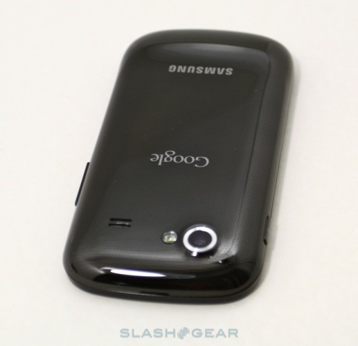
Hardware controls are limited, with only a power button on the right edge and a volume rocker on the right; no camera shortcut key, sadly. Ports have all been shifted to the bottom of the phone, with the 3.5mm headphones jack next to the microUSB port for charging/syncing. We prefer the placement of the audio port, since it keeps the headphones cable out of the way. Gone, though, are the Nexus One's dual-microphones, which helped the smartphone with noise reduction, and the color-changing trackball; in fact the Nexus S lacks any sort of LED indicator light.
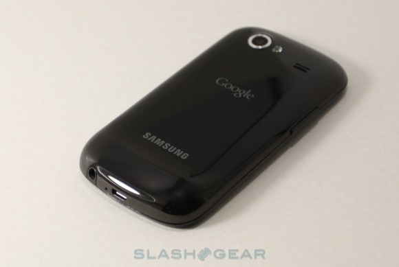
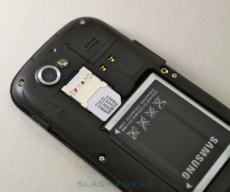
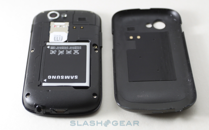
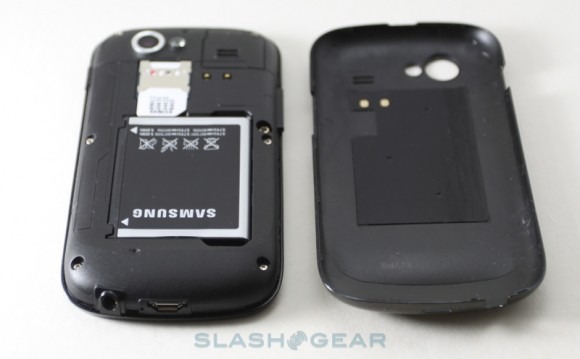
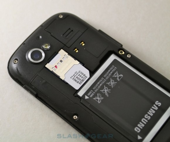
Also gone is the microSD card slot; peel off the battery cover and you'll find the SIM reader and a 1,500mAh battery – the same capacity as that in the Galaxy S, but physically a little smaller – but no way to augment the 16GB of onboard storage. It's unclear whether this is a conscious move by Google to push Android handsets in the direction of Windows Phone (and iPhone before it), a compromise Samsung were forced to make in order to fit in NFC, or something else.
NFC – or Near Field Communications – is the newest of the Nexus S' wireless connectivity options, and it joins WiFi b/g/n and Bluetooth 2.1 (not, as in the Galaxy S, Bluetooth 3.0) for short-range communication. Cellular connectivity, like with the original Nexus One, supports quadband GSM/EDGE and triband UMTS/HSPA (900/1700/2100): that means T-Mobile USA and broad European/Asian carrier support. Unfortunately it also means no AT&T 3G in the US, and no support for T-Mobile USA's faster HSPA+. Perhaps, again, it's a matter of fitting hardware into a finite space, but when Nokia can include pentaband UMTS/HSPA in their recent handsets, we wonder why Samsung can't do the same. Google may well end up releasing an AT&T-specific Nexus S, but the inability to roam between the two key US GSM networks is a frustrating limitation.
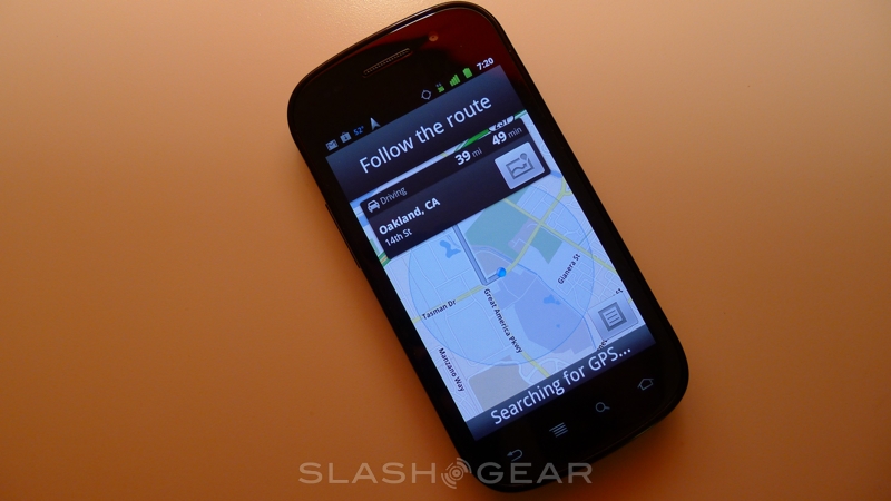
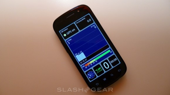
Similarly frustrating can be GPS performance; we haven't observed the dire positioning problems originally found on the Galaxy S, but at times the Nexus S proved simply incapable of getting a GPS lock: we drove for around 30 minutes of open, clear freeway and the handset continued to show "Searching for GPS." The issue is intermittent, however, with the phone not liking it if you try to get a fix while moving.

It's a shame, because performance in general from Samsung's own 1GHz Hummingbird processor is swift and satisfying. It's paired with 512MB of RAM and 1GB of ROM, and while it may not be a dual-core chip like the Tegra 2 – which we're expecting to show up in handsets like the LG Star come early 2011 – the Nexus S is still very fast. Google could've chosen a Tegra 2 or other dual-core handset to launch Gingerbread, but the Nexus S shows it's simply not necessary: the Samsung does a fine job showing off the performance of Android 2.3 on a single-core processor. Unfortunately we could only run benchmarking tool Quadrant once – the Nexus S scored over 1,600 – as the app crashed on subsequent attempts.
Software
While Android went through its share of significant updates, particularly in the jump from 1.6 to 2.0, the progression from Froyo to Gingerbread is less dramatic. That's not to say it's a meaningless upgrade, of course; simply that Android is already a solid, well-developed platform in its own right.
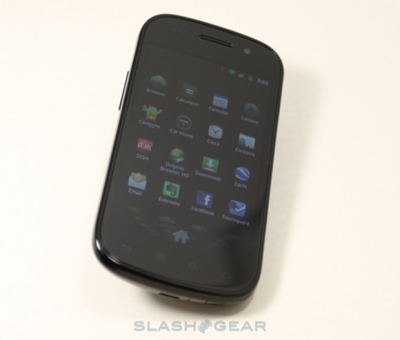
The Nexus S appeals as a pure Google experience, something many users are looking for in the hope of seeing earlier OS updates, and the untampered Gingerbread UI is the most usable to-date. The color scheme has been tweaked, with the grey status bar replaced by a black version; rather than being merely aesthetic, it also reduces power consumption. The call screen is much slicker than before, and call logs are now threaded like emails; you also get all of Google's usual Android apps, including the recently updated Gmail app, and the promise of v5.0 of Google Maps with its 3D city rendering and offline caching when it's released imminently.
Demo of Google Maps in Android 2.3
[vms d31e82c6ef826f341dae]
The tweaks continue throughout the OS. There's a new, dedicated download page which shows everything you've pulled down onto the phone, and a new battery page which augments the previous horizontal usage bars with a matrix showing power consumption over the course of the Nexus S' uptime. It's not entirely polished, however. On some occasions we were unable to add app shortcuts to the homepage. We'd also like to see the ability to set different times for when the display shuts-off and when the phone actually locks, as on the DROID X.
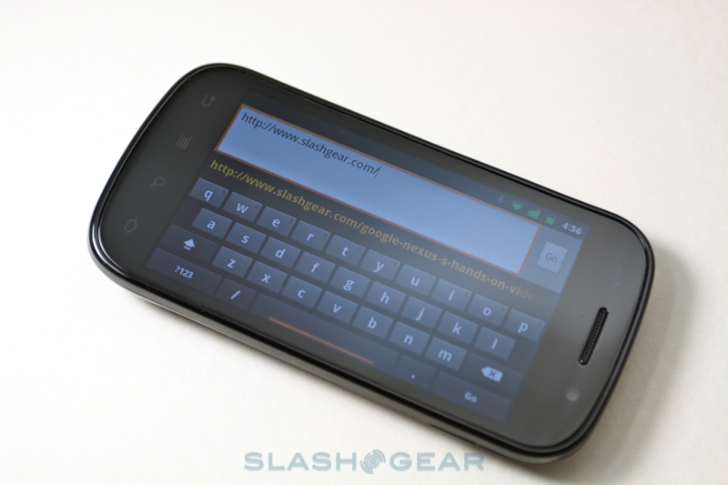
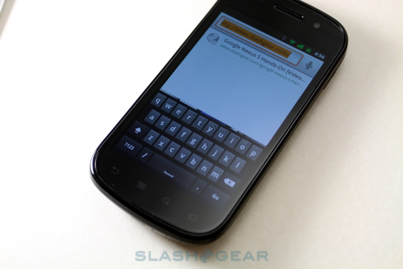
Gingerbread's biggest change is in text entry and editing, with a refresh both of the on-screen keyboards and of how copy/paste is handled. The latter, despite being something taken for granted on traditional computers, still remains controversial on mobile devices: Microsoft omitted it completely in Windows Phone 7, and it took Apple years to get it right for iOS. Google's approach falls short of the consistent UI on the iPhone, though it's an improvement over Froyo. Instead of double-tapping to select a word, the new Gingerbread method is to tap and hold; you then get easily dragged highlight cursors. Unfortunately, it seems the new system is yet to propagate throughout the OS, as some apps continue to offer the old double-tap method.
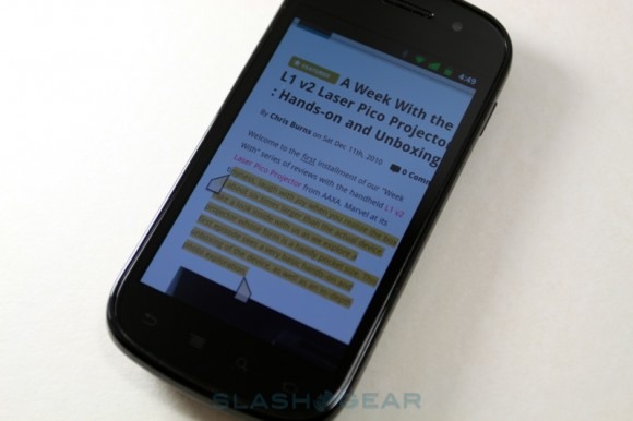
It's a shame, because the keyboard is much improved. Google has added multitouch support, meaning you can now hold down a modifier, such as the shift or number buttons, with one finger and tap at the changed layout with another. The keys themselves are a little smaller than on the Froyo layout, though it's not an especially dramatic change, and Google's auto-correct and predictive systems are strong and reasonably accurate. Voice control also works well, though you'll still need a network connection for the servers to crunch your dictation.
As with Froyo, Gingerbread supports Flash Player 10.1 for in-page video and games in the Android browser; oddly, though, we had to install the Adobe package ourselves, since it wasn't pre-loaded. The Hummingbird CPU and Gingerbread's own enhancements kept things running smoothly, with less of the sluggishness in scrolling and panning that we've occasionally seen in 2.2 when using Flash, but also appears to have introduced some issues of its own. Some Flash sites simply refused to work, such as Dropcam's live video streaming, whereas we had no problems whatsoever viewing them on a Froyo handset.
Near Field Communications (NFC)
Near Field Communications looks to be one of Google's key drives for 2011, a short-range wireless technology that will – eventually – allow for two-way communications between devices. We say eventually; at present, all the Nexus S' chip can do is read tags, such as the Google Places business sticker bundled in our reviewers' pack. They, Google expect, will be snapped up by companies keen to link their online presence in with the real world – simply run the new Tags app on the Nexus S, hold the phone near the sticker, and you get whatever information is encoded on it popping up on your handset. That could be a link to a website, online video (as in the case of the bundled sticker) or a contacts entry.
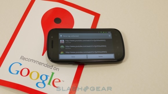
(Watch NFC in action in hands-on video below)
In the future, though, there's a lot more potential for NFC. Once Google unlocks the functionality, you should be able to exchange data – such as your contact details – by holding two handsets near each other. You'll also be able to write to NFC tags, potentially creating your own smart business cards to hand out. There are undoubtedly security concerns still lingering over the technology, but with Google betting strongly on the system there's plenty of motivation to get that ironed out.
Camera & Multimedia
As with the Galaxy S family, Samsung has used a 5-megapixel camera for the Nexus S, complete with auto-focus and an LED flash. The biggest difference is in the UI, with Gingerbread bringing a new camera control layout, which makes much more sense for everyday use. Quality is also strong, a little better than on the Galaxy S, though as ever the low-light performance with the LED flash is heavily dependent on whether you're in the sweet spot of not-too-close, not-too-far-away. It's actually easier to get stronger low-light shots with the flash turned off, in fact.

Video, meanwhile, is underwhelming, being limited to 720 x 480 resolution whereas the Galaxy S manages 720p. It's perhaps a concession to the non-expandable storage – 720p HD takes a fair chunk of memory space – but remains an obvious gap on the spec sheet. Still, the clips the Nexus S can produce are "good enough" for a phone, though you're unlikely to be replacing your Flip camcorder with the new handset.
Nexus S sample video
[vms 0e8682c0a27c0518e805]
As with the missing 720p support, there have been complaints over the Nexus S lacking either HDMI connectivity or DLNA streaming. While some users will certainly rue their omission, we can't say we're particularly disappointed not to have them onboard. Although we've had HDMI ports on smartphones before, we've only ever used it a handful of times and on several occasions encountered problems with the TV we've connected it to anyway. Similarly, DLNA remains a niche option, with consumers uncertain on both what it is and how to use it, and it demands a compatible device (whether TV, STB or other). Neither is a deal-breaker, we'd wager, to most users.
The front-facing camera will take stills but, at VGA resolution, they're hardly impressive. Instead it's intended for video calls, though the glaring absence is any sort of video chat functionality baked into Gingerbread itself. Apps like Fring and Tango do take advantage of it, however, and will work over WiFi and 3G, unlike Apple's WiFi-only Face Time. Still, we can't see video calling on Android reaching a tipping point until Google packages the functionality in the core OS.
Phone & Battery
Despite lacking the Nexus One's microphone array, audio quality on the Nexus S is particularly strong. Callers reported hearing us loud and clear, despite whatever ambient noise was around us, while the Nexus S' earpiece and speaker were both loud and crisp even at the highest volume settings. Obviously you're limited to T-Mobile's 3G network in the US, though you could still use an AT&T SIM for GSM/EDGE calls and data. Another option is VoIP, with native SIP support baked into Gingerbread. You'll need an account with a VoIP provider, of course, but with that – and assuming your carrier doesn't mind data use for VoIP purposes – you can bypass regular calls altogether.
Battery life, meanwhile, is also much improved. We're not sure if it's the UI tweaks, Gingerbread's own frugality, Samsung's power management or something else – most likely a combination of all these factors – but the Nexus S bucks the trend for high-powered Android smartphones to run out of juice sooner rather than later. A full charge from 0-percent to full power took 4hr 15min, and we managed a full day with extensive use without needing to top the Nexus S up. Some apps proved more hungry than others, however, and Gingerbread's new battery monitoring tools helped pick them out: Twitter app Seesmic proved one such culprit. We've spoken with Google about the perhaps excessive full charge time, and have been told that subsequent recharges should be faster as the battery is conditioned.
Wrap-Up
The Google Nexus One was a game-changer among Android devices, and it set a blueprint for hardware that has persisted throughout 2010. The Nexus S, meanwhile, has a tougher challenge: a balance between hardware and software that, the search giant hopes, will shape the development and feature-adoption of future Android devices from third-party manufacturers. With Gingerbread, Google has hit the reset button on a worrying trend of increasingly power-hungry handsets, and that's something we particularly hope new devices continue.

Google's other big investment will take more time to mature: NFC. With applications limited at present – Google's Places stickers are currently only available in one trial market in the US – it's going to be a harder sell for manufacturers than, say, a higher resolution camera or faster processor. Nonetheless, Google isn't the only company pushing for it: Apple has several patents for NFC-related mobile technologies, such as payments and digital event ticketing, and rumors persist of an NFC-enabled iPhone refresh in 2011, while Microsoft has long been touting NFC in its vision of the future.
There's the potential, then, for Google to shape the NFC field by virtue of being first to market, but only if it can persuade other Android device manufacturers to follow suit. Happily, the Nexus S is a strong contender in the smartphone space whether or not NFC catches on, though it remains to be seen how 2011's dual-core handsets will change the field once again. There's a compelling argument for the Nexus S, especially if you want your future OS updates sooner rather than later, but we're also keen to see how Gingerbread affects the performance of similarly specified Android handsets on the market today. It's the best Android device around, and a strong alternative to the iPhone 4, but a big part of that appeal is – at the moment – the rarity of the platform it runs.
Nexus S unboxing video:
[vms 8eb2e219dce49e64c885]
Nexus S hands-on:
[vms e5b854ffad5f70a516c8]
[vms cf807b2ed53c3a8f8fc8]


