Nexus 6 Review - You Want To Lick This Lollipop
A new Google smartphone is a big deal, and the Nexus 6 is a very big phone indeed. Largest so far of Google's collaborations with handset manufacturers, and first to see Motorola take the Nexus reins – ironically just as the two firms part company – it's a riff on this year's Moto X but with a new turn of speed and a crazy Quad HD display. It's also the launch vehicle for Android 5.0 Lollipop on phones, arguably the biggest thing to happen to the OS in many generations. So, with supplies still frustrating all but the best-timed of buyers, is the Nexus 6 the Android phone you want in your pocket?
Design and Display
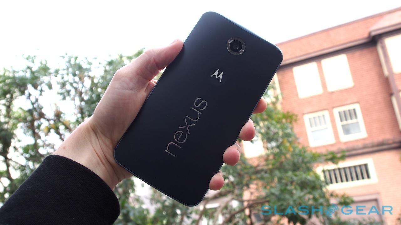
Familiar, and yet still surprising. If you've kept up with Motorola's Android phones over the past year or two, the general shape of the Nexus 6 won't come as a great surprise; nonetheless, there are a few factors that distinguish it from devices like the 2014 Moto X.
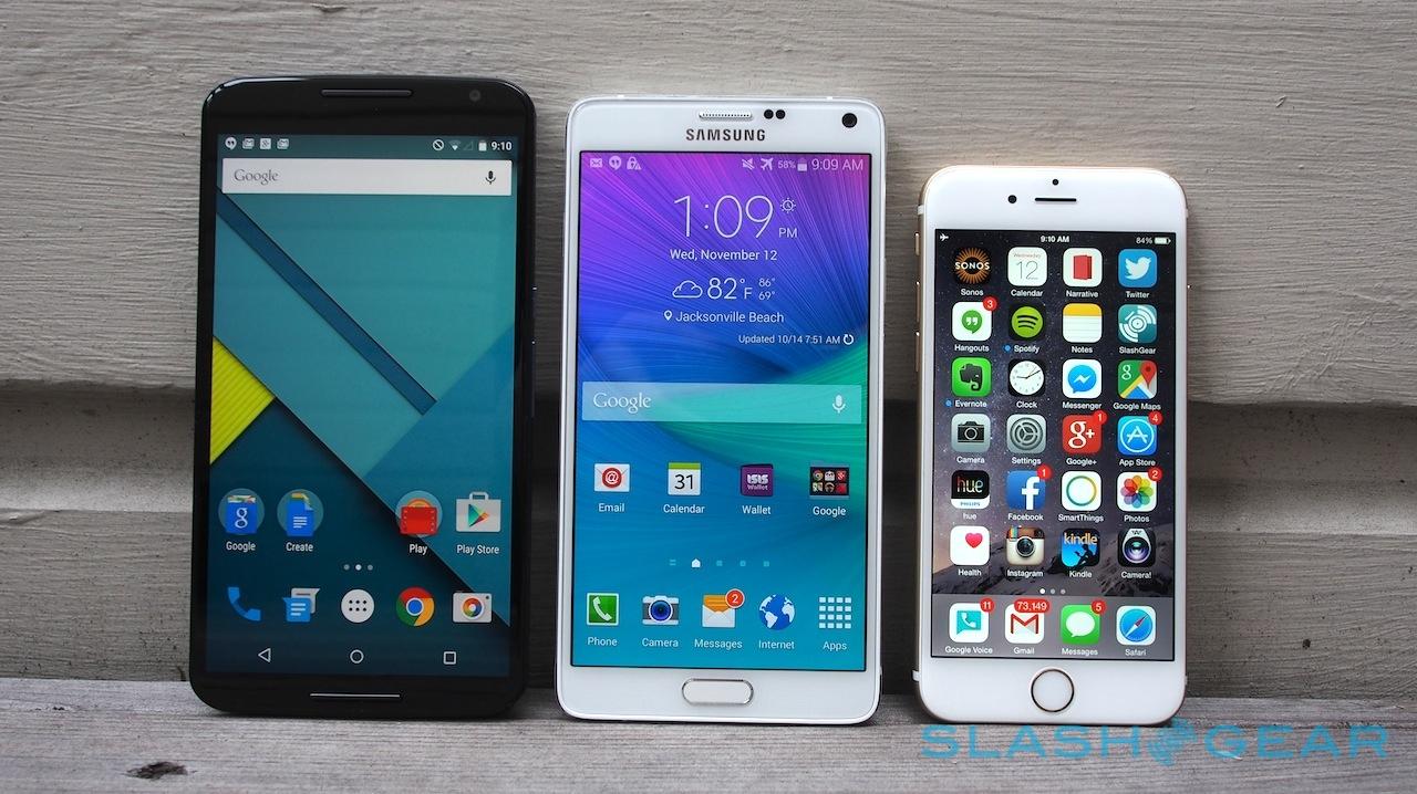
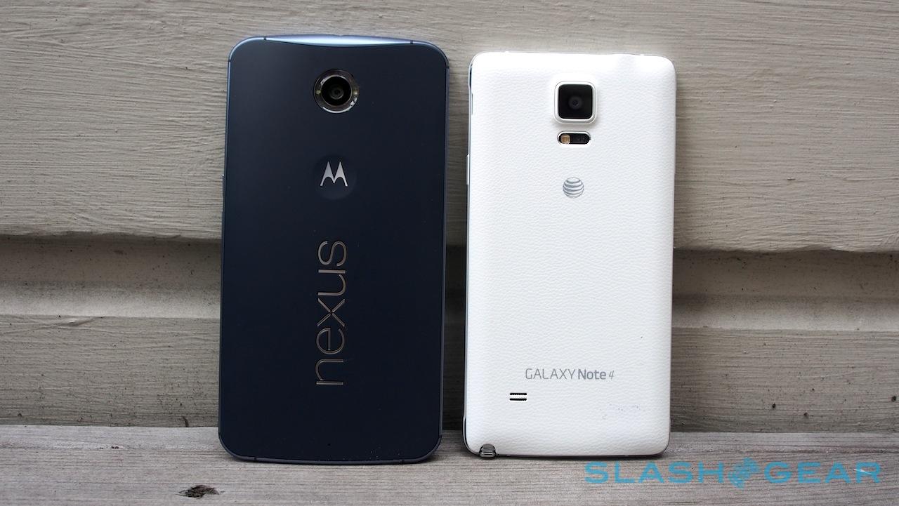
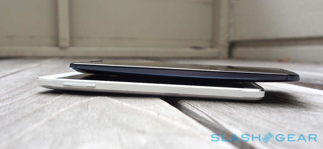
First and foremost is its size. Make no mistake, this is a big smartphone: a hand-filling 82.98 x 159.26 x 10.06 mm and 184 grams. For comparison purposes, that makes it larger in all dimensions than Samsung's Galaxy Note 4 (which clocks in at 78.8 x 153.5 x 8.5 mm and 176 grams) and Apple's iPhone 6 Plus (at 77.8 x 158.1 x 7.1 mm and 172 grams). The 77.8 x 158.1 x 7.1 mm, 172g iPhone 6 (shown in the image below) and the 72.4 x 140.8 x 9.9 mm, 144 gram Moto X are dwarfed.

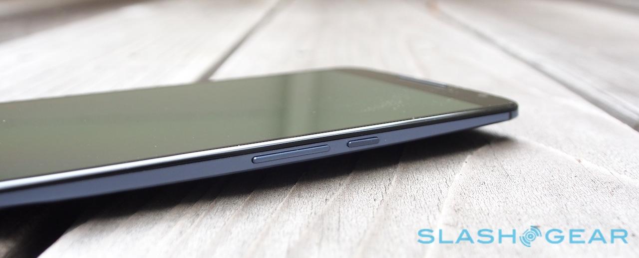
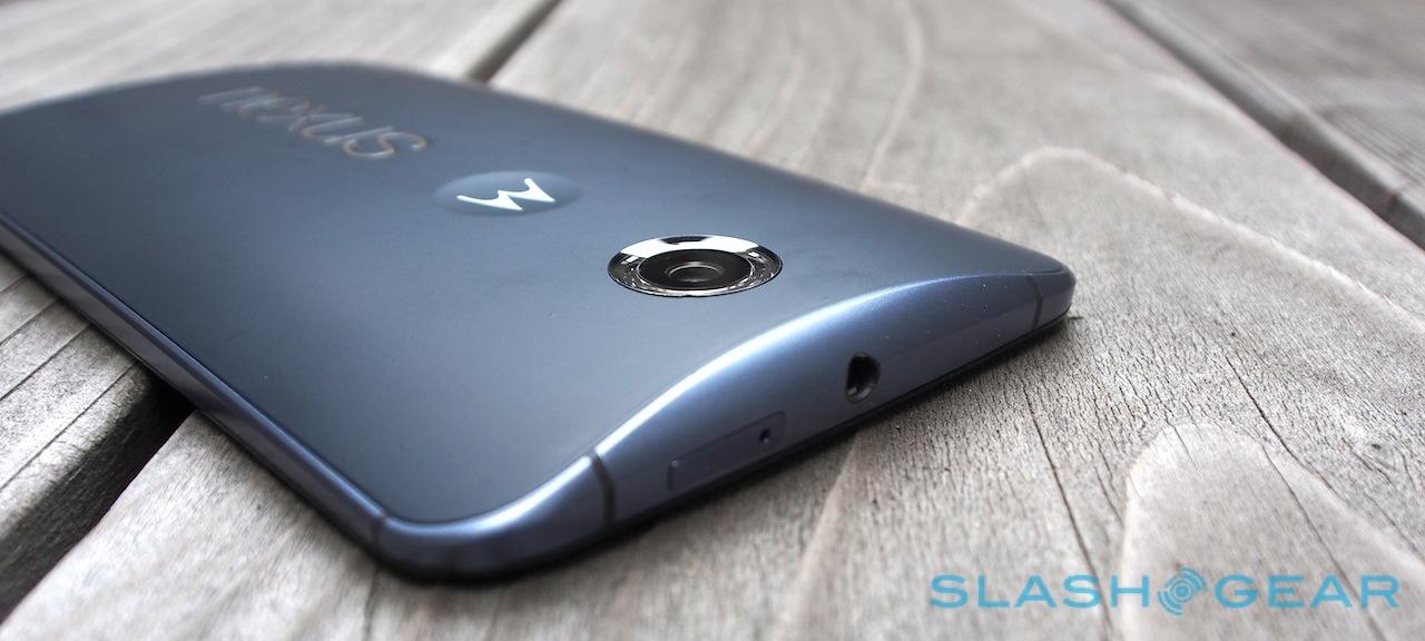
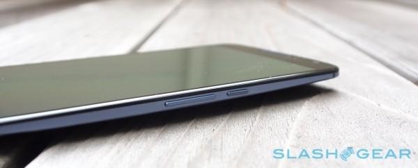
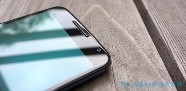
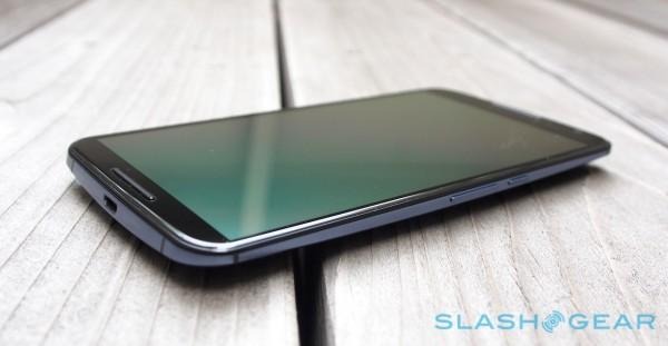
Lay them side by side, though, and the design lineage is clear. Both use an aluminum chassis with the antenna integrated, are fronted by an expansive sheet of toughened Gorilla Glass 3, and help disguise their bulk by tapering the edges dramatically. It's a clever trick, not to mention an effective one, and it means that where your fingertips grip the Nexus 6 feels premium and surprisingly skinny. The power and volume keys – the latter surprisingly small given the room they could potentially take up – have been moved down so as to more readily fall to hand.
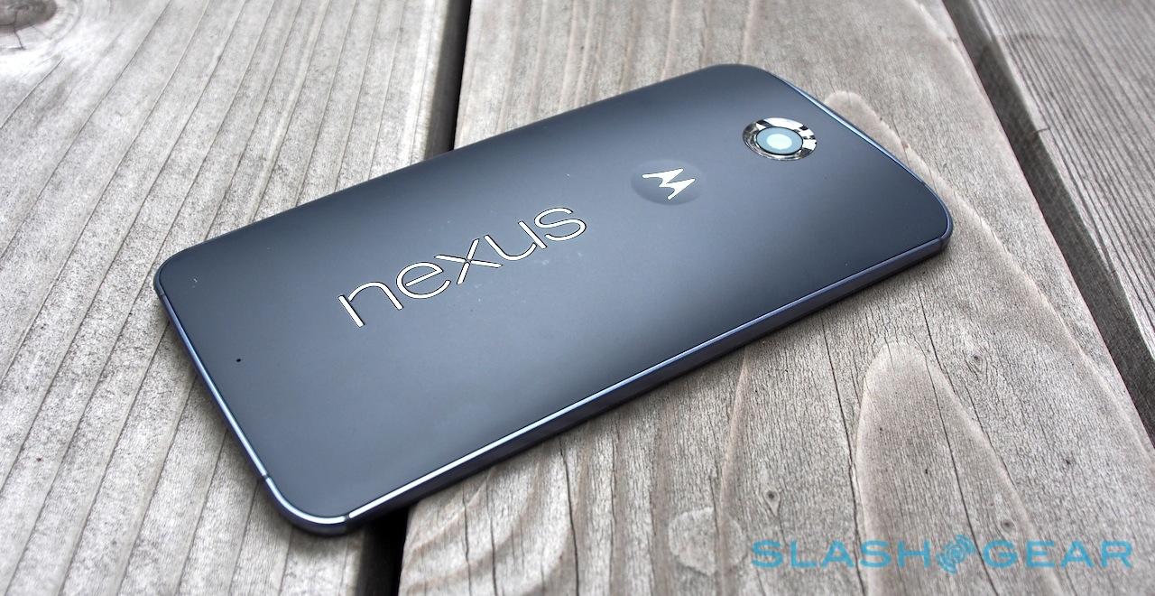
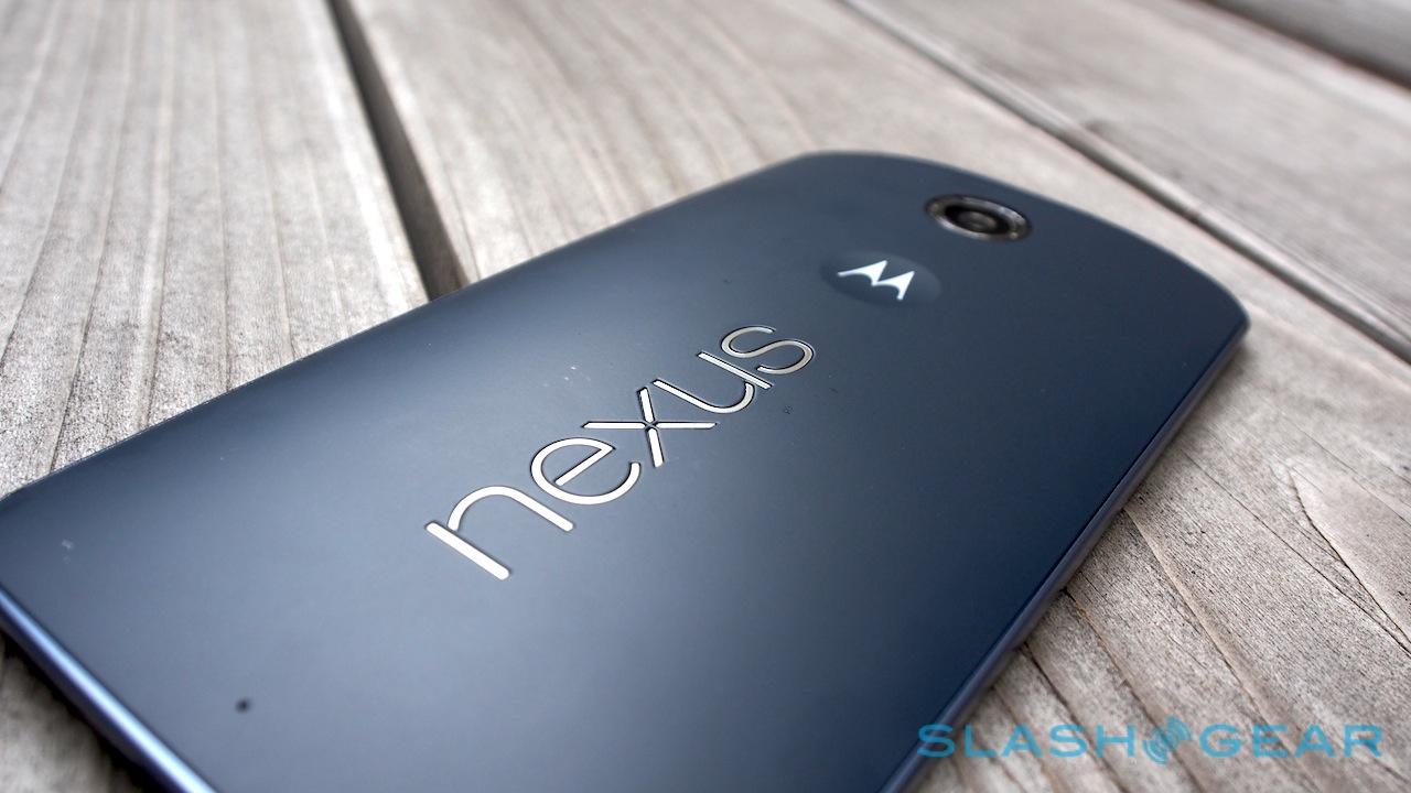
Unfortunately, where Motorola has flirted with wood, leather, and other materials for the back cover of the Moto X, Google has stuck with the basics for the Nexus 6. The back panel comes in either Midnight Blue or Cloud White, both polycarbonate plastic that – while flex-free – isn't quite as high-quality to the touch as either metal or some of the more unusual finishes might be.

The benefit of those dimensions is in the display. Google has opted for a 5.96-inch, 2560 x 1440 AMOLED panel, and it's a beauty: more pixel dense than the screen on the Nexus 9, for instance, or indeed the iPhone 6 Plus. Samsung's Note 4 edges ahead slightly, at 500ppi versus the Nexus 6's 493ppi, thanks to its slightly smaller 5.7-inch panel, and of course the Galaxy phablet comes complete with its S Pen digital stylus, which the Motorola does without.
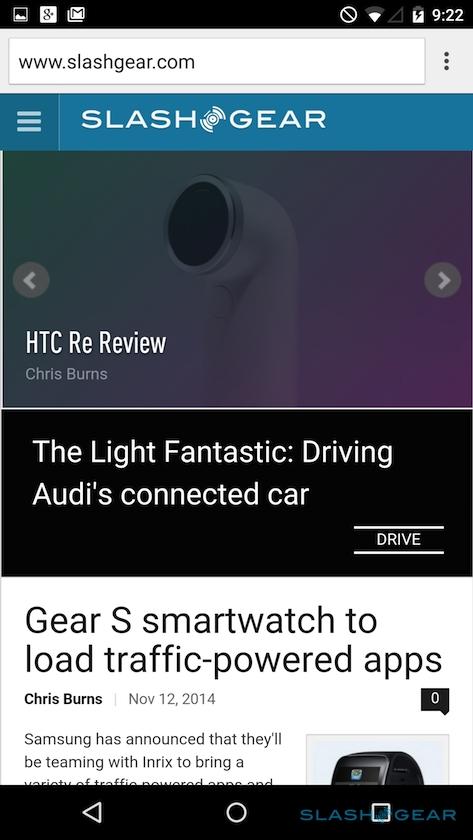
The mass market arguably won't miss it, though; they'll be too busy being mesmerized by the fantastic viewing angles, vivid colors – albeit with a tendency to greenish tones at some brightness levels – and rich contrast of the AMOLED. Of course, it also delivers a regular reminder that much of the internet isn't quite ready for displays packing this sort of detail, so expect some grain and grittiness to graphics and text on sites tailored to more humble resolutions. I can't really level the blame for that at either Motorola or Google, however.

What I'm less willing to give them a pass on is picking a near-6-inch form factor in the first place. Now, consensus is certainly mixed when it comes to what makes for too big a phone, and I'm perfectly willing to accept that individual preference plays a huge role. My gut feeling, however – and, it has to be said, that of many of the people I showed the Nexus 6 to over my time with it – is that Google has limited the appeal and usability of the phone as a result.
This is not a one-handed device. Holding it with some degree of security, my thumb can stretch just over halfway across the display. Cradle it in your fingers – where you run the risk of the smooth plastic back simply sliding across your fingertips – and you get a little more range, but for the most part this is a two-handed prospect.
For some, that won't be an issue. Others will struggle more; on more than one occasion I had to give up on checking a webpage or replying to a message because I was also trying to hold on while riding a bus, or carrying a bag. Unlike "reachability" on the iPhone 6 Plus, or Samsung's even more advanced single-handed screen size accommodations on the Note 4, there's no software finessing to bring the UI closer to your digits, either.
Deal-breaker? For some, maybe. Others won't care. Either way, it's an interesting decision for Google and Motorola to take, given the 5.2-inch panel of this year's Moto X has been so widely commended for its balance of size and usability.
Hardware
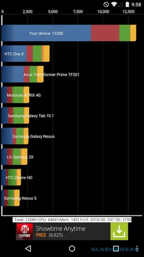
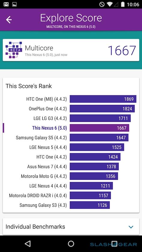
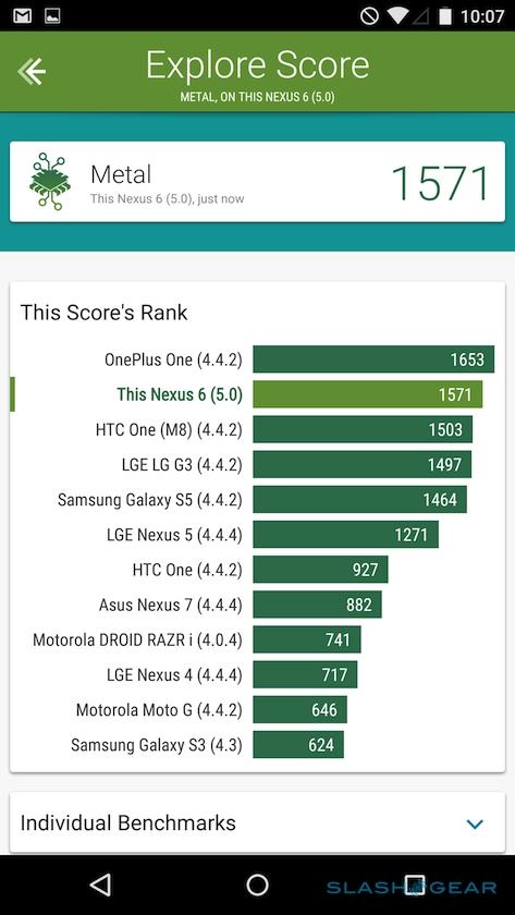
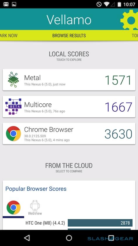
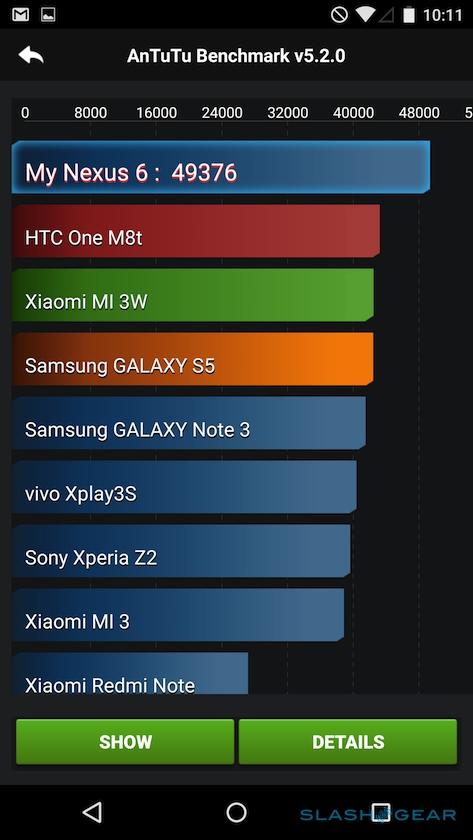
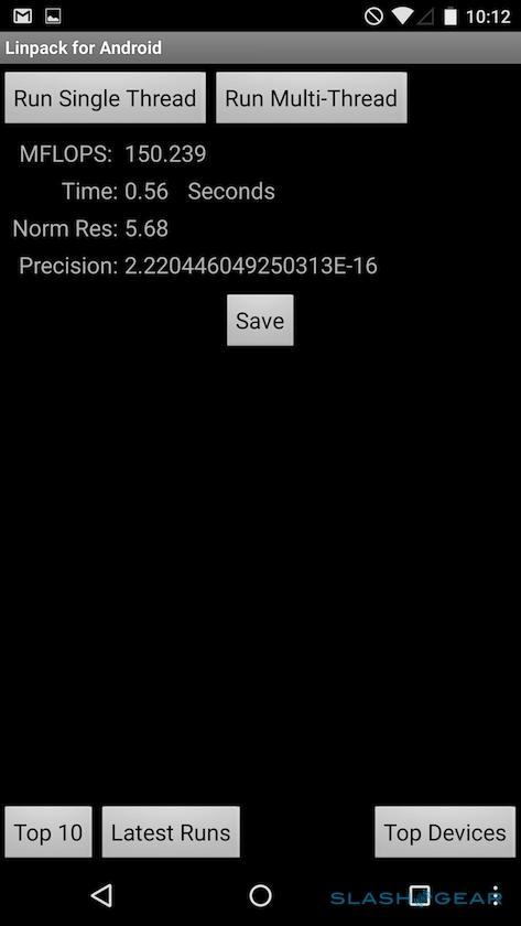
Perhaps it was simply a case of "go big or go home," and if that's the answer then you can't fault the rest of the Nexus 6 for continuing in the same vein. Superlatives abound across the spec-sheet: Qualcomm's quad core 2.7GHz Snapdragon 805 doing processor duty, with Adreno 420 graphics and a fulsome 3GB of memory.
Connectivity hasn't been stinted on, either: the Nexus 6 for the North American market has twelve LTE bands, WCDMA/HSPA+, and CDMA, while the Rest-of-World model gets ten LTE bands but a broader range of supported WCDMA/HSPA+. WiFi 802.11ac 2x2 (MIMO) means the Nexus 6 is theoretically faster across a wireless network than many laptops might be, and there's Bluetooth 4.1, GPS, and the usual bevy of sensors like an accelerometer, gyroscope, barometer, and digital compass.
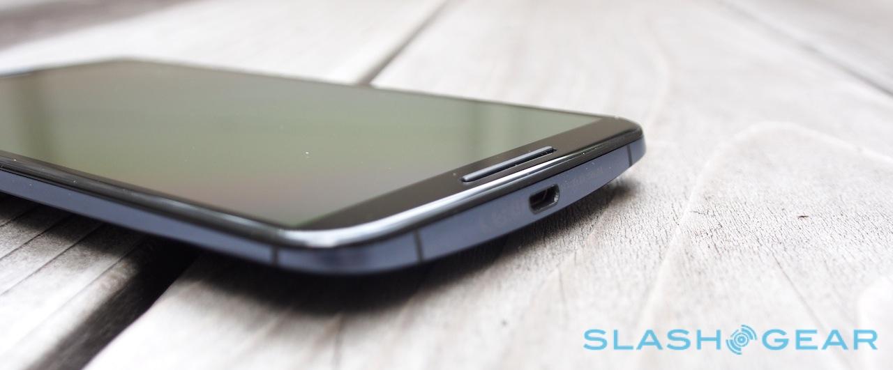
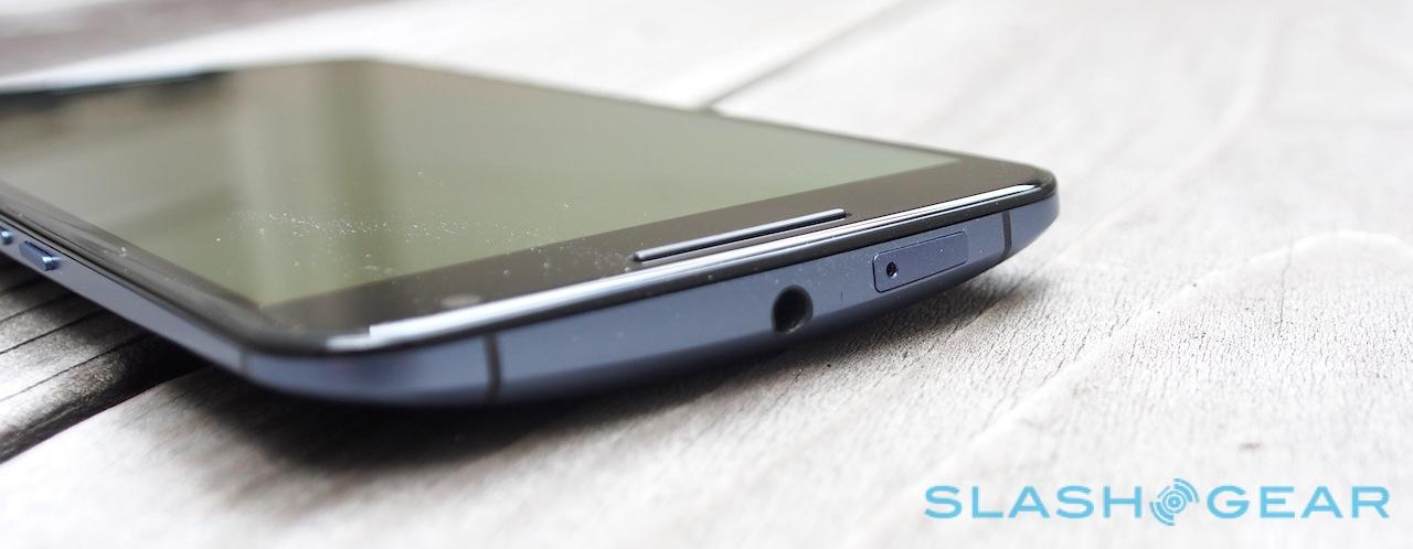
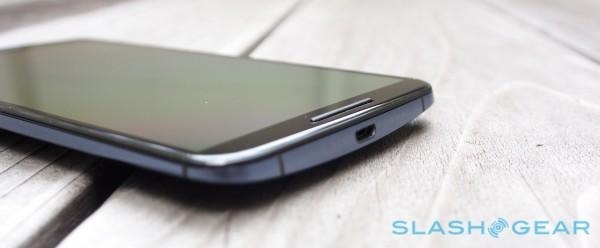
On the bottom edge there's a microUSB port, while the tiny nanoSIM tray lives on the top. You'll search in vain for a memory card slot, however: Google offers either 32GB or 64GB versions, after which point you'll have to look to the cloud for expansion. Given Google's preference for Drive that comes as little surprise, but it's still frustrating for those who would prefer local capacity over network dependency.

It's a particular shame given the Nexus 6 aptitude for multimedia. High-def videos look incredible on the AMOLED panel, and they're joined by a pair of front-facing speakers that – though they don't share the BoomSound branding of the HTC-made Nexus 9, nor quite the fidelity – certainly sound sufficiently full-bodied for those times you don't want to plug in headphones.
Android 5.0 Lollipop
Is a Nexus really about hardware or is the phone itself just a vehicle for Google to show off what has been done with Android? Lollipop is certainly the star of the show here, arguably the most significant maturation of the platform in generations.
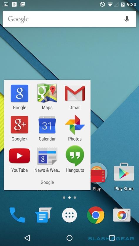
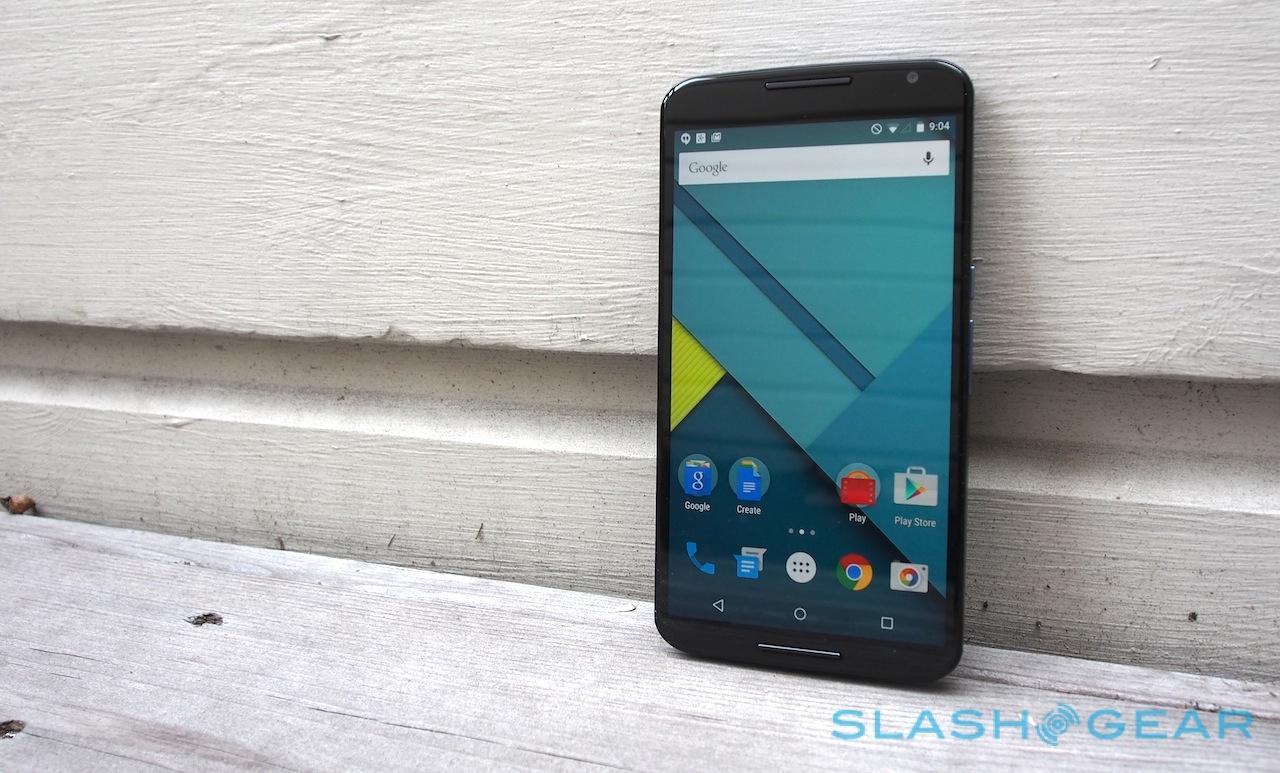
Most noticeable is what Google calls Material Design, a combination of new iconography, fluid animations and transitions, and generally a more mature feeling overall. There's a sense of 3D space, too, though thankfully it doesn't involve goofy three-dimensional screens. Instead, Android has a new sense of how different UI elements are stacked in relation to the desktop, with animation and shadowing to suit.
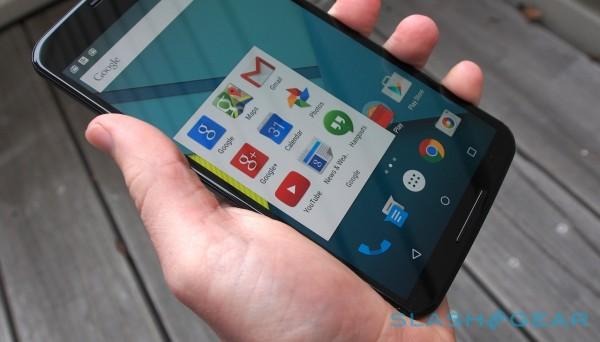
It's subtle, but after some time with Lollipop that feels like a good thing. Eye-catching interfaces so often look great when you first use them, but over time the charm of the motion fades and you find yourself waiting for the system to catch up and simply let you get on with what you want to do.
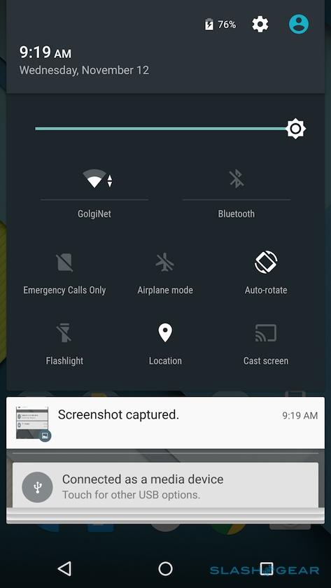
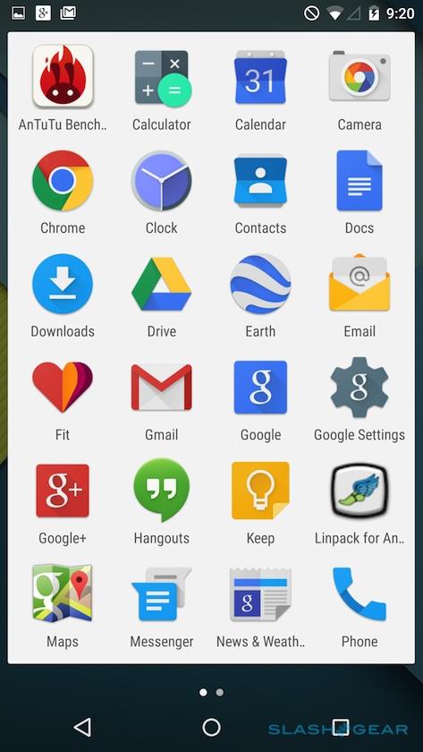
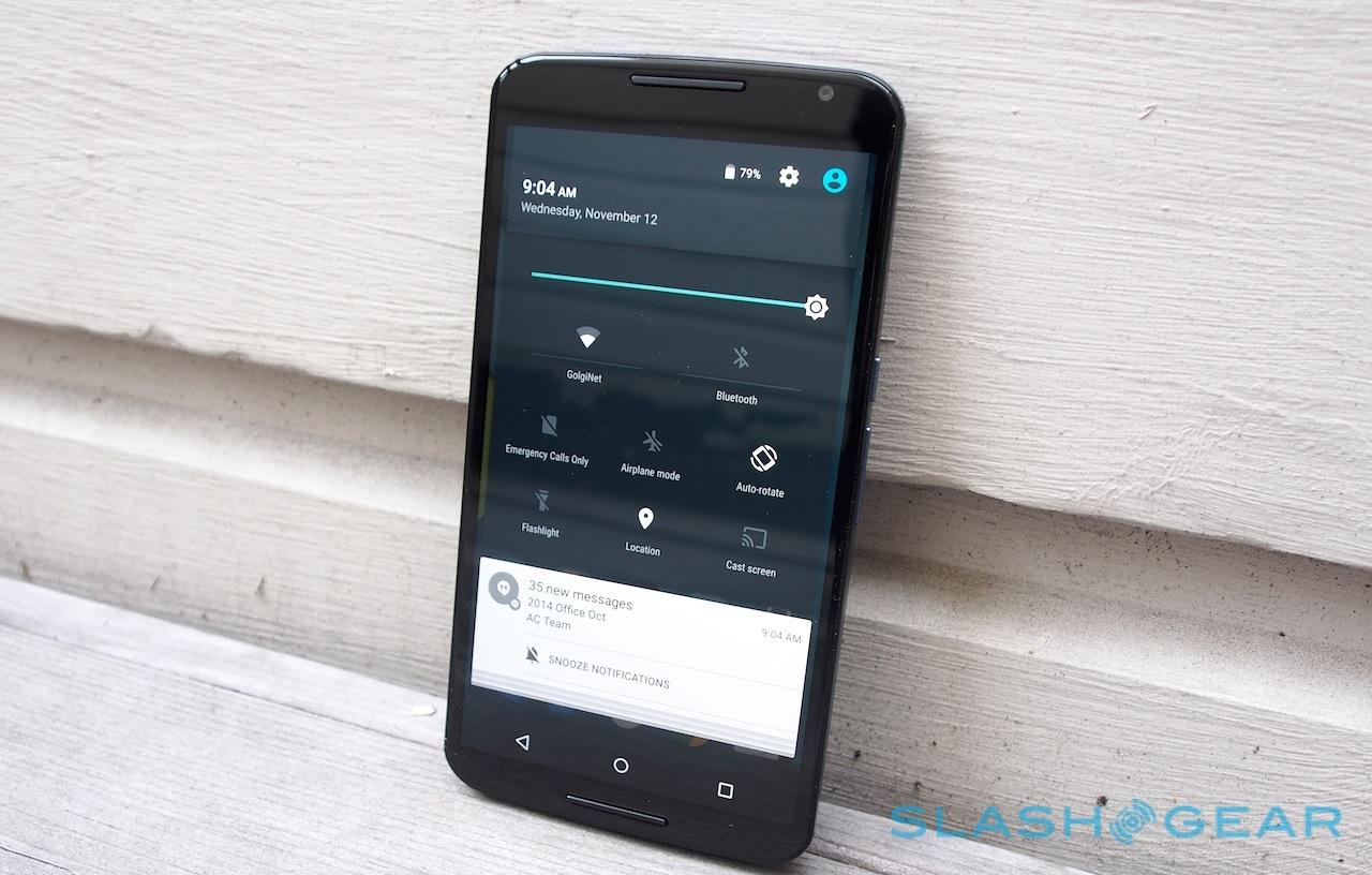
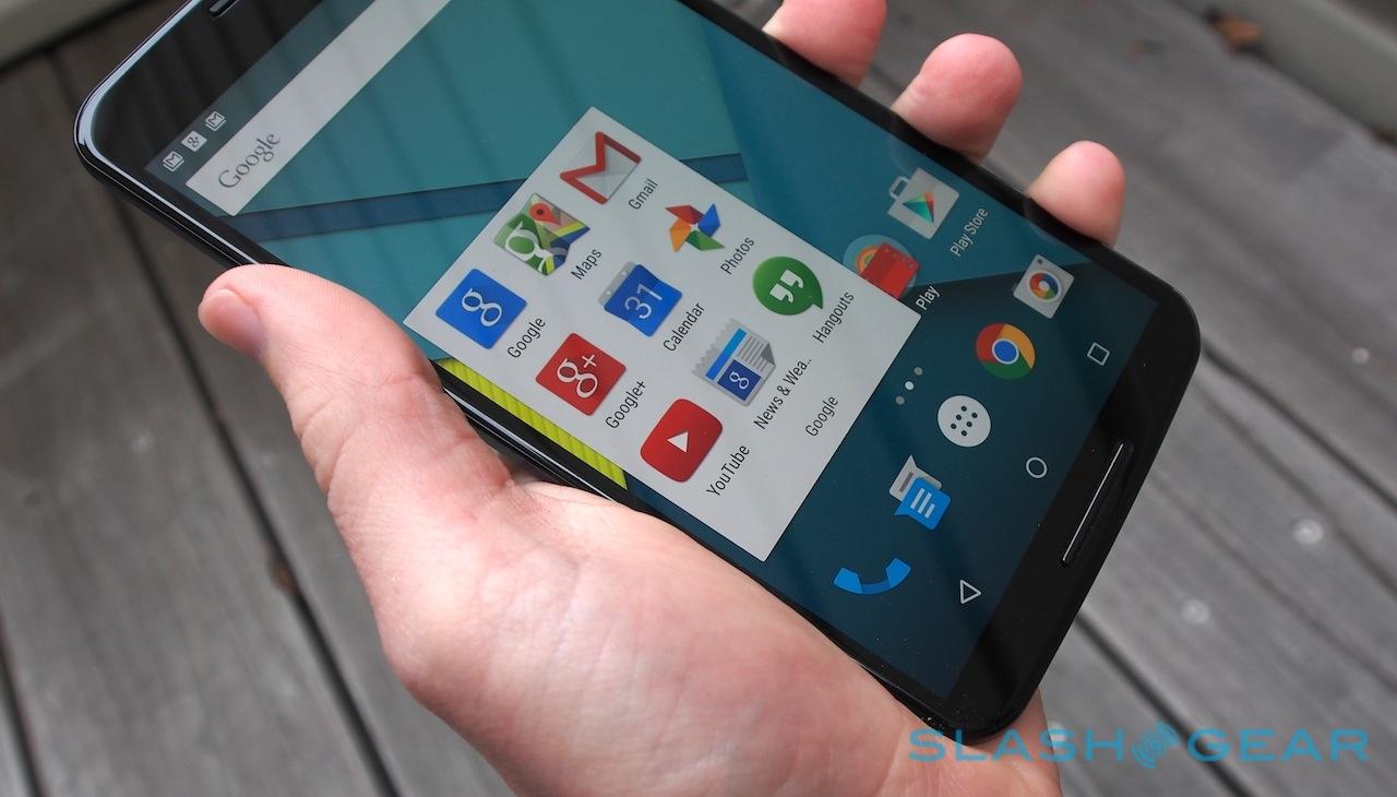
That clarity has been carried into things like the app drawer, which is now a few white panes of icons sorted sensibly alphabetically, and the notification drawer, which now appears as floating bars over the underlying app view rather than blocking it out completely. Swipe down a second time and you get the settings pane, with controls for brightness, wireless settings, Do Not Disturb and Airplane modes, the flashlight, and screen-casting if you have a Chromecast or Android TV.
An optional Android TV remote app turns the Nexus 6 into a remote control for the Nexus Player which I reviewed recently.
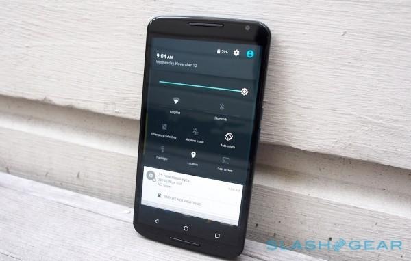
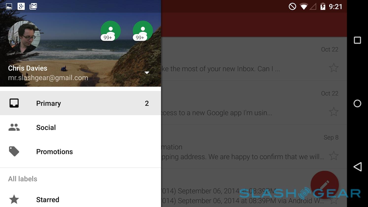
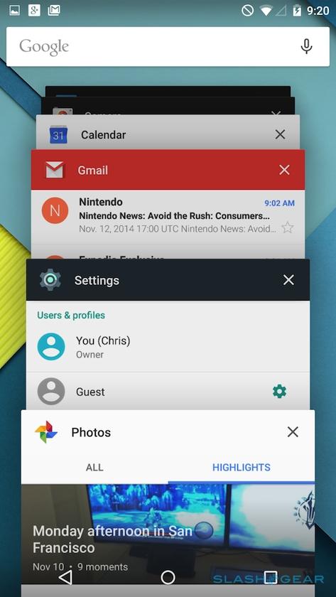
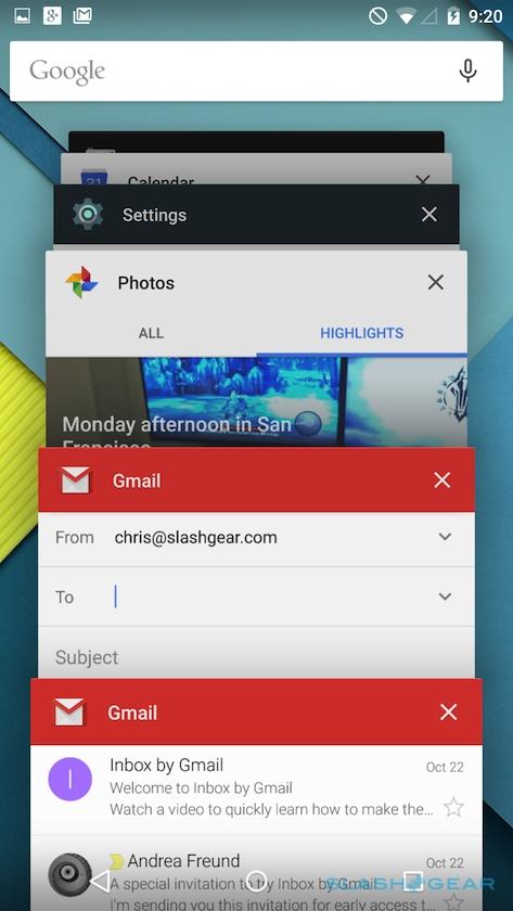
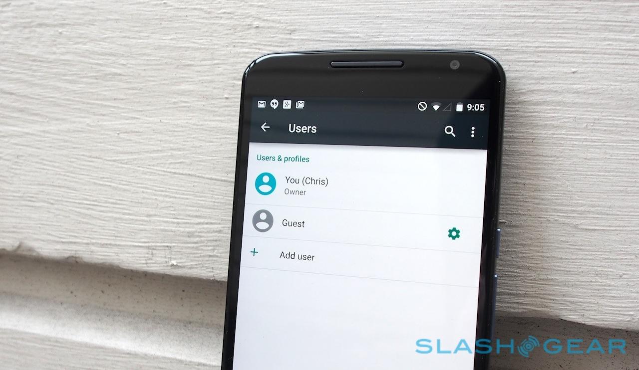
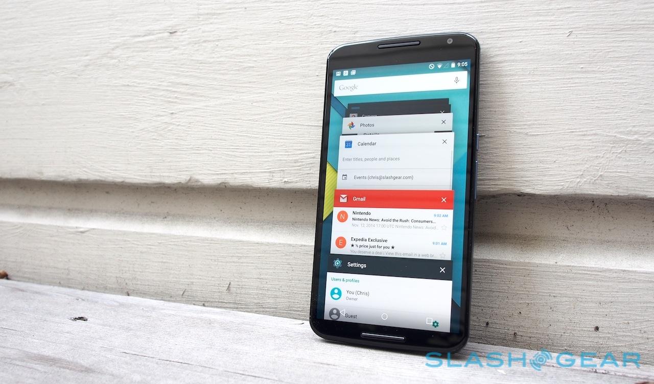
You can't customize what's there, but you can tap into the settings page. It's there you'll find one of my favorite features from the Nexus 9, the ability to set up different user accounts or enable a generic "guest" mode. Multiple owner profiles arguably makes a little less sense on a phone than it does a tablet, but if you've ever wanted to distract a child without risking them deleting emails it's very useful. Alternatively you can "pin" apps in the new multitasker view, effectively locking the phone to showing them unless you punch in your PIN.
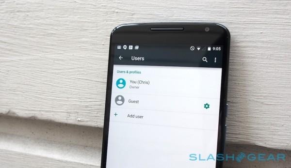
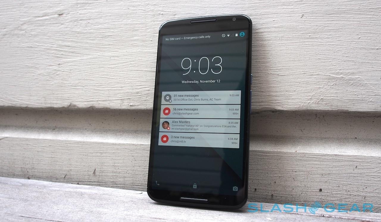
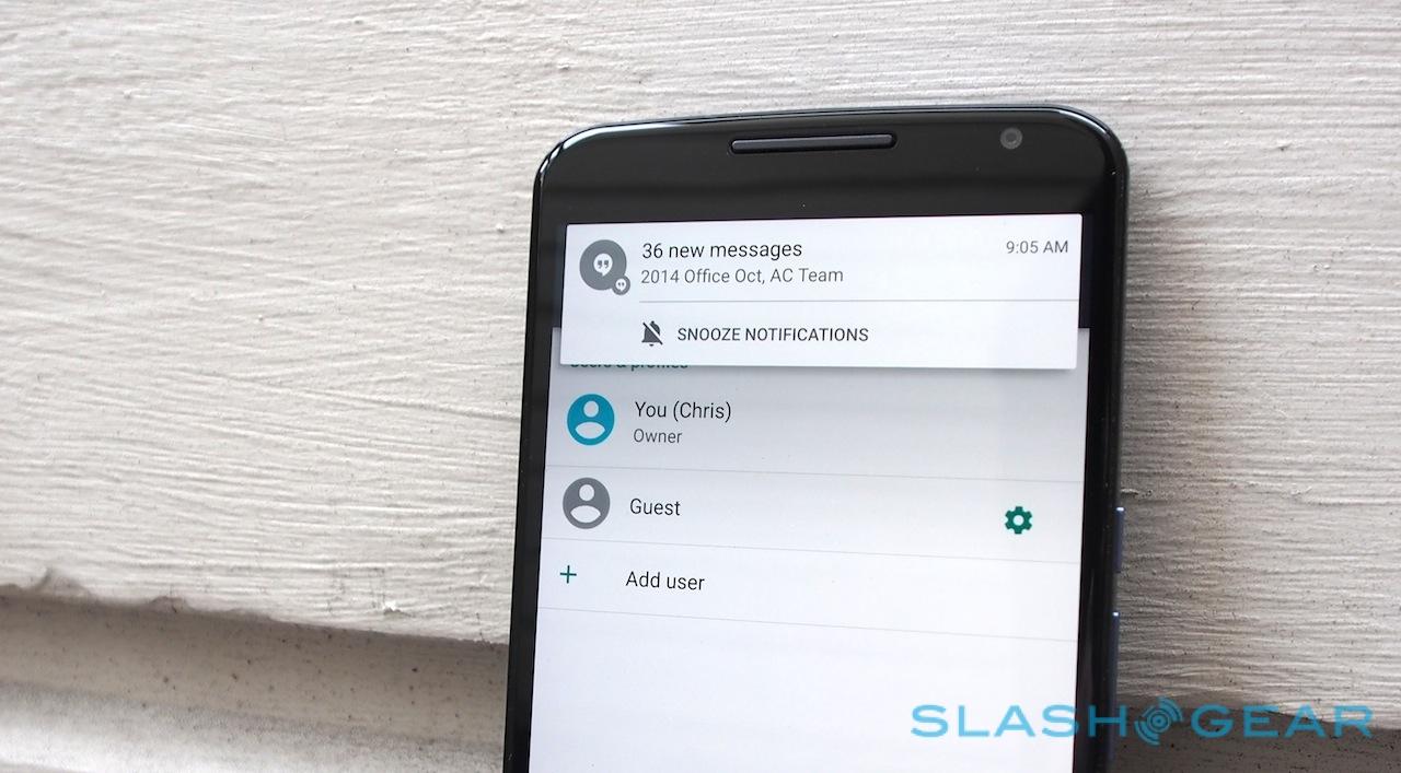
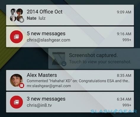
User profiles are accessed from an icon on the lockscreen, and that's also where the new notifications system shows its hand. Clearly it's a convenient place to have alerts show up – even if the "pick up to wake" feature which is meant to light the Nexus 6 up when you grab it didn't have a 100-percent consistent success rate for me – but there are times you don't necessarily want anybody glancing at your phone to get a preview of them.
Lollipop's answer is "redacted" notifications, effectively showing you that there's something new, but not giving you a preview of it. It's also possible to filter which apps get to show notifications, and Google will automatically prioritize those from high-profile contacts: if your boss emails you, that alert will be higher in the list than a more generic message.
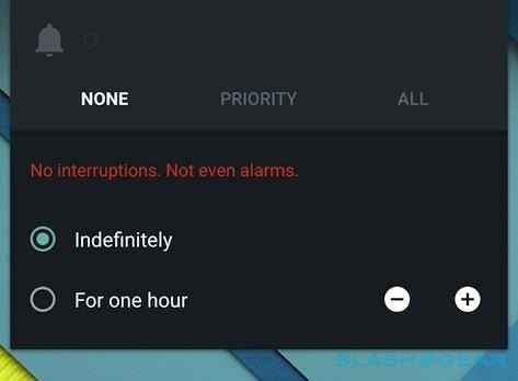
If, like me, you've sometimes missed calls or other notifications because you've inadvertently left your phone in do-not-disturb mode, Lollipop's offer to automatically turn alerts back on after a period of time will be welcome. Priority Mode can be set to allow certain contacts or even certain apps through the lockdown.
Other changes tackle convenience in different ways. If you're migrating from another Android device, Tap & Go is a godsend in the initial setup: hold them back to back, and after a bleat of NFC handshaking the old phone tells your Nexus 6 exactly what apps to download and what settings to address.
Ok Google works much as we've seen voice commands managed on the Moto X. When enabled, you can wake the Nexus 6 by saying "Ok Google" and then asking Google Now for answers. Not every Android device will support it, even when upgraded to Android 5.0, and unlike with Motorola there's no support for customizing the wake-phrase. Still, I've found it useful when wanting to make quick conversions while cooking, or for firing off messages by voice.
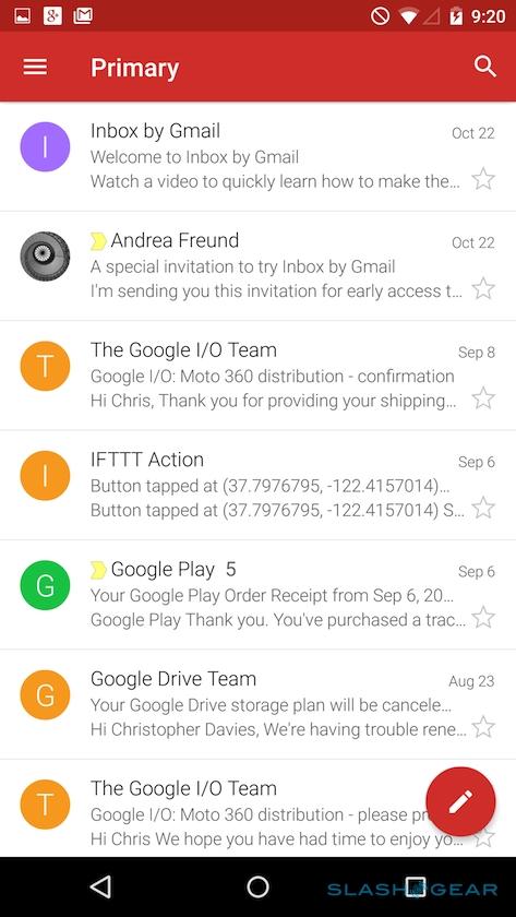
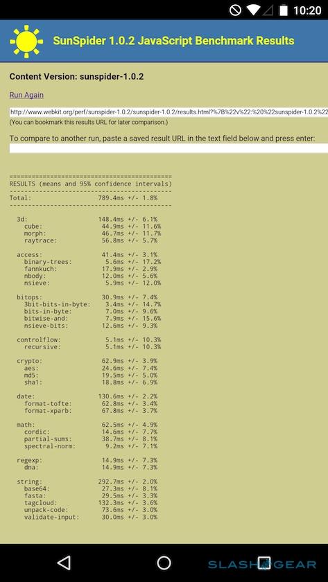
Not everything has been entirely successful, however. A few apps have shown a tendency to crash repeatedly: often the Camera app would struggle to connect with the 13-megapixel camera itself until I restarted the phone, for instance. The new Gmail and Calendar apps look fantastic, but there can be a fair amount of wasted space in the name of Material Design.
I'm also not sure why, whereas the Gmail app – which now usefully supports any POP/IMAP/Exchange accounts alongside Google's own email service – gives new messages their own tab in the multitasker, the Calendar app doesn't do the same for new appointments. It would certainly help with spotting scheduling clashes. I miss the multi-column Gmail inbox view that Android tablets get, too: the Nexus 6 certainly has the screen space for it in landscape orientation.
Behind the scenes, Android 5.0 has 64-bit processor support, and introduces a new ART runtime that replaces Dalvik. For most users that won't – and, to be entirely honest, needn't – mean anything, but there's a noticeable improvement in fluidity compared to Android 4.x. Where older Android devices, even with the latest crop of processors, could sometimes stutter and grumble when scrolling or panning, I've been impressed by how smooth Lollipop is.
Camera
It's probably fair to say that the Nexus line doesn't have the very best track record for camera performance. Whether it's speed, focus ability, or general quality, the stills and video from the Nexus 5 and Nexus 4 never quite matched what other flagship Android devices were producing at around the same time.
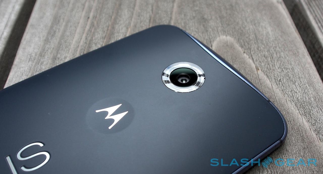
So, it's with a little skepticism that I read Motorola's camera specifications for the Nexus 6. The main camera gets a 13-megapixel sensor with an f/2.0 aperture lens and optical image stabilization. The LED ring-flash is carried over from the Moto X, not to mention 4K Ultra HD video recording (or 1080p/720p if you'd prefer). On the front there's a 2-megapixel camera.
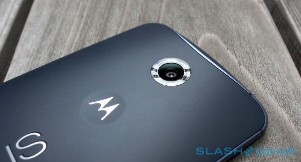
On paper, there's a lot of overlap with the Moto X; happily, there've clearly been some changes in the intervening period. In fact, the IMX214 sensor in the Nexus 6 is the same as you'd find in the OnePlus One, among other recent Android phones, though of course image processing plays a huge part in how the end results turn out. One such example is HDR+ mode, carried over from the Nexus 5, and piecing together various frames to make what in theory would be a better balanced image.
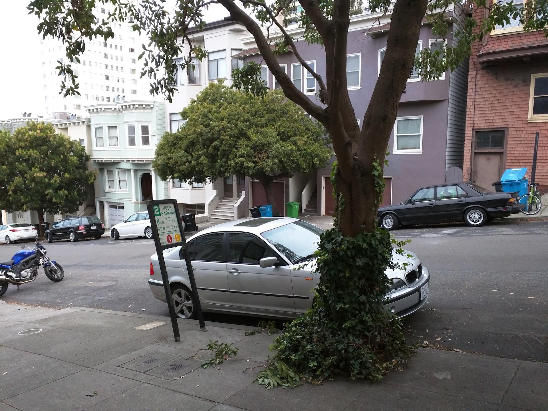
How are the actual images? Good, certainly better than the Nexus 5. Daylight images are of course the easiest for any camera, and the Nexus 6 takes them in its stride, with bold colors and solid contrast. Zoom in, though, and there can be some visible fringing to the edges.

When things get darker, the OIS and sensor work well together, and even though shots can be dim they still have a solid amount of detail to them. HDR+ mode is surprisingly effective, too, though it took 1-3 seconds to capture an image during which time you have to keep as still as possible. If you're shooting a moody landscape that's not an issue, but anything with moving subjects can end up with ghosting.
Motorola's fix is the same sort of ring flash we saw on the Moto X, a circular illuminator around the camera lens. As per the Moto X it's not actually frosted to diffuse the light, and so in fact you're really getting the benefit of two LEDs that flank the camera. It can make things more even, but as with most smartphone flashes it tends toward blowing out closer subjects and yet being too weedy to illuminate anything more than a few feet away.
As for 4K video, that looks great if you have a TV or monitor that can show it at full resolution, but even on more mundane panels is noticeably more detailed than the 1080/30p the Nexus 6 can capture. The downside, of course, is file size: my Ultra HD clips were clocking in at over 300MB per minute of recording. That either chews through your local storage in relatively short order, or is going to require quite a bit of traffic to the cloud.
Lollipop finally condenses the gallery down into a single app – rather than the confusing doubling-up of Gallery and Photos we've seen on earlier phones – to a single Photos app. That supports Google Photos online backup, and can pull out what it believes are your best images in its Highlights tab, just as Google+ has been doing in the browser.
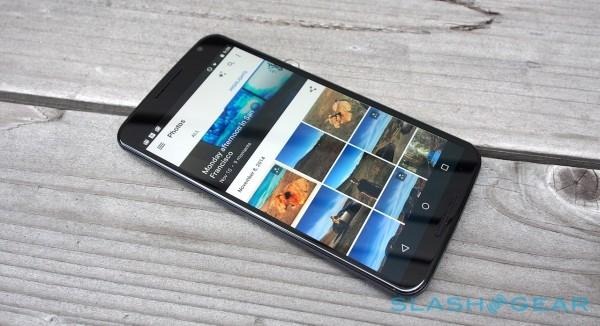
There's also support for Auto Awesome, Google's automatically-applied effects which can slap filters on your shots, piece together faces and smiles from similar frames, and even curate movies and "stories" from your media. It's all well and good, but I also had a few issues with 4K video playback, with the Photos app simply refusing to play clips until I restarted the phone.
Phone and Battery
Do you feel ridiculous holding a phone the size of the Nexus 6 to your head for voice calls? It's certainly not discrete, though at least in-call audio is decent thanks to that larger earpiece, while speakerphone use – albeit with some distortion at the top end of the volume scale – is loud and clear.
Arguably more useful, Motorola has used that chassis space to fit a capacious 3,220 mAh battery, paired with a new fast-charging technology not to mention wireless charging. The estimate is up to 24 hours of talkative, between 250 and 330 hours of standby depending on whether you have Ambient Display turned on or not, or between 9.5 and 10 hours of browsing over LTE or WiFi respectively.
Google's claim of "a full day" of use, then, assumes you'll be talking for every one of those hours. More representative use would more than likely see that shifted into the minority; sure enough, most of the time I spent with the Nexus 6 was taken up with web browsing, GPS navigation, multimedia playback and recording, email and messaging, and the odd chunk of gaming.
It did not disappoint. I found a day of mixed use was fair game for the Nexus 6, though some might lament the absence of a user-accessible battery. Still, instead you get wireless charging; there isn't a Nexus 6-specific wireless charger yet, but since the phone supports the Qi standard, any plate supporting that will work. I tried it with a number of options and had no issues.
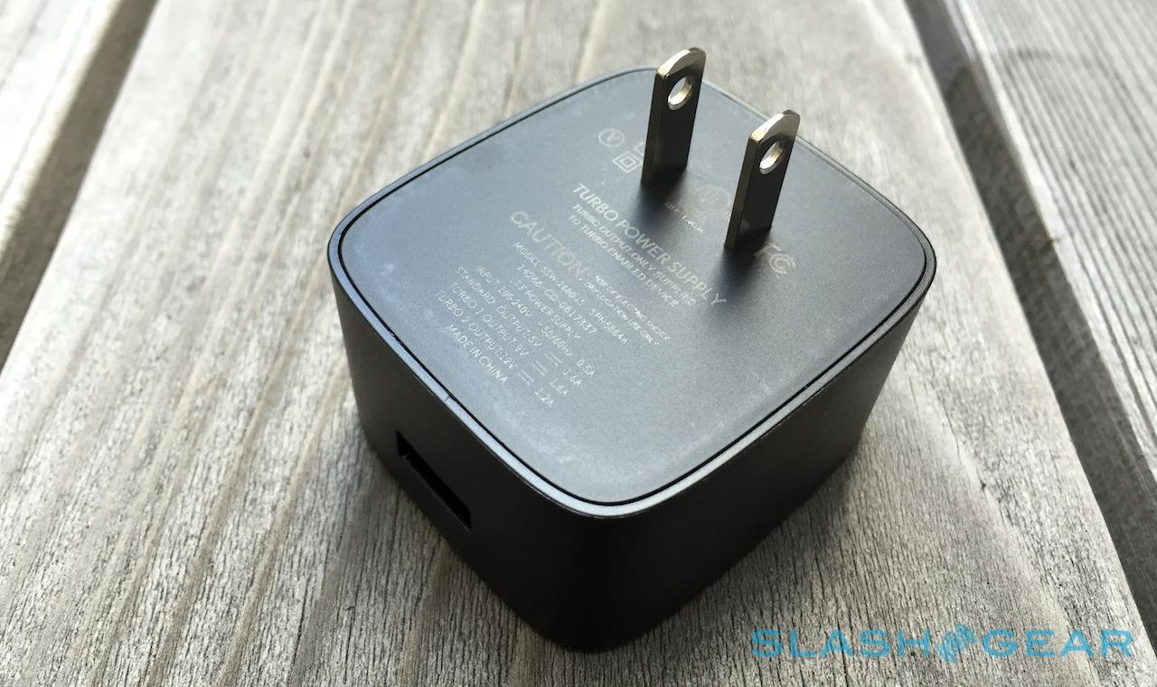
If you're yet to be bitten by the wireless bug, the Nexus 6's Turbo Charging might be more interesting. It's Motorola's rebranding of Qualcomm Quick Charge 2.0, which pushes 15W of power at a device in the name of much faster recharging.

Fifteen minutes plugged in, Motorola says, and you'll have around six hours more battery life as a result. It's worth noting that Turbo Charge is more effective the less power is already in the battery: it takes much longer to go from, say, 80-percent to full, than it does to go from 20-percent to 40-percent.
Nonetheless, it's a welcome addition. How long the top-up will last you depends heavily on use-case – unsurprisingly, standby sips far less power than, say, 4K video recording – but there's no arguing with the ability to get back on the move rather than hovering around an outlet gambling on a couple of extra percentage points. I also quickly came to appreciate the battery charging estimate Android L shows on the lock screen now, which tells you exactly how long it'll take to fill up completely.
Don't underestimate the value of the Turbo Charger being in the box, too; while we've seen other phones support the same rapid-juicing technology, some come with a regular charger rather than the fast version, and expect you to cough up more cash for the privilege.
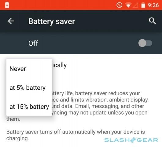
Lollipop has its own battery-miser tech, too. Automatically turned on when the power falls to 15-percent or 5-percent, it cuts screen brightness and stops vibration alerts, as well as putting a moratorium on background data use.
Pricing and Value
Turns out, the screen size isn't the most contentious part of the Nexus 6. No, that's reserved for its price. Buyers of Google's own-brand phones have arguably been spoiled over the past two generations, both the Nexus 4 and Nexus 5 starting at $299 unlocked (for 8GB or 16GB of storage, respectively).
The Nexus 6, in contrast, is more than double that off-contract. Google is asking $649 for the 32GB phone or $699 for the 64GB version: true, you're getting more storage for that, but it's nonetheless a considerable step up and a far cry from the days of mass-market affordability.

It might be a fairer price, however. What's presumably Google's dwindling willingness to subsidize its smartphone costs has brought the Nexus 6 more closely in line with its key rivals: a Galaxy Note 4, for instance, will run you around $750 without a contract, as will an iPhone 6 Plus.
Wrap-Up
In many ways, during my time with the Nexus 6 I've felt like I've been reviewing two things, not one. Certainly, the new Nexus is the most obvious, but Lollipop is not only equally impressive in its own right, but arguably more important to the smartphone space as a whole. Many more people will come into contact with Android 5.0 than will buy a Nexus 6, after all, and the improvements Google has made to the platform in terms of performance, flexibility, and semi-intelligent assistance are notable.
Unfortunately, one of the biggest improvements may well end up invisible to most. Material Design is a huge step forward for Android, but even as manufacturers like Samsung, LG, and HTC confirm they'll be pushing Lollipop out to existing devices, they're also more than likely going to hide its clean new interface under their own custom skins.
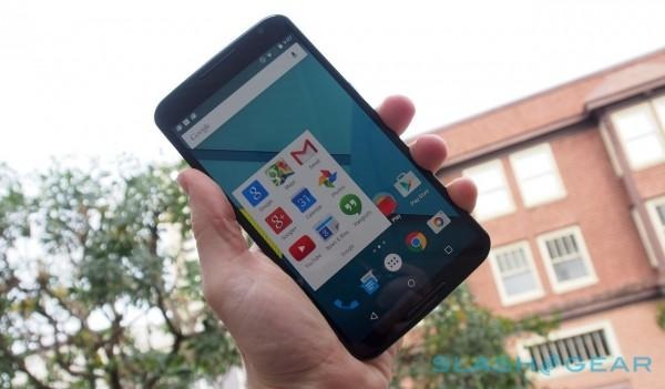
You get to taste the candy just as Google intended it with the Nexus 6, however. That's an instant point in the Motorola phone's favor from the outset, though I can't help but feel some of the mass-market appeal has been sidelined as the Nexus has grown. If the Nexus 5 was Android for the everyman, the Nexus 6 is Android for the most demanding of users, with pockets – both in terms of price and sheer size – to suit.
With a brilliant display, fast processor, solid camera, and strong battery life, the Nexus 6 has plenty in its favor. Still, for many, with Lollipop starting to arrive on the Moto X, that may prove more affordable and more pocket-friendly, while the DROID Turbo has its own strengths in performance and battery life. If you're happy with a two-handed device, though, and you insist on Android exactly as Google intends it, the Nexus 6 is the smartphone to have.

