New Windows 10 Fluent Design Icons Ditch Flat Monochrome Looks For Good
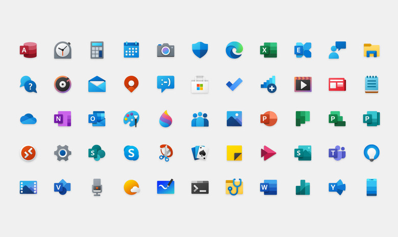
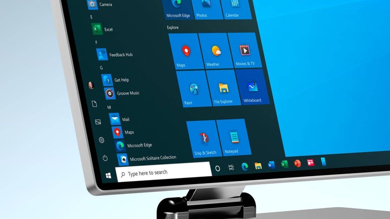
Although it hasn't always gone smoothly, Windows is undergoing a period of change. It isn't just the way that Windows 10 is being developed and delivered, broken as that may be, Microsoft is also in the process of changing the operating system's literal image. It developed its new Fluent Design language which has started to appear in bits and pieces of Windows 10 UI. Now the company has started swapping out old its old Windows 8 era icons for something with more color and a little more depth.
At a time when Apple was still flirting with skeuomorphic aesthetics, Microsoft turned heads with its ultra-minimalist design. Those elements were largely seen on Windows 8's flat style and monochromatic icons but also carried over to Windows 10. It may have helped spur a new phase of UI minimalism but, ironically, Microsoft was left behind.
The new Fluent Design marks a shift in direction that still maintains some level of minimalism that doesn't go to the extreme. The biggest problem with the old flat monochrome icons was that they were inconsistent with the colorful imagery used by apps that Microsoft had no control over. That isn't just visually jarring but also made quickly identifying icons more difficult.
Microsoft's design team talks about how wayfinding was a guiding principle in designing the new icons. They also opted to retain familiar visual cues from previous icons while sprinkling colors and some shading to add some sense of depth without going full 3D.

While these icons are making their way to Windows 10, they will also be the icons users will see on Android and iOS for Microsoft's apps. The first batch, which updates the Mail and Calendar app icons, is rolling out to Fast Ring Insiders. Other built-in Microsoft Store apps like Clock, Alarm, and Calculator will follow.
