New Nexus Phones Might Also Have A New App Launcher
There is certainly no dearth of app launchers and homescreens on Android, easily proven by a quick Google Play Store search. That, however, isn't going to stop Google from showing anyone willing to listen what it thinks the ideal Android launcher should be. It usually does that through Nexus devices, which already saw such a somewhat debated change with the Nexus 6P and 5X. Now it seems Google is playing with another idea for the upcoming Marlin and Sailfish smartphones, and it might be just as, or perhaps even more, controversial than last year's version.
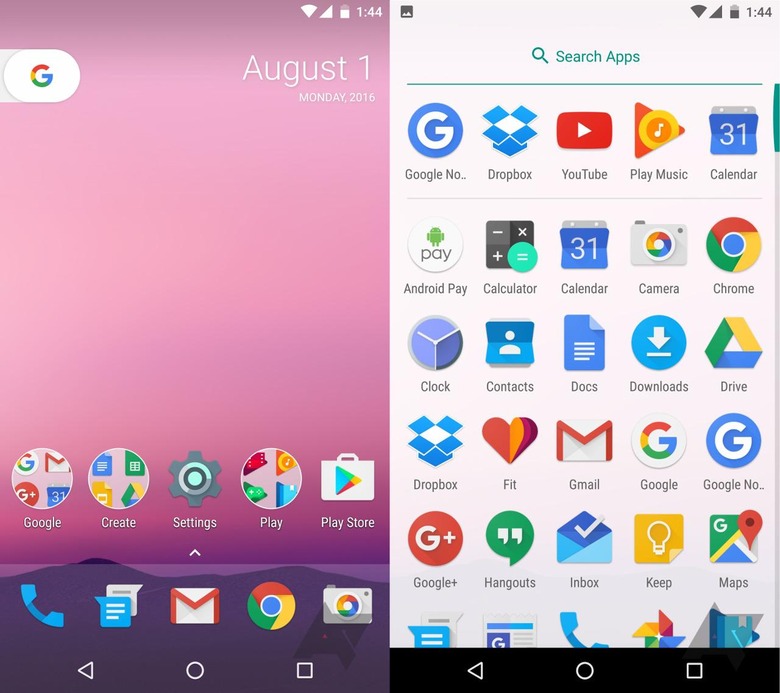
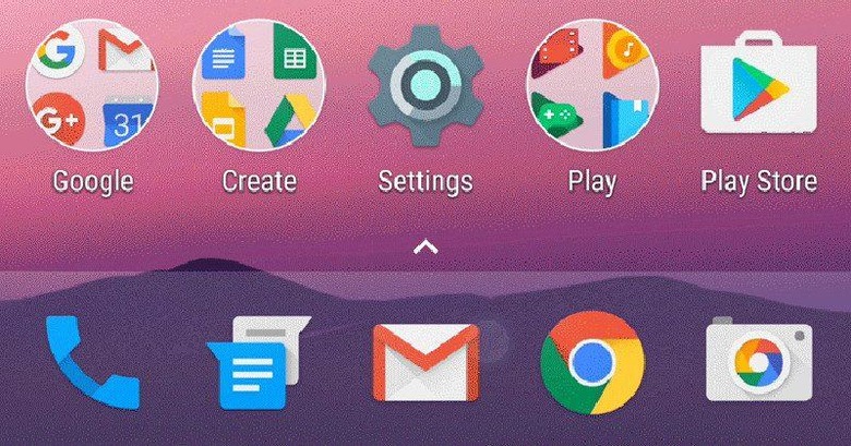
The immediately noticeable change is that there is n longer an app drawer icon. That icon, and that manner of seeing a list of all installed apps, has been a staple of stock Android almost from the very beginning. This sets it apart from iOS, which has no app drawer of any sort and dumps all icons on the home screens. While some Android launchers do mimic this behavior, Android's default has always included that button.
That said, Google hasn't gone over to the dark side either. There is still a separate, dedicated app drawer, but pulling it up requires a new way of thinking. Either you swipe up from the "dock" of pinned apps or you tap on the very small arrow at the top of that area. Either way, the app drawer slides up to take over the screen. Apps are still listed in a grid and a search bar is still located at the top. Functionally, it's the same as before. Visually, it's a new face.

There is also a new element on the home screen, a "G" icon on what looks like a pull tab. Tapping on this icon initiates a Google search, similar to what a full Google Search widget would do. But a pull tab tempts users to pull, and then they do pull/swipe, it reveals the Google Now page. Perhaps this is Google's way of making it more obvious that users can swipe to the left to enjoy all the features of Google Now.
These are very big changes as far as behavior and user interface goes, and some might not sit well with those who still stick to Android's default launchers on their Nexus devices. That said, there is no assurance that this is, indeed, the final design of the Android 7.0 home screen and, even if it is, it will most likely be confined to the new Nexus smartphones anyway.
VIA: Android Police
