New MacBook Pro Hands-On
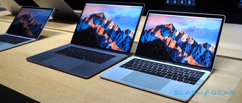
Somehow both familiar and fresh, the new MacBook Pro is more than the sum of its parts: there's some witchcraft in here, too. I've spent some hands-on time with Apple's new flagship notebook, just announced at the company's Cupertino HQ in California today, and it's the upgrade many Mac users have been waiting with middling degrees of patience. More importantly, it feels like the final piece of Apple's argument against touchscreen notebooks and 2-in-1s.
The rumor machine may have spoiled the big Touch Bar surprise – even if we weren't entirely sure of its name at the time – but there's a big difference between seeing it in renders and using it in person. It's definitely the feature your eyes latch onto first when you see the new MacBook Pro, eclipsing the skinnier body and even the larger trackpad. When it comes down to it, our eyes are used to regular aspect-ratio displays, and that's very different from this narrow strip.
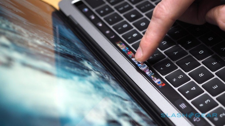
Apple isn't the first to put a display where the function keys once were, and Lenovo beat them to that. What helps distinguish Apple's system is the brightness and clarity of its display: it's hard to believe this isn't a printed panel backlit, rather than an actual screen. It's only when the graphics start changing that you can accept what you're seeing.
The physical design is clever, too. The Touch Bar has the same feel as the regular keycaps, which helps switching between keyboard and touch-strip as your fingers flick between them. It's not sapphire glass – that's reserved for the Touch ID reader at the far right – but it feels like it could handle some fairly aggressive stabs of your fingertip.
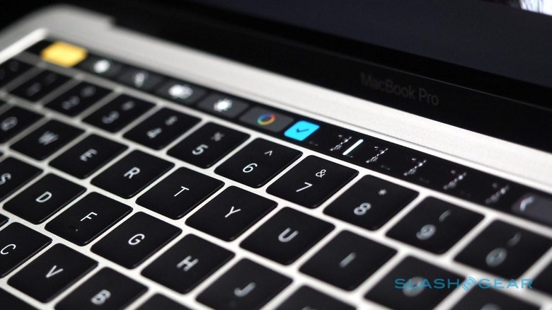
Touch ID lets you log into the MacBook with a finger-press, switch between users, and authorize Apple Pay payments – there's a neat red readout of your total that runs alongside on the Touch Bar like a point-of-sale terminal. Still, I feel like most people will get more use out of the contextually-changing app shortcuts and buttons that show up.
By default, you get shortcuts for volume and such, though they can be customized: you drag the other options down from the display, and then slot them into the row of buttons (which are wiggling, iOS-rearrange style). Expand it, and you get the keys you'd find on a traditional Function row bar from an earlier MacBook. That includes an Escape key, if you were losing sleep over that.
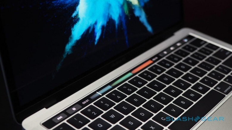
However it's in other apps when the Touch Bar really comes into its own. Scrolling through photo thumbnails in Photos or webpage tabs in Safari; getting shortcuts to the most common controls in apps like Word and Mail. Tap them, and they flourish open to give more granular control, like dragging scroll bars or swiping through filters.
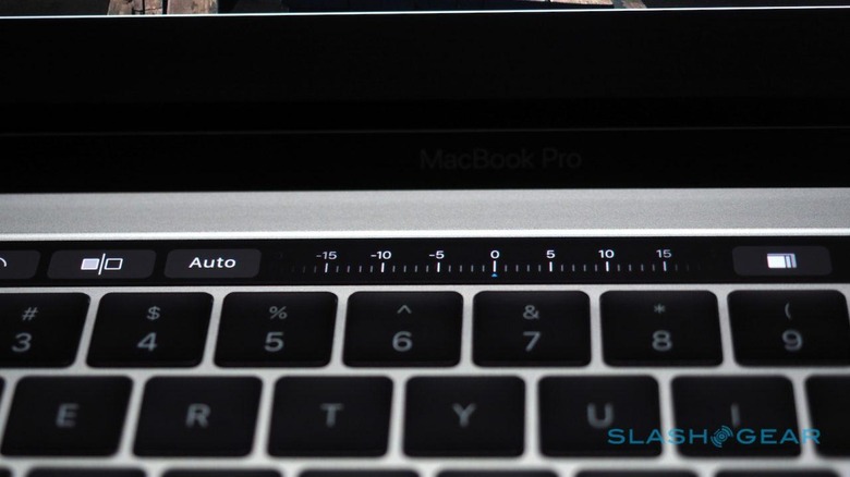
It works, because it's sufficiently high-resolution to show enough of the thumbnails to be useful, and because it's very responsive. Coupled with the oversized trackpad – now so large, those with thick wrists might start to think Apple has something against them, though I'm told palm-rejection is significantly improved for the new machine – you can bring both hands into play, as though you've got a perfect memory for keyboard shortcuts but without having to actually remember them. If I had one lingering complaint, is that haptic feedback – like you get when you tap the iPhone 7's home button or, indeed, the Force Touch trackpad on the new MacBook Pro – would be nice.
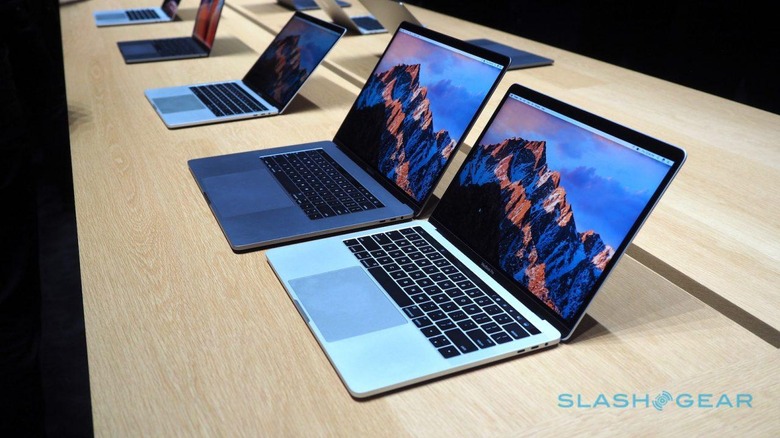
Still, as I used it, I couldn't help but think that it was Apple's final answer to those demanding a touchscreen MacBook Pro. The argument – first set out by Steve Jobs years ago – was always that the ergonomics of reaching out to tap a laptop display just weren't as comfortable as, say, leaning over a tablet like an iPad. Whether Surface Book fans would agree is questionable, but the new MacBook Pro's approach shows that you can get a whole lot done with a full-screen image or video being edited, while your hands swarm over the keyboard deck.
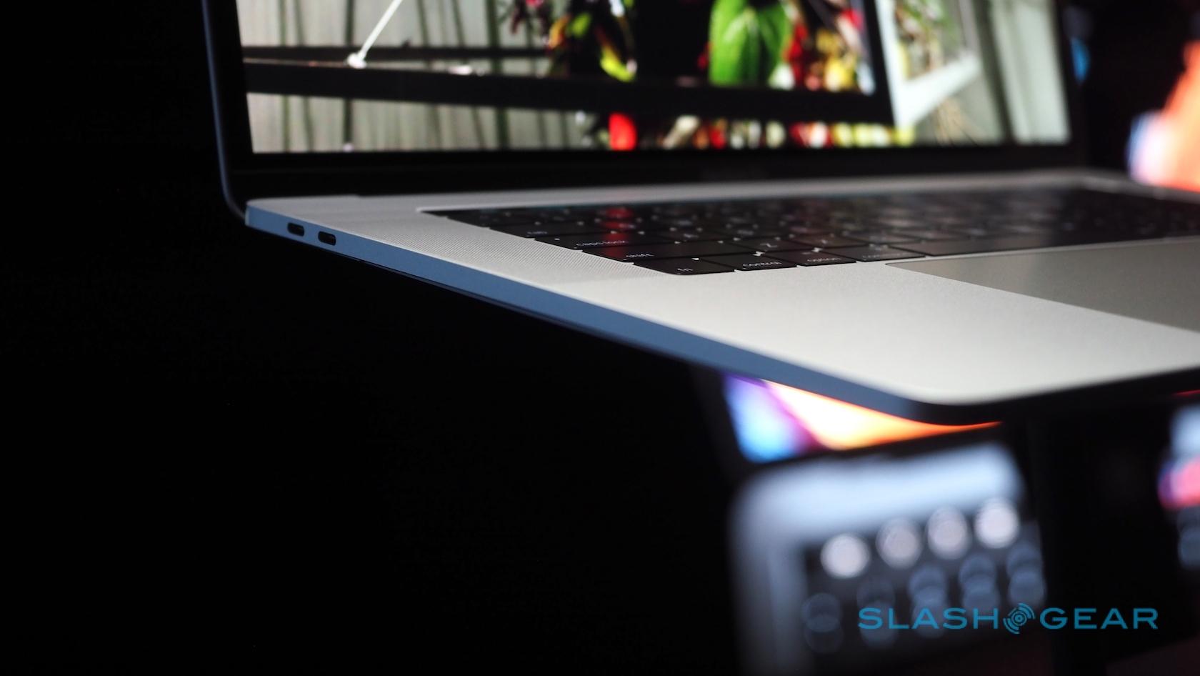
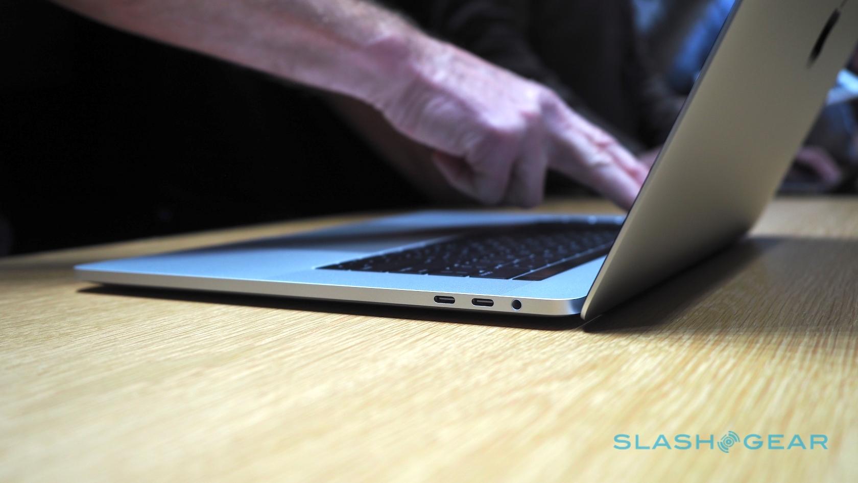
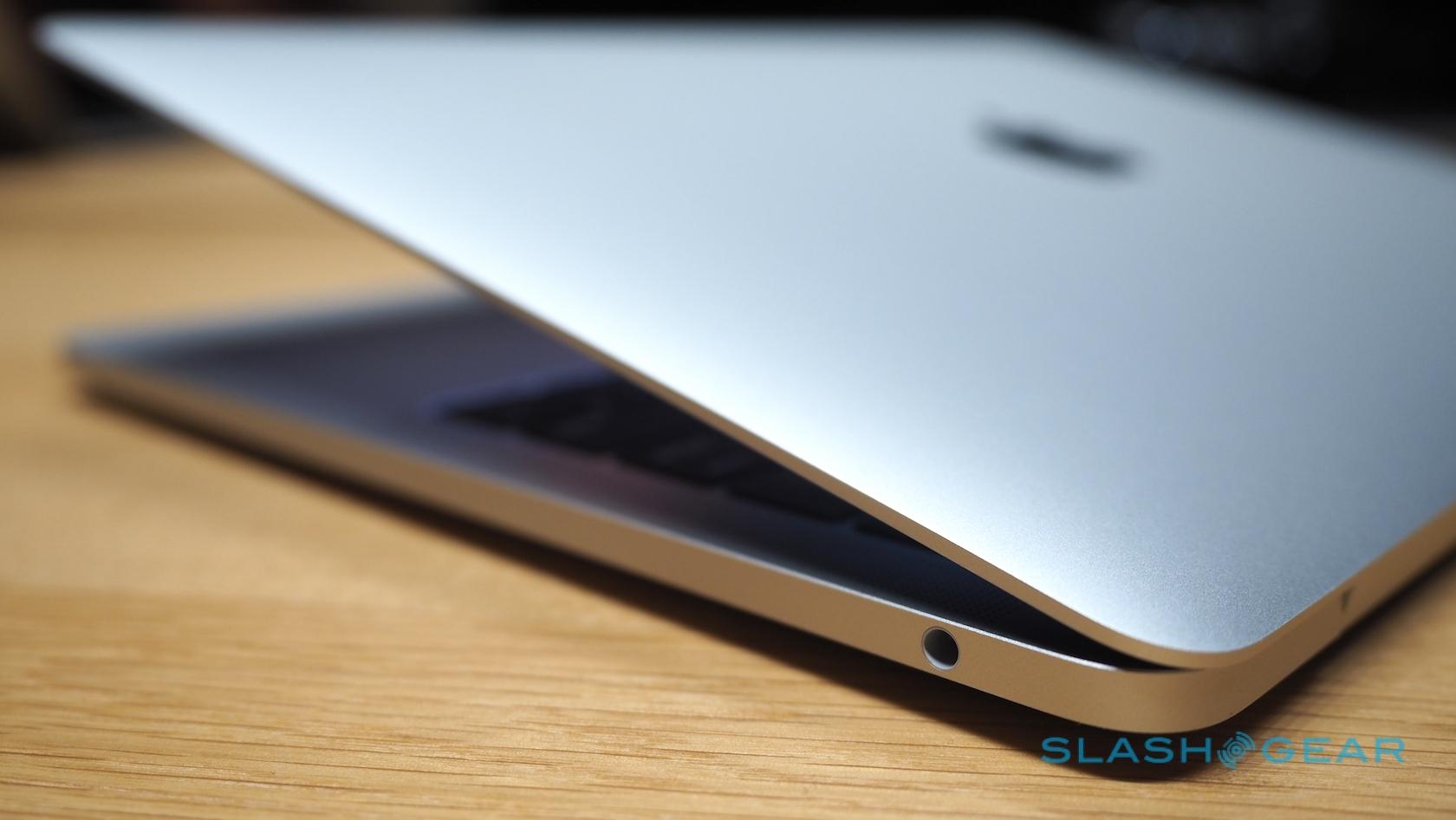
Most controversial, inevitably, is Apple's decision to switch away almost entirely from legacy ports and embrace a Thunderbolt world. You still get a 3.5mm headphone jack, but all of the other connectors have been replaced with Thunderbolt 3. Two USB Type-C ports are on each side of the notebook, for both the 13- and 15-inch models.
The upside to Thunderbolt 3 is clear. It's much faster than USB or Thunderbolt 2, of course, and supports not only power, but video output and data. You can use any of the four ports to recharge; the 15-inch is capable of driving two 5K displays simultaneously, in addition to running its own screen, and those external displays can also recharge the MacBook Pro itself.
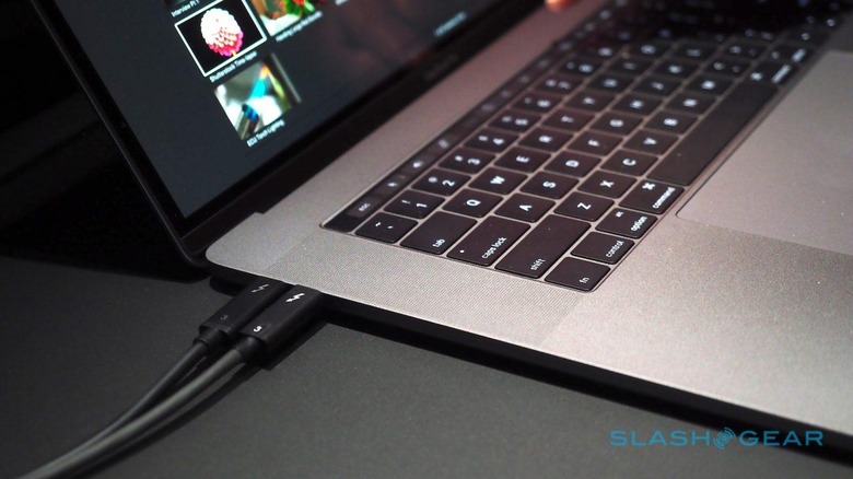
Clearly, though, there are issues too. Get used to dongles if you want to plug in any legacy hardware, which at this point probably means the vast majority of your devices. That's not entirely foreign to MacBook Pro owners who needed ethernet, for instance, but if you've been used to slotting an SD card into the side of your notebook, or plugging in a mouse or USB drive, you'll now need an adapter in-between.
I suspect in the long run the switch will be beneficial rather than a hindrance and, just as we saw with the USB Type-C on the 12-inch MacBook, will drive the progression of Thunderbolt 3 accessories. All the same, it's going to earn Apple some criticism, not least because there are no dongles in the box with any of the new MacBook Pro models. All you get is the power adapter and a charging cable.
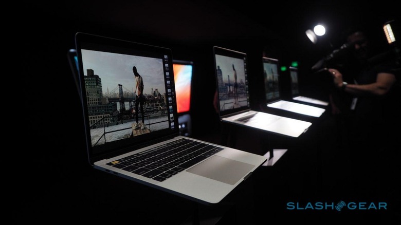
As for the rest of the design, it's the MacBook Pro you know, but skinnier. The keyboard isn't quite like that of the 12-inch MacBook, despite the physical resemblance: if anything, it feels much like the best of old and new keyboards, with much more stable keys than the old MacBook Pro but deeper travel than the first iteration of the butterfly hinge. Bear in mind, I speak as a 12-inch MacBook keyboard fan.
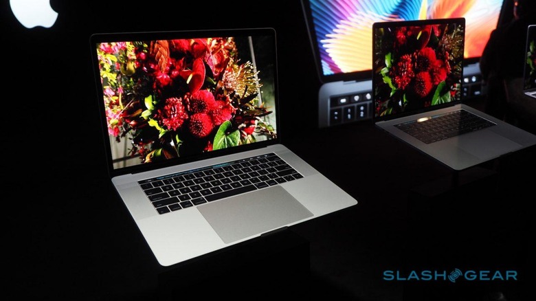
With a DCI P3 color compatible display – like the iMac 5K and the iPhone 7 – photos that take advantage of the wider color gamut look incredible. It's the same resolution as before, but contrast takes a noticeable step up, as does color richness.
NOW READ: All the news from today's Apple event
The new 13-inch MacBook Pro kicks off at $1,499, though to be frank I suspect you don't really want that one. It's Apple's attempt to ween you off the MacBook Air, and so you don't get the Touch Bar and have just two Thunderbolt 3 ports. You'll need to spend $1,799 to get the Touch Bar, double up on the Thunderbolt 3, and step up the processor from a 2.0GHz dual-core Intel Core i5 to a 2.9GHz Core i5.
Opt for the 15-inch MacBook Pro, meanwhile, and that starts at $2,399. That comes with a 2.6GHz quad-core Core i7, 16GB of memory, a 256GB SSD, and AMD's 2GB Radeon Pro 450 graphics. Throw the contents of your wallet at the configurator, and you can end up with a 2.9GHz quad-core Core i7, 16GB of memory, 2TB of SSD, and a 4GB Radeon Pro 460. You'll also be $4,299 poorer.
