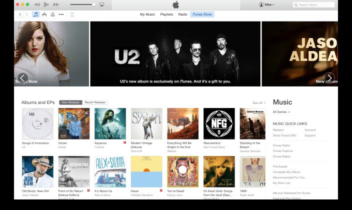
New iTunes Rolling Out, Looks Just Like OS X Yosemite
If you're currently running iTunes 12 on your desktop, open it up right now. See anything different? It might be everything! Apple has started rolling a new-look iTunes out to those running iTunes 12, with an aesthetic change that mimics OS X and new functionality. Visually, iTunes is flatter, with the top carousel getting away from the "pop-out" look. Much like OS X Yosemite, the desktop iTunes looks to offer a bit more of a mobile look and feel.
If anything, the new iTunes looks like it belongs on OS X Yosemite. The design elements are the same, and enough mobile punch to keep it looking like a desktop version of the mobile app. Like Yosemite, iTunes looks like a broader version of the mobile app, but not a carbon-copy.
As 9to5Mac points out, the mobile touches throughout are heavy. Shadowing and textural touches are gone, replaced with a brighter color scheme and subtle actionable buttons.
The update doesn't look to be a finished product, though. One major omission is app previews, which let you see a video of the app in working mode. While that is especially cool for the mobile device you'd be downloading the app to, it would also be welcome on the desktop.
It's not clear if this new iTunes is just a "beta" version, or if Apple has started releasing the new-look iTunes to users. If you don't have iTunes 12, look for it next week, when Apple holds their event, and will likely unleash Yosemite (and a new iTunes) to the masses.
Source: 9to5Mac
